
How to Run a UX Design Critique
- Jakob Nielsen
- Mar 12
- 29 min read
Summary: A design crit should implement strategic participant roles, 24-hour context share, and rigorous prioritization frameworks. This allows cross-functional teams to align technical feasibility with business objectives in a design, mitigating costly development risks and driving product excellence.

Unless you follow the defined process in this article, a design critique can easily be derailed. (Nano Banana 2)
Ever felt like design reviews are just messy arguments? Tired of crits turning into subjective blood sports where everyone suddenly becomes an art critic? This article shows how to fix that by creating a safe space for feedback. It breaks down how to prep beforehand, use silent feedback to give everyone a voice, and easily turn sticky notes into real action plans.
This is a long article of 7,000 words and 51 references with even more information. I made three short explainer videos if you want a faster overview or need to share with colleagues who don’t have the time to dig deep:
Why Design Critiques Go Wrong (YouTube, 6 min.)
How to Run a UX Design Critique (YouTube, 6 min.)
Using AI to Improve Design Critiques (YouTube, 10 min.)
The professionalization of user experience design has shifted the focus from individual creative output to a systemic, collaborative approach known as the design critique, or “crit.”
This process serves as a structured dialogue in which design decisions are scrutinized not for their aesthetic appeal but for their alignment with user needs, business objectives, and technical feasibility.[1, 2] A successful design critique functions as a catalyst for excellence, ensuring that design artifacts are refined through a collective intelligence that identifies gaps, suggests alternatives, and validates assumptions before the costly phase of development begins.[3, 4]
A canvas of pixels is refined by the chorus of collaboration. Here, vulnerability meets structure, transforming the solitary art of creation into a resilient masterpiece of collective intelligence.
How Design Crits Go Wrong
Before we turn to doing it right, let’s look at some common pitfalls in design critiques to motivate us to follow a defined process.

The top 13 reasons design crits go wrong. (Nano Banana 2)
Most design crits do not fail because people are unintelligent or careless. They fail because the conversation quietly slides away from the design problem and toward status, taste, speed, and politics. When that happens, a critique stops being a learning tool and becomes a performance.
1. The Context Vacuum (Presenting Without Framing)
What it is: The designer shows a screen and asks, “What do you think?” without explaining the user persona, core problem, business goals, or technical constraints.
Why it happens: The curse of knowledge. The designer has been staring at the problem for weeks and subconsciously assumes everyone in the room shares their deep understanding of the project's background.
Negative consequences: Reviewers give irrelevant, scattered feedback based on false assumptions. The critique devolves into a confusing Q&A session just to establish basic facts, wasting valuable meeting time.
How to avoid or fix it: Standardize the opening of every crit. Require the presenter to spend the first 3–5 minutes framing the work: Who is the user? What is their goal? What are our constraints? What specific feedback am I looking for today?
2. Solutionizing (Designing in the Room)
What it is: Reviewers tell the designer exactly how to change the UI (e.g., "Make that button red and move it to a top-right dropdown") instead of pointing out why the current design isn't working.
Why it happens: Humans are natural problem-solvers. It takes significantly less cognitive effort to blurt out a quick visual fix than to analytically articulate the underlying usability friction they are experiencing. Higher-level stakeholders are used to deciding on solutions and think their value in a crit lies in proposing concrete changes. Finally, suggesting solutions is satisfying.
Negative consequences: It stifles the designer’s creativity, reduces them to a pixel-pusher, without understanding the underlying problem. Solutionizing often results in shallow solutions that break unseen system constraints or create new UX problems. Sometimes, two suggested solutions conflict, and neither addresses the real user difficulty.
How to avoid or fix it: Train the team to give feedback based on problems, not solutions. If someone prescribes a fix, the facilitator should gently reverse-engineer it: "What specific user problem are we trying to solve by moving that button?" Capture the problem, and let the designer explore the best solutions later at their desk.
3. Bikeshedding (Critiquing the Wrong Fidelity)
What it is: Spending 20 minutes debating button corner radiuses or exact copywriting on a low-fidelity wireframe, or conversely, suggesting massive structural user-flow changes during a final visual polish review.

Bikeshedding is the natural human tendency to spend inordinate time discussing minor and less important issues, such as the design of a bike shed, while glossing over much bigger, but also more difficult, issues, such as the architecture of a skyscraper. Everybody understands the small stuff and therefore feels like piping in. (NotebookLM)
Why it happens: Visual details are highly salient and easy to grasp (a phenomenon known as Parkinson’s Law of Triviality). High-level UX architecture requires deep cognitive load to understand, so people naturally gravitate toward critiquing surface-level visuals instead.
Negative consequences: Time is wasted on trivialities while major structural flaws go completely unnoticed. Or, if structural changes are demanded during final visual polish, it blows up project timelines and budgets.
How to avoid or fix it: The presenter must explicitly bound the feedback. For example: "This is a structural wireframe. Please ignore colors and copy today; focus entirely on the navigation logic." When possible, present lower-fidelity (grayscale) designs to force focus on layout and flow.
4. Subjective “I Like / I Don't Like” Feedback
What it is: Feedback takes the form of “I don’t like this,” “This feels off,” or “I’d make it cleaner,” with little reference to users, task success, accessibility, content strategy, business constraints, or evidence.
Why it happens: When reviewers lack a strong UX vocabulary or objective criteria to lean on, they default to their emotional reactions and personal aesthetic preferences. Furthermore, visual work tempts people into reacting as consumers instead of reasoning as professionals. It is easier to express preference than to explain why something helps or harms the user.
Negative consequences: The critique devolves into an unresolvable debate over personal tastes. The design ultimately reflects the preferences of whoever argues the loudest, leaving the actual end-user out of the equation. Taste-based critiques create churn. Designers make cosmetic changes to satisfy opinions, only to reverse them in the next meeting when a different opinion dominates. The work becomes unstable, and the team confuses motion with progress
How to avoid or fix it: Ban the phrases "I like" and "I don't like." Require all feedback to be anchored to the user persona, business goals, usability principles, research findings, task requirements, or measurable objectives. Ask reviewers to reframe their thoughts: "I worry that visually impaired users might miss this purple button due to low contrast." A useful sentence stem is: “This may cause trouble because…” or “For this user and this task, the risk is…” That shifts critique from preference to reasoning.
5. The Designer Spends the Session Defending Rather Than Listening
What it is: Instead of using the critique to learn, the presenter explains every decision in advance, preemptively argues against objections, or responds to each comment as if it were a cross-examination.
Why it happens: Critique can feel personal, especially when the work is fresh and the designer has just spent weeks shaping it. Designers also know background details others do not, so they are tempted to pour out context to prove the work is rational.
Negative consequences: The meeting becomes argumentative and tiring. Reviewers either push harder, which makes the atmosphere worse, or they give up and offer safe comments. Valuable signals are lost because the designer is busy protecting the current solution.
How to avoid or fix it: Present the problem, the constraints, and the current hypothesis briefly, then stop. During feedback, the designer should mostly ask clarifying questions and take notes. It helps to remember that critique is not a trial. The job is not to win the case for the current design. The job is to make the design better.
6. The Critique Becomes a Status Ritual
What it is: The meeting exists less to improve the design than to demonstrate alignment, display authority, or signal who gets the last word. Feedback from senior people carries more weight because of rank, not because of relevance.
Why it happens: UX projects sit at the intersection of product, engineering, marketing, and leadership. In that kind of environment, even a well-intended critique can become a stage on which organizational hierarchy plays out.
Negative consequences: Honest discussion dries up. Junior designers stop speaking candidly. Peer reviewers censor themselves. The designer starts optimizing for approval rather than for user outcomes. In the long run, the team learns to read power instead of reading problems.
How to avoid or fix it: Separate critique from sign-off. Make it explicit that the purpose is to surface risks and improve the work, not to perform consensus. Use a facilitator who actively draws out quieter voices and asks senior participants to explain their reasoning rather than merely pronounce preferences. Structured turn-taking helps more than people expect.
7. Vague and Unactionable Feedback (The “Make it Pop” Syndrome)
What it is: Comments that sound profound but lack specificity, such as "Make it pop," "It feels a bit heavy," "It's clunky," or "Can we make it more user-friendly?"
Why it happens: Reviewers often experience a visceral sense that something is "off," but lack the technical design vocabulary (like hierarchy, contrast, whitespace, or alignment) to articulate exactly what is causing the friction.
Negative consequences: The designer is left completely guessing what to change. They might spend hours executing a totally different interpretation of making the design “pop,” only to be told it’s still wrong in the next meeting.
How to avoid or fix it: The facilitator or presenter must dig for clarity using the "5 Whys" approach. If someone says "it feels clunky," ask: "Are you referring to the color contrast, the text size, or the number of clicks?" Don't move on until vague feelings are translated into concrete UX attributes.
8. Presenter Defensiveness (The Ego Trap)
What it is: The presenting designer takes feedback as a personal attack. They argue with reviewers, immediately justify every design decision, or make excuses instead of listening.

If you have poured too much of your soul into a design, it’s natural to take any comment as an attack on your personal worth, even when the feedback is good-natured and will only help you improve. (NotebookLM)
Why it happens: Design work feels deeply personal. Imposter syndrome is common, and having your hard work picked apart in front of peers triggers a natural "fight or flight" ego response.
Negative consequences: It destroys psychological safety. Reviewers will stop giving honest, constructive feedback to avoid conflict. The designer stops learning, and the product's quality stagnates in an echo chamber of artificial harmony.
How to avoid or fix it: Cultivate a team mindset of: You are not your design. The critique is about stress-testing the work, not the designer's competence. Presenters should practice active listening, defaulting to responses like, "That's an interesting perspective, let me write that down to explore," without immediately rebutting.
9. The HiPPO Effect (Highest Paid Person's Opinion)
What it is: The most senior person in the room (a Director, VP, or Founder) speaks first, and the rest of the room immediately aligns with their opinion, suppressing any dissenting thoughts.

“HiPPO” is the Highest Paid Person’s Opinion. There’s a reason this person is highly paid, but it’s usually not his or her usability insights. (NotebookLM)
Why it happens: Corporate power dynamics. Junior team members are naturally hesitant to contradict the person who controls their promotions, performance reviews, and salary, making agreement feel like the safest career move.
Negative consequences: Groupthink. You lose the diverse perspectives, specialized knowledge, and fresh eyes of the rest of the team. The product gets built on the assumptions of one executive rather than a balanced view of user needs.
How to avoid or fix it: Have senior leaders purposefully speak last. Alternatively, use a "silent critique" method: put the designs on a digital whiteboard and give everyone 5–10 minutes to write feedback on sticky notes in silence before any verbal discussion begins.
10. The Unfacilitated Free-for-All (Rabbit Holes)
What it is: A chaotic discussion with no agenda or time limits. The conversation wildly jumps from topic to topic, loud voices dominate, and the discussion derails into back-end tech debt or marketing strategy.
Why it happens: Informal, friendly team cultures often lead to lax meeting structures. Because UX touches every part of the product, looking at a UI naturally prompts people to think about broader, interconnected systemic issues.
Negative consequences: The meeting runs out of time. The first screen gets 40 minutes of deep debate, the remaining five screens are rushed in 5 minutes, and the designer leaves without the specific UX feedback they actually needed to unblock their work.
How to avoid or fix it: Always assign a dedicated Facilitator (someone other than the presenter) to keep time and guide the discussion. Use a "Parking Lot" document to capture valid but off-topic ideas, so reviewers feel heard, then immediately steer the conversation back to the UI.
11. Designing by Committee (Lack of Ownership)
What it is: Treating the critique as a voting session where the designer tries to incorporate every single piece of feedback given, or the group attempts to reach full consensus on every design decision before moving forward.
Why it happens: A desire for democracy, fear of stepping on toes, workplace politics, or a misconception that all feedback is a strict mandate rather than a data point to consider.
Negative consequences: You end up with a bloated, disjointed "Frankenstein" design that tries to please everyone and fails at all of it. Strong product vision dies in committee.
How to avoid or fix it: Establish upfront that the critique is for gathering perspectives and identifying risks, not making final decisions. The designer is the ultimate owner of the work. They are responsible for listening to all feedback, but they alone synthesize it and decide what actually gets implemented.
12. The Black Hole (Failing to Document and Close the Loop)
What it is: Having a fantastic, insightful 45-minute discussion, but nobody writes anything down, and no summary or next steps are shared afterward. The crit becomes an event rather than being part of the design process.
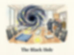
After your design critique, all the good ideas and discussions are sucked into a black hole, never to be seen again. Unless they are documented on the spot. (NotebookLM)
Why it happens: The presenter is too busy presenting, answering questions, and managing the room to take detailed notes, and everyone else assumes someone else is doing it. Important points seem obvious and memorable. They are not. Memory compresses nuance, and what felt shared in the room quickly fragments into different interpretations.
Negative consequences: Valuable insights evaporate. The designer forgets nuanced points, the exact same issues have to be re-litigated in the next critique, and reviewers feel ignored when they don't see their feedback addressed in the next iteration.
How to avoid or fix it: Always assign a dedicated Note-taker. At the end of the meeting, the presenter should verbally summarize the 3–5 main action items they are taking away. Within 24 hours, the designer should share a brief follow-up message outlining what feedback they are implementing and what they are discarding (and why).
13. The Design Is Shown Too Late
What it is: The critique happens after the design is polished, socialized, perhaps partially built, and emotionally expensive to change. By then, feedback still appears possible, but in reality the room has little appetite for meaningful revision.
Why it happens: Designers often wait until the work looks coherent before exposing it. That instinct is understandable. Nobody enjoys showing unfinished thinking. Teams also delay critique because calendars are crowded and stakeholders prefer seeing something “real.”
Negative consequences: Late critique produces the worst of both worlds. Either the team ignores major issues because it is too late to act, or it discovers fundamental problems after substantial investment. In both cases, the cost of learning becomes unnecessarily high.
How to avoid or fix it: Crit early, when the design is still cheap to change. Sketches, rough flows, wireframes, and prototypes are all valid critique material. In fact, they are often better. Early work invites conceptual feedback because it has not yet seduced the room with surface polish.
The Deeper Pattern
Underneath these unlucky thirteen mistakes, one pattern appears again and again: the critique stops being a method for examining design decisions and becomes a social event organized around opinion, hierarchy, and momentum. Once that shift occurs, even intelligent feedback loses value.
A healthy design crit is narrower, earlier, calmer, and more evidence-based than many teams expect. It asks, with discipline, “What problem is this design trying to solve, how well does it solve it, and what risks do we see?” Everything else is secondary.
A simple formula helps: frame the problem, constrain the scope, use explicit criteria, surface risks before solutions, and leave with decisions. When those five things are present, critique becomes one of the most efficient tools in UX work. When they are absent, it becomes one of the most expensive forms of confusion.
Now, how to do it right!
Structural Planning and Logistical Foundations
The efficacy of a design critique is rooted in its preparation. An unstructured session risks descending into subjective debates or “blood sports,” where designers feel attacked, and feedback remains non-actionable.[2, 5] Strategic planning involves the selection of participants, the definition of roles, and the establishment of a rigorous timeline.

Don’t make a design critique feel like a battle zone. (NotebookLM)
Defining Group Dynamics and Participant Selection
Selecting the right participants is essential to ensure a balance of expertise and perspective. While a session needs enough voices to provide diverse insights, too many participants can lead to groupthink or a dilution of focused feedback. Industry standards suggest a group size of 3 to 8 participants.[1, 3, 6] This allows for deep participation while remaining small enough for efficient facilitation.
Participant Role | Responsibilities in Critique | Strategic Value |
Facilitator | Guides session, manages time, enforces ground rules [2, 6] | Ensures the session remains productive and focused.[2, 7] |
Presenter | Sets context, explains rationale, requests specific feedback [3, 6] | Provides the narrative foundation for the work being reviewed.[3, 8] |
Recorder (Scribe) | Documents key decisions, feedback themes, and action items [6, 9] | Creates a source of truth for post-session iteration.[9, 10] |
Decision Maker | Holds the final say on which feedback is implemented [9] | Prevents design by committee and ensures alignment.[9] |
The Naysayer | Challenges assumptions and forces defense of design choices [9] | Mitigates confirmation bias and uncovers hidden risks.[9] |

The designated naysayer’s role is to challenge assumptions. Don’t let them get away with it! (NotebookLM)
Cross-functional representation is equally vital. Including stakeholders from Engineering and Product Management ensures that feedback is grounded in technical feasibility and business viability.[9, 11, 12] Developers can assess whether proposed animations or interactions are supported by the tech stack, while Product Managers align the design with market trends and KPIs.[11, 12]
The 24-Hour Context Share
To maximize the time spent in the session, leading organizations implement the 24-Hour Context Share. By distributing design materials, project background, and specific feedback requests at least one day in advance, critics have the opportunity to move past surface-level reactions and develop thoughtful, objective insights.[7] This preparation transforms the quality of feedback from reactive comments (e.g., “I don’t like this color”) to structural inquiries (e.g., “How does this color choice support the accessibility needs of our primary persona?”).[7]

It is tempting to keep refining a design until the last moment before the design critique meeting, but enforcing the discipline to close the books the day before will make for a much better outcome. Respect your critique participants by allowing them sufficient time to review your design before the event. (NotebookLM)
Framing the Presentation: Strategic Context and Storytelling
The manner in which a design is presented significantly dictates the quality of the feedback received. Presenters must move beyond simply showing screens; they must tell a story that immerses the critics in the user’s reality.
Setting the Scope and Maturity Level
Feedback must be tailored to the stage of the design process. Early-stage “mushy” concepts require broad feedback on direction and strategy, whereas late-stage “baked” designs require focused critique on polish and consistency.[3, 8] Presenters should explicitly state where they are in the lifecycle to prevent critics from focusing on pixel-perfect details when the underlying logic is still in flux.[8, 13, 14]

Critiquing a “mushy” early-stage design versus a “baked” almost-final design requires focus on different levels of detail. (NotebookLM)
Project Stage | Feedback Focus | Artifact Type |
Discovery/Ideation | Conceptual alignment, problem definition [8, 15] | Sketches, low-fidelity wireframes.[16, 17] |
Definition/Wireframing | Information architecture, logical flows [15, 18] | Digital wireframes, user journey maps.[16, 17] |
Prototyping | Interaction design, usability [19, 20] | Interactive prototypes, storyboards.[8, 17] |
Validation/Final Polish | Visual hierarchy, brand consistency [1, 2] | High-fidelity mockups, design system specs.[3, 17] |
Narrative Journeys over Static Moments
A critical failure in presentation is showing screens in isolation. To facilitate a holistic understanding, presenters should "share journeys, not moments".[8] This involves using storyboards or interactive prototypes to demonstrate how a user transitions from one step to the next.[8] This method highlights logical gaps in the "story" and ensures that the design functions as a coherent system rather than a collection of disparate pages.[8, 18]
Articulating Design Rationale
Construction of a critique-proof presentation involves articulating the rationale behind every major design decision. Connecting visual choices to user research, business goals, or technical constraints shifts the discussion from subjective preference to objective evaluation.[3, 6, 19] By preemptively explaining the “why” (for example, citing user interviews or analytics), the designer establishes authority and provides a framework for the critics to follow.[3, 18]

A strong design rationale can deflect much of the useless, subjective criticism. (NotebookLM)
Leading the Critique Session: Facilitation and Flow
The facilitator’s primary responsibility is to maintain a productive conversation flow, ensuring that the session remains a "safe space to fail" while still driving toward excellence.[7, 21]
Establishing Ground Rules
Before the review begins, the facilitator should restate the critique etiquette. These rules create a shared linguistic and behavioral standard for the group.[1, 6]
Focus on the Work, Not the Person: Critique the design decisions, not the designer’s abilities.[1]
Be Specific and Actionable: Feedback should pinpoint exact issues and provide a clear next step.[1]
Reference Goals and Users: Every observation should be tied back to the project’s objectives or the end user’s needs.[1, 3]
Suggest, Don't Dictate: Critics should offer options and reasoning rather than making demands, preserving the designer’s autonomy.[1]
The Structured Session Agenda
Time-boxing each segment of the critique prevents sessions from running over or getting bogged down in minor details.[3, 6] A standard 45-minute session might be partitioned as follows:
Agenda Item | Duration | Primary Activity |
Context & Background | 2–5 Minutes | Presenter reviews problem, objectives, and success metrics.[1, 3] |
Solution Walkthrough | 5–7 Minutes | Presenter tells the story of the work, highlighting decision points.[1, 3, 7] |
Clarifying Questions | 2–3 Minutes | Critics ask questions to ensure full understanding before critiquing.[3, 13] |
Silent Feedback | 7–10 Minutes | Participants record feedback individually using sticky notes or digital tools.[1, 3] |
Group Conversation | 10–13 Minutes | Round-robin discussion of the most critical feedback points.[3, 7] |
Wrap-up & Reflection | 3 Minutes | Presenter summarizes key takeaways and thanks the group.[1, 3] |
The inclusion of a Silent Feedback period is a high-level practice that mitigates the risk of the loudest voices dominating the room. It allows introverted team members to contribute equally and helps all participants filter their initial reactions into deliberate, objective dialogue.[1, 3, 7]

Schedule an agenda slot for silent feedback, where even the most extraverted participants have to hold their tongues. (NotebookLM)
Psychological Safety: Creating a Resilience-Oriented Culture
Design is inherently an “art of being wrong safely.”[22] For designers to bring rough, exploratory artifacts to a critique, the culture must prioritize psychological safety: the belief that one can take interpersonal risks without fear of retaliation or guilt.[22, 23, 24]
Linguistic Distancing and Decoupling Ego
One of the most effective methods for maintaining psychological safety is the use of linguistic distancing. Facilitators and critics should refer to “the design” or “this interaction” rather than “your design.”[1, 6] This subtle shift in language reminds the team that the artifact is the subject of scrutiny, not the individual’s professional identity.[1, 6]

Simple word choices can make it clear that a critical comment refers to the design and not the designer. This makes it much easier to consider the feedback neutrally rather than defensively. (NotebookLM)
Normalizing Imperfection Through Leadership
Design leaders play a crucial role in setting the tone by sharing their own unfinished work and modeling openness to feedback.[7, 21] When leaders acknowledge their own constraints and trade-offs, it validates the difficulty of the design process and encourages junior designers to be more transparent with their challenges.[7, 21, 25]

It’s great to share early work and designs that don’t look perfect yet. (NotebookLM)
Factor Influencing Safety | Mechanism of Action | Desired Outcome |
Interpersonal Risk | Creating environments that tolerate failure without retaliation.[23, 24] | Increased innovation and willingness to share "wild" ideas.[23, 26] |
Role Clarity | Explicitly defining the "Decision Maker" and "Facilitator".[9] | Reduced defensiveness as the path to resolution is clear.[5, 9] |
Peer Support | Coaching and one-on-one mentorship alongside group crits.[21] | Sustained designer growth and craft improvement over time.[3, 21] |
Synthesis Methodologies: Turning Feedback into Action
The value of a critique is only realized when the feedback is successfully synthesized into actionable improvements for the next iteration. Synthesis is the process of moving from raw data to thematic insights and prioritized tasks.[27, 28]
Affinity Mapping (The KJ Method)
Affinity mapping is a visual synthesis technique used to organize disorganized qualitative feedback into clusters of related themes.[27, 29] This process helps teams move from observing noise to identifying behavioral patterns.[27, 28]

In an affinity mapping exercise, team members move items around (usually on a wall, not the cave floor) until like items are clustered together. For example, pebbles go in one cluster, leaves in another, and moss in a third. (NotebookLM)
Atomic Preparation: Every observation, user quote, or critique point is moved to an individual note.[27, 28]
Clustering: Without overthinking, notes are grouped by “feel” or natural connection, such as “Navigation Issues” or “Search Filter Confusion.”[29, 30]
Thematic Labeling: Once clusters form, they are given action-oriented or problem-specific labels.[29, 30]
Pattern Recognition: The team steps back to look for the bigger story behind the clusters, identifying systemic flaws that might have been missed in isolation.[27, 28]
Visualization: Relationships between clusters are mapped, often using arrows or color-coding to show overlap or priority.[29, 30]
The “I Like, I Wish, What If” Feedback Format
Standardizing the way feedback is delivered ensures it is balanced and exploratory rather than purely corrective.[1, 2, 7]
“I Like”: Identifies specific elements that work well, reinforcing successful design patterns and building confidence.
“I Wish”: Frame improvements constructively. Instead of “This is bad,” use “I wish the user had more guidance here.”
“What If”: Encourages creative brainstorming by offering exploratory possibilities without demanding implementation.

Three types of feedback: I like, I wish, What if? (NotebookLM)
Prioritization Frameworks: Deciding What to Fix
After synthesis, the team must decide which issues to address in the next iteration. This requires a balance between user impact, business value, and technical feasibility.[17, 31]
Impact/Effort and RICE Frameworks
The most common prioritization method is the Impact/Effort matrix, which plots the potential "value" of a change against the "effort" (complexity, time, and resources) required to implement it.[17, 31, 32]
Quadrant | Strategy | Resource Allocation |
High Impact, Low Effort | Quick Wins: Implement immediately.[31, 32] | High Priority |
High Impact, High Effort | Big Bets: Plan for future sprints; require deep planning.[31, 32] | Strategic Investment |
Low Impact, Low Effort | Fill-ins: Address only if other work is complete.[31, 32] | Low Priority |
Low Impact, High Effort | Money Pits: Avoid; these drain resources with little return.[31, 32] | Deprioritize |

In this impact-effort matrix, you expect to gain a lot of meat (high impact) from chasing a mammoth into a pit that was easy to dig (low effort). On the other hand, the caveman should avoid hunting butterflies (low impact, high effort). (NotebookLM)
For more granular scoring, teams may use the RICE framework, which calculates a score based on Reach, Impact, Confidence, and Effort.[3, 31] The mathematical formula for this prioritization is:

This formulaic approach helps remove emotional bias from the decision-making process, ensuring that the team works on the “right things at the right time.”[4, 31]
Severity and Usability Heuristics
Usability issues should also be categorized by severity to ensure that critical-path blockers are resolved first.
Blocker: Users cannot complete the task; requires immediate fix.[17, 33]
Major Issue: Users struggle significantly; task completion is at risk.[17, 33]
Minor Issue: Users can complete the task but with frustration.[17, 33]
Cosmetic: Aesthetic issues that do not affect functionality but impact professional perception.[17, 33]
Describing usability problems in reference to the standard 10 usability heuristics provides a principled approach to understanding the underlying reasons they cause users difficulty.
Case Studies in Design Critique: Organization-Specific Rituals
Leading technology firms have developed highly optimized rituals for design critique that align with their operational scales and cultural values.
Airbnb: Tangibility and Storyboarding
Airbnb emphasizes making the work as real as possible for the critics. By putting work on physical walls or handing over interactive prototypes on a device, they ensure that feedback is grounded in the actual user experience rather than abstract concepts.[8] They prioritize "sharing journeys," using storyboards to show user movement across time and space, which helps identify holes in the experience architecture.[8]
IBM: The Playback and Hill Rituals
IBM uses "Playbacks" to eliminate silos and maintain alignment across massive, dispersed teams.[34] These sessions are not just about design; they are about "telling stories and exchanging feedback" throughout the project’s evolution.[34] IBM frames these critiques around "Hills": user-focused statements of intent that describe a desired outcome without prescribing a solution.[34] This keeps the critique focused on whether the "Hill" has been "taken" (the outcome achieved) rather than on the specific mechanics of the implementation.[34]

How will the penguins get up that hill? We don’t know at the beginning of the project, but stating this type of user goal allows the design critique to focus on whether the hill has been taken, rather than the specific implementation. (NotebookLM)
Spotify: Design Productivity and the Sandbox
Spotify’s approach is rooted in balancing exploratory "play" with logical "structure".[25] They utilize a "Sandbox" model in Figma where designers can ideate freely. For critiques, they isolate key screens onto a dedicated page to provide enough context for the team to offer confident points of view.[25] They also leverage asynchronous walkthroughs (using video tools) to provide "voice-guided" context, ensuring that even remote team members can understand the "why" behind the work at their own pace.[25]
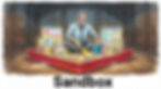
A sandbox is a dedicated space for experimenting without endangering the real system. This encourages free exploration and risk-taking. (NotebookLM)
Google: The Design Sprint and "Understand" Phase
Google’s design sprint framework includes a rigorous "Understand" phase that serves as a precursor to critique. This phase involves "360 Lightning Talks" where sprint participants share user research, business goals, and technical feasibility.[15, 35] Critique in this context is highly accelerated, with "Decide" sessions where the team votes on which ideas to prototype and test with real users within a matter of days.[15, 20]
Closing the Loop: Responding to Feedback and Iterating
The final phase of a successful critique is the designer's response. A designer must transition from "creative mode" to "analytical mode" to process the feedback objectively.[3]
Filtering and Reconsidering Feedback
Designers are not required to implement every piece of feedback received during a pure critique session.[3] Instead, they should look for patterns: if multiple critics mention the same issue, it is likely a systemic flaw that needs addressing, even if the designer personally disagrees.[1] The designer should filter feedback through the lens of the project's original goals and user needs, setting aside opinion-based comments that do not align with the objective "north star" of the project.[1, 3]
Documented Action Items and Follow-up
To ensure accountability, the session should conclude with a summary of key takeaways and assigned action items.[6, 7] Setting a timeline for these changes helps maintain momentum and ensures that the next iteration is completed in time for subsequent reviews.[4, 13] Documentation should be made accessible to the entire team, serving as a record of why certain design directions were abandoned and others embraced.[1, 6, 7]
Action Item Step | Responsible Party | Expected Outcome |
Distribute Meeting Minutes | Recorder (Scribe) | Formal record of feedback and decisions.[6, 10] |
Update Design Artifacts | Designer | New iteration incorporating prioritized changes.[3, 4, 6] |
Technical Validation | Engineering Lead | Confirmation that new directions are feasible.[11, 12] |
Stakeholder Approval | Product Manager | Alignment on strategic direction post-critique.[2, 3, 17] |
Tooling and Documentation Ecosystem
The modern UX workflow is supported by a robust ecosystem of tools designed to streamline the critique and feedback loop. These tools facilitate everything from real-time prototyping to long-form documentation and async walkthroughs.[36, 37]
Collaborative Design Platforms
Figma and Adobe XD serve as the primary environments for design critique, offering native commenting and version history that allow teams to leave feedback directly on specific design elements.[25, 36, 37] These platforms support real-time co-editing, which is essential for "live" critiques or collaborative prototyping sessions.[37, 38]
Visual Feedback and Handoff Tools
Once designs are ready for a higher level of scrutiny, tools like InVision and Zeplin provide presentation and handoff capabilities.[37] Zeplin, in particular, is used to provide engineers with accurate specs and assets, ensuring that the "technical critique" is backed by precise data.[37, 39]
Knowledge Management and Documentation
Notion and Confluence are often used to store the "System of Work,” the templates, design briefs, and research reports that provide the context for every critique.[11, 36, 40] Maintaining a centralized folder for all research ensures that everyone on the team has a shared understanding of the problem space, which is critical for framing the critique correctly.[17, 26]
AI-Enhanced Design Critiques
Current AI capabilities, as well as those we can realistically expect to see within the next few years, can improve every stage of a UX design critique: preparation, the live session, and follow-through. AI can make critique more stage-appropriate, more hypothesis-driven, less hierarchical, and more accountable over time by making each of these beneficial attributes easier to achieve, even for when critiques are run by less experienced facilitators.
One of AI’s most valuable contributions is not that it produces more feedback, but that it helps a team ask the right questions at the right level of abstraction. A rough concept should be critiqued for assumptions, user flows, and product risk; a high-fidelity mockup should be critiqued for clarity, states, accessibility, and implementation detail. By calibrating the critique to the artifact’s maturity, AI can prevent teams from applying pixel-level scrutiny to a design that is still strategically unsettled.

Forget about tiny details when you should focus on analyzing architectural questions. (NotebookLM)
AI in Design Crit Prep
Structured prompting frameworks help facilitators generate comprehensive, tailored agendas rather than generic meeting lists.[42, 43] By explicitly defining the AI agent’s role and context, facilitators can produce targeted questions that identify business goals, technical constraints, and market positioning upfront, while accounting for the specific personalities in the room.[42, 43] This prevents the late-stage “wait, that’s not what we agreed on” moments that frequently derail critiques.
AI can also review foundational documents, such as Product Requirement Documents (PRDs) or Business Requirement Documents (BRDs), to surface the criteria that should shape the critique.
AI can turn a design into an explicit set of hypotheses before the meeting begins: what the interface assumes about user motivation, what task it is trying to accelerate, what behavior it expects to change, and what risk would matter most if the idea failed. This is valuable because many critiques drift into taste-based commentary when the underlying hypotheses have never been named. A facilitator who enters the room with AI-generated hypotheses can ask reviewers to respond to the design as an argument, not merely as a composition.

A hypothesis about user behavior may be right or wrong. But making it explicit, rather than assumed and hidden, will improve the validity of your critique sessions. (NotebookLM)
A common pitfall in design critiques is diverting attention to minor technical errors or design system inconsistencies, which prevents the group from discussing higher-level strategic intent. Having AI conduct a “pre-critique” automates the identification of lower-level usability flaws before the design reaches stakeholders. This preserves human reviewers’ limited “cognitive budget”; if participants spend that budget identifying small issues that AI could have caught beforehand, they lack the resources for deeper analysis of larger, structural problems.

Using AI for a pre-critique of a new design can metaphorically “burn away” many thorny design flaws that would otherwise consume valuable time in a human design review. (NotebookLM)

Humans only have so much brain power. If they spend it on small issues, they can’t allocate sufficient cognitive resources to the more important problems. (NotebookLM)
Preparation also benefits from AI-generated placeholder content and documented rationale, which replace lorem ipsum and make designs easier for others to evaluate.
Another high-value use of AI is to collect and synthesize written critiques before the live session. Quiet participants often produce better feedback asynchronously than they do in a crowded room, especially when hierarchy is present. If the facilitator has AI cluster that input in advance, the meeting can begin with patterns and tensions already visible, rather than with the first opinion voiced in the room.
AI During the Critique Meeting
During the meeting, AI can act as a live facilitation aid by analyzing whiteboard text, chat, and meeting transcripts for signs of confusion, frustration, or disengagement.[44, 45, 46, 47] That signal gives the facilitator a rough pulse of the room and can justify interventions such as a round robin, a reframing of the question, or a request for evidence.
AI can also help counter group-dynamic failures such as the HiPPO effect.[44] If the discussion narrows after a senior leader speaks, the facilitator can use AI-generated summaries and sentiment cues to surface unanswered questions, missing evidence, or alternatives that deserve consideration.
Real-time analysis can also help facilitators de-escalate conflicts. If frustration rises around implementation complexity, the facilitator can use AI to restate the tradeoff, propose a compromise, or surface a feasible workaround grounded in the existing design system.
The facilitator should treat real-time AI-driven sentiment analysis as cues, not verdicts. Sentiment scores, speaking-time patterns, and automated summaries can surface something worth probing, but they should never become a pseudo-scientific substitute for judgment. Otherwise, the room simply trades one authority problem for another: instead of deferring to the highest-paid opinion, it begins deferring to whatever the model seems to say.
Furthermore, AI can actively participate in the session as a “synthetic stakeholder.” Facilitators can prompt AI to act as a specific user persona (e.g., a novice user, a screen-reader-dependent user, or a “Devil’s Advocate”) to instantly test assumptions against alternative viewpoints. If the room is divided on a design choice, the facilitator can ask the persona-driven AI for immediate, simulated feedback to ground the debate in user-centricity without requiring additional human personnel.
AI for Follow-Through
Beyond live sessions, AI is unlocking highly effective asynchronous critiques. For distributed teams, stakeholders often leave scattered feedback on Figma, Slack, or recorded Loom walkthroughs across different time zones. AI can instantly synthesize this disjointed commentary into a cohesive summary of priorities, mimicking the alignment of a synchronous meeting without the scheduling hurdles.

You can easily get overwhelmed by the flood of incoming comments from all over the world at all times in multiple media formats scattered across many feedback and discussion channels. AI can synthesize the lot. (NotebookLM)
Intelligent note-taking tools can transcribe the critique and extract decisions, open questions, and action items. Research repositories such as Dovetail or Miro AI can then cluster similar comments into themes, recognizing that “I can’t find the export button” and “Where is the download feature?” point to the same underlying usability issue.
Traditional approaches to analysis often result in “clean categories but no strategy.” [49] Advanced AI helps solve the volume problem by connecting themes to product strategy and business metrics.[34] By ranking themes based on their predicted impact on conversion, retention, and expansion, AI prevents teams from over-indexing on the loudest voices in the room.[49] This enables the designer to present a defensible next iteration backed by metric-tied analysis.
Tools like “Smart AI for Jira” or “Atlassian Rovo” can turn critique summaries into structured Jira tickets.[50, 51] This ensures that the intent of the critique is preserved in the execution phase. They can also propose subtasks, draft titles and descriptions, and suggest priorities based on the synthesis.

AI is great at turning large masses of unstructured information into specific action items. (NotebookLM)
Once feedback has been translated into tasks, generative AI can help designers explore solution directions.
Meta-Critique
The final application of AI in the critique process is to critique the critique itself.[44, 48] By analyzing meeting summaries and effectiveness reports, facilitators can see whether the session followed the agenda, honored time boxes, and produced feedback categories that actually improved the design. That meta-analysis turns critique from a ritual into a system that learns.

The meta-critique analyzes outcomes across many individual design critique sessions, similar to the way my cave-age characters consider what went wrong across many hunts. (NotebookLM)
The most powerful version of meta-critique is longitudinal rather than procedural. AI never tires, so it can compare critique after critique to detect recurring patterns: the same unresolved navigation issue, the same late-stage feasibility objection, or the same stakeholder concern that keeps reappearing under different names. That gives the team something more useful than a meeting scorecard. It reveals where the organization is repeatedly learning too late.

The longitudinal analysis aims to identify patterns across time, which is much more important than identifying any individual flaw in a specific project. Unfortunately, this is hard for humans to do, since specific examples always stand out (availability bias), and recent experiences are felt more keenly than events from last year due to recency bias. Luckily, AI don’t suffer from these human biases. (NotebookLM)
This meta-analysis ensures that the critique process evolves alongside the project, becoming a living system rather than a static ritual.
Video Summary
This article summarized in three short explainer videos. Share them with your colleagues and stakeholders:
Why Design Critiques Go Wrong (YouTube, 6 min.)
How to Run a UX Design Critique (YouTube, 6 min.)
Using AI to Improve Design Critiques (YouTube, 10 min.)
References
How to Run a Design Critique That Actually Improves Work (2026) ..., https://www.thecrit.co/resources/how-to-run-design-critique
Positive Experience w/ Design Critique: The Right Way to Do It | UXtweak, https://blog.uxtweak.com/design-critique/
Improving design critiques - UX Collective, https://uxdesign.cc/improving-design-critiques-0e4d075ead2f
UX Workshops - Lyssna, https://www.lyssna.com/blog/ux-workshops/
Stop being design's scapegoat with a framework for feedback that actually works | by Ololade Adesuyi | Bootcamp | Medium, https://medium.com/design-bootcamp/stop-being-designs-scapegoat-with-a-framework-for-feedback-that-actually-works-267af189994a
Design Critique Checklist: A Framework for Lean Product Teams, https://www.emerge-creatives.com/post/design-critique-checklist-a-framework-for-lean-product-teams
The Art of Design Critique: A Framework for Meaningful Feedback | by Paul | Medium, https://medium.com/@theuxarchitect/the-art-of-design-critique-a-framework-for-meaningful-feedback-7e6949d13ee7
Stop Dancing Around Criticism and Put It to Use with These Tips ..., https://review.firstround.com/give-criticism-that-makes-a-difference-with-these-tips-from-airbnbs-head-of-experience-design/
How to Develop an Effective Creative Brainstorming Process - Shopify, https://www.shopify.com/partners/blog/brainstorming-process
The best product rituals to position your team for success - LogRocket Blog, https://blog.logrocket.com/product-management/product-rituals-guide/
Balancing UX Design and Technical Constraints for Better Product Development, https://wefttechnologies.com/blog/balancing-ux-design-and-technical-constraints-for-better-product-development/
Product Feature Analysis - A Step-by-Step Guide [2025] - UXCam, https://uxcam.com/blog/product-feature-analysis/
How to Give Powerful (And Effective) Design Critique - Secret Stache, https://www.secretstache.com/blog/design-critique/
UX Academy: Group Crits - Designlab, https://help.designlab.com/hc/en-us/articles/32114328313883-UX-Academy-Group-Crits
Product Design by Google — Part 3 | by Christine Calo - Prototypr, https://blog.prototypr.io/product-design-by-google-part-3-a63aec1f8dd4
User Experience - Design Thinking: Creating Innovative Solutions, https://www.aela.io/en/blog/all/design-thinking-creating-innovative-solutions
The complete UX design process guide, https://productiveshop.com/the-complete-ux-design-process-guide/
What is a good thought process to follow when attempting to solve open ended interaction design exercises at companies like Google? - Quora, https://www.quora.com/What-is-a-good-thought-process-to-follow-when-attempting-to-solve-open-ended-interaction-design-exercises-at-companies-like-Google
Google UX Design Professional Certificate - Coursera, https://www.coursera.org/professional-certificates/google-ux-design
Make Your UX Design Process Agile Using Google's Methodology | IxDF, https://www.interaction-design.org/literature/article/make-your-ux-design-process-agile-using-google-s-methodology
Captain, coach, and counselor: The multifaceted role of a product design lead - Medium, https://medium.com/design-ibm/captain-coach-and-counselor-the-multifaceted-role-of-a-product-design-lead-96530b14274e
Design is the art of being wrong safely | by Pavel Samsonov - Medium, https://spavel.medium.com/design-is-the-art-of-being-wrong-safely-7575b0c395c2
Psychological Safety: A Meta‐Analytic Review and Extension - ODU Digital Commons, https://digitalcommons.odu.edu/cgi/viewcontent.cgi?article=1018&context=management_fac_pubs&utm_source
Designing Teams for Success: Leadership Insights from "The Collective Edge", https://www.businessofgovernment.org/blog/designing-teams-success-leadership-insights-collective-edge
A Designer's Balancing Act: Staying Creative and Organized in Figma | by Spotify Design, https://medium.com/spotify-design/a-designers-balancing-act-staying-creative-and-organized-in-figma-e91126b52cfc
The Remote Enterprise Design Thinking Field Guide - Scribd, https://www.scribd.com/document/860722451/The-Remote-Enterprise-Design-Thinking-Field-Guide
Affinity Mapping: How to Synthesize User Research Data in 5 Steps, https://www.userinterviews.com/blog/affinity-mapping-ux-research-data-synthesis
Affinity mapping in UX: Why sticky notes still rule in a digital world - CleverX, https://cleverx.com/blog/affinity-mapping-in-ux-why-sticky-notes-still-rule-in-a-digital-world
Affinity Diagrams: How to Collect, Organize, and Group UX Insights, https://maze.co/blog/affinity-diagrams/
Affinity Mapping UX - Simplify Your Research and Design Process - Marvin, https://heymarvin.com/resources/affinity-mapping-ux
9 Prioritization Frameworks & Which to Use in 2025 - Product School, https://productschool.com/blog/product-fundamentals/ultimate-guide-product-prioritization
User feedback is essential for refining content layouts that deliver optimal user experiences. However, how designers prioritize this feedback during iteration greatly influences the success of the final design. Prioritizing user feedback involves balancing impact, feasibility, business goals, and user needs to create content layouts that are intuitive, engaging, and aligned with strategic objectives. - Zigpoll, https://www.zigpoll.com/content/how-do-designers-typically-prioritize-user-feedback-when-iterating-on-content-layouts
Pain Points - UX Design Terms, https://uiuxjobsboard.com/terms/ux-design/pain-points
IBM: Design Thinking Adaptation and Adoption at Scale, https://thisisdesignthinking.net/2019/07/ibm-design-thinking-adaptation-adoption-at-scale/
Global UX Research Tips - Google Design, https://design.google/library/its-a-marathon-putting-users-first
Top UX and UI Design Tools for Product Teams in 2026 | Maze, https://maze.co/collections/ux-ui-design/tools/
Best Visual Feedback Tools by Use Case: Website, Design, Video (2026) - BugHerd, https://bugherd.com/blog/best-visual-feedback-tools
Spotify design : r/FigmaDesign - Reddit, https://www.reddit.com/r/FigmaDesign/comments/13lu8zp/spotify_design/
Everything You Need To Know About UX Design in 2024 | Thrive, https://thriveagency.com/news/everything-you-need-to-know-about-ux-design-in-2024/
Discover the Spotify model - Atlassian, https://www.atlassian.com/agile/agile-at-scale/spotify
Creating Helpful, Reliable, People-First Content | Google Search Central | Documentation, https://developers.google.com/search/docs/fundamentals/creating-helpful-content
UX Design AI Prompts: 4-Part framework for every design stage - Miro, https://miro.com/ai/prompts/ux-design-prompts/
20 Plug-and-play AI prompts for user research (+ how to write your own) - Maze, https://maze.co/collections/ai/user-research-prompts/
The Evolving Role of Facilitation: Integrating AI into Architecting Collaboration, https://www.architectingcollaboration.com/l/the-evolving-role-of-facilitation-integrating-ai-into-architecting-collaboration/
(PDF) AI-Powered Sentiment Analysis in Real-Time Brand Monitoring - ResearchGate, https://www.researchgate.net/publication/398531874_AI-Powered_Sentiment_Analysis_in_Real-Time_Brand_Monitoring
AI for sentiment analysis: Use cases, applications and development - LeewayHertz, https://www.leewayhertz.com/ai-for-sentiment-analysis/
Enhancing Product Design through AI-Driven Sentiment Analysis of Amazon Reviews Using BERT - MDPI, https://www.mdpi.com/1999-4893/17/2/59
Exploring AI In Facilitation - Voltage Control, https://voltagecontrol.com/blog/exploring-ai-in-facilitation/
AI tools that automate product feedback analysis - Figr, https://figr.design/blog/ai-tools-that-automate-product-feedback-analysis
Transform Documents into Jira Work Items Instantly with Smart AI for Jira, https://community.atlassian.com/forums/App-Central-articles/Transform-Documents-into-Jira-Work-Items-Instantly-with-Smart-AI/ba-p/3187706
Understanding Jira AI: Enhancing Work with Rovo - ikuTeam, https://ikuteam.com/blog/understanding-jira-ai-enhancing-work-with-rovo