
Gestalt Principles for Visual UI Design

Summary: Users parse a layout before they read its labels. Whitespace, borders, alignment, color, and motion determine what belongs together. When these cues fight the content, users attach the label, price, warning, status, or action to the wrong object. Proximity, similarity, enclosure, and the other Gestalt cues guide the eye, snapping visual chaos into clarity.

Users read a screen twice. The first read takes a fraction of a second and happens before conscious thought: the eye carves the layout into chunks, decides what clusters with what, and figures out which pixels are foreground and which are background. Only then comes the second read, the slow one, where users actually process labels, prices, and buttons. Get that first read wrong, and no amount of clever copywriting will save you. The user has already glued the price to the wrong product.
The rules governing that first read are the Gestalt principles, one of UX’s oldest scientific foundations. I learned them when I entered UX 43 years ago; the research was already more than half a century old. Max Wertheimer described proximity, similarity, and related forms of perceptual organization in the 1920s, decades before interactive computing. They endure because they describe recurring properties of human perception, not conventions tied to any device or design fashion.
“Gestalt” is a German word meaning a whole or unified configuration. The central insight is that people don’t consciously assemble a screen from isolated pixels. They first perceive organized wholes: objects, groups, paths, layers, and stable interpretations. Later work expanded and tested the early demonstrations, and researchers have since proposed more than 100 grouping cues. This article focuses on the 9 that carry the most practical weight in UI design.
The Five Jobs of Gestalt
Gestalt is a family of perceptual processes, not a single trick for making related objects look alike. Through these processes, users decide what constitutes an object, what belongs together, what lies in front, and which interpretation of an ambiguous display makes the most sense.

The Gestalt principles answer the questions users ask of every screen (questions designers must therefore answer deliberately): Is this one control? Which controls form a component? What shape or path is implied? Which layer is active? Which interpretation will dominate?
Gestalt acts as the compression stage of visual perception. An icon and its label become one control; several controls become a toolbar; several toolbars and panels become the application shell. A screen with 30 visible elements may therefore be perceived as 5 coherent chunks rather than 30 competing objects. At every level, internal cohesion must be stronger than the pull of neighboring groups. Visual density differs from cognitive density; the goal is fewer unresolved relationships, not just fewer elements.
Perceptual objects should match interaction objects. If a card looks like one selectable unit but only its title is clickable, the interface contradicts itself. Conversely, if a surface contains several independent actions, those actions must look independent rather than hiding inside one undifferentiated object. What users perceive as one thing should respond as one thing; what behaves as several things should look like several things.
1. Proximity

Objects close to each other are perceived as a group, even if they differ in shape, color, or size. This principle does the heavy lifting in organizing information and building logical groupings within layouts.
Proximity creates implicit relationships between elements, no borders or connectors required. Reach for it when building information hierarchies, menu structures, and page layouts.
Example: A restaurant menu places each dish name closer to its own description and price than to other dishes. This proximity lets diners pair each dish with its price, no extra visual cues needed. Corporate websites often show all their social media icons next to each other, so users understand that all of those icons represent social media, even when one of the icons is unfamiliar.
Proximity is the cheapest grouping tool you own, and most teams underuse it. The practical lever is the ratio of space, not its absolute amount: a form field “belongs” to its label when the gap between them is visibly smaller than the gap to the next field. When labels sit equidistant between two fields, they land in label limbo: users guess, and roughly half of them guess wrong. I’ve watched it happen in usability sessions for 40 years. The fix costs nothing but a few pixels of margin.
Proximity also explains why cramming a dense form into a tight space backfires. Squeeze everything together and you trigger a grouping collapse: every element clusters with every other element, which is the same as no grouping at all. Whitespace isn’t wasted space. It’s the mortar that holds your visual chunks apart.

The proximity principle makes people read this image as two groups of 4 bridesmaids each. (Muse Image)

2. Similarity

Elements sharing visual characteristics such as shape, color, size, or orientation are perceived as related or part of a group. This principle is the backbone of visual hierarchies and organized information.
Use similarity to build patterns, suggest relationships between disparate elements, or guide users through a design. It shines in icon systems and information categories.
Example: In a well-built interface, clickable buttons share the same color and shape. Users quickly learn to treat anything that looks that way as interactive.
Similarity is also the principle most likely to fail silently, because designers reach for color as the shared trait, but a big slice of your audience can’t see all colors. The National Eye Institute puts red-green color vision deficiency at about 8% of men, or 1 in 12. If your only cue that a set of buttons is “the same kind of thing” is that they’re all green, those users perceive no group. Pair color with a second shared trait (shape, an icon, a consistent label position) and the grouping survives for everyone.
The reverse matters just as much. If two controls do different things, don’t make them twins. A “Delete” button styled identically to “Save” is a landmine, because similarity whispers to the user that the two are interchangeable. When you want users to hesitate, break the similarity on purpose.

The Gestalt principle of similarity predicts that you’ll perceive two groups of wedding guests in this image. (Muse Image)

3. Common Region

Design elements enclosed within a boundary are perceived as a group, separate from elements outside the boundary. This principle is closely related to both proximity and similarity but focuses specifically on the use of borders or containing shapes.
Use a common region to carve out distinct sections, spotlight important information, or separate categories of content. It earns its keep in dropdown menus, modal windows, and content panels.
Example: In a digital dashboard, related metrics or data visualizations might be enclosed in individual cards or boxes. Enclosure lets users tell data sets apart at a glance and grasp the dashboard’s organization.
Common region is a heavyweight. Stephen Palmer’s 1992 experiments showed that a border can override proximity and similarity: dots scattered inside a drawn boundary group together even when they’re closer to dots outside it. That’s enormous power for one design element, which is why it gets abused. Wrap every little thing in its own card and you get “card soup”: a screen so fragmented into boxes that the boxes stop meaning anything. A border should mark a real boundary, not decorate a paragraph. Use the strongest cue you have sparingly, or it stops being strong.

The people on the platform form their own group: the platform’s edge is the boundary that encloses them. (Muse Image)

4. Connectedness

Elements that are visually linked by a connector such as a line or arrow are perceived as more related than elements with no connection. The principle makes relationships between parts of an interface explicit.
Designers use this principle to guide the viewer’s eye through a composition or to create a sense of movement. It’s the go-to tool for creating flow in layouts and pulling attention toward key information.
Example: In flowcharts and org charts, the lines between nodes spell out relationships and sequences: lines from executives to subordinates map the reporting structure, so viewers grasp the hierarchy at a glance.
Connectedness differs from the next principle, good continuation, in scope: continuation guides the eye along a path, while connectedness explicitly welds related items into a group.
Connectedness beats proximity when the two compete, which is why a thin line linking a data point to its label reads as “these belong together” even when the label sits far away. Stepper components, wizard progress bars, and node-and-edge diagrams all lean on this. The caution: a stray connecting line implies a phantom relationship, so don’t draw one unless you mean it.

A classic transit map runs on connectedness: one colored stroke threads together every station on the same train line. (Muse Image)

5. Continuation

The human eye naturally follows lines, curves, or a sequence of shapes, even when they intersect with other elements. Our visual system prefers to extend a smooth path rather than veer off at an abrupt angle.
In UI design, continuation creates a sense of flow and guides users through the screen. It directs attention, improves navigation, and makes the whole design feel intuitive and cohesive.
Designers harness continuation by aligning elements, planting directional cues, and drawing visual paths. Reach for it when organizing information, walking users through multi-step processes, or laying out pages that feel natural to navigate.
Example: In a data visualization dashboard, a line graph charts several trends over time. Continuation shows up in the way the eye rides each line’s ups and downs, even where lines cross gridlines or one another.
For everyday interface work, the operational form of good continuation is alignment. Line up the left edges of a column of fields and the eye reads them as one coherent list, tracking straight down the invisible line they share. Knock one field out of alignment and it visually defects from the group, which is great if you meant to single it out and terrible if you didn’t. A ragged layout makes users work to find the path; a clean grid hands them the path for free.

The eye stitches these birds into a single flock. (Muse Image)

6. Common Fate
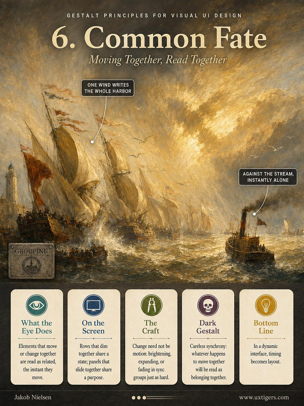
Elements moving or changing together are perceived as related. This principle comes alive in interactive and animated designs.
In UI design, common fate groups related actions and confirms user interactions. In data visualization, it spotlights trends and relationships.
Example: In a weather app, the icons for different conditions might all drift in the same direction to show which way the wind blows.

It’s hard to visualize the “common fate” Gestalt principle in a still image, because it involves change (often movement). I asked Claude for 10 ideas, and only one worked. If you were watching these people dance, you would typically be able to identify the couples because they tend to move in sync and enter and leave the dance floor together. (Muse Image)
Related changes need not be literal movement. Rows that dim together imply a shared disabled state; cards that lift and move together imply a multi-item drag; controls that pulse together imply a shared loading process. In a dynamic interface, timing becomes layout. Hover, selection, loading, streaming, expansion, reordering, and drag states should all preserve the intended grouping.

7. Closure

When presented with incomplete information, our brains fill in the missing parts to perceive a complete image. So we recognize patterns and shapes even when pieces are obscured or missing.
Closure lets designers get away with minimalism. Leave elements incomplete and the viewer leans in, finishing the design for you.
Example: We read handwriting even when letters are half-formed or disconnected. Or take the ubiquitous “hamburger” icon: three unconnected horizontal lines that users perceive as one cohesive button.

You’ll see a heart, not a pile of brightly colored polygons. (Muse Image)
Although they sound similar, closure isn’t the same as enclosure (the common region principle). Enclosure groups items by drawing a shared boundary around them; closure lets the viewer mentally complete a boundary or form that is only partly drawn.

8. Figure–Ground

The figure–ground principle describes how the human visual system separates elements into foreground (figure) and background (ground): the figure is the object of focus, and the ground is everything else. This separation is crucial for object recognition and attention.
In complex designs, figure–ground relationships can turn ambiguous: a hazard for usability, a playground for visual effects. Designers often manipulate this principle to create visual interest, guide attention, or convey multiple meanings within a single image.
Techniques for designating something as the figure include:
Focus: Sharp, clear elements are perceived as figure, while blurred, faded, or tinted elements tend to be seen as ground.
Enclosure: Elements enclosed within a boundary tend to be perceived as figure against the surrounding ground.
Shape: Closed forms or recognizable shapes are more likely to read as figure.
Overlap: When elements overlap, the element that appears to be on top claims the figure role.
Texture: Elements with distinct textures tend to stand out as figure against a smoother ground.
Detail: Adding more detail or complexity to an element promotes it to figure.
Color: Warm colors (yellows, oranges, reds) tend to advance and be perceived as figure, while cool colors (blues, greens, purples) tend to recede and be perceived as ground.
UI techniques that reinforce something as an active figure:
Contrast: Using contrasting colors, values, or textures to make the figure stand out from the background. For example, using a dark figure on a light background or vice versa.
Shadow or other 3D effects that make the figure appear closer and the background farther away.
Motion or implied motion: Moving elements or those that imply movement are more likely to become the figure.
Dimming of the background.
Blurring of the background.
Example: Road signs are designed to stand out against their background, making the sign the figure and the busy traffic the ground. Similarly, in a “lightbox” effect on a website, a popup becomes the figure while the rest of the page is dimmed and becomes the ground. (Don’t overuse this, but when a popup must seize the user’s attention, figure–ground does the job.)

What’s figure, what’s ground? Is this a fashion shoot or a tourism snap of the Eiffel Tower? Your knack for separating figure from ground is the Gestalt principle at work. (Muse Image)

9. Prägnanz (Good Figure)

The principle of Prägnanz, also known as the law of good figure or the law of simplicity, states that when several organizations are possible, perception tends toward an interpretation that is stable, regular, and coherent under the prevailing conditions. Ambiguous or complex images resolve into the simplest form.
This principle encourages designers to simplify complex information and use familiar shapes and patterns. It proves its worth in icons and memorable logos. But Prägnanz isn’t a vote for minimalism. The goal is not the fewest marks but the clearest stable interpretation. A familiar label, a redundant icon, or an extra divider can add pixels while reducing ambiguity. Conversely, a sparse screen can be perceptually complicated if users must guess what belongs together or what a symbol means. Simplify the interpretation, not just the surface.
Example: Road-sign icons use simple, easily recognizable shapes and symbols for quick comprehension. You could read many of these icons in other ways, but the simplest reading wins when you blow past the sign at speed.

Compare Ideogram’s suggestion for a street sign for “roadwork” (left) with the European standard sign (right). Yes, we could interpret the European sign as a balloon floating over a headless person, and it’s doubtless safer to wear a hard hat for this kind of work, as drawn by Ideogram. But viewers don’t read the European circle as a balloon: the Prägnanz principle makes them assume they’re looking at a person at work. And even though the black pile in the bottom right of the European sign doesn’t look like gravel, we still interpret the image correctly. Ideogram’s version adds extraneous detail that would slow down sign recognition.

Dubai hasn’t built a district in the shape of a heart yet, but if it ever does, the view from the air will resolve into a heart first, not a cluster of buildings. (Muse Image)

Do AI Design Tools See What Your Users See?
Here’s a question that would have sounded like science fiction when I started in UX: does the AI you use to generate mockups perceive grouping the way your human users do? It matters, because designers now use image models to generate layouts and vision models to critique them. That creates a tempting shortcut: asking one model whether another model produced a clear interface, then treating machine agreement as evidence about human perception. One funhouse mirror vouching for another.
Valerio Biscione and Jeffrey Bowers of the University of Bristol tested 16 neural networks on dot patterns that produce strong Gestalt effects in people. The networks detected some low-level cues, including proximity, but the effects appeared late and sometimes reversed in intermediate layers. One caveat: not every current multimodal model fails the same way. But the headline result stands: strong machine performance on an image doesn’t establish that the machine organized the image as a person would.
Use AI to generate candidates and hypotheses, not to certify perceptual clarity. A model may miss that a price sits nearer the wrong product or that a warning visually belongs to the wrong action. Human first-read testing remains the standard for human-facing interfaces.
AI is also becoming a user through computer-use agents. That creates a second, distinct requirement: the interface must expose the intended relationships to automation as well as to people. Don’t assume success in one channel proves success in the other. Test human first-read perception with people, and test delegated tasks with the agents that will actually perform them.
Gestalt Is a System Property
A Gestalt relationship lives in every rendered state, not in one pristine mockup. Responsive reflow, text enlargement, localization, validation messages, personalization, and loading states can move a price, warning, or action closer to the wrong object. Review grouping at the narrowest breakpoint, the largest supported text size, the longest plausible content, and every error, loading, expanded, and disabled state. A layout that groups correctly only in the ideal screenshot is not correctly grouped.
Every interface also has two information architectures: the visual structure seen by the eye and the programmatic structure exposed through source order, semantics, accessible names, and relationships. They must tell the same story. A card can look unified while its controls are scattered in the keyboard sequence; an error can sit beside a field while its accessible description points elsewhere. The mismatch also hurts automation whenever an agent relies on both rendered pixels and programmatic structure. Visual grouping is not a substitute for semantic markup, and semantic markup does not repair a visually misgrouped screen.
Finally, Gestalt scales through design systems. Once spacing, card treatment, button hierarchy, and motion patterns become tokens and components, a grouping decision replicates across the product. A bad local choice becomes a systemic defect; a good default prevents hundreds of local debates. Specify internal vs. external spacing, container boundaries, destructive-action differentiation, and motion grouping in the component library, then test those defaults with real content.
Using Gestalt Principles in UI Design
The operational rule is cue congruence. Make elements that belong together agree in spacing, appearance, enclosure, alignment, and behavior; make elements that serve different functions diverge on the cues users are most likely to notice. Redundancy helps when the association matters, but indiscriminate stacking creates noise. The strongest cues should support the most important relationships.
Treat the principles as perceptual forces, not on-or-off rules. Spacing, borders, color, alignment, motion, and familiar conventions all shape what the user sees as one thing. The winning interpretation is usually the one supported by the strongest coherent coalition of cues. When spacing says “two groups” but color says “one group,” the interface contains two competing information architectures, and users must work harder to figure out which cue to trust.
A Gestalt error is a misbinding: the user attaches a label, price, warning, status, source, or action to the wrong object. When such errors appear in usability testing, inspect the visual cues before rewriting the copy. The words may be correct while the layout assigns them to the wrong thing.
Audit your screens with 6 questions:
Is the gap inside each group unmistakably smaller than the gap between groups?
Do the strongest cues (spacing, border, color, alignment, and motion) agree about the same structure?
Does each perceived object match its behavior: one apparent action, one coherent hit area; several actions, visibly separate controls?
Does the hierarchy survive mobile reflow, text enlargement, localization, loading, validation, expansion, and disabled states?
Do visual structure, source order, accessible names, and keyboard sequence tell the same story?
In a one-second first-read test, do users identify the intended groups, primary action, and label-to-object relationships before they read the copy?
Dark Gestalt
Now we know how to make relationships visible. A darker breed of designer weaponizes the same mechanisms to hide or falsify relationships that matter to the user.
Dark Gestalt has 4 basic moves:
Bind unrelated things. Place separate choices inside the same perceptual group so that users mistake one for part of the other. An optional add-on enclosed with required checkout information can appear mandatory, especially when it shares the same typography, spacing, alignment, and selection treatment. The interface never says outright that the add-on is required; it lets proximity, similarity, and common region imply the claim. An even darker version preselects the add-on, making removal look like an exceptional action, or groups the extra charge with information the user must provide to complete the purchase.
Split related things. Separate information from the decision, object, or action it qualifies so that users fail to associate the two. A fee may appear far from the button that incurs it, a disclaimer may sit below an unrelated block of content, or a product price may land closer to the neighboring product than to its own description. The information remains technically present, but distance breaks the relationship users need to perceive. This tactic exploits how users read: they don’t construct every relationship through careful study; they assume that nearby elements belong together and distant elements don’t.
Camouflage unlike things as alike. Give elements with different purposes, risks, or commercial interests the same visual treatment. Sponsored content can copy the typography, card design, and placement of editorial results. A destructive action can look identical to a routine action. A recurring subscription can masquerade as a one-time purchase. Similarity tells users that the options are equivalent even when one is harmless and the other bites. No single label has to lie; the deception works by suppressing the visual distinctions that would help users recognize a different category of action.
Push consequential information into the ground. Make the preferred action visually dominant while prices, conditions, warnings, or alternatives recede into the background. The primary button may be large, saturated, centrally placed, and surrounded by whitespace, while the cost or cancellation terms appear in small, low-contrast text at the edge of the composition. The information hasn’t vanished, but figure–ground organization ensures that it loses the competition for attention. This is more sophisticated than merely hiding information: the interface constructs an attention hierarchy in which the company’s preferred choice becomes the figure and the user’s reasons for reconsidering become visual scenery.

The 4 design patterns of Dark Gestalt.
These 4 dark patterns frequently work together. A subscription offer may bind an optional service to a required transaction, split its price from the acceptance button, camouflage recurring billing as an ordinary purchase, and push the cancellation terms into the ground. Dark Gestalt therefore goes beyond a collection of misleading screens: it’s the deliberate construction of a false perceptual model, one in which the interface appears to contain different objects, relationships, and priorities from those that actually govern the transaction.
The Amazon Prime case shows the cost of this tactic. The FTC alleged that signup and cancellation flows made consequential terms hard to perceive while steering attention toward enrollment. Amazon settled in September 2025 for $2.5 billion and agreed to clearer disclosures, a conspicuous way to decline Prime, and cancellation as easy as signup. The information had been present, but not perceptually attached to the decision. Dark Gestalt is a liability dressed up as a growth hack.
Conclusion: Win the First Read
Users read a screen twice. The fast first read assigns objects, groups, paths, and layers; the slow second read interprets labels, prices, and actions. Gestalt is the grammar of the first read, and it has survived a century of interface technology because it describes how the human perceptual system is wired, not the fashion of the day.
Make related things look related, unrelated things look distinct, and the most consequential relationships carry the strongest coherent cues. Design the first read, because the visual system will impose one whether you planned it or not.

The 9 Gestalt Principles discussed in this article. (All images made with GPT Image 2 except where noted.)


