
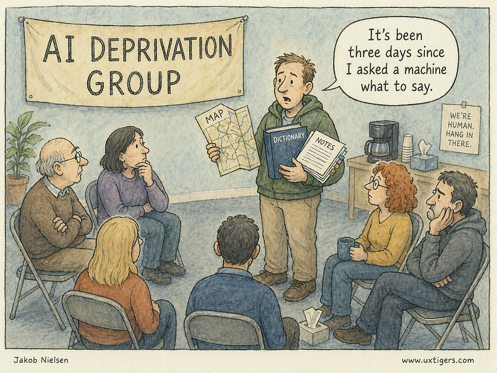
Deprivation Studies: Take the Product Away to Reveal What Users Truly Need
- Jakob Nielsen

- Apr 30
- 27 min read
Summary: Standard usability testing uncovers interface flaws, but deprivation studies reveal if a product should exist at all. By intentionally forcing users to abstain from software, we expose hidden dependencies, useless ghost features, and duct-tape workarounds, providing empirical data to ruthlessly declutter bloated interfaces and maximize true utility.

Deprivation studies are a rarely used, but highly strategic, user research methodology. (GPT-Images-2)
[Watch my short explainer video about deprivation studies (YouTube, 6 min.)]
Traditional user studies remain the most efficient way to discover how people operate an interface, but they rarely show whether the interface deserves to exist. Deprivation studies intentionally remove a product, service, or feature for a defined period, exposing dependencies that ordinary observation misses. By watching the workarounds users build when the product is gone, UX teams get closer to revealed behavior than self-report. The result is a sharper basis for prioritizing features, restructuring information architecture, and removing interface clutter.
Human memory is notoriously fallible, and human self-reporting is inherently biased. If you ask a user how they use a piece of software, they will give you an idealized, rationalized narrative. They will describe a logical sequence of events that reflects how they think they should behave, rather than the messy, error-prone, distracted reality of how they actually behave. If you put them in a usability lab and observe them attempting to complete a task, the illusions vanish. You see the hesitation, the misplaced clicks, and the navigation failures. This is why standard usability testing with five users remains the most cost-effective way to find interface flaws. Discount usability engineering works.

You can’t trust what people say about how they use your product. (GPT-Images-2)
But standard usability testing has a blind spot: it studies episodes, not dependencies and habits.
If you want to know whether a specific button is too small, or if a form is too confusing to fill out, a one-hour user test is perfectly adequate. But what if you want to know whether the user actually needs the button at all? What if you need to measure the cumulative, long-term value of a product that a user touches forty times a day?

Standard usability testing studies episodes; deprivation studies reveal the habits underneath them. As an aside, the study facilitator in this cartoon commits a methodology error in telling the user that the task was successful. You need to stay neutral whether the user makes the right or the “wrong” action. (GPT-Images-2)
When a technology becomes truly integrated into a user’s daily life, like a smartphone operating system, an enterprise team messaging app, or a digital calendar, it ceases to be an external tool and becomes an extension of the user’s cognitive architecture. The interface becomes practically invisible to them. The behavior becomes an ingrained reflex.
You cannot study a reflex by asking a user to perform it in a lab environment. You cannot accurately measure the value of a habit by asking the user to fill out a market research survey. Users cannot reliably report on the value of the air they breathe until you start suffocating them. To understand the true utility of a pervasive, habitual technology, you must disrupt the habit entirely.
You take the product away. This is the premise of the deprivation study.
In a deprivation study, participants agree to refrain from using a product or technology for a specified duration. (GPT-Images-2)
Deprivation is not a more sadistic version of usability testing. Its real power is counterfactual. It changes the research question from “Can users operate this interface?” to “What collapses when this interface disappears?” The unit of analysis is no longer the screen. It is the user’s ecosystem of memory, coordination, motivation, social obligation, and workaround labor. A good deprivation study is therefore less a test of a product than a stress test of a way of working or living.

A product or service may appear to serve a simple function, while its real value is the social behavior it enables. (GPT-Images-2)
The Fallacy of Self-Reported Value and Analytics
Many designers and product managers still mistake usage analytics for user value. High usage can reflect value, but it can also reflect poor information architecture (users clicking frantically to navigate a mess), corporate coercion, or a user’s inability to find a better path,
Analytics tell you what is happening on the screen, but they are utterly incapable of telling you why it is happening. Even more importantly, analytics cannot distinguish value from captivity. A forced click, a workaround click, a panic click, and a delighted click look identical in a dashboard. Deprivation separates these cases because the user either reconstructs the missing function at great cost, replaces it without regret, or refuses to reconstruct it at all. Those three reactions correspond to value, substitutability, and waste.

Standard analytics can’t tell the difference between “good clicks” and “bad clicks.” You may be celebrating “engagement” increasing, when all that’s happened is that users are more confused and lost. (GPT-Images-2)
To find the “why,” product teams often turn to focus groups. Focus groups are weak for interaction design because the setting rewards performance rather than observation. Participants influence one another, try to sound thoughtful, and produce socially acceptable explanations for behavior that is often automatic, fragmented, and private. If you ask a room full of people how much they value their email client, they will complain about minor UI grievances, such as the color of the unread indicator or the placement of the search bar, but they will completely fail to articulate the deep, systemic ways the tool supports their daily workflow.

The query effect: when you ask people, they will make up an opinion about anything and make it sound as profound as possible. However, these statements often have nothing to do with users’ real behaviors, because the query responses were constructed after the question was asked. (GPT-Image-2)
Surveys are no better. Present users with twenty proposed features to rank, and they will request a confusing array of bells and whistles they will never actually use, simply because the psychological cost of saying “yes” to a hypothetical feature is zero.

When there is no cost to asking for more features in a survey, users will seem to want feature bloat that would be unhealthy for them in reality. (GPT-Images-2)
Deprivation studies cut through the noise of vanity metrics and self-reporting. By enforcing an artificial scarcity, you force the user to confront their actual, functional reliance on your system. You bypass their rationalizing brain and measure their behavioral reality.
This is why the researcher must distinguish dependency from value. A user may suffer because the product is genuinely useful, but also because the product has captured critical data, imposed a proprietary workflow, trained collaborators around its notifications, or made alternatives unavailable. The right question is not merely “Did users miss it?” The better question is: “What kind of dependency did the product create, and is that dependency desirable?” (And when I say “desirable,” that’s from the perspective of the users and their companies, not from the perspective of vendor lock-in which won’t persist in the age of AI making it cheap for competitors to launch services that don’t hold their customers hostage.)

A Silicon Valley saying is that many SaaS companies don’t have customers, they have hostages, who are kept trapped by locked-up data. But if people detest your service, they will eventually leave as AI creates alternatives. (GPT-Images-2)
What Exactly is a Deprivation Study?
Definition: A deprivation study is a longitudinal qualitative research method in which habitual users abstain from a specific product, service, or feature for a defined period, typically a few days to several weeks.
Instead of asking users to use a product and observing their success, a deprivation study asks them to stop using it and observes the resulting failure. By artificially inducing a state of technological absence, researchers can study the gap left behind.
The methodology traces its roots to early media and sociological research. In the late 20th century, researchers paid families to physically unplug their televisions for a month to document the profound shifts in household dynamics, time allocation, and communication. In modern UX research, we apply this same blunt-force methodology to pervasive digital technologies.
Throughout the deprivation period, researchers collect qualitative data on the participant’s experiences, their emotional states, and, most importantly, the alternative methods and workarounds they employ to accomplish their goals. The study operates on a very simple, pragmatic premise: You do not know what a complex system actually does until you watch it fail. By entirely removing the system, you force a failure of the user’s established workflow. Suddenly, every micro-task that was previously handled by the invisible interface must be consciously addressed by the user. The massive friction they experience and the solutions they invent provide high-fidelity data about the product's true utility.
When to Use Deprivation Studies (And When to Avoid Them)
Deprivation studies are not a universal tool. They are costly, logistically demanding, and intentionally disruptive. Do not use deprivation to answer a question that a one-hour usability test, analytics review, diary study, or customer interview can answer more cleanly.
Use deprivation when you need to know what role a product plays in real life. This is common before a redesign, before a pricing change, before removing a feature, before repositioning a product, or before entering a market where users already have entrenched alternatives. It is also useful when a product team is drowning in feature requests and cannot tell which features are truly essential. The study can reveal whether users miss a feature, replace it easily, or discover that they never needed it.
You should deploy deprivation studies only when your strategic research questions involve deep behavioral integration and product value.
Ideal Scenarios for Deprivation Studies
1. Assessing High-Frequency, Habitual Products: This methodology shines when investigating products that users interact with daily. Think of ubiquitous consumer applications like social media networks, fitness wearables, and streaming services, or essential enterprise tools like Slack, Jira, or Salesforce. The product must be embedded enough in the user's routine that its removal causes an immediate, measurable disruption. If they do not have a habit, you cannot deprive them of it. Deprivation studies are particularly strong for mature products because mature products become infrastructural. Early in a product’s life, users can still describe the novelty. Later, the product disappears into routine. Deprivation makes the infrastructure visible again.
2. Diagnosing Creeping Featuritis and UI Bloat: Over time, successful software inevitably becomes bloated. Product managers succumb to the temptation to add “just one more feature” to satisfy a vocal minority of enterprise clients or to match a competitor’s marketing checklist. The interface becomes cluttered, cognitive load increases, and overall usability plummets. Deprivation is the ultimate diagnostic tool for featuritis. When you take a specific module of the product away, you discover exactly which features the user actually misses, and which ones they never even realized were gone.

Deprivation reveals which features users would fight to recover and which ones were only decorating the interface. (GPT-Images-2)
3. Evaluating the True Competitive Landscape: You may believe your primary competitor is another software company. Often, your most dangerous competitor is a physical legal pad, an Excel spreadsheet, or a quick phone call. Deprivation studies force users to rely on fallbacks. By observing these fallbacks, you discover the true competitive landscape of the user's workflow.
4. Prior to High-Stakes Overhauls: If your organization is planning a radical visual and structural overhaul of a core product that risks alienating your existing, loyal user base, a deprivation study serves as a vital reality check. By understanding precisely what specific functions users rely on to survive, you can ensure that the fundamental utility of the product is preserved and protected, even if the navigational paradigms change completely.
When NOT to Use Deprivation Studies
1. Testing Unreleased Prototypes: You cannot deprive a user of a tool they have never used. The methodology relies on breaking an established mental model.
2. Evaluating Low-Frequency Transactional Sites: If a user only interacts with your software once a year, such as annual tax-filing software or a car registration portal, a two-week deprivation study will yield absolutely zero data. The user was not going to use it anyway.
3. Mission-Critical Health, Safety, and Financial Systems: You must never violate the ethical baseline of user research. Do not conduct a deprivation study if taking the product away will cause physical harm, significant financial loss, or severe professional damage. You cannot ask an air traffic controller to participate in a deprivation study of their radar screen. You cannot ask a diabetic user to stop using their continuous glucose monitoring app. The friction you introduce must be highly annoying, but it must not be catastrophic. Common sense must prevail above all research curiosities.
Furthermore, do not use total deprivation when partial deprivation would answer the question. If the team wants to understand the value of reminders, participants do not need to abandon the entire calendar. They may only disable reminders, or use a paper calendar for selected appointments, or suppress notifications during certain hours. Smaller interventions often produce cleaner findings and will reduce study abandonment.
Think of deprivation as a dosage problem. Total abstinence is the maximal dose, and it is often unnecessarily crude. In many mature systems, the better intervention is selective removal: remove autocomplete but not search, notifications but not messages, dashboards but not raw records, mobile access but not desktop access, AI suggestions but not manual authoring. Different removals reveal different forms of value. A missing notification tests interruption dependency. A missing search function tests recoverability. A missing dashboard tests whether summary views genuinely guide decisions or merely decorate the interface.

Selective deprivation is easier to enforce and gives you valuable information about how people depend on that one thing you have removed. (GPT-Images-2)
The Anatomy of Absence: Five Main Findings to Expect
When you run a standard usability test, you find out if a user can successfully click a button. When you run a deprivation study, you find out why they needed to click it in the first place. The findings you extract from this methodology will not look like a standard bug report. They will reveal deep, structural insights about human behavior.
The findings usually fall into five categories. For all five categories separate task pain from memory pain, coordination pain, emotional pain, and identity pain. Many products are misdescribed because teams assume they are selling the task layer. In reality, users may value the product because it remembers for them, synchronizes a group, legitimizes a decision, calms anxiety, or gives them confidence that nothing has fallen through the cracks. Deprivation reveals the layer of value the product team has been too close to see.
1. The “Phantom Limb” Phenomenon and Reflexive Habits
When a digital product is deeply ingrained in a user’s workflow, interacting with it becomes completely automatic. During the first few days of a deprivation study, users will frequently experience UX “phantom limbs.” They will instinctively reach into their pocket for a smartphone app that has been deleted. They will automatically hit the keyboard shortcut for the software they are banned from using, only to stare blankly at an error message.
In their daily logs, participants will record these reflexive moments. These phantom impulses are a goldmine for interaction designers. They map precisely to the deepest grooves of the user's mental model. If users repeatedly report reaching for a specific “quick-add” button or swiping in a specific direction when the app is gone, you have identified the core behavioral anchors of your product. These are the micro-interactions you must prioritize, protect from unnecessary redesigns, and make as frictionless as computationally possible.

Reflexive attempts to use something that has been removed are great data. (GPT-Images-2)
These reflexes are also a warning against redesigns that measure success only by first-use comprehension, as frequently studied in standard usability testing. A new interface can test beautifully in a lab and still destroy value if it breaks a high-frequency reflex that experienced users have spent years automating. For mature products, learnability is not enough. The interface must preserve procedural memory.
However, reflexive habits also reveal a psychological vulnerability: cognitive deskilling. By removing the tool, you often discover the user has not merely outsourced a task to the software, but has completely lost the underlying skill required to perform it independently. When a user can no longer navigate their own city without a GPS, or structure a coherent paragraph without an AI assistant, the deprivation study measures the exact degree to which your product has atrophied human capability. This forces teams to grapple with an ethical question: is your software elevating human potential, or systematically degrading it to ensure dependency?
2. The Duct-Tape Workarounds (Compensatory Behaviors)
This is perhaps the most valuable data point a deprivation study can generate. When a user’s primary tool is removed, their underlying goal does not magically disappear. To accomplish their tasks, they will string together alternative solutions. I refer to these as “duct-tape workarounds.”

If you take away the irrigation, the vegies establish a workaround system, so clearly they need the water. Irrigation was the tool, water was the goal. (GPT-Images-2)
Imagine you deprive a sales team of their complex, enterprise Customer Relationship Management (CRM) system. How do they track their leads? They do not simply stop selling. Instead, you might find they revert to a chaotic mix of text messages for urgent updates, sticky notes on their monitors for reminders, and personal Excel spreadsheets for forecasting.
By analyzing these messy workarounds, you see your product’s value disaggregated into its raw components. You learn that your CRM wasn’t just “database software.” It was an anxiety-management tool, a daily task prioritizer, and an asynchronous communication channel.
Furthermore, if the user’s duct-tape workaround is actually easier, faster, or less frustrating than using your official product, you have discovered a critical design failure. If taking away your bloated project management tool results in users happily and efficiently managing their tasks with a simple physical notepad, your software is vastly over-engineered. The interaction cost of your UI has exceeded the value of the tool.
Workarounds should also be analyzed for who pays the cost. Sometimes the deprived participant appears to cope, but only because an assistant, teammate, customer, or family member absorbs the missing coordination work. The product’s true value may reside in preventing these invisible cost transfers. A deprivation study should therefore record not only the participant’s workaround, but also the bystanders who were recruited into it.

You may discover that several bystanders, besides the participant in a deprivation study, are key elements in the workflow and are impacted by the deprivation. (GPT-Images-2)
Such broader observation exposes the “blast radius” of the missing product. Depriving a single user of an enterprise collaboration tool doesn't just inconvenience them; it creates collateral friction for their colleagues, managers, or downstream systems who silently rely on their data exhaust. This network contagion provides an incredibly rare metric: the measurement of a product’s invisible ecosystem value, revealing that the true anchor of your software might sometimes be the secondary users who never even log in.
3. The Discovery of “Ghost Features” (The Apathy of the Unused Function)
This is often the most sobering and humbling finding for product teams. You will have dedicated hundreds of engineering hours and massive budgets to developing a complex feature, only to find that during the deprivation period, not a single user laments its absence.
Self-reported survey data might tell you a feature is a “nice to have.” Deprivation data tells you whether it is a ghost feature. If users had a realistic opportunity to need a feature during the study and did not miss it, treat that feature as a candidate for demotion, consolidation, or deletion.
However, absence of complaint must be interpreted against opportunity to need. Some features are insurance features: rarely used, but crucial when a crisis occurs. To classify a feature as a true ghost, compare deprivation silence against baseline frequency, task exposure during the study window, and the severity of the consequences if the feature were needed. Ordinary unused features should be pruned aggressively. Rare but high-consequence features should be demoted, simplified, or moved out of the main path, not blindly deleted.

Featuritis is a common affliction of modern software which often comes with a plentitude of features users will never miss. (GPT-Images-2)
4. The Relief Phenomenon (Identifying Hostile UX)
Not all deprivation is painful. One of the most shocking findings you can uncover in a deprivation study is user relief.
When researchers deprive users of certain social media platforms, notification-heavy news aggregators, or overly aggressive enterprise monitoring dashboards, participants often report a significant decrease in anxiety, an increase in deep-focus productivity, and a general sense of calm. They do not miss the product; they are profoundly glad it is gone.

Users may discover that they are happy enough after locking away your technology. (GPT-Images-2)
If a deprivation study reveals that your product’s absence causes relief rather than frustration, you have a massive strategic business problem. Your product is likely surviving purely on dark patterns, addictive behavioral loops, or rigid corporate mandates rather than genuine, user-centric value. Long-term, products that cause relief upon removal are highly vulnerable to catastrophic churn. For interaction designers, this is a glaring red flag that the system’s notification strategy, information density, or cognitive load is completely overwhelming the user and creating a hostile user experience.
Relief is not the opposite of value. It is often a sign that value and harm have been bundled together. Users may still need the product’s record keeping, search, coordination, or accountability layer while hating its interruption layer. The design response should not be to kill the product. It should be to separate the utility users need from the coercive surface that exhausts them.
In enterprise settings, relief can also point to a much deeper organizational pathology: the tool was acting as a proxy for broken processes. If depriving a team of a convoluted project management app suddenly forces them to have a highly effective, five-minute morning stand-up, the software wasn’t solving a communication problem; it was allowing management to avoid fixing one. Deprivation studies don’t just debug software; they debug company culture.
5. Identity and Meaning
Some products become part of how users see themselves. A professional tool may make a user feel competent. A fitness device may make discipline visible. A creative platform may support self-expression. A social app may maintain belonging. When deprived, users may experience not just inconvenience but a change in self-perception. These findings should be handled carefully because they are often less about interface mechanics and more about product positioning, onboarding, community design, and long-term engagement.
Guidelines for Conducting the Study
Running a deprivation study requires meticulous planning. You are asking users to do something highly unnatural and disruptive to their daily lives. If you execute the methodology poorly, users will simply cheat by breaking the deprivation rules, or they will drop out entirely, rendering your data corrupted and useless.

What if user research was a role-playing adventure game (RPG)? This is your player class card with all the equipment and skills to conduct a deprivation study. (GPT-Images-2)
Here is pragmatic, step-by-step advice for setting up and executing a valid deprivation study.
Step 1: Recruiting and Incentivization (The “Pay to Quit” Model)
Recruiting for a deprivation study is notoriously difficult. You are not asking for sixty minutes of their time in a comfortable usability lab; you are actively sabotaging their daily routine.
First, strictly screen for active, habitual users by verifying high-frequency usage through backend analytics or screener surveys; depriving occasional users yields no meaningful data.
Second, you must pay them significantly more than standard usability participants. A typical one-hour lab study might require a $100 incentive. A two-week deprivation study might require $500 to $1,000 per user, depending on the severity of the deprivation and the professional level of the participant. You are paying them a premium for their intense inconvenience and to guarantee their strict compliance.

The harsher the study, the higher the participant incentive. (GPT-Images-2)
I highly recommend a staggered payment structure: a small payment for the baseline phase, a moderate payment during the deprivation, and a massive completion bonus at the very end to prevent dropouts on Day 4 when the frustration peaks. You only need 12 to 15 highly compliant users to reach qualitative saturation.
Step 2: Establishing the Baseline (Pre-Deprivation)
You cannot accurately measure the impact of absence without first measuring the reality of presence. Before the deprivation begins, run a baseline phase for 3 to 7 days.
During this phase, instruct the user to behave normally. However, have them meticulously log their usage of the target product. Use a lightweight diary study format. Every time they use the product, they should note their goal, the time taken, and their emotional state. Better yet, with explicit user consent, use screen-tracking or passive analytics software to objectively log their baseline usage. This provides a factual, empirical record of their habits to compare against their deprived state.

Before you can measure absence, you must first document presence, but without turning the baseline into the intervention. (GPT-Images-2)
Step 3: The Deprivation Period and Data Collection
The length of the deprivation period is a delicate balance. If it is too short (e.g., 24 hours), the user treats it as a novelty or simply delays their tasks until the study is over. You will only capture initial shock, not adaptation. If it is too long (e.g., a full month), attrition rates will skyrocket, and users will permanently transition to a competitor.
The sweet spot for most digital products is 7 to 14 days.
The first three days will be characterized by intense frustration, those “phantom limb” impulses, and initial resistance. By days four through seven, users will have actively established their duct-tape workarounds. By week two, you will see which workarounds are sustainable and which ones are causing compounding, cumulative pain.
Track three time-based measures. First, replacement half-life: how long it takes users to settle on a stable substitute. Second, backlog elasticity: how much work they postpone because only your product handles it well. Third, relapse pressure: the point at which participants try to break the deprivation rules. These measures make a qualitative method easier to explain to executives because they translate lived friction into observable behavioral thresholds.

Deprivation studies produce rich data. (GPT-Images-2)
During this period, data collection must be continuous but low-friction. Do not rely solely on a single interview at the end of the two weeks. Human memory will blur the micro-frustrations experienced on Day 2. You must capture the data in situ. Use the Experience Sampling Method (ESM). Ping the users via SMS or a dedicated diary app two to three times a day at random intervals. Ask them simple questions:
Did you encounter a situation today where you desperately wanted to use the deprived product?
What specific task were you trying to achieve?
What alternative method did you use instead?
Rate the extra effort required by your alternative solution on a scale of 1 to 7.

Ask users to keep a log or diary of deprivation events and thoughts, but don’t depend on them to systematically do so without reminders. (GPT-Images-2)
Step 4: The Post-Deprivation Reunion and Debrief
The exact moment the user is reunited with the product is incredibly illuminating. Do not let this moment pass unobserved. Have the user log back into the product while you watch them, either in person or via remote screen-share.
The first actions they take upon returning to the product are highly revealing. Treat the reunion as a priority sort, not a spectacle. The first item opened, the first setting restored, the first search executed, and the first message sent are all behavioral votes. They show which part of the product users trusted enough to save for the official tool, and which parts they were willing to let substitutes handle. The actions taken in the first ten minutes of reunion point directly to your product's most vital, irreplaceable core utility.

When people resume the technology, which feature do they turn to first? (GPT-Images-2)
Following the reunion, conduct a comprehensive, 60-minute qualitative exit interview. Review their diary entries with them and ask them to elaborate on the specific workarounds they documented.
Turning Findings into Actionable Design Recommendations
Research without action is merely expensive corporate trivia. It is a waste of resources. The ultimate goal of enduring the logistical headache of a deprivation study is not to write a fascinating sociological white paper; it is to force profitable improvements to your product’s user interface.
Translating the messy, qualitative, emotional data of a deprivation study into wireframes or a product roadmap requires ruthless pragmatism. Here is how you map your findings to actionable design decisions.
1. Paving the Cow Paths (Formalizing Workarounds)
In urban planning, there is a concept called “paving the cow paths.” Instead of laying down concrete sidewalks where architects think people will walk, planners wait to see where the grass is naturally worn down by foot traffic, and then they pave over those dirt paths.
In a deprivation study, the users’ duct-tape workarounds are your cow paths. Analyze them carefully. If multiple users in your study created the exact same manual workaround to survive without your product, you have discovered a critical missing feature in your current design.

What people do when left to their own devices can serve as a good starting point for specifying new products or features. But don’t replicate unnecessary complications that are an artifact of technology deprivation and not a true need. (GPT-Images-2)
But pave only the desire path, not the dirt. A workaround often contains accidental complexity because the user lacks the right tool. The product team should extract the intent from the workaround, then design the simplest native path to that intent. Copying the workaround literally risks institutionalizing the very friction the study exposed.
Actionable Recommendation: Integrate the user's workaround directly into your product natively. Stop fighting user behavior and start facilitating it. For example, if you deprived users of a complex accounting software, and they all reverted to typing raw numbers into a plain-text document because your official form fields were too restrictive, you must build a "plain-text quick-entry" module natively into your UI. Lower the interaction cost of their natural, observed behavior.
2. Elevating the “Invisible Core” (Restructuring Information Architecture)
Your study will definitively reveal the features users missed the most: the ones that caused the most acute, verifiable pain when removed. Frequently, usability audits discover that the feature users value the absolute most is buried three clicks deep in a settings menu, while the home screen is dominated by marketing fluff or useless secondary widgets.
If users’ diary entries were primarily focused on lamenting the loss of one specific function, that function is your product’s true center of gravity.
Actionable Recommendation: Radically restructure your Information Architecture (IA). Elevate the core function. If a deprivation study proves that users missed your advanced search capability vastly more than your curated content feed, the search bar must become the most prominent, visually weighted element on the screen. The interaction cost to initiate this core utility must be reduced to an absolute minimum, ideally a single click or tap from anywhere in the system. The UI must reflect the user’s hierarchy of needs.

When deprivation research demonstrates special user love for certain features, that’s a hint to redesign to make those features more prominent and faster to reach. (GPT-Images-2)
3. Ruthless Pruning (The Strategy of Subtraction)
As established, your interface is likely cluttered with features that users do not use and do not care about. We know from Hick’s Law that the time it takes for a user to make a decision increases logarithmically with the number and complexity of choices presented to them. Every unused feature on your screen degrades the usability of the essential features by creating visual noise.
Review your deprivation data for the ghost features: the ones no one mentioned missing.

Cutting features is one of the best ways to increase usability. Less is More. (GPT-Images-2)
Actionable Recommendation: Deprecate them. Remove the dead weight to clean up the graphical user interface. If internal political pressure from stakeholders prevents outright deletion, aggressively demote the features. Move them out of the primary navigation and bury them in an "Advanced Settings" menu. Use the empirical deprivation data as an impenetrable shield against stakeholders who claim, "But users will revolt if we remove this widget!" You have documented proof that they will not even notice. Good usability is often defined by what you choose not to show on the screen.
4. Redesigning Onboarding for “Time-to-Value”
Most software onboarding flows are atrocious. They force the new user through a tedious, multi-screen carousel explaining the mechanical functionality of every minor icon in the interface. They fail entirely to teach the user why they should care about the product.
Deprivation studies give you the ultimate cheat sheet for onboarding. The study tells you exactly what long-term, habituated users value. New users do not yet know this value; they must be guided to it immediately.
Actionable Recommendation: Rewrite your onboarding copy and restructure your tutorials based exclusively on the insights from the deprivation study. Strip away everything else. Do not teach new users about secondary features. Accelerate the user’s journey to the core utility; the exact feature that experienced users rushed to use during the Reunion phase. Teach them the one or two core behaviors that will form an unbreakable habit, and let them discover the rest later. Optimize strictly for rapid “Time-to-Value.”
You can drastically cut the overhead of onboarding and other instructions by focusing them on the features users need the most, as demonstrated by deprivation research. (GPT-Images-2)
5. Aligning Marketing Strategy with Pragmatic Reality
Usability does not stop at the edge of the screen; it extends to the words you use to describe the product on your landing pages. Often, a company’s marketing department is selling an idealized fantasy, while the user is buying a purely pragmatic reality.
Actionable Recommendation: Rewrite your marketing copy, empty states, and error messages using the exact vocabulary your participants utilized in their diary logs. If your marketing proudly proclaims that your app “Synergizes Enterprise Communication Paradigms,” but your deprivation study revealed that users solely value the tool because it “stops me from losing track of PDF attachments in my inbox,” you must change your messaging. Speak to the pragmatic, observed reality of the user’s pain points. In user experience, clarity will always outperform clever marketing jargon.

Marketese rarely speak to users’ main needs. A deprivation study identifies the users main pain points that your product solves. Use this information to transform product communication into plain language that’s explicit about the product benefits. This is a major recommendation for digital content anyway. (GPT-Images-2)
Case Studies: Web and Smartphone Deprivation
Web Deprivation: From Utility Loss to Conditioned Withdrawal
Early web-deprivation research from 2004 through 2015 established a chilling fact: the desktop internet had already transitioned from a convenience into non-negotiable cognitive infrastructure.
The 2004 Yahoo!/OMD study locked 28 people offline for two weeks. Withdrawal was immediate and brutal: participants reported isolation, frustration, and a startling loss of basic analog skills. They had forgotten how to use a phone book, consult a newspaper, or even call a customer-service line. The browser had become the master interface for daily logistics, and removing it felt less like a detox and more like an amputation of everyday competence.

Web deprivation studies required users to relearn behaviors they had forgotten in favor of more convenient online access to the world. (GPT-Images-2)
By 2010, “The World Unplugged” study quantified the emotional toll with 1,000 students across five continents attempting a mere 24 hours without any media. Most failed. Those who endured generated 3.5 times more negative descriptors than positive ones, freely using the language of clinical pathology: anxious, empty, desperate, dead. The core pain came not from missing facts but from losing what researchers called “affective awareness”: the continuous background hum of knowing your social circle’s status without interacting. The web had grown invisible until severed, and then the void induced panic.
Subsequent internet-deprivation research added two more useful signals: conditioning and physiological arousal. Osborne and colleagues’ 100-participant experiment found that higher-problem internet users who had been deprived for four hours showed lower mood, greater anxiety after web cessation, and a conditioned shift toward colors prominent on the websites they had just visited. A separate Swansea/Milan study with 144 participants found increased heart rate and blood pressure after internet use ended among users with high problematic-use scores. These findings are most useful for UX research not because every heavy user is an addict, but because they show how technology can become a negative reinforcer: the user returns not for pleasure, but to stop discomfort.
Smartphone Deprivation: Neurological Rewiring and Attentional Recovery
With the smartphone, the dependency model escalated from episodic task utility to continuous ambient attachment, and the deprivation research of the 2020s exposes the startling cognitive and neurological toll.
In 2025, Ward and colleagues performed the definitive experiment: 467 adults disabled mobile internet on their phones for two weeks while keeping calls, texts, and desktop web intact. The results were so dramatic they merit reading twice. 91% of participants improved on at least one mental-health or cognitive metric. Depression symptoms fell by an effect size larger than that observed in multiple antidepressant trials. Sustained attention, the capacity every productivity method tries to restore, improved by an amount equivalent to reversing a full decade of age-related cognitive decline. People didn’t substitute other screens; they reclaimed offline life, exercising, socializing face-to-face, and sleeping more, with benefits growing stronger day by day. The constant mobile data drip was not neutral; it was actively corrosive to focus and well-being.

Deprived of smartphone use, participants reclaimed offline life and their mental health improved. (GPT-Images-2)
The compliance data from this study may be as important as the outcome data. Only part of the sample fully carried out the restriction, which means the study did not merely measure what happens when mobile internet is blocked. It also measured how hard it is to keep mobile internet blocked. In deprivation research, noncompliance is not just noise. It is behavioral evidence that the intervention is fighting a real dependency.
Neuroimaging work from the same year by Schmitgen’s team dug into the brain mechanisms. After just 72 hours without a smartphone, young adults showed altered activation in the anterior cingulate cortex, insula, and striatum when shown pictures of phones: regions at the heart of dopamine-driven craving and habit circuits. The neural signatures matched those of substance-use disorder cue reactivity. The phone had become a neurobiological trigger.
2024 trials that capped daily screen time at two hours produced consistent small-to-medium effect-size gains in sleep quality, stress reduction, and mood, proving the benefits are neither transient nor placebo. Smartphone deprivation does not simply cause irritation; it triggers a withdrawal syndrome in the brain’s reward architecture, and sustained removal allows measurable recovery. Effect sizes ranged from small to medium but were durable rather than transient.
Across all three studies, the signal is consistent: smartphones function as neurobiological triggers whose continuous dopaminergic stimulation degrades cognition, mood, and sleep. Remove the trigger for sustained periods, and the brain rebuilds baseline functional capacity remarkably quickly.

Smartphones consume attention even when not used. (GPT-Images-2)
The Dependency Shift: From Tools to Ambient Parasites
The synthesis of two decades of research reveals a clear, qualitative shift. Desktop-web dependency was task-centric: users suffered when they could not accomplish specific information goals, as though a library and post office had been simultaneously demolished. Frustration was logistical.
Smartphone dependency is an ambient attack on the brain’s attentional control system. The device’s constant bodily presence has conditioned the brain to anticipate variable rewards at any moment, where even a powered-off phone consumes cognitive resources by forcing the user to suppress the urge to check.

Classic deprivation studies of desktop web access and smartphones revealed high dependency on these two technologies, but in different ways. (GPT-Images-2)
The withdrawal profile underscores the change. Early web studies showed yearning for functional access; smartphone studies yield panic over lost affective awareness and trigger addiction-style neural craving.
The recovery data offers optimism through a measurable rebound though not a full cure. When mobile internet is reduced for sustained periods, many users regain time, attention, sleep, social connection, and perceived control. The product lesson is not that every smartphone interaction is pathological; it is that continuous access can turn a useful tool into a standing claim on the user’s mind.
Conclusion: The ROI of Subtraction
When you propose a deprivation study, you will face intense pushback from product managers and executives. The idea of intentionally stopping paying users from engaging with your product sounds counterintuitive, even dangerous, to short-term business metrics. They will argue it will hurt Daily Active Users (DAU) or cause churn.
You must counter this skepticism with the logic of Return on Investment (ROI).
The technology industry wastes billions of dollars every year designing, coding, testing, and maintaining features that serve absolutely no human need. Development teams spend months agonizing over the micro-interactions of a tool that users would gladly trade for a simple spreadsheet. We suffer from a severe addition bias: we assume the solution to any usability problem is to add more UI.

The most expensive usability mistake is adding even more features when subtraction would create more user value. (GPT-Images-2)
The most expensive mistake a software company can make is to write code for a feature that nobody wants. The second most expensive mistake is to bury a critically important feature beneath layers of convoluted navigation.
Standard usability testing will tell you if a user can navigate your interface. A deprivation study tells you if they should. It forces a stark confrontation with the truth of your product’s utility. Deprivation studies enforce a strict discipline of subtraction. They act as a brutal reality check, stripping away the superficial layers of user preference, stakeholder politics, and industry fads to expose the bedrock of actual user need.
Yes, the methodology is demanding. It requires meaningful incentives, disciplined fieldwork, and rigorous qualitative analysis. But the ROI can be unusually high because the method attacks the two most expensive product mistakes: building features nobody needs and hiding the few features users cannot live without.
If you want to know how users navigate your interface, sit them in a lab and watch them click. But if you want to know if your interface deserves to exist in the real world, take it away from users. The resulting silence, or the ensuing chaos, will tell you everything you need to know.

Would anybody watch an anime movie about a deprivation study? There could be plenty of drama. My Japanese friends: please make one! (GPT-Images-2)
Watch my short explainer video about deprivation studies (YouTube, 6 min.)


