
Cialdini’s 7 Influencing Principles

Summary: Robert Cialdini’s 7 principles of persuasion are reciprocity, commitment and consistency, social proof, authority, liking, scarcity, and unity. They are the bedrock of persuasive UX design, and they work because they’re mental shortcuts hardwired by evolution to keep our ancestors alive.

Your brain runs on autopilot most of the day, and thank goodness for that. If you deliberated over every choice from first principles, you’d starve before lunch. So the mind takes shortcuts. See a crowd staring up at the sky, and you look up too. Receive a gift, and you feel a tug to return one. Hear an expert’s title, and you relax your scrutiny. These reflexes are fast, cheap, and usually right. They’re also the seams along which persuasion pries you open.
Robert Cialdini, professor emeritus of psychology and marketing at Arizona State University and widely tagged the “Godfather of Influence,” spent 3 years undercover in sales, fundraising, and advertising training programs before publishing Influence: The Psychology of Persuasion in 1984. He came back with 6 principles. In the 2021 “New and Expanded” edition he added a 7th, unity, and rebranded his old phrase “weapons of influence” as the gentler “levers.” Same mechanisms. Softer packaging.
Influence, persuasion, manipulation. Three words for the same idea: every person is defined by relationships to others, and in business you get things done only by influencing/persuading/manipulating colleagues and bosses to go along. I predict that influencing will be the most important job skill in the 2030s, when AI provides superintelligence to execute human decisions.
Each principle is an appetite tuned for a world that no longer exists. In the ancestral environment (small bands, faces you’d see again tomorrow, real scarcity, expertise you could verify by watching a man hunt), these shortcuts were reliable. The web is a different planet: strangers at planetary scale, infinite inventory dressed up as “only 2 left,” counterfeit authority, and consensus you can fake with a bot farm. Our built-in reflexes still fire, but no longer protect. Biologists call this an evolutionary mismatch, and it explains why online persuasion is so potent and so easy to abuse. Your job sits right on that mismatch: feed the reflex real value, or feed it empty calories. Let’s take the 7 principles one at a time, then draw the line.

Reciprocity = Give First, and the Debt Does the Selling

The hunter who shares tonight’s kill is buying insurance: the week his own spear finds nothing, the debt comes back as meat.
What it is. People feel obligated to repay what they receive. Give someone a gift, a favor, or a concession, and they carry a low-grade discomfort until they square the account. The pull is indiscriminate: it works when the gift was unrequested, when it’s trivial, and even when you dislike the giver. In Dennis Regan’s 1971 Cornell experiment, a confederate who handed subjects an unrequested can of Coke got them to buy twice as many raffle tickets later, at a value that exceeded the price of the Coke, and the effect held even among subjects who couldn’t stand him. The debt drowned out the dislike.

When you receive something, even if you didn’t ask for it or want it, you feel a strong urge to reciprocate.
Origins in the ancestral world. Reciprocity solved a brutal problem: how do you survive a bad week? A hunter who shares today’s kill with an empty-handed neighbor is buying insurance. Next week the luck reverses, and the debt gets repaid in meat. The biologist Robert Trivers formalized this in 1971 as reciprocal altruism: in a species with repeated interactions and a good memory for cheaters, helping non-relatives pays, because the help comes back. Bands that ran these webs of obligation out-survived bands of loners. That itch you can’t ignore until you’ve returned a favor is the emotional enforcement evolution bolted on to make the arithmetic automatic.
On the web. Reciprocity is why “free” is a marketer’s most powerful word. HubSpot built an empire on free tools like Website Grader that solve a real problem years before mentioning a product. Canva hands you a fully capable free editor; the account is open long before it whispers “Pro.” Duolingo teaches you actual Spanish at no charge, then offers Super. Grammarly fixes your writing in the free tier, then upsells clarity suggestions you’ve already learned to want. The tell of the honest version: a mortgage site that gives you a working affordability calculator has earned the right to ask for your email, while a “calculator” that demands the email before it computes anything has given you nothing and is just a form wearing a costume.

Even giving people something as small as a free square of cheese makes them more likely to buy from you.
The downside. The obligation can be manufactured from near-nothing and aimed at a disproportionate return: the trinket glued to a donation letter, the “free” trial that quietly bills on day 8, the popup that “gives” you a discount you never asked for and then demands your email to “unlock” it. When the gift costs a rounding error and the expected repayment is your credit card, reciprocity has become a lever with a fulcrum under your wallet.
Ethical Guidelines for Reciprocity in UX
Give something genuinely useful before asking for anything. A calculator that solves the problem, a template the user will actually use, content worth the read. If the “gift” is worthless without paying, it isn’t a gift.
Front-load value in onboarding. Let new users accomplish something real in the first session before you ask them to upgrade or invite colleagues. Deliver, then request.
Keep the strings visible. If claiming a discount costs an email subscription, say so on the button, not after the click.
Keep the ask proportional to the give. A free 5-minute tool earns a fair shot at an email, not a demand for a credit card.
Let generosity compound. Recurring value builds a relationship; one-shot “gifts” engineered purely to trip a single conversion read as manipulative the moment users spot the pattern.

Commitment and Consistency = Small Yes Now, Big Yes Later

A promise clasped at dawn, with the whole band as witnesses. In a group this small, a man is his last kept word, and the flake hunts alone.
What it is. Once people take a stand or make a choice, they feel pressure to act consistently with it, especially when the commitment was active, public, and freely chosen. We align later actions with earlier ones, even when the earlier one was tiny. Jonathan Freedman and Scott Fraser proved how tiny in 1966: homeowners in Palo Alto asked cold to plant a large, ugly “Drive Carefully” sign on their lawns agreed only 17% of the time, but those first asked to display a harmless 3-inch window sticker two weeks earlier agreed 76% of the time. One trivial prior yes more than quadrupled the big one, because the sticker had quietly turned them into “the kind of person who supports safe driving.”
Origins in the ancestral world. Consistency was a reputation technology. In a small band where you’d deal with the same people for life, being predictable was survival. The flake who promised to help on the hunt and wandered off, who allied with you Monday and your rival Tuesday, got frozen out of the cooperation that kept people alive. A reputation for keeping your word made you a desirable partner, so we evolved an internal drive to match behavior to stated commitments, partly to protect that reputation and partly because holding a stable position is cognitively cheaper than constantly re-deciding everything.
On the web. This is the engine behind progressive engagement, the art of asking for small steps before large ones. LinkedIn’s profile-strength meter turns each filled-in field into a commitment you feel obliged to complete. TurboTax opens with trivial questions (your name, your state) so that by the time it asks for your income, you’re already someone who does taxes here. Fitness and language apps have you set a daily goal, then guard your streak; Duolingo’s streak counter is a commitment device with a cartoon owl attached. Wishlists, saved carts, and “reserve your spot” all plant a small stake the user then acts to honor. Reflecting back a value the user already endorsed (“You told us sustainability matters”) and offering the congruent option lets the drive do the work.

Streaks exert a powerful pull on users: once committed, they’ll pause a spacewalk before they break the chain.
The downside. The same mechanism traps people. The negative option, where a free trial silently converts to a paid plan unless you cancel, exploits inertia dressed as consistency. So does the funnel that extracts a trivial early yes specifically to make the costly later yes hard to refuse, and the “you’ve come this far, don’t lose your progress” nudge attached to progress the design manufactured. When the first small step was chosen to imprison rather than to help, consistency has curdled into a cage.

Commitment easily slides into the sunk-cost fallacy: a long slog through a boring landscape doesn’t obligate you to keep marching. (Note who’s unrolling the red carpet.)
Ethical Guidelines for Commitment and Consistency in UX
Sequence requests small to large, honestly. The early yes should be genuinely low-cost and useful, not a trap laid for a later ask.
Make commitments active, never sneaked. A box the user consciously ticks builds real commitment; a pre-checked one is consent laundering: a smuggled yes that comes back as churn.
Make exit as easy as entry. If signup is one click, cancellation must be one click. Asymmetric exit is the single most-litigated dark pattern in the world.
Reflect back only real commitments. “You saved these 3 items” reinforces a real choice; a fabricated one is manipulation.
Don’t weaponize sunk cost. Invoking progress is fair when the progress is real and the user benefits; coercive when you engineered the progress to make leaving hurt.

Social Proof = When Unsure, Copy the Herd

One bush is stripped bare while its brighter neighbor stands untouched. Nobody asks why: the crowd’s verdict carries generations of survival lessons.
What it is. People decide what to do by watching what others do, especially under uncertainty and especially when those others resemble them. If everyone’s doing it, it must be reasonable. In a 2008 field experiment by Noah Goldstein and co-authors (Cialdini among them; Journal of Consumer Research), hotel bathroom signs saying that most guests who had stayed in this very room reused their towels lifted reuse to 49%, versus 35% for the standard “save the environment” plea. A socially meaningless category (nobody identifies as a Room 214 person) beat a noble appeal, purely because it was local and present. Telling people what similar others actually do outsells lecturing them about values.
Origins in the ancestral world. Copying the group is the cheapest learning strategy ever invented. Individual trial and error is expensive and occasionally fatal: eat the wrong berry once and there’s no second lesson. But if everyone in the band avoids a plant or flees at a sound, copying them captures generations of hard-won knowledge you never had to pay for. Under uncertainty, the herd is a reasonable prior. Conformity also greased group cohesion, and in a world where exile meant death, staying in step was itself adaptive. The reflex to look where everyone’s looking is that ancient safety heuristic still running.

Once enough other people start laughing, you’re likely to succumb to conformity and join in, even if the joke wasn’t that funny.
On the web. Uncertainty is everywhere online, so social proof is everywhere too. Amazon’s review counts and “#1 Best Seller” badges, the “Most Popular” ribbon on a pricing table’s middle tier, Stripe’s and Slack’s walls of customer logos, Booking.com’s “Booked 7 times for your dates in the last 24 hours,” app-store star averages, Product Hunt upvotes, “Join 2M+ users”: all borrow the crowd’s judgment. Specific, similar proof is strongest. A review from someone with your exact use case beats a generic 5-star average, which is why B2B sites let you filter testimonials by industry and company size. When the numbers are real, this is honest information the user genuinely wants.
The downside. The moment the proof is fabricated, it’s fraud. Fake reviews, purchased followers, invented “23 people bought this in the last hour” counters, and testimonials from people who don’t exist all manufacture consensus that isn’t there. Pure consensus cosplay. Subtler: the “18 others are viewing this flight right now” ticker wired to a random-number function rather than to any real user. Even genuine proof can mislead when a rating reflects a self-selected, unrepresentative slice of buyers. The principle only serves the user when the crowd it points to is real.

Fake social proof is a dark pattern. It will work until you’re found out.
Ethical Guidelines for Social Proof in UX
Show real numbers, or show nothing. A fabricated bestseller tag or invented viewer count is a lie, and increasingly an illegal one.
Make it specific and similar. “Recommended by teams like yours” and use-case-filtered reviews are more informative, not just more persuasive.
Prefer proximity over prestige. What people in the user’s own role or region do beats a distant celebrity endorsement, as the hotel study showed.
State only true norms. “Most users choose annual” works if it’s true; a false majority is manipulation. Nor should you ever advertise the bad norm you’re trying to fix.
Don’t fake attention. Live “others viewing” or “recently purchased” widgets are fine when tied to real events, and deception when tied to a random function.

Authority = A Title Turns Off the User’s Skepticism

The elder has outlasted 60 winters, and his full game bag shows how. When he points to the healing plant, the young hunters lean in.
What it is. People defer to legitimate experts, and, more dangerously, to the mere symbols of authority: titles, uniforms, credentials, trappings. Stanley Milgram’s 1963 Yale study remains the chilling proof. Ordinary volunteers, told by an experimenter in a lab coat to deliver escalating “shocks” to a screaming learner, kept going past a switch marked “Danger: Severe Shock,” and 65% went all the way to the 450-volt maximum. Move the experimenter out of the room to give orders by phone, and full obedience collapsed to about 21%. Presence and legitimacy of the authority, not cruelty, did the work. (The 65% is a headline, not a constant; archival work shows the experimenter often improvised pressure. The direction, though, isn’t in doubt.)

The fancy uniform makes these patients bring their medical problems to the doorman rather than to the sloppily dressed doctor. Framed diplomas and grand titles are authority signals too, and they’ll rescue the ignored doctor in the end.
Origins in the ancestral world. Deferring to expertise is efficient when knowledge is unevenly distributed and hard-won. The elder who’d survived 60 winters knew which plants healed; copying his judgment beat working it out yourself. Humans run on prestige-based social learning, preferentially copying the skilled and successful because their track record is evidence their methods work. Dominance hierarchies added obedience to those higher up, avoiding costly conflict. Crucially, in the ancestral world authority and real competence were tightly correlated, because you could watch the expert perform and the fakes got exposed fast. That correlation is exactly what the modern world breaks.
On the web. Authority signals build the trust that makes users act, and the best ones are verifiable. Healthline and Mayo Clinic stamp articles “Medically reviewed by [name, MD], on [date].” A SOC 2 or HIPAA badge that links to the actual attestation. The padlock and “Secured by” seal at checkout that measurably cut cart abandonment. Named author bios with real credentials, genuine “As featured in” logos, expert-authored documentation. Stripe’s documentation reads like it was written by engineers who’ve shipped payments, and that competence is itself an authority signal. When the authority is real, surfacing it is a service.

Diplomas and credentials are traditional authority signals, which the web has borrowed in the form of “secure server” icons. However, a drawing of a padlock doesn’t really lock down the user’s data.
The downside. Authority is the easiest principle to counterfeit, because online you can’t watch the expert hunt. Fake trust badges, invented certifications, meaningless “as seen in” logos, literal borrowed lab coats in supplement ads, and confident design masking incompetence all borrow authority that wasn’t earned. Worse, authority suppresses scrutiny by design, so a false signal doesn’t merely mislead; it switches off the user’s defenses at the exact moment he or she most needs them.

“9 out of 10 doctors recommend product X!” By now, this is an advertising cliché that has lost much of its punch, especially since most of these supposed “doctors” are actors who dress up for the photoshoot. Here, taken to the extreme: the same model plays all 9 doctors.
Ethical Guidelines for Authority in UX
Display real credentials, and let users verify them. If a badge can’t be verified, don’t show it.
Match the authority to the claim. A cardiologist lends authority to heart advice, not to your unrelated crypto token.
Earn authority through demonstrated competence, then surface it. Detailed, accurate, expert content is an honest authority signal; confident tone over hollow substance is a bluff users eventually call.
Don’t impersonate institutions. “Official,” “certified,” and lookalike bank or government styling are legally loaded; implying an endorsement you don’t have is deception with a lawsuit attached.
Cite sources and show your work. Linking the underlying study or standard lets authority rest on evidence the user can check.

Liking = We Say Yes to People We Warm To

Two bands meet at the river and read each other in a glance: the same shells, the same tongue, the same side. Wariness melts into welcome.
What it is. People comply with those they like, and liking is built from a short, predictable list: physical attractiveness, similarity, compliments, familiarity, cooperation toward shared goals, and positive association. We say yes to friends, and to anyone the brain files as friend-shaped. Consider the halo effect (a term Edward Thorndike coined in 1920): one salient positive trait bleeds into judgment of everything else. In research Cialdini cites on a Canadian federal election, attractive candidates drew about 2.5 times as many votes as unattractive ones, yet 73% of voters flatly denied that looks had influenced them. They had no idea it was happening, which is exactly why liking works.

Pretty and tall people tend to get their way because of the liking principle.
Origins in the ancestral world. Liking is coalition-detection machinery. In a world of shifting alliances, correctly sorting people into ally and rival was a life-or-death classification, and the cues we evolved to read are the ones this principle exploits. Similarity in dress, dialect, and background was a reliable marker of shared group membership, and your group was the coalition that had your back. Attractiveness correlates with health, so a preference for it was a defensible partnering heuristic. A tall man was likely from a family of good hunters who ate plenty of meat, so following his advice would help you hunt better as well. Cooperation toward a common goal is the literal definition of an ally. We warm to these cues because, for most of human history, warming to them and helping those people were investments in the coalition that kept you fed.
On the web. Liking is why brand personality and human presence matter so much. Mailchimp’s warm, slightly goofy microcopy makes a tedious chore feel like help from a friend. Basecamp’s founders put their faces and opinions front and center, so you’re buying from people, not a logo. Duolingo’s owl and GitHub’s Octocat give a faceless service a personality to like. Similarity gets designed in too: a developer tool that speaks fluent developer, a site whose photography and language reflect its actual audience rather than stock-photo strangers. Genuine warmth, humor, and helpfulness make users forgiving of small friction and receptive to offers.
The downside. Liking sours into manipulation when the warmth is a mask: fake founder stories, manufactured “authenticity,” flattery calibrated to extract a sale, parasocial intimacy engineered by growth teams, influencer “friends” who are paid actors. The most insidious version is the chatbot or “AI companion” built to feel like a buddy precisely so you’ll trust it past the point your interests are served. Liking is supposed to signal a real ally. Simulated liking signals one that isn’t there.

AI is great at exploiting the liking principle through sycophancy and empathy. Sometimes this is beneficial, as when AI can make people feel better about their problems, and sometimes it turns manipulative.
Ethical Guidelines for Liking in UX
Be authentically likable, not performatively so. Users have finely tuned detectors for manufactured relatability, and tripping them costs you the trust you were after.
Ground similarity in truth. Speaking your audience’s real language builds affinity; faking values you don’t hold is a lie with a short shelf life.
Compliment sincerely or not at all. Recognizing a real achievement feels earned; empty flattery right before an upsell is a tell.
Don’t engineer parasocial dependency. A warm brand is fine; an interface designed to foster attachment that overrides the user’s judgment about whether to keep paying is not.
Keep the person and the product separable. If you’re leaning on likability to paper over a weak offering, fix the offering.

Scarcity = Rare Now, Wanted More

The dry season’s last fruits hang high, and every hand is reaching. Whoever hesitates goes without.
What it is. People want more of what they can have less of. Opportunities feel more valuable as they grow less available, and the prospect of loss motivates harder than the prospect of equivalent gain. In a 1975 study by Stephen Worchel and co-authors, people rated cookies from a jar holding just 2 as more desirable than identical cookies from a jar of 10. Same cookie, fewer of them, higher rating. The twist: cookies that started abundant and were reduced to 2 right in front of the subject rated highest of all, and higher still when the scarcity was blamed on demand from other people rather than an accident. Newly scarce beat always scarce, and competition beat mere shortage.
Origins in the ancestral world. For nearly all of human history, scarcity was real and it was information. If a food source was dwindling, you grabbed your share now, because hesitation meant going without. The individuals who felt a sharp spike of desire for things becoming unavailable secured more calories, mates, and territory. Loss aversion, the asymmetry whereby losing hurts more than gaining feels good, made brutal sense near the survival margin: losing what you had could kill you, while forgoing a possible gain usually wouldn’t. Competition amplifies the signal, because if others are reaching for the last of something, it’s both likelier to vanish and likelier to be worth having.

If something is rare (or, as here, claimed to be rare), wanting to grab it while you can is an understandable survival reflex.
On the web. Honest scarcity is genuinely useful information. Superhuman’s real waitlist made an email client feel like a members’ club. A cohort course that truly caps at 200 seats. Sneaker and limited-edition drops where the run really is finite. “Early-bird pricing ends when the first 100 tickets sell,” an honest, countable constraint. Amazon’s “Only 2 left in stock” is helpful precisely when it’s true and updates as inventory moves. Concert tickets, hotel rooms on your actual dates, the last seat on a flight: when the constraint is real, telling the user respects his or her time and helps a real decision get made.
The downside. Scarcity is the most abused principle on the commercial web, because on a digital platform almost nothing is actually scarce. Countdown timers that reset on reload. “Only 3 rooms left!” that says the same thing every day for a month. Fake stock counters, phantom deadlines, and “23 people are also looking” designed to panic you past deliberation. This is manufactured scarcity, the counterfeit of a signal that only carries information when it’s real. It converts in the short term and trains users to distrust every scarcity cue you ever show, including the honest ones.

Fake countdown timers are a notorious dark design pattern.
Ethical Guidelines for Scarcity in UX
Only signal scarcity that’s real. A countdown that resets, or a “low stock” label on an infinite digital good, is a lie users increasingly recognize.
Make deadlines mean something. If a sale “ends tonight,” it must end, or you’re the boy who cried wolf on the day you have a real deadline.
Show the real constraint, not a scary number. “3 left in your size” helps when true; an unexplained “Only 2 left!” is fear-mongering.
Don’t manufacture competition. Real waitlists and capped cohorts are fine; conjuring rival shoppers from a random-number generator is deception.
Inform, don’t stampede. If your scarcity tactic works best on the user who’d regret the purchase tomorrow, that’s your answer.

Unity = “One of Us”

One fire, one rhythm. Moving together in the night dance, the band stops being many and becomes one, which helps them survive.
What it is. Cialdini’s 7th and newest principle, introduced in Pre-Suasion (2016) and folded into the 2021 Influence. Unity goes a step past liking. With liking we say yes to people we find similar or pleasant; with unity we say yes to people we count as one of us: family, hometown, team, faith, tribe. As Cialdini puts it, “It’s not just being like you but being one of you. I may not even like you, but we belong in the same category.” Family is the strongest category of all. When Cialdini offered his students a single extra credit point if a parent completed a survey, the parent response rate jumped from below 20% to 97%. One trivial point, invoked through the frame of helping a family member, quintupled compliance. The lever was the family, not the reward.

Same hot dogs, but the fans crowd the vendor who wears the team colors.
Origins in the ancestral world. Unity runs on the oldest math in biology: kin selection. W. D. Hamilton captured it in 1964 with a rule that organisms will sacrifice for relatives in proportion to shared genes. You’d risk your life for a child because, in gene’s-eye terms, the child is partly you. So we evolved to treat shared identity as a proxy for shared interest, and family as the loudest signal. Beyond kin, coalition psychology extended the same “us” machinery to the wider band whose survival was bound to yours, so feeling fused with the group, treating its interests as your own, was adaptive. Synchronized activity (singing, marching, ritual in unison) deepens the fusion, which is why every culture on Earth invented it.
On the web. Unity is why genuine community is the strongest retention mechanism in software. Peloton calls its users “members” and builds leaderboards, tags, and shout-outs so riders feel fused into a tribe. Patagonia frames customers as fellow environmentalists, and because the company actually acts on it, the unity is earned rather than borrowed. Figma’s community, where users publish and remix each other’s files, gives people a real stake in the “us.” Notion’s ambassador program, Discord servers, “founding member” badges, and feature-voting boards where the roadmap is visibly user-shaped all convert customers into co-owners. A user who identifies with your community isn’t comparing you to competitors on price. He or she is home.
The downside. Unity is the most powerful principle, so its abuse is the most dangerous. Manufactured tribalism, cynical “join the movement” framing over a product with no movement behind it, fake community that’s really a mailing list, and identity manipulation that pits an in-group against a manufactured out-group to drive engagement all exploit belonging that isn’t real. Cialdini notes that unity explains some of the ugliest dynamics in politics and media: the inflammatory us-versus-them framing that boosts engagement by weaponizing identity. In UX, the tell is a brand that shouts “community” while offering none.

Pretending that somebody is part of a fancy community with badges and recognition, while sticking them in a dark cubicle without support: the unity principle can easily be abused.
Ethical Guidelines for Unity in UX
Build real community, then invite people in. Unity language over an empty room is a promise you’re breaking.
Use “we” and “us” only when it’s true. Inclusive language activating a real shared identity is powerful and honest; tribal framing to manufacture belonging you haven’t earned is manipulation.
Let users co-create the “us.” Feature requests you actually build and community-shaped roadmaps give real ownership; faked fusion collapses on contact.
Never manufacture an enemy. Rallying your tribe against an out-group works, and it poisons discourse. Don’t.
Honor the identity you invoke. If you frame users as part of a movement, live it, or you’ll convert your strongest advocates into your loudest critics.

Dark Influencing = When the Lever Becomes a Trap

The fruit is flawless, which is precisely the warning. The elder stops the young hand: some gifts are bait, and the snare will catch the unwary.
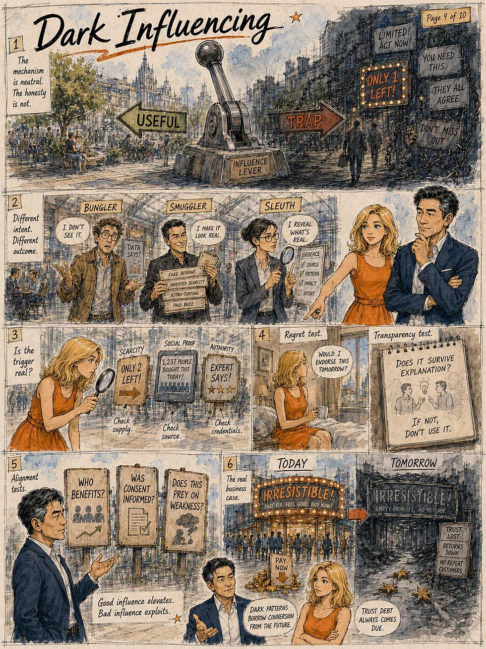
Every principle above is neutral. Reciprocity can open a real relationship or bait a hook. Scarcity can inform a real decision or panic a false one. Authority can surface real expertise or counterfeit it. The mechanism is identical; only the honesty changes. So the pressing question for anyone building interfaces is: where, exactly, is the line that turns acceptable persuasion into despicable dark design?
Cialdini himself offered a useful framework, in his 1999 paper “Of Tricks and Tumors.” He splits practitioners into 3 types. The bungler fumbles away legitimate influence he actually has (the climbing-gear seller who forgets to mention he summited El Capitan on that gear). The smuggler knows the principles and counterfeits them: importing them where they don’t genuinely exist, claiming scarcity that isn’t real, authority he doesn’t hold, consensus he manufactured. And the sleuth knows the principles too, but hunts for their genuine presence and brings it to the surface. If there really is scarcity, he says so. If there really is authority or a real commitment the user made, he reveals it and lets the reflex do honest work. Cialdini’s verdict: the sleuth is more effective than the bungler, more ethical than the smuggler, and more successful than either.
That single distinction (is the principle genuinely present, or are you counterfeiting it?) is the bottom line that separates persuasive design from dark design. Here are 6 operational tests you should put to any specific design. Fail these, and it has crossed from persuasion into manipulation and should be cut:
The truth test: Is the trigger real? Is the scarcity actual, the social proof genuine, the authority earned, the deadline honest, the community real? Fabricating the cue is lying, not persuading, and it’s the first thing regulators look for.
The regret test: Would a fully informed user endorse this tomorrow? Imagine the user understood exactly what you did and why, then woke up the next morning. Still satisfied? You facilitated a good outcome. Feels tricked? You manufactured consent. Persuasion survives daylight; manipulation depends on the user never seeing how it worked.
The transparency test: Does it survive being explained? “We show a countdown because the sale genuinely ends Friday” survives. “We show a countdown that resets so you’ll panic-buy” does not. If the mechanism only works while hidden, it’s a dark pattern.
The alignment test: Whose interest does it serve? Ethical influence helps a user do something he or she already wants, faster, in a way that also benefits you. Dark influence extracts a choice that serves you at the user’s expense. Ask honestly who wins.
The comprehension test: Is consent informed and freely given? Was the choice made with full knowledge, or did you obscure, misdirect, pre-check, or bury the material fact? Consent extracted through confusion is precisely what three states now legally refuse to recognize.
The vulnerability test: Would it prey on a weak moment? Some tactics target people precisely when judgment is compromised: the grieving, the addicted, the panicked, the child. Exploiting vulnerability rather than informing a capable decision is over the line regardless of how it scores elsewhere.
Notice what these share. Honest persuasion adds true information to a decision the user is genuinely making and would stand behind. Manipulation subtracts information, fabricates a trigger, or hijacks a reflex to produce a choice the user wouldn’t make with a clear head. That maps precisely onto the evolutionary story: these reflexes evolved to be reliable, firing at real cues that carried real information. The sleuth respects that, pulling the lever only when the cue is true. The smuggler exploits the mismatch, firing the reflex with a counterfeit cue in an environment it never evolved to defend against. Dark patterns are junk food for the mind, engineered to trip an ancient appetite with none of the nourishment the appetite exists to find.
There’s a hard-nosed business case here too, for any executive who doesn’t care about ethics for its own sake. Dark patterns borrow conversion from the future. Every manufactured urgency, fake scarcity, and buried cancel button books a sale today by spending a little of the user’s trust, and that trust debt comes due as churn, chargebacks, one-star reviews, the customer who never returns, and the brand that becomes a punchline. Manipulation is a loan shark, and the interest is your reputation.
Persuade users. Don’t poison them. The reflexes are 2 million years old, and they have a very long memory.
Persuasion Research = Watch the Decision, Not the Testimony
So you’ve rebuilt the pricing page with honest scarcity, real social proof, and a properly credentialed expert quote. Did the design actually become more persuasive? Here’s the trap most teams fall into: they ask users. They run a survey, or, worse, a focus group, and ask users whether the countdown made them more likely to buy. The answers are worthless, and we’ve known why for almost 50 years.
Richard Nisbett and Timothy Wilson showed in 1977 (“Telling More Than We Can Know,” Psychological Review) that people have almost no introspective access to the causes of their own behavior. In their famous demonstration, shoppers evaluated 4 pairs of nylon stockings arranged in a row. All 4 pairs were identical, yet the rightmost pair was preferred by a factor of 4 to 1, a pure position effect. Asked why, participants confidently cited knit, sheerness, and workmanship, offering roughly 80 different reasons across the study. Not one mentioned position, and when the researchers pointed it out, virtually everyone denied it could have mattered. Sound familiar? It’s the same species as the 73% of voters, above, who denied that a candidate’s looks moved their vote.
Influence works precisely because it operates below the level users can report. My oldest usability rule applies double here: watch what users do, not what they say. A direct question (“Did the badge persuade you?”) collects confident fiction, polished by social desirability, because nobody admits to being swayed by a sticker.
So measure behavior, and use words only when they’re anchored to behavior the user just performed. Here are 5 qualitative methods that actually detect persuasion:
Run decision tasks with real stakes, and watch. Give 5 participants a genuine budget (a gift card they get to spend for real) and a real choice that includes your design and its competitors. Then observe the decision path: where he or she hesitates, whether the scarcity message triggers an immediate add-to-cart or a suspicious hunt for alternatives, which testimonials get read versus skipped, the hover-and-retreat dance on the buy button, the scroll back down to the fine print. Persuasion shows up as smoother, faster, more confident movement toward commitment. Skepticism shows up as backtracking. Neither shows up in a questionnaire.
Test comprehension of the material facts. After the participant “buys,” quiz the substance: What was the total price? When does it renew? What did that badge certify? Was the deadline real? Honest persuasion works fine on a user who fully understands the deal; manipulation needs the misunderstanding to survive. If participants can’t correctly state the total cost or the renewal terms of what they just agreed to, the design is extracting, not persuading, no matter how good the conversion numbers look.
Schedule the morning-after interview. This operationalizes the regret test from the previous section. Recontact participants 24–48 hours later: Do they stand by the choice? Can they still describe what they bought accurately? Would they choose it again? Day-after regret in the lab is the leading indicator of returns, cancellations, and chargebacks in the field. Track it as regret-adjusted persuasion: a design that lifts commitment in the session but breeds next-day remorse hasn’t persuaded anybody. It has borrowed.
Use word-choice decks, not rating scales. The Microsoft Product Reaction Cards are perfect for this problem: a deck of 118 adjectives, 60% positive and 40% negative, from which participants pick the 5 that best describe the experience, then explain each pick. Watch the balance of “pressured,” “rushed,” and “gimmicky” against “confident,” “trustworthy,” and “in control.” Choosing from a fixed deck that visibly contains negative words lowers the social-desirability filter that inflates every satisfaction scale, and the explain-your-picks interview produces the quotes that move stakeholders.

The Microsoft Product Reaction Cards got their name from being first described by Microsoft researchers Joey Benedek and Trish Miner at the UPA 2002 conference. I remember liking their talk back then, and the method has proven its worth in the 24 years since. Although the method was invented at Microsoft, it’s not proprietary, and the full list of card words is freely available.
Mine the complaint stream. Support tickets, cancellation-reason verbatims, app-store reviews, and refund requests are qualitative persuasion data arriving continuously and for free. “I didn’t know I signed up” is the most expensive sentence in UX. Tag feel-tricked language per release and trend it.
The ultimate quantitative verdict is the A/B test, because conversion is the metric the business banks. But it’s expensive, and it’s a coarse instrument when persuasion lives in details that qualitative methods read better. Furthermore, conversion lift is morally blind: it measures magnitude, not mechanism, and it can’t tell a sleuth from a smuggler. So pair every persuasion experiment with guardrail metrics that price the trust debt: 30-day cancellation rate, refund rate, support contacts per 1,000 conversions, and repeat-purchase rate. If conversion rises while the guardrails rot, the test didn’t detect persuasion. It detected trust leaving the building, one “successful” checkout at a time. Run the qualitative battery above with 5 users per iteration first, and you’ll usually know which result the A/B test is about to give you, plus whether you should even want it.


Overview of the 7 influencing principles. (All illustrations in this article made with GPT Image 2.)


