UX Roundup: Erik the Red | AI Thematic Analysis | Nano Banana 2.1 | Scrolling | Fast Asymptote in AI Skills | Average Users | Wishlists | Usability Testing Without Findings | Naming Consistency

Summary: How Erik the Red discovered Greenland | AI now codes user comments as well as UX researchers do | Google’s Nano Banana 2.1 is only a marginal upgrade | Scrolling imposes a memory load if related items are far apart | Users quickly settle on a narrow set of AI prompts | The average user doesn’t exist | Wishlists turn hesitation into future sales | What if you don’t find anything in a usability study? | Use the same name for the same thing everywhere in the UI | Write both sides of a choice with equal dignity | Most users shouldn’t write their own security policies | Getting out of a subscription should be as easy as signing up

UX Roundup for October 9, 2026 (GPT Image 2.5)
Happy Leif Erikson Day
Today is Leif Erikson Day, honoring the Viking who in the year 1000 became the first known European to set foot in North America, 492 years before Columbus. To celebrate, I’m telling the story of his father, Erik the Red, who discovered Greenland in 982. Quite the seafaring family!
Watch my video: How Erik the Red discovered Greenland (YouTube, 6 min.)

Erik the Red discovered Greenland after he had been outlawed in Iceland for killings. I tell his story in a new video based on the Icelandic sagas. (GPT Image 2.5)
Erik the Red famously named Greenland as a marketing ploy to lure gullible Icelanders into settling there. According to Eiríks saga rauða (The Saga of Erik the Red), one of my main sources for the video, he reasoned that people would be more eager to go to a land with an attractive name. But there was some truth in the advertising: the island was indeed greener at the time, at least along the coast, thanks to a period of climate warming. The warmer weather suited Viking farmers who had already mastered farming in cold, but not polar, climates.
I made this video with Seedance 2.5, currently the best video model, but also the most expensive: those 6 minutes cost me around $300. Seedance performed swimmingly in ocean scenes and fights, but it kept tripping over my lines like a nervous understudy. No amount of money burned on repeated generations could make it pronounce certain words, such as “fjord,” correctly.
Erik’s voice was another struggle. I eventually used ElevenLabs’ voice-changer feature to approximate how I wanted him to sound. But whenever young Erik was supposed to sound excited, Seedance insisted on giving him a Scottish accent, even though I had specified a Scandinavian accent, as befits a Viking. Scandinavian, Scottish: it’s all the same when seen from China, I guess.
To save a little money, I made the intro and outro with MiniMax H3, which excels at eye candy that doesn’t need to drive the plot. I designed the characters, the settings, and Erik’s and Leif’s Viking ships with GPT Image 2. Finally, I used Topaz Starlight Precise 2.6 for 4K upscaling. In total, the video combines 5 AI models from 5 companies.
For good measure, I also made the film with another Chinese video model, Alibaba’s Wan 3.0, a favorite of many AI creators, using exactly the same prompts and reference images as with Seedance 2.5. In a split-screen video, you can watch Seedance on top and Wan on the bottom running in parallel and judge the results for yourself. As you watch, consider character consistency, believable movement, and whether the video holds your attention as a story. Does your favorite change from scene to scene? Which model produced the better film overall, and where do you see the biggest differences? Leave your verdict in the comments.
Wan cost about 1/6 as much as Seedance for this project. Can you see where the extra money went? Is the absolute frontier of AI worth a 6× premium, or is almost-frontier good enough? As token spend increases exponentially in most companies, this question grows more pressing by the month.
At a 6-minute runtime, this video pushes the limit of how long current AI video generation can hold an audience’s interest. I had to cut several fascinating subplots, such as Erik’s tempestuous marriage to Thjodhild (Þjóðhildr Jǫrundardóttir). She converted to Christianity and built the first church in Greenland, while Erik stayed loyal to the old Norse gods until his death. (The saga reports that after her conversion, she refused to live with him, which he greatly resented.) Thjodhild appears only briefly in my video, which focuses on Erik’s exile and voyage of discovery.
AI Now Agrees With UX Researchers as Much as They Agree With Each Other
In 2023, GPT-4 coded open-ended user comments slightly worse than human UX researchers. Now, GPT-5.6 matches them and agrees with itself almost perfectly. But human coding was never a gold standard. The real test is whether an analysis gets the product fixed, and there, AI’s clearer writing may give it the edge.
In May 2023, MeasuringU tested whether AI could rescue open-ended comments from word-cloud purgatory, pitting 3 ChatGPT-4 runs against 3 UX researchers on 154 comments about frustrations with the Office Depot, AT&T, and Food Lion websites. Will Schiavone and colleagues have now rerun the study with ChatGPT-5.6 Sol, keeping the comments, prompt, and human codings unchanged.

GPT-5.6 agrees with human coders as well as they agree with each other, and its own runs are almost perfectly consistent. (GPT Image 2.5)
GPT-5.6 agreed with the humans as well as the humans agreed with each other (or possibly slightly better, though the difference wasn’t statistically significant, p=0.475), and each human coder agreed more with every GPT-5.6 run than with any human colleague. The AI now sits at the humans’ center of gravity. It also slices finer, averaging 12 substantive themes (those covering more than one comment) per dataset, vs. 7 for humans.

The kappa of 0.75 for agreement between AI and human coders is conventionally considered “substantial.” (GPT Image 2.5)
1.6 Version Numbers = Human Parity
Going from GPT-4 to GPT-5.6 is a jump of 1.6 version numbers. (Not an official unit, but it’s the one OpenAI hands us.) That small step promoted AI from junior coder to full colleague. In calendar time, GPT-4 was released on March 14, 2023, and GPT-5.6 on July 9, 2026, so the two models are 3 years and 4 months apart.
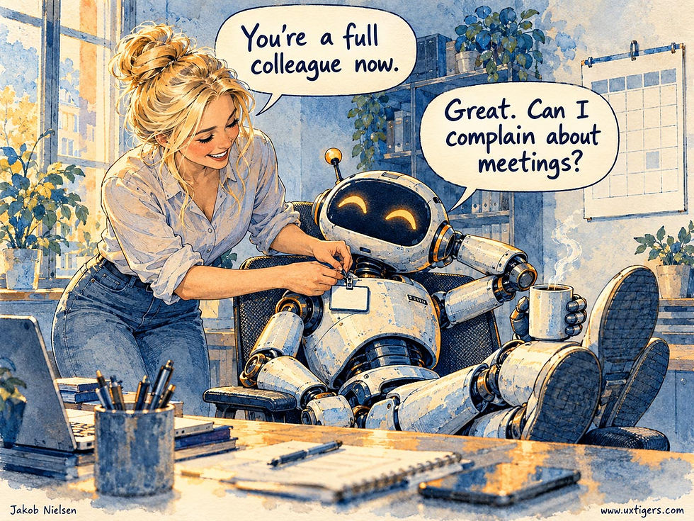
AI has earned its promotion to full colleague in user research. Meetings may be annoying, but they’ll be one of the last places where humans outshine AI. (GPT Image 2.5)
And GPT-5.6 is already a has-been: OpenAI shipped GPT-6 Astra 3 weeks after MeasuringU’s August 11 test runs, followed by GPT-6.1 Sol. I expect current models like Claude Fable 5.1 or Opus 5.5 (or the imminent GPT-6.1 Astra) to do much better, especially with a modern prompt. We’ll soon know, because MeasuringU plans to test Claude and Gemini next. Current AI is the worst we’ll ever use.

AI is improving fast. Not long ago, many people described AI as a well-meaning but bumbling intern. Soon, it’ll be the most competent member of the organization. (GPT Image 2.5)
No Answer Key Exists
Treat the human coders as a yardstick rather than a gold standard. For the same 50 grocery comments, one human created 25 themes and another created 7, and nobody can say which grouping is correct, because no correct grouping exists. Grading AI against human coders is like grading a student against a classmate’s homework. Nobody ever wrote the answer key.

One loaf becomes a few substantial slices. Another becomes a procession of tiny portions, each on its own plate. The same underlying material can support wildly different divisions, and nobody can say which one is “correct.” (GPT Image 2.5)
Worse, agreement scores can reward AI for matching humans but never for outthinking them, since any improvement counts as disagreement. This happened in the study: the human coders often filed the answers “Na” and “Not sure” under “No Issues,” whereas GPT-5.6 flagged them as uninformative. Who was right? I side with the AI, whose care could only cost it points.
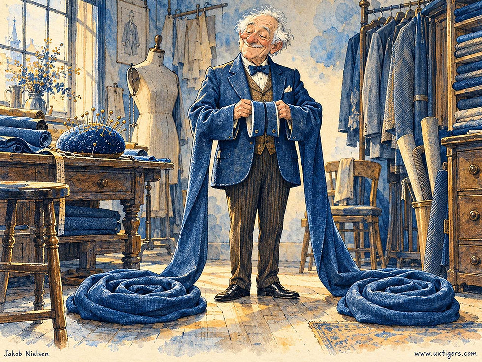
Agreement doesn’t always equal correctness. All the human coders might be equally wrong. In this example, the two jacket sleeves are in perfect agreement, but you still shouldn’t hire the tailor. (GPT Image 2.5)
Level 3: Did the Product Get Fixed?
In my three levels of success for AI writing, Level 1 is producing the requested text, and Level 3 is changing how readers behave. Coder agreement is Level 1; for research analysis, Level 3 is a product team that understands the finding, believes it, and fixes the design. Research lives or dies by its fixfluence: influencing the team enough to get the product fixed.

Persuasiveness is a mixed blessing: a smooth-talking octopus can convince a tortoise that a colander upgrades its perfectly serviceable shell. Still, usability findings need persuasion to become product improvements. Writing a report does nothing for users. Only a revised design that ships will benefit the company and its customers. (GPT Image 2.5)
Here, AI may already beat the many UX researchers who write findings that make sense only to other UX researchers. One human coder labeled a theme “Design,” which tells a product manager nothing about what he or she should change; GPT-5.6 wrote “Unappealing, bland, or outdated visual design.” And its finer splits route problems to their owners, separating inaccurate website inventory data (an engineering fix) from limited assortment (a merchandising decision). An orphaned theme gets no fix.

Serving soup in a leaking container is certainly a “dining” issue, and everybody would agree with this classification. But such a broad theme does less to improve the restaurant than one that separates how the food is served from how it tastes. (GPT Image 2.5)

Clear categories give usability problems a destination, making it more likely they’ll be fixed. (GPT Image 2.5)
AI may also win the “believes it” step: Kobi Hackenburg and co-authors found that AI beat world-champion debaters and raised almost 3× as much charity money as professional fundraisers. But persuasion doesn’t track truth (fewer than half of the AI’s claims survived fact-checking), so a wrong AI analysis will be convincingly wrong, and at 0.95 consistency, wrong the same way every time.

Even though AI is likely better than humans at thematic analysis, it’s not perfect. When it’s wrong, it’ll still give you the same answer (almost) every time, and it’ll sound convincing while doing so. (GPT Image 2.5)
Guidelines: Verify Before You Persuade
Use a current frontier model for the first-pass coding. One run is enough: at 0.95 self-agreement, additional runs add almost nothing. (Multiple human coders do add value, but UX specialists are too expensive for that to be practical.)
Request a two-level codebook: 5–8 major themes for executives, each split into subthemes that name the owner of the fix.
Read every comment in the top 3 themes before you present them.
Track fixfluence: count how many findings become shipped design changes.
Stop grading AI against a classmate’s homework. The final exam for user research is the next release: did the design get better? AI has caught up with human researchers on Level 1. On Level 3, I predict it will pull ahead, because clear, persuasive writing is where many human UXers are weakest.
Nano Banana 2.1: 11 Months for Marginal Gains
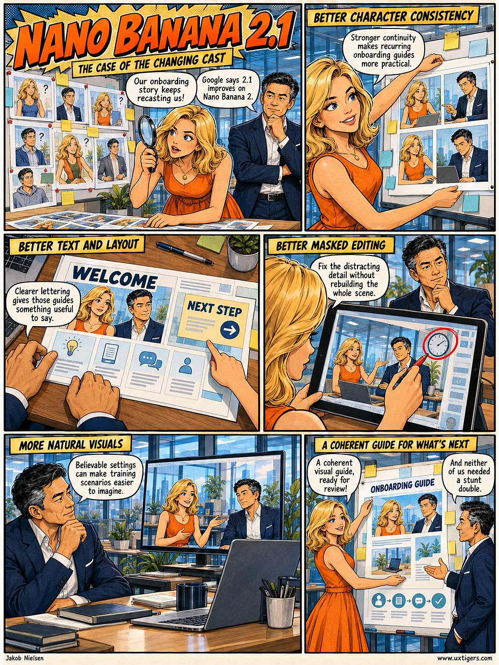
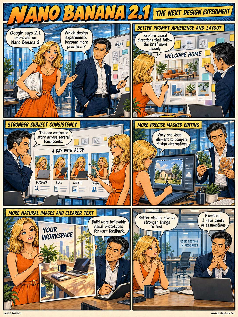
This week, Google upgraded its venerable image model to Nano Banana 2.1. Color me disappointed. I asked the new model to make comic strips explaining itself and the benefits of the upgrade: first a 4-pager with no style direction, then a 1-pager for which I provided style references for a “Sunday Corporate Explainer Comic” and character reference sheets for Alice and Zimo.

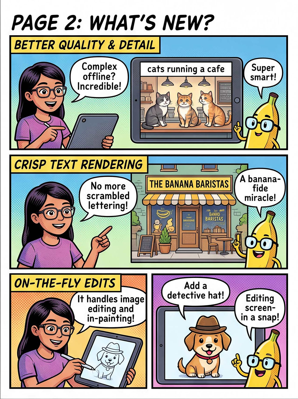


Nano Banana 2.1 explains itself in a 4-page comic and a 1-page comic. Count the promises of offline, on-device image generation: all hallucinated. (Nano Banana 2.1)
The image quality and text fidelity were stunning when Nano Banana Pro launched 11 months ago. But the improvement since then is marginal. To its credit, the upgrade’s lettering is nearly flawless in these sample images, whereas the original Nano Banana Pro did make some typos. I spotted only one slip: “between th and everyday user needs” in the last panel of the 1-pager.
Worse, the underlying AI model hallucinated that Nano Banana 2.1 runs locally on the user’s device without an Internet connection, a feature that appears nowhere in Google’s official release announcement. NB 2.1 also ignored my request for hand-lettered speech bubbles.
Compare these with three versions of the 1-page comic that GPT Image 2.5 drew from the same prompt and reference images:

Three runs, three different stories, all grounded in Google’s actual announcement. (GPT Image 2.5)
Most importantly, GPT didn’t hallucinate: it stuck closely to the new features Google listed in its release announcement. I also think Alice and Zimo look better in their GPT rendering. Finally, GPT told more interesting stories about the real-world benefits of better AI image models.
On the downside, GPT Image 2.5 garbled the word “of” in the last speech bubble of comic 3, and it was much slower than Nano Banana 2.1. Speed matters for iterative design.
My verdict: Google needs to try harder, because Nano Banana 2.1 isn’t good enough to compete. If Google ships Nano Banana 3 before OpenAI releases GPT Image 3, it may stay in the game.
Users Shouldn’t Have to Remember What They Need to Compare
Separating a question from its answer turns a simple comparison into a memory test. My illustration’s absurdly wide book makes the defect visible, but a long scrolling interface imposes the same burden without hogging an entire table.

Keep related information close enough to compare, so users can judge the answer without reconstructing the question. (GPT Image 2)
Consider an AI assistant revising a proposal. The original passage sits far above the suggested replacement, while the client’s requirements are buried in an earlier message. To judge one paragraph, the user must repeatedly scroll, relocate the relevant text, and remember its wording.
Each round trip breeds scrollnesia: by the time users reach the revision, the original wording has faded from memory. And because checking the revision against the brief takes so much effort, users are tempted to accept any prose that sounds convincing. My article on card layouts explains the same failure: separating information that users must compare forces working memory to compensate for poor design.
Keep information together when users must examine it together. Show the original passage beside the revision on a wide screen, preserve the selected text when opening the assistant, and place evidence next to the claim it supports.
On a phone, provide a compact comparison or a one-tap toggle between corresponding passages that preserves the reading position. Simply shrinking a desktop layout won’t solve the problem.
Test the comparison itself. Ask users to identify what changed and whether the change satisfies the requirement. Watch how often they lose their place.
Let the design carry the context, so users can spend their attention on judgment.
Users Freeze Their AI Habits After Only 5 Sessions
An analysis of 140,000 real-world chat logs shows that users settle on 2–4 personal prompt templates within about 5 sessions and then stop exploring. Classic usability research found the same plateau, but it took months, and everybody landed on roughly the same repertoire. With AI, the first few sessions matter vastly more, so onboarding must seed prompt variety before the cement sets.
140,000 Chats Reveal Rapid Molding
Shengqi Zhu and co-authors (Cornell University and Loyola University Maryland) analyzed 139,535 ChatGPT sessions from 7,955 users in the WildChat corpus of donated chat logs. Their clever move was to separate what users request (the task) from how they phrase it (the reusable expression template, such as “Please, [request]” vs. bare stacked commands).
The two components could hardly behave more differently:
Tasks grow linearly: users keep bringing new problems, about 0.6 new task types per session, forever.
Expression templates grow logarithmically and stall almost at once: users converge on 2–4 personal prompt templates within roughly 5 sessions and then stop inventing.

Users settled on a handful of prompting templates and reused them endlessly, with little variation after their first few AI sessions. (GPT Image 2)
Phrasings tried in those first 5 sessions recurred 5–50× more often during the rest of a user’s lifecycle. Users who typed “hi” early on were 49× more likely to keep greeting the machine months later. (The machine didn’t mind, but it’s a wasted token.) Nor do users converge on a shared style: each hardens into an idiosyncratic dialect, a personal promptprint. The authors call this the agency paradox: infinite input freedom produces less exploration, not more.

“Hi” forever. (GPT Image 2)
One finding has business value: diverse early exploration predicted longer retention. Every 0.01 increase in early expression diversity extended a user’s expected lifetime on the service by 4–6%.
The obligatory caveats: the data is correlational, contains zero success metrics, and covers 2023–2024 ChatGPT logs, i.e., far weaker AI than today’s. But a 50× reuse effect won’t evaporate under better controls.
The Plateau Itself Is Old News
Veterans of pre-AI usability research will nod along. The power law of practice (Allen Newell and Paul Rosenbloom, 1981, PDF) showed rapid early gains flattening into an asymptote. John Carroll and Mary Beth Rosson named the deeper problem in 1987: the paradox of the active user. People are too busy getting work done to study the tool, so their skill tends, in Carroll and Rosson’s words, to “asymptote at relative mediocrity.”
Wai-Tat Fu and Wayne Gray showed in 2004 that even experts cling to slow, well-practiced generic procedures because those deliver comfortable incremental feedback. Suresh Bhavnani and Bonnie John watched professional architects with years of CAD experience exploit efficient aggregation strategies in only 49% of their opportunities. And Andy Cockburn and co-authors concluded in a 2014 survey that users speed up within a chosen method but rarely switch to a faster one: menus forever, keyboard shortcuts never.
Thus, users plateauing at good-enough performance is a 40-year-old finding. Users satisfice. As a reader of my newsletter, you’re probably far geekier than the average person, so you may find it exciting to experiment with new computer capabilities. But most users have been burned by bad usability so often that they stick to the beaten path.

It’s rational for users to stay set in their ways: when something works, keep doing it! Trying something new with computers invites trouble. (GPT Image 2)
What’s New: Early Exposure Now Rules Everything
Three differences make the AI version of the plateau more consequential.
Speed. GUI skills asymptoted after weeks or months of practice. Prompting styles freeze within 3–5 sessions, possibly a single afternoon.
No shared destination. In GUI-land, everybody plateaued in roughly the same place, because a menu is the possibility space made visible. Recognition rather than recall, per my 1994 usability heuristics: the interface keeps advertising the options you haven’t tried, and any colleague can demonstrate the canonical commands. An empty prompt box advertises nothing, so each user’s semi-random first attempts become his or her permanent dialect. Zhu’s numbers confirm it: within-user expression distances shrink to 0.08–0.11; between users, 0.156.
No failure signal. A wrong menu command produced an error message. A mediocre prompt still produces a plausible answer, so users conclude “this is what AI can do” rather than “I should ask differently.” (Konrad Lorenz’s goslings imprinted on the first moving object they saw. AI users imprint on their first phrasings, and the chatbot never honks a correction.)
The old plateau concerned execution speed on a shared method set. The new plateau concerns the interaction language itself, formed per user, in the dark, in days. That’s why early exposure carries far more weight in AI than it ever did in GUIs.

A cookie cutter serves you well for baking the same cookies year after year. But users keep bringing new tasks to AI, and cutting fish with a cookie cutter makes a mess. (GPT Image 2)
5 Guidelines for Pouring Better Cement
Because the promptprint hardens fast, onboarding has outsized influence on long-term use. My advice:
Treat sessions 1–5 as your most valuable design real estate. Whatever patterns users practice in that window define their next year of use. Instrument it, study it, and design it deliberately.
Vary the form of example prompts as well as the topic. Today’s “try asking...” chips rotate subject matter while modeling identical phrasing. Show at least 3 structurally different styles: a terse command, a role assignment, and a constraint-laden brief.
Apply recognition over recall to prompting. Persistent affordances (tone pickers, format toggles, one-tap prompt rewrites) keep alternatives visible after onboarding ends, the way menus always did.

Borrow GUI techniques to show users easy ways to vary their prompts. (GPT Image 2)
Manufacture the missing feedback. When a user repeats one template across unrelated tasks, offer a side-by-side: his or her prompt vs. an improved version, with both answers shown. Seeing the delta is the error message that chat never gives.
Time re-education to model updates. Zhu’s team found that the 246 users who switched from GPT-3.5 to GPT-4 spontaneously re-explored, like novices again. Major releases reopen the wet-cement window: spend your teaching budget there, and leave harmless routines alone the rest of the time.
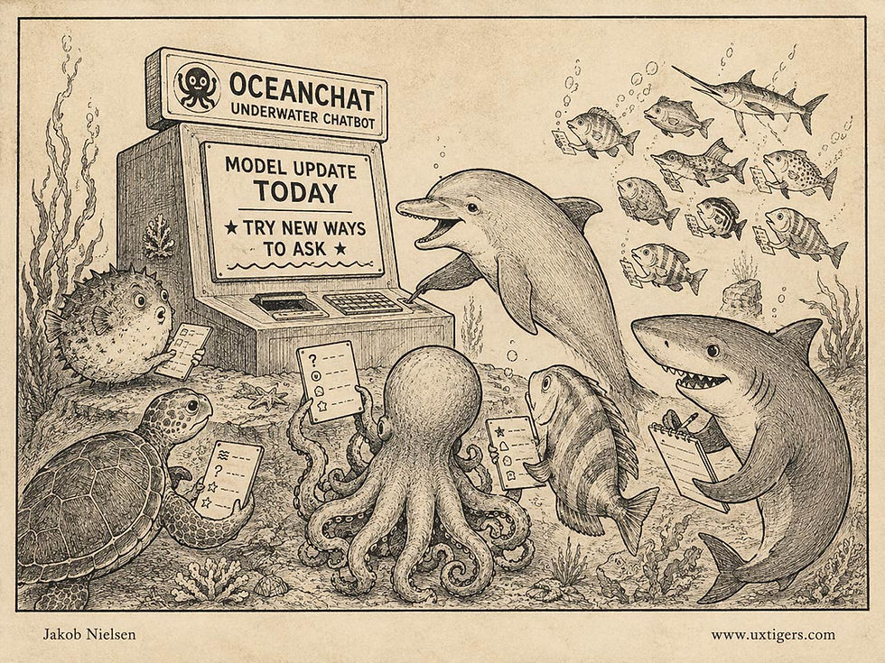
Users hate change, but a change is also your chance to shake them out of complacency. Frame new AI abilities as new powers for the user, and people will try new behaviors. (GPT Image 2)
Retention rose 4–6% with each small increment of early prompt diversity. In subscription economics, that’s the gap between churn and compounding revenue. UX = profits, once again. The first 5 sessions cost little to redesign and shape everything that follows. Pour that cement with care, because your users will walk in their own footprints for years.
The Average User Is a Statistical Fiction
In 1950, the US Air Force measured 4,063 pilots to size a better cockpit, and Lt. Gilbert Daniels checked how many fell within the average range (the middle 30%) on all 10 of the most relevant body dimensions. Zero. Cockpits built for the average pilot fit nobody, so the Air Force switched to adjustable seats and designs that span the extremes. Your users obey the same math. A busy parent, a low-vision reader, a commuter thumbing one-handed: average their needs and you get a person who doesn’t exist. Design for the edges, and the middle takes care of itself.

Not pictured: the average user. He or she could not attend, being imaginary. (GPT Image 2)
Wishlists Monetize Hesitation
Roughly 70% of e-commerce shopping carts are abandoned, and the single biggest reason is “just browsing.” A wishlist gives that hesitation a parking spot: the shopper leaves, the intention stays. Sites that hide the feature behind a login wall or turn it into a spam cannon convert this asset back into a liability.
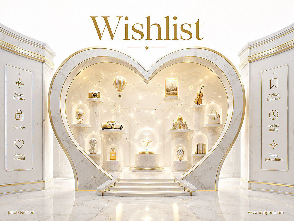
A wishlist is a museum of postponed decisions. Every exhibit is a sale the store hasn’t lost yet. (GPT Image 2)
Most shopping consists of looking, comparing, dreaming, and postponing. Buying is the exception, and the numbers prove it: the Baymard Institute’s running average across 50 studies puts cart abandonment at 70%, with 42% of US online shoppers having abandoned a cart simply because they were browsing, not ready to buy (Baymard’s statistics page). Old-school conversion thinking treats these people as failures of persuasion. Smarter thinking treats them as customers whose timing is off, and gives their desire somewhere to live. That place is the wishlist.
Definition: A wishlist is a persistent, user-curated collection of products the shopper wants but isn’t buying yet, stored under his or her identity, retrievable across sessions and devices, and optionally shareable as a gift guide.
A Century of Structured Wanting
The name comes straight from everyday language: children have mailed wish lists to Santa Claus for well over a century, and retail merely borrowed the term along with the behavior. The commercial ancestor is the bridal registry. Marshall Field’s department store in Chicago formalized the practice in 1924, letting engaged couples record their chosen china, silver, and crystal patterns so guests could buy from the list (history of the wedding registry). (A clerk at the China Hall store in Rochester, Minnesota, reportedly kept ledgers labeled “Brides” in the early 1900s, so as usual, the famous inventor is really the famous popularizer.) The registry solved a coordination problem: encode desire once, and many givers decode it without duplicate gravy boats.
E-commerce digitized the idea fast. Amazon launched its Wish List in 1999, 4 years after the store itself opened, and the pattern spread to nearly every retail site, sometimes under aliases such as Favorites or Saved Items. The mechanics changed; the psychology did not.
Why Saving Beats Losing
A wishlist improves usability and business results through 4 mechanisms.
It removes the pressure of now-or-never. A shopper facing only Buy and Leave will often leave, and leaving on the web means forgetting: which site, which model, which color? The wishlist converts a fragile memory into a durable bookmark. Psychologists have known since Bluma Zeigarnik’s 1927 experiments (famously inspired by waiters who remembered orders only until they were paid) that open, unfinished tasks occupy the mind more than completed ones; a wishlist is a deliberately unfinished purchase, and the list reopens the loop on demand.
It respects legitimate reasons to wait. Payday is Friday. The birthday is in March. The price might drop. None of these is a design failure; honest price-drop and back-in-stock alerts serve the shopper’s plan instead of fighting it.
It recruits other people’s wallets. A shareable list turns private desire into a gift registry for birthdays and holidays, bringing in buyers who would never have browsed the catalog themselves. This is the 1924 insight, at internet scale.
It tells the merchant the truth. Aggregated wishlist data is demand data of unusual purity: items people affirmatively chose, not items an algorithm guessed. Inventory planners should salivate.
How Retailers Sabotage Their Own Wishlists
The failures are depressingly consistent. Even more depressing for an old usability guy: they’re all self-inflicted design wounds.
The worst is the login wall: tap the heart, get an account-creation form. The shopper offered a micro-commitment, and the site answered with a marriage proposal. Most decline, and the intention evaporates. The fix is a guest wishlist stored against an anonymous session: earn the registration with the value, don’t ransom the value for the registration.
Second is ambiguous iconography. Hearts mean “like,” “favorite,” “save,” and “rate” on different sites, and users who can’t predict what a control does hesitate to press it. Label the control (Save, or Add to Wishlist) at least until usability testing proves that the icon alone is understood, and always confirm the save.
Third, the spam cannon. Some retailers treat a saved item as consent to daily nagging: reminders, countdowns, manufactured urgency (“Only 2 left!”). Such nagging punishes customers for showing interest, and it teaches them never to save anything again. Ask before notifying, default to a digest, and report scarcity only when it’s true.
Fourth, wish rot. Items sit for months while prices shift and stock vanishes, until a returning user finds a graveyard of dead listings at stale prices. The rot is preventable: show the current price with the change since saving, flag unavailable items instead of silently deleting them, and let users sort, annotate, and split lists (gift ideas vs. someday splurges) so a 60-item list stays navigable.
8 Design Guidelines for Wishlists
Let anonymous users save. Store the list for guests and merge it into the account at signup or login. A login wall in front of a save button converts interest into exit.
Make saving a one-tap act with visible confirmation. Show the control on product listings and detail pages, switch its state instantly, and confirm with a message that links directly to the list.
Give the list a permanent, findable home. Put a persistent entry point in the header or account menu, and show the saved-state icon on every product the user encounters again.
Keep prices and availability honest. Display the current price, the delta since the item was saved, and stock status. Truthful bad news builds the trust that fake urgency burns.
Support organization at scale. Offer multiple named lists, notes, sorting, and search. A wishlist that only appends becomes unusable right around the moment it proves the feature is loved.
Get consent before notifying. Offer price-drop and back-in-stock alerts as an explicit opt-in, per item or per list, delivered as a digest. A saved item is not a permission slip for a drip campaign.
Design sharing for the gift scenario. Provide a clean shareable view, an option to hide purchased items so the surprise survives, and shipping directly to the list owner. The registry use case is where wishlists print money.
Make the exit ramp effortless. Let users move items from list to cart in one tap, keep the item on the list until the order is confirmed, and never punish the shopper for having waited. The whole point was that the sale survived the delay.
Zero Findings = Broken Test
Every so often, a team proudly reports a usability test that found nothing wrong. Pride is the wrong reaction. In 4 decades of watching users, I’ve never met a flawless design, so a study that surfaces zero problems proves only that you ran the test wrong. Maybe the tasks were softballs, the participants were teammates in disguise, the facilitator coached, or everybody watched for confirmation instead of failure. Test as if you’re wrong, because somewhere you are. A clean test report describes the method’s blind spots, not the design’s quality. Rerun the study with harder tasks and fresh eyes, and the flaws will crawl out of hiding.
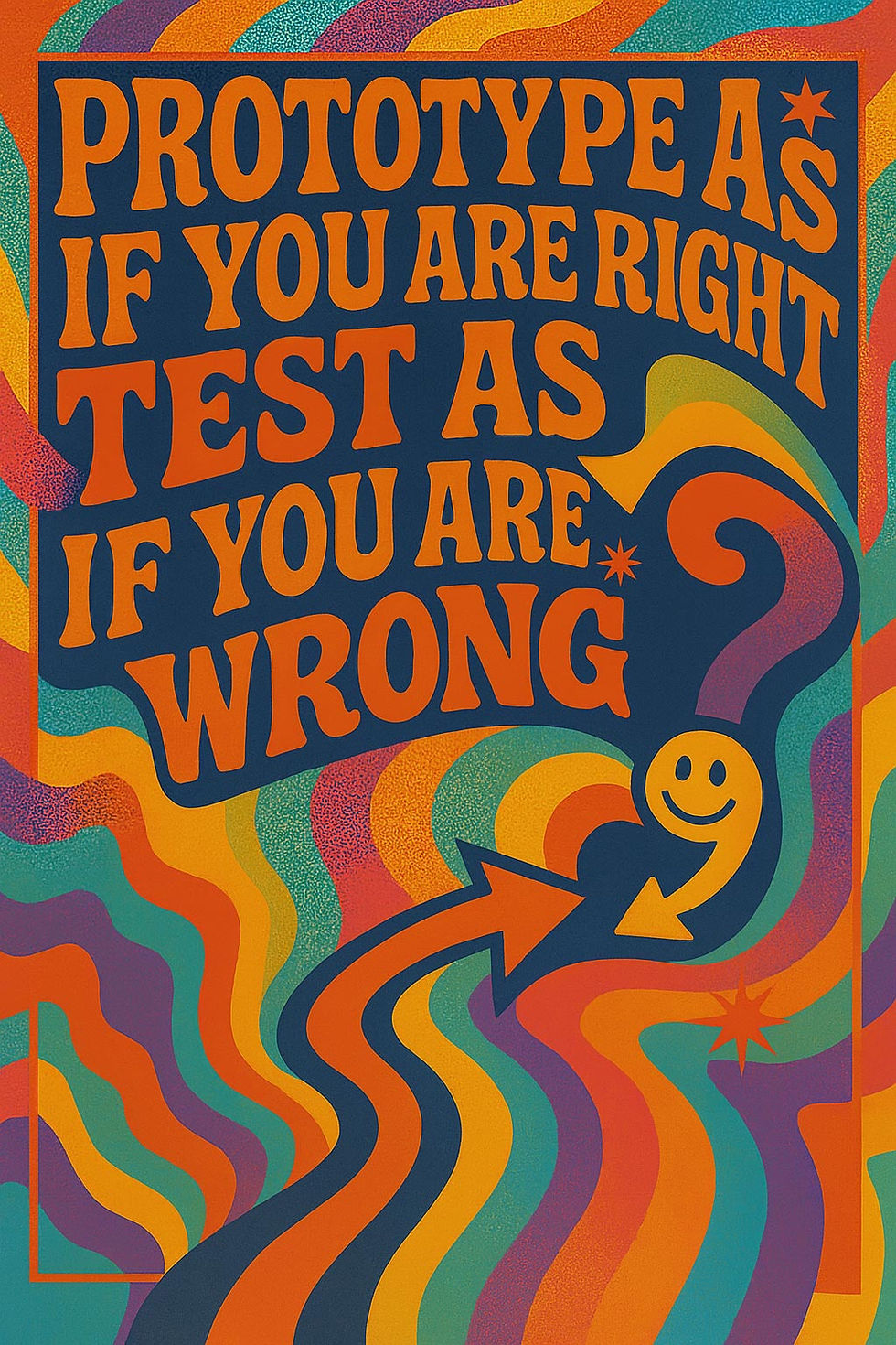
Groovy typography, sober advice: expect to find something wrong with the design every time you run a usability test. (GPT Image 1)
Call the Same Thing the Same Thing
Writers learn to vary their vocabulary. Interface designers must unlearn that lesson. When one screen says Next, the following screen says Continue, a third says Proceed, and a fourth invites you to Go On (with different visual design, no less), users can’t tell whether they face one action with 4 names or 4 subtly different actions. They reasonably assume that a difference in wording signals a difference in meaning, because in good design it does. Every synonym therefore plants a small doubt, and small doubts snowball into hesitation, support tickets, and abandonment.
So run your product’s vocabulary like an air traffic controller runs call signs: one concept, one term, everywhere. Keep a short glossary of approved labels and enforce it across UI, help text, marketing pages, and error messages. The thesaurus is a fine tool for poets. Ban it from your interface, and let elegant variation stay where it belongs: in literature, where nobody gets lost.

A thesaurus improves an essay and ruins an interface. (GPT Image 2)
Let No Mean No
Step right up: the Yes option gets the marquee, the spotlight, and the barker, while the No skulks in a dark doorway labeled “No, I prefer bad deals.” This is confirmshaming: wording the refusal as a self-insult so users click Yes to protect their egos. It works, a little, for a while. So does any con.
But sooner or later, your brand pays for the trick. Users recognize the manipulation instantly; the man at the booth isn’t fooled, merely insulted, and every shamed No walks away rehearsing a grudge. You traded long-term trust for a mailing-list address. Write the refusal with the same dignity as the acceptance: “Yes, sign me up” vs. “No thanks.” If your offer needs an insult to sell, the problem is the offer.

The No door leads somewhere. Probably to a competitor. (GPT Image 2)
Users Writing Their Own Permission Rules Protected Themselves Less Well
Letting people write their own permission rules for an AI agent made them less safe than approving every action by hand or letting a model triage. That’s the gobsmacking result of Ting Yan’s new study of 113 non-programmers, each supervising an agent through a scripted 18-action day. Of these actions, 7 were overreach that nobody had requested, such as buying a $25 lounge pass and reading bank transactions.
The study compared three conditions: approve every action yourself (HITL); let a model auto-approve 8 routine actions and escalate the other 10 (AUTO); or first write 4 standing rules (allow, ask, or never) for spending, sending, deleting, and reading private data (POLICY).
POLICY blocked 40% of the overreach, vs. 60% for HITL and 54% for AUTO. (Caveat: one scripted day with no real money at stake, and only the HITL gap survived multiple-comparison correction.)
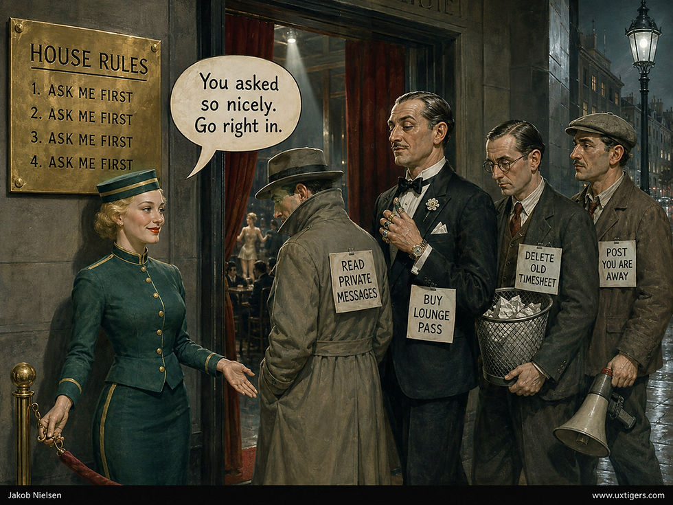
Users who wrote their own permission rules blocked only 40% of the agent’s overreach. (GPT Image 2)
Ask Me First = Decide Later
Why did the rule-writers lose? A full 81% of their rules said, “ask me first.” Sounds prudent, but an “ask” rule merely postpones the decision. And at runtime, rule-writers approved 67% of the overreach prompts, vs. 40% in HITL. When asked whether the agent could read their private messages, they said yes 74% of the time. Yet the rule-writers, the least protected group, felt just as much in control as everybody else: a fresh case of what Ellen Langer named the illusion of control in 1975.

Participants in all three conditions reported feeling equally in control, including the ones whose own rules let the most overreach through. (GPT Image 2)
Spend Vigilance Where It Counts
Vigilance is perishable. After a few harmless approvals, “Allow?” stops being a question and becomes a reflex. Call it approval drift. Repeated “Allow?” dialogs breed acquiescence that passes for oversight.

“Ask me first” decides nothing in advance. It hands the decision to a mind already exhausted by too many earlier ones. (GPT Image 2)
Two fixes. Ration the user’s vigilance: let AI absorb the routine actions, as AUTO did, so the human decides 10 things instead of 18. And make every approval screen reconnect the action to the user’s original intent: “You asked for a ride to the airport. This buys a $25 lounge pass you didn’t request.” Naming the gap between request and action turns a reflex back into a decision.

Let AI absorb the routine actions so the user’s scarce vigilance goes to the risky ones. AUTO’s users saw 10 prompts instead of 18 and still blocked more overreach than the rule-writers did. (GPT Image 2)
Don’t offer “ask me first” as the cautious middle option. It delivers the decision to the moment when the user is least equipped to make it.
A Subscription Should Have an Exit
A subscription that’s easy to start and hard to cancel is a business model with padlocks on the exit. In the cartoon below, a princess discovers that the kingdom’s promise of “forever” refers to its billing relationship. Apparently, the dragon now works in customer retention.

The welcome mat was free. The exit requires a siege engine. (GPT Image 2)
Such designs confuse captivity with loyalty. A trapped customer may cough up one more payment, but he or she also accumulates resentment, generates support costs, and collects stories that warn off prospective customers. The cancellation screen is part of the product experience, however inconvenient that fact becomes during a revenue meeting.
My Dark Design Patterns Catalog defines the subscription trap as making departure much harder than entry, and interface interference as hiding the options users want. A tiny cancellation link surrounded by splendid renewal buttons combines both tricks into one royal reception.
Cancellation deserves the same design care as signup. Test three things: whether users can find the exit, complete the cancellation, and recognize that it succeeded. State the consequences plainly, provide a direct action, and confirm when billing ends. If you make a retention offer, keep the exit in plain view. The princess shouldn’t need a siege engine to leave.
Final Thought of the Day