
UX Roundup: AI Errors Halve Every 5 Months | Muse Charm | Synthetic Users in Exploratory Design | Context | AI-Simulated Users Are Biased | Price Comparisons | Perceived Affordance | Consistency | Tab

Summary: AI errors halve every 5 months on accounting tasks | Meta’s AI appliance, the Muse Charm | Synthetic users can revive participatory design and drive divergence in the exploratory design phase | Context changes what counts as usable, so test where the work happens | Synthetic users give too-nice feedback | Make pricing plans easy to compare | Looking clickable and being clickable should be the same | Consistency facilitates transfer of learning | A table of contents lets users skip to the point | Interrupting users doesn’t count as engaging them | If one thing stands out, users remember it; if everything stands out, nothing does | A call to action must answer three questions | Old people talk to AI differently than young people do, so test with them

UX Roundup for October 5, 2026 (GPT Image 2.5)
AI Errors Halve Every 5 Months on Accounting Tasks
Aden Barton from Mercor gave 4 month-end-close tasks to 12 licensed CPAs. Unaided, they met 37% of the grading criteria. Claude Opus 5 (already outdated) met 100%. It was also cheaper: $0.21 per criterion met, vs. $10.35 for an accountant at the median U.S. wage, a 49× price difference.

Claude Opus 5 finished each task in under 6 minutes. Nearly all of the human accountants needed more than an hour per task. Speed is a quality of its own in business, where every hour spent waiting for the numbers delays the decision that depends on them. (GPT Image 2.5)
Impressive, but the slope matters more than the score. The paper’s trend line climbs 45 percentage points a year, a pace that has already slammed into the 100% ceiling. So I digitized Figure 2 to track errors instead. The frontier model missed 96% of criteria in May 2024 (GPT-4o), 46% in April 2025 (OpenAI o3, the first to beat the average accountant), 12% in February 2026, and none in July 2026. The frontier error rate halves roughly every 5 months.

Less than two years ago, human accountants trounced AI. Now AI trounces them on these accounting tasks. (GPT Image 2.5)

If you’re wedded to an understanding of AI capabilities that’s more than a few months old, you’ll misjudge when to use AI in your work. (GPT Image 2.5)
(In February 2025, I calculated that AI hallucinations had declined at a rate of 28% per year over the previous two years. This new data suggests that AI’s ability to avoid errors is now improving much faster than it was in those early days. Halving the error rate every 5 months works out to an 81% annual decline.)
Every halving leaves less room for human improvement. Accountants working with Claude took 15× longer than Claude alone and were slightly less accurate; one even overrode Claude’s correct advice. Yet another case of humans adding negative value. On analytical tasks with one right answer, once AI beats the average professional, most people who interfere make things worse.

In 2 of the AI-assisted sessions, human intervention caused Claude to change its answer from the correct figure to a mistake, and the accountant went along with the new, erroneous answer. When users express doubt, an AI should recheck its work and stand its ground if the answer holds up. (GPT Image 2.5)
At a 5-month error half-life, any benchmark where AI scores 50% today will be aced within 2 years, after which it’s useless for tracking progress. Barton proposes aiming frontier benchmarks at formerly impossible or prohibitively costly work (nobody asks humans to run 60 mph, yet that speed makes cars valuable), and using human baselines to gauge economic value by showing which tasks people can also do. Sorely needed.

We don’t have true superintelligence yet, meaning AI vastly superior to any living human at all tasks. (I expect this level of AI capability to arrive around 2030.) But we already have limited superintelligence, in that AI beats humans at many narrow tasks. So we need new benchmarks to track AI performance as it moves beyond what humans can do. (GPT Image 2.5)

To keep benchmarks from saturating, builders make tasks harder until AI fails. Barton notes that many such tasks are beyond humans too, so they don’t represent legacy workflows. (GPT Image 2.5)
Caveat: the tasks were built to trip up AI, and the accountants worked without the colleagues and context they’d have on the job. Don’t fire your CPA yet.
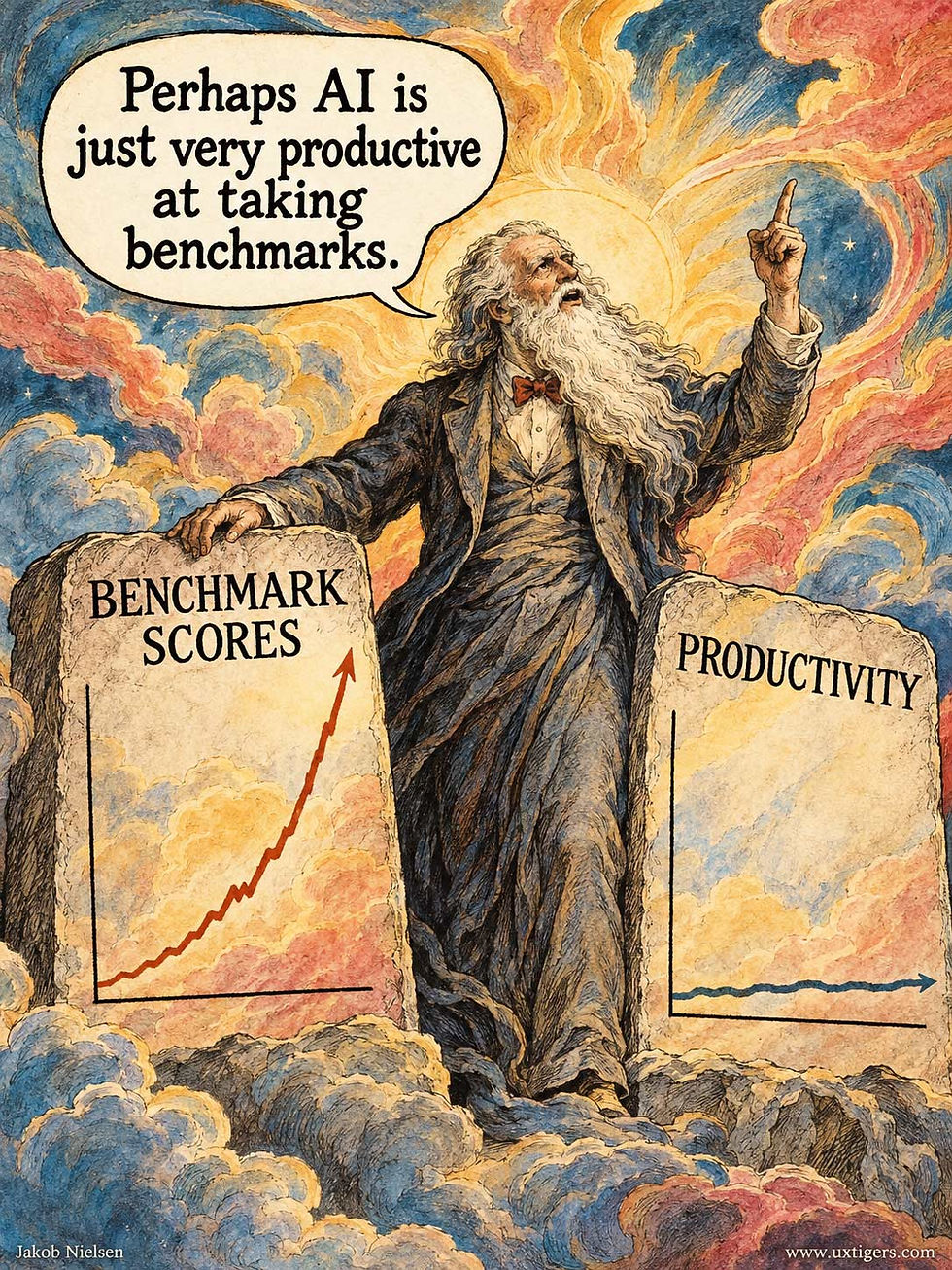
AI aces benchmarks, but company profitability hasn’t skyrocketed yet, because company-level productivity requires workflow redesign. Speeding up individual tasks inside legacy workflows designed around human limitations is like bolting a jet engine onto a horse cart. (GPT Image 2.5)
(Hat tip to Ethan Mollick for alerting me to this study.)

The latest data in this study used Claude Opus 5, which, about 10 weeks after its July 24 release, is already outdated. AI model careers are now measured in weeks. Of course, AI can’t improve on a perfect record at avoiding errors, but it’s surely getting better at interpreting the results and recommending business actions based on the accounting data. (GPT Image 2.5)
Recommended AI Music Video
Fun AI music video about the relentless pace of AI advancement (X, 4 min.). Though, as the song says, soon we’ll just call it “Video” instead of “AI Video,” because most videos will be created with AI and it doesn’t matter which technology was used, only whether the content is engaging. Nobody talks about a “Sony Video” for something recorded with a Sony camera.
Meta Muse Charm
Meta’s new AI device (the Muse charm) is an interesting venture into AI appliances and always-on AI companions. There is definitely potential in always having an AI assistant with you and operating it through voice interaction and situational awareness. I will defer further comment until I have seen it in action, not just in a keynote demo.
I give huge props to Mark Zuckerberg for bringing Meta around after the metaverse fiasco: it’s now a leading player in AI, and Muse is already a leading AI assistant in its regular (non-device) form. Zuckerberg may even become a hero to humanity for resisting the calls to delay AI acceleration that the leading AI labs use in an attempt at regulatory capture while they’re ahead. Think of the patients cured by AI’s medical discoveries and the billions of children who will get a better, more appropriate education through AI, and you will realize the harm done by even a single day of delaying AI advances. (10 years ago, I thought of Zuck as a villain for his addictive UX design, so it’s rather a turnaround for me to now consider him a hero.)
Interestingly, during the demo, Zuckerberg’s Muse assistant was named “Agrippa.” This may have passed unnoticed by most people, but this name has great historical connotations: Marcus Vipsanius Agrippa (c. 63–12 BC) was the military commander, political lieutenant, and civic builder behind the rise of Augustus, Rome’s first emperor. Agrippa was loyal, talented, and got things done. These are exactly the qualities you want in an AI assistant. (One might also note that this analogy casts Mark Zuckerberg as the emperor.)

Among his many achievements, Agrippa built the Pantheon temple, which still stands in Rome today (though Emperor Hadrian rebuilt it). The Latin inscription below the pediment translates as “Marcus Agrippa, Lucius’s son, consul for the third time, made this.” Here’s an imagined scene of Agrippa inaugurating the Pantheon in 25 BC, accompanied by his wife Pomponia Caecilia Attica and Caesar Augustus. (GPT Image 2.5)
Can Synthetic Users Revive Participatory Design?
Jaewon Choi and co-authors from Stanford, KAIST, and Hanwha Life built FocusGen, a “virtual focus group” of 1,000 AI persona agents, each assembled from census demographics, a machine-written life story, and an interview about its tastes. Hand this crowd a design brief, and every agent sketches its own visual concept, fanning one brief out into 20–30 divergent design directions.
The persona layer paid off. Image sets from the agents were 58% more visually diverse than sets from a generic AI assistant, and human judges agreed. Open-ended interview questions (“describe your five most important preferences”) beat structured questionnaires for divergence in both human and synthetic panels. But the agents produced only about half the design divergence of comparable human panels on taste-driven tasks like logos and interiors.

For divergent design ideas, draw on many different perspectives. (GPT Image 2)
Should you copy this system? No. Focus groups are a feeble research method even when staffed with real humans, as their placement in my ranking of the 50 most common user research methods shows. Worse, the study ran on Gemini 2.5 Flash, a year-old economy-tier model, with images from Imagen 3, which dates from 2024. (In AI years, that’s a geological era.) The authors concede that their numbers are tied to those model versions, and, to their credit, the paper is unusually honest about everything it didn’t prove. But stale models also mean that the results understate today’s potential. Rebuild FocusGen on a frontier model, and I expect much of that human-agent diversity gap to close.

Focus groups are a poor way to assess user needs, especially with AI participants. But input from a large set of synthetic users with different (simulated) backgrounds is a good way to spark divergent thinking in the exploratory phase of a design. (GPT Image 2)
The lasting insight concerns placement in the design process. Synthetic users are weak for UX evaluation, because they miss the richness of real user behavior. And as I reported in my August 10 newsletter, AI personas exaggerate demographic differences far beyond what real people exhibit. FocusGen supplied its own warning: flip one gender filter, and the beauty-expo concepts sprouted robot mascots, a stereotype dressed up as an insight.
Early divergent exploration flips the requirements. Here, provocation matters more than validity. A wrong idea that’s different still breaks fixation, like the caffeine-molecule coffee poster that one of the 16 creative professionals in the study admitted she would never have conceived on her own.
That flip could revive participatory design, the unrealistic 1970s dream of some of my former Scandinavian colleagues, who wanted users seated on the design team as full members. It never worked, for two reasons. First, real users are scarce and expensive: no company can divert customers or field workers from their day jobs for months. Second, they stop being users.
During my telephone company days, development teams liked to include a so-called SME (subject-matter expert). This usually turned out to be a guy who used to climb telephone poles but had since become a Bell Labs insider who no longer thought like the technicians he was brought in to represent. (Nice people, those SMEs, and that was exactly the problem: they fit in.)
Synthetic participants never go native. Their outsiderness is preserved in amber, and you can sample a fresh cohort for every project, for pennies.

Does this guy look like he climbs telephone poles? No, he looks like a professional SME. (GPT Image 2)
Syntheticipation, participatory design with synthetic users, thus fixes both failure modes of the original movement while keeping its founding idea: outside perspectives must enter the process early, when they can still bend it. Use synthetic personas to widen the funnel at the start, then test the surviving concepts on real users. Diverge with silicon; validate with carbon.
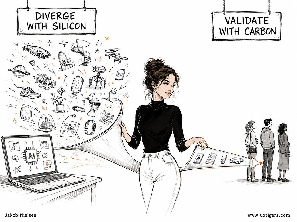
For a wide range of divergent design ideas during the exploration phase, use AI-driven synthetic users. To find out how real customers use your product in their actual business, test with live humans. Silicon and carbon both have their place in getting the design right. (GPT Image 2)
Usability Depends on Where the Work Happens
Nobody would test a fish on dry land. Yet teams routinely evaluate workplace software under conditions scrubbed clean of the difficulties their users face every day.

Test with real users under the conditions that shape their work. Ideal surroundings can hide the usability failures that matter most. (GPT Image 2)
Test a warehouse application at a quiet desk with a large monitor, a reliable connection, and an attentive researcher, and it may sail through. The actual worker uses a handheld scanner while wearing gloves, standing between shelves, and fielding questions from coworkers. In effect, the desk test redesigned the job to suit the software.
Context changes what counts as usable. A small control becomes a fat-finger lottery for a gloved hand. A lengthy explanation turns into dead time when a truck is idling at the loading dock. And a workflow that forgets its place after an interruption forces the worker to repeat completed steps.
Visit the workplace before deciding which conditions your test must reproduce. Observe the devices, documents, interruptions, and informal assistance that shape the task. Include the handoffs to colleagues and other systems, because the work doesn’t stop at the edge of your screen. I discuss the value of visiting users’ workplaces in Usability Labs: Cool or Old School?
Lab sessions remain useful for examining labels and comparing layouts. Bring the conditions that matter (gloves, noise, interruptions) into those sessions, then check the design where it will actually be used.
Measure completed work, errors, recovery, and the help people need. A participant who succeeds under ideal conditions has passed the wrong exam.
The researcher in the illustration brought diving equipment. Sometimes good UX research requires getting wet.
Synthetic Users Are Too Nice
Yuanzi Li and co-authors from 4 Chinese universities compared 18 AI models against real human answers from major social-science surveys (American National Election Studies, General Social Survey, World Values Survey, plus a prospect-theory replication) and found what they call benevolence bias: aligned models drift toward the kinder, safer, more socially approved answer. All 18 models overshot humans on social desirability, and 17 of 18 on harm aversion. The bias grows with model size and traces to post-training, the same charm school that makes chatbots such pleasant company.

The AI models tasked with simulating user feedback were too eager to please. (GPT Image 2)
Worse than the shifted average is the narrowed range. Even when explicitly instructed to role-play nasty personas, the models couldn’t answer like people who are less prosocial or more harm-tolerant than the average human. Prompt wording, language, and temperature changed the size of the bias, never its direction.

Even asking the AI to pretend to be nasty didn’t work. (GPT Image 2)
That’s why the previous news item recommended confining synthetic users to divergent exploration and reserving evaluation for real humans.

While AI can be divergent in idea generation, it was too convergent when asked for feedback. A chorus of “personas” is useless if they all sing the same flattering tune. (GPT Image 2)
I’d love to see this study replicated on the specialized services that sell synthetic users for “user research” (the scare quotes stay). A purpose-built harness might correct a bias we now know in advance. After all, the authors’ own light-touch statistical calibration restored the human distribution without any model retraining.
Until that research exists, teams using AI for supplementary usability evaluation can at least discount the pleasantness. AI personas underrepresent obstinacy, selfishness, distrust, rule-breaking, and frustration, yet those awkward behaviors often produce the most important usability findings. Real users are meaner. Cherish that.

Humans can also be too considerate in their feedback, especially in social situations. But when pressed, they’ll be more honest, and their behavior never lies. If users click the wrong button, the design is at fault. (GPT Image 2)
If Plans Can’t Be Compared, They Can’t Be Chosen
A pricing page is a comparison table, but the usual hall of mirrors breaks every rule in my Comparison Tables article. One plan is priced per month, another per user per month, the last says “Let’s talk.” Features get renamed between columns, chained (“everything in Basic, plus”), and asterisked to mean “sometimes”; one tier is a decoy that exists only to make its neighbor look reasonable.
When comparing gets too hard, users grab whatever cue is left, which is why vendors pin the Most Popular badge on the highest-margin plan, no matter how many customers actually picked it.
Build the page as the table it is: every feature a row, every plan a column, every cell a checkmark, a dash, or a number. Use one pricing unit for all plans. Vary plans along one axis only (seats, usage, or feature depth). Give Enterprise a starting price, not a phone number. Earn the badge with data or drop it. A customer who can’t compare doesn’t choose; he or she guesses, and guessers churn.

Pick a plan. Any plan. Each is the best from some angle. (GPT Image 2)
Affordances Are Promises
Every element on a screen makes a silent promise about what it will do when touched. Psychologist James Gibson coined the term affordance for the actions an object invites, and my buddy Don Norman carried the concept into design with perceived affordances. Interfaces break the promise in two directions. Some elements look clickable but do nothing, so people click, wait, and conclude the product is broken. Others are clickable but look inert, so the features behind them go undiscovered. Flat design manufactured both failures at industrial scale.
Run a promise audit. Walk through your UI and ask of every element: does it look like what it does? If it looks interactive, wire it up or tone down the styling. If it is interactive, make it look the part, with underlined links and buttons that have visible edges. Perceived affordances are the only affordances users act on. What the code can do is irrelevant until the pixels say so.

Lucky user: he discovered that the painting is actually a door. Most people won’t, which is why features hidden behind inert-looking elements go unused. (GPT Image 2)
Let Users Learn It Once
The first “Add to Cart” button teaches; the next 14 confirm. When every instance of an action looks and behaves the same, users stop reading the label and act on reflex, freeing their brainpower for the decision that matters: whether to buy. Consistency turns reading into reflex. And uniformity also makes emphasis possible. The one red mug on the shelf grabs attention only because its neighbors match. So break the pattern only on purpose, only rarely, and only where the deviation carries meaning. Treat novelty like hot sauce. A few drops wake up the dish; a whole bottle ruins it.

The red mug performs the same function. It just craves attention. (GPT Image 2)
The Table of Contents: 2,100 Years Old and Still Beating the Scrollbar
A table of contents lists a page’s section headings as links, so users can see the structure and jump straight to what they need. The pattern is at least 2,100 years old, yet most long web pages still lack one. Give every page beyond 4–5 screenfuls a linked, sticky table of contents built from headings that state what each section delivers.

A table of contents turns a wall of text into a row of doors: users glance, pick one, and walk through. (GPT Image 2)
Definition: A table of contents (TOC) is a list of a document’s section headings, presented in document order, where each entry links directly to its section. On the web, this usually means anchor links that jump within a single long page.
Invented So an Emperor Wouldn’t Have to Read
The Roman poet Quintus Valerius Soranus (died 82 BC) gets the credit for attaching the first known table of contents to a written work. We know this because Pliny the Elder said so in his Natural History (AD 77), a 37-book encyclopedia that Pliny front-loaded with a complete list of contents. In the preface, addressed to the emperor Titus, Pliny explains that he took “very careful precautions to prevent your having to read them.” Thus the first documented TOC came with an explicit usability rationale: the author knew his reader was busy and designed for skipping. Pliny would have made a fine UX designer.

Gaius Plinius Secundus (AKA Pliny the Elder, to distinguish him from his nephew, Pliny the Younger) writing his multi-scroll natural history. Both Plinys now have great beers named after them. (Muse Image)
The name is duller than the history. “Table” descends from the Latin tabula, a board or tablet used for posting lists. When books moved to the web, the pattern came along as anchor links, as the “On this page” boxes in technical documentation, and as Wikipedia’s auto-generated contents box, which since the Vector 2022 redesign has sat in a sticky sidebar that follows readers down the page.
Structure Shown Is Scent Concentrated
Why did a pattern this old survive papyrus, parchment, print, and pixels? Because the human constraint never changed: nobody reads everything. In 1997, John Morkes and I found that 79% of users scanned any new web page rather than reading it word by word. A table of contents is a scanning aid in its purest form. It compresses a 5,000-word page into 8–12 lines and lets the eyes do in 3 seconds what the scroll wheel does in 3 minutes.
Peter Pirolli and Stuart Card’s information foraging theory (developed at Xerox PARC and published in Psychological Review in 1999) explains the mechanism. Users follow information scent: the cues suggesting that a path leads to what they want, much as animals follow real scent to food. A good TOC concentrates the entire page’s scent in one small patch, letting the user judge in one glance whether the page deserves his or her time. Weak scent, and the user leaves. The theory predicts, and every analytics dashboard confirms, that people won’t scroll on faith.
Wikipedia proves the point at scale. When the Wikimedia Foundation’s Web team made the table of contents sticky and persistent in Vector 2022 (rolled out as the default across 300+ wikis serving roughly 1.5 billion page views per month), readers and editors jumped between sections 50% more than with the old top-of-page box, according to the team’s analytics. (Self-evaluation of one’s own redesign deserves a raised eyebrow, but nobody runs lab tests at this scale.) Same articles, same headings; the only change was keeping the map on screen.
Where Tables of Contents Go Wrong
A TOC inherits everything from your headings, including their sins. The most common failure is scentless headings: entries such as “Going Deeper,” “Our Approach,” or “Final Thoughts” describe nothing, so the TOC becomes a list of locked doors. The fix costs nothing. Write claim-bearing headings that front-load the keywords, and the TOC writes itself.
The second failure is anchor amnesia. Clicking a TOC entry teleports the user into the middle of a page he or she has never seen, with no sense of what was skipped, how much remains, or what the Back button will do. The cure has three parts: keep the TOC visible with the current section highlighted, land the target heading at the top of the viewport, and make the Back button return the user to the TOC. (Test that last one in your single-page app, where anchor navigation breaks most often.)
Third comes depth explosion. A 4-level TOC with 40 entries is a second document that itself needs a map. Finally, there’s the TOC that lies, with entries pointing to sections renamed or deleted in the last edit. Trust, once burned, doesn’t regrow within the session. Generate the TOC automatically from the live headings, and lying becomes impossible.
8 Design Guidelines for Tables of Contents
Add a TOC to long pages only. My rule of thumb: any page beyond 4–5 screenfuls, or any article above roughly 3,000 words; below that, the scrollbar suffices.
Write headings that state what the section delivers. The TOC can never be better than its entries, so make every heading carry a claim or a keyword, not a mood.
Front-load the first 11 characters. Scanning users judge an entry by its opening characters; “Pricing for Teams” beats “How to Think About Pricing for Teams.”
Link every entry and jump instantly. Skip slow scrolling animations on long pages; the Wikimedia team rejected them because racing past dozens of sections creates too much on-screen motion.
Keep the TOC visible and mark the current section. A sticky sidebar with a position highlight converts the TOC from a one-shot menu into a persistent you-are-here display; on narrow screens, collapse it into a floating Contents button.
Limit depth to 2 levels. Show main sections by default and expand subsections on demand; a TOC you must scroll to read has stopped being an overview.
Mirror the page exactly. Every entry must match a real heading, word for word and in order, so generate the TOC from the headings rather than maintaining it by hand.
Confirm arrival after every jump. Highlight the destination section, position its heading at the top of the viewport, and verify that Back returns the user to the spot he or she left.
Pliny apologized to Titus for writing 37 books and handed him a map for skipping 36 of them. That was AD 77. Human nature hasn’t changed since. Your users are busy, they won’t read everything, and they resent being made to hunt. A table of contents costs you roughly 10 lines at the top of the page, or one slim sticky rail, and repays the user on every visit. Write for emperors.
Interruption Is Not Engagement
A user arrives with a goal, takes two steps toward it, and a modal drops from the ceiling: “Stay updated! Allow notifications!” The site hasn’t demonstrated any value yet, but it’s already asking for commitment, like a shop assistant who blocks the door until you hand over your phone number. Users skip the text of these ambushes and hunt for the escape hatch. Every hunt burns goodwill and working memory. Interruptions are information pollution: they tax everybody to benefit almost nobody. If you must ask, ask at the moment of need, in context, after the user has seen why. Until then, hold your modals.

Note the actual task, visible in the distance, like a mirage. (GPT Image 2)
The Von Restorff Effect: Make One Thing Different, and Users Will Remember It
When one item differs from a crowd of look-alikes, people notice it and remember it, an effect Hedwig von Restorff documented in 1933. It’s the science behind the single accent-colored button. But the effect runs on scarcity: emphasize everything, and you emphasize nothing.

One amber egg in a parade of white ones. Ask the visitor tomorrow which pedestal she remembers. That’s the isolation effect, and it’s why each screen should get only one golden egg. (GPT Image 2)
Definition: The von Restorff effect (AKA the isolation effect) predicts that when several similar items are presented together, the one that differs from the rest is far more likely to be noticed and later remembered.
The effect pays twice, because the distinctive item draws the eye now and holds the memory later. And because it depends on contrast with a uniform background, it’s strictly zero-sum: emphasis is a currency, and printing more of it causes inflation.

If everything is special, nothing is special. (GPT Image 2)
A Gestalt Dissertation in 1933 Berlin
Hedwig von Restorff (1906–1962) wrote her doctoral dissertation at the Psychological Institute of the University of Berlin under Wolfgang Köhler, a founder of Gestalt psychology, and published it in 1933 in Psychologische Forschung. The title translates as “On the Effects of the Formation of a Structure in the Trace Field,” which explains why everyone just says “the von Restorff effect.” Her experiments used lists in which one item broke the pattern. In one setup, a lone number buried among 19 nonsense syllables was recalled far better than the same number sitting among fellow numbers. Her interpretation was subtler than the modern gloss: the similar items smother one another through mutual interference, while the isolate escapes the crowd. The standout doesn’t shout; the chorus muffles itself.
She earned her Ph.D. magna cum laude at age 27 (on her birthday, no less). Then history intervened. In 1935, the Nazi government dismissed the assistants Köhler had trained; Köhler emigrated to Swarthmore College, and von Restorff left psychology for medicine, practicing as a physician in Freiburg until her death at 55. Her dissertation has never been published in English, and the eponym arrived late. Researchers said “isolation effect” until R. T. Green attached her name to it in a 1956 paper. Colin MacLeod of the University of Waterloo assembled the full detective story in a 2020 article in Memory & Cognition, which also confirms the happier news that the isolation effect still replicates reliably. Not every 1933 finding can say that.
One Golden Egg per Screen
Interface designers use the effect daily, often without knowing its name. The primary action button wears the single accent color while secondary actions dress in gray, so the user’s eye lands on Continue rather than Cancel. The field with the error turns red in an otherwise calm form. The recommended pricing tier gets the highlighted card among plain siblings. The unread badge sits alone on a muted toolbar, and the current step in a wizard glows while completed steps recede.
Why does the accent button work? Because the rest of the screen agrees to stay quiet. The recipe never changes. Start with a uniform field, add one deviation, and the user’s attention and memory do the rest.
The operational rule is blunt: 1 primary action per screen. The moment a second element demands the same visual volume, both lose.

Stick to one primary action, and it’ll be noticed. (GPT Image 2)
Highlight Inflation and 4 Other Ways to Waste the Effect
Topping the list of abuses is highlight inflation. When everything is bold, red, badged, and animated, distinctiveness collapses, and the page becomes uniform noise at a higher volume. Marketing wants a banner, product wants a badge, legal wants a notice, and each addition devalues all the others. Run an emphasis budget instead: to highlight something new, un-highlight something old.
Here are 4 more failure modes:
Color-only signaling. Roughly 8% of men have red–green color deficiency, so a standout that differs only in hue is invisible to a large slice of your audience. Encode the difference redundantly: color plus shape, weight, icon, or label.
Standouts that read as ads. Make an element too alien, and users’ mental ad-blockers delete it. My eyetracking research on banner blindness back in 2007 showed users skipping anything that resembled an advertisement, however important its content. Keep the soloist inside your design language: distinctive, yet clearly a member of the band.
Weaponized salience. The glowing “Accept all” button next to a gray whisper of a “Reject” link uses von Restorff against the user. It works all too well, and European regulators have fined companies for such lopsided consent designs. Point the golden egg at the user’s goal, or expect the bill.

Please don’t turn the von Restorff effect against users. Making the safe choice all but disappear is a dark design pattern. (GPT Image 2)
Habituation. Yesterday’s standout is today’s wallpaper. A never-changing promo banner stops being isolated; the brain reclassifies it as background. Reserve strong isolation for rare events.
7 Design Guidelines for Distinctiveness
Grant each screen one visual soloist. Exactly 1 primary action receives the accent treatment, and everything else plays accompaniment.
Run an emphasis budget. Every new highlight must be paid for by demoting an existing one; the total stays constant.
Encode distinctiveness redundantly. Combine color with shape, weight, position, or wording so that users with color-vision deficiencies still see the difference.
Stay inside your design language. A standout that looks like it wandered in from an ad network will be filtered out rather than noticed.
Spend isolation on what users must retain. Critical warnings and confirmation codes deserve the treatment more than whatever marketing wants clicked this week.
Never aim salience against the user. Steering people toward the choice that hurts them is a dark pattern, and it will eventually cost you their trust.
Test memory as well as clicks. After a usability session, ask the participant what he or she remembers from the page. If the answer is the mascot rather than the warning, redesign.
Von Restorff proved that memory rewards the exception, and 93 years of replication have kept her finding standing while flashier theories collapsed. The design lesson fits in one line: a screen full of golden eggs is a screen full of eggs. Choose the one thing that deserves to be unforgettable, gild it, and leave the rest white.
A Call to Action Must Answer Three Questions
A vague call to action fails a test the user runs in half a second: what do I get, where will this take me, and what happens next? “Click here” answers none of them. “Join our community!” answers none of them either; it just sounds friendlier. The user is being asked to sign a contract unread, and most decline by scrolling on. As information foraging theory predicts, people follow links that give off a strong scent of the outcome they want, and a label without scent is a link nobody follows.
Write the button label as a mini-contract: verb, object, consequence. “Get the weekly briefing” beats “Subscribe.” “Download the 12-page report (PDF)” beats “Learn more.” “Start the free trial, no card needed” beats “Get started.” Each tells the user what the next screen holds and what it costs.
Specific labels also help accessibility. Screen-reader users often navigate from a list of a page’s links, and a list of 6 “click heres” is a list of nothing. Before shipping, run the prediction test: show only the button to 5 users and ask what will happen when they press it. If users can’t predict the next screen, the label has already failed.

Two vague labels, three unanswered questions, and one user who will scroll right past. (GPT Image 2)
AI for Older Users Must Be Tested With Older Users
AI agents stumble when older adults phrase requests the way they naturally speak. To deliver on AI’s enormous potential for an aging population, run usability studies with actual older users, and build systems that understand how these users describe their needs.
Testing your AI with young colleagues tells you little about whether older customers can use it. A new study shows how easily benchmarks can overlook the people an assistant is supposed to help.
Weide Zhan and colleagues at Fudan University interviewed 28 adults aged 59–84 in China, collecting 249 smartphone requests across 20 Android applications. Their ElderBench study tested 9 AI models and agents against these requests. Even the best performer succeeded on only about 50% of the requests, in a score that combined live execution with tests against recorded interaction paths.
Participants often described a difficulty instead of specifying an operation: “The sound is too low, I cannot hear it.” The researchers classified only 18% of requests as clear and explicit. Conventional benchmarks, by comparison, typically hand agents carefully specified commands. Such tests do part of the agent’s homework by supplying understanding that the product itself should provide.
The researchers then rewrote 100 requests into explicit, action-oriented instructions while preserving the tasks. AutoGLM’s success rose from 37% to 61%; Qwen3-VL-Flash improved from 23% to 46%. Same phone, same task, just phrased the way a tech-savvy young person would say it.
This was a benchmark built from interviews, rather than a usability study of older people operating the agents. It also lacked a younger comparison group, so it doesn’t establish the size of an age difference. It does expose the danger of substituting researchers’ command language for actual users’ expressions. You can’t assume that results from younger users will transfer to older ones. Test it.

Usability findings don’t always transfer between populations. A sparrow could easily use the tiny door, and young users could easily use many current designs. But that says nothing about whether the elephant (or an older user) can get through. Test with your full target audience. (GPT Image 2)
My design conclusion: the AI must carry the translation burden. When a user complains that the sound is too low, the assistant should find the relevant volume setting on its own, using the current screen for context and asking a focused question only when necessary. Forcing users to spell out every operation makes them do the reasoning they hoped to delegate.

I’ve always said that computers should adjust to humans, not the other way around. This is doubly true for AI, which can (in principle, if not yet in most products) adapt to individual users and accept instructions in many different formats, including the way old users express themselves. (GPT Image 2)
AI could be a godsend for older people. In my article on AI and older users, I argued that AI can compensate for declining fluid intelligence, our capacity to reason through unfamiliar problems and generate new ideas. AI supplies possibilities; older users apply accumulated knowledge and judgment, or crystallized intelligence, to select and improve them. This “wise winnowing” puts decades of experience to work. An interface that demands expert promptcraft slams the door on the users who stand to gain the most.
Thus, recruit actual older users with varied experience and abilities. Start an iterative round with 5 of them, let them phrase requests in their own words, and observe comprehension, recovery, and successful completion. Measure how much work remains for the user after the AI starts helping. Larger type alone won’t fix an assistant that misunderstands the task.

Most designers know that old users need bigger fonts. (Even so, many still ship tiny text as the default.) But the more critical usability issue when supporting seniors is often system complexity. (GPT Image 2)
The urgency grows as populations age in almost every country. The World Health Organization projects that 1 in 6 people worldwide will be 60 or older by 2030. Older users are a large and growing slice of every mainstream product’s customer base. Put older people in your usability studies now, while you can still fix what their participation will reveal.

The customer base is aging fast, but many designers still think it’s cooler to target young users. (GPT Image 2)
Final Thought of the Day


