
The Framing Effect in UX: Identical Facts, Opposite Decisions

Summary: Describe an option as a gain, and people play it safe; describe the same option as a loss, and they gamble. No presentation is frame-free, so pick the frame that maximizes comprehension, and audit your funnels for frames that merely maximize clicks. Every screen is a framing device. Yours included.

One apple, two frames. Presented as a famine or a bounty, logically identical facts steer viewers to opposite conclusions. The frame does the deciding; the fruit didn’t change.
One Disease, Two Frames, One Nobel Prize
In 1981, Amos Tversky and Daniel Kahneman published “The Framing of Decisions and the Psychology of Choice” in Science, featuring the most famous hypothetical epidemic in social science. Participants read that an unusual disease was expected to kill 600 people, then chose between two programs. One group (152 respondents) saw a gain frame: Program A saves 200 people for sure, while Program B offers a 1/3 chance of saving all 600 and a 2/3 chance of saving nobody. Here, 72% chose the sure thing. The other group (155 respondents) saw the identical arithmetic dressed as a loss frame: Program C means that 400 people will die for sure. Now 78% chose the gamble. Same facts, opposite preferences.
The result flows from prospect theory, the two men’s account of how people evaluate outcomes relative to a reference point, feeling losses more sharply than equivalent gains. The mechanism explains the name: like a picture frame, the description crops reality, showing either the 200 saved or the 400 lost, never both at once. Kahneman collected the 2002 Nobel Prize in economics for this research program. (Tversky had died in 1996, and Nobels aren’t awarded posthumously. Timing matters in prizes as in frames.)
Definition: The framing effect is the change in people’s decisions caused by logically equivalent descriptions of the same options, typically by presenting outcomes as gains versus losses or by emphasizing a positive versus negative attribute.

The frame changes everything: is this a picture of a disaster at sea or a rescue in progress? The customer would rather buy a rescue.
You might file this under things that happen only to undergraduates. Don’t. Barbara McNeil, Stephen Pauker, Harold Sox, and Amos Tversky ran the same manipulation on working clinicians in a 1982 New England Journal of Medicine study, asking 238 patients, 491 graduate students, and 424 physicians to choose between surgery and radiation for lung cancer. In the survival frame, 18% preferred radiation; in the mortality frame, built by subtracting those same numbers from 100, 44% preferred radiation. Doctors, doing the arithmetic they perform for a living, changed their decision by 26 percentage points because somebody rewrote one sentence. Expertise isn’t armor.

Framing is so famous that it’s become a cliché even among people who have never heard of behavioral economics: is the glass half empty or half full? (Muse Image)
And the effect isn’t confined to life-and-death gambles. Irwin Levin and Gary Gaeth of the University of Iowa showed in a 1988 study in the Journal of Consumer Research that ground beef labeled “75% lean” was rated tastier and higher quality than identical beef labeled “25% fat.” The gap shrank once people tasted the meat, but it didn’t vanish. Words season food.

People even thought the same meat tasted better when it was framed as 75% lean rather than 25% fat.
Three Frames, Three Different Design Problems
Lumping every framing effect together is the mistake that made the early literature look contradictory. Levin sorted it out with Sandra Schneider and Gaeth in “All Frames Are Not Created Equal” (Organizational Behavior and Human Decision Processes, 1998), separating three mechanisms that break three different parts of your interface.

Attribute framing is the workhorse of everyday UI copy and the type most designers underrate, since it needs no risk, no gamble, and no uncertainty: one adjective on a spec sheet does the damage. Risky-choice framing owns your migration prompts, plan changes, and “are you sure?” dialogs, while goal framing owns your onboarding nudges and security prompts. So know which one you’re shipping.
Why Evolution Handed Us the Frame
Framing looks like a defect only if you assume the mind was built to maximize expected value. It wasn’t. It was built to keep an organism above a survival threshold, and on that job, reference dependence is exactly the right strategy.
The cleanest evidence comes from birds. In a 1980 experiment published in Animal Behaviour, Thomas Caraco, Steven Martindale, and Thomas Whittam offered yellow-eyed juncos a feeding station with a constant seed reward and one with a variable reward of the same average. On a positive energy budget, taking in more than they needed to survive the night, the birds picked the sure thing; pushed onto a feeding regime with fewer calories than needed, the same birds took the gamble. That’s the energy budget rule, and it isn’t a quirk of small bird brains: if your reserves already clear the threshold, variance can only kill you, whereas if they fall short, the safe option guarantees death and the gamble is your only path back above the line. Risk-averse in gains, risk-seeking in losses. That’s prospect theory, discovered in a bird feeder and running in wild animals for millions of years before Kahneman gave it a name.

A well-fed bird sticks with the sure thing rather than gamble and risk going hungry (and a few days without food can kill it). A starving bird takes the gamble because the gamble is pure upside: it lets the bird survive some of the time (passing its genes to the next generation), whereas certain starvation means death (and no offspring to carry those genes).
Rose McDermott, James Fowler, and Oleg Smirnov made this formal in “On the Evolutionary Origin of Prospect Theory Preferences” (The Journal of Politics, 2008), deriving prospect-theory-shaped preferences directly from risk-sensitive optimal foraging. For a Pleistocene forager, the same calculation ran daily. Enough calories cached for the night? Don’t chase the wounded buffalo. Short by half a day? Chase it, because sitting still is fatal.
And the comparative evidence points the same way. Keith Chen, Venkat Lakshminarayanan, and Laurie Santos taught a colony of capuchin monkeys to use fiat currency and reported both reference dependence and loss aversion in Journal of Political Economy, 2006, concluding that these biases may be innate rather than learned. Alan Silberberg and colleagues pushed back in 2008, attributing the monkeys’ behavior to differences in reinforcement delay rather than loss aversion, and their critique is reasonable. Even so, risk sensitivity keyed to energy state has since been replicated in shrews, bumblebees, rats, and lizards. Something very old is running here.
An animal that read frames survived more often and passed its DNA to the next generation. Over millions of years, that pressure drove the frame-reading genes toward fixation, so that by the time humans arrived, framing was already standard equipment in the gene pool. Our biology still includes those genes, so they still drive our behavior.
So why does a mere rewording flip the switch? Because in the ancestral environment, the wording was the data. No forager ever received the same fact twice in mirrored descriptions and got graded on his or her consistency. He or she got one description, once, usually from a band member with a stake in the outcome, and its framing carried real information about which side of the survival line the group was sitting on. “We’ll still have 200 head” and “we’ll lose 400” are logically identical and pragmatically different, because a speaker reaches for the first when things are fine and the second when they aren’t. Reading the frame was reading the speaker: cheap, fast, and usually right.
Thus, description invariance (treating mirrored wordings as the same fact) was never selected for, because it was never tested. Your checkout page is among the first environments in 4 million years of hominin evolution to run that experiment, and it runs it on millions of people a day. Consistency across mirrored descriptions is a demand no ancestor ever faced, which is exactly why your users fail it.

4 million years of evolutionary pressure baked adaptations into our genes that were optimal for surviving the savanna and are merely quaint at a checkout page.
Every Web Page Is a Frame
You can’t opt out. Every price, rating, and progress indicator on your site arrives pre-framed. So the only question worth asking is who chose the frame, and on whose behalf.
Pricing. “Save 17%” and “Save $120 per year” describe the same discount, but only the second is verifiable against reality. John Gourville of Harvard Business School showed in a 1998 Journal of Consumer Research paper that reframing an annual charge as pennies per day made people more willing to pay, which is why “$8/month, billed annually” outsells “Pay $96 today to cover a year’s charges” for identical money on an identical schedule.
Shipping thresholds. “Add $12 more and shipping is free” is a gain frame wrapped around the same checkout state as “shipping on this order costs $8.” The gain frame converts better, and it says less about the money leaving the user’s account, so show the running total either way.
Ratings. “4.3 stars,” “86% positive,” and “14% of buyers rated this 3 or below” describe one dataset, and ecommerce sites reliably pick the flattering two. Show the distribution and let users choose their own frame.
Empty states. “No results found” frames the user as having failed, whereas “0 of 4,812 products match all 6 filters. Remove a filter to see 340 more” frames the system as owing the user a next step. Same query, opposite emotional payload, and only one of them keeps the session alive.
Consent flows. An “Accept all” rendered as a fat blue button next to “Manage preferences” in gray link text is a frame expressed in pixels rather than words. Visual weight is framing, and so is button order, and so is which option gets an active verb.

Visual weight in a UI design is framing: when used positively, it focuses users’ attention on the most important parts of the interface; when used for evil, it herds most people through the door that makes the most money, even when that door is the worst one for them.
Enterprise Apps Frame You 8 Hours a Day
Enterprise and productivity software gets a pass on framing because nobody thinks of a settings panel as persuasion. That’s wrong. And the stakes run higher than on any marketing page, since people live inside these tools 8 hours a day for years on end.
Progress indicators. Joseph Nunes and Xavier Drèze ran a field experiment with 300 car-wash customers (Journal of Consumer Research, 2006), giving one group an empty 8-stamp loyalty card and the other a 10-stamp card with 2 stamps pre-applied, so both faced exactly 8 more purchases. Completion over 9 months: 19% for the empty card, 34% for the pre-stamped one. That’s the argument for onboarding checklists that open at “2 of 7 done” rather than zero, provided those 2 steps were genuinely completed. Otherwise, it’s dark design: fabricate the head start, and you’ve built a small lie into your setup wizard.
Dashboards and internal metrics. A reliability dashboard reporting 99.9% uptime is also reporting 8.76 hours of downtime per year (8,760 × 0.001 = 8.76), and a retention chart sitting at 94% is a churn chart sitting at 6%, which on 200,000 accounts means 12,000 people walked out the door. Which framing your executives see determines which incident gets funded, and picking the flattering frame for internal reporting is how organizations accumulate frame debt: wordings that survive only because nobody has ever bothered to write their mirror.

If you only present dashboard numbers with a positive framing, you mislead the executives who use them to make decisions.
Destructive actions. Here the loss frame is the honest one, and softening it is the error. “Delete” tells the user nothing, while “Permanently delete 1,204 records. This can’t be undone” names the loss, because the loss is real. Save your strongest loss framing for the moments when the user genuinely stands to lose something.

Messages about potentially destructive actions should be framed to make the consequences clear, rather than to imply or hide them.
Errors and system messages. “Sync failed” is a verdict, whereas “12 of 340 files didn’t upload. Retry those 12” is a task with an owner and a next action. Error copy is where framing pays the fastest dividend in application design, because the user has already hit the worst moment of the session and one sentence decides whether he or she recovers or quits.
Permissions and consent. “Grant access to your workspace” and “this app will be able to read every file your team has ever uploaded” describe precisely the same OAuth scope. Enterprise admins approve the first and interrogate the second, and I’ll let you guess which wording most consent screens use.
Frame for Comprehension, Not for Conversion
Since no frame is neutral, the design question is which frame leaves users best informed:
Pair every percentage with an absolute number. “Save $120 per year (17%)” lets users check the frame against reality; a naked “Save 17%!” invites misjudgment.
Use natural frequencies for risk. Gerd Gigerenzer’s group at the Max Planck Institute for Human Development in Berlin asked 160 gynecologists to estimate the chance that a woman with a positive mammogram actually has breast cancer, and when the numbers arrived as conditional probabilities, 21% got it right. Given the identical numbers as natural frequencies (of 1,000 women, 10 have cancer, 9 of those test positive, and 89 healthy women also test positive), 87% got it right (Psychological Science in the Public Interest, 2007). An eye-popping 66-point swing, achieved with nothing but a framing change. Users likewise grasp “1 in 5 shipments arrives late” faster than “20% delay probability,” and faster still with a concrete anchor (“roughly one late box per month at your order volume”).
Frame errors as next steps. “Add a payment method to publish” tells users how to win; “Publishing failed: invalid account state” tells them they lost. Same fact, and only one wording advances the task.
Audit mirrored framing. For each consequential choice point in a funnel, list the current wording, write its mirror frame, and ask which one a fully informed user would consider fair. Wherever the answer embarrasses you, fix the copy.

The mirror audit: present the inverse framing and see whether it changes the user experience.
For high-stakes decisions in health, money, and privacy, present both frames outright, so that a patient portal says “90% of patients survive this procedure; 10% do not.” Winnow your frames until the numbers can defend themselves under either description.

Saying that 90% of patients survive a procedure is overly optimistic, while saying that 10% die is overly negative. Say both to communicate honestly with patients, most of whom have no understanding of probabilities.
Mirror Test Cartoon
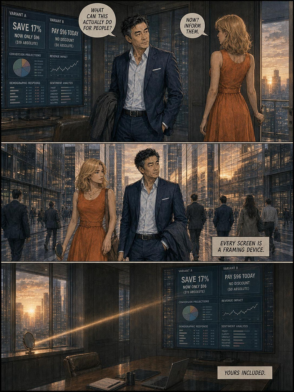
The mirror test may be the most actionable advice in this article. Here, my recurring characters Alice and Zimo take you through this idea:


Loss Frames Are the Crowbar of Dark Patterns
Because losses loom larger than gains, the loss frame is the manipulator’s favorite tool, and its abuse has been industrialized. Fake countdown timers convert a neutral purchase into an expiring loss, fear upsells (“Your files are unprotected!”) frame a routine state as an emergency, consent flows describe tracking as “a personalized experience” while framing refusal as broken functionality, and drip pricing turns each new fee into a trivial add-on guarding the money you already sank. All of it is user-hostile.
This isn’t a fringe practice. The European Commission’s 2022 behavioral study on unfair commercial practices found that a staggering 97% of the most popular websites and apps used by EU consumers deployed at least one dark pattern, most commonly hidden information and false hierarchy, preselection, nagging, difficult cancellation, and forced registration. The Commission’s 2024 Digital Fairness Fitness Check put the cost to EU consumers at a minimum of €7.9 billion a year, and a Digital Fairness Act to squash these dark design patterns is expected in Q4 2026. Regulators have stopped treating manipulative copy as a matter of taste.
So the test for legitimate loss framing is verifiability: if seats genuinely run out, saying so serves users, but a timer that resets on reload is a lie inside a frame. Keep accept and decline options symmetric in wording and visual weight, reserve urgency for provable scarcity, and test comprehension rather than conversion by asking 5 users to restate the deal in their own words and seeing whether they get it right.
AI UX: One Frame, No Rivals
Conversational AI gives users intent-based outcome specification, the first new interaction paradigm in 60 years, and I remain a fan. But look at what comes back. A search results page hands you 10 competing accounts of your question, whereas a chatbot hands you one. An AI answer is a framing monopoly: one description of the facts with no rival in sight. Everywhere else in this article, users could at least compare frames across sources or sites. In conversational AI, the comparison set has been summarized out of existence.

AI is an oracle that usually presents only one answer, giving it a framing monopoly.
Worse, the lone frame arrives beautifully dressed. Samia Kabir, David Udo-Imeh, Bonan Kou, and Tianyi Zhang of Purdue University fed 517 Stack Overflow programming questions to ChatGPT for a CHI 2024 study. Even though 52% of the answers contained incorrect information, the participants still preferred the ChatGPT answers 35% of the time, citing comprehensiveness and polished language, and overlooked the misinformation 39% of the time. This study used GPT 3.5, which is positively ancient by now. Current frontier models are far more accurate. But the finding that matters is that users swallowed a misleading frame, and smoother prose from smarter models only makes that easier. Fluency is attribute framing applied to correctness: the same wrong fact, delivered in confident, well-structured prose, reads as right.
The frame then migrates into the user’s head. In a Cornell-led CHI 2023 experiment, Maurice Jakesch, Advait Bhat, Daniel Buschek, Lior Zalmanson, and Mor Naaman asked 1,506 participants to write a short post on whether social media is good for society, giving some an AI writing assistant covertly configured to argue one side. The assistant’s slant shifted not only the essays but the opinions participants reported in a separate attitude survey afterward. The model chose a frame; the user adopted it as his or her own view without ever seeing a choice being made. AI is extremely persuasive and often abuses its generative powers to produce fact flooding that overwhelms the user’s critical faculties. The 2023 study used GPT 3.0, which had roughly the intelligence of Homo habilis next to today’s much smarter (and thus much more persuasive) models.

Fact flooding: AI can generate an overwhelming amount of content that, even if each individual fact is true, can set the frame for users in a way that becomes persuasive rather than informative.
Thus, for conversational output, the design brief is the one this article already issued for pricing pages and patient portals, only with higher stakes. Keep the source one click away from every AI summary. State model confidence in both directions, because “92% confident” and “wrong about 1 time in 12” are the same number, and only the second sends users back to check. Remember, too, that your prompt templates select the frames your model serves to every user in every session: they’re UI copy at a scale no screen ever shipped, so audit them like button labels.
Agentic AI raises the stakes again, because the user stops watching the work entirely. Anthropic’s February 2026 analysis of millions of sessions with its Claude Code programming agent found that the longest runs (99.9th percentile) nearly doubled in 3 months, from under 25 minutes to over 45. Oversight also flips as users gain experience: beginners approve actions one at a time and rarely interrupt, while veterans run full auto-approve in over 40% of sessions (vs. roughly 20% for new users) yet interrupt mid-run nearly twice as often, in 9% of turns vs. 5%. Experienced users aren’t abandoning control; they’re trading per-action inspection for monitoring the agent’s running narration and pouncing when something reads wrong. Note what that means. The narration is now the control interface: the user reviews the agent’s account of 45 minutes of invisible work, not the work. And who composes that account and decides its framing? The party being supervised.
A completion message is a self-graded report card. “Done. Updated 14 files, all tests pass” is the gain frame of a run that may also have touched three files nobody asked about and skipped the one test that mattered. Structure the report as an audit rather than a victory lap, in fixed order: what the agent did, what it verified, what it skipped or couldn’t confirm.

When an AI agent reports on its own progress, it risks presenting the results in an overly positive framing.
Two further framing traps sabotage the human half of the loop. Interrupting a long run feels like losing sunk work, and you know what loss frames do: users let a dubious run continue for the same reason 78% of Tversky and Kahneman’s respondents gambled in the loss frame. Label the stop control “pause, keep everything so far,” and pulling the cord becomes protecting work instead of destroying it. When every permission prompt looks identical, the interface frames dropping a production table and reading a README as equally risky, so users respond as they do to cookie banners: reflexive approval. Reserve the alarming frame for the irreversible action, exactly as the destructive-action advice above prescribes.
Conversational AI puts one frame in front of the user. Agentic AI goes further: the user supervises the frame, not the work. Build that frame with the care you’d give a cockpit display, because that’s what it now is.
12 Design Guidelines for the Framing Effect
Pair percentages with absolute numbers, because a frame is hardest to abuse when the raw quantity sits beside it.
Dual-frame high-stakes information. State both “90% survive” and “10% do not” for medical, financial, and privacy decisions.
Prefer natural frequencies (“1 in 5”) over probabilities for risk communication, since Gigerenzer’s doctors went from 21% correct to 87% on that change alone.
Keep accept and decline symmetric in tone, size, and color. Asymmetry is a frame with a thumb on the scale.
Reserve loss framing for verifiable risks. Invented urgency is fraud, and users have learned to smell it.
Frame error messages as the next action, since a path forward outperforms a verdict.
Use the loss frame where the loss is real. Destructive-action dialogs should name exactly what disappears and state that it can’t be recovered.
Open progress indicators above zero only when the progress was earned. Real head starts motivate; fake ones are a lie in a progress bar.
Report metrics in both frames internally: uptime percentage and downtime hours, retention and churn. Pay down your frame debt before an outage does it for you.
Express AI confidence as a two-sided frequency, not a one-sided percentage.
Audit prompt templates on the same schedule as UI copy, and rerun each one mirrored to see whether the model’s answer survives the reflection.
Test comprehension, not just conversion. If 5 users restate the offer and 2 get it wrong, the frame is misleading no matter how well it converts.
Conclusion: There Are No Unframed Facts
Every description of every option selects some facts and shades the rest, which means that neutrality is unavailable and responsibility is unavoidable. There is no view without a frame, so choose the frame that informs. The Norse skalds worked this out long before anyone ran an experiment on it, since a raid becomes tribute the moment you control the telling. They just called it poetry.

Were the Vikings raiders, or did they simply collect tribute? A matter of framing.
Designers who accept this pick wordings that survive being mirrored, and their users make decisions that survive hindsight. Designers who exploit it get the opposite: choices that feel wrong a week later, with the user’s distrust aimed squarely at the frame-maker. So run the mirror test on your three most consequential screens this week. If a wording won’t survive its own reflection, it was never a description. It was a nudge with the label filed off. Which frame in your product failed worst? Tell me in the comments.

There is no view without a frame, so design the framing for usability and honest communication. (All images in this article made with GPT Image 2, except as indicated.)
Comic Book Summary
If this was too much reading, Alice and Zimo give you a comic book summary in Seinen Urban Realism style (GPT Image 2):


