
Thumbnails Give a Fast Overview

Summary: Thumbnails are miniature previews that let users choose by looking instead of reading. They exploit the staggering speed of human scene perception, but fail as twins (neighbors that look identical) or as lies (previews that misrepresent what’s behind the click). Two rules follow: differ from your neighbors; resemble your destination. Every thumbnail is a promise about the click.

16 promises at a glance. The grid works only if users can tell the promises apart, and only if the other side of the click keeps them. (Kimi K3)
Definition: A thumbnail is a small image that represents a larger item (a photo, video, document, or product) and typically serves as a link to it. A thumbnail grid presents many such previews for parallel visual scanning, and since users see the grid before any single picture, the grid is the true unit of design. Thumbnails are also the pictorial half of the card pattern I dissected recently: the picture attracts and predicts, while the caption names and disambiguates. Each needs the other.

The picture attracts, the caption disambiguates: a package deal. (GPT Image 2)
From Grease Pencil to Neural Network: A Short History
The name comes from the artist’s “thumbnail sketch,” a 19th-century term for a drawing small enough to fit on a thumbnail. Photographers institutionalized the idea with the contact sheet (standard practice from the 1930s): an entire roll of film printed tiny, examined with a loupe, keepers circled in grease pencil. The contact sheet embodied the core insight that still powers every thumbnail grid: triage many, examine few.

A thumbnail is metaphorically (but not literally) an image small enough to fit on the nail of a thumb. (GPT Image 2)

The thumbnail’s ancestor: a contact sheet, which gave the photographer an overview of a full roll of film on a single page. (GPT Image 2)
Why did the early Web embrace tiny previews? Bandwidth. In the mid-1990s, a full-sized JPEG took half a minute over a 28.8 kbps modem, so galleries showed penny-sized previews and let users spend their download budget like misers. The thumbnail was a cost-control device, and those were the days when I campaigned hard for small images to deliver the fast response times necessary for navigation usability. (30 years later, bandwidth is about 4,000 times greater, I use large images freely, and thumbnails are as useful as ever. A design pattern that outlives the constraint that created it has found a better reason to exist; here, the human visual system.)

Full-sized images used to take an eternity to download, meaning that they impeded navigation freedom. (GPT Image 2)
Then the previews became products in their own right. Google launched Image Search in July 2001 after Jennifer Lopez’s green Versace dress from the 2000 Grammys generated the biggest search query Google had ever seen. Ten blue text links couldn’t deliver what those users wanted: the picture. Suddenly a screenful of thumbnails was the search result. YouTube (2005) then completed the arc by turning the thumbnail into a marketing surface, with all the honesty problems that implies.
And in 2016, Netflix quantified the stakes: artwork constitutes 82% of a member’s focus while browsing. Average consideration per title: 1.8 seconds. The contact sheet never had a conversion rate. Today’s thumbnails do, and entire teams are paid to move it.
Why Thumbnails Work: Vision Is Absurdly Fast
Mary Potter’s lab at MIT reported in 2014 that people can detect the gist of a photograph shown for only 13 milliseconds in rapid sequences of 6–12 images. (Methodology caveat: a 2016 replication attempt by John Maguire and Piers Howe of the University of Melbourne, using stronger visual masking, found no gist detection below 53 ms, so treat the 13 ms figure with a raised eyebrow. The safe conclusion survives: scene gist arrives within about a tenth of a second, which by my arithmetic makes the picture at least 10 times faster than reading a 5-word title.)

The human visual system grasps the gist of a picture in about a tenth of a second. (Kimi K3)
That speed is the thumbnail’s entire business model. 4 payoffs follow:
• Recognition beats recall, as I’ve preached since publishing my 10 usability heuristics in 1994. Re-finding “that beach photo from the Sicily trip” by sight is effortless; re-finding it in a list of filenames like IMG_4021.jpg is archaeology. Picture memory is also weirdly durable. In Lionel Standing’s classic “Learning 10,000 Pictures” experiment (1973), people viewed 10,000 photos for 5 seconds each, and later recognition tests implied roughly 6,600 pictures retained. Nobody remembers 6,600 filenames.
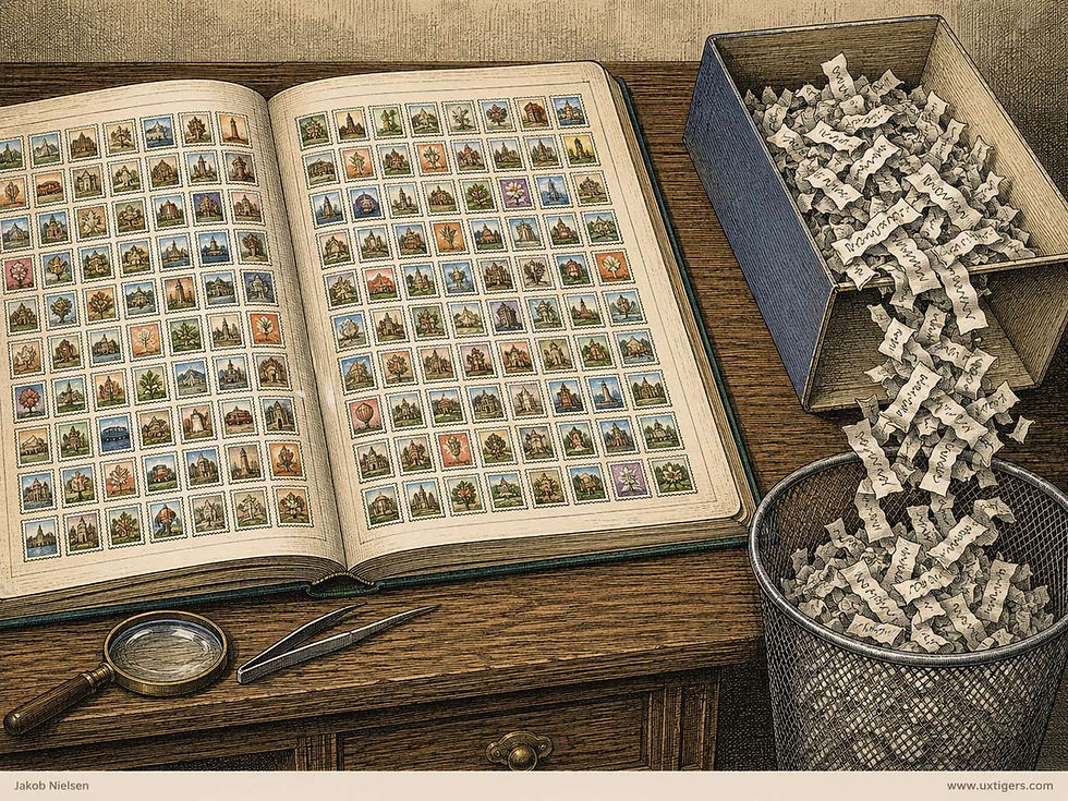
Image recognition is superior. (GPT Image 2)
• Information scent turns visual. Information foraging theory says users follow whatever cues best predict where the good stuff is. A good preview is concentrated scent: users click right the first time instead of boomerang browsing (click, wrong, back, repeat).

Good scent is a paved path; weak scent is a round trip. (GPT Image 2)
Density without crowding. A grid presents dozens of candidates per screenful, and parallel visual scanning absorbs that load in a way 40 lines of text never could. A text list packs more rows per screen, so the win is processing mode rather than item count: the eye sweeps a grid but must traverse a list.

The eye can skate through a grid of thumbnails faster than it can process long scrolling text. (GPT Image 2)
Comparison of visual attributes. Choosing a hotel room, a fabric, or a haircut is a visual decision, and thumbnails let users compare the actual attribute instead of adjectives about it. Users lean on this harder than most designers assume: Baymard Institute found that 42% of e-commerce users attempt to gauge a product’s physical size from the images alone. That goes badly when every product floats in white limbo at an identical rendered size. (A wristwatch and a grandfather clock make convincing twins at 200 pixels.)
Field Notes from the Thumbnail-Industrial Complex
The companies with the best behavioral data have converged on the same conclusion: the little picture is the big lever. Their findings are worth stealing.
Netflix reported that members decide within about 90 seconds or abandon the session, which prices each 1.8-second glance rather steeply. Its artwork research found that faces with complex, expressive emotions outperform neutral ones, that villains outperform heroes in kids and action titles, and that images containing more than 3 people depress engagement. (No mystery in that last finding: divide a thumbnail among 4 faces, and no face keeps enough pixels to carry an expression. The same article also repeats the 13 ms gist claim as settled fact; marketing departments rarely commission replication studies.)
To feed its testing machine, Netflix built AVA, a system that sifts candidate frames automatically and scores brightness, blur, face sentiment, shot composition, and actor prominence. Why automate? A 10-episode season contains some 9 million frames, and no human art director is paid by the frame.

9 million frames per Netflix season go in; a handful of candidates come out. (GPT Image 2)
YouTube states that 90% of the best-performing videos have custom thumbnails rather than auto-grabbed frames. At the top of the food chain, MrBeast’s operation reportedly spends about $10,000 per thumbnail and iterates through some 20 variants per video. The team tests details as fine as facial expression: closed-mouth beat open-mouth across 30 consecutive videos. And the stated philosophy from his thumbnail lead: “Trust is what makes people come back and click on your videos.” When the world’s most aggressive thumbnail shop preaches honesty, the sermon comes straight from the retention data.
Commerce shows the revenue line directly. DoorDash’s merchant data claims menus with item photos saw up to 44% higher monthly sales (vendor-reported numbers, so season to taste, but the direction matches everything else we know). More rigorously, Shunyuan Zhang and co-authors analyzed 7,423 Airbnb properties over 16 months in Management Science. Units with professionally shot, verified photos earned 9.0% higher occupancy than host-photographed ones. Same rooms, better previews, more bookings. Thumbnails don’t decorate the funnel; they work its front door.

Pictures of food attract more customers than text-only menus. (GPT Image 2)
One more transferable finding: faces are gaze magnets. Eye-tracking work by Moran Cerf and colleagues at Caltech showed that viewers fixate on faces regardless of the task they were given. A face in a thumbnail buys attention. Whether it buys the right attention depends on the face having something to do with the content. Which brings us to the failure modes.
Where Thumbnails Fail: Twins, Lies, and Postage Stamps
Each failure below breaks one of the two rules: a thumbnail that doesn’t differ from its neighbors can’t be chosen, and one that doesn’t resemble its destination shouldn’t be. Behind the first rule lies a perceptual asymmetry: gist survives shrinking; detail doesn’t. Antonio Torralba at MIT found that people name the category of a color scene at a mere 32×32 pixels with 82% accuracy, which is why thumbnails work at all. But category is what 20 beach photos share, and the detail that separates them is the first casualty of the shrink.
Postage-stamp syndrome. Shrink a 12-person group photo to 60 pixels and you get confetti. The arithmetic is unforgiving: a YouTube thumbnail authored at 1280×720 renders at 168 pixels wide in the suggested-videos sidebar, an 87% linear reduction. Text set in 60-pixel type arrives as 8-pixel type, and your headline becomes a smudge. If the differentiating detail isn’t visible at rendered size, the thumbnail communicates nothing. So the right thumbnail size is set by the smallest detail that separates the items, not by how many fit on a screen.

Shrink past the differentiating detail, and a thumbnail becomes so much confetti. (GPT Image 2)
Thumbnail twins. A grid where every item renders nearly identically: 20 PDFs all showing a white first page with an unreadable title, 20 tutorial videos all showing the same talking head, 20 skincare products that are all white bottles on white backgrounds. When all previews look alike, the grid adds load time and 0 information, because a thumbnail informs only by differing from its neighbors, and twins don’t differ. Rigid brand templates manufacture twins deliberately: if every episode cover carries the same host photo and logo lockup, the packaging has eaten the signal. The fix is to crop each item around what distinguishes it, or fall back to text.
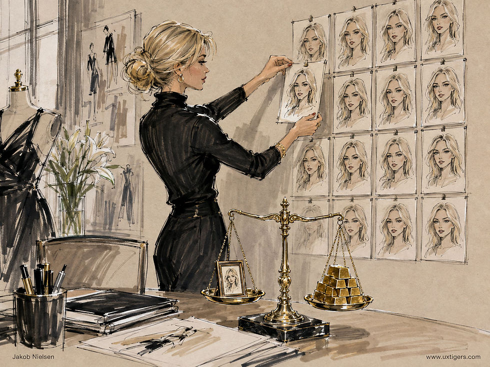
When thumbnails are too similar, they stop being useful. (GPT Image 2.5)
The lying thumbnail. YouTube proved that shocked faces and red arrows lift click-through rates, and simultaneously proved the cost: scent that lies produces instant back-button clicks and, over time, a trust discount on everything you show. Thumbnail inflation works like monetary inflation: each exaggerated preview buys its click by devaluing the currency in which all your future previews are priced.

Thumbnail inflation: a YouTube disease. I usually avoid those “astonished face” thumbnails, but the few times I succumbed, I must admit they get clicks. (GPT Image 2)
Worse, attention within a grid is zero-sum: a shocked face steals clicks only from its neighbors, so once every creator wears one, the advantages cancel and only the trust discount remains. A Red Queen race, where everyone runs faster to stay in place. (Credit where due: YouTube also demonstrated at planetary scale that a good preview beats a good title. The lesson generalizes; the clickbait needn’t.)
Dumb automatic cropping. Center-cropping beheads portraits and amputates products, because the subject of a photograph is rarely its geometric center. In 2021, Twitter removed automatic cropping altogether, concluding that “how to crop an image is a decision best made by people.” Remember that verdict. It returns when we hand AI the whole canvas, not just the scissors.
Layout shift. Thumbnails that pop in late shove the grid around, so users tap item 7 and get item 9, a bait-and-switch staged by the layout itself. Reserve the space before the pixels arrive.

Clicking thumbnails shouldn’t feel like Whack-a-Mole. Keep them steady and easy to hit. (GPT Image 2)
Image-only navigation. A thumbnail without a text label fails twice: partially for sighted users when items look similar, and totally for screen-reader users when the alt text says “thumbnail.”
Users pay for each of these failures the same way: with the scent-failure loop, in which they click the wrong thumbnail, back out, and click the next wrong one. Or, worse from the company’s perspective, they stop clicking and leave.
When the Machine Draws the Miniature
Thumbnails used to be made one at a time by a person with opinions. Now much of the making is delegated to AI, which enters the workshop through three doors:

AI selection is the most mature door and the least controversial. Sifting 9 million frames down to 30 candidates is the donkey work machines should do, and AVA-style triage gives human curators a fighting chance. But saliency models find what’s visually loud, not what’s representative, and they inherit the biases of their training data, as Twitter’s cropper demonstrated. Selection systems need the same fairness audits we now expect of any classifier, plus a human veto for flagship content.
AI optimization is where the metric decides the morality. Netflix personalizes artwork per viewer with bandit algorithms, and in 2018, users noticed the dark side. Black viewers reported being pitched Like Father (a comedy starring Kristen Bell and Kelsey Grammer) through cover art foregrounding 2 Black supporting actors with about 10 minutes of screen time. Netflix answered that it never collects race and personalizes only on viewing history.
Presumably true, and beside the point: a thumbnail that misrepresents the work is a lying thumbnail, even when a well-meaning algorithm tells the lie. Personalized scent must still be honest scent, for every audience segment the optimizer discovers on its own. (Netflix publishes more rigorous thumbnail research than anybody, which is partly why its stumbles are so instructive.)
Personalization also corrodes the other great thumbnail virtue: recognition. Thumbnails serve two tasks with opposite needs. Discovery wants the most predictive image; re-finding wants the same image as last time. Personalization serves the first by sabotaging the second: if the cover of a show shape-shifts between sessions as the optimizer explores, users lose the stable visual anchor they use to re-find items. “It had a red cover last Tuesday” stops working, and your library starts behaving like a bookshelf rearranged nightly by an overeager butler.
Now the good news, and it comes from an unexpected quarter. YouTube’s built-in A/B testing for thumbnails picks winners by watch-time share, not click-through rate. The company’s stated reason deserves framing: thumbnails “help a viewer understand what the video is about so that they don’t waste their time clicking on the wrong videos.” That is information scent, operationalized as a business metric. The platform that invented industrial clickbait now ships an optimizer whose loss function punishes it. Less paradoxical than it sounds: a creator sees only the clicks a shocked face steals from the neighbors, while the platform sees the whole arms race, in sessions cut short and trust spent. Whoever holds the aggregate ledger eventually prices honesty correctly. Progress happens.
AI synthesis is the newest door and the one that rewrites the most guidelines. YouTube added generative thumbnail creation to its Ask Studio assistant in July 2026, a dozen standalone tools sell the same trick, and product teams everywhere are tempted to generate hero images for items that never had photography budgets.
Much of this is a gift to usability. The long tail of content (the church newsletter, the 40,000-SKU parts catalog, the video uploaded by someone who’s never heard of CTR) always defaulted to twins: gray placeholders and auto-grabbed mid-blink frames. Cheap synthesis can give every item a distinct, competent preview. It can even deliver the per-item art direction that guideline 1 below demands but no staffing plan ever funded.
But synthesis introduces a failure mode selection never had: synthetic scent, a preview of content that doesn’t exist. A generated thumbnail can depict the explosion that isn’t in the video, the hotel balcony that isn’t on the booking, the 5 pockets the jacket doesn’t have. With selection, the worst case is an unflattering truth. With synthesis, the worst case is a handsome fiction. The model commits it without malice, so nobody in the workflow feels like a liar, yet the contract breaks anyway. Users don’t score intentions; they score the gap between the promise and the click.

Synthetic scent: the thumbnail promised an action movie with explosions; the content didn’t have any. (GPT Image 2)
Synthesis also fails at its own craft with the smooth, overlit sameness that audiences have learned to spot. That sameness carries a price beyond aesthetics, because AI Stigma means users discount content that advertises its machine origin. Once users learn the visual signature of content that wastes their time, they route their eyes around it: slop blindness is banner blindness with a fresh coat of paint, applied by the victims themselves.

Slop blindness: users learn the visual signature of wasted time and filter it out. (GPT Image 2)
Platforms have noticed. YouTube now excludes mass-produced “AI slop” from monetization, and Gizmodo’s coverage puts low-effort AI output at roughly 20% of the videos served to new users. In news contexts, the stakes climb from annoyance to credibility. Focus groups run by Edina Strikovic and Hannes Cools of the University of Amsterdam found that participants accepted AI-generated charts and illustrations but rejected photorealistic AI imagery for politics and conflict coverage.
Note what users object to in all these cases: the forgery, never the paintbrush. A synthetic image faithfully derived from the actual content offends nobody, and misrepresentation offended long before machines learned to draw, back when humans Photoshopped the shocked face.
There’s a fourth door, and it swings the other way: AI as the viewer. Shopping and research agents now browse on users’ behalf, and current agents mostly read your markup, not your pixels. The framework for agent-ready websites by Said Elnaffar and Farzad Rashidi makes the general case, and the thumbnail-specific corollary is blunt: for an AI agent, the alt text is the thumbnail. The $10,000 emotional masterpiece is invisible to a buyer that parses the DOM; the product’s fate rides on the metadata you attached with 0 art direction. Sites that spent a decade polishing pixels while filling every alt attribute with “image123” have their priorities backwards for this audience.
History has come full circle: the agent reads your page the way a 1995 modem user did, text first and pictures optional. The attention arms race ends at this door, because an agent can’t be seduced, only misinformed. Only the second rule survives: resemble your destination.
14 Design Guidelines for Thumbnails
Guidelines 1–8 apply to every thumbnail no matter who or what produced it; 9–14 address production lines where AI does the selecting, testing, or painting.
1. Crop each thumbnail around the differentiating detail, not the center. For your most important content, that means human art direction, item by item.
2. Apply the arm’s-length test: if you can’t tell 2 neighboring thumbnails apart within 1 second at arm’s length from the actual device, they’re too small or too similar. Run the test on the real grid, in the company the thumbnails will keep. (My rule of thumb, appropriately enough.)

The arm’s-length test: 2 neighboring thumbnails, 1 second, no excuses. (GPT Image 2)
3. Attach a short text label unless the images alone are unmistakably distinct. Labels also rescue users searching for something they’ve never seen.
4. Keep frames and aspect ratios uniform so the content varies while the packaging stays constant. Variation should carry information.
5. Show honest previews. The thumbnail is a contract with the click, and every breach gets billed to your credibility.
6. Reserve fixed space for every image and lazy-load below the fold, so the grid never reflows under the user’s finger.
7. Write alt text that names the item (“Hotel room with balcony and sea view”), never the format (“photo,” “thumbnail”). In the agent era, this doubles as your machine-facing thumbnail, so treat it as sales copy, not compliance filler.
8. Judge thumbnails at real size on a real phone. They get designed on 27-inch monitors and consumed on 6-inch screens; evaluate them where they’ll live. If the design carries overlay text, 3 words is my recommended maximum, sized to survive an 87% shrink.

Designed on 27 inches, consumed on 6: judge it where it lives. (GPT Image 2)
9. Let AI nominate, let humans ratify. Machine triage of millions of frames is pure gain; machine final cut is not. Scale the human veto to the traffic: your top 100 items deserve eyes, while the long tail can run on autopilot with spot checks.
10. Generate only from the truth. A synthesized thumbnail must be derived from the actual content: real frames, real product photography, real page layouts. Generative backgrounds and cleanup are fine. Depicting objects, people, or outcomes absent from the content is synthetic scent, and it converts your image pipeline into a clickbait factory that nobody consciously operates.
11. Keep each item’s visual identity stable. Personalize or A/B test while an item is still being discovered, then freeze the anchor. Once users have watched, bought, or saved something, its thumbnail is a landmark for re-finding. And landmarks don’t relocate nightly.
12. Optimize for post-click success, not clicks. Follow YouTube’s lead: reward the variant that produces watch time, completed tasks, or kept purchases, and let CTR-only winners lose. Clicks are zero-sum across a grid; satisfied users aren’t. Any optimizer pointed at clicks alone will rediscover lying on its own schedule.
13. Audit automated crops and personalization for demographic skew. Twitter measured its cropper only after users forced the issue. So measure yours first: test crops on diverse faces, and check what your personalizer shows to the segments it invented.
14. Give the machine your style, not just your prompt. Generic generation produces the house style of the model, which is everybody’s house style, which is twins at ecosystem scale. Feed brand palettes, real assets, and composition rules so that distinctiveness survives automation. If your thumbnails could be anyone’s, they’re no one’s.
Conclusion: Small Pictures, Big Contracts
Human vision hands designers a gift: the gist of a picture, delivered in a tenth of a second, free of charge. Thumbnails spend that gift well when each little frame differs from its neighbors and resembles its destination, and they squander it when the grid is a wall of twins or a row of small lies. AI raises the stakes at both ends. It can give every item in a million-item catalog its own well-cropped, legible preview. It can just as cheaply mass-produce handsome fictions and let an optimizer discover that fictions get clicked. The technology changed; the contract didn’t. Every thumbnail is a promise. Keep it, and users glide through your collection; break it, and the back button keeps the score.

When the preview matches the destination, your thumbnail has kept its promise. (GPT Image 2)
And now the back button has help, because the next visitor may be an agent that never sees your gorgeous forgery, only your alt text.
So audit your grid this week: stand at arm’s length, hunt for twins, and read the alt text aloud. Then ask of each little picture the only question that matters: is this a promise we can keep?

The thumbnail menu gets users dinner before the text-only menu. (GPT Image 2)


