UX Roundup: CAPTCHA | Undo | Robotaxi Safety | Better Usability for Educational AI | Scrolljacking | Floating Action Button | Long Forms | Secondary vs. Primary Features | Picture Superiority

Summary: Too easy to fail CAPTCHA verification | Rethinking undo for the AI age | Waymo gets 25% safer every year, a crawl for AI but a sprint for cars | Students disliked the AI tutoring style that’s likely best for learning | Scrolling belongs to the user | A floating action button should promote one hero action | Excess form fields are a usability curse | Great secondary features don’t compensate for bad essential features | People remember images better than text | A default checkmark isn’t true user consent | Advanced AI hasn’t caused more cybercrime
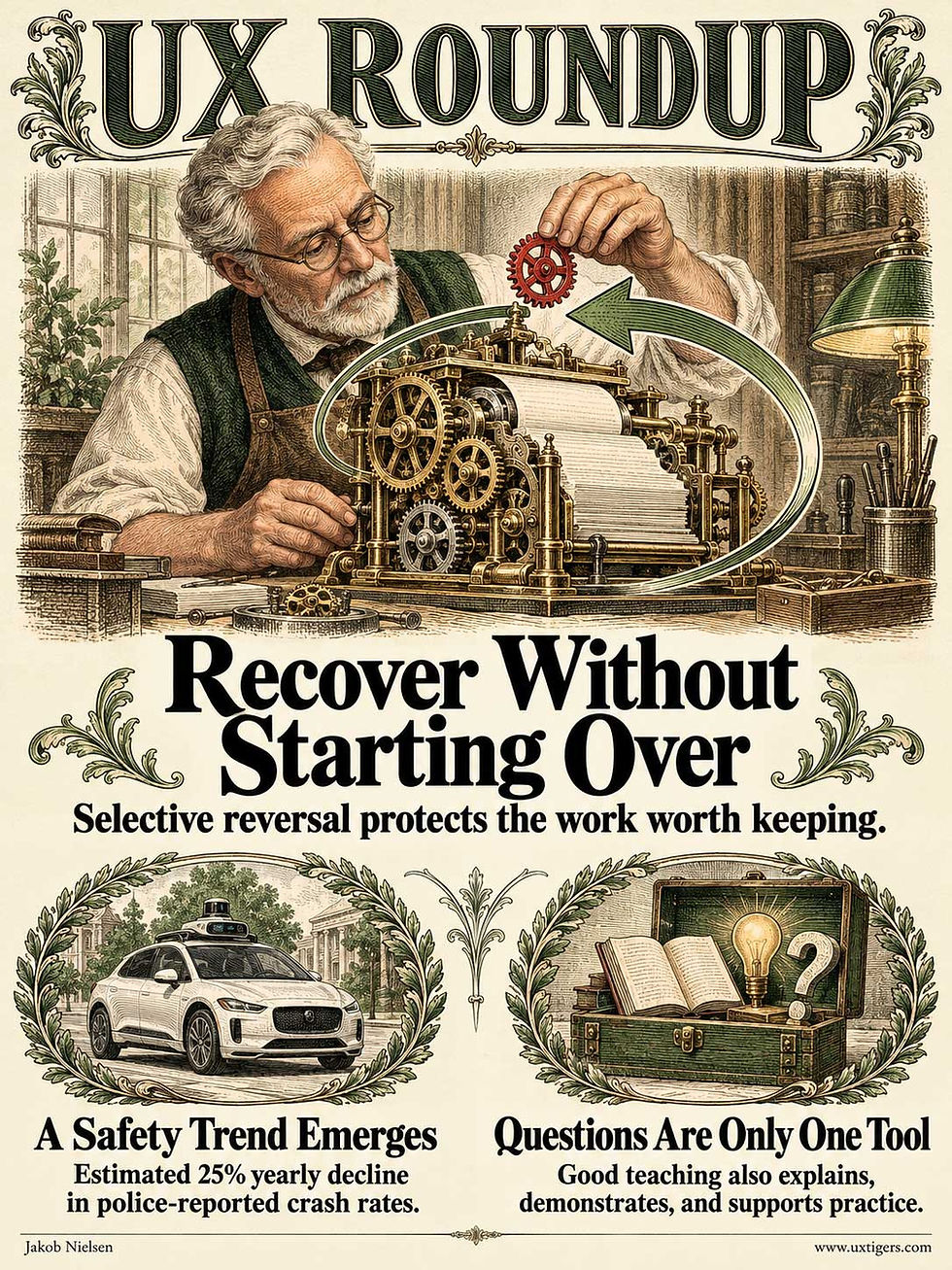
UX Roundup for October 12, 2026 (GPT Image 2.5)
Failed Verification Doesn’t Prove Bad Intent
A verification challenge can reject a legitimate visitor simply because the interface demands an ability or resource that the visitor lacks. Our alien has crossed interstellar space, only to be stopped by the final obstacle to first contact: a website with a narrow definition of acceptable company.
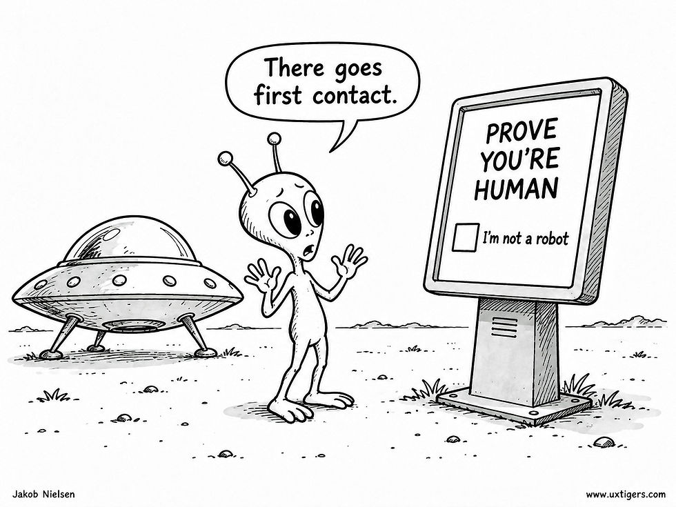
First contact failed the identity check. (GPT Image 2)
Back on Earth, the same mistake shuts out customers who can’t decipher a smeared image, make out garbled audio, or reach the device that a particular verification method requires. Their failure establishes only that this route didn’t work. Treating it as evidence of abusive intent turns an imperfect test into an exclusion machine.
In my discussion of CAPTCHA and legitimate users, I describe how these puzzles can obstruct customers and create accessibility barriers. The cost lands on people who are simply trying to get something done. Any honest tally of a protection mechanism’s value must subtract the customers it accidentally turns away.
Measure successful access by legitimate users. Test the verification flow with 5 representative customers, and watch how they recover after a failed attempt. Offer a workable alternative and preserve completed form fields. Count abandonment alongside blocked abuse. Otherwise, your proud security report may be celebrating the departure of your next customer.
Undo Needs AI, and AI Needs Better Undo

Undo is the safety net that lets users explore a UI boldly, including daring leaps that would be reckless without it. Unfortunately, traditional undo was built for command-based UIs, and our new AI interactions can fall straight through it. (GPT Image 2.5)
Undo is the best emergency exit ever built, but users misjudge where it leads. Carnegie Mellon graduate student Libby Divers and colleagues found that stranded users redo work by hand rather than hunt for the right command. One Excel user retyped everything when Ctrl+Y, Excel’s redo shortcut, did nothing in another app. Another expected the Back button to restore a half-filled form. (It should, but don’t count on it.)
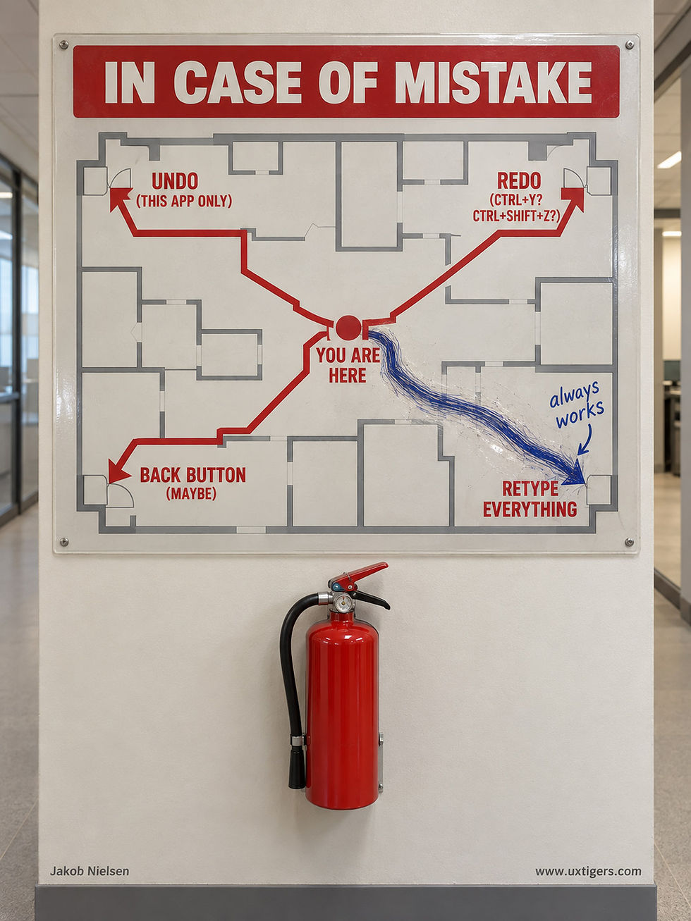
Undo should be the user’s lifeline out of any mistake. Unfortunately, the escape routes differ from app to app, so users often take the slowest exit of all. (GPT Image 2.5)

The Back button frequently returns to a previous page in its pristine initial state, wiping out all the user’s work on that page. Bad undo implementation! (GPT Image 2.5)
When undo worked, people hammered it, skipping past intermediate states, until things looked right. It doubled as a safety net and a comparison tool, used “for a feeling rather than a specific error.” (A pilot with “several people” isn’t a thorough study, but it rings true.)

People keep pressing undo until the screen looks the way they want. A lifeline this simple invites fearless trial and error. (GPT Image 2.5)
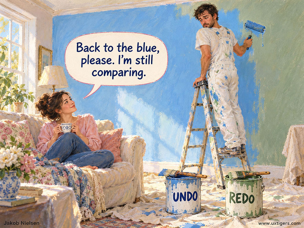
Undo and redo are so simple that users flip between them to compare versions, the way you’d hold two paint swatches against the wall. (GPT Image 2.5)
AI widens the gap between intent and undo. Accept an AI rewrite with 4 changes, and one Ctrl+Z discards all 4, including the two you liked. With an agent editing alongside you, “undo last” may reverse its work instead of yours. Groupware researchers Atul Prakash and Michael Knister solved this in 1994 with per-user undo: treat the AI as another user.
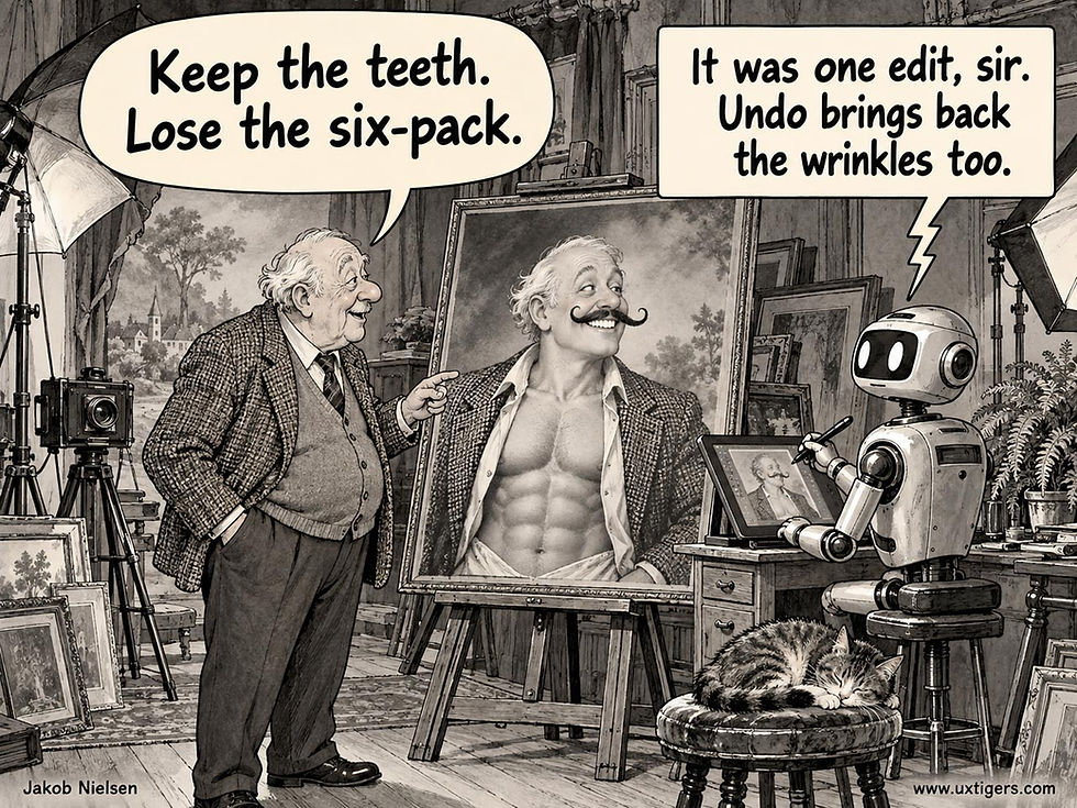
Simplistic undo swings a sledgehammer where AI interactions need a scalpel. Undo must become selective, reversing just the change you regret instead of every change made in one step. (GPT Image 2.5)
But AI can also close the gap. Users could name the destination (“before I reformatted the tables”) and preview the side effects. AI could spot distress, such as frantic mouse-waving after Send, and offer the right undo. I’d also have AI label undo history the way users remember it, not as 40 entries called “Typing.”
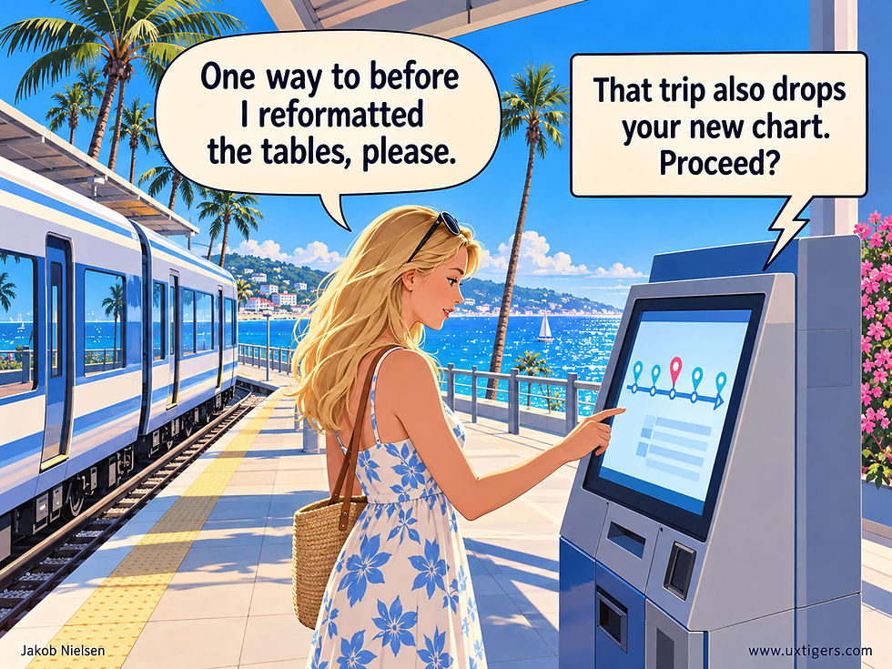
Intent-aware undo will work like buying a ticket to the state you want. Like any good travel agent, a smart system should disclose the trip’s hidden costs, such as side effects on later work. (GPT Image 2.5)

Undo histories list dozens of identical entries. AI should use its semantic understanding of user actions to label states the way users remember them. (GPT Image 2.5)
Days-long agent runs need undo most. Nobody will audit 4,000 steps, and agents misjudge their own impact: in a study by Zhuohao Jerry Zhang and co-authors at Apple, the best 2024-era model matched humans’ impact ratings for phone UI actions only 58% of the time. So checkpoint long runs at milestates: well-defined states described in the user’s terms (“Tuesday: 12 suppliers shortlisted, nothing ordered”). Put one before every irreversible step, and ask before crossing.
Rollback must say what it can’t restore, since the outside world has no undo stack: once the recipient has read your email, nothing can unsend it. Keep the abandoned timeline, too, because users undo (often followed by redo) to compare versions.

Even the best undo implementation can’t reverse every action, so warn users before irreversible steps. Crossing the Rubicon worked out well for Julius Caesar until the Ides of March, 44 BC. (GPT Image 2.5)
Undo was built to reverse commands. In AI’s intent-based paradigm, the exit must lead to outcomes users recognize.
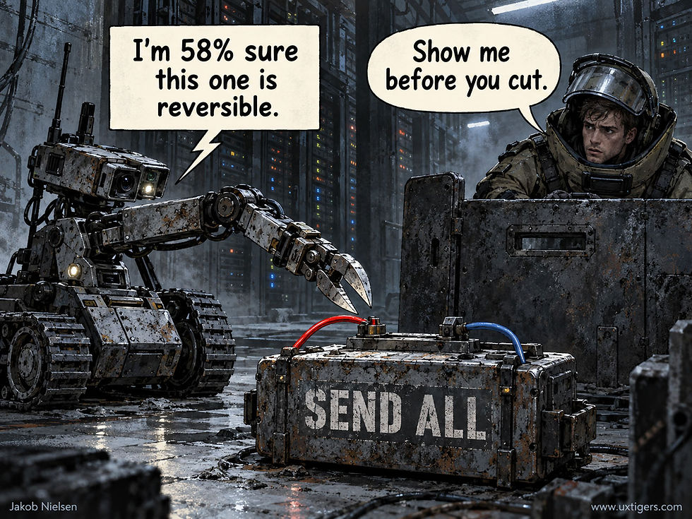
AI’s judgment of an action’s impact still matches human judgment only 58% of the time, so safety comes first. AI labs should prioritize this down-to-earth form of alignment, because AI usability depends on it. (GPT Image 2.5)
Waymo’s Crash Rate Falls 25% per Year: Slow for AI, Fast for Cars
An independent analysis of Waymo’s own data finds that its police-reported crash rate has dropped by an estimated 25% per year since mid-2024: a crawl by AI standards and a sprint by road-safety standards. If every car in America drove like a Waymo does today, roughly 30,000 fewer people would die on US roads each year (1.1 million worldwide). Another decade of the current trend would cut US traffic deaths to about 100. And the headline would still read “AI Kills 100.”
Halving Every 2.4 Years
Waymo publishes its crash counts and driverless mileage every quarter on its Safety Impact hub, letting Elan Bechor fit a trend to them: a Poisson regression with city fixed effects, a shared trend in log rates, and mileage as the offset. The data cover 24 city-quarters in Phoenix, San Francisco, and Los Angeles from July 2024 through June 2026, with 276 Waymo vehicles in police-reported crashes over 204.9 million driverless miles. The estimated decline is 25.3% per year, with a 95% confidence interval from 6.8% to 40.1% and p = 0.0097.
Bechor flags the main weakness himself: the trend is a statistical association, which doesn’t prove for sure that better software caused it. The fitted rate fell from roughly 1.8 to roughly 1.0 police-reported crashes per million miles, while human drivers in the same cities sit at about 5. In two years, Waymo went from 2.8 times safer than the humans around it to nearly 5 times safer. People who don’t work for Waymo have confirmed the level, if not yet the trend: the Insurance Institute for Highway Safety (IIHS) found 68% fewer police-reportable crashes over 50 million Waymo miles.
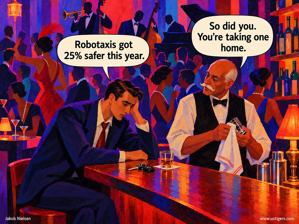
Autonomous cars are safer than average human drivers and far safer than people who shouldn’t be driving tonight. They will also serve people who can’t drive at all: children gain independent mobility, and people too old or disabled to drive safely regain it. (GPT Image 2.5)
Everybody Else: Claims Without Curves
No other robotaxi operator, American or Chinese, publishes a time series. Here’s what exists:
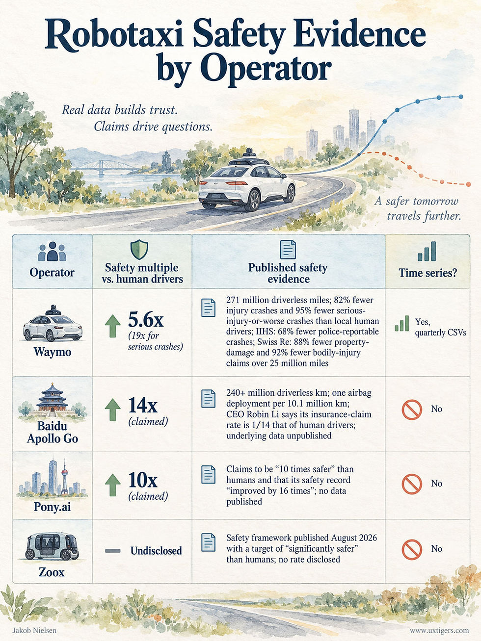
Multiples are 1 ÷ (1 − reduction). Waymo’s is measured on injury crashes; Baidu’s and Pony.ai’s are company claims with no published data behind them. Tesla’s Cybercab started autonomous operations in Texas a few weeks ago. Safety data from this deployment aren’t available yet, but the press would pounce on any accident, so the silence suggests that the Cybercab is very safe, too. (GPT Image 2.5)
The IIHS explains why the table is so thin: federal rules require companies to report crashes but not miles, and without miles there is no rate. Pony.ai’s “improved by 16 times” doesn’t say since when or by what measure. A trend needs two numbers and two dates; that claim has neither. Verdict: Waymo is the only operator whose safety claims can be checked, so it’s the only one whose improvement can be measured. A safety record that can’t be plotted over time is a slogan.
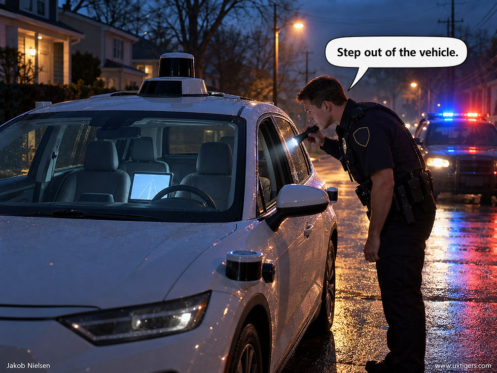
Safety reporting for self-driving cars isn’t standardized, even within the United States, let alone internationally, which makes comparisons treacherous. (GPT Image 2.5)
Why Only 25%? Atomspeed
METR’s time-horizon metric for AI coding agents has doubled every 4.3 months since 2023, and AI’s ability to do accounting has advanced at about the same rate, with errors cut in half (meaning that error-avoidance doubled) every 5 months. Compounded over the same two years, AI capability grew roughly 48-fold; Waymo’s crash rate improved 1.8-fold.
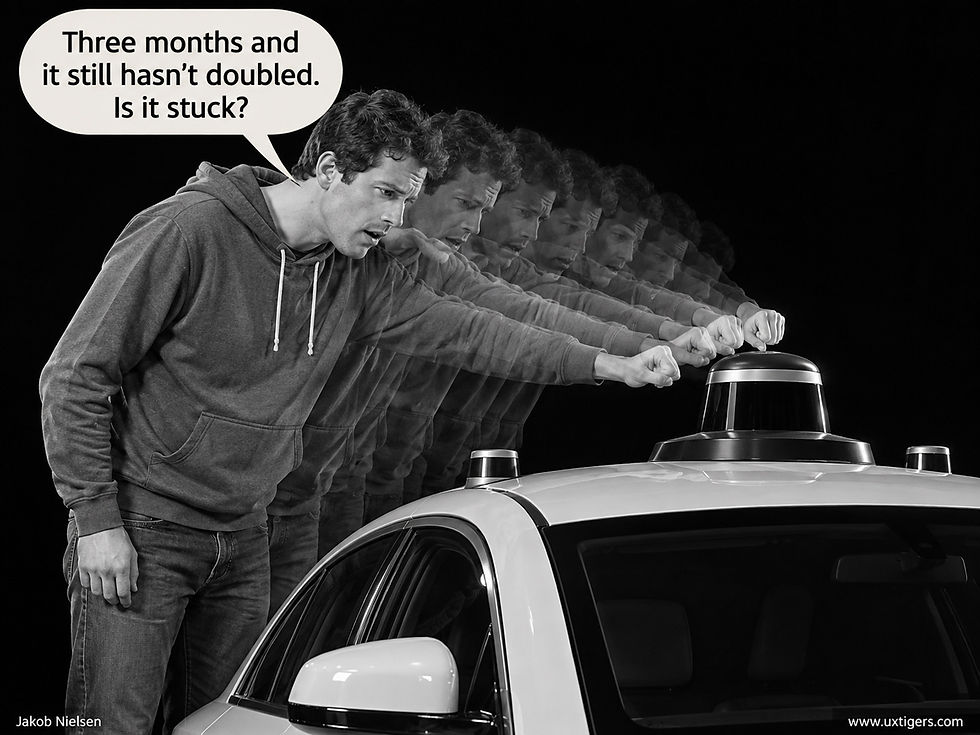
Relative to other AI advances, autonomous cars improve slowly. But steadily. (GPT Image 2.5)
Bits move at bitspeed, and cars move at atomspeed. I see 4 reasons for the gap.
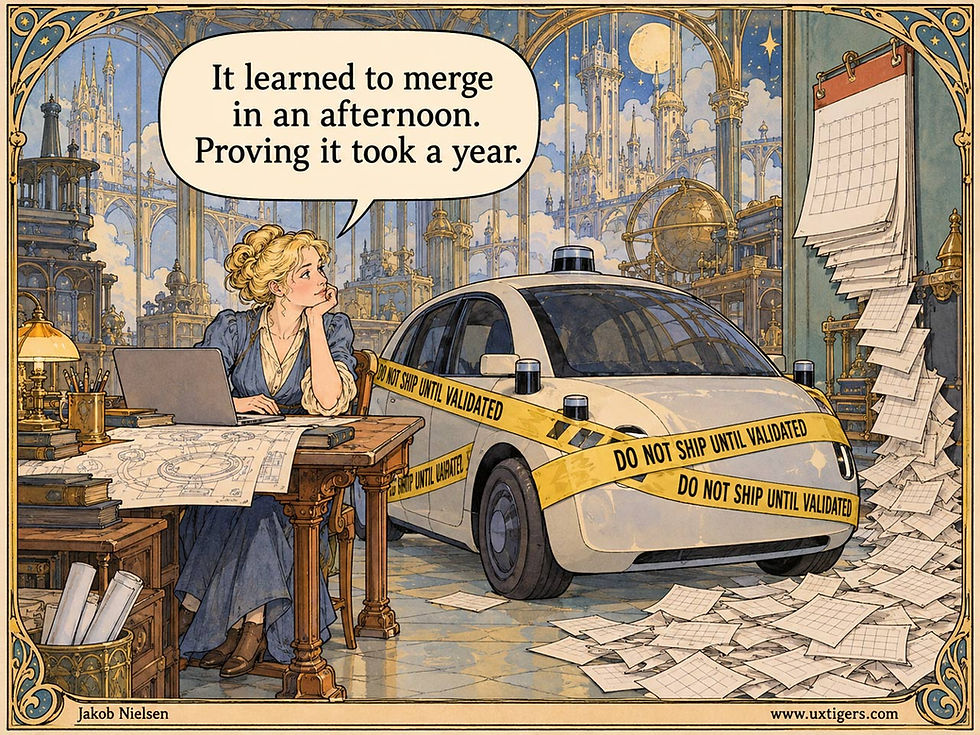
Atomspeed is slower than bitspeed: even though software updates can happen fast, it’ll take forever to collect enough accident statistics to prove whether they improve safety. (GPT Image 2.5)
The crashfloor is other people. Waymo’s crash-type data show intersection injury crashes down 96% compared with human drivers, but front-to-rear crashes (where the Waymo is usually the car being hit) down only 48%. The residual risk increasingly comes from humans ramming a robot that did nothing wrong. Better software can’t reach the other car’s brake pedal.
Safety-critical software ships slowly. A chatbot ships weekly. A driving model must pass a safety case before it touches the fleet, and sensor hardware turns over in years. Progress runs at the speed of validation, not training.
Measurement is the bottleneck. Crashes are rare: 276 in 205 million miles. Detecting a 25% change in a once-per-million-miles event takes hundreds of millions of miles; Waymo can’t even report fatalities separately yet for lack of statistical power. A software fix that ships in a day can take a year to grade.
Scope ate the gains. Waymo expanded its service areas repeatedly during those two years, and Bechor’s city fixed effects can’t capture changes in route mix within each city. Harder miles hide software gains.
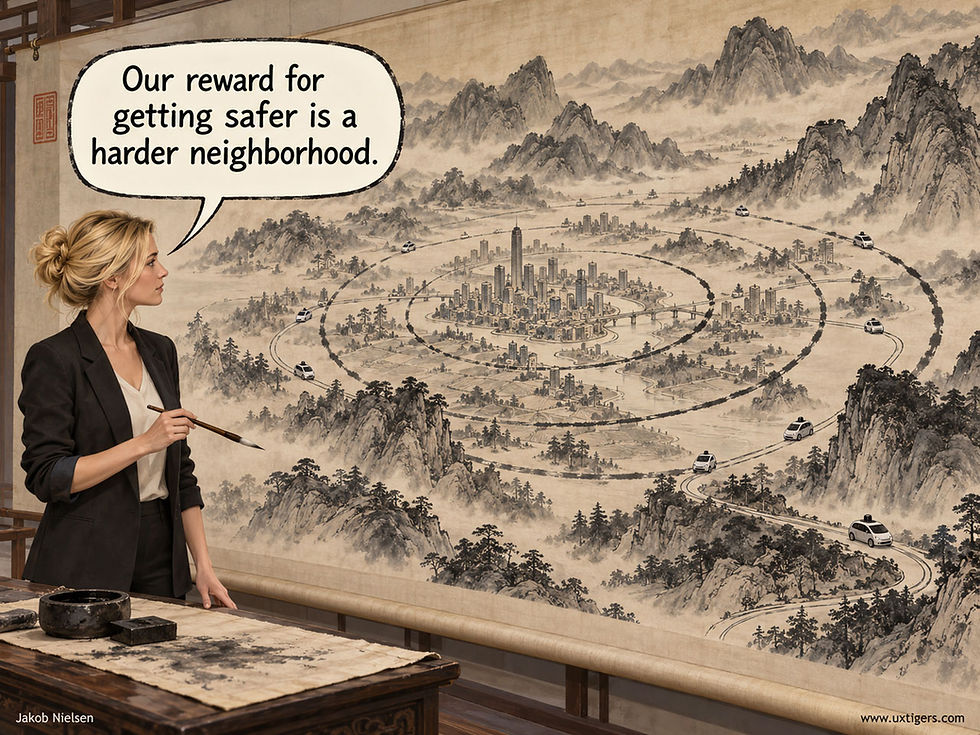
An improved safety record wins autonomous car services permits to expand beyond the easy city center, onto poorly lit roads with higher speed limits. (GPT Image 2.5)
None of this makes a 25% annual improvement small. By late 2023, at 7.1 million miles, Waymo already had 55% fewer police-reported crashes than humans, according to Kristofer Kusano and colleagues at Waymo. Airbags and stability control each delivered a one-time step down in risk. A safety technology that compounds at 25% per year from an already superhuman baseline has no precedent in the automobile’s 140-year history.
30,000 American Lives a Year, Then 36,500
Start with the United States. The National Highway Traffic Safety Administration’s early estimate (PDF) for 2025 is 36,640 US traffic deaths. Waymo’s rate of serious-injury-or-worse crashes is 95% below its human benchmark. (Its fatal-only reduction is 79%, but that rests on 2 fatal crashes against 9.6 expected, with a confidence interval from 15% to 98%, so I use the serious-injury figure.) If every vehicle in the country matched Waymo today: 36,640 × 0.95 ≈ 34,800 American lives saved per year. With the 79% figure, 29,000. My maximum-likelihood estimate: 30,000+.
Now compound. At 25.3% per year, 10 years shrink the residual crash rate to 0.747^10 = 5.4% of today’s. Apply that to the roughly 1,800 deaths that would remain: about 100 US traffic deaths per year in 2036, down from 36,640, or 36,500 lives saved annually. Caveats: Waymo’s benchmark is urban surface streets in snow-free cities, while 41% of US deaths (PDF) happen on rural roads; the 25% trend was measured on all police-reported crashes, not fatal ones; and about 6,000 of today’s deaths are motorcyclists. One caveat cuts the other way: in an all-Waymo world, the crashfloor disappears, because the other car is also a Waymo.
Worldwide: 1.1 Million Lives a Year
Now run the same arithmetic for the planet. The World Health Organization counts 1.19 million road deaths a year. If every car on Earth drove like a Waymo today: 1.19 million × 0.95 ≈ 1.13 million lives saved per year. In 2036, with the residual rate down to 5.4% of today’s: about 3,000 deaths left worldwide, or 1.19 million lives saved every year. Picture nearly the entire population of Dallas, spared.
Read this worldwide number as a ceiling: the best case if everything goes right. The world runs about 1.5 billion vehicles, and the average car on American roads is 12.8 years old. Even if every car sold from tomorrow morning were driverless, most of the 2036 fleet would still have a human at the wheel. More than half of the world’s road deaths are pedestrians, cyclists, and motorcyclists, many in countries where the roads look nothing like Phoenix. So the realistic 2036 number is far above 3,000. But the ceiling tells you the size of the prize, and the prize is a million lives a year.
The 2036 Headline: AI Kills 100
Suppose it all happens, and in 2036 driverless cars cut US traffic deaths to 100. I can write the headline today: “AI Kills 100 Americans.” Not “Robots Save 36,500 Lives,” because the 36,500 people who didn’t die will never be interviewed, photographed, or represented by counsel, while each of the 100 who did gets a name, a family, and a congressional hearing. That’s negativity bias (Paul Rozin and Edward Royzman, 2001): a negative event outweighs a positive one of equal size, and journalism is the industry built on it. “Man bites dog” has been the working definition of news since the 1800s.
We’ve already seen the trailer: one dragged pedestrian in San Francisco in 2023 ended Cruise, while the 100-plus Americans killed by human drivers that same day weren’t news at all. Expect the same asymmetry at 100 deaths a year. The count will fall by 99.7%, and the coverage won’t fall at all.
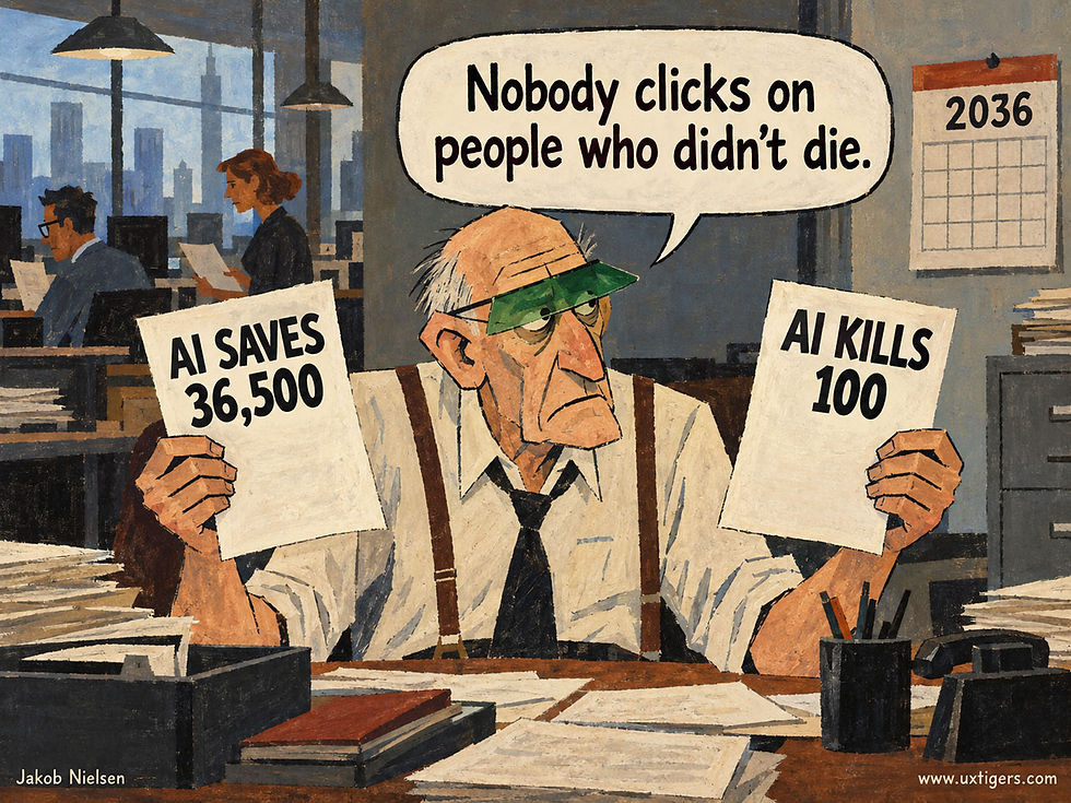
An old saying in journalism: “If it bleeds, it leads.” People saved by AI don’t bleed, so they don’t lead. (GPT Image 2.5)
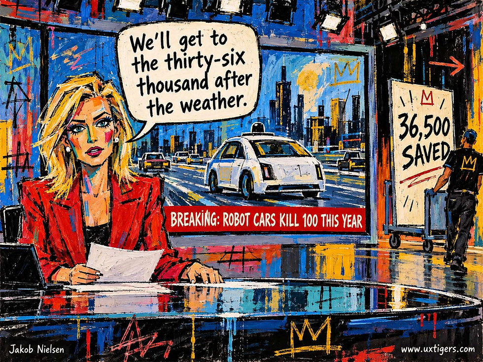
Unfortunately, the legacy media’s coverage of AI is even more biased than the old “bleed-lead” formula predicts, so don’t expect AI’s good deeds to make the broadcast, even after the weather. (GPT Image 2.5)
Bits Sprint, Atoms Jog
My prediction: the leading robotaxi fleets will keep halving their crash rates every 2–3 years through 2030, and the humans who still drive will set the crashfloor. Slow by AI standards is the story for AI watchers; fast by road standards is the story for everyone who has to cross a street.
Educational AI Must Teach Without Interrogating
Unrestricted AI produced larger immediate test-score gains than constrained tutoring, but lasting learning remains untested. The stronger design lesson: relentless Socratic questioning frustrated learners enough to drive them away.
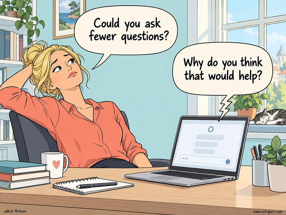
When a Socratic AI tutor answers every question with another question, students run out of patience long before the tutor runs out of questions. (GPT Image 2)
Alexandre Clin Deffarges of ETH Zürich and co-authors at the MIT Media Lab compared three GPT-5.2-based learning systems in an experiment with 50 adults studying nuclear safety: an unrestricted chatbot that handed over exercise answers on request, a Socratic chatbot that withheld answers, and an adaptive exercise system that responded to brain-sensing measurements.
On a 100-point scale, average test-score gains were 20.1 points with unrestricted AI, compared with 10.5 for Socratic tutoring and 11.2 for adaptive exercises. In 53% of unrestricted exercise interactions, participants pasted the question into the chatbot to retrieve the answer. The shortcut group won.

Students like an AI that simply hands them the answers to all the exercises. Unfortunately, durable learning requires students to work through exercises themselves, so answer-dispensing AI has performed poorly in most studies. (GPT Image 2)
This runs against earlier findings of weaker reasoning with unrestricted AI, including Matthias Stadler and co-authors’ study of 91 university students. But these experiments measured different outcomes. As the new paper acknowledges, its post-test followed training immediately, when recently seen answers could still be fresh in memory with no durable understanding behind them. That explanation is plausible, but this study can’t establish whether either constrained tutor would win a test given several weeks later.
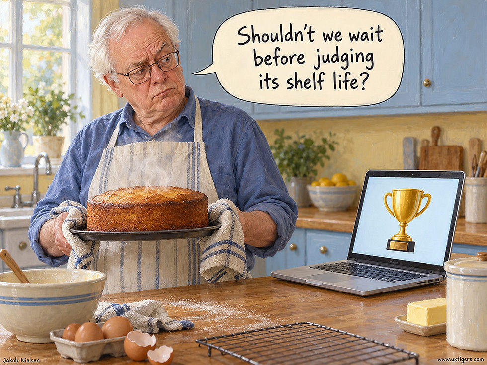
You can’t judge a cake’s shelf life the moment it leaves the oven. Likewise, a comprehension test given right after an instructional session can’t reveal how much students will retain. Education should produce knowledge that keeps, and a same-day test only measures freshness. (GPT Image 2)
For me, the more interesting finding is the Socratic system’s usability failure. Sessions averaged a grueling 119 messages, versus 37 with unrestricted AI. Participants rated its helpfulness 5.7 out of 10, compared with 8.6 for the unrestricted chatbot that did much of the work for the students. Many became frustrated and progressively disengaged. One reported, “I just gave up.”
The tutor’s instructions forbade revealing even a missing step. Such rigidity turns guidance into an interrogation. A student who lacks the necessary concept can’t conjure it from an endless procession of questions, however cheerfully phrased.
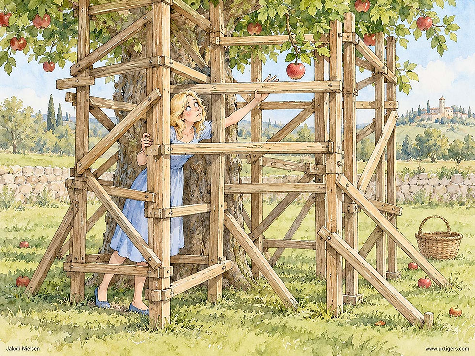
Educational scaffolding should help learners reach higher. The tutor in this study apparently built a cage instead, trapping learners in a maze of restrictions. (GPT Image 2)
Educational AI needs serious usability work. Test successive designs with representative students, watching for the moment when productive struggle turns into bewilderment. Begin with 5 students per iteration. Explain the tutoring approach upfront, ask focused questions, and make progress visible. When repeated attempts fail, offer a more concrete hint, explain the missing concept, or demonstrate an analogous problem before asking the student to try again.
Students must do the thinking that builds understanding, and a chatbot that simply dispenses exercise answers lets them skip that work. Yet preserving intellectual effort requires removing needless interaction effort. Evaluate satisfaction and abandonment alongside independent performance on new problems, with follow-up tests weeks later. A tutor that students willingly keep using has a chance to teach them. A tutor they abandon teaches nobody.
The Scroll Belongs to the User
Reading requires one humble precondition: the text must hold still. Yet pages routinely violate it. Scripts hijack the scroll wheel and glide to wherever the designer wants attention. Late-loading ads shove paragraphs down just as the reader’s eyes arrive, like a waiter whisking away your plate mid-bite. Autoplay videos yank away both attention and bandwidth. Each trick treats the viewport as the publisher’s property, when it’s the one part of the experience that belongs entirely to the reader.
The business case for restraint is explicit. In 2021, Google began using layout stability as a search ranking signal, measured as Cumulative Layout Shift. Jumpy pages annoy readers and search engines alike, a rare alignment of incentives with usability.
So keep your hands off the wheel. Reserve fixed space for anything that loads late, never move content someone is reading, and let scrolling do exactly what the reader’s fingers command. The reader drives. Your page is the road, and roads should stay put.
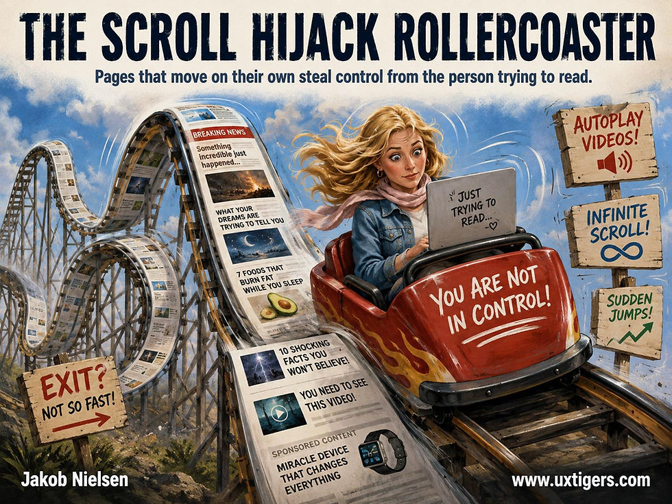
Readers came for the words, not the ride. (GPT Image 2)
The Floating Action Button: 1 Screen, 1 Hero Action
The floating action button (FAB) hovers above the interface to promote a screen’s single most important action. That prominence is a budget: spend it on the one action users perform constantly, label it plainly, and never let the button squat on top of the content users came for.
Definition: A FAB is a circular, visually elevated button that floats above all other content at a fixed position (usually the bottom-right corner), stays put while the page scrolls, and triggers the screen’s primary action. Google’s Material Design specifies a 56 dp diameter (40 dp for the mini variant, 96 dp for the large size added in 2021), and an extended variant adds a text label to the icon (m3.material.io).
Example: Gmail’s compose button, the pencil that follows you through 10,000 messages.
Born 2014, Named for Its Shadow
Google introduced the FAB with Material Design at its I/O conference in June 2014, under design chief Matías Duarte. Material treats the interface as layered sheets of digital paper, and this button “floats” on its own elevation layer above every sheet, casting a shadow to prove it. Hence the name. The “action” half comes from the spec’s job description: the FAB embodies the screen’s primary, promoted action. Within a few years, the bottom-right circle had spread across Android and leaked into iOS and web apps. That ubiquity now works in its favor: per Jakob’s Law, users spend most of their time in other apps, so they arrive at yours pre-trained to expect that a floating circle creates something new.
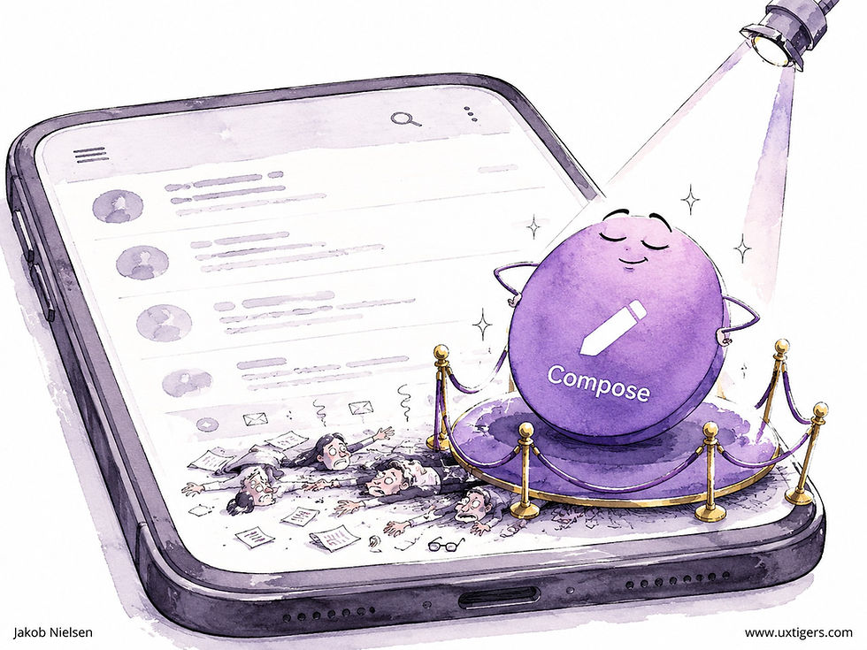
The FAB levitates above everything else on the screen, hogging the spotlight on the interface’s best real estate. That spotlight is a budget. Spend it on the single action users perform most, or you’ve designed an ornament. (GPT Image 2)
Why FABs Work: Fitts Meets the Thumb
A FAB is a large, isolated, high-contrast target parked next to the thumb of a one-handed phone user. Paul Fitts’s 1954 law predicts the result: big and close means fast to hit. And that thumb matters more than desk-bound designers assume. In Steven Hoober’s field observations of 1,333 phone users (2013), 49% of the people touching their screens operated the phone one-handed, the thumb doing all the work. The bottom corner is the thumb’s home turf, and the FAB claims it. Three further properties earn the pattern its keep:
Persistence. The button floats above scrolling content, so the primary action remains available at item 5,000 of an infinite list. No hunting, no scrolling back to a toolbar.
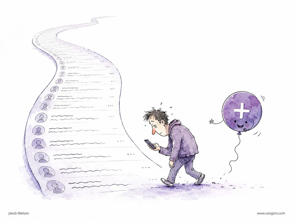
The FAB follows the user through thick and thin; or rather, through long scrolling lists. (GPT Image 2)
Consistency. The same corner on every screen means zero relearning from screen to screen, and even from app to app.
Communication. A FAB is a one-icon mission statement. Camera app: shutter. Email: compose. Notes: new note. The button tells first-time users what the app is for.
How FABs Hurt: The Squatter Problem and 4 More
Content occlusion. The floating circle squats on the last list item, hiding its controls, timestamps, or checkboxes. This is the FAB’s original sin, visible in app after app. The fix: add bottom inset padding so content can scroll clear, or shrink and hide the FAB during downward scrolls and restore it on upward ones.
Mystery meat. A bare “+” on a screen where 5 different things could plausibly be added forces guessing. Icons need labels. Use the extended FAB (“Compose,” “New invoice”) whenever space allows, which is nearly always.
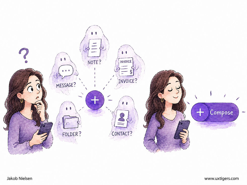
A one-word label exorcises the ghosts of guesswork. (GPT Image 2)
The wrong hero. If analytics show that users mostly share, but the FAB says edit, you’ve blown the prominence budget on the product manager’s favorite feature. Promote the measured top action, not the aspirational one.
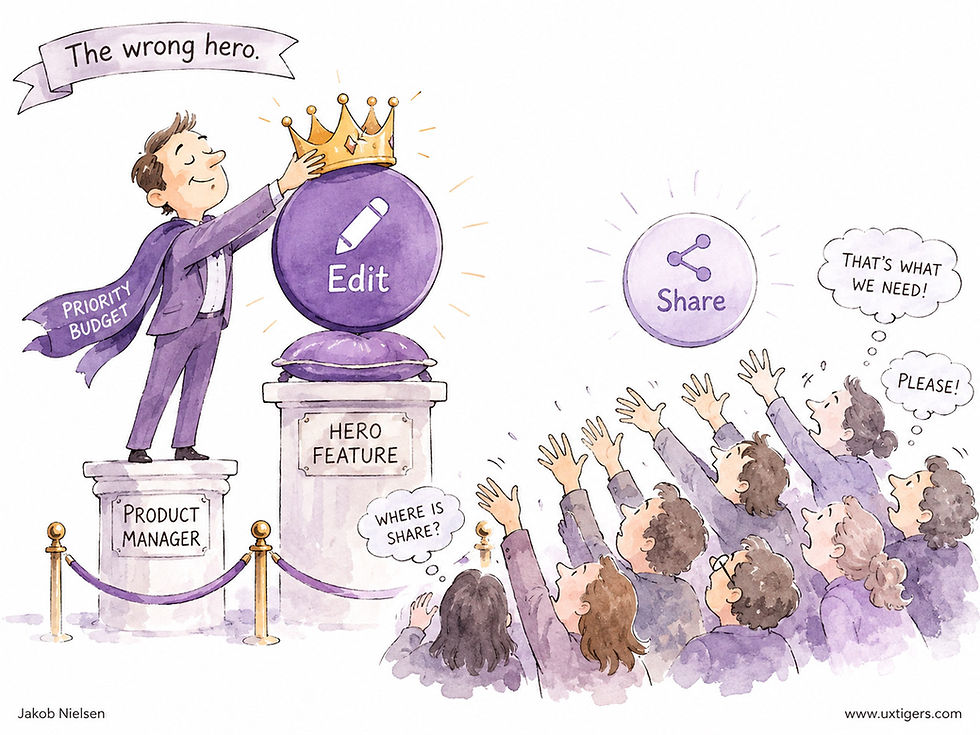
Make sure the one action you crown with a floating button is the one users actually perform most, not the one you wish they would. (GPT Image 2)
FAB inflation. Two FABs, or a “speed dial” that sprouts 5 mini-buttons on tap, turns the pattern into a mystery menu. Hidden actions are unused actions.
No hero at all. Dashboards, settings screens, and reading views often have no primary creation action. A FAB there is decoration that occludes data. Omit it.

Hiding the content users came for is one of the floating button’s most common sins. Besides, dashboards and other mostly read-only screens rarely need a FAB. (GPT Image 2)
Don’t get me wrong: I’m a fan of the FAB when it’s deployed with discipline. It’s one of the few post-2010 mobile patterns that solved a real problem (keeping the primary action within thumb reach at all times) rather than chasing fashion. Every failure above stems from careless deployment; the pattern itself is sound.
One more caveat: the FAB is a phone-first pattern. On desktop, a floating button forfeits the screen-edge advantage that makes toolbar and corner targets fast for mouse users, while its occlusion cost remains, so a conventional toolbar button usually wins there. And never assign a FAB a destructive action; a giant, thumb-adjacent, always-present delete button is an accident subscription service.

The FAB is easy to hit, including by accident, so never turn it into a trap by assigning it a destructive or dangerous action. (GPT Image 2)
8 Design Guidelines for Floating Action Buttons
One FAB per screen, maximum. Two heroes equal none. If several actions matter equally, use a toolbar and let the FAB go.
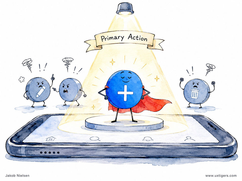
Only one FAB, even if you hurt the feelings of the other buttons. (GPT Image 2)
Promote the measured top action. Choose by frequency data from analytics, and revisit the choice when the data shifts.
Prefer the extended FAB. An icon plus a one-word label removes the guessing. Reserve bare icons for meanings that are truly universal; there are fewer of those than you think.
Keep content reachable. Add scroll inset padding beneath lists, and collapse or hide the FAB while the user scrolls down.
Constructive actions only. Create, compose, add. Never delete, never anything irreversible.
Respect the metrics. 56 dp diameter, 16 dp margins, and a touch target of at least 48 dp, or your platform’s equivalents.
Fix its position across the app. The same corner everywhere; a wandering FAB squanders the habit users formed.
Omit the FAB when there’s no primary action. Prominence spent on nothing buys only occlusion.
Every Form Field Costs You Customers
Each field in a form is a step the customer must climb, and every step sheds a few more climbers. Multiply 27 required fields by a checkout’s worth of impatience, and you’ve built an endurance event where a purchase used to be. The fix is subtraction, applied without mercy: ask only what this transaction needs, defer the rest until you actually need it, and never make a human retype what the system already knows. Marketing’s nice-to-have question is the user’s reason to quit. When in doubt, leave it out; you can always ask later. Fewer fields, more finishers.
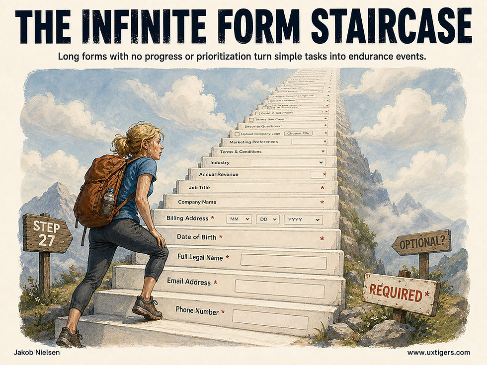
A prospective customer shouldn’t need 6 months of altitude training to finish your checkout. (GPT Image 2)
Shiny Secondary Features Don’t Compensate for Bad Primary Features
A bicycle burdened with a gigantic jeweled bell reveals a familiar product strategy: lavish attention on an accessory until it interferes with the reason anyone bought the product.
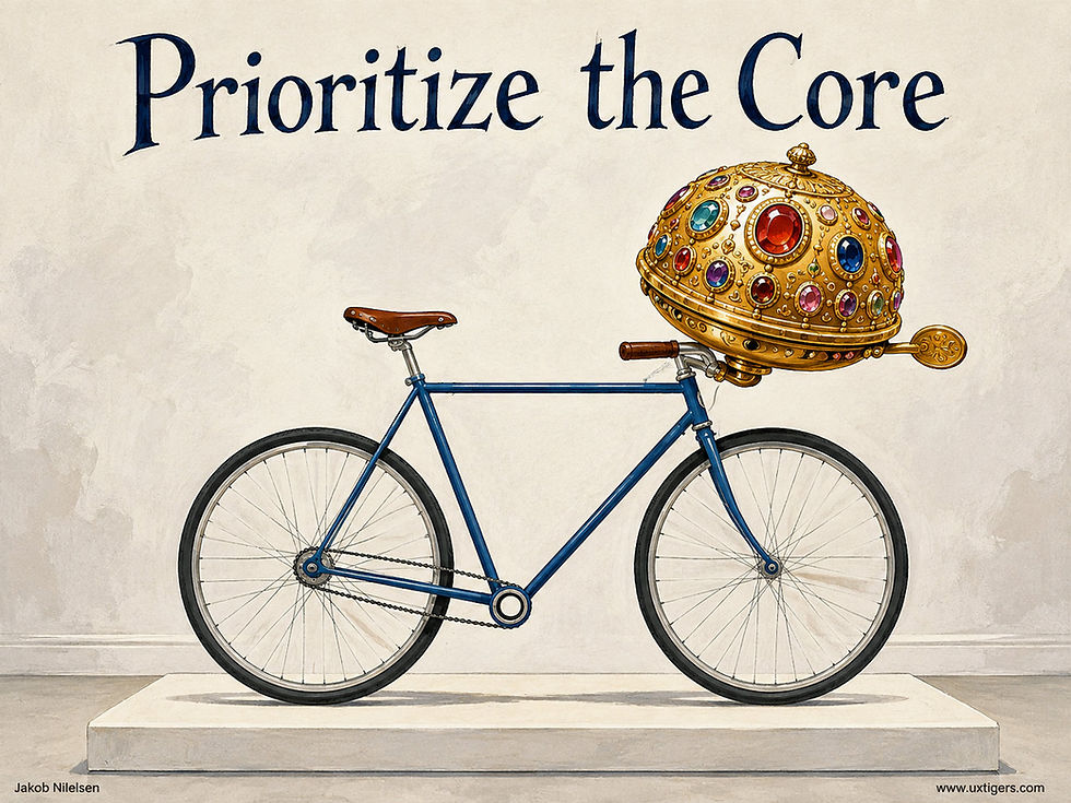
No jeweled bell will save a bicycle without pedals, and no nice secondary feature will save a product with poor or missing essential features. (GPT Image 2)
Software teams perform the same trick when they polish secondary features while the main task remains slow or unreliable. An expense system might offer animated spending insights while employees still struggle to submit receipts. The dashboard sparkles; reimbursement waits.
The temptation grows when a new feature makes a better demo than an improvement to an old workflow. A glamorous addition gives the sales team something to announce. Removing a recurring obstacle gives customers time back. Count that benefit, even though it makes a dull screenshot.
As I explain in my article on hedonic adaptation, novelty loses its shine, but recurring usability problems keep wasting users’ time day after day.
Start by identifying the task that justifies your product’s existence. Observe where users lose time, make errors, or abandon it. Prioritize fixes according to how often those obstacles occur and how much damage they cause.
A small saving on a task performed 100 times a day can outweigh a spectacular improvement to something done once a month. Frequency belongs in your roadmap discussions.
Then assess each proposed addition for the burden it introduces: another control to understand, another decision to make, another distraction from finishing.
Decorate the bicycle after it rides well.
Picture Superiority Effect: Users Remember What They See and Forget What They Read
People recognize and recall pictures far better than words: viewers who sat through 10,000 photos later recognized an estimated 6,600 of them. Encode your critical messages visually, but only with images that carry meaning. Decorative stock photos get ignored today and remembered by nobody tomorrow.

The paragraph on the left is already dissolving into alphabet dust; the scene on the right will still be vivid next week. Memory plays favorites, and pictures are the favorite. (GPT Image 2)
Memory Hoards Pictures and Shreds Words
Definition: The picture superiority effect is the finding that concepts presented as pictures are remembered better, in both recognition and recall, than the same concepts presented as words.
The evidence is old and gobsmacking. In 1967, Roger Shepard (Journal of Verbal Learning and Verbal Behavior) showed that people who had leafed through hundreds of photos could later pick the ones they’d seen from new distractors with near-perfect accuracy. Then in 1973, Lionel Standing published Learning 10,000 Pictures (16-page PDF) in the Quarterly Journal of Experimental Psychology.
His heroic participants viewed 10,000 photos, 5 seconds each, spread over several days. Tested 2 days later on pairs (one old photo, one new), they picked the correct one 83% of the time. Chance on a two-choice test is 50%, so the corrected retention rate is 2 × (83 − 50) = 66%, or roughly 6,600 pictures retained from a single viewing of each. Standing concluded that picture recognition memory is “almost limitless.” Nobody has found the ceiling since.
Words in the same experiments performed consistently worse. Your beautifully crafted paragraphs are competing against that.
Two Codes Beat One
The name is refreshingly literal: pictures are simply superior memory stimuli. But why? The dominant explanation comes from Allan Paivio of the University of Western Ontario, whose dual-coding theory (1971) holds that a picture gets stored twice: once as a visual trace and once as a verbal label, because you silently name what you see. A word usually gets stored once. Two retrieval hooks beat one. Paivio and Kalman Csapo put the phrase in a journal title with “Picture Superiority in Free Recall: Imagery or Dual Coding?” (Cognitive Psychology, 1973), and the label stuck.

An image usually embeds in memory with two hooks: the picture itself plus the word you can’t help but think of to describe it. (GPT Image 2)
Of course, the effect describes memory. It promises nothing about comprehension or reading speed, and designers who forget that distinction pay for it, as we’ll see.
Meaningful Pictures Are Free Memory
For UX, the effect is a standing offer: anything you encode in a strong image travels further in the user’s head than the same message in text. Use it where memory matters. Show the actual product from multiple angles instead of describing it. Replace a wall of assembly prose with numbered diagrams. Give each pricing tier a distinct visual identity so users can tell them apart on the second visit. Chart the data instead of narrating it. And invest in a distinctive app icon, because that tiny picture is the handle users grab when they want you back.

Images must earn their place on the payroll. The swap test: if a stock photo could replace an image without loss, that image is freeloading. (GPT Image 2)
The offer comes with one condition: the picture must carry meaning. In my eyetracking research, users routinely ignored purely decorative photos (smiling stock-photo models and generic handshakes), while they studied photos of real products and real people. Such decoration is a picture placebo: an image that occupies the space of information while containing none. A picture may be worth 1,000 words, but a picture placebo is worth zero. (Sorry for exhuming the world’s most tired proverb, but this is the one context where it works.)
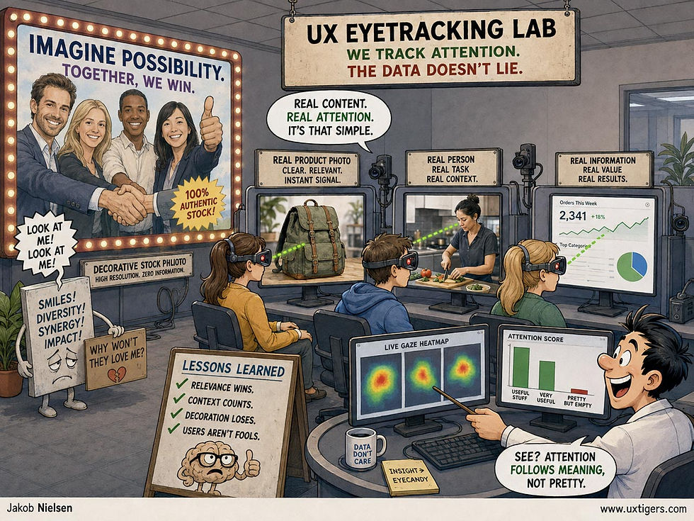
Informative images beat picture placebos every time. Stop using generic stock photos of smiling people straight out of central casting, especially since AI makes custom images so easy to create. (GPT Image 2)
When Pictures Backfire
The same memory glue that helps you can also hurt you, in 4 recurring ways.
First, the picture placebo problem: filler images waste bandwidth, push real content below the fold, and train users to ignore your imagery wholesale. Second, icon-only interfaces confuse memorability with interpretability. A pictogram is easy to remember once learned, yet often impossible to guess, which is how we get toolbars of mystery symbols that users hover over like archaeologists. Icons need text labels.
Third, images that overpromise do lasting damage: the user remembers the juicy burger photo, not the disclaimer beneath it, so the sad reality on the plate lands as a betrayal. Picture superiority guarantees that your most misleading image is your most memorable one. Fourth, accessibility: for a blind user, an image without alt text communicates nothing at all, so screen-reader users get a placebo of their own.
Every one of these failures has the same cure: treat images as content, with the same editorial standards you apply to words, and back them with words where words do the job better.
7 Design Guidelines for Using Pictures
Give every image a job. Each picture should deliver information, evidence, or relevant emotion. If any stock photo could be swapped in without changing the meaning, delete the image.
Pair icons with text labels. Recognition of a learned icon is nearly effortless, but first-time interpretation is guesswork. Labels cost a few pixels and end the guessing game.
Show the real thing. Photograph the actual product, the actual team, and the actual results. Users can smell a stock model at 50 paces, and they remember authenticity.
Dual-code what must be remembered. For content users need to recall next week (a safety step, a key differentiator, a core stat), present it as picture plus words, giving memory two hooks instead of one.
Write alt text that conveys the image’s message. The alternative text should deliver the same information the picture does, so the picture superiority effect doesn’t become a picture exclusivity effect.
Never let an image promise what the product won’t deliver. Users will remember the photo and forget your footnote. The gap between the two is remembered longest of all.
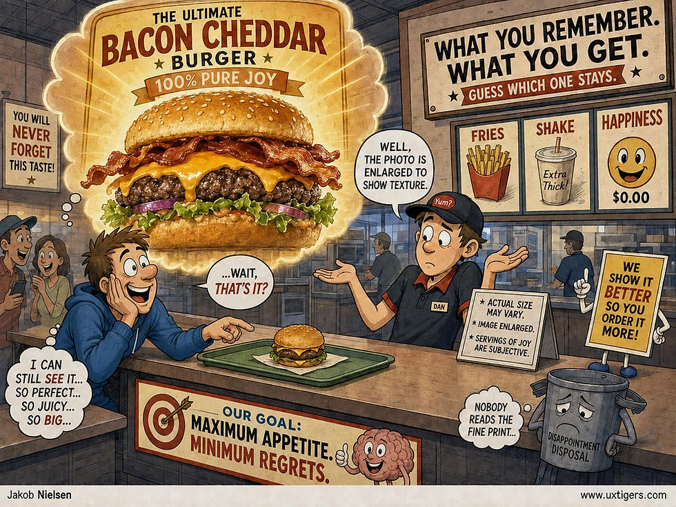
Don’t use images that lie: the picture superiority effect makes the lie memorable, and all the more damaging to your brand once the truth arrives on a tray. (GPT Image 2)
Test icons and diagrams with users before shipping. A 5-user comprehension test reveals within an hour whether your imagery communicates or merely decorates.
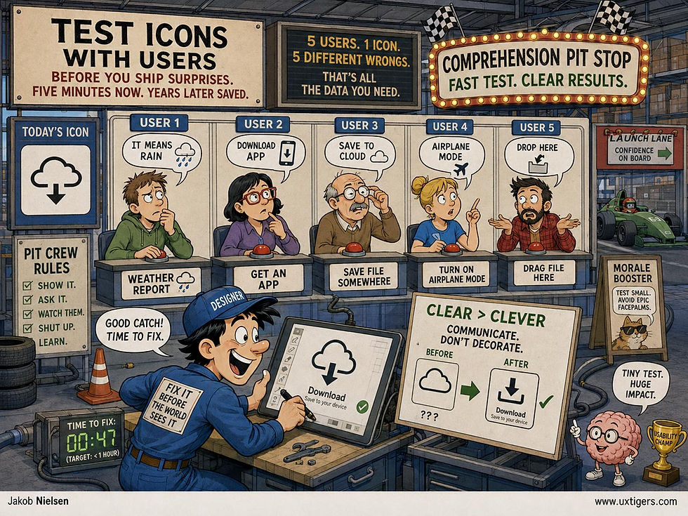
Testing images with a handful of users is the pit stop that keeps your design from crashing on launch day. (GPT Image 2)
Prechecked Consent Isn’t Consent
A subscription form with 10 boxes already ticked has stopped asking questions. It announces a decision and dares the user to reverse it. Defaults dominate: most people accept whatever is preselected, as I discussed in my Defaults article, so the checked boxes mostly stay checked, and the design knows it. The law has caught up with the psychology: in the Planet49 case of 2019, the EU Court of Justice ruled that a pre-ticked box isn’t valid consent, because consent requires the user to actually do something. A column of prechecked subscriptions is a column of invalid consents.
The business case is even shorter than the legal one. Every reader who never asked for the daily newsletter is a future spam complaint, and Google’s sender guidelines require bulk senders to keep their reported spam rate below 0.1%, with 0.3% as the line past which Gmail stops offering mitigation. Hit 3 complaints per 1,000 messages, and even the mail people did want starts landing in junk. Prechecking poisons the well your audience drinks from. Start every box unchecked, offer one list at a time, and let the weekly digest earn the daily upgrade. A subscriber you had to trick is a spam report with a lit fuse.
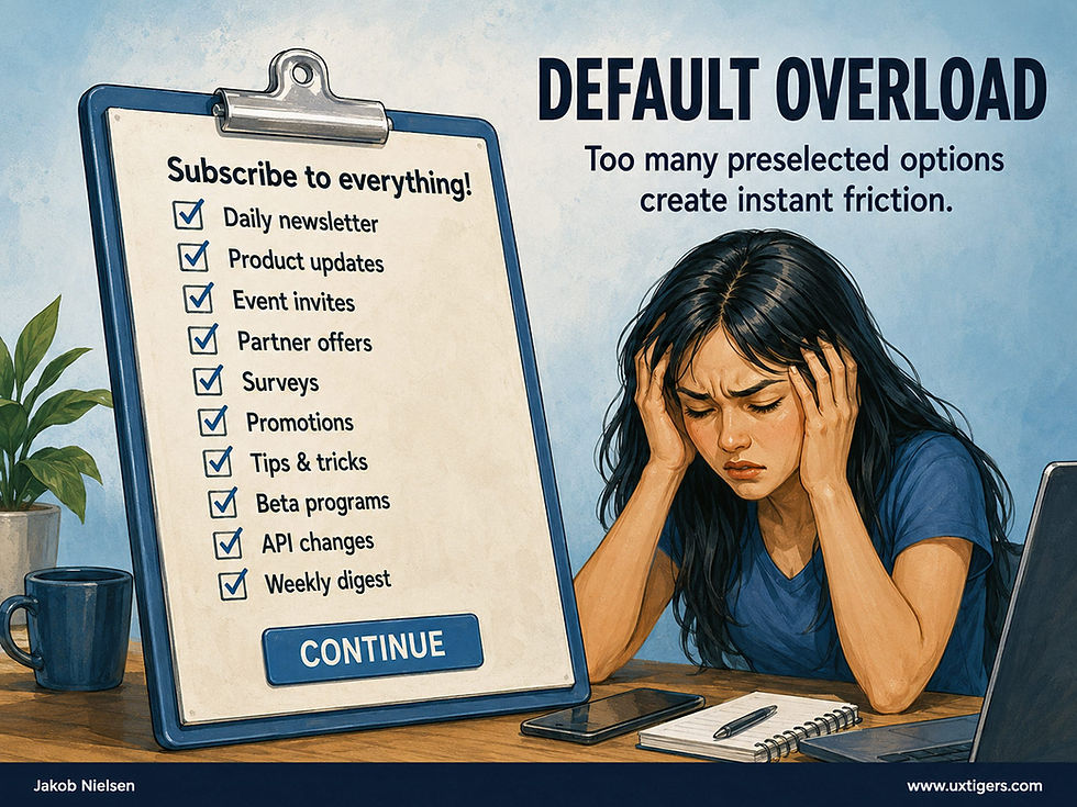
Ten boxes ticked in advance are ten decisions the user never made. (GPT Image 2)
AI Defenders Win Round One: No Cybercrime Surge After Fable 5
Anthropic’s much-hyped Claude Fable 5 launched in June amid warnings that Mythos-class AI would arm cybercriminals. The predicted crime wave is a no-show.

When the predicted catastrophe fails to arrive, doomers don’t apologize. They just move the date. (GPT Image 2.5)
Epoch AI’s Caroline Falkman Olsson and Yafah Edelman polled about 1,000 US adults in June and another 1,000 in September. The share hit by any cyber incident in the past year went from 46% to 45%. So much for the scaremongering. (The difference is well within the margin of error, so that 1-point dip doesn’t prove that cybercrime is down.)

The one fear that has come true concerns speed: defenders must now react faster than ever, which is possible only with AI help. (GPT Image 2.5)
Why no surge? The poll can’t say. My best guess: AI-powered defense is working. Defenders got Mythos-class AI 2 months before the public, through Anthropic’s Project Glasswing. By July, major vendors were disclosing serious vulnerabilities at 5× the pre-Mythos monthly record.
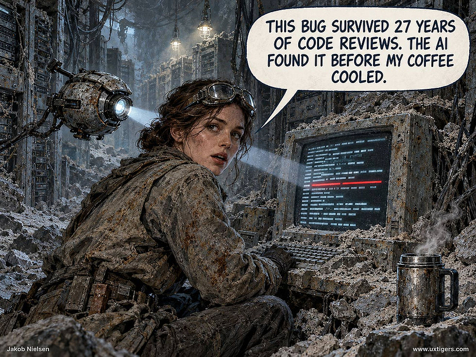
When you read about AI finding security holes, remember who dug them: human programmers, sometimes decades ago. (GPT Image 2.5)
So far, so good. But attackers get better models too, including open-weight ones that no lab can recall. Defense must keep outpatching offense. Fortunately, several labs are on it: OpenAI committed $1 billion in subsidized access and support for frontline defenders, Google launched a preview of its CodeMender patching agent, and Anthropic opened its strongest models to verified defenders as small as municipal utilities. Round two starts with the next model release.

The absence of an AI crime wave is no reason to cut the security budget. Things will go well only as long as we keep up the defense. (GPT Image 2.5)
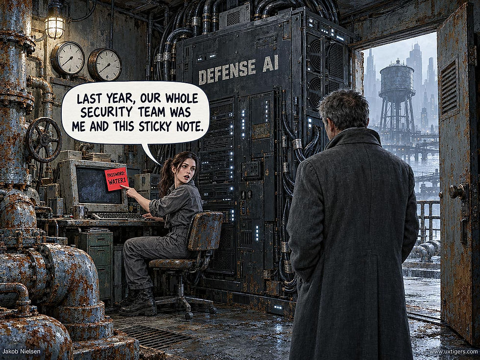
Many companies used to treat cyber risk as an afterthought. The one good thing about the AI scaremongers: security may finally get the attention it deserves. (GPT Image 2.5)
Final Thought of the Day