
Cards: How a 3×5 Rectangle Conquered Screen Design

Summary: A card packs everything about one item (image, title, key facts, action) inside a clearly bounded rectangle that the user’s visual system sees as a single object, which is why cards excel at presenting browsable collections of self-contained things. But boxing everything produces flabby layouts with pitiful information density, and now that AI makes cards that no designer ever inspects, the old guidelines need a new enforcement mechanism. Contain your cards, and make them keep their promises.

A card is a promise: everything inside the frame belongs to one item, and nothing outside does.
Definition: A “card” (in the UI sense of the word) is a rectangular container that groups all the information and actions for a single item: typically an image, a title, a line or two of supporting detail, and 1 primary action. Cards live in grids or feeds, where each card represents one member of a collection.
This design pattern takes its name from a thoroughly literal metaphor, and the metaphor repays study, because the paper ancestors of the screen card solved the same problems we face today: too many items, too little attention, and a desperate need to keep each item’s facts from leaking into its neighbor’s.

A hard boundary turns a heap into an offer: the frame does the selling.
From Index Card to Interface Card
Around 1760, Carl Linnaeus managed his species taxonomy on uniform paper slips, an ancestor of the index card. He needed to insert new species into an ever-growing classification without recopying the whole system, and loose, same-sized slips delivered exactly that. In 1791, the French revolutionary government, having confiscated the aristocracy’s libraries, cataloged the loot on the backs of playing cards, which were conveniently blank in those days. (Also conveniently, the previous owners were in no position to object, having lost their heads.) Libraries then ran on card catalogs for the next 2 centuries, and the format spread to business cards, recipe boxes, baseball cards, and the Rolodex.

Swedish naturalist Carl Linnaeus (1707–1778) changed his name to Carl von Linné when the king ennobled him for collecting leaves and beetles. Or, more accurately, for his breakthrough scientific analysis of his collection. (Muse Image)
Physical cards taught three durable lessons: uniform size makes items sortable and scannable, a hard boundary makes each item self-contained, and portability makes collections rearrangeable. Toyota added a fourth lesson in the 1950s, when Taiichi Ohno built the kanban system around cards that traveled with work orders: a card’s position can carry information, not just its contents.
Software borrowed all 4 lessons, repeatedly. Bill Atkinson’s HyperCard (1987) organized information as literal stacks of cards, and because it shipped free with every Macintosh, it seeded a generation, including me, with card-shaped thinking (I was an avid HyperCard fan).

A small hypertext report I designed in HyperCard in 1987. This screenshot shows one “card,” and clicking any of the boxed links would replace it with another card. Believe it or not, this image is a full-screen capture from a Macintosh Plus, which sported a screen resolution of 512×342 monochrome pixels.
Trello (2011) resurrected Ohno’s kanban as draggable screen cards. Pinterest (2010) made the card grid a mainstream browsing pattern, Tinder (2012) turned card handling into courtship, and Google Now (2012) served glanceable snippets as cards. Twitter’s link-preview cards (2012), assembled automatically from page metadata (a trick fed by Facebook’s Open Graph standard of 2010), established something we’ll return to later: cards built by software, with no human composing each one. Google’s Material Design specification (2014) then canonized the component, complete with paper-and-ink physics. By 2015, the Web looked as if a stationery store had exploded.

The card design pattern has a long history.

The exploding stationery store: if a handful are good, cards everywhere must be better. Not!
The Frame Does the Grouping
Why do cards work? Because the border performs cognitive work the user would otherwise do. Gestalt principles supply the mechanism: Stephen Palmer’s principle of common region (published in Cognitive Psychology, 1992) showed that elements enclosed by a shared boundary are perceived as a group, an effect strong enough to override proximity and similarity. That override is the magic ingredient. A product card mixes wildly unlike elements (a photo, a price, 5 little stars, a button), yet users effortlessly read them as facets of one product, because the card boundary says so. Users never have to puzzle over which caption belongs to which picture. The frame is information.

The museum curator clearly failed the Gestalt theory course. We can’t tell which of these two paintings the wall label applies to.
Elevation reinforces the effect. A subtle shadow lifts the card off the page in figure-ground terms: the card becomes the figure, the page recedes to ground. Material Design’s paper metaphor recruited depth perception for grouping duty.
Four further benefits compound:
Chunking. A collection becomes discrete units that users scan card by card instead of parsing an undifferentiated page. (George Miller told us in 1956 that working memory juggles about 7 chunks, though 4 is a better measure for most users; cards arrive pre-chunked.)
Template consistency. Every card repeats the same internal slots: image on top, title below, metadata, action. After the first card, users know where to look on all the rest, so scanning shifts into high gear.
Responsive reflow. Cards rewrap gracefully: 4 columns on a desktop monitor, 1 column on a phone, no separate design required.
A generous tap target. The whole card can act as a link, comfortably beating the 1 × 1 cm minimum touch target and sparing users the misery of hunting for a 12-pixel text link.

But note what the frame costs: pixels. Borders, shadows, and padding all spend screen space on saying “these things go together” rather than on the things themselves. Pixel consumption is justified exactly when grouping is in doubt, a point I’ll return to when we get to card sprawl.
One Card = One Object in the Mind
The frame does more than group. It manufactures an object, and human attention is built around objects.

A card can have a primary action button (as shown here), or the entire card can be the click target, which works when the card is a hypertext link to a detailed page.
In a classic experiment, John Duncan (1984) showed people 2 overlapping shapes and asked them to judge 2 attributes. When both attributes belonged to the same object, people judged the pair as accurately as a single attribute; when the attributes were split across the 2 objects, accuracy dropped. Attention, in other words, grabs whole objects at a time, and switching objects costs. A well-formed card exploits this: the title, price, and rating are attributes of a single perceptual object, so the user absorbs them together in a glance rather than paying a switching tax 3 times. This is the psychology of the card’s contained focus. The frame is a spotlight with walls: while the user is on a card, competing items are not merely distant, they are outside, and everything inside shares the beam.
Daniel Kahneman and colleagues (1992) called the mind’s temporary dossier about a thing an object file: a mental folder that binds features (red, round, $14.99) to one identity and follows it around. A card is an object file rendered in pixels. The designer has pre-assembled the folder, so the user’s brain doesn’t have to. Hence the card contract, with its two clauses: everything inside the frame is about this item, and everything the user needs at this decision point is inside the frame. Break either clause, and the card stops being a card; it’s just a rectangle with trust issues.
Chunking magnifies the payoff. Miller’s famous 7 was revised downward by Nelson Cowan (2001), whose review put working memory at about 4 chunks, plus or minus 1. A screenful showing 4–6 cards therefore matches what a user can actively compare in his or her head; a screenful of 40 non-chunked items can’t be “considered” at all, only foraged. And because pictures are remembered far better than words (Allan Paivio’s dual-coding research from the 1970s), the thumbnail becomes the chunk’s handle: users re-find a card as “the blue one, top right,” using visual and spatial memory instead of rereading titles. That’s also why a grid full of near-identical stock photos hurts twice: it wastes the handle and poisons spatial memory with lookalikes.

If cards are designed right, visual and spatial memory can help users re-find a card.
Cards Emit Information Scent (or Should)
A card almost never contains the whole item; it advertises the item. The card is a doorway, and users decide whether to walk through it based on information scent: the cues that let them estimate what’s on the other side and whether it’s worth the click. Information foraging theory, which supplies the scent concept, was developed at Xerox PARC in the 1990s by Peter Pirolli and Stuart Card. (Yes, the theory of how users sniff at cards was co-invented by a man named Card. Nominative determinism is undefeated.)

Information foraging: users are predators budgeting effort per utility gained.
Foraging theory models users as predators estimating the value of a patch before committing to it, and a card is the most concentrated scent packet screen design has produced: one image, one title, and two facts, all bound to one prey item. The economics are brutal. Netflix reported that artwork consumes a whopping 82% of members’ attention while browsing, that a member spends about 1.8 seconds considering each title, and that you get 60–90 seconds of browsing before the member gives up and wanders off. Your card does not get read. It gets sniffed, for about 2 seconds, mostly via the image.

1.8 seconds to scan a card, 82% of it on the image. There is no appeals process.
Two design consequences follow. First, design for the 2-second read: the differentiating information must sit in the image and the first words of the title, because that’s all the attention a card is allotted. Second, scent must be accurate. A card that promises what its destination doesn’t deliver commits scent fraud, and after a few bounces, users learn to distrust the entire grid. An overpromising card is a defective card, exactly as broken as a dead link and much harder to detect automatically.

Promise a lion but deliver a housecat? Nobody will line up at your next tent.
Example: Alice shops for trail-running shoes. The winning store’s cards each show the shoe itself, photographed at the same angle on a plain background, with the title “Trail runner, waterproof, 310 g” and the price in the same corner of every card. Alice compares 4 candidates in seconds, using the photos as handles and the prices as anchors, and clicks with confidence. Bob’s store dresses every card in a lifestyle photo of ecstatic joggers at sunset, titled “Unleash Your Potential.” Every card smells the same, which is to say it smells of nothing. Bob’s 90 seconds expire, and so does the sale.
How Users Handle Their Cards
Watch users work through a card grid and you’ll see a repertoire of behaviors that physical cards would recognize.
Scanning. Users don’t read grids linearly. My eyetracking research found the famous F-pattern on text-heavy pages and list layouts, but card grids produce a choppier pinball bounce: fixate the image, hop to the title, judge, jump onward, with whole regions skipped outright. Images get first contact, which is why informative images are gold and decorative ones are dead weight; users reliably skip filler stock photos while studying product photos and real faces. Titles get a few fixations at most. My old finding that scanning users often read only about the first 11 characters of a link still applies, which is grim news for the 12 cards in a row that all begin with “How to.”
Triage. Users satisfice. They don’t rank all 30 cards and select the optimum; they take the first card whose scent clears the threshold. The practical consequence: position is destiny. A mediocre card in slot 2 beats a great card in slot 17, so ordering the collection deserves as much design attention as the cards themselves.
Tapping. The whole card as one big target is Paul Fitts’s 1954 law working in your favor: big, close targets are acquired fast and without precision anxiety. Squandering this advantage (a card where only the tiny title link responds) is one of the most common card bugs in the wild.

Fitts’s Law says that items are faster to touch or click the bigger and closer they are. In this example, the exact formula would tell us whether the big target that’s farther away is faster to acquire than the mid-sized object that’s closer by. But in any case, the Law predicts that the smaller targets to the left will be slower than either. (GPT Image 2)
Hovering. On desktop, users sweep the cursor across cards to probe for interactivity and to summon shortcut actions. Hover reveals are fine as accelerators, never as the only route to a function, because touch screens have no hover and neither do keyboards.
Swiping. Tinder’s stroke of genius in 2012 was making the gesture the verdict: swipe right to accept, left to reject, one card at a time. Note how much Tinder’s cards omit, showing only a photo, a first name, an age. That scent minimalism is a deliberate product decision to force judgment on the photo, and it works for dating. Copying it anywhere users need actual information (say, B2B software selection) would be malpractice, although I confess the mental image of procurement officers swiping left on enterprise resource planning suites has its charm.

Much enterprise software deserves to be treated like a bad date.
Dragging. In Trello and every kanban board since, the card is a work token and its column is its status. Moving the card is the data entry. So kanban boards feel far lighter than the form-based project tools they replaced: Ohno’s insight about position carrying information, running on glass.
Saving. Pinterest built an entire company on the urge to collect cards into decks of one’s own. The card is the natural unit of curation: bounded, portable, self-contained. If your items are things users might want to keep, offer a save action; if they can’t articulate what they’d be saving, your card probably contains more than one item.
Expanding. Apple’s App Store (since 2017) morphs the tapped card into the full detail page, and the continuity matters: the card visibly becomes the page, so the user never wonders where he or she landed. Card-to-page expansion is the strongest cure for the where-am-I whiplash of a hard page jump.
Flipping. Mostly a mistake. Users don’t discover flip interactions, the animation annoys people who are sensitive to motion, and whatever hides on the back emits no scent while hidden. Flip when the object actually has 2 faces (a language flashcard); never bury the price back there.
Comparing. Here cards start to creak. When users need to weigh several items across several attributes, a card grid forces them to hold attribute values in working memory while hopping between frames, and Cowan’s 4-chunk limit makes that a losing game. So users compensate by opening items in 6 browser tabs: a design failure confessed in tab form. Comparison tasks want a table.

Drawing connections between open tabs often substitutes (poorly!) for the comparison table the designer didn’t bother to build.
Card Sprawl: When Everything Is a Card, Nothing Is
The failure mode deserves a name: card sprawl, the compulsion to wrap every scrap of content in its own padded, bordered, drop-shadowed rectangle. After Material Design shipped in 2014, settings screens, dashboards, and entire intranets broke out in cards like a rash. (Material’s spec was right for its home turf of feeds and collections; the sprawl came from teams applying it to everything with edges.) Card sprawl hurts four ways:
Information density collapses. Padding, borders, and internal whitespace routinely devour half the screen, so a table showing 20 rows on 1 screen becomes 20 cards spread across 5 screenfuls. Users pay in scrolling; you pay in abandoned sessions. (Regular readers know low information density is my perennial complaint: screens exist to convey information, and padding conveys nothing.)
Hierarchy disappears. When every card is the same size, the trivial looks as important as the critical. Uniformity is fine for peers, deadly for priorities. The dashboard version of this disease presents “Revenue” and “Number of Logins from Estonia” in identical stately boxes, each displaying 1 number in a frame worthy of a Cézanne.
Click targets get ambiguous. Is the image the link? The title? The button? A card offering three different destinations produces misclicks and hesitation. The inverse sin also thrives: a card that looks tappable, where only a buried button responds.
Prose gets butchered. Chopping a continuous article into cards destroys reading flow. Cards are for collections, not for arguments. An argument needs its sentences to touch.
The remedies are equally concrete. Use a table or list when users compare homogeneous items across attributes. Make the whole card 1 click with a single primary action, relegating secondary actions to an overflow menu. Vary card size or placement to encode importance. And card-ify only content that is genuinely self-contained: if the frame’s grouping work doesn’t need doing, the frame is pure overhead.
Dashboards deserve a split verdict. A KPI card earns its frame when it answers 1 question at a glance and stands alone (yesterday’s revenue, current server status), which is the card contract working as intended. It forfeits the frame when the box outweighs the fact inside it, or when the 12 boxes are really 12 rows of what should have been 1 table.
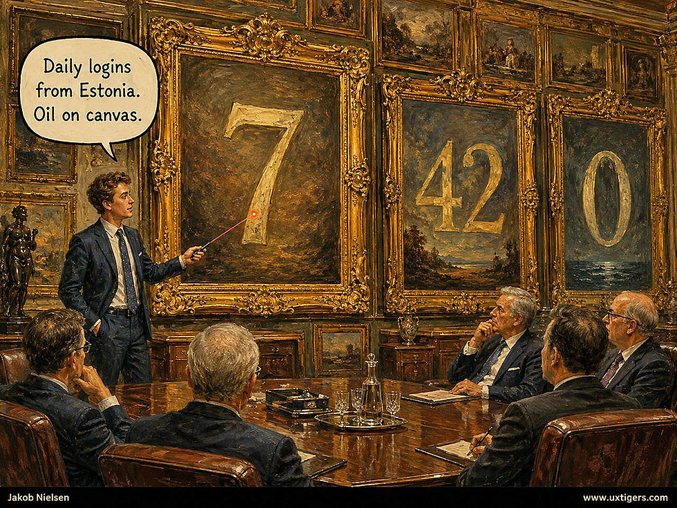
Give every metric the same gilded frame, and hierarchy has left the room.
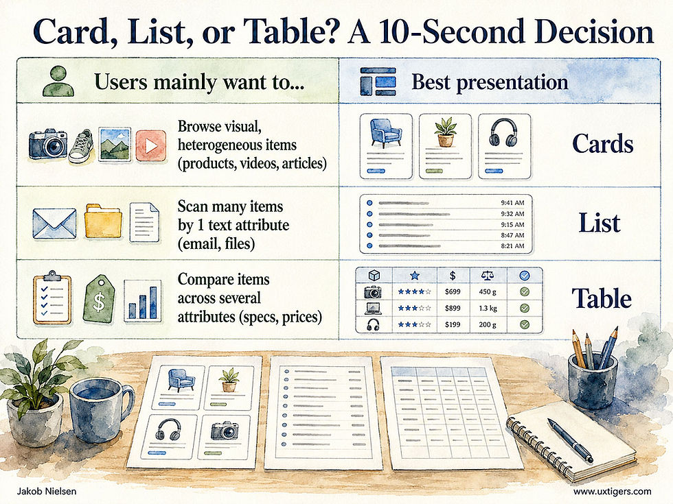
The 10-second decision: browsing tasks get cards, scanning tasks get lists, comparison tasks get tables.
The rule: if users compare, tabulate; if they browse, card.
38 Design Guidelines for Cards
The psychology above compresses into rules. Here are 38, grouped into 5 clusters: layout, interaction, writing, imagery, and the collection as a whole. None of them requires genius; all of them require deciding to care.
Card Anatomy and Layout
1. One card = 1 item. If you can’t name the single thing a card represents, it shouldn’t be a card. A “Miscellaneous” card is a drawer labeled “Stuff.”
2. Keep the internal template identical across the grid so users learn the layout once and then scan on autopilot. Variation should carry meaning, never whimsy.
3. Give the card 1 reading direction: image, then title, then metadata, then action. The title belongs directly adjacent to the image, because the eye’s first hop is image-to-title; don’t make it a hike.
4. Restrain the chrome. A border, a shadow, or a background shift will define the region; using all three produces clutter, not clarity. Palmer’s common region is cheap to trigger.
5. Watch your density. My rule of thumb: if a desktop screen shows fewer than 6 cards while users need to weigh a dozen options, switch to a list or table.
6. Keep card heights equal within a row. Ragged bottoms sabotage horizontal scanning. Reserve masonry layouts for pure visual browsing à la Pinterest, where nobody compares attributes.
7. Clamp text to fixed line counts (say, 2 lines of title, 3 of description) instead of letting long content stretch its card. Growing cards turn a grid into a patchwork quilt.
8. Encode importance with size and position, not decoration. A hero card may span 2 columns; 12 identical cards claim 12 equal priorities, which is usually a lie told by a lazy layout.
Interaction and Affordances
9. Make the entire card clickable, with exactly 1 primary action. Tuck secondary actions into an overflow menu or reveal them on hover, and cap them at 2; a card sprouting 5 buttons is a form in costume.

Big gate, small doorbell button. Much better to make the whole card area clickable than to require users to click a tiny target.
10. Signal interactivity honestly. Hover feedback and elevation belong only on cards that respond; a decorative card dressed as a button is a lie, and a tappable card styled flat is a missed sale.
11. Give every card a visible keyboard focus state and 1 logical tab stop, with the title as the accessible link name. A screen-reader user should hear “Waterproof hiking boots, link,” not a 40-word inventory of the card’s contents.
12. Respect the 1 × 1 cm minimum for secondary touch targets, and keep adjacent cards’ actions from abutting, so a thumb aiming at one card’s Save doesn’t hit its neighbor’s Delete.
13. Don’t flip cards to reveal essential information. Users don’t discover flips, motion-sensitive users suffer, and hidden content emits no scent. Flashcards flip; product cards don’t.
14. Treat card carousels as a last resort. A horizontal strip hides most of the deck behind a gesture. If you must, show a partial peek of the next card, provide arrows, and never auto-advance.
15. Load with skeleton cards shaped like the real ones, and never reflow after render. A grid that shifts as images trickle in converts confident clicks into misclicks.
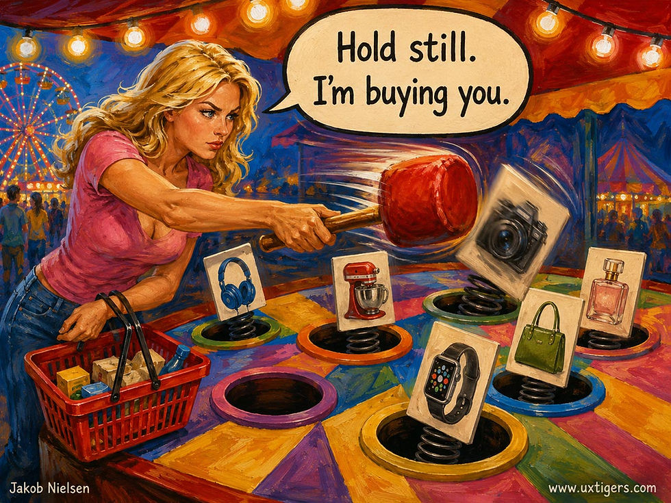
A user interface shouldn’t be a whack-a-mole game: cards that jump around cause misclicks.
16. Show a drag handle wherever cards are draggable. On a kanban board, position is data, but only if users realize the cards move at all.
Writing Card Content
17. Front-load the differentiating words in the title. Scanning users read roughly the first 11 characters before deciding to stay or skip. “Waterproof hiking boots, 780 g” survives that test; “Introducing our latest innovation in outdoor footwear” doesn’t.
18. Write specific, plain titles, not clever ones. A pun must be decoded, and the card’s entire attention budget is about 2 seconds. Spend it on nouns.
19. Vary the opening words across cards. When 12 titles all begin “How to,” the differentiators hide mid-sentence, exactly where scanning eyes never go.
20. Make the description add facts the title lacks (price basis, audience, date, size) instead of restating the title in baggier clothes. A card’s text budget is too small to spend twice on the same information.
21. Delete marketese. In my 1997 studies with John Morkes, rewriting promotional web copy into objective language improved measured usability by 27%. Inside a 2-line card, “award-winning” and “world-class” are theft with adjectives.
22. Show 3–4 metadata attributes, chosen because they drive the decision, formatted identically on every card. Same units, same order, same spot, digits rather than words. If price matters, price appears on all cards, always in the same corner.
23. Truncate honestly. An ellipsis is acceptable only when the full text is 1 click away; never amputate the differentiator: cutting “…256 GB” off a phone title removes the reason to click it.
24. Skip generic call-to-action buttons. “Learn more” emits zero scent, and a grid of them is torture for screen-reader users navigating by link list. The card is the button; if you add a labeled action anyway, name the deed: “Watch trailer,” “Compare plans.”
Images and Thumbnails
25. Include an image only when it informs. Show the product, the screenshot, the poster, the actual person. Users study informative images and skip decorative ones, so a grid of interchangeable stock photos is expensive noise; in that case, drop the images and let the cards be text.

If thumbnail images are too similar, they stop being informative and emit zero information scent.
26. Crop card images around the differentiating detail, not the geometric center. 12 identically cropped lifestyle photos help nobody choose.
27. Use 1 aspect ratio per collection (1:1, 3:2, or 16:9). Mixed ratios shred row alignment, and alignment is what makes a grid scannable in the first place.
28. Design for the rendered size. A thumbnail is a 200–300 pixel argument. Detail that vanishes at that size doesn’t belong in the crop, so judge candidate images at actual card size, not zoomed to glory in your asset library.
29. Keep essential text out of the image file. Screen readers can’t read it, translation systems can’t translate it, responsive crops decapitate it, and AI agents (see below) won’t parse it. If you overlay text, add a scrim and check contrast.
30. Use faces deliberately. Faces magnetize fixations, so spend them where the person is the content: the host, the instructor, the seller. As a bonus, a face gazing toward your title drags the user’s eyes along with it.
31. Keep 1 visual style per collection. Mixing photography, illustration, and screenshots reads as three different kinds of things. Style variation should signal category variation, or it’s just noise in a beret.
32. Cap overlays and badges at 2 per thumbnail. A duration badge (YouTube’s is exemplary) and a “New” flag earn their pixels; 6 badges turn the thumbnail into a NASCAR car.
The Collection Level
33. Make the ordering explainable, and offer sorting when order drives choices. Users treat position as a recommendation, so tell them what “Recommended” means, or let them re-sort by price, date, or rating.
34. Add filters once the collection exceeds roughly 20 cards. Nobody forages through 200 cards; users narrow the patch first or abandon it.
35. Prefer pagination or a “load more” button when users return and compare. Infinite scroll destroys place memory (“it was 3 screens down; now it isn’t”) and belongs only in leisure feeds where nothing needs to be found twice.
36. Don’t let cards look like ads. Banner blindness, documented by Jan Benway and David Lane back in 1998, now afflicts anything ad-shaped: a bright image plus a border plus a button approximates a display ad closely enough that users’ eyes skate past your actual content.
37. Design the empty state and the end state. An empty grid should say what will appear there and how to make it appear; a finished grid should say so (“You’ve seen all 48 results”) instead of trailing off into suspicious whitespace.
38. Test the choice with 5 users doing a real task. If they squint, scroll endlessly, or open 6 browser tabs to compare items side by side, your cards should have been a table.
When AI Deals the Cards
Cards were machine-made long before they were AI-made. Twitter’s 2012 link previews assembled themselves from Open Graph metadata; no human designed the card for your specific link: a template did. Netflix went further in the late 2010s: bandit algorithms pick which artwork each member sees for the same title, so 2 subscribers get 2 different cards for one show. That was still selection among human-made parts.
Generative AI removes that last constraint. Models now write the title, summarize the item, choose or synthesize the image, assemble the card, and decide which cards to deal at all. ChatGPT presents shopping results as product cards. OpenAI’s Apps SDK renders Spotify, Zillow, and Booking.com inside the conversation as interactive cards, and Google’s Gemini generates interfaces on the fly. Notice the pattern: chat was supposed to replace the GUI, yet the moment an AI assistant needs to show you 5 hotels, it deals cards, because language is serial and choices are parallel. Reading 5 hotel descriptions aloud is a punishment; glancing at 5 cards is a decision. The card is the GUI’s beachhead inside conversational AI, precisely because it’s the GUI’s most modular, self-contained unit: the one component a model can emit one at a time, safely, into a scrolling stream.
What does not change: the reader. The Gestalt principle of common region doesn’t care whether a human or a transformer drew the frame. The 1.8-second sniff test applies with full force to AI-dealt cards. Every guideline above survives contact with AI. What changes is who enforces the guidelines, and when.
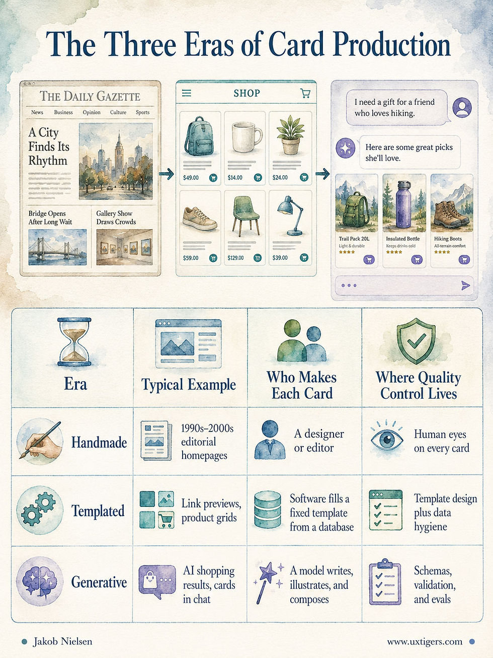
In the handmade era, a designer could inspect every card before users saw it. In the templated era, one person approved the template, and the database did the rest. In the generative era, nobody sees most cards before users do, because the cards don’t exist until the moment of the request. So the guidelines must stop living in a style-guide PDF that a reviewer applies after the fact and start living in the system itself: a card schema with typed, constrained slots (title of at most 60 characters, exactly 1 image with alt text, 3 metadata fields with fixed units, 1 action), validators that reject malformed cards outright, and evals, the AI age’s regression tests. These automated grading passes sample yesterday’s generated cards and score them against the rules. A guideline the AI can’t violate beats a guideline a reviewer would have to enforce. You used to design cards; now you design the deck.

When AI goes off the tracks in designing cards.
Three failure modes deserve special vigilance, because AI industrializes them:
Counterfeit cards. A hallucinated card looks exactly like a real one: crisp frame, confident title, plausible price. But if the summary overpromises or the fact is wrong, the card breaks the contract at machine scale, and the pogo-sticking that follows teaches users to distrust every card you deal. A schema checks a card’s form; only evals check its honesty. So add scent-integrity checks: does the card’s claim match its destination? By the same logic, personalize the lure but never the facts. Netflix picking artwork per member is fine; a card that adjusts its claims to each user’s psychological profile is a dark pattern with a personalization badge.
Clickbait drift. Train the card-writer to maximize clicks and you’ll breed clickbait, as YouTube’s thumbnail arms race demonstrated for years before generative AI showed up to automate it. Optimize card copy and imagery for downstream success instead: completion, satisfaction, return visits, absence of instant bounces. Reward the arrival, not the click.
Sameness at scale. Left to its defaults, a model writes 20 product descriptions in the same agreeable register, and the collection converges on beige. Run the shuffle test on generated card copy: if the descriptions could be swapped between cards without anyone noticing, they carry zero scent and should fail the eval. Differentiation is the entire job of card text; an AI that writes smoother sameness faster is a liability with good grammar.

If it makes no difference whether you shuffle information around between cards, the content is insufficiently differentiated.
There’s a final twist: the next reader of your card may not have eyes. As I noted in Hello AI Agents, and as the agentic-shopping data in my August 7 roundup confirms, users increasingly send AI agents to browse on their behalf. An agent parsing your product grid needs semantic markup, schema.org structured data, real text, and honest alt attributes: the same things a screen-reader user needs. Accessibility and agent-readability have converged, and my GEO guidelines cover the details. A card whose price lives inside a JPEG is now invisible twice: once to blind users, once to the shopping agents carrying everybody else’s wallets.
Conclusion: Keep the Card’s Promise
The index card conquered offices because it was uniform, bounded, and cheap. The screen card conquered interfaces for the same reasons, and it earned that victory: the frame does real cognitive work, gathering everything about one item into one perceptual object that a user can sniff in 2 seconds, tap with a lazy thumb, drag across a kanban board, or save to a collection.
But no librarian ever filed 1 card per drawer, padded in velvet, and no catalog ever profited from a card that lied about its book. The card is a great servant and a lousy default. Deploy it where users browse distinct things. Give the frame something worth framing. Write titles that pay off in 11 characters, pick images that inform at 250 pixels, and count the cards on your screen against the options your users must weigh. And if machines now deal most of your cards, move the guidelines into the schema and the evals, where no rushed reviewer can forget them. The frame is a promise. Keep it, whether the hand dealing the card is human or not.

It doesn’t matter who deals the cards, human or robot. The usability guidelines remain the same. (All images in this article made with GPT Image 2, except where indicated.)


