
UX Roundup: Long-Running AI | Consistency | What AI to Use | AI Anxiety | AI Helps Blind Users | NPS
- Jakob Nielsen

- Nov 3, 2025
- 10 min read
Summary: UX for long-running AI tasks | Consistent user interface design | What are the best AI models to use now | AI anxiety in the workplace | AI helps blind users, but a study found that accessibility challenges remain in current AI UI | NPS scored

UX Roundup for November 3, 2025. (Seedream 4)
UX For Long-Running AI Tasks
New explainer video about the UX of AI that runs for hours or days (YouTube, 5 min.).
Concept: Eton upperclassman.
I had a hard time making this avatar speak with a suitably posh English accent in ElevenLabs. We do need more voice variety to support a broader range of interesting avatar designs. The sound is just as important as the visuals in a video.
I should probably have turned to Hume for voice design, but when I tested it in 2024, I found it difficult to use for my projects. The fact that I still shy away from using Hume a year later is a testament to the durability of the negative brand impressions caused by poor usability, and why you shouldn’t launch new products without getting the UX right.
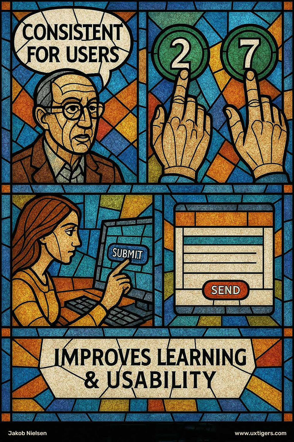
Consistency Improves Usability
Consistency is a foundational usability principle. It means that design elements, behaviors, and terminology follow the same rules across the product. This applies not only to visuals but also to function; ensuring that the same actions consistently produce the same results. When users can predict what will happen, they spend less effort decoding the interface and more effort accomplishing their goals.
Treat consistency as a hierarchy: follow platform conventions first (OS and browser behaviors), then product conventions (your own patterns), and only then local innovations. This ordering preserves learned behaviors from other apps, stabilizes your own experience, and limits novelty to places where it truly pays off.
One of the most significant benefits of a consistent UI is its direct impact on learnability. When elements like buttons, icons, and menus are placed consistently and behave predictably, users quickly develop a mental model of the system. This allows them to transfer knowledge from one part of the application to another, shortening the learning curve. For example, using the same icon–label pair and placement for the same action allows people to reuse knowledge instead of relearning. The resulting lower cognitive load lets users focus on their tasks rather than deciphering the interface, fostering a sense of mastery and confidence that encourages deeper engagement.
Consistency is one of the oldest usability guidelines, and I have preached it for more than 30 years, since I made it my usability heuristic number four, but new designers often feel that their ego is more important than users’ familiarity with old design conventions and try to impose “cool design” on humanity, which would rather be left alone and have technology that just works. (GPT Image 1).
Consistency must span channels. Labels, iconography, and flows should match across web, mobile, email notifications, and support content. If “Favorites” becomes “Saved” in another surface, people assume the feature changed. Name things once and use those names everywhere users encounter the concept.
Furthermore, consistency is a powerful tool for preventing user errors. Inconsistency breeds confusion; when the same action is labeled or visualized differently, users hesitate and make mistakes. Even small mismatches, such as swapping the color or position of a primary button, slow people down, increase misclicks, and disrupt workflows.
Language and formatting are part of consistency. Keep verb forms, date and time formats, capitalization, and units uniform (“Edit profile,” not “Edit Profile” in one place and “Change your Profile” in another). Users notice when words shift; this linguistic inconsistency degrades trust and makes the interface feel unstable, even if the visuals are aligned.
Feedback patterns also need rules. Use the same component for the same kind of message (e.g., inline validation for field errors, toast for transient confirmations) and keep durations predictable. When a spinner, progress bar, or haptic behaves differently for similar operations, users doubt the system’s reliability.
By establishing and adhering to clear design patterns, such as using a consistent color for confirmation buttons and another for cancellation buttons, designers can create a reliable and trustworthy environment. Users can then act decisively and efficiently, secure in the knowledge that their interactions will produce the expected results.
AI-driven features introduce a new challenge to consistency. AI models are often stochastic; the output (such as generated text, images, or personalized recommendations) differ each time, even with identical inputs. This inherent variability conflicts with the user’s fundamental need for predictability, as users often interpret variability as unreliability.
In AI interfaces, the definition of consistency shifts from the output to the interaction model and the presentation framework. The goal is not to force the AI to be deterministic, but to ensure the user’s experience interacting with the AI remains predictable. The UI must provide a stable, rigorous framework around the dynamic content.
To ensure consistency in AI features, designers must:
Anchor the unpredictable: Surround AI-generated content with stable UI elements. Navigation, settings, and primary action buttons should never shift, even if the content within a panel changes dynamically.
Standardize the framework: Even if the specific words or images change, the presentation must be consistent. Use standardized templates, typography, and containers to frame AI outputs, clearly differentiating generated material from static UI components.
Provide consistent controls: Users need predictable ways to manage, correct, and refine AI outputs. Mechanisms for prompting the AI, requesting revisions (regenerating), providing feedback (e.g., thumbs up/down), or saving the output must use the same components and placement every time they appear.
Maintain a consistent persona: While the specific content generated by an AI may change, the AI’s persona must remain consistent. The tone, voice, reading level, and adherence to safety guardrails must be maintained across all communications.
Ensure predictable feedback and error handling: Variability in the AI’s accuracy must be handled consistently. If an AI action fails, takes time to process, or produces a low-confidence result, the system’s feedback and error-handling behavior must be as predictable as any other part of the interface.
Consistency is not aesthetics; it is usability. A predictable system shortens learning, reduces errors, and removes friction. Investing in a design language, covering visual patterns, terminology, interaction models, and behavioral rules, makes the product more accessible, faster to use, and easier to evolve.
Which AI Models to Use Now
Ethan Mollick is probably the leading expert on AI use in business. He recently published his updated advice on what AI products to use now.
If you’re a regular reader of my newsletter, you already know what I use the most, but here are my current recommendations:
Text and reasoning: Gemini Pro (best for reasoning), Claude (best for creative writing)
Serious research: Deep Research from ChatGPT and/or Gemini (about equally good)
Everyday research (what used to be search): Perplexity (much faster than the Deep Research models)
Images: Seedream, GPT Native Image Model, Grok Imagine
Video: Kling, Veo
Music: Suno
Avatars: HeyGen
In all cases, I strongly recommend getting a paid subscription, since the free levels are strongly crippled. I also recommend getting at least one “Pro” subscription (called “Ultra” from Gemini and “Heavy” from Grok). These high-level subscriptions run $200–300 per month, but are worth the cost, especially to allow you to make full use of Deep Research and advanced reasoning.
Your company should reimburse you for up to $1,000 per month in AI subscriptions. They’ll get it back many times in increased productivity. If your boss is a dinosaur and doesn’t want to pay for AI, you may find it hard to spend that much from your family budget, but try your hardest to find around $300 to cover one “Pro” level subscription plus a few other tools at the regular subscription level. Think of it as an investment in still having a job in three years.
The list of recommended AI (whether Prof. Mollick’s or mine) is more stable now than it was a year ago. Of the 12 tools I list here, only three entered my list in the last half year (Grok Imagine, Seedream, Veo). Of course, 25% turnover in half a year is still substantial, but not nearly the pace of change we used to see in AI.

A rich toolkit is needed to get the best from current AI. But the product space is somewhat stabilizing. (Seedream 4)
If you only use ChatGPT, you’re missing out on the benefits of specialized AI tools. More important, you will be seriously underestimating the creative and productive potential of future AI. A sad statistic from a recent survey of 2,430 research scientists: Only 11 % of respondents had heard of specialized research tools, leading most to rely on general‑purpose tools like ChatGPT.
From that survey: AI usage among researchers rose from 57% in 2024 to 84% in 2025. Although 85% say AI improves efficiency the share of researchers who believe current AI exceeds human capabilities less than one-third.
“AI Anxiety” Is Real
Employee‑experience firm Perceptyx surveyed more than 3,600 workers in North America and Europe to assess AI adoption. Although 71 % of employees use some AI, only 15 % of respondents say they use AI to its full potential, suggesting that curiosity outstrips mastery. (Of course, even people who think they use AI to its fullest probably don’t. For sure, they don’t use all the AI capabilities we won’t get until next year.)
Seniority is a major divide: 82 % of executives rely on AI, compared with 68 % of managers and just 35 % of individual contributors. Managers also report that AI is reshaping their jobs; 81–85 % say their workload has changed, and 84–90 % need new skills.
Given that AI use is concentrated among senior staff, it may not be surprising that only 47% individual contributors say they understand how AI is used in their organization. However, realizing the full potential of AI requires a complete rethinking of workflows, and most likely a bottom-up approach in many cases. This lack of AI use and understanding among the people who do the everyday work is a condemnation of the extremely poor approach to AI training in most companies, and an equally bad assessment of the executives’ ability to articulate and communicate the company’s AI strategy.

Very wide gap between the need for AI and the number of employees who believe they use its full potential. (Seedream 4)
Microsoft Study: Copilot Helps Blind Developers, But Accessibility Gaps Remain
Microsoft Research Asia studied how GitHub Copilot and similar tools support blind and low‑vision developers. Sixteen participants completed onboarding tasks and used Copilot over two weeks. The AI assistant helped participants write user interfaces via natural‑language prompts and reduced the burden of memorizing syntax.
The study distilled eight concrete recommendations to make AI programming assistants more accessible:
Provide consistent, discoverable keyboard shortcuts so users can navigate suggestions without using a mouse.
Offer guidance on how to write effective prompts and clarify which programming tasks the assistant can handle.
Deliver concise, structured responses and allow users to toggle verbosity; long answers slow down screen reader navigation.
Integrate a consolidated view of suggestions, code, and errors so users need not switch contexts.
Include clear status updates and progress indicators for long‑running tasks. (Something I covered recently in my review of how to improve the usability of slow AI.)
Build accessibility guidelines into the assistant so that generated code adheres to them.
Support personalization so users can tailor the interface to their preferences.
· Make training materials accessible via screen readers.
The last point is a good reminder that total user experience extends beyond the user interface to include user assistance.
Most of these recommendations would also improve usability for sighted users, but become more critical when users have a more limited way of using the AI. Good to see this kind of study being done and published. (Click the above link for more details.)
Scoring the Net Promoter Score (NPS)

NPS divides respondents into three groups: detractors who will warn people against your product, promotors who will recommend you, and passives who won’t tell anybody about you. (Seedream 4)
The Net Promoter Score (NPS) has two main advantages:
It is widely used, meaning that many stakeholders already know it, and the plethora of existing scores means that new scores are easy to interpret.

Popularity has its own strength. People know NPS, and that’s a reason in itself to use it. (Seedream 4)
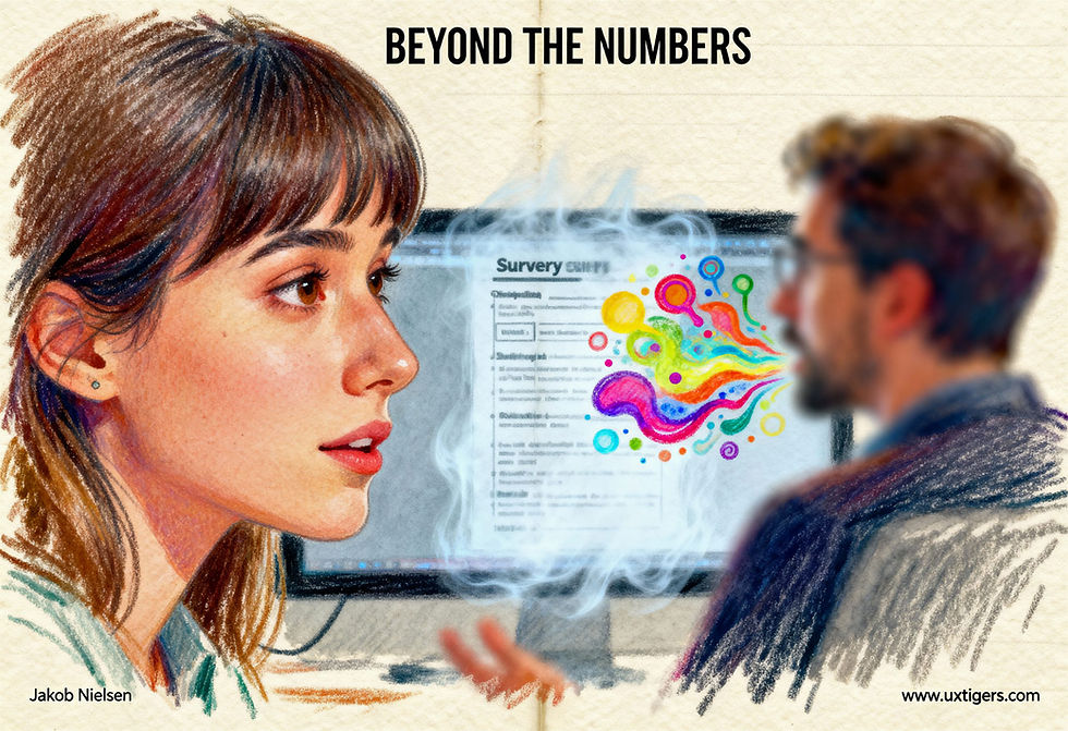
It is a single question: “How likely are you to recommend this to a friend or colleague?” (Scored on a 0–10 scale.) Fewer questions yield more responses and, in turn, higher validity. In user research, qualitative observations are more valuable than survey responses, so it's best to spend as little time in a session on questionnaires. Less is more! (However, for a single question to ask users, I prefer the Single Ease Question (SEQ).)

Ask less, learn more. (Seedream 4)
The pros and cons of NPS have been endlessly debated in UXR, and MeasuringU has done the field a great service by collecting the most trustworthy evidence in a single article.
(MeasuringU are the world’s leading experts in quantitative user research, so I trust their summary of what results to trust.)
Here’s my summary of their summary:
The Good: “Promotors” actually recommend and “detractors” detract, and NPS’s boxing of responses into three groups (with “passives” being the third) is justified. Also, NPS is a reliable metric with an appropriate response scale, and a single question suffices.

The so-called promoters really do promote your product or service to others. (Seedream 4)
The Bad: NPS is not as strong a predictor of company growth as claimed when it was introduced, and it's not better than satisfaction metrics.
The Ugly (when used in UX design): NPS doesn’t tell you how to improve the UI in a redesign.

Being told your product’s NPS score is no help to the designer when trying to untangle a confused user experience and create a clean UI. (Seedream 4)
MeasuringU reminds us that this last Ugly point is not a problem with NPS as such, because it was never intended as a design tool. It’s a summative evaluation, not a formative one. However, as long as UX is resource-constrained, I prefer allocating our limited resources to collecting data that will drive product design and thus improve both company profits and customer satisfaction.

Summative evaluation tells us whether the design is good or bad, but not how to improve it. Formative evaluation tells us which parts of a design work, and which parts have usability problems, and helps steer the direction of the following design iteration to build a better product. NPS is a summative evaluation. (Seedream 4)
User research can be so much richer than “72,” or whatever NPS score you get. (Seedream 4)
No matter how rich the world gets, resources will never become infinite, but it’s likely that after AI has doubled or tripled the world economy, more resources will be available to uplift design quality. Richer people demand better goods and services, after all, and they can pay. Let’s say that UX budgets will be 10x in 20 years: that, of course, will mean less strict prioritization of what to do. We will always need to prioritize and avoid wasting shareholders’ money, but for the time being, we still need to curtail UX spending severely. That’s why I ultimately come out against NPS.

Budget limits will always be with us. The great builders of the past had far less than we do, yet they constructed wonders. Our successors will have more, as AI triples the world economy. (Seedream 4)

Rich people demand higher quality, so as AI makes the world richer, people will spend some of their newfound wealth on better design. (Seedream 4)


