
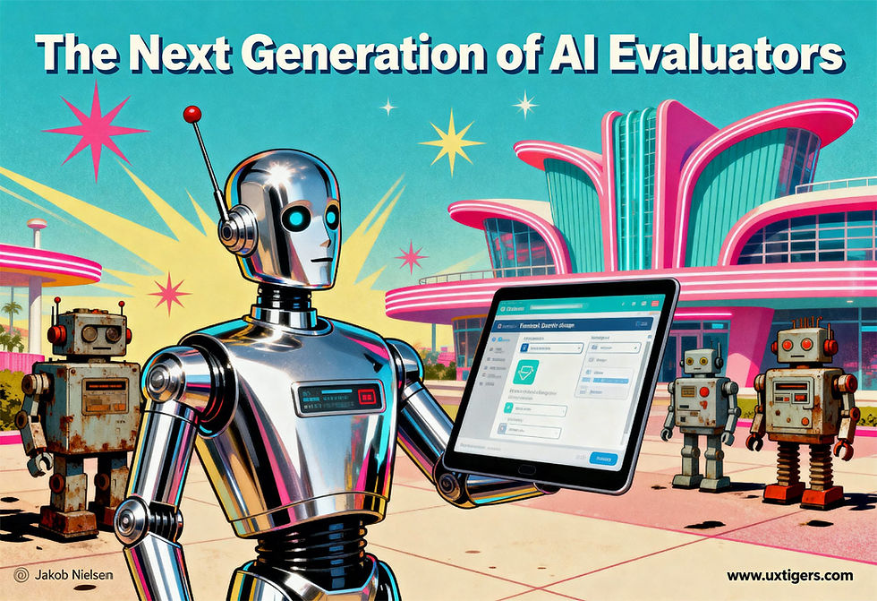
UX Roundup: Usability Halloween | Score Secondary Research | AI UI Ideas | Heuristic Evaluation with AI
- Jakob Nielsen

- Oct 27, 2025
- 12 min read
Updated: Nov 12, 2025
Summary: Usability Halloween | Study Similarity Score to assess the relevance of secondary research | 23 design ideas to improve AI UI | Using AI to conduct heuristic evaluation

UX Roundup for October 27, 2025. (Seedream 4)
Usability Halloween Costume
Dress up as a usability expert this Halloween! I made a short video (YouTube, 3 min.) with Sora 2 and Veo 3 to show what kids think of this idea. (Spoiler: They like it, but then all these kids were generated by my prompts.)

Happy Halloween from all of us at UX Tigers! (“All” being simply Jakob Nielsen and a bunch of avatars.)
When you watch this video, note how the clips I made with Sora are highly frantic with many fast jump cuts, especially in comparison with Veo’s calmer cinematography. I am convinced that Sora 2 has undergone extensive reinforcement training to emulate viral social videos, whereas Google was probably more influenced by educational videos when training Veo 3.
While it's nice to make something like my Halloween video with minimal prompting that leaves all the cuts and edits to the AI controlling the video model, I prefer the video I made with a usability action figure (YouTube, 1 min.) because of the added control I have when writing the script and directing the clips myself, rather than both being automatically composed by the AI.

I just have to show you this image: I asked Seedream 4 to generate a “Halloween-themed image with a tiger,” and this is what I got. I am a big fan of this Chinese image model, and it did deliver high prompt adherence (there’s a tiger and several Halloween-related image elements), but I still think it’s a rather absurd interpretation of the brief.

To give Seedream credit where due: here is its second attempt at a Halloween tiger. Nice and spooky.
3S: Use the Study Similarity Score to Assess Secondary Research Relevance
Secondary research is the use of other people’s user research findings to inform your own design project. Several benefits: the secondary research project has already been completed and published, so the findings are immediately available, whereas days or weeks will pass before getting the results of a new (primary) user study. Secondary research is also usually free (as for most academic papers) or relatively cheap. For example, Baymard Institute charges $200/month to access the findings from more than 150,000 hours of user research with shoppers using e-commerce websites. If you run an e-commerce site, you can learn more than you’ll be able to implement at the cost of a small amount of gold relative to the increase in sales you’ll get with better usability.

The ROI from secondary research can be high, even if you have to pay for an outside report, as long as it’s highly targeted to your situation. Most secondary research is free, but it still incurs an opportunity cost from the time you spend reading it. (Seedream 4)
The main problem with secondary research is that other people did it, and their research goals differed from your goals. This means that some secondary reports can be useless (and thus not worth your time to read, even if the paper itself it free), or possibly even misleading.
Consider the simple example of designing a product for giraffes and coming across a user research study conducted with ostriches. Both animals have long necks, so maybe a finding about how to design to accommodate long necks will transfer. Maybe a guideline could be to use very large fonts that are readable when the user’s head is far from the screen, as shown in this realistic image of the two user populations:

If you design software for giraffes, beware of relying on secondary research conducted with ostriches. (Seedream 4)
On the other hand, a giraffe is a mammal whereas an ostrich is a bird, so any findings that relate to the ability to use the product while keeping your eggs warm during nesting will be useless. In fact, giraffe usability might even be reduced by implementing design guidelines targeted at nesting ostriches.
Enter the Study Similarity Score (3S): A simple way to assess a secondary study’s findings will transfer to your own products.
You score each of the following 5 characteristics on a 0–100 scale, based on a quick scan of the report or paper, mostly focused on its methodology section:
User match: Are participants like your users?
Task match: Are tasks the same workflow, inputs, and constraints?
Context match: Same device, stakes, time pressure, assistive settings?
Outcome match: Same success metrics (sales, speed, error, satisfaction, retention)?
Ecological validity: Is it field‑like (real data, real stakes) vs toy prompts?
The 3S is the sum of these five individual scores. Action, based on a report’s 3S score:
400–500: You’ve struck gold. Read the report in depth and strongly consider following its recommendations in your design.
250–399: Skim the report for insights and issues to be aware of in your own subsequent user research. However, beware of implementing design recommendations without doing at least a quick user test of your own with your own target audience and tasks. Luckily, vibe design makes it fast to drum up a prototype design to gather valid data cheaply.
0–249: Findings from such secondary research are unlikely to generalize to your design. However, you may be able to get ideas for your own research from the authors’ methodology.

If you find a secondary research study with a 3S score above 400, you’ve struck gold. Mine it for all it’s worth. (Seedream 4)
23 Design Ideas to Improve AI UI
The master’s students in Dan Shaffer’s “Design of AI Products and Services” class at Carnegie Mellon University has published a set of 23 ideas for improving the linear chat that’s the dominant user interface for most current AI systems.
Let me first say that I am impressed by this student work. What’s published for now is just the outcome of their initial ideation, and I am sure that the design patterns will get clarified further in subsequent work. Even now, the list should serve as inspiration for AI labs in improving the usability of their products.
These features mostly address power user problems, because they only become important when you use AI extensively. On the one hand this focus is too bad for the 7 billion humans who still don’t use AI and need easier novice access, but on the other hand it’s good because it shows that these students are heavy AI users themselves, which bodes well for their career prospects. (You could do worse than hiring one of them.)

Current AI UI is dominated by scrolling (whether scrolling a single chat session, or scrolling a list of past chats, but as the number of objects increase, navigation becomes essential for usability. Many of the design ideas discussed here fall under this very general umbrella. (GPT Image-1)
The concepts designed to improve AI interaction fall into four essential themes, each addressing common friction points in AI-powered products.
1. Workflow Structure and Conversation Organization (8 UI Ideas)
This theme addresses the fundamental difficulty users experience when traditional linear chat interfaces fail to support complex, multi-threaded work and collaboration within interfaces traditionally constrained by sequential chat logs. To enhance flexibility during ideation, the concept of BranchFlow allows users to branch AI responses into visual trees, retaining context and automatically clustering related ideas, enabling seamless transitions into structured workflows. For workflows requiring different types of interaction, the Dual-mode AI Workspace caters to varied user needs by offering a freeform canvas for creative flexibility alongside a guided workspace tailored for structured, goal-oriented tasks, all within a single interface. Effective continuation of work is supported by Contexts, which provides AI-generated workflow threads that span across multiple chats, helping users mentally track and quickly switch to the most recent instance of an ongoing task.

Many ideas for improving AI UI related to supporting a branching nature of many interactions, instead of treating everything as linear. (GPT Image-1)

The dual-mode workspace provides two UIs: for freeform exploration and for guided sessions with more structure. (GPT Image-1)
To combat the difficulty of revisiting past work (something particularly needed after long AI runs), Thematic Chat Grouping automatically clusters related chats based on shared themes, linking conversations with summaries and dates so users can trace ideas and jump between connected threads. For dealing with volume, Info Clusters groups chats to provide an overview of numerous conversations and allows for stable export and data transfer between different AI applications. When returning to a specific old conversation, the Re-entry Panel helps users regain context by providing an always-updated, AI-generated recap of the last session, key topics, and suggested next steps, allowing them to seamlessly resume their workflow. Furthermore, navigation within lengthy chats is simplified by the Chat Navigator, which lets users star key moments, enabling quick previews and navigation back to relevant parts of the conversation. Lastly, the Bookmark Tab solves the problem of extensive scrolling by collecting previous outputs or prompts, making them readily available for reuse or review.

Bookmarks are an old design pattern for web browsing and file management, but so far less used for managing the copious amounts of AI objects (whether prompts or output) we have to deal with. (GPT Image-1)
2. Prompt and Input Guidance (7 UI Ideas)
A major hurdle for users is articulating complex or multi-goal requests and dealing with the blank canvas of a chat box, which often hides the AI’s true capabilities: what I call The AI Articulation Barrier). This theme introduces systems to improve input clarity and effectiveness, starting with Prompt Modes (like Research or Design guides) positioned near the chat box to give users guidance on framing their requests effectively. To help craft the initial request, Prompt Prompts or Prompt Suggestions offer ways to improve a prompt before waiting for a response by suggesting keywords and tags, or users can rely on AI Prompt Generation, which provides flexible options for iteration while still permitting manual editing (this set of features are roughly the same as what I discussed as “Prompt Augmentation”).
For complex inputs, the Prompting Guide addresses "Chunky Context Dumps" by visually parsing the input text and categorizing components like Goals and Contexts into a navigable bar for user review (an idea related to Aided Prompt Understanding). Finally, to ensure the AI focuses on crucial elements, users can employ Highlight Attached Files using semantic colors, or utilize Highlight What’s Important in the prompt itself by highlighting or using typographic hierarchy (like bolding) to communicate priorities to the AI.

The prompting guide automatically categorizes prompts and separates goals and context, possibly helping users understand why some prompts work better than others. (GPT Image-1)

Using multiple colors to highlight different aspects of prompts and attachments, to indicate importance ratings or category differences. Maybe future AI user interfaces will be like a colorful chameleon that changes color depending on circumstances. (GPT Image-1)
3. Trust, Transparency, and Output Control (4 UI Ideas)
This cluster is dedicated to fostering user trust by addressing issues of transparency (hallucinations, source context) and enabling granular control over the AI's generated output, since current tools often require clunky full regenerations. The Side-Panel AI Verification mechanism addresses lack of context and hallucinations by opening a side panel showing contradicting information and allowing the user to quickly resolve or ignore issues, while the Preview of Source concept facilitates fact-checking without leaving the AI by providing a preview of the referenced source. Regarding output modification, Multi-level Refinement provides clear entry points for editing at various levels, offering option-level icons for big-picture edits (like rewrite or merge) and inline highlighting for precise changes (refine, suggest alternatives). Similarly, the Fine-tune Pop-ups allow users to select only a specific area of text in the output and perform immediate fine-tuning actions, such as improving, explaining, or changing the tone of that selected section.

A fine-tuning UI will allow users more detailed control over what parts of AI-generated objects they want to work with. (GPT Image-1)
4. AI Memory Management (4 UI Ideas)
This theme focuses on making the AI’s memory explicit, organized, and controllable, resolving the issue that Large Language Models (LLMs) frequently forget important information between sessions. The concept of Conversational Memory seeks to make the memory process transparent and controllable within the natural flow of conversation by displaying in-line citations when memories are used and allowing users to confirm anchor phrases. To improve context, Memory Citations specifically show exactly where memories are being pulled from, while Memory Context provides a more robust organizational structure for memories, helping users navigate many long conversations by grouping them.
Finally, addressing the issue of LLMs forgetting preferences, Memory Setup is offered as an optional task that allows users to proactively remind the AI of their settings and priorities, ensuring those preferences are applied going forward.

Better abilities for understanding and managing what AI remembers about you and past interactions, maybe even before we set out on an interactive journey with the AI. (GPT Image-1)
New Video Model VEED: “Less Is More” Sample Video
Small experiment with the new video model VEED Fabric 1.0. I made a video where Hades, the King of the Underworld in Greek mythology, discusses one of my favorite usability slogans: “Less Is More.”

Less Is More, discussed by Hades. I used Seedream 4 (my current favorite image tool) to make the thumbnail for my new video.
For comparison, the video also includes a segment made with OpenAI’s Sora 2 video model, based on the same concept. Since Sora currently doesn’t support uploading photos of “real people” (or Greek gods), it made Hades look different in each of the clips I edited together for its segment.
I continue to be disappointed with Sora, but I also recognize the usability benefits from generating a video without first having to create characters and write the manuscript for what they should say, both of which I did for the VEED segment. With Sora, I just told it to make clips where Hades talks about “Less Is More,” and the AI filled in all the details.
In my series of “Greek gods discuss usability” videos, I prefer what Veo 3.1 did with Aphrodite. Very nice character consistency from uploading an “ingredient” photo, which Veo used as the basis for multiple clips.
Heuristic Evaluation with AI
Luis Campos and colleagues, from the Federal University of Technology Paraná in Brazil, have published a study on using AI for heuristic evaluation, comparing the performance of two AI models with that of 4 human usability experts on using my 10 usability heuristics to spot design flaws in a UI.
They evaluated the usability of a system to assist physicians and nurses in pediatric intensive care units in using a protocol for assessing pediatric patients’ conditions using physiological indicators. AI and human evaluators were both provided with screenshots of 16 screens from this UI.
The AIs were ChatGPT 4o (launched May 2024) and Gemini 2.5 Flash (launched June 2025). It would be interesting to have the study replicated with the current top versions, GPT 5 Pro and Gemini 2.5 Pro Deep with Deep Think. Most likely, these upgraded AI models will perform better.
Academic publishing moves so slowly that every time we see a new paper, it’s already obsolete because it tested yesterday’s AI models, not today's. Let alone tomorrow’s AI, which is what we need to assess to plan our careers. (Seedream 4)
The two AI models performed about equally well:
GPT 4o: 63 usability problems found, with 18% false positives in its initial report.
Gemini 2.5 Flash: 82 usability problems found, with 17% false positives in its initial report.
Human usability experts (average of 4): 25 usability problems found, with 7% false positives in the initial reports.
Humans are better than AI at avoiding false positives; that is something claimed to be a usability problem, even though it isn’t. On the other hand, AI is better at digging deeper and identifying more design issues, though the extra findings will often be minor usability problems that are irritations rather than show-stoppers that prevent users from completing their tasks. (This study didn’t classify usability problems by severity, so I’m going by findings from prior research in this assessment.)
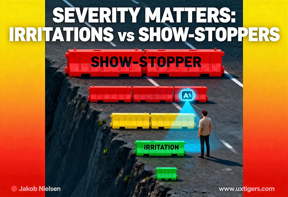
Usability problems vary in how big a barrier they pose for users’ ability and willingness to complete tasks. Unfortunately, AI currently has fairly poor judgment, so it will often highlight more minor usability problems than major ones. This is one reason human judgment calls remain needed for a few more years. (Seedream 4)
Replicating both my own original research on heuristic evaluation and new research specifically on using AI for heuristic evaluation, the different AIs found different usability problems. Of the total set of usability problems identified by AI, 20% were found by both AIs, 38% were only found by ChatGPT, and 42% were only found by Gemini. Considering how cheap it is to subscribe to multiple AI models, it’s highly recommended to employ more than one on a heuristic evaluation project.

Having multiple AI models analyze the same problem often yields better results and remains cheap. (Seedream 4)
(It was also the case that the human evaluators found different problems, and that the coverage from combining 4 evaluators’ reports was much better than relying on a single human usability expert. However, it’s very expensive to employ many human professionals to do the same job.)
AI probably still can’t beat human usability experts at heuristic evaluation, though I expect that the current frontier models will do better than what’s documented in this and other research using older models. Next year’s models will do even better. When will AI exceed human performance in heuristic evaluation? My guess is sometimes between 2027 (next-generation AI, whether or not it will be called GPT-6) and 2030 (superintelligence).
One reason AI will get better at heuristic evaluation is that it will be able to use live user interfaces to perform real tasks, which consistently improves results compared to evaluating a design based on static screenshots. It’s the beauty of heuristic evaluation that it works with any representation of a design, whether a fully implemented live system, a clickable prototype, static screenshots, or a theoretical specification without screen designs. However, the more real the UI, the better heuristic evaluation does.
For now, you particularly need to worry about false positives when using AI for heuristic evaluation. My recommendation: Treat the AI report as a list of suggestions, not as final recommendations for redesigning UI elements. Have a human expert review this suggestion list: it is always much easier to judge the usability of a design component when it has been called out for detailed inspection, and when the initial report lists the UX principle (out of the 10 canonical heuristics, or any other known usability insights) that this design element supposedly violates. (In contrast, it’s hard to identify usability problems when given a UI design to evaluate without suspected usability violations already identified.)

For now (at least until 2027), treat a usability report from an AI model as a list of suggestions for a human usability expert to review, not as UX design gospel. (Seedream 4)


