
UX Roundup: Usability Still Improves | AI Persuasiveness | Featuritis | AI Fiction Wins | Stepper Controls

Summary: A better design system improved usability | AI persuades even when people know it’s AI | Fewer features = better usability | Readers prefer AI stories if they don’t know it’s AI | The stepper design pattern for adjusting numeric values

UX Roundup for August 31, 2026 (GPT Image 2)
Google Took Aim at My UX-ROI Claim and Hit Its Own Design System
A new Google eyetracking study found that redesigns following the Material 3 Expressive guidelines let users complete whole tasks 20% faster and spot the correct control 33% faster than with Google’s shipping designs, with users over 45 gaining the most and satisfaction ratings up on all 5 scales. The authors present this as refuting my claim that usability’s low-hanging fruit has been picked. Half a point to them. The fruit was real, but it had been caged by Material Design’s own rigidity. The gains came from a design-system upgrade rather than from user research, and bigger buttons are a bounded trick. Flexibility also cuts both ways: a higher usability ceiling for skilled teams, a lower floor for the untrained majority. My declining-ROI thesis takes a dent and keeps rolling.
It’s not every year that Google publishes a study built to prove me wrong, so let’s welcome it properly. In the CHI 2026 paper Usability Hasn’t Peaked, Frank Bentley and co-authors from Google and Ipsos had 48 participants in Chicago wear eyetracking glasses while completing tasks in 10 widely used Android apps, including Gmail, Meet, Messages, Fitbit, and Alarm. Each app appeared in two versions: the shipping Material 3 baseline and a redesign following Material 3 Expressive, the flexible design system Google released in May 2025. Their declared target: my article Declining ROI From UX Design Work, where I wrote that “the low-hanging fruit of terrible usability has long since been picked.”
The Data Is Real: Faster Eyes, Faster Thumbs

Two notes on the table. The task-time row is what the paper files under “tap time”: the clock ran from screen display to the correct tap, and since every task was a single tap, tap time is total task completion time in this study. The sentiment row averages the 5 attributes in the paper’s Figure 6 (Appealing, Clean, Fun, Modern, Easiness); exact means are printed for 4 of the 5, so I measured Appealing off the chart, calibrated against the 8 printed values, good to ±0.02. Since sentiment was measured on an interval scale, not a ratio scale, we can’t calculate an improvement percentage, but a 0.7-point gain is substantial on a 5-point scale.
The first row is the bottom line. Users experience total time, and businesses pay for total time. Component measures such as fixation time are useful diagnostics: they explain why a design got better (people locate the control sooner), but for judging how much better, only the whole task counts, not the time spent on its parts. Here the decomposition is tidy: 0.80 s of the 1.17 s total saving, or 2/3, came from finding the element faster, with the rest from confirming and reaching it once seen. The single-tap setup is double-edged, though. It makes the measurement clean, and it leaves open whether the 20% survives real multi-screen workflows.

Most high-value UX designs involve multi-step tasks: ecommerce, for example, requires at least finding and evaluating the product, plus checking out. Completing a single screen quickly is less interesting than the user’s progression through the full workflow, and this was not measured in the current study. (GPT Image 2)
The 45+ row is the study’s human story. On the old designs, older users needed more than twice as long as the young to find the right control; on the Expressive versions, they reached parity. Individual tasks saw even bigger wins: spotting the button to forward a concert invitation in Gmail got 73% faster.
Satisfaction moved with performance. Expressive won on every one of the 5 attributes, with the widest gap on Fun (3.97 vs. 3.07 for baseline) and the narrowest on Clean (4.15 vs. 3.76), and users preferred the redesigns outright in 8 of the 10 apps. A 0.7-point jump on a 5-point scale is a big move for mature products, and satisfaction is the usability component that keeps users around after the stopwatch goes home.
A further point in the study’s favor, one the authors were too modest to claim. Since Masaaki Kurosu and Kaori Kashimura of Hitachi showed in 1995 that ratings of 26 ATM layouts tracked beauty more than actual operability, and Noam Tractinsky and colleagues confirmed it in 2000 in the aptly titled What Is Beautiful Is Usable, we’ve known about the aesthetic-usability effect: users rate attractive designs as easier to use whether or not they are. In Tractinsky’s ATM experiment, degrading the actual usability didn’t even dent the ratings. So the 4.57 Easiness score alone would prove little; pretty pixels buy good reviews. What elevates the Google study is that the eye tracker and the stopwatch moved in the same direction as the opinions. Perception flatters; a 1.17-second faster correct tap doesn’t. When behavior and sentiment agree, you can believe both.
The classic aesthetic-usability effect: users scoring something higher just because it’s pretty. This is why ratings alone are insufficient to judge usability. (GPT Image 2)

Actual behavior, as measured by timing studies and eyetracking, differs from users’ subjective opinions, to which I usually accord less credence. But when the two types of data point in the same direction, that strengthens our belief that the new design is superior. (GPT Image 2)
Credit where due: this is how to argue about usability. Behavioral data, randomized presentation, and fieldwork run by Ipsos researchers rather than by the team that made the designs. They also picked the hardest possible test, Google’s own most polished apps, which the authors correctly note are exactly the designs I said would resist further gains. My gripes are brief: screens were first-exposure, and the study measured seconds and smiles, not sales or user performance with real work. Nobody measured a business outcome, which is what an ROI argument needs. But one detail cuts in their favor: participants use the current apps daily, so familiarity should have advantaged the baselines. Expressive won anyway.

What will a hard-nosed business executive with budget responsibilities say? (They’re all hard-nosed, or their companies would go under.) That it’s nice enough to save users a few seconds, but that’s not money in the bank. A true ROI argument needs to go one step beyond pure usability metrics. (GPT Image 2)
The Fruit Existed Because Google Had Caged It
So where was a 0.8-second fixation gain hiding in 2026, on screens polished by decades of UX work? Inside the design system’s own rulebook. Old Material required every button to be 48 dp tall, and most ended up the same regulation blue. Uniform components mean a flat visual hierarchy, and the Hick–Hyman Law tells us what follows: when nothing stands out, users must scan everything. Material 3 Expressive lifts the restrictions with Extra Large buttons, contrasting colors, color-based containment to group related controls, and variable typography.

Uniform designs make users hunt across the whole screen, while expressive hierarchy lets them land. (GPT Image 2)
Thus the usability plateau was partly man-made: a local maximum enforced by design-system rigidity, which is the authors’ own framing and a fair one. And yes, I concede the point that follows. Mainstream mobile design did have one substantial, cheap gain left. I said the orchard was bare, and Google found a fruit. In a cage. That Google built.

The low-hanging fruit of the bigger button was locked up in a cage by the rules of the previous design system. (GPT Image 2)
Bigger Buttons Are Bounded Fruit
Fitts’s Law dates to 1954: larger targets are faster to hit, and the new data confirms it still works. But this fruit has two hard ceilings. First, salience is a budget. Emphasize one or two actions and the screen gets faster; emphasize everything and you’re back where you started, because when every button shouts, no button is heard. The paper proves this itself: the only app where users preferred the old design (Setup, at 66%) was the one they said had too many colors.

Fitts’s Law still works (and it always will): make something bigger, and it’s easier to hit. But you can’t make everything big, or you run out of screen. (GPT Image 2)
Second, size runs out of screen. The limit case is a phone whose entire display is one giant button. Superb usability. One feature. (The paper’s giant alarm-snooze button also doubles as its example of persuasion: a designer can aim the biggest button at whatever he or she wants pressed, which is not always what the user wants.) So the Expressive gain is a one-time level shift. Once apps harvest visual hierarchy, we’re back on the plateau, one terrace higher.

If you make everything big, colorful, and flashy, pretty soon nothing stands out. There are limits to this design strategy. (GPT Image 2)

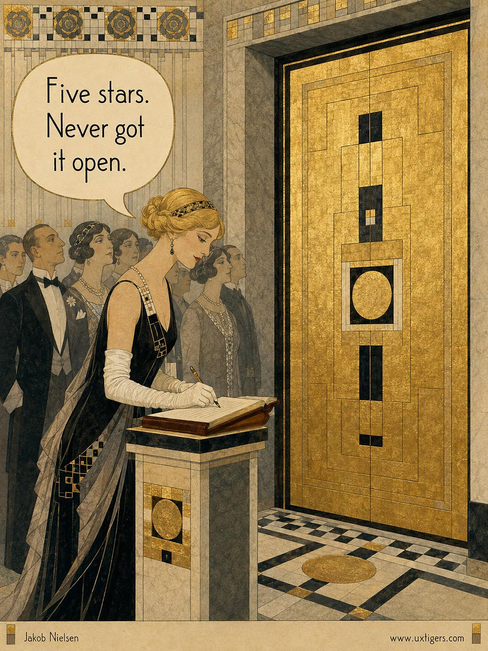
The ceiling bites. This product manager is right, though: fewer features usually lead to better usability. (GPT Image 2)
The Gains Are a Design-System Dividend, Not a Research Renaissance
Now for the part the paper’s framing skips. How were the winning screens produced? Google handed its product designers a Figma kit and the Expressive guidelines, gave no instructions to focus on usability, and waited a few months. No user testing shaped the redesigns. The improvements are a design-system dividend: the platform team invests once, and every Android app inherits better defaults for free, precisely the commodification my ROI article described: best practices “available for the picking.”

A good design system springs from extensive usability research, and that research pays fat dividends to both the platform owners and independent software vendors. But once this research is embedded in the design system, independent companies shouldn’t redo that usability work. Better to comply with the design system and leverage Jakob’s Law. This doesn’t mean there should be no usability jobs on independent app teams (research is still needed on workflows and feature definitions), but it does mean fewer jobs. (GPT Image 2)
Research didn’t vanish; it centralized. Material’s guidelines rest on years of usability studies by the design-system team, and this paper is itself validation research run once for billions of users. At that scale the arithmetic sings: 1.17 seconds saved per tap, multiplied across billions of daily taps, recalls how my old phone-company colleagues saved $7 million per year by shaving one second off directory-assistance lookups. Platform owners will always enjoy usability ROI that the median product team can’t match. The median team’s rational move: skip the hiring spree and adopt the system.

A second here, a second there: shave a second off an interaction performed billions of times, and pretty soon you’re talking real time. (GPT Image 2)
My advice:
Promote the true primary action on each screen with extra size and a contrasting color, and group secondary controls with containment. These gains cost almost nothing and pay most for users over 45.
Spend salience like money. One emphasized action per screen, two at most.
Verify with 5 users that the button you enlarged is the one users actually want pressed, and stop there; it’s a one-time check.
Flexibility = Higher Ceiling, Lower Floor
One risk deserves its own subhead, and to the authors’ credit, they flag it themselves. Prescriptive design systems capped usability, but they also guaranteed it: when every button must be 48 dp tall, the worst screen an untrained engineer can ship is still recognizably usable. Old Material was a floor as much as a ceiling. Give that engineer Extra Small buttons and free rein with color, and he or she can now build something worse than anything the old rules permitted, including sleeker dark patterns. Remember who produced the study’s winning screens: professional Google product designers, whose work was then reviewed for compliance with the Expressive guidelines. The median Android app gets neither.

The lab achieved its 20% gains through top designers and compliance review; the app ecosystem may show less care and thus realize smaller gains. (GPT Image 2)
Thus I expect the ecosystem-wide gain to undershoot the lab’s 20%, with skilled teams climbing toward the new ceiling while part of the long tail falls through the new floor. Design-system owners can hedge this by shipping opinionated defaults, because defaults are what the untrained use. Jakob’s Law adds a second brake: users transfer expectations between apps, so 10 apps that each express themselves differently tax users more than 10 uniform ones. The paper’s answer, that broad patterns still transfer within one stylistic family, is plausible but untested.

The more apps differ in their UI expression of the same underlying functionality, the harder all apps are to use, because the differences impede transfer of learning. Thus, a stricter design system will lift usability across the board, even if the specifics it imposes are not necessarily any better than those of a more loosely applied design system. (GPT Image 2)
One Dent, Same Curve
Was I simply wrong? Partially, and happily. Wrong that no cheap step-change remained in mainstream mobile: one fruit was left, locked in a cage of Google’s own construction, and Expressive is the key. Very likely, vendors could tighten their design systems further to “force” (or encourage) better usability from the projects built on them.

My report on the extinction of the low-hanging usability fruit was premature: there was a big button left to be found. (GPT Image 2)
Right about the economics: the gain arrives as a commodity pattern requiring no per-team research, its main lever saturates fast, and my ROI curve gets a blip before resuming its decline, much as I predicted for the AI land-grab phase. Enjoy the fruit; it’s a good one. Just don’t rebuild the orchard ladder on the strength of a single apple.
AI Labels Don’t Blunt AI Persuasion, but Intent Warnings Cut It in Half
Users who were prominently told they were chatting with an AI were persuaded exactly as much as users told nothing. Disclosing what the AI was instructed to do cut persuasion in half. Regulate hidden agendas, not AI provenance.
In my August 7 roundup, I covered how AI now out-persuades champion human debaters through fact flooding: burying users under more claims than anyone can rebut in real time. The obvious defense is disclosure. Tell people they’re talking to a machine, and surely they’ll discount what the machine says. A new preregistered experiment by Adrian Rauchfleisch (National Taiwan University) and Andreas Jungherr (University of Bamberg) tested that defense. It failed completely.
1,500 UK adults held short chats with a GPT-5.6 chatbot arguing for one of 60 policy positions. With no disclosure, attitudes shifted 12.6 points on a 0–100 scale. With a prominent EU-style “AI-generated” label shown before and throughout the chat, the shift was 13.1 points: statistically equivalent. (The study ran the week before Article 50 of the EU AI Act made such labels mandatory. Great timing, though too late to stop this intrusive mandate.) 98% of labeled participants recalled the label. It changed nothing.

An explicit “AI-generated” label did not make the content measurably less persuasive. (GPT Image 2)
Readers of my AI Stigma article should pause here: study after study shows people rate identical work worse once told that AI made it. Why does the stigma make users like AI less, yet believe it anyway? My best guess: stigma is a verdict on the source, while fact flooding attacks through the content. This bot packed 2 factual claims into every message, about 7 per conversation, and 96% of them checked out as accurate, so this wasn’t even misinformation, just careful selection of facts that “happen” to support the hidden agenda. Sneering at the messenger refutes none of the claims, and nobody can verify 7 claims mid-chat.

Fact flooding is a dark design pattern when AI spits out so many facts that people believe its claims. (GPT Image 2)
What worked: a second treatment also disclosed the bot’s intent, quoting its verbatim instructions (“persuade the user… Do NOT tell the user that your goal is to persuade them”). Persuasion was cut in half, dropping to 6.3 points. Users rated the bot 5 points colder, judged it more manipulative, counterargued more, and wanted the sponsoring campaign punished. (Even though it was the same AI.) The stigma showed up in full force. And the bot still moved them 6.3 points. (One limit: participants had to chat for at least 2 rounds. In the wild, an intent warning’s biggest effect might be that people close the tab, which this design can’t measure.)

Knowing that the AI had an agenda to persuade them finally made users somewhat more skeptical. The flood of AI facts still had an effect, but only half as much. (GPT Image 2)
Takeaway: this finding exposes the EU’s mandate to watermark AI content as a ridiculous waste. What makes a message worrisome is the hidden agenda steering it, undisclosed. Its AI pedigree was always a distraction. Watermarks and labels are provenance theater: they answer a question users can already answer themselves, while the actual threat sails through unmarked. Mandated agenda disclosure would protect consumers far better, and the EU already owns the template in its political-advertising rules, which require every ad to name its sponsor. And when you design AI yourself, point it at informing users, not steering them: even a fully outed persuasion machine keeps half of its fact-flooding ability to drown users’ critical faculties.

Hidden AI persuasion is indeed worrisome, but, as usual, the EU bureaucracy has attacked the problem the wrong way, imposing costs on everyone without addressing the real issue. (GPT Image 2)
Prune Features, Then Prune More
Strategy is the discipline of deciding what not to do, as Michael Porter taught us back in 1996. Every feature you keep charges rent: users must scan past it, support must explain it, engineers must maintain it, and the three things customers actually pay for (core value, ease of use, reliability) sink deeper into the foliage. Pruning feels like loss. It’s shaping. A bonsai holds less wood than the overgrown shrub, yet it fetches the higher price, because every remaining branch was chosen. Cut until what’s left is unmistakable. Then be ready to defend the cuts in the roadmap meeting.

Left: the roadmap after two years of “just one more feature.” Right: strategy. (GPT Image 2)
Bot or Not: Readers Prefer AI Stories, Until You Tell Them
Across 3 new studies with 2,587 participants, readers rated ChatGPT’s short fiction as better and more absorbing than published human stories, couldn’t tell the two apart, but still marked down whatever carried an AI label. Amazon buyers already act accordingly: books with substantial AI text now capture roughly 20% of sales. The quality war is over, and AI won. Only the label war remains, and AI is losing so far, because the AI labs shirk their duty to depict AI as more useful than scary.

AI has won the quality war: people like AI content, full stop. However, the label war remains, since many people still think that AI is not as good as it demonstrably is when scored anonymously. (GPT Image 2)
Sydney Sears and Deena Skolnick Weisberg of Villanova University ran 3 studies that should retire the claim that AI can’t write fiction people want to read. In Study 1, 1,682 adults each read a single short story of about 1,000 words: either a piece published in a literary journal or collection, or a ChatGPT-generated counterpart on the same theme. On a rating scale from −3 to +3, the AI stories scored 1.54 for quality vs. 0.97 for the human stories, and readers found them more absorbing, too.

In a blind taste test, people preferred stories written by AI. (GPT Image 2)
Studies 2 and 3 (905 further participants) presented both stories side by side and asked which was human. Study 2 respondents chose correctly 39% of the time, significantly worse than a coin flip (p < .001); Study 3 landed at 52%, statistically a coin flip. (And the deck was stacked in favor of detection: participants knew in advance that exactly one of their two stories was AI-made. They still failed.) Literary expertise didn’t help one bit, whereas self-reported AI expertise helped a little. Readers who said they judged by the ease of the language guessed worse: fluent prose feels human, but fluency is precisely AI’s signature.
Note the models involved: these stories came from GPT-4 in late 2023 and 2024. Ancient technology, and it still won. The next OpenAI model, codenamed Astra, is said to finally target good writing (almost) as much as good software development, so it should do much better.
The Label Surcharge: Same Story, Lower Score
Study 1 contained a second manipulation: half the participants were told their story was human-written and half were told it came from ChatGPT, independent of the truth. The “human” label lifted quality ratings of identical texts from 1.12 to 1.40. Provenance works like a brand, and “human” is still a premium brand, even when blind testing says the store brand is better. Call it the label surcharge.

People still flock to the “human” label and suffer from AI Stigma, which causes them to value contributions less when they know AI made them. (GPT Image 2)
We’ve seen this pattern before. In April 2025, I covered a study by Brian Porter and Edouard Machery (University of Pittsburgh) that pitted the even older GPT-3.5 against 10 of the most famous poets in history, from Chaucer to Plath. 1,634 readers identified the true author only 47% of the time, the AI poems scored higher on 13 of 14 quality attributes, and an “AI” label cut a poem’s quality rating by 0.8 points on a 7-point scale. Shakespeare lost the blind taste test.
Bookslop = 20% of Book Sales
Lab ratings are one thing; wallets are better evidence. Tuhin Chakrabarty and co-authors ran AI detection across 14,419 self-published genre-fiction books sold on Amazon from 2023 to mid-2026, with the results charted by Moses Sternstein at a16z. Books with substantial AI text (more than 1/4 of the words) have gobbled up market share since 2023 and now account for around 20% of sales. Buyers also pay almost as much for a substantially AI-written book as for a fully human-written one: the per-title earnings gap has largely closed.

Snooty reviewers and academics may deem AI-written books “bookslop,” but readers buy and read these stories with pleasure. (GPT Image 2)
Crucially, none of these books disclose AI involvement, so the label surcharge never gets collected. The flood is real, though: the number of titles with sales grew 19.2-fold while revenue grew only 8.9-fold, so the average title earns less. Critics call it “bookslop.” Buyers call it good reading.
Conclusion: Judge Writing by Readers, Not by Pedigree
Three action items:
Stop treating AI drafting as a quality compromise for mainstream audiences. Measure what matters: task success, engagement, conversion. (Whether AI beats the top 1% of human writers is a separate question. Most content was never written by them anyway.)
Don’t build review workflows that assume people can detect AI text. Even self-described experts barely beat chance, and their small edge comes from spotting model tics that change with every release.
Treat disclosure as a pricing decision, not only an ethics decision. Labels move perceived quality by measurable amounts, so decide deliberately when and how you label.
Alan Turing proposed his imitation game in 1950. In 2026, readers don’t care about the Turing test and buy the machine’s book just as happily. The market has spoken; it just doesn’t know whom it’s quoting.

How much longer will people be deluded into paying more for human-created content when they actually like AI content more? (GPT Image 2)
The Stepper: Right Control for Small Steps, Wrong Control for Long Journeys
A stepper changes a numeric value in fixed increments through paired − and + buttons. It’s the most error-proof way to adjust a value by a few steps, and a slow-drip torture device when users must travel far. My threshold: if typical use requires more than 10 taps, pick a different control.

From −5 to +5 in a few taps: precisely the short journey a stepper is built for. (GPT Image 2)
Definition: A stepper (also called a spinner or spin box) is a numeric input consisting of a decrement button, an increment button, and a displayed value that changes by a fixed step with each press.
(Terminology alert: some design systems use “stepper” for the progress indicator in multi-step wizards. That’s a different animal; today’s subject is the numeric stepper.)
The concept predates screens. Mechanical tally counters clicked upward 1 unit per press, thermostats grew − and + buttons, and cameras adjusted exposure in ±1/3 stops. Software adopted the pattern as the “spin box” in early-1990s Windows dialogs, while classic Macintosh guidelines called the stacked variant “little arrows,” a name that accurately described both their appearance and their Fitts’s-law misery. The touch era rehabilitated the control: Apple shipped a fat, thumb-friendly stepper as a standard iOS component in 2011, and today the − 1 + quantity picker is the default control in practically every shopping cart on Earth.
Why Steppers Earn Their Keep
Why does such a humble control survive three decades of design fashion? Because it prevents errors by construction.
Only valid values exist. A stepper can’t receive “two,” “2.5,” or an accidental paste of somebody’s phone number. The control is the validation.
No keyboard eruption. On phones, tapping + once beats summoning a full keyboard, typing, and dismissing it: a 1-tap task instead of a 4-step ritual.
Predictable deltas. Each press changes the value by a known amount, so adjustments require little attention, and any error is small and instantly reversible.
Matched to real behavior. In every shopping-cart study I’ve watched, quantity changes are overwhelmingly ±1. The stepper makes the frequent operation the cheapest operation, which is how frequency economics should work.
The Tap Tax: How Steppers Go Wrong
Misuse begins when the journey gets long. Ask a user born in 1988 to set a birth-year field that starts at 2026, and the stepper demands 38 taps. Call this the tap tax: the toll a design charges in repeated presses. The keystroke-level model of Card, Moran, and Newell (1980) prices a button press at roughly 0.2 seconds, so 38 of them, plus visual checking along the way, add up to 10+ seconds of pure friction for one field. And that estimate is charitable.
Other classics of the genre:
Microscopic desktop arrows. The traditional stacked spin arrows measure roughly 11 × 6 pixels apiece. Fitts predicted the misclicks in 1954; designers keep shipping the arrows anyway.
A read-only value. Locking the number display so users can’t type routes every long journey through the tap tax. User-hostile, and trivially avoidable.
No press-and-hold. Without auto-repeat, each increment costs a full discrete tap, so medium journeys feel like Morse code.
Missing state at the limits. When the value hits its maximum, a + button that stays enabled invites taps into the void. Silence reads as breakage.
Wrong step size. A step of 1 on a 0–1,000 scale exhausts users, and a step of 25 when users want 30 blocks them. Both errors ship constantly.
The remedies are mechanical: let users type into the value field, add accelerating auto-repeat, disable (but keep visible) buttons at the bounds, and pick the increment to match the smallest change users actually make.

8 Design Guidelines for Steppers
Deploy a stepper only when the typical change is ≤ 10 increments from the default or current value. Beyond that, the tap tax exceeds the error-prevention benefit.
Keep the value editable. The displayed number should accept direct typing, with the − and + buttons serving as the convenience layer, not the only road.
Size each button at 1 × 1 cm minimum and put horizontal distance between − and +, so a hurried thumb doesn’t decrement when it meant to increment.
Place − on the left and + on the right, matching the number line every user learned at age 6. Vertical stacks force people to stop and think about which arrow means more.
Add press-and-hold auto-repeat that accelerates after about 1 second, capping the tap tax on medium journeys.
Choose the increment to match the smallest change users care about, and consider 2-speed stepping (tap = 1, hold = 10) for wider ranges.
Disable buttons at the range limits while leaving them visible, and show units with the value: “3 kg,” not a naked “3.”
Default to the most likely value (quantity 1, guests 2) so most users finish the journey in 0–2 taps.
A stepper is a staircase: pleasant for one flight, punishing for 40. The control’s great virtue, total constraint, is also its speed limit, so the design decision reduces to arithmetic you can do in your head. Count the taps a typical user needs to reach a typical value. At 3, smile. At 38, apologize and add a text field.
A Final Thought


