
UX Roundup: Skewed AI Use | Reviewing AI Results | Writing & Design | Losing Users’ Work | Autofill | Hover Effects | Time Gains | Asking What You Know | Multilingual Video | CAPTCHA | Social Presence

Summary: Superusers use AI 15× the norm | Checking AI’s work is becoming a burden | Uniting writing and design | Respect the user’s work above all | The form that fills itself | Fingers can’t hover | Main AI benefit is saving time | Don’t ask users for information the computer should know | One video, 9 languages | The CAPTCHA curse | How much human should your interface transmit? | Every extra feature must earn its place | Practice your interviewing skills | Accessibility depends on the situation

UX Roundup for October 16, 2026 (GPT Image 2.5)
10% of ChatGPT Users Send 63% of the Prompts
The typical ChatGPT conversation is a question and a follow-up. For 3 years, the median conversation has been stuck at 2 prompts in every month but one. Meanwhile, the top 10% of users sent 63% of all prompts.

AI can do anything and go as deep as you want, and yet the median chat length has been frozen since the beginning: a question plus a follow-up. (GPT Image 2.5)
Epoch AI’s new ChatGPT usage explorer, introduced by Amreeta Das and co-authors, draws on chat-history metadata from 5,000 US YouGov panelists. At last, we have longitudinal logs of real AI use, showing what people did, rather than what they say in surveys.

The data in this study was anonymized and stripped of the actual content (prompts and results) from the AI use. We might surmise that somebody who frequently enters long text could be a novelist, but there are hundreds of other plausible explanations. That’s why this type of quantitative research must be supplemented by qualitative user research. (GPT Image 2.5)
Do the math. If 10% of users send 63% of the prompts, the other 90% share the remaining 37%. Per person, these superusers send 15 times as much as everybody else (63/10 = 6.3 vs. 37/90 = 0.41). This confirms my analysis that the average user is a statistical artifact. Design for the mean, and you serve nobody.

The average user doesn’t exist: most users are far below the mean, while a few superusers are far above it. Design for the masses and design for the superusers, but don’t design for the average. (GPT Image 2.5)

Design for the average user, and you get a jet-propelled tricycle: too much machine for the many low-end users and too little for the few superusers who currently provide most of your revenue. (GPT Image 2.5)
Lopsided, yes, but less so than social media. Stefan Wojcik and Adam Hughes from Pew Research Center found in 2019 that the most prolific 10% of Twitter users wrote 80% of tweets by US adults, a 36× per-person gap. (Like posting, prompting means writing something.) Why the difference? My guess: everybody has questions, but few feel the urge to broadcast.

The top 10% of AI users consume 15× as much as everybody else. The future may be here, but it’s far from evenly distributed. (GPT Image 2.5)
Growth Came from the Top
The growth was just as uneven. In under 3 years (January 2023 to December 2025), mean monthly messages per active user (prompts plus replies) grew 5×, from 31 to 158, while the median grew only 2.6×, from 14 to 36. Since the bottom half can’t exceed the median, the extra volume had to come mostly from the top.
Conversation length tells the same story. The mean grew from 3.7 to 5.8 prompts, while the median stayed at 2. And from December 2023 to December 2025, the share of users active 21+ days a month quadrupled, to 11%. Watch only the mean, and meanflation will convince you that everybody’s usage quintupled, much as the average net worth in a bar soars when a billionaire walks in. The typical user’s usage did no such thing.

Meanflation: in any skewed dataset (like AI or social media use), the mean is inflated far beyond the median, which represents the vast majority of users. (GPT Image 2.5)
The data has weaknesses. Only people still using ChatGPT in 2026 were included, so quitters are invisible, which flatters the growth. The panel skews older, likely understating heavy use, and the message text was stripped, so we know how much people prompted, but not what they asked. Still, the panel’s prompt volume grew 5.6× in a year, versus 5.8× in OpenAI’s own data, so I trust the shape of the curves.

The data came from an opt-in panel biased toward older users, but the results track OpenAI’s own numbers closely enough to be believable. (GPT Image 2.5)
Spending is just as lopsided. In a16z’s analysis of the top consumer AI applications, the top 10% of paying users spend $156 per month on AI subscriptions, versus only $25 for the median payer (a 6.2× gap). Top spending increased by 31% from January 2024 to August 2026, while the median barely budged. Since most people still restrict their AI use to the free plans, the median among all users (as opposed to paying users) is $0. In the a16z dataset, only 4.5% of Americans had a paid AI subscription in August 2026.
Today’s Superusers Preview Tomorrow’s Majority
Now for the best news. In December 2025, the median user exchanged 36 messages, more than the January 2023 mean of 31.

The typical user in December 2025 easily cleared the bar set by the average user only 3 years earlier. (GPT Image 2.5)
Superusers scout the trail, and the majority follows a few years behind. That bodes well for AI’s future. So give the 2-prompt majority a simple lobby, give superusers a fully stocked workshop, and track the full distribution, from the median to the 99th percentile.

If you read this newsletter, you’re probably one of the rare superusers of AI. Heavy AI use is a curiosity today, but it presages the likely majority behavior of a few years from now. Study it. (GPT Image 2.5)
AI Output Outruns Human Review
AI can produce work faster than people can judge it. Unless the interface makes inspection manageable, the promised productivity gain arrives with an unpaid invoice for human attention.

AI’s productivity benefit depends on the total effort required to generate, review, and repair its output. (GPT Image 2)
In my illustration, the little robot presents an enormous pearl, and the recipient needs a ladder and a magnifying glass to appraise the gift. Dazzling output, with matching inspection overhead.
Imagine a marketing manager receiving 40 campaign concepts. Each needs checking against the product, audience, and budget. Generating them took seconds. Comparing overlapping proposals and discovering their weaknesses could devour the afternoon. Ask for another batch, and the review debt compounds like credit-card interest.
Measure the total time spent on generation, review, and repair. Compare it with the time needed to achieve the same quality without AI. Counting only generation speed leaves the human work off the invoice. In my midyear assessment of AI and UX, I argued that limited human review capacity could become the bottleneck for adopting agents.
Thus, design the output so that users inspect the weightiest decisions first. Present a few distinct directions, explain their assumptions, and reveal supporting detail on demand. Let users select a direction before the system elaborates it into a mountain of material.
Then watch people as they review the result. Record where they lose their place, repeat comparisons, or open other tools to verify claims. Each of those stumbles is a design opportunity.
A useful AI assistant should help you inspect the pearl without hiring a scaffolding contractor.
AI Reunites Writing and Design
Design is visual writing, and writing is textual design, argues UX strategist Bob Goodman. And both beat debate for sharing knowledge. Working memory holds about 4 chunks, so spoken arguments march single file and harden into two poles. A whiteboard keeps dozens of ideas side by side, where half-formed options blend into hybrids before anyone has to defend them.

Debate lines up ideas one at a time, while a whiteboard lets you weigh them all at once. (GPT Image 2.5)
He’s right, and AI now translates freely between the two. Type a paragraph and get 10 images: storyboards, flowcharts, mockups, cartoons. Upload any image, including a UI design, and get 10 analyses: a heuristic evaluation, an accessibility audit, a microcopy critique. Either way, you’ve built Goodman’s inventory of possibilities in minutes.

AI instantly converts writing into design and back again, so you can work in both media in parallel, at almost no cost. (GPT Image 2.5)

With AI, every writer can draw, and every designer can write. (GPT Image 2.5)

Spatialize, contextualize, and externalize your thinking. (GPT Image 2.5)

People struggle to describe what they want, but they recognize it on sight. AI turns a vague brief into concrete options they can point at. (GPT Image 2.5)
The ancient Greeks used one verb, graphein (γράφειν), for writing and drawing. AI welds them back together, making anyone pictolingual: fluent in both words and pictures. So when your next meeting deadlocks, ask AI to sketch both positions plus 8 hybrids, then critique all 10. Nobody feels honor-bound to defend a variant that cost nothing to create.

We’re all pictolingual now. (GPT Image 2.5)

AI reunites the separated twins of good UX, old squabbles included. (GPT Image 2.5)
Never Lose the User’s Work
Typed text is expensive. At a typical 40 words per minute, a thoughtful 200-word answer costs 5 minutes of typing, plus the harder minutes of deciding what to say. When a form discards that investment because of a timeout, a validation error, or an accidental tap on Back, the product has destroyed real work. Users remember it the way they remember a restaurant that gave them food poisoning: vividly, and with no intention of returning.
Worse, many battle-scarred users practice defensive copying: select all, copy, then submit, just in case the form eats the original. When customers develop superstitions to survive your product, the design has failed.
The guidelines are cheap to state. Autosave continuously. Preserve every field through errors, refreshes, and navigation. Restore drafts on return. And never claim that all changes are saved unless they are, because a false “Saved” message adds a lie to the loss. Losing a user’s words once can lose the user forever.

Users forgive slow software sooner than software that eats their words. (GPT Image 2)
Autofill Cuts Form Abandonment by 75%, So Stop Sabotaging It
Users who let the browser fill their forms finish about 35% faster and abandon 75% less often than users who type everything. Yet countless sites fight autofill with nonstandard field names and misguided autocomplete="off" settings. Label your fields correctly and let the browser do the typing.

Autofill as users dream of it: the data descends from on high, and the form fills itself. Real browsers deliver a workable approximation of this miracle, but only if your form fields are coded to cooperate. (GPT Image 2)
Definition: Autofill is a browser or operating-system feature that completes form fields (name, email, address, phone, payment card) with information the user saved earlier, after a single confirming click or tap.
Autofill is the big sibling of autocomplete. Autocomplete suggests endings for the characters you’re typing in one field; autofill populates whole fields, often the entire form, in one action.
In 1994, I published my 10 usability heuristics. Number 6 is recognition rather than recall: don’t force users to remember information the computer already knows. Autofill drives that principle to its logical endpoint. The user neither recalls nor retypes; he or she merely glances and confirms. One click replaces roughly 100 keystrokes for a typical name-address-email-phone block. (Count the characters in your own contact details if you doubt me.)
From IE5 Party Trick to Web Standard
Microsoft shipped the first mainstream form AutoComplete in Internet Explorer 5 in 1999, along with a nonstandard autocomplete attribute for pages that wanted to opt out. The attribute floated around as an unofficial extension for a decade before HTML5 standardized it and expanded it into today’s vocabulary of purpose tokens (given-name, postal-code, cc-number, and dozens more). These tokens tell the browser exactly what each field expects. As for the name, it’s plain engineering English for software that fills forms automatically, with no Greek roots to dig up. Refreshing.
Accessibility standards caught up in 2018, when WCAG 2.1 added success criterion 1.3.5 (Identify Input Purpose, Level AA), which requires the purpose of common input fields to be programmatically determinable. In practice, that means using those autocomplete tokens. Users with motor impairments and cognitive disabilities gain the most, because every keystroke costs them more than it costs other users.
The Evidence: Fewer Keystrokes = More Conversions
The Chrome team analyzed thousands of address and credit-card forms across millions of page loads on top US websites in 2024. Compared with pure typing, autofill-assisted sessions showed 75% lower form abandonment and roughly 35% shorter completion times. Shopify, reporting on the same program, found that guest checkouts using autofill converted at a 45% higher rate than guest checkouts without it.
Now the caveats. This is correlational vendor research, run only in the United States. People who use autofill may simply be more experienced online shoppers, and Google has every reason to make Chrome look good. But independent data agrees. Form-analytics company Zuko found that 23% of tracked users triggered autofill and that autofill correlated with higher completion on most forms, with about 10% of forms showing a negative relationship (usually forms that mishandle the filled data). So the direction of the effect isn’t in serious doubt.
Every field you force people to retype levies a keystroke tax: a small toll of time, typos, and irritation collected on every single visit. On a phone keyboard, the tax roughly doubles.

Every keystroke is a burden on users. Twice as burdensome on mobile. (GPT Image 2)
How Sites Sabotage Autofill (and Sometimes Users)
Mismapped fields. Nonstandard field names with no autocomplete tokens force the browser to guess, and it sometimes guesses wrong: the city lands in the state field, or a work address ends up in a shipping form. Users trust the prefilled form, skim it, submit, and the package ships to the wrong place. The remedy is trivial. Declare each field’s purpose explicitly.

Changing the standard sequence of form fields is begging for trouble. (GPT Image 2)
Autofill switched off. Developers sprinkle autocomplete="off" on login and address fields in the name of security. Modern browsers ignore the setting in many cases because it hurt users more than it protected them, and blocking password managers pushes people toward weaker, more memorable passwords.
Confirm-by-retyping theater. “Confirm your email” fields that block both paste and autofill deliver pure keystroke tax with zero security benefit. A typo made once will happily be typed twice.

Security theater: asking people to do the same thing twice. (GPT Image 2)
Hidden-field harvesting. In January 2017, Finnish developer Viljami Kuosmanen demonstrated a phishing page showing 2 visible fields while 6 hidden ones (phone, organization, address, postal code, city, and country) were silently autofilled and submitted along with them. Browsers added safeguards afterward, but the lesson stands. Autofill can leak data that the user never saw. Serve forms over HTTPS, and never collect data through invisible fields yourself.
Format mismatches. A saved international phone number crammed into a US-only input mask produces an error message, and the user must delete the mangled number and retype it, paying the keystroke tax twice.

Assume that customers will arrive from around the world, bringing their own phone formats, postal codes, and names of every length. (GPT Image 2)
8 Design Guidelines for Autofill-Friendly Forms
Put the correct autocomplete token on every field that collects standard personal data. This one-line change is the highest-ROI form improvement available in 2026.
Use a real <form> element with conventional name values and properly associated <label> elements, since browsers use all three signals to map fields.
Never disable autofill on ordinary fields. The rare legitimate exceptions include CAPTCHA answers. (One-time passcodes deserve the opposite treatment. The one-time-code token lets many phones offer the code straight from the text message.)
Allow paste everywhere, including password and email-confirmation fields.
Delete fields you don’t strictly need. A deleted field is 100% autofill-proof, error-proof, and abandonment-proof.

The happy field-deletion scissors are your best usability friend. Every field that’s gone is one that can’t go wrong. (GPT Image 2)
Match field structure to how browsers store data: separate given name and family name, standard address lines, and a country selector placed before the address so formats adjust.
Validate politely after filling. Don’t fire error messages while autofill is mid-flight; re-run validation once all fields settle.
Test with a real saved browser profile on both desktop and phone. Watching your own checkout misfile your own address is a humbling 5-minute usability study.
Autofill is that rare UX feature where the user’s own software volunteers to do your data entry, at zero cost to you. The browser stands ready, the golden data hovering over your form. So your only job is to stop blocking the miracle. Audit your forms this week, add the tokens, and quit collecting the keystroke tax. Your conversion rate will climb, and every user with a phone keyboard and better things to do will notice.
Touchscreens Don’t Hover
A finger has no hover state. It either touches the glass or it doesn’t, so a control that appears only when a mouse pointer floats over it is invisible to everyone on a phone or tablet. StatCounter’s running tally puts those devices at more than half of the world’s web page views.
Rollover menus and hover-gated buttons date from the mouse-only web of the late 1990s, when every pointer hovered. Today they turn navigation into a séance: wave a hand over the screen and hope something materializes.
The damage runs deeper than delay. A user who can’t see the Edit or Delete action concludes that the feature doesn’t exist, a harsher verdict than “hard to find.” My rule: anything a user can act on must be visible at rest. Hover may enrich (a tooltip, a preview, a highlight), but it must never be the only route to a control. Test on a phone for 5 minutes and count your ghosts.

Hover to reveal the menu. Hovering is not supported on this device. (GPT Image 2)
AI Sells Time
Two consumer-AI surveys landed a day apart this September, and they agree on how many Americans use AI. Parks Associates polled 8,000 US internet households; Menlo Ventures surveyed 5,067 US adults with Morning Consult. Parks has 63% of households using generative AI, and Menlo has 64% of adults. When surveys with different sponsors, samples, and questions land within a point of each other, believe them.
Ask AI users what they value most, and the answer is unglamorous: time. In the Parks data, 18% of AI users rank “saves me time” as AI’s single most valuable benefit, double any other benefit. (The press release trumpets a softer number, the 54% who put saved time in their top 5. Flip it around, and 46% left it out.)

Time saving is the AI benefit users prize most, but today much of the saved time leaks away through waiting, prompting, and checking. (GPT Image 2.5)
Menlo asked differently and crowned a different winner. Among the 38% of Americans who say AI improved their lives, 56% credit learning new things, ahead of creativity (36%) and productivity (35%). But watch what Menlo’s respondents do. Parents use AI daily at a 40% rate, compared with 25% of all adults, and the typical user spending $100 or more a month is a Millennial parent who is richer in dollars than in hours. The time-starved buy the most AI.
Two guidelines from this data:
Sell time. If time is the product, every wasted second is a defect. Slow responses, prompt fiddling, and output checking all get deducted from the savings, which is why AI needs speed. Measure net time saved per task.
Design for payer ≠ user. Half of AI’s paying users ride on somebody else’s credit card, yet (as Menlo notes) almost nothing is priced or designed for the household. Build family plans, shared billing, and spending visibility for whoever holds the card.
Don’t Ask Users for Information the Computer Already Has

A mother interrogates the son whose birth she attended. Note the cookies: they’re supposed to prevent exactly this. (GPT Image 2)
No mother asks her son for his date of birth. She was there. The photos on the wall prove it. Yet software grills users this way all day: the bank that makes you type your account number after you log in, the airline that asks a 20-year frequent flyer for his or her name, the government form demanding data you submitted to the same agency last year.
A computer has one superpower: perfect memory. Squandering it is design malpractice. And every redundant question adds interaction cost, invites typos, and tells customers their time is worth nothing.
Design the fix in from the start. Store what users tell you, recognize them when they return, and prefill everything you know. If the system can know it, the user shouldn’t type it.
I’ve preached this guideline for 30 years. That it still requires a cartoon in 2026 is a bitter punchline. It’s also slogan 3 on my list of the Top 10 UX Slogans: Make It Easy. Nothing is easier than the question that never appears.
Multilingual Videos Are Easy, Unless Lips Move
YouTube lets you upload soundtracks in alternate languages. I used this feature to dub my recent video Human-in-the-Loop: Bound to Fail (YouTube, 2 min.) into Chinese, Danish, French, German, Hindi, Japanese, Portuguese (with a Brazilian accent), and Spanish. Try it if you speak one of these languages, and let me know whether you prefer watching the video in your own language or in the original English.

One video now speaks 9 languages: pick your preference in YouTube’s settings menu with the gear icon. (GPT Image 2.5)
This translation project was easy because the original video used a single narrator, and the voice wasn’t lip-synced to an on-screen avatar. Of course, you can use Sync Labs to retrofit an existing video with new lip sync that matches a new voice (as I did with my video “Keep It Simple”), but it’s expensive, time-consuming, and annoying. So I don’t expect to publish multilingual soundtracks for many of my videos unless there’s huge demand.

Modifying an existing video with lip sync is surprisingly expensive and still error-prone when multiple characters speak. (GPT Image 2.5)
I watched the video in my native Danish, and I didn’t like it as much as the original. The problem is that a dubbed soundtrack must race the clock, a constraint that subtitles and articles escape. The new narration must fit the timing of each original video segment, which is harder in verbose languages, or in languages whose extralongcompoundwords take whole seconds to pronounce.

Some languages need more syllables to make the same point, and a dubbed soundtrack can’t stretch the video to fit. (GPT Image 2.5)
Stop Making Humans Prove They’re Human
CAPTCHA outsources the site’s security problem to the person least equipped to solve it: the paying customer. To buy a ticket, a human must find traffic lights, rotate a bus, and squint at blurry crosswalks, while modern bots increasingly solve these puzzles better than people do. That’s backwards. Meanwhile, users with low vision, older eyes, or plain bad luck fail the hazing and leave. Frisking your best customers at the front door while burglars stroll in through the loading dock drives away revenue and stops nobody. Make the machines do the vetting; let the humans do the buying. Reserve puzzles for traffic that actually looks suspicious.

Time remaining: 02:47. Dignity remaining: less. (GPT Image 2)
Social Presence Theory: How Much Human Should Your Interface Transmit?
Every medium transmits some fraction of a person, and social presence theory measures how large that fraction feels. It was formulated in 1976 to compare telephone and video meetings; today it decides whether your checkout feels trustworthy and whether your AI agent feels honest.

High social presence without an actual human in the room: the person on the other end arrives as a pattern of light. Design determines how much of him or her comes through, and whether anyone is really there at all. (GPT Image 2)
A 1976 Theory Built for the Age of Zoom
Definition: Social presence is the degree to which a medium makes the other person in an interaction feel salient, or present, to you.

Depending on the technology and the design, the other person can feel more or less present in an interaction. And if the “person” is an AI? Same question, though often you’ll want to turn the social dial down for AI interactions. (GPT Image 2)
John Short, Ederyn Williams, and Bruce Christie coined the term in their 1976 book The Social Psychology of Telecommunications, written at the Communications Studies Group in London. Their driving question was down-to-earth: could audio and video conferencing substitute for business travel? (The 1970s were asking Zoom’s questions half a century before a pandemic forced the answers. History rhymes.) Their experiments compared face-to-face meetings, video links such as the British Post Office’s Confravision service, and audio-only channels. The media formed a ladder: face-to-face transmits the most of a person (gaze, expression, posture, tone), video less, audio less still, and text the least.
The name labels the property they measured: how much of the other party’s presence a channel delivers. Negotiation and getting-acquainted tasks suffered on low-presence channels; routine information exchange didn’t care.

Can computer-mediated social presence replace business travel? Today, clearly yes. For early videoconferencing systems, that was the right design goal, and reaching for it revealed how far the technology still had to go. (GPT Image 2)
Presence Sells: The E-Commerce Evidence
E-commerce is a low-presence medium by default: no clerk, no eye contact, just a form demanding your credit card number. Two studies measured what warmth buys back. David Gefen and Detmar Straub reported in a 2004 Omega article that perceived social presence increased consumers’ trust in a website. Khaled Hassanein and Milena Head then manipulated presence directly in a 2007 International Journal of Human-Computer Studies experiment. The same shopping site, dressed up with emotive text and photographs of people, scored higher on perceived social presence, which in turn raised trust, enjoyment, and perceived usefulness.
The design toolbox follows directly: photographs of your actual staff, first-person microcopy written by a human who sounds like one, a live-chat offer at high-stakes steps, reviews with names and faces, and, in collaboration software, the live cursors and avatars that make colleagues feel co-present in a document. (Google Docs’ little colored cursors are pure social-presence engineering, and gloriously effective.)

Social presence cues are useful in collaboration interfaces, such as shared-document editing. (GPT Image 2)
But presence is a dial. Turn it up for tasks that are emotional, ambiguous, or trust-hungry: telehealth, disputes, big-ticket purchases. Turn it down for routine transactions. Plenty of shoppers pick the self-checkout lane precisely to be left alone, and the customer who merely wants to reorder printer toner doesn’t need a hovering avatar asking how his or her weekend went.

The social-presence dial shouldn’t always be turned to max. Sometimes a lower setting is better. (GPT Image 2)

Computers and AI spare you the social niceties when you just want a routine task done quickly. Turn the dial to zero for such tasks. Not everything should be an emotionally engaging “experience.” (GPT Image 2)
Counterfeit Presence: The Fastest Way to Burn Trust
The characteristic abuse of this theory is counterfeit presence: simulating a human who isn’t there. The rogues’ gallery includes stock-photo “agents” named Sarah, scripted “Sarah is typing…” animations, bots passing as people, and “23 shoppers are viewing this item” counters produced by a random-number generator. Each borrows the trust that presence earns, without the human who earns it.
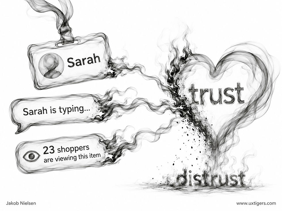
Counterfeit presence torches user trust, and what remains is distrust. Users find out eventually. (GPT Image 2)
It works until discovery, and discovery is now routine. The stakes rose when AI got good. A 2026 voice agent passes casual inspection, so the honesty burden now rests entirely on the design. Deception saws off the branch that the whole technique sits on. Manufactured trust, once exposed, converts to durable distrust at a terrible exchange rate. There’s a quality ceiling too: Masahiro Mori’s uncanny-valley observation from 1970 predicts that pushing an artificial agent to almost-human makes affinity collapse into unease.
To be fair to the robots, a clearly disclosed bot with real competence usually beats a human reading a script, and many users prefer the honest bot for routine tasks. Disclosure costs one sentence and buys lasting trust. Cheap at the price.
7 Design Guidelines for Social Presence
Treat presence as a per-task dial. Map high-stakes, emotional touchpoints to high presence and routine transactions to low presence, then design each accordingly.
Add human evidence where trust decisions happen: real staff photos and human-voiced copy at checkout, pricing pages, and health or finance flows.
Use only real people. Stock-photo “team members” subtract the very trust they were hired to add, the moment a user recognizes the model from another site.
Disclose AI agents in the first exchange, then let competence do the persuading.
Show honest presence cues in collaboration tools (cursors, typing indicators, read receipts), and let users mute them, because an audience of cursors distracts some people, and read receipts can feel like surveillance.
Never fabricate activity. Fake counters, fake typing, and fake “live” agents are trust arson. They warm the room for a moment and leave it in ashes.
In user testing, ask participants who or what they believed they were talking to. Any surprise at the debrief is a design defect, whatever the metrics say.
The figure of light in my illustration is what every mediated conversation really is: some fraction of a person, reconstituted at the far end. Design chooses the fraction. Short, Williams, and Christie measured that choice in 1976 with televisions and telephone lines; we now make it with avatars, video calls, and increasingly persuasive AI agents. Transmit as much genuine humanity as the task needs, and simulate none you don’t have. Presence is borrowed humanity, and users always audit the loan.
Every Extra Feature Must Earn Its Place
A wheel that no longer rolls is a failed product, however impressive its accessories. The caveman’s upgrade captures the danger of adding individually defensible features until their combined weight defeats the original purpose. The roadmap has steamrolled the product.

The upgrade passed the feature review. Rolling wasn’t on the agenda. (GPT Image 2)
I argued in Prune Features, Then Prune More that features impose continuing costs on users, support teams, and engineering. Customers must wade through the accumulated choices long after the launch announcement has faded. Like an unused gym membership, the cost keeps coming due.
AI makes the temptation to add features stronger than ever, because generating another control, mode, or sidebar costs next to nothing. Yet a feature that’s cheap to build can still be expensive to use. A writing assistant that demands several decisions before fixing a sentence can bury its convenience beneath its capabilities.
Before approving the next addition, run the three most common customer tasks through the proposed design. Compare the required decisions and effort with the current product, and make any regression explicit in the review. Protect the basic job from the growing feature list. Move occasional capabilities out of the main path when they obstruct routine work. The wheel’s first obligation remains wonderfully uncomplicated: roll.
Rehearse Job Interviews with a Tireless AI Coach
ADPList has launched an interviewing coach as a free service where you can practice being interviewed by an AI before you face a hiring manager. Because AI is infinitely patient, you can try and try again, adjusting your approach each time based on its feedback.

An AI coach can spotlight the weak spots in your answers before a hiring manager finds them. (GPT Image 2.5)
Besides job interviews (probably the main use case), the simulated conversations can also prepare you for moments like defending a design decision to a skeptical PM.
Accessibility Changes with the Situation
An interface that works only with bare fingers on a steady desk has mistaken a favorable situation for a universal human capability. The astronaut’s gloves expose that assumption. An airlock touchscreen turns into a locked door when its designer apparently expected visitors in shirtsleeves.

The mission passed its spaceworthiness review. The touchscreen passed its desk review. (GPT Image 2)
Ordinary customers encounter less theatrical versions of the same problem. They carry shopping bags, wear winter gloves, use a phone on a moving bus, or work with a temporarily injured hand. Their precision and reach shrink, but the task still has to get done.
My article Fitts’s Law: Big and Near Beats Small and Far explains why target size and distance shape interaction costs. It also stresses spacing, because a near miss becomes the wrong command when another control occupies the neighboring pixels. Generous dimensions alone won’t rescue a crowded panel.
Design for the conditions surrounding the task. Start with my 1 × 1 cm minimum for ordinary touch targets, then test larger controls and wider separation wherever the context demands them. Include the gear users actually wear, gloves and all. A laboratory trial with uncovered hands tells you precious little about opening this particular door.
Final Thought of the Day


