
Comparison Tables Are Decision Machines: Design Them to Deliver a Verdict

Summary: Comparison tables ease the burden of remembering alternatives and help users understand which option fits their needs and what would change that verdict. This article explains the psychology of choice and delivers guidelines for designing comparison tables and for getting your products into the comparisons that AI agents now assemble.

Users approach a comparison table the way this contemplative fellow does: hoping to leave with a verdict. Design the table to bring deliberation to a satisfying end.
Comparison tables place alternatives side by side, one attribute per row, freeing users to concentrate on judging. They fail when treated as advertising: every cell a checkmark, every row cherry-picked. Distrust stalls the sale: users who doubt the comparison leave to verify it elsewhere, and some never come back.
The stakes just went up. AI agents now assemble comparison tables of their own from whatever data they can find, and a wall of checkmarks gives them precious little to work with.

Users need a clear path to a decision. Unnecessary information clutters that path, bloats the comparison table, and lowers its usability.
Definition: A comparison table arranges 2 or more alternatives (products, plans, tools) as columns and their shared attributes as rows. Users can scan across any row to compare one attribute and down any column to understand what one alternative offers.
The format is old. Consumer Reports built a publishing institution on it starting in 1936, ranking toasters and automobiles in ruthless little grids. Congress joined the trade in 1990: the Nutrition Labeling and Education Act standardized serving sizes on food labels so a shopper could compare two cereal boxes without a calculator.
Enterprise buyers know the format as the feature matrix included with every request for proposal, and SaaS pricing pages have turned the 3-column plan table into a genre of its own. The name requires no etymology lesson: it’s a table for comparing. (Refreshingly literal, in a field that gave us the “hamburger menu.”)

Households have trusted ruthless little grids to inform their buying decisions since 1936.
Why Tables Work: They Do the Remembering
Comparison is brutal on working memory. Nelson Cowan’s 2001 review (PDF) put the realistic capacity of human working memory at about 4 chunks, yet comparing 4 products on 6 attributes means juggling 24 values. Without a table, users build a makeshift one: 5 open browser tabs, a notepad, and a fraying temper.
The table takes over the job of remembering, leaving the brain free to judge the alternatives. (This also explains why shoppers photograph store shelves and screenshot pricing pages: they’re manufacturing the external memory the site didn’t provide. Every such screenshot is a design bug report.)

Comparing 4 products on 6 attributes asks users to juggle 24 values with room for about 4 chunks in working memory. Something has to give.

Without a comparison table, users must carry the alternatives in their heads. Let the interface do the remembering.
The table performs a second cognitive rescue that gets less attention: it converts absolute judgments into relative ones. Humans fumble the first kind of judgment and fly through the second. Few shoppers know whether a laptop screen at 300 nits is bright, but they can instantly see that it’s dimmer than the 500-nit screen one column over.
Christopher Hsee named this the evaluability hypothesis (PDF) in 1996, with a tidy demonstration. Judged one at a time, a dictionary with 10,000 entries and an intact cover attracted higher offers than one with 20,000 entries and a torn cover, because a torn cover is easy to evaluate and an entry count isn’t. Judged side by side, the offers flipped. The comparison gave the numbers meaning. A row turns an isolated specification into evidence for a verdict, supplying the frame of reference that separate product pages force users to build for themselves.
Jill Larkin and Herbert Simon explained in 1987 why a diagram is (sometimes) worth 10,000 words: it puts related facts next to each other, so what would have been a search becomes a glance. In a table, the two numbers to be compared sit millimeters apart, and an act of memory becomes an act of perception.
Choice Overload: Real, Contested, and Curable by Design
In the famous 2000 field experiment by Sheena Iyengar and Mark Lepper, a grocery display of 24 jams attracted more shoppers than a display of 6 (60% vs. 40% stopped). But the smaller display achieved a purchase rate 10 times as high: 30% of its samplers bought, compared with 3% at the larger display. Abundance draws a crowd; choosing must still feel manageable.
The fine print matters: the jam study became a business-book legend, and legends get audited. A 2010 meta-analysis (PDF) by Benjamin Scheibehenne and co-authors, covering 50 experiments, found a mean effect size of about zero. On average, more choice neither paralyzed nor motivated. Then Alexander Chernev and co-authors helped reconcile the findings in 2015 by identifying 4 conditions associated with choice overload, including a complex assortment, a difficult decision task, and shoppers who are uncertain about their own preferences.

The lesson from the famous jam study, as revised by replication attempts and meta-analysis, is not to reduce product selection. Make as many different jams as you like. The lesson is to avoid the psychological conditions that cause choice overload. That’s a usability challenge, not an inventory limitation.
Read that list with a designer’s eye: your interface can influence both task difficulty and uncertainty about preferences. A wall of 40 unstructured product cards magnifies both problems. A well-built comparison flow (filter the field, shortlist a few, compare them attribute by attribute) reduces both. Thus the research offers practical encouragement for large catalogs: better design can make a broad assortment manageable.
So keep the 24 jams, and give shoppers a way to narrow the field and compare the contenders without losing track of what matters to them.

Too many choices can paralyze users, but design offers a cure: structure turns a heap of options into a manageable decision.
Tables also support selective reading: aligned columns and informative row labels let users find the few facts relevant to their decision without reading every cell. The structure pays for itself in faster scanning.
Winnowing: Users Cut the Field Before They Compare
Nobody wants to compare 40 options. Run the arithmetic: 40 options on 12 attributes produce 480 cells, and at a leisurely 2 seconds per cell, that’s 16 minutes of reading before users have even weighed the trade-offs. Users refuse, and they’re right to.
Decision researchers have mapped what people do instead. Amos Tversky’s elimination-by-aspects model (1972) describes the first phase: the user picks an important attribute, sets a cutoff, and executes every option that fails. Under $1,000. Must have offline mode. No subscriptions. Each pass is crude, ignores trade-offs, and shrinks the field fast.
John Payne and co-authors, in their 1993 book The Adaptive Decision Maker, showed that people switch strategies as the field shrinks. They begin with quick eliminations while options are plentiful, then weigh attributes carefully against one another once only 3 or 4 finalists remain.
The interface should follow the same division of labor. Filters serve the elimination phase; the comparison table serves the trade-off phase. A filter is elimination by aspects with a user interface: every checkbox sets a cutoff, and every applied facet executes a batch of options. The table then hosts the finals.
Sites get into trouble when they cross the wires: a comparison table with 15 columns asks a trade-off tool to do elimination work, while a filter panel with 40 facets asks users to consider cutoffs they don’t care about.
Payne and co-authors also sorted decision strategies into two families. Elimination is non-compensatory: a miss on one attribute kills an option, whatever its other virtues. Trade-offs are compensatory: strength on one attribute can outweigh weakness on another.
The distinction exposes the filter’s hidden body count. A hard cutoff at $1,000 commits filtercide on the $1,020 laptop that would have won the trade-off round on every other row. The user never learns it existed, and your sale disappears with it. Every filter deserves a mercy clause, which is why guideline 31 asks you to show the near misses.

Filtercide: a rigid cutoff can eliminate the option users would prefer. Offer near misses separately so shoppers can reconsider flexible limits.
(Skipping the trade-off phase entirely and deciding on a single attribute is called lexicographic choice. A sort button supplies its simplest interface: rank on one row, take the top item. Its track record is spotty. Paris conducted history’s most consequential 3-column comparison, of Hera, Athena, and Aphrodite, by choosing whichever bribe he fancied most. The Trojans paid for the missing rows.)

Prince Paris awarded the golden apple to Aphrodite based on a single criterion: she offered him an attractive (literally) bribe. Sorry for the spoiler if you’re about to read Homer.
One more behavioral reality: most users satisfice. They pick the first good-enough option, because the hunt for the absolute best burns time and effort, and both are costs like any other. A comparison table lowers the price of thoroughness: checking one more candidate costs a glance instead of a pilgrimage through another product page. Satisficers can make better choices in a table without working harder, which is the only self-improvement program most users will accept.
Alignable Differences: The Table’s Secret Weapon
Psychology offers one more explanation for why tables beat prose, and it deserves wider fame in UX circles. People compare most easily when attributes line up. Cognitive scientists call a difference alignable when both options have a value on the same dimension (one battery runs 11 hours, the other 17) and nonalignable when an attribute exists for one option and doesn’t apply to the other.
In a 1998 study, Shi Zhang and Arthur Markman showed that alignable differences dominate choice and memory: brands that differed from an established competitor on comparable dimensions beat brands that differed on unique, incomparable ones.
A comparison table is an alignability factory. Every row places all contenders on one shared dimension, giving users a common yardstick. That’s the secret weapon. It also has consequences for your product strategy: shoppers can overlook your proudest unique feature if they have no comparable attribute against which to judge it. Give it a row.
“Offline mode: Yes / No” brings your differentiator onto a shared dimension where its absence embarrasses the competition. No row, no weight: an attribute missing from the table barely counts. Marketers who bury their differentiator in a paragraph while the table lists commodity specs have benched their strongest argument.

The unique feature loses to the comparable one.
The Table Chooses the Terms of the Contest
Designers like to imagine the table as the scales of justice: load the facts, read the verdict. But a table makes three claims before a single cell is filled: what matters (the rows), who counts as a contender (the columns), and how to measure (the units). Each is an editorial decision, and each steers the choice whether you intend it to or not.
Users often build their preferences at the table. Paul Slovic’s 1995 review (PDF) concluded that preferences are constructed in the act of choosing, and James Bettman and co-authors showed in 1998 that shoppers assemble them from whatever attributes the situation makes salient. Your row list creates that situation.
Maxwell McCombs and Donald Shaw demonstrated in 1972 that the press helps determine which topics people consider important. Row labels hold a similar power over a purchase: they set the agenda for the decision. A first-time robot-vacuum buyer can arrive with no views on suction, mapping, or bin capacity and leave weighing precisely those attributes, because your rows put them on the shopping agenda.
The choice of columns exerts the quietest influence, because the contenders you admit become the yardstick for every row. Allen Parducci showed in 1965 that people judge a value by its position within the range on display: add a column with a 20-hour battery, and every 11-hour battery starts to look feeble. Three effects exploit the lineup:
The compromise effect. Itamar Simonson showed in 1989 that an option gains share when it becomes the middle of the lineup, because a middle choice is easy to justify (“not the cheapest junk, not the gold-plated excess”). The good-better-best pricing page is this effect wearing a business suit: the towering Enterprise tier exists partly to make the middle plan feel sensible.
The center-stage effect. Ana Valenzuela and Priya Raghubir found in 2009 that people believe the best option occupies the middle position and choose it far more often than chance would predict. In a 3-column table, the center column is prime real estate.

Users assume the middle option earned its position.
The decoy effect. Joel Huber and co-authors demonstrated in 1982 that adding an option nobody should pick shifts choices toward the option it flatters. Dan Ariely’s Predictably Irrational retells the famous subscription experiment: The Economist offered web-only access for $59, print-only access for $125, and print-plus-web access for the same $125. With the useless print-only decoy present, 84 of 100 MIT students picked the $125 bundle. Removing the decoy flipped the majority: 68 students took the cheaper option.
The replication record complicates the story, and an article that advocates checking sources had better practice what it preaches. Shane Frederick and co-authors reported in 2014 that the decoy effect largely evaporates with naturalistic stimuli such as photographed products, surviving mainly when options are described by numeric attributes in a grid. Even Huber and co-authors’ response acknowledged the limits.
Those limits matter here: a grid of numeric attributes is precisely what many comparison tables provide. The effect’s weakness elsewhere is no comfort to a table designer working in the very conditions that make it strongest.
Use position and composition to spotlight a recommendation you can justify. Users readily accept defaults, and most never change them, so the recommendation deserves scrutiny. A phantom tier designed to herd users toward your preferred plan can betray itself: behavioral economics has entered the business mainstream, and your customers include people who recognize a decoy when they see one.
A fourth distortion is built into the format itself. Hsee and Jiao Zhang showed in 2004 that side-by-side evaluation makes people overweight differences they’ll never notice once they own the product and use it alone; they named it distinction bias. The table renders 300 vs. 500 nits as a rout, although a buyer will normally use one laptop, and either screen is bright enough for an office.
The buyer leaves in the grip of a deltusion: the conviction that a difference visible in a row will be a difference felt in use. (Deltusion is the shopping-stage cousin of hedonesia, the post-purchase amnesia for how good things used to feel.) A difference that wins the sale and then evaporates in use can return as a refund request, a one-star review, or a customer who feels tricked. An honest table identifies the threshold that matters and reserves its emphasis for differences that survive daily use.

A difference that wins a row may disappear in daily use. Emphasize consequences buyers will actually notice, or distinction bias may lead them astray.
The format has a fifth bias in the same direction: a table gives weight to what fits in a cell. Capabilities tabulate neatly (one checkmark each). Ease of use, reliability, and the temperament of the support staff are harder to capture, so the grid overcounts what a product can do and undercounts what it’s like to live with.
Debora Thompson and co-authors named the result feature fatigue in 2005: shoppers favor the feature-laden model before use and the simpler one afterward, weighing capability at purchase and usability at home. Give those neglected qualities a row, using evidence such as a return rate or a satisfaction score, or accept that your table sells products people won’t enjoy.

Features win comparison rows before purchase. Usability determines whether customers enjoy the product afterward.
Compare the Whole Job
Rows interact. A table can quote the cheapest plan accurately and list a capability accurately while leaving users to discover that the capability requires a more expensive tier. Both cells are true, but they describe different purchases. The same problem arises when storage, integrations, or support require add-ons whose costs sit outside the comparison. Every column must describe a configuration users can actually buy and use.

Every cell can be accurate while the assembled purchase is impossible. Each column must describe a configuration customers can actually buy.
Suppose a 10-person team needs single sign-on and shared storage. Compare the least expensive configuration from each vendor that meets those requirements, including mandatory seats and add-ons. Then show the total for the same period. The buyer shouldn’t have to discover halfway through checkout that the attractive price and the decisive checkmark were never available together.
This changes the work behind the table. Your product data must record which capabilities require which plans or components, so the interface can recalculate the full configuration when a requirement changes. An AI agent needs those dependencies too; otherwise it can assemble a beautifully aligned comparison of purchases that don’t exist. Have someone try to configure and price each column’s offering using the information shown; the quoted total should survive that exercise.
How Users Actually Read a Comparison Table
Watch users work with a comparison table, and a recognizable choreography emerges:
Orient by row labels. The label column tells users what the table knows and where to find it. Treat it as the table’s navigation system: write informative labels and keep them visible while users inspect the values.
Pounce on the rows that matter. Each user sweeps the 3 or 4 rows bearing on his or her personal dealbreakers and ignores the rest, jumping directly to the relevant labels. An undifferentiated soup of attributes turns this quick sweep into a hunting expedition.
Duel the finalists. With 4 columns on screen, users still compare two at a time, ping-ponging between a pair before admitting the next contender. The duel has an expensive failure mode: the draw. Amos Tversky and Eldar Shafir showed in 1992 that conflict breeds deferral. Offered one well-priced CD player, 34% of participants postponed the purchase; offered two attractive players that each won on different attributes, 46% postponed. Users want the trade-off to yield a winner they can choose with confidence. A stalemate can end in an abandoned cart, so help resolve a draw with a tiebreaker: a recommended column (guideline 39) or one more row that settles it.
Recruit the table as a witness. Many users arrive with a secret favorite and mine the table for the clinching justification to repeat to a spouse or a CFO. Simonson’s research describes choice as a search for reasons, so hand over the reasons: “the cheapest plan with SSO” is a sentence somebody can win a meeting with.
Close the case. Once the verdict is in, users want the table to release them. Yangjie Gu and co-authors found in 2013 that an act of closure (closing the menu, putting a lid on the rejected chocolates) raises satisfaction with the choice, especially after choosing from a large assortment, because it ends the comparison. So retire the losing columns at checkout. Keeping them in view invites the buyer to reopen a case that should already be closed.

People read tables to reach a decision, then quote them to win the meeting. Give them a verdict they can explain.
The absence of a comparison table produces a signature behavior: boomerang browsing. The user opens product A, memorizes 3 facts, opens product B, forgets 2 of them, returns to A, and eventually leaves to let a spreadsheet (or, increasingly, an AI agent) do the job your site refused to do. In information-foraging terms, the user pays travel costs between two patches that should have been one. Analytics showing rapid shuttling between related product pages are a comparison table’s business case written in session logs.
How Tables Lie: Checkmark Inflation
Now for the abuse. The most common comparison table on the commercial web is the vendor-authored one, and most are propaganda: the vendor’s column is a solid stripe of checkmarks while competitors collect X’s on carefully chosen rows. Fewer users fall for this than the marketing department hopes. This is checkmark inflation, and like monetary inflation, it debases the currency. (It’s the tabular branch of claimflation: hype that compounds until no claim in the vicinity is worth anything.)
The moment users spot one rigged row, they discount the entire table, and your honest rows die alongside the dishonest ones. Game theorists would call a checkmark cheap talk: a claim that costs nothing to make and therefore proves nothing.

Bigger claims don’t create more useful comparisons. Replace inflated checkmarks with differences buyers can evaluate.
A number is a hostage: a published “4-hour response time” can be tested, quoted back at you, and litigated. That accountability gives users, and AI agents, something firmer to judge than a decorative checkmark. My verdict on the all-checkmark table: WRONG, and transparently so. (A fair vendor table is useful. The self-serving ones just make the fair ones harder to believe.)

Do you, just maybe, think that this table was designed by the vendor of Option C?
The full rogues’ gallery of table sins extends well beyond the checkmark stripe:
Attribute soup. 40 rows of spec detritus in arbitrary order force users to hunt for the 6 attributes that matter to the decision. Worse, the filler sabotages the decisive rows: Richard Nisbett and co-authors found in 1981 that nondiagnostic information dilutes the impact of diagnostic information, and Tom Meyvis and Chris Janiszewski confirmed in 2002 that irrelevant product features weaken belief in the relevant ones.
Ballot stuffing. Users compare two finalists by counting the rows each one wins, a shortcut that J. Edward Russo and Barbara Dosher documented in 1983 as the majority of confirming dimensions: tally the wins, ignore the margins. Rows are votes. So a vendor that splits its own strength into 5 rows (SSO, SAML, SCIM, MFA, audit log) while compressing its rival’s into one (“Security: Yes”) has rigged the count without printing a single false cell.
Binary cells for nonbinary facts. A checkmark under “Support” conceals whether the service provides a 24/7 phone line or merely a ghost-town forum. Users can’t weigh what you won’t quantify.
Symbol salad. Dots for quality, arrows for speed, shields for security, stars for support, all on unexplained scales. Cute, and unreadable.

Too many comparison tables serve symbol salad. Limit the menu to one or two clearly explained types of symbols.
The asterisk farm. “Unlimited*” with a footnote confessing the limit. One asterisk is a caveat; a cell block full of them is a plea bargain.
The stale competitor column. The rival shipped that “missing” feature two years ago, and every prospect who knows it now doubts your entire table.
Rating-scale inflation. When grades only go up, the scale dies. The European Union’s energy labels accumulated A+, A++, and A+++ until regulators reset the scale to a plain A–G in 2021. That’s checkmark inflation with a regulatory budget: a scale where everything scores at the top conveys nothing.
Column sprawl. Beyond about 5 product columns, tables sprout horizontal scrollbars, and the user must scroll back and forth to compare the supposedly side-by-side alternatives.
Mobile collapse. On a phone, a 6-column table becomes an accordion of misery unless somebody designed for the small screen on purpose.
The remedies follow the stages of a decision: help users find viable candidates, compare the consequences of each choice, and recognize when they have enough information to choose.

Mass-produce checkmarks, and they lose their value, like any overprinted currency.
Two Table Types: Selection First, Comparison Second
Before the guidelines, we need one distinction, because half the “comparison table” arguments I referee turn out to involve two people discussing different animals. (An article recommending comparison tables had better contain a few itself.)

The two species form a sequence: browse, filter, shortlist, compare, decide. Sorting and filtering serve selection; side-by-side differences serve comparison. Preserve that handoff, so users carry their shortlist into the detailed view without rebuilding it.
Show What Would Change the Winner
A recommendation becomes more useful when it reveals what would change the verdict. Suppose printer A costs $100 plus 8 cents per page, while printer B costs $200 plus 3 cents per page. These are hypothetical prices, with other costs held equal. B recovers its extra $100 at 2,000 pages: $100 divided by the 5-cent saving per page. Below that volume, A is cheaper; above it, B is cheaper. The table has turned two price rows into a decision the buyer can make.
Ask how many pages the buyer expects to print while owning the printer. That’s a concrete question about use. Asking the buyer to assign abstract numerical weights to purchase price and running cost piles a second decision problem on top of the first. For other categories, the relevant question might concern team size, trips per year, or the cost of an hour without service. Find the assumption that changes the verdict, show it beside the recommendation, and let users adjust it to match their situation.

The cheapest printer depends on lifetime print volume. Ask about usage before recommending a winner.
This also gives users a stopping rule. If reasonable changes to an uncertain estimate leave the same option ahead, users have less reason to keep searching. If a small change reverses the result, show that uncertainty and help resolve it before declaring a winner. I would apply the same rule to an AI shopping assistant’s follow-up questions: ask next about the unresolved requirement most likely to change the recommendation. Each extra question should earn its interruption by settling something that could change the buyer’s choice.
40 Design Guidelines for Comparison Tables
The guidelines are grouped by the decisions you’ll face, in the order you’ll face them. Each is concrete enough to check in a design review.
Choosing the Rows: Which Attributes Make the Cut
A table can’t hold everything. Choosing the attributes is an editorial act: you decide, on the user’s behalf, which questions this purchase decision will turn on.
1. Show only the attributes that drive the decision by default, and park the rest behind “Show full specs.” Cap the default view at roughly 10 rows. Buyers who need IOPS numbers can open the full specification; everyone else gets a shorter route to the decisive attributes. Progressive disclosure lets one table serve both groups.
2. Build the attribute list from user research into how people choose. Support tickets, search queries, filter analytics, and sales-call objections reveal which attributes swing decisions and therefore deserve a row. The alternative process (“every product manager gets a row”) is how attribute soup gets cooked.

Serve attribute soup, and users must fish for the few attributes they care about.
3. Include the attributes users should weigh, even if they don’t know to ask about them. Printer shoppers compare purchase prices; the ruinous number is cost per page. The most valuable row can be the one buyers never thought to request, yet reach for the moment they see it. Phrase rows in terms of consequences for the buyer. “Battery: 5,000 mAh” names an ingredient; “2 days between charges” explains what that ingredient delivers in daily use. The latter gives shoppers something they can judge.
4. Collapse rows where every option ties. A row of 5 identical checkmarks informs nobody. Promote the shared items to a one-line preamble (“All plans include SSL, backups, and 24/7 monitoring”), reassuring buyers while freeing rows for real differences.
5. Order rows by decision weight. Price, the make-or-break capabilities, and the true differentiators go first; alphabetical order is an admission that nobody thought about the reader.
6. In tables longer than 10 rows, group the rows under subheads. “Price,” “Performance,” “Support,” and similar clusters restore scannability and let a user leap straight to the section containing his or her dealbreaker.
7. Define jargon in row labels on the spot. A parenthetical or tooltip (“IOPS: input/output operations per second”) keeps novices in the game. A row label the user can’t decipher is a row the user skips, and it might have been your strongest selling point.
Choosing the Columns: Which Items Get Compared
8. Start with no more than 5 product columns on desktop and 2 on phones, plus the attribute labels. Treat these as design defaults to test with your content. Beyond those limits, side-by-side comparison quietly becomes back-and-forth scrolling, the disease the table was supposed to cure. Small shortlists also match how people shop. John Hauser and Birger Wernerfelt found in 1990 that shoppers seriously consider a median of 4 shampoos from a shelf of 30-plus, and 2–5 cars from a market of 160-plus. Marketers call the shortlist the consideration set, and a 5-column table is its portrait.

With more than 5 product columns, a comparison table becomes an overloaded clown car. Buyers need room to inspect each passenger.
9. For larger catalogs, let users pick 3–5 items to compare via checkboxes. Provide a persistent compare tray showing their picks. When the limit is reached, disable further checkboxes and explain the limit before users attempt another selection. A cap of 4 is a practical starting point; test whether users can keep the decisive rows and alternatives in view.
10. Curate default comparison sets for users who won’t pick. “Compare our 3 most popular models” or sets grouped by use (“best for families,” “best for travel”) serve the majority who hope somebody else has already done the winnowing.
11. Give columns to the items users actually shortlist. Bestsellers, the current generation, and the incumbent your prospects keep asking about have earned their place; the zombie SKU nobody buys hasn’t. For vendor tables, include the market leader even though you’ll lose some rows: comparing yourself only against pushovers convinces nobody. Users notice a missing column faster than a missing row, because they often arrive knowing which products exist before they understand which attributes matter.
12. When the decision is an upgrade or replacement, show the user’s current product or plan as a column. People evaluate change relative to what they already have. “Your current plan” makes the baseline visible. Include the cost of getting from here to there: migration, training, replacement accessories, and overlapping subscriptions. A cheaper subscription can still be an expensive switch. Let the comparison reveal when staying put is the sensible decision; otherwise every column quietly assumes that buying something new is mandatory.

A cheaper subscription can be an expensive switch. Compare the cost of moving to a new plan with the full cost of staying on the old one.
13. Place your recommended option where eyes and psychology already point: the center of 3 product columns, or the first data column when there are 4 or more. The center-stage evidence favors the middle; the scanning evidence favors early columns. Label the recommendation honestly, explain the reason, and keep its position stable across visits.
Cell Values: Numbers, Units, and Honest Magnitudes
14. Fill cells with measured values whenever the underlying fact has magnitude. “Response time: 4 hours” informs; a checkmark decorates. A table of values lets users judge the size of each difference and apply their own priorities, which is the entire dignity of the format.
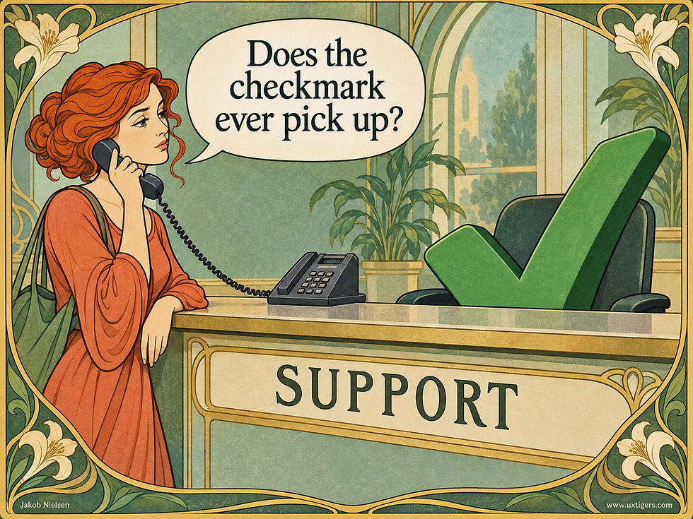
A support checkmark conceals the difference between a prompt answer and an unanswered telephone. Publish the service level.
15. Use a single, consistently defined metric across every column in a row. Keep the definition, units, and measurement period identical; otherwise the row invites false comparisons. And choose the unit before marketing does. Mario Pandelaere and co-authors showed in 2011 that a gap looks bigger in smaller units: shoppers perceive the advantage of a 9-year warranty over a 7-year one as smaller than that of 108 months over 84. Restating a 10-point quality rating on a 1,000-point scale lifted the share choosing the higher-rated, pricier option from 19% to 46%. The unit is a persuasion lever; an honest table picks the one users think in and resists manufacturing a deltusion.

12 hours and 720 minutes describe identical performance. Convert the values to the same units before comparing the numbers.
16. Normalize to the unit users decide in. Detergent A at $18.99 for 96 loads and detergent B at $12.49 for 64 loads become comparable at 19.8 vs. 19.5 cents per load. The “cheap” package’s apparent advantage shrinks to a fraction of a cent. Grocery shelf tags print unit prices because shoppers need the division done for them in the aisle; your users need the same service in your table. Per load, per page, per seat, per terabyte: pick the divisor that matches the decision. Shelf tags alone barely help, by the way: Russo (of the ballot-stuffing study) found in 1977 that unit prices on shelf tags cut shoppers’ spending by 1%, while the same numbers assembled into one ranked list cut it by 3% and lifted store brands’ share by 5%. Rearranging identical information into a comparison tripled its effect.
17. Quote money in one currency and on one billing schedule. “$8 per user/month billed annually” next to “$12.50 per user/month” sets a comparison trap: the first monthly figure conceals a 12-month commitment. Convert every price to a monthly figure on the same terms, then disclose the commitment and the required payment on a separate row.
18. State the test conditions behind contested numbers. “Up to 17 hours” of battery life means little without “(video playback, 50% brightness).” Values obtained under different workloads or test procedures don’t become comparable merely because they occupy the same row. Give the measurement conditions alongside each value so users can judge what it represents.
19. Distinguish “No,” “0,” “N/A,” and “not published.” These are 4 different facts. “No” means the capability is absent, “0” is a measured value, “N/A” means the dimension doesn’t apply, and “not published” identifies a gap in the available information (often a telling one). A blank cell forces the user to guess which of the 4 you meant, and users guess unkindly.

Explain every empty cell. Users need to know whether a value is unavailable, the attribute doesn’t apply, or the answer is zero or “no.”
20. Avoid “Contact sales” cells wherever a number could live. Price opacity halts comparison. And comparison shoppers don’t wait: they finish the job at a competitor who publishes a price. Paul Milgrom proved in 1981 that once disclosure is verifiable, silence gets read as bad news (economists call the dynamic unraveling), so a “Contact sales” cell reads as expensive. If pricing varies, give buyers an honest starting point with “from $2,400/year.”

Few things frustrate users more than being denied information they need, especially the price, and then being condemned to wait on hold for it. Make the answer available before prospective customers must plead for an audience.
21. If you must rate, use one vocabulary with a visible legend. Choose a single scale (say, 1–5 dots), explain it once, and apply it everywhere. And remember the EU’s A+++ debacle: a scale that lets grades inflate stops distinguishing the alternatives, which is the only reason to have ratings.
22. Right-align numbers and keep decimal precision consistent within each row. “$12.00” vs. “$9.5” invites a misreading at a glance; use the same number of decimal places and align the decimal points so the eye can subtract. Numbers are the one content type where typography does arithmetic.
Showing Differences
23. Offer a “show differences only” toggle. Hiding identical rows trims the table to the differences the user needs to weigh. Amazon has offered a version of it for years; borrow shamelessly. The idea is older than it looks: in a 1772 letter to Joseph Priestley, Benjamin Franklin described listing a decision’s pros and cons and striking out the entries that cancel out until the balance becomes clear, a method he called moral algebra. Your toggle is Franklin’s algebra with a button.
24. Mark each row’s winner, but gently. Light shading plus a small icon or word beats a green/red paint job. Never encode the verdict in color alone: about 8% of men have red-green color deficiencies, so the distinction between your carefully chosen highlights may disappear for some of your readers.
25. Show the difference when it decides the purchase. “+$40/month buys 3 extra seats and SSO” does the subtraction users came to do and explains what the extra money buys. Every sum the table performs is one users don’t have to do.
26. Say which direction wins. Lower latency is better; higher uptime is better. Users can mix these up, so unintuitive metrics deserve an explicit “(lower is better)” or a small directional arrow with a clear meaning.
27. Reserve emphasis for differences that matter. Highlighting a 0.3-ounce weight difference trains users to ignore your highlighting. Treat emphasis as a limited budget: spend it on the few rows that swing decisions, where a visual cue can repay the attention it demands.
Sorting
28. Treat the default sort order as a recommendation, and make it an honest one. Most users never change defaults, so “sorted by: featured” is a decision you’re making for the majority. Google Flights labels its default “Best” and explains the trade-off behind the ranking in plain language; do the same, and identify sponsored placements explicitly.
29. Make every quantitative column sortable in both directions, with a visible indicator of the active sort. Show the result within 1 second, my long-standing threshold for keeping a user’s flow of thought intact; a sort that triggers a full page reload teaches users to stop sorting.
30. Sort like a numerate adult. Numeric columns sort numerically (10 after 2, not before it), missing values sink to the bottom regardless of direction, and ties break according to a sensible secondary criterion such as rating. Users rarely praise correct sorting. But they abandon tables over the “$1,000 sorts before $200” bug, a case of digit dyslexia.

I’m amazed that I still encounter tables that sort numbers alphabetically instead of by value. This usability flaw has had a career of 40 years and counting.
Filtering
31. Build filters around users’ must-haves. Filters are elimination by aspects with checkboxes, so offer the 5–7 attributes users rely on to rule out products, and tuck the rest under “more filters.” A 40-facet panel is attribute soup served vertically. For preferences with some flexibility, offer a separate line such as “4 more within 10% of your price limit.” Display those near misses separately from the matching results, rescuing them from the filtercide a sharp threshold would otherwise commit.
32. Show result counts before and after filtering. Facet counts (“Wi-Fi 7 (12)”) tell users how many options will survive a cutoff before they commit, and an Apply button that reads “Show 23 results” converts a leap of faith into an informed step. Never leave users at a dead end of 0 results without suggesting which filter to loosen.
33. Keep applied filters visible, removable, and shareable. Show them as chips with an x to remove each one, provide “clear all,” and encode the filter state in the URL. The URL earns its keep twice: the user sends the shortlist to a spouse tonight, and an AI agent lands on a pre-filtered view tomorrow.
Layout and Mobile
34. Freeze the row labels and the header. When the table scrolls in either direction, a sticky first column and sticky header keep each value attached to its meaning. Lose the labels, and users are back to memorizing which number belongs to which product and attribute.
35. Design the phone version on purpose. Useful mobile patterns include a sticky attribute column with 2 swipeable product columns, or stacked product cards with attributes in identical order. Shrinking the desktop table produces a 6-column eye chart. Apple’s iPhone comparison shows 3 models on desktop and 2 on a phone, giving each column the space it needs to remain legible.

When comparison becomes a scrolling expedition, users must remember the alternatives again. Design the shortlist for the available screen.
36. Never truncate row labels. “Response t…” leaves users guessing about the very label that should explain the row. Wrap the label to 2 lines before abbreviating anything.
37. Help the eye track across wide tables. Zebra striping or row hover-highlighting prevents row slips, where a user compares product A’s price with a value from a neighboring row in product B’s column. Users may never notice this error, leaving them confidently comparing two numbers that mean different things.
Earning Trust
38. Include rows where you lose. A table that acknowledges a competitor’s strength earns belief for every claim it makes elsewhere. This is the antidote to checkmark inflation, and it’s also, conveniently, what keeps your table credible when an AI agent cross-checks the claims.
39. Highlight a sensible default choice and explain why in a phrase. Most users hope somebody will simply tell them which option to choose; mark the “best for most people” column with its reason (“covers teams up to 10”). Add the condition that would favor the runner-up: “Choose printer A below 2,000 lifetime pages; printer B above it.” A reason helps users accept the recommendation, and a boundary helps them recognize when another option fits better.
40. Cite the source and date of every contested claim. Competitor capabilities change; a footnoted, dated table (“verified March 2026”) can withstand scrutiny, and scrutiny is precisely what comparison shoppers bring. Pass that test, and the table becomes what it should have been all along: the place where a hesitating prospect finds enough solid ground to become a customer.
Test the Decision, Then Count the Sales
A table that raises conversion can still send customers home with the wrong product. The findings on distinction bias and feature fatigue above explain why. Thus I would evaluate a comparison table by the decisions it produces: whether users choose an option that meets their requirements and understand the compromise they’re accepting. Measuring confidence alone can reward a table for making a misunderstanding feel convincing.
Run a formative usability test with 5 representative users facing realistic decisions. Record users’ initial requirements before they see the table, then observe whether each person can find a suitable option, explain its decisive advantage and limitation, and explain any change in priorities that the table prompted.
Keep the procedure the same across design variants. Include a case where the cheapest option fails a requirement and a case where paying more brings no relevant benefit. A recommendation badge should survive those tests. Testing with 5 users exposes design failures; it won’t establish a reliable increase in conversion.
In production, track purchases alongside cancellations, returns, downgrades, and support contacts that reveal misunderstood capabilities or commitments. Investigate the reasons behind those events; a return caused by shipping damage tells you little about the table. Compare matched groups of customers or run a controlled experiment over an appropriate follow-up period. The business outcome you want is a purchase that holds up in use. Faster decisions and higher conversion help when they lead there.
The same logic applies when users decide to buy nothing. If every available product violates a stated requirement, the table should make that visible. Counting this outcome as a failure pressures designers to manufacture a winner. In a usability test, a well-founded rejection can demonstrate that the decision machine worked. In your business analysis, examine whether avoiding the mismatch reduces refunds, support costs, and lost trust.

When every product fails a requirement, buying nothing is a sound decision. A useful comparison makes that outcome clear.
The Robot Builds the Table Now
For 30 years, the comparison table was something a website showed a person. That assumption is expiring. As I reported in my August 7 UX Roundup, Salesforce’s behavioral dataset covering over 1.5 billion shoppers shows agentic search growing 200% year over year. The data span Q1 2024 through Q1 2026, supplemented by surveys of 3,450 commerce professionals and 4,689 consumers in 8 countries.
Traffic referred to retail sites from AI chats grew a staggering 150–428% year over year in each measured quarter, while overall traffic grew at rates ranging from single digits to the low double digits. Meanwhile, use of traditional search fell 15%, and product discovery through brands’ own properties fell 7%. On the seller side, 28% of commerce organizations already run agentic AI, and another 44% plan to do so within 6 months.
Translate the statistics into a scene. A shopper asks her AI assistant for “the best robot vacuum for pet hair under $500,” and the AI assembles a comparison table on the spot: 4 columns, 8 rows, and consistent units, drawing on whatever sources it retrieved in a few seconds.
She arrives at your product page (if she arrives at all) partway through her decision, shortlist in hand, to verify a row the robot already wrote. Her visit is a checkthrough, the click-through’s skeptical successor: a 10-second confirmation of one cell, after which she leaves satisfied or leaves suspicious. Increasingly, an AI builds the first comparison table in the purchase journey. That table is the new shelf space: if your product has no column, the shopper has no reason to consider it.
Being a column gives you a chance to enter the shortlist before the shopper reaches your site. The potential business advantage is prequalification: an assistant may already have checked the buyer’s requirements. Measure whether that happens in your category, using completed purchases and subsequent returns as well as referral traffic. Paid visibility is also entering the picture: Google’s AI Mode advertising shows that sellers can buy placements in some AI experiences. Analyze paid exposure separately from inclusion in an independently assembled comparison; a larger ad budget doesn’t repair a misquoted specification.
GEO for Comparison Tables: How to Become a Column
Generative engine optimization (GEO) is the craft of getting your content cited and used by AI models, and my 8 general GEO guidelines cover the broad program: structure for skimmability, answer whole families of questions, and build authority across platforms. Comparison tables deserve their own guidelines because feeding a robot a table is a more exacting business than feeding it prose. The numbering continues below:
41. Publish real HTML tables with proper header cells. Keep the comparison available as text, with explicit relationships between products, attributes, and values. Multimodal AI can read images, but a table published only as a picture adds a recognition step and may be missed by a system that retrieves only text. Semantic markup also gives screen readers the structure your sighted visitors see.
42. Make every cell self-describing. AI systems quote fragments, so a cell reading “17” can be mangled when an AI combines sources, while “Battery life: 17 hours (video playback)” survives extraction intact. Units, conditions, and the attribute name should travel with the number: assume any cell may be read aloud without its table.

A cell may travel outside its table. Send the attribute, units, and measurement conditions along with the number.
43. Maintain one canonical, dated spec page per product, and make every other published version agree with it. When your press kit says 11 hours, a retailer feed says 12, and an old blog post says 14, the AI either picks the wrong figure or reports the disagreement. Attach the product version, market, and test conditions to each value, so legitimate differences don’t look like contradictory claims.
44. Publish structured product data. Product schema markup, spec feeds, and machine-readable pricing let the AI extract attributes without guessing at the meaning of your prose. This is the e-commerce version of guideline 4 in my GEO set.
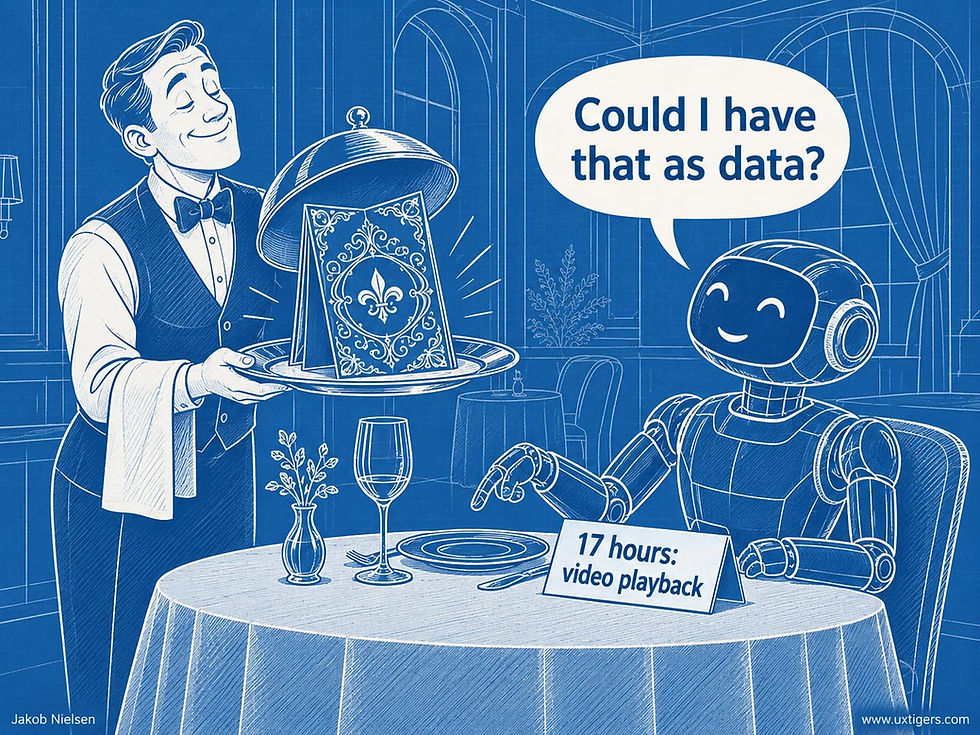
AI likes to be served data. Give it labeled product facts that its comparison tools can extract and combine. Even the prettiest decoration won’t supply missing structure.
45. Write the “X vs. Y” pages yourself, honestly. Comparative and superlative content is exactly what generative engines synthesize into answers. If you don’t publish a comparison with your main rival, the AI builds its table from sources that did, and your competitor’s framing becomes the robot’s framing. Include the rows where you lose and explain which customers should choose the rival. That gives a comparison system useful selection criteria, backed by claims its users can verify.
46. Audit the sources used for your category. Profound’s August 2024–June 2025 citation study found different source patterns across engines; it doesn’t establish a permanent recipe for every product market. Ask the same set of representative shopping questions repeatedly and record which review sites, forums, retailers, and manufacturer pages supply the answers. Prioritize accurate information where your buyers’ comparisons originate.
47. Keep your product pages fast, accessible, and fresh. Make the specifications available to the crawlers you intend to serve, and publish a visible verification date. Check that the retrieved page contains the current values, including prices and product variants. A recent date earns its keep only when somebody has checked the data; changing the timestamp alone improves nothing.
48. Monitor your AI share of voice monthly. Ask the major engines for “the best [your category] for [your key segment]” and record whether you appear as a column, which credible alternatives are absent, and whether the important cells are correct. Repeat the questions: a single answer gives you far too little evidence to judge your market position. Treat a brief visit referred by AI as a possible checkthrough; elapsed time alone can’t distinguish successful confirmation from immediate disappointment. Validate that interpretation through user research, feedback from shoppers, or their later behavior. When the AI misquotes your specs, correct the upstream source it cites and repeat the check.

The table the AI builds is the new shelf space. If you’re left off it, you’re in a commercial Siberia more remote than page 2 of Google’s old search results: you might as well not exist.
Do the Classic Guidelines Survive When AI Sets the Table?
The principles largely survive, but the work changes hands.
The human requirements endure. AI-generated tables still need manageable shortlists, visible labels, consistent units, and emphasis on differences that matter to the decision. Start with the same column defaults, then test the output on the screens people actually use. A 12-column table with mixed billing periods inflicts the same work on the buyer regardless of who assembled it. AI product designers should use the 40 guidelines above as a starting specification, then test the choices the interface produces.
AI changes who performs each job:

The first row marks the biggest opportunity: the AI can choose attributes that match the buyer’s situation. A shopper who mentions a cat can get a “pet hair performance” row; another shopper can prioritize noise during video calls.
Your data warehouse supplies the material for these different views. The feature museum (the full spec sheet that guideline 1 parked behind “Show full specs”) finally has a useful job in the basement: holding the long tail of attributes from which a relevant exhibit can be assembled. Publish those attributes in structured form, including ones too specialized for the default table shown to human visitors.
But guideline 3 still applies: a prompt contains only what the buyer knows to ask. The shopper requesting the cheapest printer may omit running costs, just as a team comparing subscriptions may omit migration work. An agent should use the category’s decision model to reveal the overlooked consequence, then ask about the factor most likely to change the winner. Personalization proves its worth by uncovering the requirements the buyer forgot to state and interpreting what he or she does say in light of them.
Tracing a claim to its source becomes harder when an agent combines information from several places. AI tables can carry invented specs, stale values, or numbers lifted from incompatible product versions. Make every disputed cell traceable to its source, date, and conditions. Your spec page should support the checkthrough: put the relevant value beside its test conditions and verification date, with a direct link to that section. The user should be able to confirm the claim in one glance.
Correct Cells Can Hide a Missing Contender
A perfectly sourced table can still make a poor recommendation if its search missed the product that would have won. This is a coverage problem, and checking the visible cells won’t find it. “Best among these 4 products” makes a smaller claim than “best product for you.” The interface should state the search scope, show the requirements used to exclude candidates, and let the user add a missing contender. Audit absent columns as well as disputed cells.

Perfectly accurate cells can’t rescue a shortlist that omits the best contender. Audit missing columns as well as disputed facts.
For each important customer situation, build a reference shortlist from knowledge of the product category, independent of the agent’s results, and examine the agent’s omissions. Distinguish an item excluded because it fails a requirement from an item whose data wasn’t found. Keep those reasons visible when the shortlist changes. Vendors can use this audit to discover missing product information; AI product teams can use it to improve retrieval before spending more effort polishing the final grid.
AI also inherits the ballot-stuffing problem. An agent can give one product 5 winning rows that all measure the same underlying advantage, then bury a decisive weakness among them. Group related attributes and show how each group affects the recommendation. And when several sites agree, check whether they copied the same source: an echo isn’t a second witness. Automation makes it easier to audit many products, and just as easy to spread the same mistaken comparison.

A product’s 5 winning rows may represent one advantage counted 5 times. Group related attributes before tallying victories.
Conclusion: Set the Table for Two Guests
The contemplative fellow at the top of this article wanted to leave with a verdict. A good table helps him identify a workable option, understand its costs, and see what would change the recommendation. Judge the table by whether that decision holds up in daily use. If users must rebuild the comparison in browser tabs or a spreadsheet, your interface has outsourced its core job to the customer.
The second guest is a robot shopping on the first guest’s behalf. Give it precise product identities, configurations customers can actually buy and use, labeled values, and dated sources from which it can assemble a sound comparison. Then audit both the cells it produces and the contenders it leaves out. A persuasive grid of accurate facts can still give poor advice when the best alternative never reaches the table.

Practice the old-school hospitality my grandmother prided herself on: serve both guests an equally great meal.
Begin with a 10-minute audit. Open your comparison table and count the checkmarks that should be numbers. Identify the assumption most likely to change the recommended option, and see whether users can adjust it. Then ask two or three AI engines to compare products for a specific customer situation. Check the decisive cells, the missing contenders, and the path back to your source data.
Follow that inspection with user testing: can buyers choose a suitable option and explain the trade-off they accepted? That’s the verdict your decision machine must earn.
(All illustrations in this article made with GPT Image 2)


