
The 100 Most Common UX Design Methods, Ranked by Value

Summary: 100 top UXD methods ranked by breadth, altitude, persuasion, and cost. AI prototyping wins as the highest-value method. Cheap framing methods crowd the rest of the top 10, because deciding what to build outscores building it. Expensive workshop rituals sink, and 6 famous methods have a high risk of being design theater. AI is shrinking the cost column and will devalue the persuasion column, but judgment gets scarcer as production gets free.

In a companion article, I ranked the 50 most common user research methods by the value they deliver. This article completes the toolbox: the design half. Research methods answer questions about users. Design methods create, frame, inspect, and align the product itself. I’ve excluded the research methods covered in the earlier ranking (usability testing, interviews, surveys, card sorting, analytics, A/B testing, and their relatives) and included the synthesis artifacts and inspection methods that live on the design side of the fence: personas, journey maps, heuristic evaluation, and their kin. Designers produce and consume these inside design work, even when the raw material came from research.

Most people stick with a few methods that they know well. Let this article prod you to broaden your toolkit. Set a goal: try one new method a month.
The 100 methods below are the ones design teams practice most, from wireframing (daily, on every product team) to GOMS modeling (yearly, somewhere, probably), but I rank them by value, not frequency.
The Method Value Formula
Every method received 4 scores:
Breadth (1–10): how many kinds of design problems, and how many project stages, the method serves. A 1 solves one narrow problem at one stage. A 5 covers several problem types or 2–3 stages. A 10 applies to nearly any problem at nearly any stage.
Altitude (1–10): the level of the decision that the method’s output primarily feeds. Scores of 1–3 mean surface decisions that are easily reversed; 4–7 mean structural decisions about flows, architecture, and scope; 8–10 mean strategic decisions about what to build and for whom. Altitude deliberately excludes stakes: a method scores high for shaping big decisions, not for touching risky ones. I return to this exclusion at the end, because it produces the table’s one systematic blind spot.
Persuasion (1–10): how effectively the method’s output moves people who are not designers. A 1 is meaningless outside the design team. A 10 wins executive budgets on its own.
Cost (1–10): cumulative person-time for one typical engagement, counting every participant. A 1 is under an hour, a 3 is about a day, a 5 is a few days, a 7 is 1–3 weeks, and a 9–10 means a month or more of combined human attention.
The formula: Value = Breadth + Altitude + Persuasion − 2 × Cost.
Why does cost count double? Because otherwise the 3 benefit scores would steamroll your very real budget limitations. Doubling the downside of spending resources keeps expensive rituals honest. A method that consumes a team for a week must deliver near-maximum benefits merely to reach the middle of this table, which is exactly how a design leader should think about spending 40 hours of other people’s attention.

I give a method’s cost double weight in my scoring formula, because cost is the parameter that decides whether the method is feasible in practice.
The multiplier is also a scarcity dial you can turn to match your own organization. Set it to 1, as a well-staffed enterprise group might, and the top 4 don’t move: design sprints climb only from rank 76 to 32, and vision concepts from 44 to 15. Set it to 3 (startup reality), and nothing costing more than half a day survives the top 20. Thus the headline survives any weight a sane manager would choose.
The formula has one asymmetry. Cost is certain, while the 3 benefit scores are promises that come true only if the method’s output changes a decision. So the value column shows each method’s ceiling; the real return is the benefits multiplied by the method’s decision yield (the share of runs that change what gets built) minus the doubled cost. Run the arithmetic on a journey map whose benefit scores sum to 20, but that changes a decision one time in 10: 2 points of realized benefit against 10 points of doubled cost, a net of −8, 5 points below last-place design system work. Theater has a decision yield near zero, and the theater-risk annotations are my estimates of where the yield tends to collapse.
Some housekeeping rules. First, each method is scored per typical engagement, except for 4 program methods (marked with an asterisk) that run continuously rather than as engagements: I costed those per quarter of operation. The formula prices infrastructure as if it were an engagement, so program-method values are understated by design; keep that asterisk in mind when you reach the bottom of the table. Second, ties are broken by lower cost, then by higher frequency of use in the field. Third, each method’s description below ends with 2 annotations: AI Leverage (how much AI can amplify or accelerate the method: Low, Medium, or High) and Theater Risk (how often the method is performed for appearance rather than for decisions: Low, Medium, or High). Both get their own discussion sections after the descriptions.
One reading note. These scores are calibrated judgments, not laboratory measurements. Their job is to make the value argument explicit. If you disagree with a number, my scores have already done their work, because now you’re arguing about breadth, altitude, persuasion, and cost instead of arguing from adjectives.
The Ranking: All 100 Design Methods Scored


(*) An asterisk indicates a method that’s an ongoing infrastructure investment rather than a specific activity for your current project. This means that most benefits would accrue to future projects, which drags down the ranking, because the scores measure the value delivered to the current project.
Framing Beats Crafting
The table’s headline is the champion: AI prototyping, the youngest method on the list, wins by 4 clear points, the widest gap anywhere in the ranking. Nothing else pairs near-strategic altitude with demo-grade persuasion at a 2-hour price. The full argument appears in its description below, but the short version is that working software has become almost free, and working software is the most persuasive artifact our field produces.
A quieter story comes from what else sits at the top of the table. Problem statements, jobs-to-be-done framing, design briefs, and How-Might-We framing all land in the top 12, ahead of nearly every artifact-producing method in the field. The pattern is altitude arbitrage: these methods buy influence over strategic decisions at sketch prices. An hour spent deciding which problem to solve outperforms a week spent rendering the solution, yet most design calendars allocate time in exactly the opposite proportion. The top of this table is a standing argument for rebalancing.
One caution about the cheapness. Framing methods are priced by the pen and paid for by the argument: the hour in the cost column buys the sentence, and the value arrives only after the people who could derail the project have fought over that sentence and signed it. A problem statement written alone at a desk costs the same hour and yields nothing. Agreement is the expensive part of framing, and it’s the one deliverable nobody can generate.
Cost is a hard gate. Only 3 methods costing 3 points or more crack the top 22: stakeholder interviews, UX metrics frameworks, and interactive prototyping. Everything expensive needs altitude of 7 or higher plus persuasion of 7 or higher merely to reach mid-table, which is why vision concepts, with a 9 for altitude and a perfect 10 for persuasion, still land at rank 44. Their 7-point cost, doubled, ate the glamour. (But watch for vision concepts to possibly rise with AI improvements as discussed at the end of the article.)
The crowd turns out to be nearly right. Wireframing, the most practiced method in UX, lands 9th: popularity and value correlate, loosely. And the cellar tells one coherent story rather than several embarrassing ones. Three of the bottom 4 methods are infrastructure programs or pure cataloging: design system work at −3, content inventory at −2, and design tokens at 0 carry either an asterisk or a clerical job description. The asterisked methods are victims of the per-quarter pricing rule, not verdicts on their worth, as the limitations section explains. Meanwhile, GOMS modeling, the perennial cellar candidate, hangs on at rank 94 on the strength of its persuasion score alone. Even a 43-year-old formula survives in this economy if it can talk to a CFO.
Ranks 1–10: Cheap Altitude Dominates
Ten methods, and among them only a single cost score above 2. The winners buy big decisions with small hours.
1. AI Prototyping (20 points)

AI prototyping means generating working interface code from natural-language prompts, a practice the industry has nicknamed vibe coding. The method barely existed 5 years ago. Describe the product you imagine, and a large language model returns running software: real buttons, real data, real interactions. What once took an engineer 2 weeks now takes a designer 2 hours, sometimes 2 minutes, and the output does what static mockups never could: it lets stakeholders, and users, try the idea instead of imagining it. Nothing convinces an executive like software that works. Therein lies the danger. A working demo is simultaneously the most convincing and the most smoke-and-mirrors-prone artifact in software: it looks finished while omitting error handling, edge cases, permissions, and performance. The persuasion score measures amplification, not signal: a working demo argues exactly as hard for a bad idea as for a good one. Its credibility, borrowed from its glossy finish rather than from evidence, is the highest of anything a designer can produce before lunch, which makes the top-ranked method the one best equipped to march a company confidently in the wrong direction. Watch users, not demos, and that includes your own demos. Use AI prototypes to answer direction questions cheaply, then throw the code away. The moment a prototype gets mistaken for a beta, you’ve shipped your scaffolding. Treat the output as an argument, not an asset.
AI Leverage: High. Theater Risk: Medium.
2. Sketching (16 points)

Sketching is rapid freehand drawing to explore many layouts, flows, and concepts at minimal cost, and no method serves more problems at more stages: the same pencil works for onboarding flows, dashboard layouts, service concepts, and conference-room arguments. Sketching is a thinking tool, and its primary audience is the person holding the pencil. Ugliness is a feature, not a bug. Rough drawings invite critique, while polished mockups invite approval, so the fastest way to get honest feedback on a direction is to present it badly on purpose. Work in quantity: 10 rough alternatives beat one lovingly rendered favorite, because the 10th sketch contains the idea the first 9 were hiding. Sketch before you open a design tool, or the tool’s defaults will make your first idea look finished. Sketching has survived every tool revolution since the drafting table, and AI hasn’t dented it, because drawing out your own understanding is thinking, and thinking can’t be delegated. The pencil remains undefeated.
AI Leverage: Medium. Theater Risk: Low.
3. Problem Statements (15 points)

A problem statement condenses business goals and user needs into a single agreed sentence describing what the design must solve, and that sentence is the highest-leverage hour available to most teams. Every downstream method inherits the framing, so weeks of wireframes can’t rescue a mis-stated problem, and no amount of craft compensates for solving the wrong thing well. Writing the sentence takes an hour. Agreeing on it takes longer, and the arguing is the method: disagreement surfaced at the sentence stage costs nothing, while the same disagreement surfaced at the mockup stage delays you by weeks. Three rules keep the artifact useful. Keep it to one sentence, because length hides disagreement. Get every stakeholder to sign it, literally if necessary. And ban solutions from the wording: if the statement names a feature, it’s a Trojan-horse solution, wheeled in to predetermine the outcome. Revisit the sentence whenever scope shifts, because problems drift while documents don’t.
AI Leverage: Medium. Theater Risk: Low.
4. Jobs-to-Be-Done Framing (15 points)

Jobs-to-be-done framing defines requirements around the progress users are trying to make rather than around demographics or feature requests. The canonical example is Clayton Christensen’s milkshake study: a fast-food chain discovered that morning commuters “hired” milkshakes for the “job” of making a boring drive bearable, which meant the milkshake competed with bananas, bagels, and boredom, not with other milkshakes. Same product, new job, new competitors. Reframe the job, and the roadmap changes overnight, because the job decides what the product must do well and what it can safely ignore. Phrase each job in the situation-first template: when I am in this circumstance, I want this motivation satisfied, so I can achieve this outcome. The template disciplines teams that would otherwise chase feature requests or design for a persona’s demographics rather than the persona’s progress. One warning: a consulting industry has barnacled onto this simple idea, layering certifications, taxonomies, and jargon onto what remains a single reframing question. Adapt the question, skip the priesthood. Ask what your product is hired to do, and be prepared for an unflattering answer.
AI Leverage: Medium. Theater Risk: Medium.
5. AI-Assisted Ideation (14 points)

AI-assisted ideation means prompting a large language model to generate, expand, or critique design concepts during exploration, and it fits anywhere, because every design problem at every stage begins with candidate ideas. Think of it as brainstorming without the meeting: no scheduling, no whiteboard markers, no colleague anchoring the group on the first idea spoken aloud, and full availability at 2 a.m. when the deadline looms. The economics are absurd: 50 ideas now cost less than one used to. Use the machine for volume and range, and reserve judgment for yourself. Ask for 20 options, not 3. Prompt for the worst possible idea, for opposites, for how an airline or a casino would solve your problem. Then apply the one thing the model lacks: taste. Left unprompted, language models regress toward the obvious, the statistical median of everything ever written, so the weirdness must be requisitioned explicitly. The designer who treats AI output as a finish line ships mediocrity; the designer who treats it as raw ore ships faster and stranger work.
AI Leverage: High. Theater Risk: Low.
6. Design Briefs (14 points)

A design brief condenses a project into one page before the work begins: the goal, the audience, the constraints, the success criteria, and, most valuably, what is out of scope. The brief decides what the project is before momentum decides instead, and writing one costs an afternoon. The economics mirror those of problem statements (method 3): an hour of writing prevents weeks of drift. Scope creep never announces itself. It arrives politely, one reasonable request at a time, and the brief is the door policy that lets a designer decline without declining personally: the document says no, and the designer merely points at it. Two disciplines keep briefs honest. Hold the length to one page, because a brief that needs 10 pages describes a project that hasn’t decided what it is. And write the out-of-scope list first, since it’s the section people fight about, and the fight is cheapest before anyone is attached to anything. Revisit the brief at every milestone. Projects drift; the paper shouldn’t drift with them.
AI Leverage: Medium. Theater Risk: Low.
7. Impact–Effort Prioritization (13 points)

Impact–effort prioritization plots candidate work on a 2×2 grid: how much a change would matter against how much it would cost to build. The quick-wins quadrant (high impact, low effort) gets built first. The method costs an hour with the team, executives read a 2×2 natively, and the output settles next quarter’s work while the coffee is still warm. It also fails in one predictable way: optimism inflation. Left unsupervised, every pet idea migrates toward the favorable corner, until the quick-wins quadrant becomes the most crowded real estate in product management. Three corrections. Force-rank the items instead of letting them cluster, because a grid where everything is high impact ranks nothing. Have engineers score effort, since designers estimating engineering time produce comedy, not estimates. And revisit the grid after the first 2 items ship, when the estimates have met reality and reality has won. The method is cheap, fast, and wrong about half the time, which still beats deciding by whoever argues loudest.
AI Leverage: Low. Theater Risk: Medium.
8. Lean Hypotheses (13 points)

A lean hypothesis converts a design opinion into a testable claim, typically in the form: we believe this change will produce this outcome for these users, and we’ll know from this signal. Writing one costs minutes. Its value comes from what the format forbids: vagueness. A hypothesis must name the change, the audience, the expected effect, and the evidence, which means it must be possible to be wrong. That’s the discipline. A hypothesis you can’t imagine failing isn’t a hypothesis; it’s a wish with a template. Two rules keep the method sharp. Write one hypothesis per change, because bundled claims produce unreadable results. And name the kill criterion in advance: decide what failure looks like before the experiment starts, because afterward every number can be read as survival. The testing itself belongs to the research methods (A/B testing, analytics) covered in the companion ranking. The design method is the writing, and the writing is where teams discover they never agreed on what the change was for.
AI Leverage: Medium. Theater Risk: Low.
9. Wireframing (13 points)

Wireframing produces low-fidelity screen structure: layout, hierarchy, and navigation drawn in gray boxes, deliberately stripped of visual design. It’s the most practiced method in UX, and its popularity is deserved. Wireframes work because they’re concrete enough to argue about and cheap enough that losing the argument is okay. Abstract debates about “prominence” and “flow” end the moment a rectangle appears, because now everyone is pointing at the same rectangle. The classic failure is fidelity drift: gray boxes acquire brand colors, then real typography, then pixel obsession, and suddenly the team is polishing before it has decided. Keep wireframes ugly on purpose, so the conversation stays structural. Two practices raise the value further. Wireframe flows rather than single screens, since most design failures live between screens, not on them. And annotate intent (what this region must accomplish) rather than decoration. AI now generates competent wireframes from a text prompt, which moved the bottleneck from drawing the boxes to knowing which boxes to ask for.
AI Leverage: High. Theater Risk: Low.
10. Whiteboarding (13 points)

Whiteboarding is collaborative sketching on a shared surface, in real time, markers optional but recommended. It serves any problem at any stage with any mix of people, and an hour plus a marker is the entire budget. The whiteboard is the great equalizer of design tools: the product manager, the engineer, and the designer all hold the same pen, and nobody’s rectangle renders better than anyone else’s. That is the point. Whiteboarding is thinking in public, where half-formed ideas get built on instead of polished, and where erasability makes nothing precious. The erasing is a feature. Standing up helps too: people argue differently on their feet. Two disciplines. Photograph the board, then erase it, because the board is for thinking and the photo is for memory, and a board preserved for a week becomes a shrine. And end every session by circling the decision, since a whiteboard covered in boxes but empty of conclusions was an expensive way to stretch your legs.
AI Leverage: Low. Theater Risk: Low.
Ranks 11–30: The Reliable Middle
Twenty methods that earn their keep on most teams, most quarters.
11. Storyboarding (13 points)

Storyboarding draws a user moving through a scenario as a sequence of comic-strip frames: the person, the place, the problem, the product, the payoff. Its power is narrative’s unfair advantage over specification: nobody has ever teared up at a flowchart. Stick figures and 6 frames suffice, drawn in an afternoon. Borrow the structure from film: establish the context, complicate it, resolve it with the design. The frames before the product appears are the valuable ones, because they force the team to depict the life the design is entering. AI image generation now produces boards in minutes, though stick figures still argue better.
AI Leverage: High. Theater Risk: Low.
12. How-Might-We Framing (12 points)

How-Might-We framing rewrites a problem or research finding as an open question beginning “how might we,” which converts complaint into invitation. The craft is calibration. Too broad (“how might we improve checkout”) invites platitudes; too narrow (“how might we add a progress bar”) smuggles a solution into the question. The productive middle names the outcome and leaves the mechanism open: how might we let a shopper finish in under a minute. The question costs minutes to write, and its wording steers everything downstream, from which ideas get generated to which get taken seriously. Choose the question like it’s a budget, because it is.
AI Leverage: Medium. Theater Risk: Medium.
13. User Flow Diagramming (12 points)

User flow diagramming maps the path a person takes through the product to reach a goal, including decision points, branches, and exits. Flows are architecture: the diagram decides how the product is shaped before any screen decides how it looks. The method’s quiet superpower is the unhappy path. Every error state, dead end, and abandonment route found in a diagram is a support ticket that never gets filed. Draw the flow before the wireframes, keep the notation plain enough for engineers and product managers to correct, and treat every box with no exit arrow as a bug report.
AI Leverage: Medium. Theater Risk: Low.
14. Opportunity Solution Trees (12 points)

An opportunity solution tree, Teresa Torres’s contribution to product discipline, connects one desired outcome to the opportunities that could produce it, the solutions that could seize each opportunity, and the experiments that could test each solution. The tree’s value is its grammar: a solution with no parent opportunity gets pruned, which is a polite structural way of killing pet features. Teams that maintain the tree stop asking “what should we build” and start asking “which branch are we betting on,” a better question, asked earlier. Keep it current or it becomes a diagram of last quarter’s optimism.
AI Leverage: Medium. Theater Risk: Medium.
15. Assumption Mapping (12 points)

Assumption mapping inventories everything that must be true for a design to succeed, then sorts the list by how important each assumption is and how little evidence supports it. The important-but-unverified quadrant is the work order: those are the riskiest assumptions, and they get tested first. The method costs a wall, an hour, and some honesty. Its payoff is directional: projects rarely die from open questions, since open questions get investigated. They die from closed ones that were quietly wrong. Pair it with lean hypotheses, which convert the riskiest assumptions into testable form, and the 2 methods become a pipeline.
AI Leverage: Medium. Theater Risk: Low.
16. Red Route Analysis (12 points)

Red route analysis identifies the small set of tasks that are both frequent and critical, then concentrates design effort there. The name comes from London’s red routes, roads where stopping is prohibited because the whole city depends on their flow. What it really decides is where the design budget goes. A product that nails its 3 red routes survives mediocrity everywhere else; a product that polishes 40 tasks equally excels at none. The discipline is refusal. Every task someone wants promoted to a red route dilutes the ones already there, and dilution is the failure mode.
AI Leverage: Low. Theater Risk: Low.
17. RICE Scoring (12 points)

RICE scoring, developed at Intercom, ranks candidate work by Reach times Impact times Confidence, divided by Effort. Its appeal is arithmetic’s costume of objectivity: numbers travel through organizations that adjectives cannot penetrate. The honest column is Confidence, which openly admits the other 3 are guesses. Respect that admission. A RICE score of 47.3 is a guess multiplied by a guess, divided by a guess, and reported to one decimal place, which is still guessing, just tidier. Use RICE to expose disagreements (why is your Reach triple mine?) rather than to end them, and it earns its rank.
AI Leverage: Low. Theater Risk: Medium.
18. Premortem (12 points)

A premortem, Gary Klein’s technique, gathers the team before a project starts and announces that it has failed spectacularly: now write the story of why. The temporal trick matters. Prospective hindsight converts criticism, which is socially expensive, into imagination, which is a contribution. For one hour, the pessimist becomes the most valuable person in the room, and failure modes surface while they still cost nothing to fix. Run it after the plan exists but before the commitment hardens. AI turns out to be a tireless premortem partner: ask a model for 20 ways your project could die, and it will oblige without worrying about its promotion.
AI Leverage: High. Theater Risk: Low.
19. Value Proposition Canvas (12 points)

The value proposition canvas, Alex Osterwalder’s tool, maps customer jobs, pains, and gains on one side and the product’s features, pain relievers, and gain creators on the other, then asks whether the 2 sides describe each other. This is a fit decision, one step from deciding what to build at all. The canvas earns its keep by embarrassment. When the right side lovingly describes your product and the left side describes no living customer, the method has worked, painfully. Fill in the customer side first, from evidence rather than hope, or the canvas becomes a mirror instead of a map.
AI Leverage: Medium. Theater Risk: Medium.
20. Stakeholder Interviews (12 points)

Stakeholder interviews are one-on-one conversations with the people who fund, build, or can veto the design: executives, engineers, sales, support, legal. Users tell you what to build; stakeholders tell you what will get built. The method surfaces hidden constraints, unstated success criteria, and the political landmines that otherwise detonate in week 11. What you learn routinely redefines the project itself. Interview stakeholders separately (people say different things in front of each other), ask what failure would look like, and ask who else must be happy. The last question maps the org chart that isn’t on paper.
AI Leverage: Medium. Theater Risk: Low.
21. UX Metrics Frameworks (12 points)
A UX metrics framework, such as Google’s HEART, defines what success means in numbers before the design work starts: happiness, engagement, adoption, retention, task success, or whatever the product’s truth requires. Teams optimize what dashboards display, so whoever chooses the metric has, in effect, chosen the design. Metrics are also the native language of executives, which buys design a seat in conversations it usually watches from the hallway. One warning deserves its own laminated card: Goodhart’s law. Any number that becomes a target stops measuring what it once measured. Pair every metric with a counter-metric that would reveal gaming, and review the pair, never the number alone.
AI Leverage: Medium. Theater Risk: Medium.
22. Interactive Prototyping (12 points)
Interactive prototyping links mockups into a clickable simulation of the product’s behavior, built in a design tool rather than in code. It remains the standard way to make an interaction argument concrete: stakeholders click and believe. The hours of wiring screens together are honest hours, spent settling how the product should actually behave. The risk is inherited from all convincing simulations: audiences remember the demo and forget the disclaimer, so the polished prototype hardens into the committed spec. State what’s fake out loud, in the meeting, every time. Its AI-generated cousin at rank 1 is faster and produces real code; this remains the craftsman’s version.
AI Leverage: Medium. Theater Risk: Medium.
23. Scenarios (11 points)
A scenario is a short written narrative of a specific person accomplishing a specific goal in a specific context: no interface details, just the situation and the success. Scenarios force designs to serve situations rather than screens, which is how a method that costs less than an hour ends up steering structural decisions. Write the scenario before any interface exists, then measure candidate designs by a simple standard: which one makes the story shorter. Scenarios survive without personas attached, and a plain paragraph beats an elaborate template. The moment a scenario mentions a button, it has stopped being a scenario.
AI Leverage: Medium. Theater Risk: Low.
24. Task Flow Diagramming (10 points)
Task flow diagramming charts the steps of a single task in sequence: one path, no persona branching, just the work as the user experiences it. It’s the humble sibling of user flow diagramming, and the humility is useful, because a linear diagram makes step-count bloat impossible to ignore. Count the steps. Every step is a place to quit, and the diagram prices each one in plain sight. The method is free insurance against accidentally designing a 14-step checkout, which no team ever does on purpose and several teams do every year.
AI Leverage: Medium. Theater Risk: Low.
25. User Stories (10 points)
A user story compresses a requirement into the agile template: “as a particular user, I want a capability, so that some benefit occurs.” The design content lives in the so-that clause, and it’s also the part most commonly amputated in practice. A story without its benefit is a feature request in costume, unrankable and untestable. Keep stories thin, keep the user real rather than “as a user,” and defend the so-that clause in every backlog grooming, because it’s the only place the why survives contact with the sprint board. AI drafts and slices stories competently; the judgment of which to keep stays human.
AI Leverage: High. Theater Risk: Low.
26. Sitemapping (10 points)
A sitemap diagrams the product’s screens or content areas as a hierarchy: information architecture at a glance. The structure it settles is the skeleton every screen hangs on. The diagram’s diagnostic value is what it exposes: orphan pages nothing links to, and content buried 5 levels deep. If reaching a page requires 4 clicks of archaeology, the sitemap knew before any user complained. Keep it current through the project, because an outdated sitemap actively misleads, and pair it with navigation labels users would actually say, since a beautiful hierarchy of unfamiliar words is a beautiful maze.
AI Leverage: Medium. Theater Risk: Low.
27. Expert Review (10 points)
An expert review has a senior practitioner inspect the design against accumulated professional judgment, unconstrained by any fixed checklist. It’s fast, opinionated, and exactly as good as the expert, which is both the pitch and the warning. Reviews earn their keep when the findings arrive as a prioritized list with severities and suggested directions, not as a stream of preferences. Two boundaries keep the method honest. The reviewer critiques against the product’s goals, stated up front. And the review supplements watching real users; it never substitutes, because expertise predicts many problems and still misses the ones users invent.
AI Leverage: Medium. Theater Risk: Medium.
28. User Story Mapping (10 points)
User story mapping, Jeff Patton’s method, arranges stories along a horizontal backbone of the user’s journey, then slices horizontally into releases. The map shows what a flat backlog hides: gaps in the journey, and whether release one is a walking skeleton or a severed arm. Slicing is a scoping decision, and scoping is where products succeed or bloat. The workshop costs a day of the team. Its output should embarrass at least one planned feature into a later release, which is how you know the slicing was real rather than ceremonial. Photograph the wall; walls get erased.
AI Leverage: Medium. Theater Risk: Low.
29. Competitive Analysis (10 points)
Competitive analysis systematically reviews rival products: features, flows, positioning, pricing, and the moves they suggest. Executives love the resulting table, and the findings genuinely inform scope and differentiation. The classic trap is checklist parity: copying visible features is copying answers without ever seeing the exam question, and it converges every product in a category toward the same beige average. Analyze the jobs competitors serve and the trade-offs they accepted, not the widgets they shipped. AI research agents now draft a competent competitive briefing overnight, which lowers the cost and raises the temptation to skip the thinking.
AI Leverage: High. Theater Risk: Medium.
30. Journey Mapping (10 points)
Journey mapping visualizes the end-to-end experience across touchpoints, channels, and time, annotated with the user’s actions, emotions, and pain points. A good journey map is an empathy machine the size of a wall, and organizations reorganize around what it reveals. It’s also the method most likely to become expensive wall art, admired in the hallway, consulted nowhere. The difference between the 2 outcomes is assignment. Every pain point on the map gets an owner and a date, or the map is decor. Build it from evidence, not from a workshop’s collective imagination, and prune it annually.
AI Leverage: Medium. Theater Risk: High.
Ranks 31–60: Useful in the Right Moment
Thirty methods worth knowing and deploying selectively.
31. Roadmapping (10 points)
Roadmapping sequences what gets built over time, which is strategy made visible, and the one design artifact executives reliably read. The trouble is that a roadmap is a forecast and every reader treats it as a contract. Dated promises decay into broken ones. Prefer now-next-later horizons over quarter-labeled timelines, and republish when reality edits the plan, because reality always edits the plan.
AI Leverage: Low. Theater Risk: Medium.
32. Severity Ratings (9 points)
Severity ratings score each usability problem by its impact, frequency, and persistence, converting a finding list into a fix order. The numbers force priority conversations that adjectives dodge. One discipline: rate against user harm, not against developer convenience, because “easy to fix” and “worth fixing” are different columns, and teams that merge them ship cosmetics while the crater remains.
AI Leverage: Low. Theater Risk: Low.
33. Stakeholder Mapping (9 points)
Stakeholder mapping charts the people around a project by influence and interest, producing the political map the org chart hides. It costs an hour and prevents the classic ambush: the seagull executive who swoops in near the end, squawks opinions, and dumps on the plan was always on the map; you just never looked. Update it when reorgs happen, which is to say often.
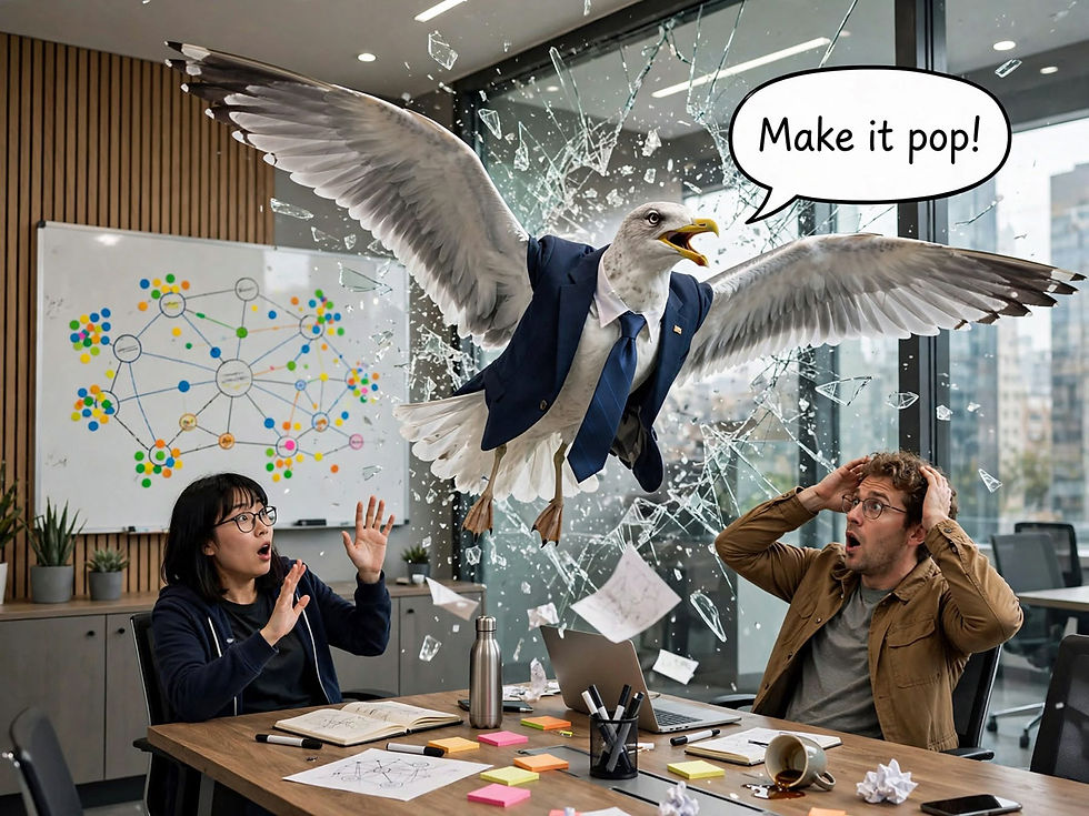
The seagull executive. Don’t let this happen to you; use stakeholder mapping. (Muse Image)
AI Leverage: Low. Theater Risk: Low.
34. Mind Mapping (9 points)
Mind mapping expands a central concept into radiating branches of associations, alone or as a group. It surveys a territory fast and cheap, which is its whole job. The map is a net, not a filter: it collects everything and decides nothing, so schedule a ruthless follow-up method to do the choosing, or the map remains a pretty inventory.
AI Leverage: Medium. Theater Risk: Low.
35. Brainstorming (9 points)
Brainstorming is the classic group ideation meeting: quantity first, judgment deferred, in theory. In practice, hierarchy and anchoring shrink it, because the boss speaks first and the ideas queue up politely behind. It still earns its place on sheer availability: any group, any problem, no preparation. Fix the group dynamics with brainwriting (rank 55), or skip the room entirely with AI-assisted ideation (rank 5).
AI Leverage: Medium. Theater Risk: Medium.
36. Affinity Diagramming (9 points)
Affinity diagramming clusters observations, quotes, or ideas into emergent themes on a wall of notes, building structure from the bottom up. It’s the standard way to digest messy input. The caveat: the themes reflect the clusterers, and the wall tends to agree with whoever stands closest to it. Rotate who moves the notes, and label clusters with findings, not topics.
AI Leverage: Medium. Theater Risk: Medium.
37. Proto-Personas (9 points)
Proto-personas are provisional user archetypes built from the team’s existing knowledge in an afternoon, explicitly labeled as assumptions awaiting evidence. As scaffolding, they’re honest and cheap. The sin is laundering: guesses that survive 3 meetings get promoted to facts. Print the word “unvalidated” on each one in a font nobody can ignore, and set an expiration date.
AI Leverage: Medium. Theater Risk: Medium.
38. Wireflows (9 points)
Wireflows arrange wireframes as the nodes of a flow diagram, combining screen structure and path logic in one artifact. The hybrid earns its keep on mobile, where screens are small enough to read in sequence and most design sins live in the transitions. One artifact to update instead of 2, which is also one artifact that can go stale.
AI Leverage: Medium. Theater Risk: Low.
39. Design Review (9 points)
A design review is the recurring gate where work gets approved, redirected, or rejected. Its value depends entirely on what the work is reviewed against. Review against the brief and the problem statement, and the meeting compounds earlier methods; review against taste, and it becomes an audition where the loudest palate wins. Publish the criteria before the meeting.
AI Leverage: Low. Theater Risk: Medium.
40. Design Principles (9 points)
Design principles are a short set of rules for the trade-offs a team faces repeatedly, so the argument happens once instead of weekly. The test of a principle is whether it ever says no to something the team wants. “Be simple, be bold” has never declined a feature in its life. Write principles as preferences with victims: e.g., “we choose speed [the preference] over completeness [the victim].”
AI Leverage: Medium. Theater Risk: High.
41. Ecosystem Mapping (8 points)
Ecosystem mapping diagrams the actors, systems, and relationships surrounding a product: partners, platforms, data flows, dependencies, and the choke points among them. It informs strategy about position rather than decisions about screens. Most useful when entering a market or untangling why a product’s fate keeps being decided by systems nobody in the room owns.
AI Leverage: Medium. Theater Risk: Medium.
42. Heuristic Evaluation (8 points)
Heuristic evaluation, the method Rolf Molich and I published in 1990, has a few evaluators independently inspect a design against usability principles, then merge findings. It remains the best-known discount inspection method. Two cautions, one old and one new. It supplements watching real users; it never substitutes. And AI now applies the heuristics tirelessly, which makes the independent-evaluators structure cheaper than it has ever been: run the model as one evaluator among several, with a human confirming every finding.
AI Leverage: High. Theater Risk: Low.
43. Personas (8 points)
Personas condense behavioral patterns into fictional archetypes so teams design for someone instead of everyone. As decision tools, they settle arguments about who we serve, and who we don’t. As posters, they’re theater. When the persona’s favorite coffee is documented but her top task isn’t, the artifact has changed genres. Keep them few, behavioral, and quotable in design reviews, or retire them.
AI Leverage: Medium. Theater Risk: High.
44. Vision Concepts (8 points)
A vision concept is a polished depiction of a future product, often a video or showpiece prototype, built to align strategy and win investment. Nothing else in the table moves executives like a produced future, and the persuasion cuts both ways, since a vision that convinces the company can also sell it nonsense. AI video generation has collapsed production costs: visions are cheaper now, and so is their brand of self-deception.
AI Leverage: High. Theater Risk: High.
45. AI-Assisted Copy Drafting (7 points)
AI-assisted copy drafting prompts a language model for first drafts of interface text: labels, error messages, empty states, onboarding strings. The drafts arrive in seconds, in bulk, in any tone requested. The constraint is accountability: the model has never met your users, your brand, or your lawyers. AI drafts; a human with context approves.
AI Leverage: High. Theater Risk: Low.
46. Dot Voting (7 points)
Dot voting hands everyone a few sticker votes to place on candidate options, converging a group in minutes. Fast, cheap, and cheerfully pseudo-democratic: the votes reflect the room, and the room reflects the invite list. Use it to narrow options, never to finalize them, and let the vote inform the decider rather than impersonate the decision.
AI Leverage: Low. Theater Risk: Medium.
47. Paper Prototyping (7 points)
Paper prototyping simulates an interface with hand-drawn screens that a person manipulates by hand, swapping sheets as the user “clicks.” Digital tools have absorbed most of its territory, but paper remains unbeatable for 2 jobs: co-creating with people who would never open a design tool, and the first hour of an idea, when drawing is faster than dragging.
AI Leverage: Low. Theater Risk: Low.
48. Design Critique (7 points)
Design critique is structured peer feedback on work in progress, distinct from the approval gate of a design review. Three rules keep it useful: the presenter states the problem before showing the solution, feedback targets the stated goals rather than personal taste, and seniority buys no extra volume. Run well, it’s the cheapest quality mechanism a team owns.
AI Leverage: Low. Theater Risk: Low.
49. High-Fidelity Mockups (7 points)
High-fidelity mockups are pixel-accurate static screens: real typography, real color, real content, no behavior. They’re necessary craft on the way to production and a weak decision tool: everything they settle can be repainted next sprint. The polish paradox applies: a finished-looking screen forecloses structural feedback, because nobody rearranges what appears done. Sequence them after the structure is settled, not instead of settling it.
AI Leverage: Medium. Theater Risk: Medium.
50. Crazy Eights (6 points)
Crazy Eights folds a paper into 8 panels and demands 8 sketches in 8 minutes. The speed is the mechanism: it outruns self-censorship. Sketches 1 through 5 are the obvious ones everyone carries in; the exercise exists for sketches 6 through 8, which appear only after the obvious runs out. Cheap, silly-feeling, and reliably productive.
AI Leverage: Low. Theater Risk: Medium.
51. Readability Analysis (6 points)
Readability analysis scores text difficulty, typically as a school grade level. The number persuades writers whom style advice cannot reach: “grade 14” starts revisions that “this feels dense” never did. Aim near grade 8 for general audiences. Treat the score as a floor, not a finish line, because perfectly readable text can still say the wrong thing clearly.
AI Leverage: High. Theater Risk: Low.
52. SCAMPER (6 points)
SCAMPER walks an existing design through 7 transformations: substitute, combine, adapt, modify, put to other uses, eliminate, reverse. It’s mechanical creativity for stuck moments, a crank to turn when inspiration declines to attend. The checklist nature that makes it feel unglamorous also makes it a perfect AI prompt: ask a model to SCAMPER your design and judge the wreckage.
AI Leverage: Medium. Theater Risk: Low.
53. Empathy Mapping (6 points)
Empathy mapping fills 4 quadrants with what a user says, thinks, does, and feels. Anchored to observed evidence, it’s a compact synthesis tool. Filled from a conference room’s collective imagination, it’s empathy theater: feelings invented on behalf of people nobody met. Cite a source for every note, and mark the unsourced quadrants as fiction until proven otherwise.
AI Leverage: Medium. Theater Risk: High.
54. Moodboarding (6 points)
Moodboarding collages visual references (imagery, type, color, texture) to align on aesthetic direction before design begins. Its real product is vocabulary: the board gives a team words and pictures for taste, which otherwise gets argued in adjectives. Cheap, and persuasive enough to settle direction debates that would burn 3 mockup rounds.
AI Leverage: Medium. Theater Risk: Low.
55. Brainwriting (6 points)
Brainwriting has everyone write ideas silently and simultaneously before any discussion begins, then pass or pool the papers. It repairs brainstorming’s central defect: the quiet people’s ideas arrive intact, unanchored by whoever spoke first. The best brainstorm is the one where nobody talks for the first 10 minutes, and this is that method, formalized.
AI Leverage: Low. Theater Risk: Low.
56. Content-First Design (6 points)
Content-first design drafts the real words before drawing the layout, so structure follows message instead of message being poured into leftover boxes. It’s the method that kills lorem ipsum, and good riddance: a design fitted to fake words fits fake words. Slower to start, faster to finish, because the layout argues with actual sentences from day one.
AI Leverage: Medium. Theater Risk: Low.
57. MoSCoW Prioritization (6 points)
MoSCoW sorts requirements into Must, Should, Could, and Won’t. The buckets are simple, which is the appeal, and porous, which is the problem: under deadline gravity, everything migrates to Must, producing scope creep with a classification system. The Won’t list is the only bucket with teeth. Cap the Musts at a number, in writing, before sorting begins.
AI Leverage: Low. Theater Risk: Medium.
58. Workshop Facilitation (6 points)
Workshop facilitation designs and runs structured group sessions: the meta-method that makes affinity walls, dot votes, and sketching rounds actually produce. The cost is honest, because a workshop is a room full of salaries. The test: every workshop exists to make a named decision. A workshop without one is a team-building event in disguise.
AI Leverage: Low. Theater Risk: Medium.
59. Service Blueprinting (6 points)
Service blueprinting extends a journey map below the waterline: the frontstage experience, plus the backstage staff actions, systems, and processes that produce it. It exposes that experience problems are usually operations problems viewed from the front row. The weeks of cost are real, and so is the payoff: it’s the one artifact design and operations can argue over together.
AI Leverage: Medium. Theater Risk: Medium.
60. Plain-Language Editing (5 points)
Plain-language editing rewrites interface text for clarity: short sentences, common words, active voice, one idea per sentence. The work is invisible when done well, which is both the point and a career problem. Its persuasion tool is the before-and-after pair, which converts skeptics whom guidelines never move. Every rewrite that removes a clause removes a support contact.
AI Leverage: High. Theater Risk: Low.
Ranks 61–100: Specialists, Overhead, and Misjudged Infrastructure
Forty methods defined briefly: niche tools, necessary plumbing, and 4 asterisked programs the formula prices unfairly on purpose.
61. UI State Mapping (5 points)
UI state mapping inventories every condition a screen can occupy: empty, loading, partial, error, and ideal. Most teams design the ideal and improvise the rest, yet the empty state is where the product greets every stranger.
AI Leverage: Medium. Theater Risk: Low.
62. Lightning Demos (5 points)
Lightning demos have each participant present a short tour of an existing solution worth stealing from, before ideation begins. Raid adjacent industries rather than direct competitors: the best checkout inspiration rarely comes from another checkout.
AI Leverage: Medium. Theater Risk: Low.
63. Style Tiles (5 points)
Style tiles sample a visual direction (typography, color, texture, imagery) without mocking up full screens. They let a team argue about taste at one-tenth the cost of arguing about taste inside finished comps.
AI Leverage: Medium. Theater Risk: Low.
64. Use Cases (5 points)
Use cases specify an interaction formally: actor, goal, preconditions, main path, and every alternate path. Engineering-adjacent rigor that feels bureaucratic until you need it, because the alternate paths are where edge cases live on paper instead of in production.
AI Leverage: Medium. Theater Risk: Low.
65. Cognitive Walkthrough (5 points)
A cognitive walkthrough steps through a task asking, at each step, whether a first-time user would know what to do and recognize progress. Narrow by design: it evaluates learnability, cheaply, and nothing else.
AI Leverage: Medium. Theater Risk: Low.
66. Task Analysis (5 points)
Task analysis decomposes users’ work into goals, subtasks, sequences, and dependencies before any design begins. The discipline of understanding the work before designing the tool, at the cost of a few unglamorous days.
AI Leverage: Medium. Theater Risk: Low.
67. Object-Oriented UX (5 points)
Object-oriented UX designs the system’s objects, attributes, and relationships before any screens: nouns before verbs. It fights the incoherence that accumulates when a product gets designed one screen at a time by different hands.
AI Leverage: Medium. Theater Risk: Low.
68. Wizard of Oz Prototyping (5 points)
Wizard of Oz prototyping fakes a working system with a hidden human operating the levers, testing a concept before the machinery exists. For AI features, the wizard can now literally be an AI, which is either progress or a job posting.
AI Leverage: High. Theater Risk: Low.
69. Design Annotations (4 points)
Design annotations attach margin notes to mockups explaining behavior, logic, and conditions the pixels can’t show. They’re the difference between what developers see and what the designer meant, priced at an hour of typing.
AI Leverage: Medium. Theater Risk: Low.
70. Standards Compliance Review (4 points)
A standards compliance review audits designs against platform or organizational rules: Apple’s and Google’s guidelines, or the internal design system. It catches drift cheaply. Compliance is a floor, though, and floors have never delighted anyone.
AI Leverage: Medium. Theater Risk: Medium.
71. Motion Prototyping (4 points)
Motion prototyping animates transitions and micro-movements to specify timing and feel that static comps can’t communicate. Motion sells. The discipline: motion should explain the interface, not perform for the demo reel.
AI Leverage: Medium. Theater Risk: Medium.
72. Design Pairing (4 points)
Design pairing puts 2 designers on one problem at one screen, live. Quality rises, knowledge transfers, and review debt shrinks, all purchased with the most expensive currency available: doubled attention. Spend it on the hard problems.
AI Leverage: Low. Theater Risk: Low.
73. Dogfooding* (4 points)
Dogfooding has the team use its own product for real work, continuously. Pain becomes personal, which accelerates fixes. The blind spot: employees are expert, forgiving, and nothing like your users.
AI Leverage: Low. Theater Risk: Low.
74. Accessibility Evaluation (4 points)
Accessibility evaluation audits a design against standards such as WCAG, covering vision, motor, hearing, and cognitive access, through automated checks plus manual review with assistive technology. Do it early, when fixes are structural rather than cosmetic. Its position in this table is a formula artifact, not a verdict; the limitations section explains why.
AI Leverage: Medium. Theater Risk: Medium.
75. Coded Prototyping (4 points)
Coded prototyping hand-builds prototypes in real code when design tools can’t express the behavior: novel interactions, real data, real latency. The artisanal cousin of AI Prototyping (rank 1), slower and more controllable, with the same warning label about demos.
AI Leverage: High. Theater Risk: Medium.
76. Design Sprints (4 points)
The design sprint, Jake Knapp’s 5-day process, compresses framing, sketching, deciding, prototyping, and testing into one week. The concentration is the benefit: a decision that would drift for a quarter gets made by Friday. The price is a full team for a full week. Spend a sprint on a genuine crossroads and it’s a bargain. Run it as quarterly ritual and it’s elaborate theater, a week that produces souvenirs.
AI Leverage: Low. Theater Risk: High.
77. Copy Review (3 points)
Copy review is an editorial pass over interface text for clarity, consistency, and tone before release. The cheapest quality gate in the pipeline, and the one most reliably absent from it.
AI Leverage: High. Theater Risk: Low.
78. Accessibility Annotations (3 points)
Accessibility annotations mark mockups with roles, labels, focus order, and reading sequence for engineers to build from. Accessibility decided at design time costs a small fraction of accessibility retrofitted after the compliance audit fails.
AI Leverage: Medium. Theater Risk: Low.
79. Design Documentation (3 points)
Design documentation records decisions and their rationale. Low altitude, because it makes no decisions, only preserves them. The archive earns its keep the third time someone proposes the redesign that failed twice.
AI Leverage: High. Theater Risk: Low.
80. Microinteraction Design (3 points)
Microinteraction design crafts the small feedback moments: toggles, confirmations, the tiny choreography of a button acknowledging a press. Delight per pixel, and polish that quietly presumes the structure underneath deserved polishing.
AI Leverage: Medium. Theater Risk: Low.
81. Bodystorming (3 points)
Bodystorming acts out scenarios physically, in context, with bodies and props standing in for the product. It feels ridiculous and produces embodied insights that whiteboards can’t, particularly for spatial, physical, and service experiences.
AI Leverage: Low. Theater Risk: Medium.
82. Atomic Design (3 points)
Atomic design, Brad Frost’s framework, structures interfaces as a hierarchy: atoms, molecules, organisms, templates, pages. A grammar for design systems, most valuable when a component library is being born or reorganized.
AI Leverage: Medium. Theater Risk: Low.
83. Design Studio (3 points)
Design studio runs timed rounds of sketching, presenting, and critiquing in a group, converging on a shared direction. Parallel ideas plus immediate feedback, priced at an afternoon of everyone’s salary.
AI Leverage: Low. Theater Risk: Medium.
84. Co-Design (3 points)
Co-design brings users or stakeholders into the creation itself, as partners rather than subjects. Done honestly, it redistributes power. Done for the photos, it’s participation theater, and participants can always tell which one they attended.
AI Leverage: Low. Theater Risk: Medium.
85. Consistency Inspection (2 points)
Consistency inspection systematically checks that identical things look and behave identically across the product. Tedium with compounding returns, and now largely delegable: AI scans for the 9 date formats in minutes, and it never gets bored.
AI Leverage: High. Theater Risk: Low.
86. Voice and Tone Guidelines (2 points)
Voice and tone guidelines document how the product speaks: its personality, and how that personality flexes across contexts. The core insight worth the whole document: tone must soften as user stress rises.
AI Leverage: Medium. Theater Risk: Low.
87. Content Modeling (2 points)
Content modeling defines structured content types, their fields, and their relationships before design begins. The blueprint the CMS is built from, and the reason (when skipped) that every article page holds its images together with tape.
AI Leverage: Medium. Theater Risk: Low.
88. Content Audit (2 points)
A content audit passes judgment on the existing content inventory: keep, fix, or kill, page by page. The kill list is the real deliverable, and the hardest one to get signed.
AI Leverage: Medium. Theater Risk: Low.
89. UI Inventory (2 points)
A UI inventory screenshots and catalogs every variant of every element in the current product. Its output is the famous wall of 47 button styles, which has funded more design systems than any business case ever written.
AI Leverage: Medium. Theater Risk: Low.
90. Taxonomy Design (2 points)
Taxonomy design builds the category system and labels through which users find content. For content-heavy products it quietly outranks its position here, because users navigate your taxonomy before they ever see your screens.
AI Leverage: Medium. Theater Risk: Low.
91. Design QA (1 point)
Design QA checks the built product against the design specifications before release, catching the drift between intent and implementation. Few decisions, pure necessity: the toll booth at the end of the design highway.
AI Leverage: Medium. Theater Risk: Low.
92. Design Handoff and Specification (1 point)
Design handoff packages the work for engineering: specs, assets, measurements, behavior notes. The formula prices it honestly as communication overhead. The better the upstream collaboration, the thinner this artifact needs to be.
AI Leverage: Medium. Theater Risk: Low.
93. Internationalization Review (1 point)
Internationalization review checks that designs survive translation: text expansion, right-to-left layouts, date and number formats, cultural color meanings. German text runs a third longer and breaks your buttons long before your German users do.
AI Leverage: Medium. Theater Risk: Low.
94. GOMS/KLM Modeling (1 point)
GOMS and keystroke-level modeling, from Card, Moran, and Newell’s 1983 work, predict expert task times by summing modeled keystrokes, pointing, and mental operations. Seconds saved, multiplied by millions of transactions, make a business case a CFO can love. Narrow but potent: reserve it for high-volume, repetitive, expert tasks, where it remains the sharpest tool available.
AI Leverage: High. Theater Risk: Low.
95. Parallel Design (1 point)
Parallel design has several designers independently create alternatives before comparing and merging the best elements. My research in the 1990s validated the quality gains: independent alternatives explore more of the design space than one team iterating ever covers. AI rewrites the economics, since alternatives now cost roughly one prompt apiece.
AI Leverage: High. Theater Risk: Low.
96. Mental Model Diagramming (1 point)
Mental model diagramming, Indi Young’s method, aligns columns of product support beneath segments of how users think about their task. The gaps in the diagram are the roadmap. Deep, rigorous, and weeks of work.
AI Leverage: Medium. Theater Risk: Medium.
97. Terminology Management* (0 points)
Terminology management maintains the canonical glossary: one name per concept, enforced everywhere. Every synonym that slips into the UI hands users a translation task they never applied for.
AI Leverage: Medium. Theater Risk: Low.
98. Design Tokens* (0 points)
Design tokens store design decisions as named variables: change the token, reskin the product. This is infrastructure whose benefits compound across every future engagement: consistency stops depending on anyone’s memory.
AI Leverage: Medium. Theater Risk: Low.
99. Content Inventory (−2 points)
A content inventory catalogs every existing page and asset, row by row, before any judgment happens. Pure clerical grunt work, and the foundation every content audit and migration stands on. The redemption: AI crawlers now finish in an afternoon what interns once resented for weeks.
AI Leverage: High. Theater Risk: Low.
100. Design System Work* (−3 points)
Design system work builds and operates the shared component library, patterns, and rules an entire organization designs with. The benefit is compounding consistency: a thousand small decisions get made once, every product ships faster, and everything looks related without anyone negotiating. Nobody should cancel a design system over this score. The last-place ranking is a pricing artifact, and the limitations section explains why the number is problematic.
AI Leverage: Medium. Theater Risk: Low.
AI Amplifies the Grunt Work
Of the 100 methods, 20 carry a High AI-leverage annotation, telling us what AI is (currently) most useful for. AI amplifies 3 kinds of design work:
Generation: prototyping, ideation, copy drafting, wireframes, storyboards, vision videos, coded prototypes, and parallel alternatives, where the model supplies volume and humans supply selection.
Inspection and cataloging: heuristic passes, consistency checks, readability scoring, copy review, content inventories, competitive research, and GOMS arithmetic, where the model’s tirelessness beats any human’s patience.
Documentation: design docs and user stories, drafted from meeting transcripts faster than anyone can type.
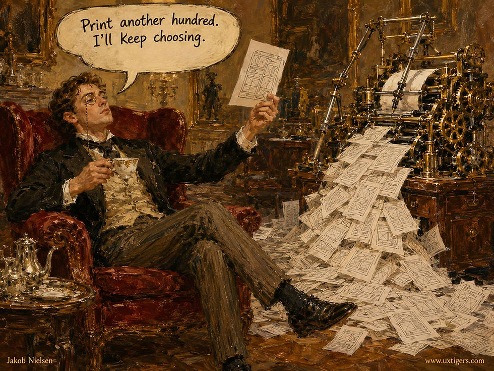
In AI-amplified generation, the model supplies the volume and the human supplies the rejection.
The Low annotations are just as instructive. They cluster on methods whose value is live human interaction (whiteboarding, critique, facilitation, pairing, co-design, dogfooding) and on methods that are pure judgment calls (the 2×2 grid, dot voting, MoSCoW), where AI can’t accelerate because it’s not human, and because its judgment still trails that of seasoned designers.

The methods AI can’t accelerate are the ones whose entire value is humans in a room.
Stronger AI will do its best work in the table’s cellar. Content inventory, current rank 99, was priced as weeks of clerical tedium; AI crawlers finish it in an afternoon. Parallel design, rank 95, was taxed for deliberate redundancy; independent alternatives now cost roughly one prompt apiece. GOMS modeling, rank 94, once demanded a specialist; the models now build the models. The pattern across all 3: AI will move a method up this table by shrinking its cost column. It cannot raise a method’s altitude, because altitude is the level of the decision being fed, and deciding remains stubbornly, expensively human. Altitude belongs to whoever is accountable for the outcome, and no model is accountable for anything, so AI can inform a decision at any altitude and occupy none.

Deciding stays human and expensive, even as AI lowers the cost of most other steps of the design process.
Look ahead 5 years, and the reshuffling will turn structural. The classic fidelity ladder (sketch, wireframe, mockup, prototype, final) existed because each rung cost more than the last, so teams climbed deliberately and held reviews between rungs. When generation is nearly free, the ladder collapses into fluidelity: one continuous conversation that moves among fidelities at will, sketching a flow at 10 a.m., running it as working code at 11, and dropping back to gray boxes at noon because the code exposed a structural flaw. The rungs survive as checkpoints rather than activities: moments where a human decides, no longer weeks where a human produces. But the ladder was also a forcing function. Its expense scheduled the pauses in which teams decided, and fluidelity removes them, so the deciding must now be scheduled on purpose, or a team slides from sketch to shipped without ever having decided anything. Expect the table’s middle, the artifact-production belt, to thin as its members blur together.
Design inspection travels a different road: it ceases to be a discrete event and becomes continuous. Heuristic checks, consistency sweeps, readability scoring, and accessibility linting are pattern-matching against rules, which is what models do tirelessly, so they’ll run in the background of design tools the way automated tests run on every code commit. A check that runs on every save stops being a method a team schedules and becomes a property of the tooling. Future editions of this table will need an “ambient” category, or those rows will simply evaporate into the software.

AI will run design cleanup and inspection continuously in the background, replacing the old scheduled events involving humans.
What stays scarce is the top of the table. Framing, selection, taste, and stakeholder trust don’t get cheaper when production does; they get relatively more valuable, so altitude arbitrage compounds. Expect newcomers, too. AI prototyping didn’t exist 5 years ago and now leads the field, and a 2031 list of top UXD methods will likely include methods for briefing design agents, curating example sets, and judging machine-generated alternatives, practices that today lack even settled names. The scores in this article describe 2026 practice, and the cost column is a snapshot of a falling object.
The persuasion column will move too, and downward for whatever AI made cheap. Part of what persuaded executives about a polished prototype was the visible effort behind it: a costly signal, in the sense of Michael Spence’s 1973 signaling theory, that a team had bet weeks of its life on the idea. Free generation kills the signal. When every proposal arrives as working software, demoflation sets in: each demo persuades less, because demos no longer separate the ideas a team is serious about from the ones that took 20 minutes. I predict that AI prototyping’s persuasion score slides from 9 toward 6 by 2031. But it would still top the table, since its cost drops to 1 (8 + 7 + 6 − 2 = 19). Persuasion itself will migrate back to the one thing that stays expensive to fake: evidence of what real users did. The persuasion column is a snapshot of a currency about to be devalued.
The 5 Biggest Climbers of the Next 5 Years
The forecast works like this: take each method’s 2026 scores, re-price its cost column under the AI tooling a typical team will hold in 2031, recompute the formula, and place the result against today’s table. The positions are yardsticks rather than predictions of the whole future table, since in reality every method moves at once. In this version, the size of a climb is the old rank divided by the new one: moving from rank 20 to rank 10 and moving from rank 60 to rank 30 both count the same, because in each case the rank number halves, and halving your rank roughly doubles your prominence anywhere in the table.

I’m sure that many new design methods will be invented to leverage AI. Don’t just do the old things faster; do new things!
1. Vision Concepts: from rank 44 to roughly rank 3, a rise of about 15 times. A vision video that took a production crew 3 weeks now takes a designer with video-generation tools a few days. Re-price the cost from 7 to 3 and the value recomputes to 16, tying sketching for second place in today’s field, with only AI prototyping ahead. You still need to spend the time mapping out the vision before producing the video, and the thinking didn’t get cheaper; only the rendering did. One warning: the theater risk remains, so dating every vision and naming its decision will matter more, not less. A second warning: demoflation hits here hardest. A vision video that cost a crew 3 weeks persuaded partly because it cost a crew 3 weeks. Re-price its persuasion from 10 to 8 alongside the cost cut, and the value lands at 14, roughly rank 7 rather than rank 3: still the biggest climb in the table, at about 6 times instead of 15.

Vision concepts were expensive. Now AI video models can make a high-fidelity vision video cheaply, though you still need to spend time mapping out the vision before producing the video.
2. Journey Mapping: from rank 30 to roughly rank 6, a rise of about 5 times. First drafts assembled overnight from support tickets, analytics, and interview transcripts cut the cost from a week of workshops to a day of validation, and they improve the evidence at the same time, since the map starts from data rather than from guesswork around a conference table. The value recomputes from 10 to 14.
3. UI Inventory: from rank 89 to roughly rank 25, a rise of about 3.6 times. Cataloging every element variant is a visual pattern-matching task that multimodal AI performs on autopilot. The wall of 47 button styles becomes a nightly report, and the recomputed value of 10 places the method among today’s top 25.

AI can automate the collection of your UI styles across all screens and redo this tedious work on a regular basis without complaint. You’ll be surprised at the many slight variations of the “same” design element you host.
4. Service Blueprinting: from rank 59 to roughly rank 20, a rise of about 3 times. The below-the-waterline half of a blueprint lives in process documentation, ticket queues, and operations interviews, all of which AI can digest into a first draft. The alignment workshops remain, and should, but drafting stops consuming the budget: cost falls from 7 to 4, and the value recomputes to 12.
5. Coded Prototyping: from rank 75 to roughly rank 26, a rise of about 2.9 times. AI writes most of the code while the human keeps control of the details that generated prototypes fumble. Cost falls from weeks to days, and the value recomputes from 4 to 10.
GOMS/KLM Modeling is almost tied with Coded Prototyping. Building a keystroke-level model once required a specialist and a quiet week. A model that watches a screen recording can now assemble the operator sequence and predict expert task times on request, so every efficiency claim can ship with a predicted-seconds number attached.
Parallel Design is also almost tied for fifth place: the method’s huge downside was paying several designers to work independently on the same problem. When independent alternatives cost one prompt apiece, the redundancy tax vanishes while the quality gains my 1990s research documented remain. With AI handling the production work, comparing genuinely different directions will become standard practice rather than a luxury.

5 different designs? 1 prompt! Parallel design becomes feasible with AI.
The Prettiest Artifacts Carry the Highest Theater Risk
Method theater is a method performed for appearance rather than for decisions: the deliverable exists, the photograph gets taken, and nothing downstream changes. Six methods earned a High theater-risk annotation: design sprints, journey mapping, personas, empathy mapping, vision concepts, and design principles. Notice what they share. Workshop formats. Photogenic artifacts. Persuasive outputs. Theater risk tracks how good a method’s product looks on a wall, which should worry anyone whose wall is currently full.

Method theater: the deliverable exists, the photograph gets taken, but nothing downstream changes.
Each of the 6 fails in its own signature way. The sprint becomes a quarterly ritual in search of a crossroads. The journey map becomes a hallway mural that collects compliments instead of decisions. Personas become laminated biographies with stock-photo faces and undocumented tasks. Empathy maps fill with feelings invented on behalf of people nobody in the room has met. Vision videos aim their formidable persuasion inward until the company believes its own trailer. And design principles harden into poster words that have never once said no to a feature.

Personas fail by becoming laminated biographies: maintained with devotion, consulted by no one.
Theater deserves a sympathetic diagnosis before a harsh one, because it’s usually rational behavior under bad incentives rather than a character flaw. Artifacts are legible to management this quarter; outcomes arrive next year, diluted by a hundred confounding factors. The mural gets photographed at the all-hands, and the retention curve doesn’t, so people produce what gets photographed. The incentive then hardens into a creed.
Artifactolatry, the worship of deliverables as if producing them were designing, gets institutionalized by UX maturity models that grade an organization on whether it owns personas, journey maps, and principles, never on whether any of them changed a release. A maturity model that counts artifacts certifies theater, and a team graded by one would be foolish not to perform. Persuasion is a genuine benefit, but only while it’s aimed at a live decision. Persuasion aimed at nothing doesn’t keep; it converts directly into cost, plus a small dividend of organizational self-regard.

Theater is rational under bad incentives: when the goal is to look good internally, it makes sense to produce deliverables that showcase user-centered design, even if nobody uses them to improve the product.
AI changes the theater economics in the wrong direction first. Production cost used to ration theater: a journey map consumed a week, so a team could afford only so much scenery. That rationing is ending, and artifact volume will rise before discipline does. The more corrosive shift is qualitative. AI-generated personas, synthesized empathy quadrants, and invented user quotes arrive formatted like research, so the coming decade’s theater won’t look like posters. It will look like evidence. Vaporesearch, research-shaped output with no users behind it, is vaporware’s descendant and the harder of the two to catch: vaporware at least failed to ship, whereas vaporesearch ships on schedule, beautifully formatted, and gets cited in the roadmap review. The defense is provenance: every artifact states where its facts came from, and an artifact that can’t name its sources is fiction with a nice template.

The empathy map séance: if you dream up the evidence, the deliverables will be worthless method theater.

The greatest danger of AI in UX is that deliverables will look thorough and perfectly worked-through, even if they’re based on no actual user data.
Three tests separate working artifacts from scenery:
The wall test: if the artifact’s main job is being photographed for the all-hands, it’s scenery.
The retrospective test: name one decision this artifact changed last quarter, with an owner and a date.
The deletion test: if it vanished tonight, whose next sprint would change?

If it was removed overnight, would anybody miss it? What would be done differently?
None of this argues for abstinence, since 5 of the 6 high-risk methods still post respectable scores, and cheap ceremony that builds shared context is harmless; a team that enjoys its rituals is not a crime scene. The high-risk 6 are expensive ceremonies, though, and expensive ceremony must buy decisions. Theater risk isn’t a reason to skip a method. It’s a reason to schedule its consequences.
One overlap deserves its own warning label: vision concepts appears on the High-AI list, the High-theater list, and the climbers forecast. AI makes theater cheaper too, and cheap theater means more theater. The methods that photograph best are about to become the methods that cost least, which is precisely the combination this section exists to flag. Glossibility is about to be free.
Limitations
My altitude scores measure the level of a decision, not its consequences, and that distinction produces one unfortunate placement: accessibility evaluation at rank 74. The score is arithmetically fair and morally mute. Accessibility work carries legal exposure and the practical stakes of serving people who live with disabilities, and none of that weight appears in breadth, altitude, or persuasion. Read rank 74 as “the formula cannot see why this matters,” not as permission to skip the work.
Second, the 4 asterisked programs (dogfooding, terminology management, design tokens, and design system work) are expensive today for benefits that compound across every future project: their benefits to your current project are small relative to the cost, and that’s what my formula scored. Their values are understated, spectacularly so for design system work at −3. The best fix is to stop thinking of infrastructure as a design method and to treat it as a separate beast.
Third, the formula can’t see prevented disasters. Premortems, assumption mapping, UI state mapping, and internationalization review earn their keep by making something not happen, and a nonevent persuades nobody, which is why their persuasion scores sit at 2–4 and why no all-hands has ever applauded the outage that didn’t occur. Their theater risk is Low for the same reason: nobody performs insurance.
How to Use This Ranking
Rebalance toward framing. Problem statements, jobs-to-be-done, briefs, and How-Might-We questions occupy the top of the table because an hour of deciding outperforms a week of rendering. Move framing methods from “when there’s time” to “before anything else.”

Spending time getting the problem right saves much more time later, so use the framing methods first.
Prototype with AI early, and throw the code away. Working software is now the cheapest persuasive artifact in design. Treat every prototype as a disposable argument, and watch users, not demos, including your own.
Chain the cheap methods. Methods score in this table one at a time, but they pay out in sequences, because each link catches the previous link’s error before it compounds. A problem statement, 10 sketches, an AI prototype, and a 5-user test fit inside 2 working days, and that chain beats any top-10 method run alone.
Audit your calendar against the table. Tally where last month’s design hours actually went. Most teams discover they’re rich in ranks 49 through 92 and starving in the top 12, which is a solvable resource-allocation problem, not a talent problem. The audit usually exposes a second culprit: your tools pick your methods. A design tool’s defaults make high-fidelity mockups the easiest artifact to produce, a whiteboard tool turns every question into a workshop, and an AI coding tool makes the prototype the first artifact instead of the fourth. Nobody decided any of this; the toolchain did. Audit the tools alongside the calendar.
Make high-theater methods name their decision. Before the next sprint, journey map, persona set, or vision video, write down the decision it exists to change and who owns the follow-through. That sentence is the entire cure for artifactolatry. No named decision, no workshop.
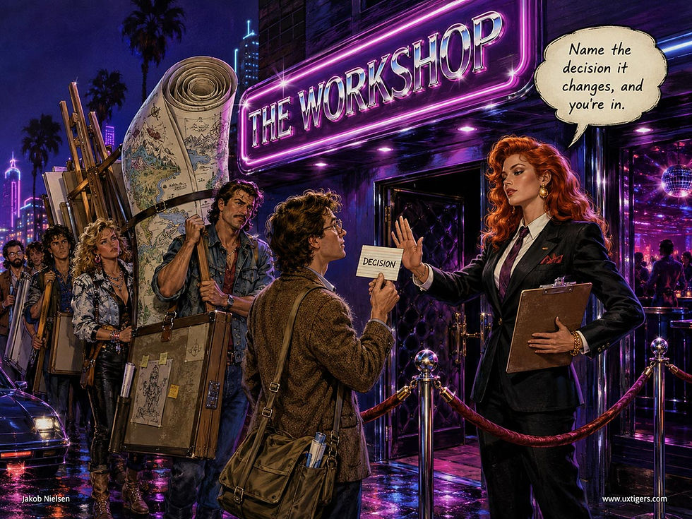
Before using a method, write down what decision would be influenced: imagine two very different outcomes and state how the design would differ under those two extremes.
Hand AI the grunt work and keep the judgment. Inventories, first drafts, heuristic passes, consistency sweeps, and failure-mode lists are now nearly free. Selection, altitude, and taste aren’t, and pretending otherwise ships mediocrity faster. And label anything AI synthesized about users as vaporesearch until real users confirm it.
Read the asterisks before canceling infrastructure. Design system work is last because the formula prices programs as if they were workshops. Compounding value is invisible to per-engagement arithmetic, and defunding your design system because of rank 100 would be the most expensive way possible to misread a table.
Whatever this table says a method is worth, multiply it by your own decision yield before believing it. The best design method remains the one that changes a real decision. This table just tells you the going price.

Remember my recommendation from the beginning of this long article: pick one new method to try every month. (All images in this article made with GPT Image 2, except as noted)


