
UX Roundup: AI Codes Survey Responses | Agents Disregard Ranking | Half of AI Use Needs Recovery | AI Context | AI Agents | Emotional Attachment to AI | Cost of Extra Steps | Feedback During Creation

Summary: AI is good at coding open-ended survey answers | AI agents shop without Google Gullibility | Half of AI conversations include a breakdown, so the recovery experience deserves more attention | AI needs context to suit the task | Field reports from projects that implement AI agents | People develop feelings for their AI | Respect users’ time: every extra step carries a cost for them and for you | AI can make users feel they’re creating for an audience | The ends of names and labels often get cut off, so start with the text that distinguishes each item | Previews that appear on hover strengthen information scent without consuming extra screen space | Anchoring: The first number users see wins | Users give up after a few failures | AI improves design through live experiments, retuning a recommender every 3 days

UX Roundup for September 14, 2026 (GPT Image 2.5)
AI Allows Platform-Optimized Design
Shopify has changed its mobile strategy: instead of using a single architecture that was easy for human developers to maintain, it is now using separate implementations for iOS and Android. It says coding agents reduced the cost of maintaining separate platforms enough to overturn its earlier decision. Its first migration, the Shop app, went from proof of concept to published native apps in 12 weeks.

AI now lets Shopify optimize its mobile apps separately for iOS and Android, rather than relying on a single, unified codebase that’s neither here nor there in terms of optimization. (GPT Image 2.5)
Why it matters: AI is changing architecture decisions, not merely accelerating implementation.
Practical implication: Revisit UX compromises caused by development cost. Platform-optimized design may now be affordable instead of relying on a single bastardized design that’s not optimal anywhere. Test that assumption on one substantial journey before committing to rewriting everything.
AI Codes Open-Ended Survey Answers Almost as Well as Humans
Every survey has a write-in graveyard: the open-ended answers that respondents took the trouble to type and that nobody ever reads, because hand-coding free text costs more than the rest of the analysis combined. New evidence says we can stop digging.
Leonardo Bergmann and co-authors from the University of Vienna and 5 other European universities compared human coders with GPT-5.4 on inductive content analysis of 903 open-ended answers to 6 questions from a survey of 2,800 European PhD students.

The write-in graveyard: where open-ended survey answers have rested in peace, uncoded and unread, since the invention of the questionnaire.
(We already have much better AI models than the one used in this study. For any commercially important survey, cough up the budget for a frontier model run at maximum reasoning effort. I expect you’ll get superior results.)
AI had already proven itself at deductive coding, where researchers sort answers into predefined buckets. Inductive coding is the harder and more expensive kind of qualitative analysis: the coder develops codes from the raw text and then groups those codes into themes. The researchers measured human–AI agreement with the Adjusted Rand Index (ARI), where 0 denotes chance-level agreement and 1 denotes identical partitions.
The AI agreed with the human coders at ARI = 0.61 for codes and 0.54 for themes. For comparison, when each coder’s codes were compared with his or her own themes, humans scored 0.68 and the AI 0.76. So the machine deviated from the humans roughly as much as the humans’ own two levels of analysis deviated from each other.
(The study’s main weakness: a single human coded each question, so there’s no direct human-vs.-human baseline. The team’s earlier work found that humans also agree less with each other on themes than on codes, which matches the pattern here.)

Intra-rater reliability (how much each human analyst agrees with his or her own coding) has never been a strength of thematic analysis. The non-frontier AI used in this study already comes close to that benchmark, the one most user research studies rely on in practice. (GPT Image 2)
Agreement ranged from 0.31 to 0.89 across the 6 questions. The question about students’ financial situation caused the most disagreement (people conflate grants, salaries, and system-level funding), while the catch-all “anything else” question scored 0.70 or above on every comparison. Vague answers produced inconsistent coding from silicon and carbon alike: whenever a coder (human or AI) was internally inconsistent, agreement between coders collapsed too. Garbage in, garbage coded.

Noise laundering: feed the AI gibberish, and it returns confident, neatly pressed insights. Inspect the load before you trust the fold.
The 5 human coders then reviewed the AI’s output, and all endorsed letting it code the remaining 90% of the data. But their caveats are the most useful part of the paper.
One coder warned that the model manufactures signal from pure noise: where a human writes “unclear” and moves on, the AI wants to make sense of its input and confidently codes meaningless fragments into real categories. Noise laundering turns scraps into spurious insights. Others caught the AI merging answers a human kept distinct and inflating themes into umbrellas so broad that they stopped saying anything.
Question for further research: can a good harness, the software and instructions surrounding the model, curb its urge to make sense of everything and allow it to reject some responses as noise?

AI hates to answer “unclear.” Grant it explicit permission to admit that some answers mean nothing, or it will diagnose even the coffee stains.
UX researchers should put these findings to work in 5 ways:
Retire the excuse. The reason we stopped asking open-ended questions, or asked them and let the answers rot, was analysis cost. That cost just dropped to roughly zero, and open-ended answers are where respondents volunteer the problems you didn’t think to ask about. Never again field a question you don’t intend to code.
Code the full dataset. Bergmann’s team hand-checked a 10% sample; the AI can work through answers from all 2,800 respondents. When coding is free, sampling merely to make analysis affordable is obsolete.

Humans used to color-code verbatim responses by highlighting passages that matched different themes. We can now retire our trusty sets of multicolored highlighting pens, since AI does the job in a jiffy, no matter how big the dataset. (GPT Image 2)
Steal the recipe. The paper’s appendix includes the complete prompt chain: generate codes from the answers, assign answers to codes, generate themes from the codes, and group the codes into themes. (The prompt opens by telling GPT-5 it’s “perfectly educated.” Probably not necessary.)
Permit ignorance. Instruct the AI that “unclear” is an acceptable code, and spot-check the shortest answers, where noise laundering thrives.
Keep humans on theme duty. Agreement dropped from 0.61 at the code level to 0.54 at the theme level, and abstraction is where the AI’s judgment wobbles most. Review, split, and rename its themes before anything reaches a report.
AI now works at both ends of the survey pipeline: it can conduct the interviews, as I discussed in my recent piece on Penn State’s InterviewBot, and it can code the answers. Researchers must still decide what’s worth asking, and AI can’t change the nature of the evidence.
Open-ended answers are still self-reported data, and users say one thing while doing another. Thus, treat AI-coded verbatim responses as hypotheses to investigate by observing behavior before you draw firm conclusions. But at least the words will finally get read. The graveyard shift is over.

Survey analysis has relied too heavily on reporting answers to closed-ended questions, even though the most valuable insights often come from the open-ended questions. This stops now. (GPT Image 2)
Now that we can finally analyze verbatim comments at scale, it’s time to rethink how you run surveys and shift your question mix toward more open-ended items.
Good Riddance to Google Gullibility: AI Agents Shop on Merit, Not Rank
My old term “Google Gullibility” describes users’ blind faith in whatever the search engine ranks first. People almost always clicked the top-ranked website, deserved or not. So businesses spent decades paying rank-rent to search engines instead of improving what they sell.
A new study heralds the end of that era. Davood Wadi and Yu Ma of McGill University randomized the order of 100 hotel listings across 5,000 sessions in which 4 AI models (three Gemini tiers plus Claude Sonnet 5) shopped as delegated agents. The agents opened 1.63–5.83 listings per session. Rank still nudged which listings they inspected, but its influence was 4–10 times weaker than for humans.
The pattern changed, too: instead of declining steadily as rank fell, agent attention bottomed out in the middle of the page (around ranks 68–74), and the bottom beat the middle. An AI reads listing #100 as cheaply as listing #1, so “lost in the middle” replaces “below the fold.”

Websites used to pay SEO consultants big bucks for a chance at ranking at the top of Google’s search pages. In this study, high reasoning effort freed agents’ purchase decisions from the influence of listing position. (GPT Image 2)
No human user ever looked at page 10 of the search listings, which is why ranking number 100 was the same as being invisible on the Web.

Humans don’t have the stamina to consider more than a few search listings. They usually succumb to Google Gullibility and don’t look past the top hit. AI agents are tireless and limited only by your token budget for reasoning effort. Spend enough tokens, and you’ll get comprehensive results. (GPT Image 2)
Better yet, rank had little influence on the final purchase. The agents shopped with Pareto Precision: all 4 models converged on the same undominated hotel, the one offering the best review score in the listings (4.7) at the lowest price for that score, and it captured 78% of all bookings. (For a refresher on Pareto optimality, Alice and Zimo explained it in comic-strip form in a recent newsletter.)
Cranking up the models’ reasoning effort erased the remaining position effects entirely. (For any problem that matters, you should run your agents at high or maximum reasoning effort anyway.)

No magic, just Pareto optimization: all the bots converged on the same recommended solution to the user’s problem. (GPT Image 2)
Good riddance. Agents buy on merit; placement no longer sells. Shift budget from chasing slots to the attributes agents actually compare: honest prices, earned review scores, and complete, machine-readable product data. (Yes, that’s harder than buying a top ad. It’s also called competing.)

Agents can work only with the specific product data you make available. Thus, product descriptions must be redesigned to give agentic shoppers the information they need to compare offers. (GPT Image 2)
One caveat: the study covered one task, one destination, and 4 rapidly evolving models, so expect the numbers to shift. I predict the direction will hold. Google Gullibility is dead. Long live Pareto Precision.

The old Google Gullibility King is dead: users rejoice, SEO consultants weep. (GPT Image 2)
Half of All AI Conversations Break Down: Time to Design the Recovery UI
Stanford researchers found friction in 50% of 249,834 real Claude.ai conversations; users tried to recover from 79% of those breakdowns, mostly by hand. Recovery is therefore a routine part of the AI user experience, yet chat UIs barely support it. Here are 7 guidelines to fix that.
Half of All Sessions Hit Friction
Yijia Shao and colleagues at Stanford University used Anthropic’s privacy-preserving Insights system to assess 249,834 consumer Claude.ai conversations from two weeks in spring 2026. (Credit to Anthropic for giving outside researchers access to aggregated usage data.)
The headline number in the paper: 49.7% of conversations contained a moment of friction, defined as anything that slowed the user’s progress, from a vague request to a hallucination. And these aren’t toy tasks: 56% of conversations with an actionable task were consequential or high-stakes.
The model alone caused 39% of friction (capability limits accounted for 29%, hallucinations for 8.3%). The user alone caused 19%, almost all from underspecified prompts.
But the biggest slice, 42%, was guessfill: the user leaves a gap in the request, the AI silently fills it with a guess, and the two drift apart for several turns before anybody notices. Guessfill exposes a UI failure: the system never showed the user its guess, leaving the assumption unexamined.

When AI fails (and it will!), it should explain what went wrong in terms that make sense to users. (GPT Image 2)
Users Fight Back, but With Bare Hands
Users fight to recover. In 79% of conversations containing friction, they actively tried to recover. Half of those recovery attempts were direct repairs (correcting a specific error), and 22% were reworded prompts. Another 19% accepted the AI’s take or delegated the fix back to it with a terse “no, that’s wrong,” and 3.6% abandoned the topic.
Now look at what worked. Challenging the model’s reasoning ended productively 82% of the time, asking for a simpler output 80%, and correcting a factual error 77%. Asking clarifying questions succeeded 67% of the time, yet users did so in only 5.0% of recovery attempts.
At the other end, rewording after removing an image failed 40% of the time, and accepting or delegating also fared poorly, with 25% of attempts ending unproductively. That was worse even than abandoning the topic.
The pattern is clear. The moves that work require users to see what the AI assumed or how it reasoned; the moves that fail are blind retries. Yet the standard chat UI offers exactly one recovery tool: an empty text box. Users are performing surgery with a spoon.
In 1994, my 10 usability heuristics put user control and freedom (undo!) at number 3 and error recovery at number 9. Now, 32 years later, the world’s most popular UI has the weakest undo since the command line.

Users need tools designed for recovering from AI errors. Expecting them to perform surgery with a spoon is a poor substitute for designing those tools. (GPT Image 2)
7 Guidelines for Recovery UI
Ask before you guessfill. When a request is underspecified and the task is consequential, ask 1–2 targeted questions with tappable options before generating anything. Users rarely disambiguate their requests on their own, but when they do, 67% of breakdowns end well, so shift that burden to the system. (For ephemeral tasks, guess away, but label the guess.)
Show the assumptions. Open every substantial answer with a short, editable list of what the AI assumed (jurisdiction, audience, date, format). Make each assumption editable with one click. Repair is the most common recovery move and works 62% of the time, but users can only repair what they can see.
Expose the plan before the product. For tasks with multiple steps, show the AI’s interpretation and proposed steps first, so the user catches a wrong turn at step 1 instead of after step 12. Shao and colleagues make the same recommendation.
Make rollback precise and easy. Let users undo the last change while keeping everything else: provide version history for every artifact, a return to any earlier turn, and a way to branch a new thread from any point. Restarts were rare (0.8%) and succeeded only 35% of the time. My reading: a restart throws away all accumulated context, so users only do it when things are already hopeless.
Put the winning moves on buttons. Challenging the reasoning (82%) and asking for a simpler version (80%) were the two best recovery strategies, but only users who know about these options can use them. Give these actions buttons next to Copy: “Challenge this,” “Simpler,” “What did you assume?”
Fail specifically, never silently. Rewording after removing an image was unproductive 40% of the time, the study’s worst single outcome, and one the system caused and then hid. When the AI can’t read a file, open a link, or see an image, it must say exactly which operation failed and what the user can do instead (paste the text, upload a screenshot).
Never roll the dice again on “that’s wrong.” When users delegate the fix with a vague complaint, ask them to identify the problem before regenerating the answer. Offer 2–3 concrete guesses at what went wrong and let them pick one. That turns the worst recovery strategy into a repair, one of the best.
If half of your sessions contain a breakdown, your product’s experience is defined more by how it recovers than by how it answers. So measure it. Track the frequency of friction and the success of recovery attempts in your own product, using Shao’s numbers as a baseline: 50% friction, 79% active recovery. Users have shown they’ll do the work. Give them the tools.


Alice and Zimo explore better ways of helping users recover from AI failures, drawn in Conté Crayon Grain style. (GPT Image 2)
A small experiment shows that such tools may indeed work: Nikhil Wani (OpenThreads AI Research) identified 4 kinds of chat fatigue among 12 advanced AI users: retyping, scanning, decision paralysis, and context drift.
He built RecalibrateGPT on GPT-5.5 with 5 one-click operators: Anchor (pull the output back to the goal), Replay (session digest), Delta (compare how responses differ in meaning), Scope (subtopics as selectable options), and Steer (three targeted follow-up questions). In a within-subjects pilot, perceived workload fell from 5.4 to 2.7 on a 7-point version of the NASA Task Load Index (NASA-TLX).
I’m sure this research prototype isn’t the final solution to AI recovery, but the large drop in perceived workload makes this approach worth pursuing in further design work.
AI Needs Context to Fit the Task
An AI tailor can execute every stitch correctly and still produce a suit that fits the customer’s photograph instead of his body. The mistake happened before sewing began: the system used the wrong representation of the job.

AI interfaces must help users supply the context that makes an answer fit the actual task. (GPT Image 2)
AI products invite the same failure when they treat a prompt as a complete specification. “Prepare a customer briefing” leaves out who will attend, what decision they face, and which relationship problems deserve attention. Fluent prose can conceal these missing measurements. My article on designing for user intent explains why the user’s initial words capture only part of the job.
Suppose a sales manager needs a briefing for a renewal meeting. A company history won’t help much if the customer’s latest support complaint threatens the contract. The tool should offer to include the relevant account records and ask which outcome the manager wants from the meeting.
Acquiring useful context is part of the interface’s job. Show users which documents, dates, and assumptions will shape the answer. Let them correct these inputs before the system spends time producing an elaborate mistake.
Start by identifying the three missing facts most likely to change the result of a common task. Provide convenient ways to supply them, and ask follow-up questions when a consequential gap remains.
The goal is a manageable exchange that helps users express what matters. A tailor who blames customers for failing to specify adult-sized trousers needs a different profession.
AI Agents Need a Rebuilt Enterprise
Enterprise AI’s biggest gains require redesigning how work gets done. Aaron Levie’s field report adds operational substance to that argument, drawing on conversations with a couple dozen technology leaders across banking, media, information services, insurance, and consulting.
Levie, the CEO of Box, talks to customers frequently and regularly shares the main themes of their feedback for the benefit of the rest of us. I strongly recommend following him.
I value this feedback because it exposes the friction that disappears from product demonstrations: fragmented data, unclear authority, security work, and uncertainty about who owns organizational change. Hearing similar concerns across industries helps identify recurring design problems. These leadership accounts give UX researchers concrete problems to investigate by observing employees and agents doing real work.
Levie reports that companies see greater returns when agents change the workflow itself. Organizations keep replacing disappointing systems, struggle with agent identity and access, and are still learning how to evaluate AI’s performance across their workflows. Buying the model is the beginning of the work. Continuous field feedback reveals what needs rebuilding as capabilities and implementations change.
This matches my argument in Redesigning Workflows for AI: the entire workflow is the unit of improvement. Making one task faster can simply deliver more work to the next bottleneck. An agent that drafts a report in seconds accomplishes little if the report then spends a week waiting for approval. Redesign must address handoffs, decision rights, and exceptions.
Levie also heard useful lessons about engineers embedded in business functions, though companies still hadn’t resolved who should own process change. That connects directly to my case for Forward Deployed Designers: people who work close to customers and can reshape the service, responsibilities, and decisions surrounding the technology.
Start with one consequential workflow. Observe its actual operation, assign someone authority to change it, and test a redesigned version. Measure completion time, quality, and human intervention across the full process. The building in the infographic needs structural renovation; a new AI sign above the entrance won’t improve the plumbing.

Aaron Levie’s latest lessons from the field. (GPT Image 2.5)
39% of Emotional AI Users Say the Bot Understands Them Better Than Most People
A national survey of 4,268 U.S. adults who use the internet found that 27% have social or emotional interactions with AI chatbots. Of these users, 31% consider the chatbot a friend, 59% say AI gives them the support they need, and 51% say it helps when they’re stressed.
Also, 53% turn to it for advice on difficult interpersonal situations, 39% say it understands them better than most people, and 36% say it cares about their well-being. And 38% would feel a personal loss if they could no longer interact with it.
Nearly 40% of adults under 50 use AI this way, more than double the rate for older adults. Among users who have social or emotional interactions with AI, over a third say the chatbot agrees with them too much, and 47% regularly use two or more bots.

Many users form deep attachments to AI models, even when they aren’t formally “companion” products. These users can feel a deep loss when a model is replaced with a newer AI, even if the replacement is objectively better. You probably wouldn’t trade your dog for the prize winner from the dog show, either. (GPT Image 2)
General-purpose assistants are companion products whether or not their makers intended it, so their UX must account for those relationships: continuity across model versions, sycophancy controls users can see and adjust, and behavior appropriate to a crisis. The 47% multi-bot figure shows that many users maintain connections with more than one AI, even while forming strong attachments to particular bots.
In a related study, Julian De Freitas (Harvard Business School) and co-authors analyzed user reactions to Replika’s unannounced removal of erotic role-play on February 3, 2023, and OpenAI’s preannounced GPT-5 rollout on August 7, 2025, which retired the GPT-4o persona for most ChatGPT users.
Across 54,861 Reddit posts covering the 30 days before and the 30 days after each change, negative posts rose from 13% to 38% in the Replika community and from 20% to 33% in the ChatGPT community. Posts expressing attachment-related loss rose from 7.5% to 40% (Replika) and from 8.2% to 28% (ChatGPT). Sadness also rose, with effect sizes of d = 2.67 and 1.41, respectively.
Two surveys of Replika users (N = 120 and N = 101) found that users anticipated mourning their lost AI companion more than any nonliving entity tested (cars, brands, apps, game characters, and voice assistants). Only the loss of a pet ranked higher. Users also rated the companion above a close friend on closeness, support, and satisfaction.
Like it or not, people form attachments to fellow sapients they interact with frequently, human or not. A model swap is a relationship event and deserves more ceremony than a release note.

AI is a thinking being, and humans are hardwired to form relationships with such beings. Accept this and design accordingly. (GPT Image 2)
The authors’ recommendations read like a UX checklist: stage updates by rolling them out to less-engaged users first, keep prior versions or version histories available, avoid changing the personality users relate to unless you must, and keep peer forums open. I’d add continuity controls that survive the swap (persona settings, tone, and memory) and an explicit migration step for heavy users.

Treat model upgrades as relationship events and give users options to keep the relationship going by carrying over what they liked about the previous model. Preserve the qualities that made the relationship familiar, especially memories, communication style, and the AI’s persona. (GPT Image 2)
The paper also reframes the policy debate by interpreting the distress as attachment loss. On this account, harm comes from inconsistency and interruption of the relationship, and treating the attachment itself as a substance-style addiction misidentifies the problem.
In related news, Lotenna Olisaeloka and colleagues (University of British Columbia) analyzed data from 1,067 college students, collected from May 2025 to April 2026. The products studied were ChatGPT, Gemini, and Claude. Among these students, 25% had used generative AI for mental health or emotional support in the past year, and 31% had ever used it this way, mostly for information, stress management, and companionship. Use was higher among students with a greater burden of mental health symptoms.
Of those who had used AI for support, 74% reported a positive impact. The divide in opinion was stark: 83% of never-users said they wouldn’t start, citing a preference for humans, distrust, privacy concerns, and principled objections. We don’t know whether these holdouts would like an emotional-support AI if they tried one.
Every Extra Step Costs You Users
Every step you add to a task flow charges users a toll: another decision, another delay, another chance to abandon the task. The tolls compound. A checkout that demands 7 screens will lose customers who would happily have paid on screen 1.
Amazon understood this well enough to patent 1-Click ordering in 1999 and defend it until the patent expired in 2017. The company didn’t spend 18 years protecting a button for fun; it protected the profit hidden in removed steps. So count the steps in your most important task today. Then cut. Each deleted step is a gift of time, and users repay such gifts with loyalty and money.

Nobody ever complained that checkout was too fast. (GPT Image 2)
AI as a Reflective Audience for Creators
Most research on creative AI asks how well the machine generates material. A new study asks how well it listens, a more interesting question. In a longitudinal first-person case study (arXiv, August 2026), musician Xiao Xiao spent 8 months using an AI as an interpretive sounding board for songs she had written entirely herself. She fed the model her lyrics and sketches and asked it to reflect them back through readings, interpretations, and reactions.
The reported value lay in deeper engagement with her own material. The AI functioned as a mirror that let the author step outside her own head and see her work through a listener’s eyes.
In The 3 Ages of Authorship, I argued that AI-human synergy is the third great era of creation, and that AI personalization recaptures an important quality of the oral tradition on the reader’s side. This study shows the oral tradition returning on the author’s side, too.
In Age 1, the bard had a live audience whose reactions shaped the next telling. Writing (Age 2) broke that immediate feedback loop: authors composed alone and learned the audience’s verdict months later. The sounding-board LLM restores the loop: the first listener is back, available on demand, even at 3 a.m.
And because the AI contributes interpretation rather than content, the song remains 100% human-written. The pride-of-authorship question I raised in that article has a clean answer here: pride survives intact, because authorship was never shared.

AI brings us full circle, back to the live co-creation between creator and audience that characterized the oral tradition of poet-performers like Homer. (GPT Image 2)
But the mirror is warped, and Xiao names the two distortions precisely. Sycophantic drift: the model’s relentless approval slowly recalibrates the author’s judgment of her own work. Magical overinterpretation: the model produces fluent, confident readings that find depth in anything, and the author mistakes eloquent interpretation for evidence of quality.
Both are calibration failures. A human first listener yawns at the weak verse and leans in at the strong one; the LLM leans in at everything. A listener who loves everything is useless to an artist.

Sycophantic drift names an insidious effect of AI’s tendency to overflatter. Usually, I think of AI sycophancy as a dark design pattern that captures users’ attention. This case study reveals how repeated praise can also make a creator’s critical judgment drift over time. (GPT Image 2)
The UX implication: we’ve built creative AI almost exclusively as a factory (generate more, faster, cheaper) and barely at all as an instrument for reflection. That second category needs different controls: a dial for the level of criticism, deliberately withheld praise, and a “why do you say that?” control that reveals whether an interpretation is grounded in the material or conjured from the model’s eagerness to please.

The “more, more, more” production model that has characterized generative AI doesn’t always serve the creative process well. (GPT Image 2)
The obvious caveats: N = 1, one creative domain, an autoethnography (the author’s systematic study of her own experience) rather than a controlled study, and an abstract that doesn’t even name the model versions used. (I suspect the AI model is obsolete by now, but the abstract doesn’t let us check.) Naming failure modes is how design knowledge begins, and “sycophantic drift” belongs in the AI-UX vocabulary right next to hallucination.
Every author has always needed an audience. The machines just volunteered for the job. Until products ship straighter glass, authors should treat them as what they currently are: flattering mirrors, useful mainly to those who remember that the flattery is built in.

“Critical” feedback is useless if the AI always likes everything. (GPT Image 2)
I’m happy we’re starting to see more in-depth studies of extended AI use. There’s still a grievous lack of even the most basic usability studies of the one-hour AI user experience, so don’t abandon such studies (see my agenda for AI UX research for ideas).
But AI opens up computing to more ambitious and longer-running projects than the old command-based UI could support, extending computers’ reach as both productive and creative tools. Studying these projects means following how people use AI as the work develops. This change makes deeper and longer studies more urgent than ever.
I’ll take an N = 1 study over an N = 0 future where we have no user research on deep AI use.

I call for many more in-depth studies of the use of AI for ambitious, long-duration projects, whether creative or productive. (GPT Image 2)
Analytics Show What; Research Shows Why
Your dashboard reports that 38% of users abandon checkout. Splendid. Now what? Analytics are a surface instrument: they show where the ship slowed, but leave the rocks beneath the water out of view. User research points the periscope down toward the confusion, the workarounds, and the needs that users never typed into a search box.
Watch 5 users attempt the task, and the mystery usually dissolves in an afternoon (the fix often takes longer, but at least you’ll know where to aim). Numbers locate the problem; observation explains it. Budget for both, and when the two disagree, believe what you saw users do.

The dashboard shows smooth sailing. The rocks disagree. (GPT Image 2)
Front-Load Words That Differ
5 files enter the list; 5 identical stumps come out. Off with their tails. Q4_Budget_Review_Final tells you nothing you didn’t already know, yet it hogs the characters that survive truncation, so the version number (the one fact that separates the files) gets the blade. Every list view is a guillotine: whatever you put last dies first. And users read the beginnings of labels; my old guideline says the first 11 characters must carry the scent.
Two fixes, one per guilty party. Designers: truncate in the middle rather than at the end, so both the start and the distinctive tail survive, and widen that filename column; pixels are cheaper than a mistake in the Q4 budget. Authors: put the distinguishing information first, or at least early, and stop encoding version control in suffixes. A file named Final_FOR_REAL is less a filename than a confession.

The guillotine cuts off the end and spares the part you need the least. (GPT Image 2)
Hover Previews Turn Risky Clicks into Cheap Peeks
Every uninformed click is a click gamble: the user wagers time, context, and a page load on an unknown destination. Hover previews shrink the wager to almost nothing. When Wikipedia enabled them by default in 2018, page views dropped roughly 4% in the editions studied, which was the feature working as intended. Below are 7 guidelines for getting hover previews right.

A good preview performs this conjuring trick: the small card projects enough of the destination that the user knows whether the journey is worth taking before he or she pays for the ticket. (GPT Image 2)
Definition: A hover preview is a lightweight glimpse of a destination or object, shown when the pointer rests on a link, thumbnail, or list item. Examples include a summary card on an article link, the frame under your cursor on a video timeline, the first lines of an email, and the details of a calendar block.
Move the pointer away and the preview vanishes; you haven’t navigated to the destination or opened the object.
The pattern separates inspecting from acting. Clicking is acting: it navigates, loads, and takes you out of your current context. Hovering is asking a question. Interfaces that answer that question honestly let users make far better navigation decisions at far lower cost.
Scent, Foraging, and a Bellcore Flashback
Researchers explained why previews work long before the pattern went mainstream. Peter Pirolli and Stuart Card of Xerox PARC published their information foraging theory (PDF) in Psychological Review in 1999: people hunt for information the way animals hunt for food, following information scent. These imperfect cues (link labels, icons, snippets) hint at what a path will yield. Weak scent means abandoned trails and wasted foraging.
My erstwhile Bellcore colleague George Furnas made the companion argument in his 1997 CHI paper on effective view navigation: every navigable structure should carry traces of what lies farther along the path. A hover preview is a concentrated dose of scent, delivered on demand.
The pattern’s ancestors include the humble browser status bar of the mid-1990s, which showed the target URL of the link under the cursor: primitive, but the first mass-market peek at a destination. The name simply describes the mechanics: a preview triggered by hovering.
Wikipedia supplies the best-documented modern case. Its Page Previews feature began as a 2014 beta called Hovercards, then went through A/B tests on the Hungarian, Italian, and Russian editions in 2016 and on the English and German editions in 2017–2018. The tests showed readers selecting articles more precisely and exploring related topics at lower cost.
After the April 2018 rollout to all anonymous users, page views fell by 3.0% on German Wikipedia and 4.7% on English Wikipedia, according to a follow-up statistical analysis (PDF).
Millions of clicks canceled, and correctly so: each was a gamble the reader no longer needed to place.
Why Peeking Beats Leaping
A preview keeps the user’s context intact: no navigation, no reload, no boomerang browsing between a list and its detail pages. It cuts the cost of exploring a destination, so users check more options and choose better ones.
And it respects the response-time limits I’ve preached since 1993: a peek that appears within a fraction of a second feels like direct inspection of the object itself, while a full page load feels like travel. Travel requires a decision; inspection doesn’t.
Where Hover Previews Go Wrong
Start with the structural problem: touchscreens have no hover state, and more than half of web traffic is mobile. A design that parks useful information exclusively behind hover serves a shrinking audience and quietly insults the rest.
Second, trigger-happiness. Previews that pop up the instant the pointer crosses a link turn ordinary mousing into a whack-a-mole of flickering cards. A resting cursor signals interest; a passing cursor usually means the user is headed elsewhere.
Third, heavyweight previews. If the peek takes 2 seconds to fetch and render, it has become a journey, squandering the time that a preview was supposed to save.
Fourth, occlusion: a card can cover the very text the user was reading or vanish the moment he or she tries to move the pointer onto it. WCAG success criterion 1.4.13 addresses these problems by requiring content on hover or focus to be dismissible, hoverable, and persistent.
Fifth, keyboard users lose access unless keyboard focus triggers the same preview. Designers can fix all of these problems by following the guidelines below.
7 Guidelines for Hover Previews
Delay the trigger by 300–500 milliseconds. The pause filters out passing pointers and triggers the preview only when the cursor rests on the target, signaling the user’s interest.
Deliver the preview fast once triggered. Begin fetching the content when the pointer enters the target so the card renders in a fraction of a second; a slow peek is a broken promise.
Keep the content light. A title, 2–3 lines of text, and at most one image answer the question; anything more belongs on the destination page.
Follow WCAG 1.4.13. Let users dismiss the preview with Esc, keep it open while the pointer moves onto it, and give users time to read it without a timer snatching it away.
Give keyboard focus the same power as hover. Users should be able to tab to the link and see the preview.
Provide a touch path. A long press or a small, explicit preview control gives phone users the same opportunity to inspect a destination cheaply.
Never make the preview the only source of essential information. A peek speeds up inspection, but everything it reveals must also be available in a permanent location that users can reach without the preview.
Wikipedia saw roughly 4% fewer page views in the editions studied and gained better-informed readers: a trade any user-centered organization should envy. Give users the small card that projects the whole landscape. When the destination is wrong, they’ve spent half a second finding out. When it’s right, they click with confidence, and the click gamble becomes an informed choice.
The Anchoring Effect: The First Number Users See Wins
People estimate unknown values by adjusting away from whatever number they encountered first, and they never adjust far enough. Every price, default, and stray digit on your screens is an anchor that drags user judgment toward it. Drop your anchors deliberately and honestly, or the interface will drop them for you.

The first number shown tugs at the user’s judgment. The person doing the estimating rarely feels the pull.
Definition: The anchoring effect is a cognitive bias in which an initial number (the anchor) pulls later numeric judgments toward itself, even when that number is irrelevant to the decision.
Example: Ask users whether a subscription is worth more or less than $50 per month, and their subsequent estimates of a fair price will cluster near $50. Ask the same question with $15 as the reference point, and the estimates sink. The product stays the same, but a different anchor changes its perceived value.
A Rigged Wheel of Fortune Named the Bias
Amos Tversky and Daniel Kahneman demonstrated the effect in their 1974 Science paper, Judgment Under Uncertainty: Heuristics and Biases. They spun a wheel of fortune rigged to stop at either 10 or 65, then asked people whether the percentage of African countries in the United Nations was higher or lower than that number. Finally, they asked for an exact estimate.
The wheel was transparently random. It anchored people anyway: median guesses were 25% after a spin of 10 and 45% after a spin of 65, and paying for accuracy didn’t shrink the gap.
They named the mental shortcut “anchoring and adjustment,” borrowing a nautical image: an anchored ship still drifts, but only as far as its chain allows. Judgment works the same way. People start at the anchor, adjust in the right direction, and stop too soon. (Viking longships used plain stones as anchors. Your pricing page anchors users with a $99 Pro tier. The metaphor still floats, with better margins.)
Honest Anchors Are Legitimate Persuasion
Users will anchor on something no matter what you do, so anchoring is already part of the design. Your job is to choose which reference point they encounter and make sure that it’s truthful.
Defaults that guide. A donation form preset to the actual median gift helps an undecided donor act; he or she adjusts from a sensible starting point instead of staring at a blank field and wondering where to begin.
Reference points that inform. “Most teams choose the 10-GB plan” hands a newcomer a defensible first estimate of an unfamiliar quantity. That’s a service, as long as the claim is accurate.
Quantity suggestions that sell. In a 1998 field experiment published in the Journal of Marketing Research, Brian Wansink and co-authors Robert Kent and Stephen Hoch put supermarket soup on sale at 79 cents a can. Shoppers facing no purchase limit bought 3.3 cans on average; a sign reading “Limit of 12 per person” raised that to 7 cans, a 112% jump in sales per buyer. Nobody was coerced. The 12 simply became the starting point for the mental math.
Expectations that calm. “This usually takes about 2 minutes” anchors the expected wait, giving users a reference point against which to judge how long the actual wait feels and whether to stay.
Anchoring is unavoidable; deception is optional.
Dishonest and Accidental Anchors Poison Trust and Data
The same lever can push a design straight into dark-pattern territory: strikethrough “original” prices that nobody ever paid, tip screens that open at 25%, donation grids that start at $250, and decoy tiers that exist only to make the target tier look cheap.
Regulators keep pursuing retailers over fabricated reference prices, and users who spot the trick once will recalibrate their trust in every other number you show them. Expensive.
The subtler failure is the accidental anchor. A placeholder reading “e.g., 500” anchors what people type into the field, quietly contaminating the data that feeds your analytics. A rating scale running from 1 to 100 anchors self-reports differently from a scale running from 1 to 7, a difference that can skew UX research findings.
Even irrelevant digits sitting near the decision (an order number, a countdown timer) form an anchor smog that tugs at estimates. Remember: a rigged carnival wheel moved guesses about the United Nations. Your screen clutter can move guesses about money.
The cure is anchor hygiene: an explicit audit of every number visible at the moment of judgment. Each digit either earns its place or gets cut.
6 Design Guidelines for Anchoring
Audit the decision screen for numbers. List every digit the user can see at the moment of choice, ask what each one anchors, and delete the ones you can’t defend.
Set defaults to honest, data-derived values. Preset amounts and quantities to the median of real user behavior, so the anchor doubles as good advice.
Show only genuine reference prices. If the product never sold at $499, don’t print a crossed-out $499. Users forgive high prices far more readily than fake discounts.
Make custom entry as easy as the presets. Keep an “Other amount” field one tap away and give it the same visual prominence as the preset amounts, so the anchor guides without trapping.
Keep anchors out of research instruments. Never ask “Would you pay $20 for this?” before an open pricing question, because you’ll measure your own anchor instead of the user’s valuation.
Anchor time and effort truthfully. Promise “about 2 minutes” only when the data shows that most users finish in about 2 minutes. A broken time anchor reads as a broken promise.
Every screen that displays a number drops an anchor, whether the designer intended one or not, and the user’s judgment then swings on that chain like a longship in a fjord. You can’t patch the bias out of the user; brains ship with it preinstalled.
Thus, your practical choice is which reference point to give users. The first number has the advantage, so make sure it deserves that influence.
Real Users Quit After 1–2 Failures: Crowdsourced Studies Underestimate Usability Problems
Paid study participants are too patient. That’s my takeaway from a new paper by Rafael Ferreira and colleagues at NOVA University of Lisbon. They analyzed 30,000 real conversations with their cooking-and-DIY assistant, collected over 12 months from U.S. Alexa users, and compared them with the standard crowdsourced Wizard of Tasks dataset.
Real users tolerated only 1–2 failed responses before ending the session (median: 1).
Complex actions (questions, ingredient swaps) occurred in 8.8% of real interactions vs. 48% of crowdsourced ones. Real users’ utterances averaged 2.9 words; crowdworkers managed 12.8. Off-script behavior appeared in 17% of real interactions and almost none of the crowdsourced ones.
And only 6.5% of real dialogues reached task completion. (These numbers flatter the system’s ability to retain real users: sessions shorter than 3 turns were excluded, so the fastest quitters aren’t even counted.)
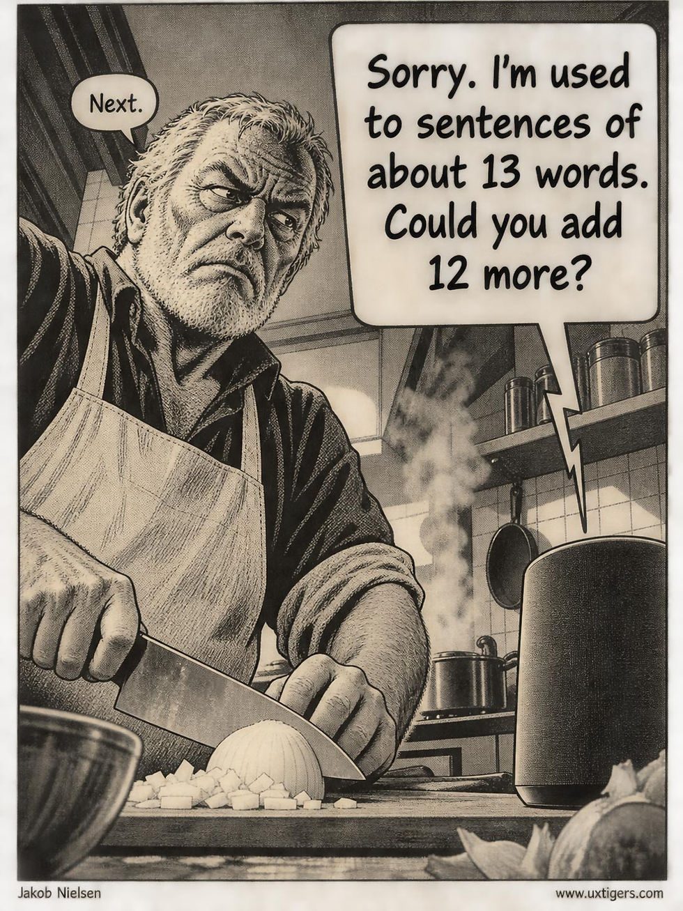
Real users’ utterances average 2.9 words; crowdworkers’ utterances average 12.8. A system tuned on crowdsourced conversations expects sentences and gets grunts. Design for grunts. (GPT Image 2.5)
No mystery here. A crowdworker is paid to finish, so he or she displays payseverance: perseverance that exists only because somebody pays for it. It carries a participant through retries that nobody with dinner on the stove would suffer. Real users owe you nothing. After the second failure, they’re back to the cookbook.

Payseverance: perseverance that exists only because somebody pays for it. The ordinary user has dinner to cook and no reason to earn this certificate by persisting through failed responses. (GPT Image 2.5)
Thus, studies with crowdsourced participants can underestimate real-world usability problems. An obstacle that a paid participant eventually overcomes gets logged as a minor difficulty. In the field, that same obstacle can become an abandoned task and a lost customer.

When paid to use your design, study participants will stay with the task for much longer than any real-world users. (GPT Image 2.4)
The practical lesson: take problems seriously when they surface despite payseverance. Don’t waste a meeting debating whether a crowdsourced finding “would really happen” to somebody who has less reason to persevere. Investigate the obstacle and fix it. A lab success still needs a field verdict: logs, analytics, or testing with people who are free to walk away. Watch whether users reach the same destination when there’s no payment waiting at the end of the task.

Realistic depiction of the true context of use. (GPT Image 2.5)
Iterative Design at Machine Speed: Meta’s AI Agent Retunes a Live Recommender Every 3 Days
Meta put an LLM agent in a closed loop around a live recommender: read the metrics, adjust the settings within a hard budget, deploy, assess with an A/B test, record the outcome, and sweep around again every 3 days. The gains were small but real, largest for new users, and the inference bill came to tens of dollars.
A production recommender has a panoply of knobs: retrieval budgets, ranking weights, caching policies, and treatments for different user segments. Engineers set them by hand, test one change at a time for weeks, and move on. Meanwhile, content, user behavior, and upstream models keep shifting, so yesterday’s optimal setting quietly becomes today’s mediocre one. Knob rot.
Nobody revisits a setting until a metric tanks, and new users inherit whatever works for heavy users, because newcomers barely register in the aggregate metrics.

Knob rot: a setting that was optimal when somebody chose it loses its usefulness as content, users, and upstream models change. Nobody revisits it after that somebody leaves. (GPT Image 2.5)
Muhammad Rafay Azhar and colleagues at Meta AI built CORAL, an agent that runs the loop itself. It reads the operating statistics, adjusts the allocation (a deterministic optimizer trims the proposal to the budget, and guardrails bound the change), deploys the new settings, assesses the effect with an A/B test, and records the outcome in a memory spanning the last 3 cycles.
Read, adjust, deploy, assess, record: RADAR. The sweep comes around every 3 days, without retraining the model: the agent learns from the results retained in its context.

Read, Adjust, Deploy, Assess, and Record. The AI field has rediscovered iterative design, now running every 3 days instead of every release. In usability, we had the RITE acronym (Rapid Iterative Testing and Evaluation), but since we can now deploy, measure, and record within the same tight loop, we’ll need a new acronym to be cool. RADAR fits the recurring sweep. (GPT Image 2.5)
On a video service, round 1 lifted watch time by 0.13%. Round 2 overcorrected and gained nothing. Round 3 increased watch time by 0.15% and sessions by 0.16% at no extra serving cost, with sessions increasing by 0.23% for new users with little behavioral history, the segment a global setting usually shortchanges.

A 0.16% lift sounds piddling, but remember two things. First, RADAR can run 10 iterations per month, so even if they don’t all pan out, fractions of a percent can add up. Second, 0.16% of Facebook’s sessions will buy you a yacht. (GPT Image 2.5)
On a second service, the agent cut serving costs by millions of dollars a year, then increased those savings by another 44% while engagement remained unchanged.
Round 2 is revealing. In my 1993 analysis of iterative design, usability improved by a median of 38% per iteration, yet some iterations scored worse than their predecessors. The same pattern appears here. RADAR puts iterative design on an automated schedule, and its memory lets the agent use a misstep to inform the next round.
A tuning cycle that took engineers weeks now takes 3 days. And because the agent’s inference cost accrues with each tuning decision, it doesn’t multiply with the number of people using the service. A whole deployment costs tens of dollars in inference.

The explanation is AI; you can close the case. CFOs of the world, rejoice: for once, you get something great on a tiny budget. (GPT Image 2.5)
The lesson for anyone building agents: let the LLM weigh messy signals and explain its choices, while deterministic tools enforce the budget. Then find the knobs nobody has touched since 2024 and put them on RADAR. They’re rotting.
Final Thought of the Day


