
UX Roundup: Ecommerce Usability Fails | Social Media Less Social | Overseeing Agents | Your Team as Video Game Characters | UX Hero | Seedance
- Jakob Nielsen
- 5 minutes ago
- 11 min read
Summary: The two most conversion-killing ecommerce usability fails | Social media use remains strong but the platforms are becoming less about connecting with other people | The usability of overseeing AI agents | Team-building image idea: design video game characters | Professor Ben Shneiderman was one of the greatest early pioneers of user experience | Seedance 2 as PC software concept

UX Roundup for June 1, 2026 (GPT-Images-2)
Ecommerce Usability Fails
You would think that after 30 years of building ecommerce sites, we would know how to design an ecommerce website for maximal usability and conversion. You would be right — and wrong!
(I refuse to abandon the lovely em-dash just because most AI models overuse this useful typography element.)
We do know the usability guidelines for ecommerce design, but they are often overlooked, especially by smaller, specialized vertical sites that could benefit the most from good design.
Two of the most egregious, sales-killing usability mistakes in ecommerce are found in the checkout process, which is otherwise the best-documented part of ecommerce design: Coupon codes and required registration without a guest checkout option.
A highly prominent coupon code field directly on the checkout page is often included to please VIP shoppers or run seasonal promotions. But coupon fields act as a severe conversion barrier for the vast majority of regular visitors. By prominently displaying an empty discount box, you are actively interrupting a seamless purchasing flow and introducing unnecessary psychological friction.
When a prepared user without a promo code sees this field, they immediately experience the fear of missing out. The implicit message is that the current price is a bad deal, prompting the shopper to pause their transaction. Consequently, they quickly abandon your checkout page and leave the site to search for coupons on the Internet.
This external search represents a massive risk to your bottom line. Search engine results for brand discounts are notoriously treacherous. Your prospective customers will inevitably encounter affiliate marketing traps, frustrating expired codes, and most dangerously, highly targeted advertisements from your direct competitors. This distraction often leads them to find another site where they buy a very similar product at a cheaper rate.
Even if shoppers resist the lure of a competitor and return to your website, the damage is already done. Returning without a working code, they must face reality. They feel cheated because they have to pay full price while others get a discount. Ultimately, this profound sense of unfairness may lead them to not buy at all.

Showing a coupon code field on an ecommerce checkout page is like opening a portal to the rest of the Internet, encouraging the prospective customer to step through in order to find a deal, which they’ll often close on a different website. (GPT-Images-2)
The solution? Automatically add the discount to the cart when users click through from a promotion. You save the loyal customer the extra step of copy-pasting the coupon code and gain the sales benefit of reminding users about the discount on every single product page where the promotion applies.
It’s just as bad when an ecommerce site requires account creation from new shoppers instead of allowing guest checkout. An online shopping experience should be entirely effortless, but forced signups introduce immediate, frustrating barriers.
The mandatory registration process is usually convoluted, including demands for a unique userid where all variations of the user’s name are usually taken by older (maybe even inactive) accounts. This effectively forces new customers to invent confusing, unnatural usernames they will never remember.
The next painful step is password creation with so many special requirements that users repeatedly fail to meet the platform’s overly strict security rules (password pain was number 6 on my list of top-10 UI annoyances). Discovering the exact required combination of uppercase letters, obscure symbols, and numbers is mentally exhausting. Extremely frustrated by these constant, unnecessary digital roadblocks, often people give up and abandon the registration process entirely. They leave their full shopping carts behind, permanently costing the site the sale.

A second major conversion killer: the lack of guest checkout, imposing the pain of convoluted account creation. Users often give up once they get slapped down too many times. (GPT-Images-2)
Fortunately, the optimal solution is straightforward. Instead, offer smooth guest checkout without the friction of account creation. Let the buyer pay without jumping through administrative hoops. Then after the user has completed the purchase (and the site has closed the sale and made the money), offer an easy way to convert the data the user has already entered into a registered account for easier subsequent purchases. This smart approach prioritizes seamless customer experiences, significantly reduces cart abandonment, and ultimately guarantees your ecommerce store’s lasting, highly profitable online business success.
Repeatedly encountering these two design mistakes even today offends my usability sensitivities because I have explained them so often over the decades. But there are many more: The Baymard Institute has documented more than 700 of UX guidelines for ecommerce design. The full subscription costs $400 per month, which expensive, but should pay for itself for any site with more than minimal sales.
However, if you are cheap, of if management doesn’t believe in user research, Baymard now also has a free option, where they publish abbreviated guides to their most important research findings. (I think this is smart for their sales, because after a company redesigns to fix a few usability flaws, the sales increase will often be sufficient to motivate even the most usability-hostile leadership to cough up the funds for more insights.)
Check out the 4,000 word article about Baymard’s checkout usability findings. This is about as long as my articles, so it’s worth an entire infographic series to summarize:


(GPT-Images-2)
Social Media Dominates Media Consumption, But Is Not Social
Market research firm GWI has published an interesting analysis of many of its recent surveys called Connecting the Dots 2026. It’s surveys on consumers’ media consumption places social media on top, closely followed by short videos (e.g., TikTok), for a total of 13.5 hours spent on average with these two media forms. In contrast, traditional broadcast TV clocks in slightly below 5 hours per week. (This across 54 countries where GWI conducts market research.)

Weekly media consumption, according to GWI’s consumer survey. (GPT-Images-2)
Slightly scary: young people (16–24 years old) spend even more time on social media and short videos: 18 hours weekly. What a way to fritter away your youth, confirming the old saying that youth is wasted on the young.
However, despite the traditional name of “social” media, social media use has become less social in recent years, according to GWI data. Ten years ago, the top three reasons to use social media were to stay in touch with family & friends, to meet new people, and to share the user’s opinions with others. All strongly social motivations for using the platforms.
Now, the top reasons are to fill spare time or relax, to find entertaining content, or to see what’s trending, none of which relate to connecting with other people or being social.

Is this good or bad? Probably mainly bad, contributing to feelings of being lonely and isolated. A redeeming point, also from GWI research, is that AI seems to be breaking this trend toward passive and dulling media consumption to make users more active and creative.
Agent Oversight Usability
The history of user interface design is a story of shifting the burden of labor from the human to the machine. We evolved from punch cards to command lines, and from graphical interfaces to touchscreens, always seeking to reduce friction. Yet, in the nascent days of generative AI, we took a frustrating step backward. We suffered heavily through the “blank page” problem. Users were forced to painstakingly articulate every micro-step to a chatbot, desperately trying to engineer the perfect prompt to coax out the desired result. The human was doing the heavy lifting, acting as a translator for a machine that lacked initiative.
Steadily improving user interfaces, from text-based command lines to graphical user interfaces, have shifted much of the burden from the human to the computer. AI agents are the next step in this sequence of load-shifting. (GPT-Images-2)
No more. We are entering the era of autonomous AI agents: systems designed to take a high-level goal and execute complex, multi-step workflows without the need for constant, explicit prompting.
For UX professionals, this means the primary UI for AI is no longer conversational. Users are now managing ecosystems of agents. Just as designers were getting a handle on how to increase the usability of the ubiquitous chat window (erroneously heralded as the ultimate, frictionless interface), it is rapidly becoming a legacy bottleneck. Today’s users are no longer simply chatting with a singular, subservient bot; they are deploying, monitoring, and managing sprawling ecosystems of specialized agents working in parallel.

Conversational user interfaces were never a guarantee of usability. They were still hard work. (GPT-Images-2)

The new usability challenge: make it easy to oversee many AI agents, each running autonomously, and understand what each is doing. (GPT-Images-2)
Consequently, the fundamental usability challenge is inverting once again. We have shifted away from the problem of articulation (how do I meticulously say exactly what I want the machine to do?) to the far more critical problem of oversight (is this autonomous entity actually doing what I intended, and is it doing it safely?). Consider the stakes in this new reality: an agent can now autonomously refactor an entire monolithic codebase, independently research and negotiate procurement contracts, or execute a multi-channel, dynamically optimized marketing campaign while the user is away from the keyboard. When software operates with this unprecedented degree of agency, traditional step-by-step interaction models fundamentally fail.

The stakes for getting AI usability right keep getting higher as AI agents tackle bigger problems and run for days or weeks. (GPT-Images-2)

From the articulation barrier to the oversight burden: usability in the AI era keeps shifting under our feet. (GPT-Images-2)
In this new paradigm, the user’s role is elevated from a micro-manager to a Creative Director. A Creative Director doesn’t push every pixel or write every line of copy; they set the vision, review the progress, and provide critical course correction. But a director cannot lead if they are locked out of the studio. If our new interfaces fail to provide high-level state visibility, perhaps the most vital of all core usability heuristics, the user will inevitably lose trust in the system. In the realm of autonomous AI, trust is the entire product.
Therefore, our mandate as designers must evolve. We must move beyond the simplicity of “Send” buttons and linear chat histories. We must design interruption points and explicit review gates. We need to engineer control towers that allow humans to pause, inspect, and course-correct an agent mid-flight. If the user cannot easily see, interpret, and logically follow the agent’s “thinking” at scale, they are flying completely blind. And if they are flying blind, they are no longer in charge of the user experience; the machine is. It is time we design interfaces that restore the user’s control, allowing them to confidently govern the machine rather than just talk to it.

My main lifetime goal has been to place humans in charge of computers instead of being subservient. AI is no different. But what’s new is that AI now enables us to run multiple autonomous agents, meaning that we must change from an operational user interface to an oversight UI. (GPT-Images-2)
Your Team as Video Game Characters
Idea for team-building or to introduce colleagues in other disciplines to your team: draw them as characters in popular video games.
Here, “what if UX Designer were an NPC in GTA6?” (for extra credit and maybe too-much realism, you can upload the person’s likeness as reference images). Repeat for different roles and sub-disciplines.


UX designers as non-player characters (NPC) in Grand Theft Auto 6. (GPT-Images-2)
Video game metaphors don’t have to be only about people or work roles. We can also visualize concepts or theories that way, though my attempts with GTA screens have been less successful. Here are some that worked:

Usability Heuristic 7 (Flexibility and Efficiency of Use) as a GTA character. (GPT-Images-2)


Progress indicators. (GPT-Images-2)
What’s a Good Rating Scale Score?
I recommend against heavy use of rating scales in user research, because they only measure what users say about usability, not what they actually do, and thus don’t capture true usability or task performance. Much better to spend most of your research dollars observing users’ behavior, whether you watch personally or have an AI watch for you.
That said, there are also benefits to knowing how much users like your design, and so I don’t want to abolish rating scales completely. But when you get back a score on a 1–7 scale, how do you know whether that number is good or bad, and what to do about it?
The best way to know is to use a consistent survey instrument repeatedly over the years, so that you can track the scores. If the score is up from last time, then people liked your redesign! Simple.

The simplest way to interpret survey results is to compare them with the outcome of exactly the same survey asked about your previous design iteration. (GTP-Images-2)
Second-best: use a standard question that other teams have used many times before to capture user opinions about other designs. If you score in the top 25% of those previously-collected measures, you have a design that’s pretty good, but if you score in the bottom half, you’re clearly worse than most other designs. I recommend using the Single Ease Question (SEQ) from MeasuringU: substantial benchmark data has already been collected for this one-question survey, and because it is indeed limited to a single question, administering it doesn’t impose a major burden on your users.

When you use a standard survey instrument, you can compare your results with those in the benchmark. (GPT-Images-2)

Surveys should be as short as possible. Every extra question lowers your response rate and thus undermines the validity of the answers. (GPT-Images-1)
But what if you need unique insights that can’t be captured by a standardized survey developed by outsiders to satisfy a wide range of design projects? You have a new question that you never asked before, and which nobody else has asked either. No old data for comparing your newly collected scores!
Luckily, my old friends, Drs. Jim Lewis and Jeff Sauro from MeasuringU provide a rule of thumb for judging rating scales for which no historical data is available.
Very simple:
Good score: top 20% of the scale, so for a 100-point scale, 80 or above, and for the traditional 1–7 scale, 5.8 or above.
Average score: around 70% of the range of the scale, so 5.2 on a 1–7 scale.
Poor score: below the midpoint of the scale, so 4.0 or less on a 1–7 scale.

The rule of thumb for judging rating scale scores, here converted to the common 1–7 scale used in most user research surveys. Notice how skewed it is, relative to the mathematical mean of the scale. (GPT-Images-2)
Why is the mathematical midpoint of the scale poor rather than average? Because users tend to be polite and score generously. Acquiescence bias (also called agreement bias or “yes-saying”) is extremely well documented, also outside usability research. Humans have a systematic tendency to agree with survey statements or answer “yes.”

Humans aren’t math. Interpret survey scores accordingly. (GPT-Images-2)
A classic indicator is when respondents tend to endorse both sides of logically opposed statements, such as “I like taking charge” and “I prefer to let others lead,” at rates higher than would be expected if they were answering carefully.

Acquiescence bias makes survey responses hard to interpret correctly. (GPT-Images-2)
Acquiescence bias has several underlying drivers: cognitive ease or effort reduction (agreeing is a low-friction default), social desirability (wanting to appear polite, cooperative, or non-confrontational), and cultural norms that reward deference or agreeableness, especially in Asia. Sociological studies also emphasize status differentials and perceptions of the researcher as a higher-authority figure, which can lead particularly lower-status respondents to “yea-say” out of respect or the wish to avoid conflict.
A mathematically average survey score is thus a bad score in terms of the underlying experience factors you’re trying to assess.


If you must use subjective rating data, at least follow the guidelines in this comic strip. And combine with observational data. (GPT-Images-2)
Heroes of UI: Ben Shneiderman
Ben Shneiderman is a pioneer of user interface research and one of my heroes.

Ben Shneiderman career overview. (GPT-Images-2)
The thinking image model shines in pulling together information from this kind of infographic. I am disappointed that it didn’t show the real covers of Shneiderman’s books. They can absolutely be found on the web. Personally, I would also have featured his early book Software Psychology (1980) which was a pioneering work that influenced me when I started. As a book author myself, I’m sure that Ben prefers AI to highlight his latest book (featuring his latest thinking) instead of one of his first (featuring outdated information), but to be true to history, Software Psychology was the more important work.
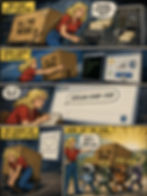
Seedance 2.0 Concept Advertisement
What if the leading AI video model had been a packaged software product in 1980? Here’s a concept ad that could have run in the personal computer magazines of the era:

(GPT-Images-2)
Considering the expense of the AI credits to make videos with Seedance (it’s by far the most expensive video model, but it is also the best), I would have saved a lot of money if I could have bought it as packaged software at the advertised price.