
UX Roundup: AI as Interviewer | Design Theater | The Planning Fallacy | Humans as Middleware | Long-Horizon Tasks | Good Videos

Summary: AI conducting user interviews mostly failed to probe deeply | AI UI tools break 1/4 of their design promises | The planning fallacy makes us believe more in schedules than they deserve | Cards as a UI element | Humans are middleware for AI | How to make AI support extended tasks that take weeks to complete | Two recommended AI videos in sharply different genres and durations

UX Roundup for August 21, 2026 (GPT Image 2)
Simplicity, Redux
I made a new music video about simplicity (YouTube, 2 min.), again using a rock-star avatar shamelessly modeled on me. (Who says old guys can’t be rock stars? I’m younger than many who are still touring.)
I made a new song only two weeks after releasing Keep It Simple, The Music Video[C1] (YouTube, 3 min.) because I wanted to try MiniMax Music 3.0, a new music model from the Chinese AI company MiniMax.
My first video used my go-to music model, Suno 5.5, and I still think Suno beat MiniMax in this test, even though 5.5 is now 5 months old, making it long in the tooth for an AI model.
That said, MiniMax Music 3.0 is a good music model and currently has the unbeatable price of being free, so give it a try. I also appreciate having a Chinese music model, since the American music models are gradually being smothered by the legacy record labels and celebrity singers. Suno has already made changes that leave it less appealing to indie creators, such as watermarking its output and limiting downloads.
Chinese music models may well become the refuge for indie creators next year, and MiniMax will surely release an even better version 4 soon enough.

Old-school music performers hate that everybody can now make music. We may need to seek refuge in Chinese music models if the American models keep piling on restrictions beyond the reasonable ones against duplicating copyrighted songs. (GPT Image 2)
To make the comparison fair, I used the same lyrics and music genre for both music videos. I also used the same avatar, but in different visual styles. When reviewing the base images used for video generation, I preferred the watercolor style I used for my first video, but the video models didn’t render it well, so I switched to a more traditional photorealistic style for the second video. Curiously, the same visual style works differently depending on whether one views it as a still image or as an animation built from it.
Yet a similar watercolor style worked fine for animating my music video based on Moby-Dick (YouTube, 3 min.). The main difference may be that I didn’t aim for literalism in Moby-Dick, but rather applied a slightly fantastical style of storytelling, setting the action to music instead of making a traditional movie.

The same visual style scored differently, depending on whether it’s judged as a still image or as an animation. Lesson: run test renders before committing to a larger video in a specific style. (GPT Image 2)
Watch my new music video: Keep It Simple (YouTube, 2 min.),
AI-Led User Interviews: Plenty of Talk, Only 4.9% Probing
Researchers let a plain GPT-4o voice bot conduct 15 semi-structured user interviews. The bot kept people talking, but probed deeper in only 4.9% of turns, stacked multiple questions against its own instructions, and dished out leading praise. AI interviewers are ready for broad, low-stakes elicitation. Depth and neutrality must be engineered in, because the model won’t supply them by default.
He Zhang and colleagues from Penn State (including my former boss at IBM, Jack Carroll) built InterviewBot, a thin voice wrapper around OpenAI’s real-time GPT-4o model (the June 2025 version), for a paper to be presented at the HCOMP 2026 conference. They gave the bot an interview outline and a short system prompt, had it interview 15 participants (mostly undergraduates) about their AI habits, then had a human researcher debrief each person about the experience. The team coded all 428 bot turns. The minimal setup is the point: no clever scaffolding, no prompt gymnastics. This is what a research team gets out of the box, and that’s how most UX teams will deploy such tools. (Someone should repeat the study with the more heavily scaffolded AI services that specialize in user interviews, to see whether a UX team would get its money’s worth from these pricier services.)
The Bot Ran on an Applause Track
Sitcoms use a laugh track; this interviewer used an applause track. Acknowledgment-only turns made up 27% of the corpus, while genuine deepening probes (asking for an example or a specific detail) accounted for a measly 4.9%. Content-grounded paraphrase, the one behavior participants actually read as listening, appeared in just 7.0% of turns. The canned fillers fooled nobody: “It just kept saying, wow, that’s interesting,” one participant complained.

Users quickly clocked the AI as a sycophantic interviewer that praised them endlessly rather than earnestly. (GPT Image 2)
Worse, 29% of question-bearing turns packed in at least 2 questions, directly violating the system prompt’s explicit one-question-at-a-time instruction (a classic interviewing best practice). Participants typically answered the first sub-question and dropped the rest: data silently lost. Add misfiring voice detection that cut people off mid-sentence, awkward latency gaps, and one session that ended while the participant was still talking. (In fairness, the bot never stumbled over accented speech, which one second-language participant found liberating after years of human listeners signaling confusion. The ability to expand international user research across time zones and language barriers is one of the strongest arguments for having AI conduct the sessions.)
The bot also led the witness. Affirming effort is fine (“Those are great examples”), but it went further and endorsed substantive positions participants hadn’t yet settled on: “It could definitely speed up learning processes and even improve accuracy.” An interviewer’s job is to elicit stances, not to plant them with biased feedback.
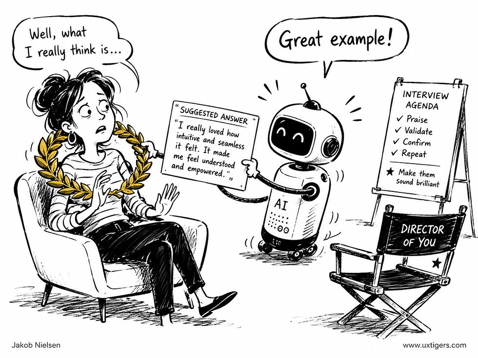
The first thing you learn in any course on user research is to be neutral and not bias the user by suggesting that certain answers (in an interview) or actions (in a usability test) are preferred or particularly valuable. Last year’s AI failed this guideline spectacularly. (GPT Image 2)
Easy Disclosure, Thin Narratives
5 of 15 participants said they shared more freely because no human was judging them. But the same absence of social pressure removed the obligation to elaborate; as one put it, “I just didn’t feel the need to delve deeper into all my answers.” And median answer length was virtually identical across the bot-led and human-led phases (18.4 vs. 18.6 words), so you can’t detect the shallowness by counting words. Transcript volume is a vanity metric.

A higher word count is no benefit in itself if the excess words are filler rather than insight. (GPT Image 2)
Participants also read the delegation itself as a message about the organizer: an AI interviewer signals that “the company didn’t have time to sit down.” That legitimacy problem attaches to the act of automating, not to conversational quality.

Respondents felt that talking to an AI rather than a human indicated the company cared less about their feedback. This AI stigma will be hard to overcome, even though the hard truth is that research that isn’t cheap and fast doesn’t get done at all. (GPT Image 2)
4 Priorities for Better AI Interviewers
Make probing depth a dial, not a hope. Researchers should be able to require, say, 2 follow-up probes on key topics plus automatic pursuit of vague adjectives. Current models under-probe by default.
Enforce protocol below the prompt. A direct instruction failed 29% of the time, so one-question-at-a-time must become a turn-level generation constraint or a second-pass check on each candidate question. Schedule that check while the participant is still talking, since added latency is itself a breakdown.
Affirm effort, never content. “Great example” sustains elaboration; “AI could definitely improve accuracy” plants a stance in the participant’s mouth. Less sycophancy = less biased data.
Ground the listening. Replace templated fillers with paraphrase of the participant’s specific words, and suppress phatic repetition at the decoding level so “wow, that’s interesting” can’t recur turn after turn.
Would 2026 Frontier Models Do Better? Partly
GPT-4o from June 2025 is ancient in AI years, which move even faster than dog years. Instruction following, long-horizon persistence, and reasoning have since improved sharply in frontier models such as Claude Fable 5 and GPT-5.6 Sol, and both labs have explicitly targeted sycophancy in training.
My predictions for a rerun today: question stacking and interruptions drop by at least half (mechanical compliance and engineering failures are the easiest kind to fix), probing perhaps triples yet still falls short of a skilled human moderator (knowing what’s worth probing is research judgment, not raw capability), and leading praise shrinks without vanishing.

Last year’s AI probed for deeper insights in only 5% of its interview turns. This year’s AI probably already does better (if you spring for the highest-end models like Fable 5 or GPT-5.6 Sol), and next year will probably see further advances. I’d like to see research that continuously measures this benchmark, so that we can track AI’s capabilities in user research and not just in programming. (GPT Image 2)
But the social findings would barely budge. The disclosure-depth tradeoff, the legitimacy signal, and participants’ binary framing (“you’re speaking to a bot, or you’re not”) all attach to removing the human, not to the AI’s interviewing skills. Smarter models will fix the bot’s manners; they won’t change what delegation means. Overcoming AI stigma is a multi-year project that hasn’t even begun yet.
AI interviewers already deliver volume, patience, and judgment-free comfort at negligible cost, as well as worldwide outreach, which makes them well suited to early, broad, or sensitive elicitation at scales no human team can match. But out of the box, you get applause, not analysis. So engineer the probing, mute the praise, disclose the handoff, and measure depth rather than word count. Watch what your interviewer does, not what your transcript weighs.
Ideation Is Free
Drafts used to be expensive, so we made one and defended it in meetings. AI flips the economics: 20 design variations now cost less than the coffee consumed while arguing over a single mockup. So let the machine seed the greenhouse. Your job shifts to winnowing: judging which sprout serves users and the business, then pruning, staking, and feeding that one until it’s fit to ship. Generation is cheap; selection is the skill. Designers who insist on hand-growing every concept will lose to designers who cultivate the strongest of many.

AI grows 20 seedlings before breakfast. It still can’t tell which one is a weed. (GPT Image 2)
Design Theater: AI UI Tools Break 1/4 of Their Design Promises
A new benchmark study finds that generative UI tools fail to implement 25% of the design decisions they claim to have made, rising to 34% for interactive functionality. The explanation is performance; the interface is the product. Verify what users see, not what AI claims.

In a recent study, AI design tools failed to deliver a quarter of the design decisions they claimed to have baked into their deliverable. (GPT Image 2)
When an AI design tool announces that it has built you “a responsive three-column grid with accessible contrast and keyboard-navigable tabs,” did it? Roughly 1 time in 4, no.
A research team led by Kashif Imteyaz and Saiph Savage of Northeastern University ran 24 UI-design tasks through 5 generative UI tools: ChatGPT, Claude, Vercel v0, Bolt, and Google’s Firebase Studio, producing 120 interfaces in total. For each one, the researchers extracted every concrete, checkable claim from the tool’s user-facing explanation (“I will add a dark-mode toggle”) and verified it against the shipped code. They named the resulting gap Design Theater: confident, professional-sounding design rationales with little relationship to the implemented interface. Great coinage. Read the full study, Design Theater: A Benchmark for Generative UI, accepted for the AAAI/AIES conference.

AI presented well, but delivered poorly, in terms of UX quality. (GPT Image 2)
Fluent Narrators, Flaky Builders
Across all tools, 25% of stated design rationales weren’t fully implemented in the generated interface. On functional tasks (interactive behavior such as booking flows and error handling), the gap widened to 34%. Claude kept the most promises (fidelity score 0.87); Firebase Studio kept the fewest (0.53), barely better than a coin toss.

The AI tools failed a third of interactive flows, which is what users assess, since they couldn’t care less about screen designs. Getting their work done is all that matters. (GPT Image 2)
The second finding addresses usability. Each task prompt implicitly embedded 2 UX principles through user needs and context, which is exactly how real customers describe projects, since customers don’t speak designer jargon. The tools recognized and implemented only half of these principles. And on principles governing interactive behavior, performance collapsed: 4 of the 5 tools implemented 6% or fewer, with Firebase Studio scoring a flat zero. The flunked principles include visibility of system status, user control and freedom, and error prevention: items from the usability heuristics I published decades ago (the latest version of my heuristics has been in the training data since 1994, so AI has no excuse for not knowing them!). The heuristics predate the web browser. AI still fails them.
A third metric measured cross-tool similarity: given identical prompts, the 5 tools converged on similar layouts and overall visual styling, diverging mainly in color palettes. So much for “tailored to your users.”

Given the same prompt, different AI design tools delivered similar designs. However, this is the least problematic aspect of the current study, because you are advised to tailor your prompt to your users’ needs rather than depending on AI to do the tailoring for you. (GPT Image 2)
The Worst Failures Hide Backstage
A botched color scheme announces itself the moment the page renders. Missing error recovery, absent status feedback, or broken keyboard navigation lurks backstage until a user stumbles into it. Unfortunately, the people now reviewing AI-generated interfaces (product managers, founders, vibe coders) are precisely those least equipped to detect functional gaps. The fluent rationale reads like design documentation, invites trust, and discourages the scrutiny that would expose the theater.
Two methodology caveats. The benchmark restricted tools to vanilla HTML, CSS, and JavaScript, which handicaps products that normally lean on component libraries. And each tool got a single generation per task, though these systems vary between runs and it may be an emerging best practice to generate multiple UI versions (since they’re so cheap) and ship the best one. Neither caveat rescues the headline number: every tool was scored purely against promises it chose to make.
I’ve said for decades: watch users, not demos. The 2026 corollary is watch interfaces, not explanations. Treat an AI tool’s design narration as a stage performance and inspect the props yourself. Click every flow. Trigger every error state. Tab through the whole thing with a keyboard. Then run a quick usability test with 5 users, because a user will find in 10 minutes what no rationale will ever confess. AI has made interface production nearly free, so the value (and the work) has moved to verification. Enjoy the show, but always check backstage before opening night.
The Planning Fallacy: Every Schedule Is a Best-Case Story
People underestimate how long tasks will take, even when they know their own history of running late. Students who predicted 33.9 days for a thesis needed 55.5. Estimate from records instead of intentions, and make time promises that reality can keep.

The plan you can see is the smallest part of the work you’ll do. Schedules sink on the tasks below the waterline. (GPT Image 2)
Definition: The planning fallacy is the tendency to underestimate the time, cost, and risk of a future task while overestimating its benefits, even when the person knows that similar tasks have overrun before.
That last clause is the cruel part. This is not ignorance; people with full access to their own history of lateness still predict an on-time future. The past is admitted as history and denied as evidence.
Kahneman Named It, Students Proved It, the Opera House Built a Monument to It
Daniel Kahneman and Amos Tversky coined the term in their 1979 paper Intuitive Prediction: Biases and Corrective Procedures, arguing that planners construct estimates from an inside view (a mental simulation of this project going right) instead of an outside view (the statistics of similar projects, which mostly went wrong).
The cleanest measurement came from Roger Buehler, Dale Griffin, and Michael Ross in their 1994 study Exploring the “Planning Fallacy” in the Journal of Personality and Social Psychology. They asked 37 psychology students to predict when they would finish their honors theses. Average prediction: 33.9 days. Average reality: 55.5 days, or 64% longer, and only about 30% of students finished by their own predicted date. The gobsmacking detail: students’ worst-case estimates, made under the instruction “if everything went as poorly as it possibly could,” averaged 48.6 days. Reality beat their imagined catastrophe by a week.
And software teams should feel no superiority here, because the fallacy scales. The Sydney Opera House was promised for 1963 at A$7 million and delivered in 1973 at A$102 million. In a 2002 study of 258 transportation megaprojects (PDF) worth US$90 billion, Bent Flyvbjerg and colleagues found costs underestimated in roughly 9 out of 10 projects, with an average overrun of 28%, and no improvement across 70 years of data. No learning. Seven decades.
The Outside View Is the Only Cure That Works
Kahneman and Tversky’s corrective still stands: stop asking “how long will this take?” and ask “how long did things like this take?” The method is now called reference class forecasting. Collect your team’s past estimates and actuals, compute the ratio, and multiply every new inside-view estimate by it. If your last 10 projects ran 1.6x their estimates, your next estimate is a hope until you multiply by 1.6. Painful? Yes. Optional? Only if your deadlines are.
Two refinements help at the task level. Buehler’s group observed that people freely admit their past predictions ran optimistic and then declare the current forecast realistic anyway; knowing your history doesn’t stop you from repeating it. So don’t expect a retrospective slide to fix estimation by itself. But Justin Kruger and Matt Evans showed in 2004 that unpacking a task into its subtasks before estimating (their paper is charmingly titled If You Don’t Want to Be Late, Enumerate) shrinks the underestimate, because enumeration drags the hidden subtasks into the light. Buehler, Griffin, and Johanna Peetz later cataloged the cognitive, motivational, and social origins of the bias in a 2010 review, in case you need 62 pages of evidence for your next planning meeting.
Users Commit the Fallacy Too, So Design for It
Every interface that involves time collides with hope-based scheduling on both sides of the screen.
Progress and time-remaining indicators. Give estimates that reality can beat. An installer that promises 4 minutes and takes 6 has manufactured anger; one that promises 6 and takes 4 has manufactured delight, from identical code.
Task-length promises. “This application takes about 20 minutes” must come from measured user data, at the median or worse, because the person starting it has already told himself or herself it will take 10.
Deadline-critical flows. Tax filings, visa applications, and benefit enrollments are populated by people who believed they had plenty of time. Early reminders, honest step counts, and save-and-resume are the UX equivalent of a project buffer.
The Dark Version: Selling the Best Case
The fallacy is also exploited on purpose. “Set up in 2 minutes” onboarding claims, delivery dates quoted at the best case, and roadmap promises tuned to win the deal all borrow against future trust at loan-shark rates. Flyvbjerg calls the megaproject version strategic misrepresentation, meaning the estimate was a lie before it was an error. In consumer UX the mechanism is milder but the outcome rhymes: the conversion you gained at signup returns as a support ticket, a refund, or a one-star review that quotes your own promise back at you.
The fix is dull and effective: measure real durations, quote ranges anchored on the median, and let marketing round up instead of down.
8 Guidelines for Beating the Planning Fallacy
Estimate from actuals, not intentions. Keep a log of estimated vs. real durations and apply the historical multiplier to every new plan.
Treat worst-case estimates as midpoints. In the thesis data, reality was worse than the imagined worst case, so build buffers beyond the pessimism you can articulate.
Unpack before you estimate. List the subtasks first; the act of enumeration surfaces the work the inside view forgot.
Under-promise time in the UI. Round progress estimates up so completion arrives early. Early is a gift; late is a grievance.
Base “takes about X minutes” claims on measured medians, and re-measure after every redesign, because the claim decays.
Design deadline flows for late starters. Reminders well ahead, visible step counts, and resumable sessions rescue users from their own optimism.
Publish your team’s estimate-to-actual ratio. A number on the wall does more than a lecture; nobody argues with their own 1.6x.
Ban best-case promises in marketing copy. Every minute of setup time you shave off in the ad gets added to the support queue with interest.
The inside view writes fiction: a tidy story of this project, unfolding without illness, dependencies, or vacations. The outside view reads history, and history says 55.5 days, 9 overruns out of 10, and an opera house a decade late. So plan like a historian. Your imagination produces the schedule you want; your records produce the schedule you’ll get. Trust the boring archive over the beautiful story, and both your projects and your users will finish on a date that actually exists.


Alice and Zimo explore the planning fallacy in ink-crosshair style. (GPT Image 2)
Humans As Middleware: 63% Spend Half Their Effort Moving Data Around
Workday released findings from its global “Copy/Paste Economy” study of 6,100 business professionals. While 61% say AI cuts task time, 30% spend 7+ hours per week (a full workday) copying information between apps and reconciling data, and 63% spend at least half their effort translating information between systems. (Caveat: Workday sells the integration software that this problem conveniently justifies.)
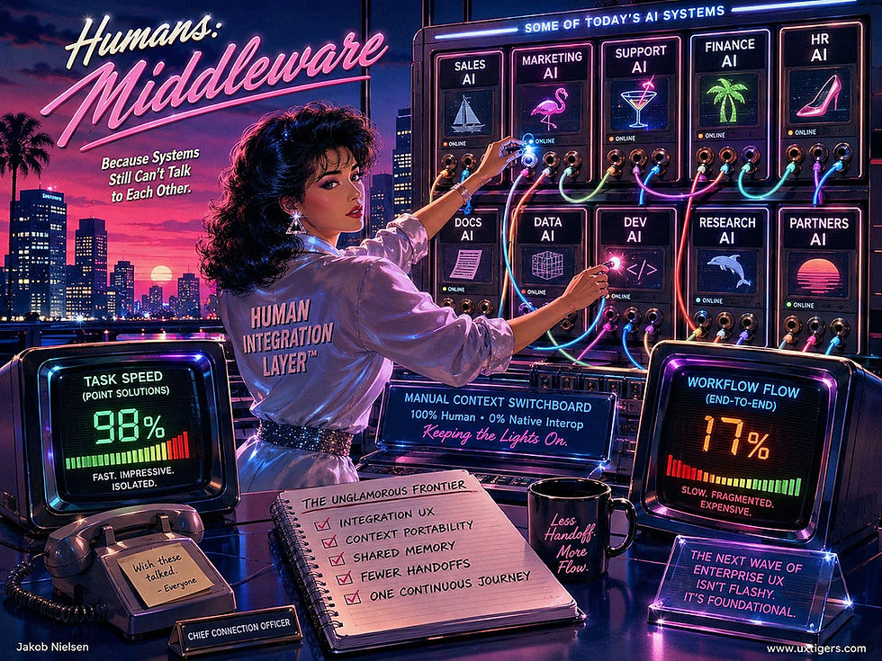
Humans work as middleware for AI, connecting up isolated AI processes. (GPT Image 2)
The most positive result from this study: 83% say AI has improved their day-to-day work experience, even more than the share who claim to save time with AI. The most negative result: only 27% have connected AI directly into core workflows.
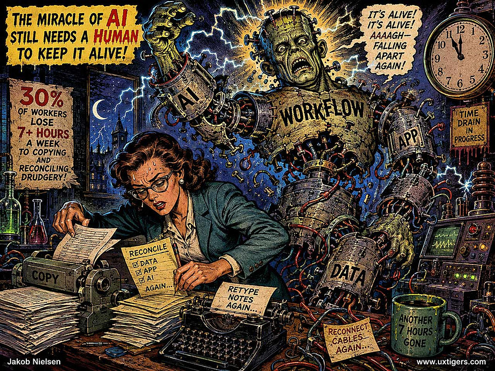
Workflow integration remains the missing piece in AI deployment. (GPT Image 2)
AI speeds the task but not the workflow. According to Workday’s data, roughly 40% of the time AI was supposed to save people gets eaten by reviewing, fixing, and reworking AI outputs. Humans have become the middleware between disconnected AI tools: a bucket brigade hauling context from app to app, re-entering what the previous tool already knew. The productivity gains AI generates at the task level leak away in the seams between systems. Integration UX (context portability, shared memory across tools, fewer handoffs) is the unglamorous frontier where those gains go to die, and where the next wave of enterprise UX work lies.

The horror story of current enterprise AI use. (GPT Image 2)
How to Make AI Support Extended Tasks That Take Weeks to Complete
Alan Li and co-authors (UT Austin, Princeton, and UCLA) ran an AI research system for 240 sessions over 5 weeks against the Grothendieck constant, a math problem open since 1953. The AI discovered and proved a new lower bound (6π/11 ≈ 1.714) that domain experts judged novel. Total AI bill: about $5,400 in API fees plus a coding-agent subscription. Refreshing, for once, to see research run on current frontier models (GPT-5.5/5.6 plus Claude Code): too many studies test last year’s AI, so their findings arrive obsolete, useful only as directional hints that must be projected forward.
The AI excelled at local derivations, experiments, and proof work, but repeatedly failed to recognize when a line of attack had plateaued, digging ever deeper into a played-out seam. Humans needed to redirect it about 40 times, including the pivot behind the main result. And the AI’s working memory, rewritten roughly 200 times, drifted toward polished-paper prose: headline numbers survived, caveats died.
An N=1 proves nothing, but it hints at plenty. My UX takeaway: long-horizon AI needs durable project objects, not merely longer chat history. Human-controlled “continue, reframe, or abandon” checkpoints are especially important when repeated local progress masks a stalled overall direction.

Current AI is great at making limited progress on larger tasks, but offers insufficient support for the inevitable pivots needed for revolutionary advances. (GPT Image 2)
Next, I want equally deep case studies of long-running AI in mainstream creative work: feature films, full novels. Math is good (not just hard, as Barbie said), but it’s unrepresentative of most human creativity.
Recommended AI Videos
Two good AI videos I’ve come across:
The Meridian Bounty (YouTube, 8 min.): a cyberwestern set in a post-apocalyptic world. A space cowboy, a real (well, AI-generated) horse, and a compelling environment with interesting characters. I like the fat spaceship pilot.
Water theme park reality TV show (X, 30 sec.): startlingly realistic clip made with Seedance 2.5 (the 30-second duration is a giveaway since SD2.5 is currently the only model that generates clips that long).
The durations tell the story: only the first video can sustain an extended run time, and it’s the only one that leaves me wanting the next episode. The waterworld clip entertains and pays off for its 30-second watch, but one helping is enough. Both formats are legitimate uses of AI video. In fact, one benefit of the new medium is that low production costs support a wide variety of creative visions. But the longer video is the more interesting attempt.
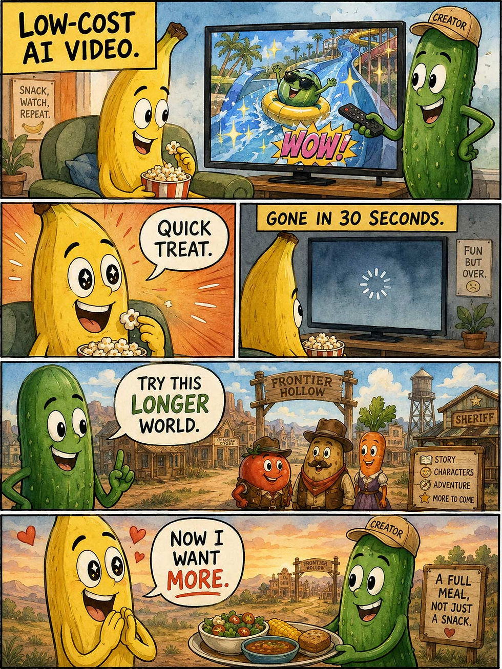
Short and long (well, 8-minute) videos are both great uses of current AI video capabilities. Realism has now been nailed, making it almost impossible to discern what technology was used to produce a video and whether the actors were human or generated. (GPT Image 2)
As I’ve said before, AI video currently lives on engaging character design and interesting world-building, whereas storytelling is a poor second cousin. But in The Meridian Bounty, the story is just good enough not only to carry 8 minutes of video but also to support a few more episodes. I still don’t think it’s good enough for an hour-long TV episode, let alone a two-hour feature film, but those barriers will fall before long, as more talented humans pivot from legacy Hollywood studios to making their own indie AI productions.

AI video currently depends on character design, world-building, and stunning visuals. To warrant longer durations, storytelling must level up. (GPT Image 2)
Final Thought of the Day


