
UX Roundup: Carousels | AI-Native Games | Bulk Actions | AI Film Wins at Cannes | AI Use 2× in One Year

Updated: Aug 2
Summary: Carousels are scanned in an L-pattern, not the F-pattern | Making AI-Native games playable | Bulk actions support flexibility and efficiency of use | AI film wins a bronze lion at the Cannes Festival | Use of AI applications doubled in one year

UX Roundup for July 24, 2026 (GPT Image 2)
Carousels Break the F-Pattern: Users Scan in an L and Ignore Your Labels
Eye tracking of 87 users browsing streaming-style screens refutes every web-search assumption it tested: no F-pattern, no hierarchical label-first browsing, no examination hypothesis. Users judge each row by its first thumbnails, swipe only when committed, and read carousel titles late or never. Design for that behavior, or don’t use carousels at all.
Definition: A carousel is a horizontally swipeable row of themed items sitting beneath a descriptive label; only the first few items are visible until the user swipes. Stack such rows vertically, and you get a stacked carousel interface.
Example: The Netflix home screen: rows labeled “Trending Now,” “Comedies,” or “Because You Watched…” each show 5–6 movie posters, and an arrow slides in more titles from the right. (Not the auto-rotating homepage hero rotator; that one remains a stinker.)

The stacked carousel interface has multiple rows of rotating items on top of each other. Lots of opportunity for users to spin. (GPT Image 2)
In a new study presented at SIGIR 2026, Jingwei Kang, Maarten de Rijke, and Harrie Oosterhuis of the University of Amsterdam tested whether the assumptions baked into carousel click models and metrics match real behavior. They analyzed RecGaze, the only public eye-tracking dataset for stacked carousel interfaces, collected by Santiago de Leon-Martinez and colleagues: 87 participants each browsed 30 streaming-style screens and clicked the one movie they’d watch per screen, for 2,375 valid screens. Each screen stacked 10 genre rows of 15 movies, shown 5 at a time across 3 swipeable viewport sets.
The team checked 4 assumptions imported from web search: the F-pattern; hierarchical, left-to-right browsing; the examination hypothesis (clicks hinge only on an item being seen and being attractive); and title-first navigation. None survived. My gripes: 1 dataset, 1 layout, 1 leisure domain, a forced click per screen; the authors concede them all. Still, 1 real dataset beats 10 borrowed assumptions.
Scanning a Carousel Is Nothing Like Scanning a Page
When I named the F-pattern in 2006, our eye-tracking data showed fixations hugging the top-left corner of text-heavy web pages, thinning rightward and downward. Carousels bend that geometry 3 ways:
Dual focus on the initially viewable set. Attention peaks top-left as expected, but a second peak appears at the top-right (partly swipe-arrow hunting, perhaps, though the authors doubt it).
Mirrored Fs after swiping. On the second and third viewable sets (after swiping), attention decays right to left: swiped-in content enters from the right.
No F across viewport sets. Examination falls off a cliff at the viewport boundary: in the top row, 84% saw the last visible movie but only 33% saw the first hidden one.
Conditioned on a click, a new shape emerges, which the authors dub the L-pattern: users examined the entire first item of nearly every row above the click, plus the clicked row out to the clicked item. And swiping happens almost exclusively in the row that wins the click. Horizontal exploration isn’t browsing; it’s commitment.

Row titles fare worst. The top row’s first thumbnail was examined on 91% of screens; its title on only 26%, so a whopping 65% of users (at minimum) saw the movie but never its genre label. In fact, titles were the first element examined in a row a mere 2–15% of the time. We’ve long known about banner blindness on web pages: users skip anything shaped like an ad. Carousels instead exhibit label blindness: users look straight past the heading to the pictures beneath. The thumbnails are the navigation; the title is decoration (not the other way around, as you might have surmised, given that thumbnails are just pretty pictures — but they do define the movie and usually show the lead star).
The examination hypothesis fell too: with row order randomized, click rates given examination should match within any column. They didn’t: row 1 out-converted row 6 by 2.63 percentage points (p < 0.001), a cousin of the trust bias in ranked lists.
Why Carousels Rewire the Eyes
Why does a pattern that held for 20 years of web pages collapse in a carousel? Four reasons:
Swiping moves the starting line. The F was never about the letter; it described economical scanning that begins where content begins. Carousel rotation relocates that origin to the right edge, so the F mirrors.
Interaction cost gates exploration. Off-viewport items must be paid for with a click to rotate the viewport, so users dig horizontally only after deciding a row deserves it. Hence the L.
Pictures out-shout words. 5 scary movie posters say “thriller” faster than the word Thriller; the items carry the information scent. Recognition beats reading.
The first column is a free sampling menu. Cruising down the leftmost thumbnails samples every category with minimal eye travel. Users shop the carousel like a supermarket: judge each aisle by its endcap, ignore the ceiling signs, and walk down only the aisle holding tonight’s dinner.
6 Guidelines for Stacked Carousel Design
Lead each row with its 2 most category-defining items. Users infer what a row is from its opening thumbnails, not its title; those slots must communicate the theme, even if that demotes the most popular item.
Ration your rows. First-item examination fell from 91% in row 1 to 39% in row 10, so strategic categories belong in the top 3–4 rows.
Treat off-viewport items as invisible. Given the cliff at the viewport boundary, content that users must see belongs on the initially visible set (shown without rotating the carousel). No exceptions.
Never confine essential information to a title. Disclosures like “Sponsored” and urgency cues like “Leaving Soon” must sit on the items, because most users skip the label, and the rest read it late.
Log swipes as high-intent signals. Users swipe almost only in the row they end up choosing, so an arrow click is a shortlisting act. Feed it to your personalization model.
Fix your metrics. Position discounts that decay smoothly from the top-left reward the wrong placements. Weight the initially viewable set and the first column heavily, expect near-zero exposure elsewhere, and remember trust bias inflates top-row clicks.
When to Use a Carousel, If Ever
Use a carousel only when 3 conditions all hold:
Items are visually self-describing: posters, products, photos, artwork. If your thumbnails are logos or gray document icons, the rows say nothing.
Many categories must share one viewport, and cross-category sampling genuinely helps, as in entertainment and shopping discovery.
The task is open-ended browsing. For lookup and directed tasks, search plus a vertical list wins; nobody should paginate horizontally toward a known target.
Fail any test, and a plain list or grid serves users better, because a carousel hides 2/3 of each row behind swipes that only the already-committed will make. My recommendation: streaming services, recipe collections, and e-commerce discovery have earned carousels; documentation, B2B catalogs, and dashboards haven’t.
Carousels are supermarket shelving for pixels: fine for a leisurely cruise past visually appetizing goods, wrong for finding the fuse box. The Amsterdam team swapped 4 borrowed assumptions for observed behavior; designers must now do their part. Respect the L, stock the endcaps, and stop expecting anyone to read the aisle signs.
AI Autocomplete: A Serious Attack on the Articulation Barrier
MagicX released AI Autocomplete this week: it turns an ordinary text box from a passive receptacle into an active guide. Conventional autocomplete predicts the next word or a popular query. MagicX instead predicts the action a person wants and reveals the missing parameters required to perform it. The feature is designed to sit inside search, commerce, media-generation, agent, and customer-service products. The host product still executes the action.

Regular autocomplete simply adds more letters and words to the user’s input. This can save a lot of typing and is a useful, if unintelligent, feature. (GPT Image 2)
As an example, if a shopper types “Buy,” AI Autocomplete can offer category, color, brand, model, budget, delivery, size, and payment choices. Suggestions appear as pills and dropdowns; selections become both a readable query and structured fields. Suggestions may draw upon a product’s catalog, inventory, prices, metadata, rules, and business logic. Users can ignore the suggestions or submit an incomplete request, as before.
The important UX contribution is that AI Autocomplete directly attacks the articulation barrier I described in 2023. Intent-based AI is powerful because users state the desired outcome instead of operating every control. Its price is the demand that people accurately describe their needs in prose. Writing new prose is harder than recognizing or reading existing material, and even highly literate users routinely fail to specify complex needs completely. I therefore predicted that successful AI interfaces would be hybrids: natural language for flexibility, supplemented by GUI elements that show users what the system can do.

The articulation barrier: Users cannot ask what they cannot yet articulate. (GPT Image 2)

Intelligent autocomplete is predictive of the user’s intent. If it’s good, it can describe what you want better than you could articulate it yourself. Does MagicX’s new product fulfill this vision? We don’t know yet. (GPT Image 2)
MagicX is an unusually faithful implementation of my prediction, at least if it works as promised. Users can begin with a crude fragment and progressively recognize suitable options instead of recalling product capabilities, specialist vocabulary, and every necessary constraint. This should reduce typing, expose otherwise invisible features, prevent some invalid requests, and replace several rounds of clarification with one richer submission. In my later article on prompt augmentation, I predicted real-time inline assistance while the user writes the prompt. MagicX combines two of my AI design patterns (Prompt Builders and Parametrization) inside the text field itself.
For bounded tasks with a well-understood structure, this could lower the articulation barrier substantially. Buying shoes, booking travel, filtering a catalog, configuring media generation, or briefing an agent all contain dimensions that can be anticipated and presented as choices. The user need not become a prompt engineer merely to remember that price, delivery date, camera angle, authentication, or visual style matters.

Understanding user intent matters, and good AI can do this better, though not perfectly. If the user types the three letters K-E-Y, what do you predict as good autocompletes? If you can infer that the user’s intent relates to the object used to unlock a lock, then you could suggest keychain, keyholder, and simply “keys.” Without correct intent inference, good old stupid autocomplete would happily suggest words like keyboard and keynote. (GPT Image 2)
However, lowering the barrier is not eliminating it. Users must still initiate the request, read the labels, and recognize the correct options. The feature supplies only dimensions anticipated by the product’s schema and business logic. If an important constraint is absent, it remains invisible. Suggestions may also anchor people on plausible but incomplete interpretations. AI autocomplete could also become Dark Design by unduly promoting choices favored by the seller.
Most importantly, people often cannot articulate complex needs because they do not yet know what they want. They discover their intent by seeing alternatives, reacting to results, and revising the problem. Autocomplete front-loads known parameters; it doesn’t perform deep requirements discovery. This leaves it short of the longer-term intent-by-discovery approach, where users explore alternatives, manipulate outcomes, and home in on their destination.
AI Autocomplete also does not explain why a suggestion appeared, expose unresolved ambiguity, provide rich visual or multimodal exploration, or repair the downstream delivery gap. A beautifully structured prompt can still produce a hallucination, a poor design, or the wrong action.

Autocomplete may just have been promoted from humble search-engine add-on to harbinger of the intent-based future of AI user experience. (GPT Image 2)
AI Autocomplete is therefore a promising bridge between the text-only present and a more usable intent-based future. It may be the strongest commercial implementation yet of a hybrid interface for overcoming the articulation barrier. But my original article called for studies with users across literacy levels performing real tasks. Until such evidence exists, MagicX has demonstrated an excellent design direction, not the disappearance of the articulation barrier. (To make things clear: I am not endorsing this product since I don’t know how well it works outside the vendor demo. Watch users, not demos. But do look into it.)
Constraints Make AI Playable: Lessons from 53 AI-Native Games
A new survey of 53 games built around runtime generative AI finds that the successes pair open-ended generation with hard structure: goals, persistent state, validation, and legible feedback. Generation is cheap; playability must be engineered. Most of these lessons transfer straight to non-game AI products.
A river without banks isn’t a river but a swamp: all water, no direction. Generative AI gives games an endless current of dialogue, quests, characters, and worlds. But current alone produces mush: the banks (rules, goals, state, and feedback) are what turn flow into play.
That’s the core finding of “AI-Native Games: A Survey and Roadmap” by Zhiyue Xu of the Institute of Automation at the Chinese Academy of Sciences and 5 colleagues, including the veteran game-AI researcher Simon Lucas of Queen Mary University of London. The team screened 98 candidate artifacts down to 53 AI-native games and prototypes from 2022 to 2026, then coded each along two axes: the player-facing game type and the AI mechanic that makes the model indispensable.
The Rip-Out Test Separates Native from Decorative
The authors define an AI-native game by a counterfactual: generative AI must be so constitutive of the core loop that removing it would collapse the game or mutate it into a different activity. Call it the rip-out test. Rip out the model; if the game still works, the AI was decoration.
The test yields a tidy 2×2. One axis asks whether generative AI is constitutive of the core loop, or could be ripped out without changing the form of play. The other asks whether the artifact is a strict game at all, with goals, rules, win conditions, and consequential state. Crossing the axes produces 4 quadrants:

Pass both tests, and you have an AI-native game: the AI is load-bearing. In Vaudeville, an interrogation detective game, questioning the model is the game: no model, no suspects, no game.
Keep the game but make the AI replaceable, and you have an AI-augmented game: a real game in which runtime AI enriches a non-core layer. In Tenure-Track Chili, generated dialogue garnishes a loop that would survive on authored content.
Reverse the pattern (central AI, missing ludic structure) and you get an AI-boundary artifact. AI Dungeon offers endless story continuation, but without goals, rules, or win conditions, open-ended storytelling isn’t a strict game.
Fail both tests, and you’ve left game design entirely: plain chatbots and tavern-style role-play offer open-ended conversation with no game attached. All three in-scope categories are legitimate businesses. Only one is AI-native.

Rules, constraints, and a win condition make games flow. If the game designer doesn’t build those, users are lost. (GPT Image 2)
Language Games Dominate the Corpus
Where has the field actually gone? Overwhelmingly toward words. Narrative adventures account for 24 of the 53 artifacts (45%), and the 3 leading AI mechanics (interrogating characters to extract hidden information, persuading or deceiving them, and AI story-mastering) cover a combined 79% of the corpus. Mechanics that push AI deeper into the rules remain scarce: semantic adjudication (the model rules on whether your improvised action succeeds) appears in only 6 games, multi-agent simulation in 4, and generative construction in 1.
Part of the skew is model capability: current AI shines when the interaction is linguistic, and we may expect more video-oriented AI games as world models mature. But part is absorption capacity: detective fiction converts model wobble into unreliable testimony; a strategy game converts it into a corrupted save file. (One quibble: the authors coded this fast-moving corpus themselves, and the census will be stale within a year. The framework will outlive the numbers.)
6 Guidelines for AI-Based Entertainment Design
The survey’s roadmap boils down to the disciplined engineering of freedom. Whether you’re building a detective game, an interactive story, or a companion app, my distillation is:
Apply the rip-out test before you brag. If finite authored content or deterministic code could deliver the same experience, you’ve built an AI-augmented product, not a true AI-native game. Fine, but market it honestly.
Generate, then verify. Route every model proposal through validators: Does the required object exist? Can the player reach that location? Does the outcome contradict established world state? Rejected proposals get revised or replaced by authored fallbacks. (My heuristic, not theirs: if validators reject more than 1 in 4 proposals, your design space is too open.)
Freeze good generations into permanent rules. Infinite Craft caches every element combination, so a recipe discovered once works forever. Caching converts stochastic output into a system players can learn, and slashes the inference bill as a bonus.
Design the turn rhythm around latency. When every character reply arrives after an unpredictable multi-second pause, presence evaporates. Historical Simulator: Chongzhen resolves player commands as periodic imperial edicts and reports, hiding inference delay inside the fiction itself.
Explain verdicts in game terms, not model terms. “The spell backfired because the effect exceeds your available mana” preserves trust; silent stochastic failure destroys it. Players accept losing. They don’t accept arbitrariness.
Reserve the big model for moments that matter. Handle routine behavior with cheap local logic, and spend foundation-model inference only where semantic uncertainty is the point. Marginal cost per interaction belongs in the design brief from day one.

Responsiveness is crucial for gameplay immersion, so lean heavily on smaller, faster AI models for most interactions and reserve the big, slow models for situations that need the extra intelligence. In games, speed usually beats a small step up in intelligence. (GPT Image 2)
The Same Lessons Apply Far Beyond Games
Does any of this matter if you build enterprise software rather than dungeon crawlers? You betcha. Games are where sloppy AI design gets punished fastest: players quit within minutes, whereas office workers suffer in silence for years.
The rip-out test audits product strategy. Most corporate “AI features” bolted onto existing apps fail it instantly: remove the chatbot, and the product is unchanged (occasionally improved). That classification should drive investment, interface design, and marketing claims.
Generate-and-verify is the architecture of every trustworthy agent. An AI that files expense reports needs exactly the validators a spell-judging game needs: check preconditions, check state consistency, fail gracefully to a safe default. As I argued in “AI Is First New UI Paradigm in 60 Years,” intent-based interfaces make outcome verification the designer’s job.
Memory instability demotes users to janitors. The paper notes that when a game forgets its own prior decrees, strategy degenerates into prompt maintenance. Every AI user knows this purgatory: re-explaining context the system should have retained. Persistent, inspectable memory is a feature people will pay for.
State-anchored explanations beat model transparency. Nobody needs a chain-of-thought dump. Users need the game-design version of explainability, such as “the loan was declined because the debt ratio exceeds 43%”: an actionable reason tied to visible state.
Latency is an interaction-design material. Games wrap delay in fiction. Productivity tools can wrap it in asynchronous workflows where the agent goes away, works, and reports back, instead of parking the user in front of a spinner.

Games are designed to entertain users during delays. (GPT Image 2)
Games Are the Test Kitchen for AI Interaction
Interaction techniques have a long habit of debuting in games and migrating into serious software. This was true as far back as Spacewar!, which pioneered interactive graphics in 1962, long before anybody had heard of Macintosh, Windows, or the Web. AI-native games are now running that experiment for generative AI, at high speed and with brutal feedback. The 53 pioneers in this survey are discovering, one failed prototype at a time, where the banks must go before the water becomes a river. Don’t dismiss them as toys. Steal their validators, caches, and fallbacks, and your AI product will flow instead of flood.
Bulk Actions: 1 Click, 1,000 Changes, 0 Tolerance for Ambiguity
Bulk actions let users select many items and apply a single command to all of them, collapsing an hour of repetitive clicking into seconds. The efficiency is real, and so is the hazard: the mechanism that archives 500 emails in 1 click deletes 500 in 1 click. Show the scope, permit reversal, and the pattern is pure profit.

Bulk actions in one picture: many items, one funnel, one command. The design job is guaranteeing that users know exactly what’s in the funnel before they press Apply. (GPT Image 2)
Definition: A bulk action is a single operation (for example, delete, move, tag, approve, reprice, or export) applied simultaneously to a user-selected set of items.
The anatomy has three parts: a selection mechanism (checkboxes, shift-click ranges, select all), an action bar that appears once items are selected, and feedback confirming what happened, ideally with an undo attached. Weakness in any of the 3 undermines the other 2.
From Punch Cards to “Select All Conversations”
The mindset is older than the screen. Batch processing, the dominant computing paradigm from roughly 1945 to 1965, meant submitting a deck of punch cards and letting the machine grind through the whole stack; operating on records one at a time would have struck those operators as absurd. Command lines then handed individuals the same mass leverage: rm *.bak deletes every matching file instantly, silently, and without appeal, which is why graybeard system administrators trade scar stories about it.

The danger of bulk actions: one command can do a whole lot of damage. Provide undo. (GPT Image 2)
Graphical multi-select arrived with the Xerox Star (1981) and reached ordinary users with the Macintosh (1984), via shift-click and the rubber-band marquee. The modern reference implementation is Gmail (2004): select one page of conversations, and a quiet link offers to extend the selection to every conversation matching the search. That link is the pattern at its most powerful and its most dangerous, in roughly 10 words of blue text.
Why Bulk Actions Work: The Arithmetic Is Brutal
Why do power users beg for this feature? Walk through the numbers. A knowledge worker archiving 200 stale emails one at a time spends about 3 seconds per message, or 10 minutes of click-and-wait drudgery. Select all, archive: about 5 seconds. That’s a 120× speedup on one mundane chore. Now scale it up: a merchandiser repricing 3,000 products, a moderator resolving 800 flagged posts, an administrator deactivating the accounts of 60 departed employees. Without bulk actions, these jobs are measured in days; with them, in minutes. A prime example of usability heuristic number 7, Flexibility and Efficiency of Use.
Speed is only half the win. Consistency (heuristic 4) is the other half: one command produces one uniform result, whereas 3,000 manual repetitions guarantee that item 173 gets forgotten and item 2,418 gets the wrong tag. Machines excel at monotony. Let them have it.
How Bulk Actions Fail: Invisible Cargo
The signature catastrophe is scope confusion with invisible cargo, the items swept into an operation that the user never laid eyes on. The 3,387 matching conversations sitting on pages 2 through 136, included via “select all.” The selection that silently persisted after the user changed filters and forgot about it. Cargo can also vanish invisibly: a selection that resets when the user flips to page 2 discards 10 minutes of careful checkbox work without a word. Persisting and resetting are both defensible policies; doing either invisibly is not.

It is risky if the user only sees a few objects, but the bulk action hauls along a huge additional invisible cargo. Powerful features like bulk actions must take extra care to communicate what they will do in advance and provide clear feedback after they have completed. (GPT Image 2)
Second, irreversibility. Ben Shneiderman put “permit easy reversal of actions” in his golden rules of interface design in 1985, observing that reversibility relieves anxiety and invites exploration. (I assigned the same duty to user control and freedom in my 10 usability heuristics in 1994. This requirement has been on the exam for 41 years, folks.) A destructive bulk action without undo converts one misread dialog into a résumé-updating event.
Third, partial applicability: the action is valid for 480 of the 500 selected records, and the system either fails everything or, worse, applies it to 480 and says nothing about the other 20. Fourth, mid-job failure: a 5,000-item operation times out at item 2,612, leaving a half-applied state murkier than either doing nothing or finishing.
Every one of these has a known cure, listed below. None of the cures is exotic. All of them get skipped weekly by teams shipping admin panels.
9 Design Guidelines for Bulk Actions
Show a persistent selection count. “3,412 selected” must stay visible beside the actions at all times; the count is the user’s only window into the cargo.
Make select-all scope an explicit 2-step choice. Selecting the visible page and extending to all matches are separate, labeled decisions, à la Gmail.
Declare what happens to selections when the context changes. If flipping pages or editing filters keeps or clears the selection, say so on screen at that moment.
Attach undo to every reversible action. An undo toast lasting 10–30 seconds converts most bulk mistakes into non-events.
Scale the friction to the destructiveness. For irreversible operations on large sets, require typing the item count or a keyword; a 1-click confirmation dialog gets dismissed on autopilot.
Offer a preview on demand. A “review the 3,412 items” link before executing catches a mis-scoped selection while the mistake is still free to fix.

A preview feature will prevent many mistakes. (GPT Image 2)
Report partial results precisely. “480 updated, 20 skipped (locked)” with a list of the 20; a bare “Done” hides failures the user will discover at the worst possible time.
Run big jobs in the background. Show progress, allow cancellation, and deliver a completion report instead of freezing the interface or timing out halfway through.
Keep an audit trail. Record who applied which action to how many items and when; in enterprise systems, the log is what turns a disaster into a recoverable incident.

Users will love you for bulk actions that multiply their leverage and delete their tedium. (GPT Image 2)
“Lorem Ipsum” AI Film Wins Bronze Lion at Cannes
At the recent Cannes Lions International Festival of Creativity, Purga Studio won bronze in the Film Craft category for three AI-generated short films, all titled “Lorem Ipsum”: Mafia, Samurai, and Western (YouTube, each about 2 min.).

Lorem ipsum was the traditional placeholder text used in design mock-ups while awaiting final copy. It had its day. (Reve 2.1)
I won’t give away the tagline, but it explains why they made 3 films in different genres from the same script. Readers of a certain age will appreciate the “lorem ipsum” joke. Luckily, those pseudo-Latin lines are a thing of the past now that AI can generate more appropriate placeholder text for any draft design.
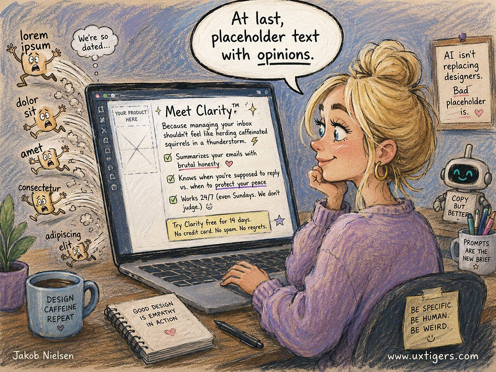
AI creates realistic placeholder text, banishing “lorem ipsum dolor sit amet” to the fringes, and to nostalgic AI movies. (GPT Image 2)
It’s impressive that Purga won bronze in the general Film Craft category for these AI films, given that the Festival also had a special category for AI films. This is proof that AI movies are gaining on legacy production methods, though, of course, still only at the bronze level, not gold. And only for short work, not feature films. Yet!

Three movie genres, same script; makes sense. (Not the script in my cartoon, of course.) A creative achievement by Purga Studio. (GPT Image 2)
Some AI creators are attempting longer work. The Next Show has produced AI versions of Aladdin (YouTube, 1 hr. 31 min.) and The Odyssey (YouTube, 23 min.). The published video of Aladdin is described as “Season 1,” and probably covers only 1/3 or 1/2 of the story, meaning that the final AI film will be 3 hours or more. The clip from The Odyssey only covers the episodes where Odysseus visits the Cyclops and the Sirens, plus some parallel exposition of Penelope’s troubles with the suitors on Ithaca. This equates to most of the poem’s Books 9 and 12, plus picking up Penelope’s ruse with her loom from Book 2. The material related in the 23-minute AI video covers roughly 1/12 of The Odyssey’s 24 books, meaning that the final film would run for almost 5 hours if it were to cover everything.
In my judgment, these AI adaptations of Aladdin and The Odyssey are of roughly B-movie quality, so they probably wouldn’t win bronze at an international festival. That said, the special effects in both AI films are much better than anything a B-movie ever put on screen. Special effects are an AI strength, and it can put the giant Polyphemus in the same frame as human-sized “actors” without breaking a sweat.

A giant character doesn’t pose a giant problem for an AI video model. In fact, rendering the Cyclops is no more expensive than rendering Odysseus. (Muse Image)
I actually enjoyed watching both of these longer AI works. Other viewers agree, since Aladdin racked up 2 million views in the first few days after release, which is more than almost any production from legacy Hollywood studios can boast. (The recent legacy production of The Odyssey only sold about a quarter of a million tickets over the same period, but admittedly, those were paid tickets, whereas YouTube videos are free to watch, except for having to sit through some ads.)

I don’t think the AI version of The Odyssey is captivating enough for me to watch the complete film. But that’s this year’s AI. Next year’s AI movies might be able to pull off a full-length feature film. (GPT Image 2)
The AI work that has enthralled me most recently sticks to short episodes but stitches many of them into one long story: the Chinese mini-movie series “My Uncle Don Quixote.” Unfortunately, I don’t think this series is available on regular Western video services like YouTube; I’ve only been able to find the first 3 episodes reposted on X by user 沐阳.
The story is about a Chinese teenager who flies to New York to live with his uncle, who moonlights as a literal knight in shining armor. (Thus, the title.) The show presents a very Chinese take on New York City, but that’s part of its charm.

Short films of up to maybe 5 minutes are still the format where AI shines. A big pile of AI clips doesn’t quite make for a great feature-length movie yet. (Muse Image)
All the videos I have linked in this news item have impeccable production quality, and for Lorem Ipsum and My Uncle Don Quixote, I don’t think you can really tell the characters are AI-generated rather than live human actors. (Aladdin and The Odyssey have a bit more wooden acting and a few unnatural movements.) Lorem Ipsum was made with Kling, and My Uncle Don Quixote was almost certainly made with Seedance 2.5 (sadly not available outside China yet, but it’s an astounding video model).

The best AI videos from Seedance 2.5 are so good that it’s virtually impossible to tell AI characters from the human actors the legacy movie studios will probably keep using for another few years, hidebound as they are by tradition. (GPT Image 2)
Time in AI Apps Doubled in a Year: 36 Billion Hours in H1 2026
People spent roughly 36 billion hours inside AI apps worldwide in the first half of 2026, more than double the 17.2 billion of H1 2025. (The US numbers were 4.0 billion hours in H1 2026 vs. 2.6 billion in H1 2025: slower growth in this more mature market.) Consumer spending on those apps hit $4.2 billion, up from $1.83 billion a year earlier: 130% annual growth, even faster than the growth in hours. Downloads reached nearly 2.3 billion. Those figures come from Sensor Tower’s State of AI report, summarized here.

Humanity spent 36 billion hours in AI apps during the first half of 2026. Assuming that growth continues, the full year will reach about 80 billion hours. (GPT Image 2)
Why should UX people care about app-store accounting? Because behavior beats surveys. Self-reported adoption studies tell you what people say; a doubling of measured hours tells you what they do. And the monetization jump is the tell: paying $4.2 billion in 6 months is revealed preference, the strongest usability signal money can express. Free curiosity is cheap. Wallets aren’t.

Users spent 130% more money on AI in the first half of 2026 than the first half of 2025. That’s a revealed preference that says that AI works so well for people that they’re willing to pay for it. (GPT Image 2)
The competitive picture matters too: 18 months ago, ChatGPT dominated; now, 8 platforms each top 100 million users worldwide. The largest AI platform by monthly active users (MAU) is Meta AI, with 1.2 billion, thanks to its embedding within Facebook, Instagram, and WhatsApp. The largest platform by actual use (frequency included, not just one stop per month) remains ChatGPT, with about twice the usage of Gemini.

Meta is the company exposing the largest number of individuals to AI because its AI rides inside three of the world's most-used apps (Facebook, Instagram, WhatsApp). However, intense and deliberate AI use is still concentrated in other apps, where ChatGPT continues to lead. (GPT Image 2)
Fragmentation means users are comparison-shopping AI experiences, so interaction quality finally becomes a competitive weapon rather than a nice-to-have. Switching costs in chat interfaces are nearly zero: users can defect mid-sentence. The product with the least friction wins the marginal session.
Will this doubling every year continue? Nothing is forever, especially exponential growth, but there’s substantial headroom: most people still aren't advanced AI users, even if they’ve dabbled. A few more years of annual doubling are quite feasible.
A Final Thought
(Yes, this section exists because of the peak–end rule.)


