
UX Roundup: Graph UI vs. Chat | Linear UI for Stories | Reusing Past Alternatives | Fast Wins | Mental Models | AI as Tool or Coworker | Sticky Navigation

Summary: Graph-based UI for AI is better than linear chat for design tasks | Storytelling improves with a keyframing UI | With a better history UI, clients reused a designer’s past alternatives 2.6× as often as they generated new material | Fast wins make users stay | Mental models: the map in the user’s head always wins | Users hold only 2 mental models of AI: tool or coworker | Sticky navigation gives users a firm foundation but consumes pixels
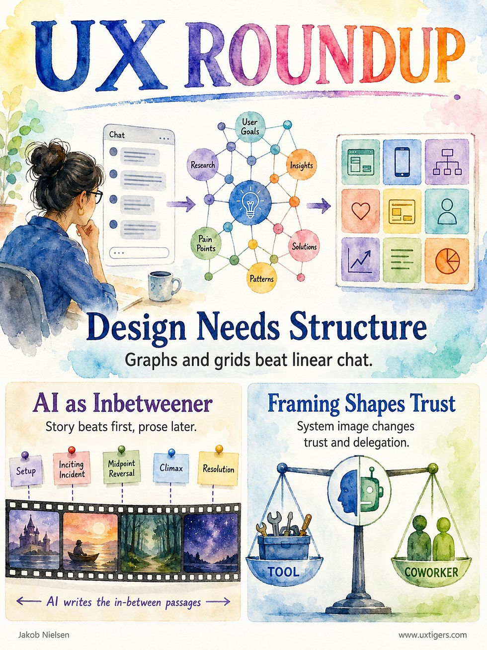
UX Roundup for September 7, 2026 (GPT Image 2)
The Chat Box Is the Wrong Shape for Design: 2 New Studies Point to Graphs and Grids
Two new research prototypes give AI design conversation the structure that a scrolling transcript lacks. Grounding the chat in a knowledge graph of the designer’s own concepts cut task turns by 46%, and an expand-then-refine grid of options generated 21% more design variety. Structure wins for design work, but linear chat keeps its job for simple, well-specified tasks.
Design conversations with AI fail in a predictable way: the system remembers your words but forgets the web of meaning behind them. You said “warm” in turn 2 and meant tactile grain; by turn 7, the AI has drifted into reading the word as color temperature, and you’re re-explaining. Two papers from the upcoming UIST ’26 conference attack this failure from opposite ends, and both beat standard chat in studies with professional designers. Add the branching-canvas results I covered in August, and the evidence is piling up: the linear chat box is a straitjacket for design work.
CogChat: A Graph of What the Designer Means
Jiin Choi and Kyung Hoon Hyun of Hanyang University in Seoul built CogChat, a chat framework that extracts typed entities and relations (materials, properties, concepts) from each turn into a personal knowledge graph. With every message, it injects only the roughly 20 most relevant nodes into the AI’s context. It also asks probing questions with 2–3 suggested answers: intentional questions pin down vague terms (which earthy tone: terracotta, olive, or sand?), and exploratory questions surface related concepts the designer hasn’t raised yet. Double-clicking any word in the chat reveals what the system believes it means, so misreadings get caught before they poison later turns.

A knowledge graph holds interconnected concepts in place; linear chat lets them drift. (Muse Image)
In a study with 9 professional designers, CogChat cut task turns by 46% (5.1 vs. 9.4 for plain chat) and completion time by 28%. Designers answered 70% of its probing questions, versus 17% of the generic follow-ups from the baseline. And the system reused the designers’ own vocabulary: lexical overlap between the AI’s responses and the designers’ language more than doubled.
The kicker: the baseline received the full conversation history in its context window, so nothing was forgotten in the storage sense. More telling still, dumping the whole graph into the prompt scored below the curated top 20 on every benchmark, because irrelevant nodes compete for the model’s attention. Context curation beats context capacity.

Better a handful of gems than a wheelbarrow of discards. (Muse Image)
Surprise2Refine: Expand the Options, Then Refine
Yuzhe You and co-authors from the University of Waterloo and Adobe Research tackled the other side of the conversation: what the designer might want, given what he or she means. Their Surprise2Refine system builds on an observation every design educator will recognize: designers need a broad design space while exploring and a narrow one while refining, yet AI tools offer either one fixed space or an endlessly growing pile of outputs.
The tool extracts two semantic axes from the designer’s mood board (say, composition × art style) and generates a 3×3 grid of deliberately different candidates, seeding controlled surprises (the authors’ term) in the far cells. Once a direction emerges, three operations shrink the space: zooming varies a favorite in small steps, anchoring pins several favorites and interpolates blends between them, and decomposition extracts reusable tokens (a color palette, for instance) to drag onto other designs.

A 3×3 grid exposed designers to variations and surprises, allowing them to pick by recognition. (Muse Image)
Compared with the same generator minus the grid, 14 professional designers produced initial option sets that were 21% more diverse on image-similarity metrics and rated the tool 70 vs. the baseline’s 56 on the 100-point Creativity Support Index (a 25% higher score). One participant called the grid “a map of my design journey”; another likened it to version control. Tellingly, 10 of the 14 looped back from refinement into fresh exploration: when divergence is cheap and nothing gets lost, people diverge more.
The Arrows All Point One Way
Together with recent ForkGraph findings, these projects triangulate the same conclusion. CogChat structures the intent side of the conversation (the designer’s concepts and their relations), while Surprise2Refine and VisCanvas structure the artifact side (the candidate solutions). The common enemy is the scrolling transcript, which steamrolls a branching process into a line.
The two-stage rhythm of Surprise2Refine (expand the considered set, then refine it) is the approach I recommended in Diamond Prompting back in April 2024: exploratory prompts to harvest breadth, then detail-refining prompts on the curated winners. What I prescribed as prompting discipline, this tool builds into the user interface, so nobody has to remember the method. That’s progress. The best methodology is the one the UI performs for you.
Both papers also reward recognition over articulation: clicking a suggested answer or a grid cell replaces composing a paragraph. That’s the core argument of Creation as Exploration and Discovery and Intent by Discovery: people recognize what they want far more easily than they can specify it.

Recognition doesn’t just beat recall when the goal is fixed; it beats articulation when the goal has yet to be discovered. (Muse Image)
Graph or Line? 5 Signals to Decide
None of this dethrones the plain chat box with its linear UI. In the VisCanvas study, 10 of the 20 participants preferred chat for answering a single predefined question. The 3 Surprise2Refine designers who arrived already knowing their target preferred the straight-line baseline, which was also rated easier to learn. And CogChat’s graph machinery doesn’t even switch on until 5 concepts have accumulated. Chat imposes a linearity constraint on design work; structured interfaces levy a complexity tax on simple work. Pick the smaller cognitive burden:

Design work is dense in the left column’s signals, which is why both studies recruited designers. Much other knowledge work (looking up a fact, drafting a routine email, converting a file) lives in the right column, and a straight line is fine when you already know the destination. My best guess (and it’s a guess until somebody runs the study) is that structure pays for itself past roughly 5 turns of converging on a single artifact with ambiguous vocabulary. Below that, the scaffolding costs more than the building.
Both studies are small (9 and 14 designers), single-session, and score process and perception rather than blind expert ratings of the final artifacts. Fine for establishing the direction; useless for locating the boundary. We need broader usability studies that vary ambiguity, turn count, and option volume to find where structured interaction overtakes chat, plus longitudinal research on personal knowledge graphs that live for months rather than 30 minutes. (A thesis-sized opportunity for a smart Ph.D. student, to add to my recent list of UX research priorities for AI.) Design conversation is a diamond pretending to be a line. Build AI interfaces shaped like the work, and measure where each shape wins.
Stories Are Timelines, So Keyframe Them
One more UIST ’26 paper adds a third shape to the emerging taxonomy of AI user interfaces. Chao Zhang and Abe Davis of Cornell University built narrative keyframing for AI-assisted fiction: the writer pins constraints at key story moments (plot events, character states, perspective drafts), and the AI generates the prose in between. Hand-drawn animation has divided labor this way for a century: lead artists draw the keyframes, juniors fill in the rest. AI is the new inbetweener.
The clever part is the perspective keyframe. The system drafts each scene in a character’s own first-person voice, the writer selects which behavioral evidence to keep, and the final third-person narrative is assembled from those selections, color-coded for traceability. In a study with 12 writers, keyframing beat a chatbot-plus-character-sheets baseline on transparency (6.4 vs. 4.0 on a 7-point scale) and control, and expert raters preferred its characterization in 29 of 30 story pairs. The caveat: raters occasionally found the enriched prose “bogged down by overwriting.” (AI overbaking its writing? Where have we heard that before? RLHF (reinforcement learning from human feedback) has its downsides. I hope the next generation of models learns to write better.)
Why a timeline rather than a graph or grid? Because fiction is an extended artifact with an inherently linear structure: readers consume it from first word to last. The conversation about the work may branch and loop; the work itself cannot. Note the twist relative to my table above: linear chat fits a linear process; keyframing fits a linear product built through a branching process. So the UI structures the artifact’s own axis, letting the author vary control density: dense keyframes where the writer cares most, sparse stretches where the AI can coast.

A story has one direction of travel: first word to last. (Muse Image)
My meta-conclusion: concepts form a graph, options form a grid, narratives form a timeline. As AI grows into deep support for creation, design, and other advanced knowledge work, no single chat box will serve it all. Expect a rich ecosystem of AI user interfaces, each shaped like the work it supports; start designing for it now. Shape-matching is becoming the core craft of AI UX.

As AI becomes the default way work gets done, no single user interface can serve every human activity. (Muse Image)
Discarded Alternatives Are Design Material, So Stop Sorting Them by Time
More evidence for ForkGraph-style interfaces. Karim Benharrak and Amy Pavel (UC Berkeley) tackled a mundane pain of GenAI-era creative work: the pile of discarded alternatives. Creators currently squirrel them away in saved files and hidden layers. Their HistoryPalette tool organizes prior alternatives by spatial position, topic, and time, with quick preview and reuse, and filters out failed generations with 93% accuracy.
In studies with 3 creative professionals and 8 client collaborators, clients reused prior alternatives far more than they generated new ones (11.9 vs. 4.6 actions on average), and 7 of 12 participants never once touched the chronological view, preferring position and concept organization. Participants often preferred reusing earlier material because they knew what they’d get, not merely because reuse was faster.
Version history organized by time is version history organized for nobody. When people revisit creative alternatives, they think “the ones for the sky” or “the blue variants,” not “last Tuesday, 3:14 p.m.,” and this study caught that preference red-handed: most participants ignored the timeline entirely. The transferable pattern for anyone building or buying creative tools: history should be semantic, spatial, and filterable, with the failures pruned automatically.
There’s also a client-collaboration insight worth stealing: given access to the designer’s rejected alternatives, clients largely shopped the existing set rather than demanding new work. Showing your discards can be cheaper than generating fresh ones.
Generative systems turn discarded alternatives into potentially valuable design material. A linear undo stack assumes that history is a sequence; generative work sprawls like a family tree. Tools should preserve forks, group them by meaning and location, and offer instant in-context previews before committing. Prompts and provenance should travel with each alternative. The same pattern serves AI-generated layouts, text, code, video, and presentations, far beyond image editing.
The First Win Decides Whether Users Stay
A new user doesn’t want a tour of your 200 features. He or she wants one thing done, today, before deciding whether you deserve a second session. So design onboarding as a short dock, not a cruise of the whole harbor: pick the single task that proves your value, bulldoze every obstacle between signup and that success, and celebrate when it lands. Feature tours can wait. The first win converts a visitor into a user; everything else converts a visitor into a churn statistic. Find your product’s first win, then count the minutes (and the clicks) between signup and that win.

Your product ships with the whole harbor. On day one, the user only needs the dock. (GPT Image 2)
Mental Models: The Map in the User’s Head Always Wins
A mental model is the user’s internal theory of how your design works. Match it, and users fly through tasks on autopilot; violate it, and they pay a “model tax” in errors and support tickets.
Definition: A mental model is what the user believes about how a system works: what its parts are, how they connect, and what will happen when he or she acts.
Note the word believes. Mental models are cobbled together from the detritus of every other product people have used, half-remembered advice, and plain guesswork. They’re incomplete, unstable, and often flat-out wrong. But they’re all users have. Nobody acts on your architecture diagram; people act on their private map of it. And as Alfred Korzybski warned in 1933, the map is not the territory.

Every user carries a scale model of your product in his or her head: part map, part plumbing, part folklore. Crude? Sure. But that model, not your specification, decides where the user clicks next. (GPT Image 2)
From 1943 Psychology to 1988 Design
The concept predates the GUI by decades. Kenneth Craik proposed in his 1943 book The Nature of Explanation that the mind builds “small-scale models” of reality to anticipate events. Philip Johnson-Laird made it a full theory of reasoning in his 1983 book Mental Models. Don Norman then dragged it into our field: The Design of Everyday Things (1988) distinguishes the designer’s model, the user’s model, and the system image (the parts of the design users can actually perceive). Designer and user never meet, so the system image is your only teaching channel. I baked the same insight into my 10 usability heuristics in 1994 as “match between the system and the real world.” (Yes, I’ve been beating this drum for 32 years. The drum is fine; my arm is tired.)
Matched Models = Autopilot; Mismatched Models = Model Tax
When an interface behaves as the user’s model predicts, he or she coasts and spends scarce brainpower on the actual task. When it doesn’t, every click becomes a small science experiment. This is the model tax: the sum of errors, hesitations, and support tickets levied whenever design and belief diverge. Users pay it daily; so does your support budget.
Classic evidence: Willett Kempton’s 1986 thermostat study in the journal Cognitive Science. Many households hold a “valve theory”: set the dial higher and heat pours out faster, like a gas pedal. False. A typical furnace runs at one rate until the target temperature trips the switch. Result: cranked dials, wasted energy, and puzzled homeowners. Wrong model, wrong behavior. And nobody reads the manual.
Thus Jakob’s Law, which I formulated in 2000: users spend most of their time on other sites, so they expect your site to work like the ones they already know. Their model of your product was built elsewhere, free of charge. Exploit that training instead of fighting it.
When “Mental Models” Becomes an Excuse
Three misapplications do more damage than ignorance of the concept ever could:
Asking users to describe their model. They can’t. Models are tacit, so interviews produce polite rationalizations. Watch what users do, not what they say: behavior in a usability test reveals the model that talk conceals.
Substituting your model for theirs. You ≠ User. You built the system, so you hold the least representative model in the building. Team consensus is not user data.
Matching so slavishly that design never improves. If we only mirrored existing models, we’d still ship command lines. Copy the model’s predictions and skip the furniture: the 1984 Macintosh desktop won because folders behaved as expected, while the manila styling was mere garnish.
6 Design Guidelines That Leverage Mental Models
Follow convention by default. Deviate only when testing proves your alternative better; freshness alone doesn’t qualify.
Test with 5 users and watch behavior. Model mismatches announce themselves within minutes as wrong turns and misclicks.
Make the system image teach. Labels, signifiers, and feedback are the only vocabulary you have for correcting a wrong model.
Fix mismatches in the design first. User education is the last resort; re-educating millions of strangers is a battle you’ll lose.
Introduce new models at the moment of need. A one-line hint at the point of action beats a 20-page manual nobody opens.
Audit metaphors for false promises. Decoration that implies behavior the system lacks charges the model tax twice.
Users navigate by their maps and won’t redraw them just because your team shipped something clever. The map is not the territory, but the map is what users act on. So shape the territory to fit the map, and when you must change the map, do it one gentle signpost at a time. Lost travelers rarely complain. They leave.


Mental model abuse easily turns into a gothic haunted house if you’re not careful. Here, my recurring narrators, Alice and Zimo, explore the mysteries of mental models. (GPT Image 2)
Users Hold Just 2 Mental Models of AI: Tool or Coworker
The previous item defined mental models. This item counts the models people actually hold of AI: 2. Ask what an AI system is, and the public answers tool or coworker. A new study of 1.8 million texts and 57 AI insiders finds every subtler position flattened onto that single dial. Your product will be slotted at one end of that dial whether you like it or not, so pick your setting and teach it at the point of action.
1.8 Million Documents, 57 Insiders, 3 Debates
Jacy Reese Anthis and co-authors (University of Chicago and Stanford) ran topic models over 371,312 newspaper articles and 1.4 million tweets about AI from 2018 to 2024, then interviewed 57 AI professionals in 2021 and again in 2023, before and after ChatGPT. Their paper, Method, Mind, and Morality, appears in the ACM’s CSCW proceedings this October. Three debates organize public sensemaking: the method by which AI is built (top-down rules vs. bottom-up learning from data), the mind it’s presumed to have (tool vs. agent), and the morality of deploying it (slow down vs. speed up). Mind is the debate that shows up at the keyboard, because the mind users attribute to your product predicts how they’ll use it.

A frame changes nothing about the machine and everything about what people think. (GPT Image 2)
Mind = One Dial, Two Settings
A 2023 CHI study by Taenyun Kim and co-authors found 4 roles that laypeople assign to AI: tool, servant, assistant, and mediator. In the wild, all 4 collapse onto one dimension, from tool, where the user drives and the system obeys, to coworker, where the system has something like intentions. The insiders themselves disagreed. One interviewee insisted, “It’s an assistant, not an automation.” Another saw “an early proto-entity.” A third dismissed the coworker talk as “a marketing ploy.” These were people with an average of 9 years in AI. (A caveat: that sample was 77% male, LinkedIn-recruited, and pre-agent era, so it’s not the general public. But if insiders can’t settle the frame, outsiders won’t.)
Each setting comes with its own failure mode. Tool-setting users under-delegate and blame themselves for weak results. Coworker-setting users over-trust: they skip verification, feel betrayed when the machine invents a citation, and thank it for its trouble. My own model is neither: AI is the third UI paradigm, intent-based outcome specification. But my preference doesn’t run your product. The map in the user’s head always wins.
Nuancectomy: Whatever You Say Gets Shortened
The study’s biggest warning for designers: frames simplify, and the simplification isn’t neutral. Nuance reaches dedicated users, the authors note, but gets sheared off as the audience broadens. Their example is delicious. “Superintelligence is coming, so regulate the AI industry” travels through public discourse as “Superintelligence is coming,” a slogan that excites investors and speeds up what the speaker wanted to slow down. Every explanation of your AI feature suffers the same nuancectomy on its way to the median user. Write “drafts text that should be reviewed for accuracy,” and the user hears “it writes my stuff.”

Soundbites win; footnotes lose. (GPT Image 2)
One consolation: anthropomorphism can’t be cured, only channeled. The humanlike frame has been building since the 1966 ELIZA chatbot, reinforced by 4 decades of killer movie robots, and the authors concede it can’t be wished away. But which kind of human is still unsettled (interviewees reached for “assistant,” “proto-entity,” and “invisible friend”), and unsettled frames are the ones a designer can still move.
5 Guidelines for Steering the User’s AI Model
Pick a setting and make the system image match it. Don’t market a coworker and ship a tool; the gap is pure model tax. If the output needs checking, skip the first name and the cartoon face.
Teach the model at the point of action, not in a tour. Show the plan before the AI executes; afterward, show what it read and what it skipped.
Borrow models users already own. One interviewee noted that prompt engineering is what salespeople and lawyers have always done: ask good questions. Jakob’s Law applies to metaphors, too.
Design for the failure mode of the setting users pick. Coworker-setting users need cheap verification (sources, undo, a confidence flag); tool-setting users need discoverable delegation (examples of what the AI will do unasked).
Watch behavior, not opinions. A user who calls the AI “just a tool” and then thanks it holds the coworker model in his or her fingers.
Settle the Frame in Your UI, Not in the Press
Anthis and co-authors (one of them Erik Brynjolfsson, who named the productivity paradox in 1993) suggest that framing contests may explain part of AI’s delayed payoff: factories took decades to rearrange their floors around the electric motor, and society is now rearranging its mental furniture around AI. Don’t wait for the public to settle the frame question. It will land on two settings regardless, and both are wrong for most products. Draw the map yourself, in the system image, one signpost at a time.

The public’s model of AI is dominated by decades of misleading media portrayals. Those are hard to overcome, but your own UI can help users form better models. (GPT Image 2)
Sticky Navigation Must Earn Its Pixels
A sticky navigation bar stays glued to the edge of the viewport while the page scrolls, keeping wayfinding and key actions one tap away at all times. That persistence saves users real effort, but it charges a permanent tax on screen space. My rule of thumb: all sticky elements combined get at most 10% of the viewport, and they must behave calmly.

Everything on the page falls away as the user scrolls; the sticky bar stays bolted to the top of the viewport, patiently accumulating ivy. The best sticky headers are exactly this calm: one slim strip, no stacking, no bouncing. (GPT Image 2)
Definition: Sticky navigation (also called a fixed or persistent header) is a menu bar that remains visible at a viewport edge while the rest of the page scrolls underneath it.
The name is refreshingly literal: the bar sticks to the glass while the page moves. No metaphor committee required. Two variants dominate. The fully sticky bar never budges. The partially sticky (auto-hiding) bar slides away when the user scrolls down to read and reappears the instant he or she scrolls up, on the theory that upward scrolling signals “I’m done reading and want to go somewhere.” That theory is usually right.

From Frames to Fixed: A Short History
Designers have craved persistent menus since the web’s toddler years. Netscape 2 (1996) offered HTML frames, which kept a menu pane on screen at all times, and simultaneously broke URLs, bookmarks, printing, and predictable Back-button behavior. I made frames the #1 offense in my 1996 list of the top 10 web design mistakes, and 30 years later I stand by the verdict. The desire for persistence was sound; the implementation was a wrecking ball.
CSS 2 (1998) solved the problem properly with position: fixed, which pins one element without harming the rest of the page. Adoption crawled anyway, because Internet Explorer ignored the property until IE7 shipped in 2006. (Nice work, Microsoft.) The iPhone (2007) finally made stickiness mainstream: on a small screen, every page becomes a long scrolling ribbon, and a menu sitting 8 screenfuls up might as well be on the moon. The auto-hiding header followed in the early 2010s, as designers tried to enjoy persistence without paying its full price.
Why Sticky Navigation Helps
A menu users can’t see is a menu users won’t use. When navigation, search, or the shopping cart is always a tap away, people act on impulses the moment they occur, instead of flicking through 40 screenfuls back to the top. More likely, they’d abandon the impulse entirely, and an abandoned impulse on an e-commerce site is abandoned revenue.
Persistent headers also anchor wayfinding. The logo and section labels continuously answer the two eternal questions of navigation: where am I, and whose place is this? And because sticky controls occupy a fixed physical location, users develop motor memory: after a few visits, the finger travels to the cart icon without conscious aiming, the same way your hand finds the light switch in the dark.
Thus the business case: a persistently visible “Add to cart,” “Sign up,” or search field is a salesperson who never takes a break. Retailers keep sticky headers for the same reason supermarkets stack candy at the checkout: an impulse within arm’s reach becomes a sale.
Reachable Navigation = Faster Users
We have exactly one controlled experiment on this pattern, and it deserves to be better known. UX designer Hyrum Denney built two nearly identical test sites, one with standard navigation and one with a sticky menu, and timed 40 participants completing 5 tasks on each (Smashing Magazine, 2012). The sticky version was 22% faster to navigate. Preference was even more lopsided: 34 of the 40 participants preferred the sticky site, 6 had no preference, and not a single person preferred standard navigation. Best of all, nobody could say what differed between the two sites; one participant reported only a vague sense of “a lot less time clicking.”
The Viewport Tax
Every pixel of persistent chrome is a pixel of content the user can never see. This is the viewport tax: the share of the screen permanently confiscated by elements that don’t make room for content as the user scrolls. Paid once, it’s a fair price. But sticky elements breed like rabbits. A cookie banner sticks to the bottom, a promo ribbon sticks to the top, the navigation sticks below the ribbon, a sub-navigation sticks below that, and suddenly users read your content through a mail slot. Rotate a phone to landscape, and a standard header plus the browser’s own bars can confiscate 1/4 of the glass.
Three further ways sticky navigation hurts, each with its remedy:
Covered content. In-page anchor links scroll headings underneath the fixed bar, so the user lands on a section whose first line is hidden. The CSS scroll-margin-top property fixes this in one line of code. Ship it today.
Jittery auto-hiding. Bars that flicker in and out during slow scrolling create motion distraction exactly where the eye is reading. Require a minimum scroll distance before toggling.
Growing headers. Some headers expand with mega-menus, promo countdowns, or search suggestions and never shrink back. A header should condense once scrolling starts, never enlarge.
8 Design Guidelines for Sticky Navigation
Budget 10% of viewport height for all sticky chrome combined, counting both top and bottom edges. That’s my rule of thumb, and I consider it generous.
Stack at most one sticky layer per screen edge. If marketing insists on a promo ribbon, it either scrolls away with the page or it replaces something.
Prefer partial stickiness for long-form reading. Hide on scroll-down, return on scroll-up: readers get the pixels, navigators get the menu.
Shrink after scroll. Show the full-height header at the top of the page, then condense to a slim strip once the user starts moving.
Keep the contents stable. Same items, same order, same positions on every page; motor memory is the whole point of persistence.
Offset in-page anchors so linked headings don’t hide beneath the bar.
Stock the bar with the few commands users invoke constantly: navigation, search, cart, or the one primary call to action. Not the 9 links the org chart demanded.
Test on a landscape phone and an 11-inch laptop. Sticky designs approved on 27-inch monitors are where viewport taxes turn confiscatory.
The sticky bar is the only design element with a lifetime lease on the user’s screen. Charge it rent. If it stays slim, calm, and stocked with the commands people actually use, it repays its pixels many times over in saved scrolling and captured impulses. If it stacks, bounces, and hoards space, evict it. The page belongs to the content; the bar is just the doorman.
Final Thought of the Day

(Homage to Don Norman, made with GPT Image 2)


