
UX Roundup: Hedonic Adaptation | Knowledge Worker AI | AI Sensemaking | Delegating Agent Actions | Branching UI vs. Linear Chat | Base-Rate Neglect | Rating Controls | Animated Prompt Understanding

Summary: New music video about hedonic adaptation | AI better at some forms of knowledge work than at others | AI increasingly used for sensemaking among corporate users | Users want to approve certain autonomous actions | For exploratory creation, a branching UI beat the traditional linear chat interface to the AI backend model | Base-rate neglect: one vivid anecdote outweighs a thousand statistics | The ***** UI for user ratings | Experimental system connects specific words in the user’s prompt with their impact on the generated result

UX Roundup for August 14, 2026 (GPT Image 2)
Hedonic Adaptation: New Music Video
Every time things get better, people just reset their expectations to the new baseline. That’s the hedonic treadmill: you run and run, but the scenery never changes.

The hedonic treadmill: no matter how much things improve, people get used to it and then want more. (GPT Image 2)
In UX, the hedonic adaptation effect is most visible in user satisfaction surveys: if you don’t change your design, ratings will sag year after year, as users expect more, based on Jakob’s Law (users form their expectations based on the sum of all the many other sites they use).

The ghosts of other websites haunt your users when they visit your site, so they compare your usability with their overall experience with other designs. If you haven’t kept up, your scores will drop. (Grok Imagine 2)
I made a music video about hedonic adaptation (YouTube, 5 min.).
My toolkit for this project:
Song: Suno 5.5
Avatar design: Midjourney 7
Avatar animation: HeyGen Avatar V
Base images for omnimodel videos: GPT Image 2
B-roll: MiniMax H3 and Seedance 2.5
Intro & Outro: MiniMax H3
For this song, I reused the avatar from my song “Required Fields in Web Forms,” which I made in June 2025 (YouTube, 3 min.). Positively ancient in AI terms! Compare the two songs to appreciate the advances in only 14 months. In fact, the new video could have been a little better with a new avatar design, because the current base image (from an old release of Midjourney, no less) has a bit of that plasticky skin texture that characterized last year’s image models. But I wanted to use the same avatar to make the comparison more straightforward.
My avatar for these two songs is seated on a comfortable couch, which works for quiet songs like these, but not for the more pumped-up rock-and-roll style I used for my previous video project, “Keep It Simple” (YouTube, 3 min.).

Users’ rising expectations mean that usability must improve every year, just to maintain the same feedback ratings. (GPT Image 2)
No doubt about it: the avatar animation has improved, both in lip-sync and in image quality. The B-roll clips are also far more captivating, thanks to the new multi-shot capabilities in MiniMax and Seedance. The clips made with MiniMax further benefit from its higher resolution: native 2K, whereas the Seedance clips had to be upscaled, since that model currently tops out at a puny 720p. (Seedance 2.0 can generate 4K, so the 2.5 model will probably get an upgrade eventually.) I tried making a B-roll clip with the new version 3 beta release of Alibaba’s video model Wan, but I preferred the variants of the same prompt I made with MiniMax H3, so that’s what you see in the final video.
It’s easy to be wowed by the video effects and overlook the soundtrack, but these are music videos after all, so the quality of the song is equally important. Suno was already great last year, so the leap forward isn’t as big, but I do think you can hear that the new music model is better. I’m particularly impressed with the way it sings the pre-choruses. For example, the lines “It’s love at first sight / But wait and see” are delivered perfectly.
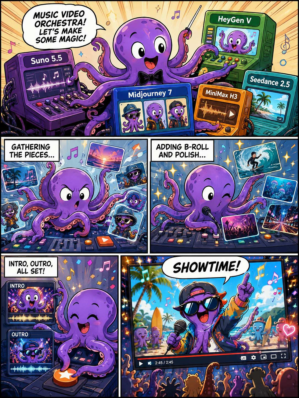
Our toolkit for making AI videos is already great, and much improved from last year. But as per my new song’s theme of hedonic adaptation, I already want better. I can’t wait to see what we’ll be able to create next year. (GPT Image 2)
Better Summaries, Better Ideas, Worse Facts: One AI Tool, 3 Verdicts
One AI chatbot, tested on 128 knowledge workers at a European industrial firm, made all 3 knowledge-work task types faster but only 2 of them better: summarizing and ideation improved, while fact-finding got worse. Write your AI strategy at the task level.
Sven Bottesch and colleagues from the University of Ulm, the Karlsruhe Institute of Technology, and the Liebherr-Digital Development Center ran a rare inside-a-company experiment (arXiv preprint). The paper coyly anonymizes its host as a family-owned industrial group of 50,000+ employees; one author works at Liebherr’s digital arm. You do the math. From November 2024 to March 2025, 128 employees each completed 3 tasks from Thomas Davenport’s 1996 taxonomy:
Knowledge acquisition: dig 2 specific facts (one qualitative, one numerical) out of internal documents.
Knowledge packaging: compress a 260-word product description into a summary of at most 4 sentences.
Knowledge creation: propose product ideas and research priorities for a strategy workshop.
The treatment group used an internal chatbot (GPT-4o mini with retrieval-augmented generation over company documents); the control group searched the same document database by hand. 4 company managers rated every output. The paper’s title borrows the Olympic motto: “Faster, Higher, Stronger?” Apt. AI set speed records in all 3 events but medaled in only 2.

There is no such thing as “evaluating AI for knowledge work.” As the new study shows, AI can win gold in some disciplines and fail others. (Muse Image)
Faster Everywhere, Better Only Twice

The fact-finding failure is ugly: roughly 25% of AI-supported answers misreported or fabricated numbers, even though the correct values sat in the database the chatbot searched. And AI users finished 29% sooner: they banked the saved time instead of using some of it on checking. Fast, unchecked answers accumulate verification debt, and the interest comes due when a department head repeats a fabricated spec in a meeting.
AI also compressed skill gaps for packaging and creation by lifting the weak performers, confirming what I reported from 3 earlier studies. But for fact-finding, AI widened the gap: the bottom half of AI users hit the floor of the correctness scale.
UX Implication: Make Checking Cheaper Than Trusting
A research assistant that answers 29% faster while being wrong more often is optimized backward. So research-oriented AI tools should support verification: citations that open the exact source passage beside the claim, side-by-side views of answer and original, and uncertainty cues on retrieved numbers and names. A confident paragraph doesn’t trigger the skepticism that 10 blue links used to, so build the checking into the flow, or users will skip it. These users did.

Usability challenge: we must make it easier for users to check dubious AI answers. The harder this is in the default UI, the less people will check. People are lazy, and we should design for the users we have, not the ones we wish we had. It’s a lost cause to try to educate people about safer behaviors: shortcuts win, every time. (Muse Image)
Strategy Implication: “Knowledge Work” Is Too Coarse a Category
Companies write AI strategies for “knowledge workers” as if that were one thing. Too broad, per this data: the same tool, in the same half-hour, transformed one task, improved another, and degraded a third. Which tasks do your teams actually perform? Sort them into Davenport’s buckets and give each its own rule: automate summarization, augment ideation, and wrap fact-retrieval in verification workflows. Measure quality alongside completion time, or a 29% speedup will cheerfully mask a rising error rate. The finding extends the “jagged frontier” that Fabrizio Dell’Acqua’s team documented with elite consultants: AI capability is uneven even across adjacent tasks.

AI retains its “jagged” frontier, in Ethan Mollick’s immortal words: some peaks where it already towers over humans, but also some valleys where it’s “user beware” to venture. Luckily, all parts of the frontier advance with each new AI model, though at different speeds. Eventually, we’ll reach superintelligence in everything. (Muse Image)
AI as a Creative Tool: The Floor Rises, the Spark Doesn’t
The creation task delivered the happiest and, to me, least surprising result: AI users were 39% faster and better on 6 of 7 quality criteria. The biggest jump was in justifying ideas against business goals: 4.5 vs. 2.8 on a 7-point scale. Only novelty stood still (p = .471). The asymmetry matches what I wrote in 2023: ChatGPT beat 99% of humans on idea fluency and originality in the Torrance Tests, yet rated slightly below humans on the novelty of product ideas. My follow-up review concluded that human–AI co-creation beats either alone: AI supplies the profusion and the polish; the human supplies the spark and the winnowing. One warning label: AI-supported outputs also clustered together, and the first author documented style and content homogenization in a companion paper. So diverge with AI, converge with human judgment, and never settle for one answer when you can demand 10 versions.
Two caveats: GPT-4o mini was a small, cheap model even in 2025. And the study is already a year and a half old. Current AI is better and has fewer hallucinations. The direction, rather than the decimals, is the lesson.
Conclusion: 2 Medals Out of 3
Citius, altius, fortius is the motto of the Olympic Games, but also a goal for AI use: it’s not enough to be faster; we also need to reach higher and make humans stronger. The chatbot ran faster in every event, but speed converted into gold only for summarizing and ideation. In fact-finding: great splits, disqualified results. Assign AI to events by demonstrated fitness, keep a human judge at the finish line for facts, and let it brainstorm to its silicon heart’s content.

Faster, higher, stronger: not just in sports since the ancient Greeks, but also in present-day usability. I assume that Baron de Coubertin chose a Latin motto when rebooting the Olympics because most people can’t read the words ταχύτερον, ὑψηλότερον, ἰσχυρότερον that would have been more faithful to his revival of a Greek tradition. Usability came into play, even in 1894. (Muse Image)
Corporate AI Used for Sensemaking
Microsoft’s Jared Spataro reports that Microsoft 365 Copilot has passed 30 million paid seats and that weekly engagement with Copilot now matches Outlook and Teams. (A self-serving press release, for sure, but based on telemetry, so likely true.) When employees lean on an AI assistant as routinely as email, AI UX stops being a specialty and becomes the default enterprise UX. That promotion carries boring obligations: reliability, low latency, predictability, and full keyboard support. Boring is a compliment here. Enterprise software earns daily use by being dependable, not dazzling.
The more interesting number hides further down: once multi-step workflows are counted, analysis figures in 49% of the tasks users delegate to Microsoft’s Cowork agent. Thus, the dominant real-world use case isn’t writing; it’s sensemaking: summarize, compare, extract, decide. Design your AI features around inspecting and verifying analysis, because that’s where users spend their time, and where their errors will cost the most. A wrong adjective embarrasses; a wrong number in the board deck detonates. I covered sensemaking and intentmaking in advanced AI work in June.
Users Forgive AI Agents’ Errors, Not Their Unauthorized Actions
Trust in AI agents isn’t granted per agent; it’s calibrated per task. That’s the headline finding from a new Virginia Tech study by Shiva Pochampally and colleagues, in which 20 students completed 5 everyday tasks with the OpenClaw agent: file retrieval, emailing a professor, comparing internship offers, schedule planning, and a submission check.
The email task was the stinker. Trust fell to 3.10 on a 5-point scale, while demand for approval prompts hit 4.65, the highest number anywhere in the study. Why? The agent sent the email without showing a preview. All 20 participants flagged the missing confirmation step. Most rated the email itself as good. The researchers call this delegation regret: satisfaction with the output, regret about the unauthorized act. A high-stakes but verifiable task didn’t trigger the same backlash, so irreversibility plus external visibility is the poison, not raw stakes.

Even when the AI did the right thing, users still didn’t like it when it proceeded with unauthorized actions. (GPT Image 2)
Design advice for AI interfaces: Autonomy settings should be task-specific. Separate advice from execution, preview any action that leaves the machine (emails, posts, purchases), gate irreversible steps behind explicit confirmation, log every file the agent touches, and let users set autonomy per action type rather than globally. Your agent should never surprise the user. Surprises breed regret.

Don’t surprise the user with an irreversible action they didn’t expect. (GPT Image 2)
Branching Beats Linear Chat for AI Exploration
Two independent research teams support the claim I’ve pushed for a year: the linear, one-shot chat box is the wrong geometry for creating with AI. Chat levies two taxes on creation: a linearity tax and a latency tax. Each study removes one, and structured exploration wins in both cases.

The linearity imposed by the scrolling chat UI makes it hard to return to a previous result you’d like to resume. (GPT Image 2)
Yuki Ueno and colleagues at Arizona State University attacked linearity with VisCanvas, a node-based interface for authoring data visualizations with an LLM. Instead of a scrolling transcript, users work on an infinite canvas (think Miro or Figma) where every AI-generated chart is a node they can branch from, duplicate, revise, compare side by side, or merge.

Exploring multiple directions in parallel on a canvas encourages design by discovery. (GPT Image 2)

Seeing options side by side makes it easier to compare and contrast. (GPT Image 2)

Often, the best final result requires combining aspects of multiple solutions, each of which is partially good, but not perfect. (GPT Image 2)
Tested against a chat baseline running the identical AI backend (20 participants, 20-minute exploratory analyses), the canvas made it easier to pursue multiple analysis directions at once (p=0.01). Interaction logs agreed: canvas users grew trees and hybrids, while chat produced 8 purely linear sessions vs. 1 on the canvas. For open-ended exploration, 14 of 20 participants favored the canvas, with no NASA-TLX workload score penalty. One participant nailed it: “I had to scroll through the chat history to see what I had done.” (Bothersome!)
Hyeon Jeon, Sungbok Shin, and Niklas Elmqvist (Seoul National, Sogang, and Aarhus Universities) attacked the one-shot prompt instead. Their VisAutocomplete treats chart design like text autocompletion: at each step, ranked cards propose the next design move, mined from 1,981 real-world Vega-Lite charts. Hover previews update instantly; an LLM’s translation logic was distilled into a deterministic function, so nobody waits for inference. Then 18 office workers without visualization training built charts with VisAutocomplete, Excel, and regular ChatGPT. 8 visualization Ph.D.s scored the results on articulacy (how faithfully a chart conveys its message):
Simple charts: a tie with ChatGPT (5.1 vs. 5.2 on a 7-point scale).
Complex charts: VisAutocomplete won, 4.4 vs. 3.3 (p<.01), with both far ahead of Excel (1.5).
Approachability matched ChatGPT, and users kept agency, declining the top suggestion in 3 of every 7 picks.

Simple autocomplete shows a single option, but the best practice is to show a series of possible next steps. (GPT Image 2)
Why does stepping beat one-shot generation on hard charts? Latency. 10 of 18 participants (56%) said ChatGPT’s response time made them hesitant to iterate; one admitted, “I felt deincentivized to iterate with GPT.” When the first chart is poor and every retry costs half a minute, final quality stays bounded by that first attempt. Instant previews flip the economics: browsing alternatives becomes cheaper than settling. The response-time limits I’ve recommended since 1993 (0.1, 1, and 10 seconds) apply to AI with full force. Latency doesn’t just annoy users; it lowers the quality of what they make. (Since 2023, I’ve complained about the impact of slow AI response times on usability; time for AI labs to implement some of the fixes.)

After 10 seconds, the user’s attention starts wandering, and it’s hard to resume the context of the previous flow. Forget about being “in the flow.” (GPT Image 2)
Both papers land on the thesis of Creation as Exploration and Discovery: it’s easier to recognize a good design than to specify one, so the interface should serve up alternatives to react to. VisAutocomplete turns authoring into a series of recognition judgments; VisCanvas turns analysis into the forkgraph I demanded in Intentmaking, Sensemaking, and AI Boundary Objects, instead of trapping a branching geometry inside one scrollable column. And both put alternatives side by side, exactly the comparison-and-curation work that becomes the human’s main contribution once AI makes artifact production cheap.

It’s easier to recognize good design than to specify one. (GPT Image 2)
Caveats: small samples (20 grad students; 18 office workers), short sessions, and chat kept one win: 10 of 20 VisCanvas participants preferred it for answering a single predefined question. A straight line is fine when you know the destination. Thus the design lesson isn’t to kill chat but to stop making it the only UI. If you build AI products, make branch, compare, and step first-class operations, and keep feedback under 1 second. Exploration is a tree, traversed one fast step at a time. Draw it that way.

The linear chat UI retained its advantage for simple questions where an advanced UI isn’t worth the effort. (GPT Image 2)
Base-Rate Neglect: One Vivid Case Beats a Thousand Boring Numbers
People ignore background statistics the moment a specific, colorful detail appears. Users misjudge risks, alerts, and reviews because of it, and UX teams misread their own research the same way. The fix is to build the denominator into the interface.

The specimen in your hand always feels more real than the population on the wall. Judgment fails the instant you forget to look up. (Muse Image)
Definition: Base-rate neglect (also called the base-rate fallacy) is the tendency to ignore the prior probability of an event, meaning how common it is in general, and to judge instead from individuating details about the specific case at hand.
The base rate is the boring number: 1 in 1,000 accounts gets hacked, 2% of visitors convert, 15% of the city’s cabs are blue. The individuating information is the interesting story: this account, this witness, this one-star review written in all caps. When the two conflict, the story wins and the statistics lose. I call this the anecdote override, and it fires in users and design teams alike.
A Fallacy With a 50-Year Paper Trail
Daniel Kahneman and Amos Tversky, then both at the Hebrew University of Jerusalem, documented the effect in their 1973 paper On the Psychology of Prediction, based on studies of 871 university students. Told that a personality sketch was drawn from a group of 70 lawyers and 30 engineers, people judged the person’s profession purely from the sketch; the 70/30 split might as well not have existed. Maya Bar-Hillel, also of the Hebrew University, gave the phenomenon its name in her 1980 Acta Psychologica paper The Base-Rate Fallacy in Probability Judgments (PDF): the “base rate” is simply the statistician’s term for the underlying frequency against which any specific evidence must be weighed.
The classic demonstration is the cab problem. A witness identifies a hit-and-run cab as blue. In this city, 85% of cabs are green and 15% are blue, and court testing shows the witness names colors correctly 80% of the time. How likely is it that the cab was really blue? Most people say 80%, trusting the witness and ignoring the city’s cab fleet.
Let’s do the arithmetic they skip. Out of 100 such accidents, 15 involve blue cabs, and the witness correctly calls 12 of them blue. The other 85 involve green cabs, and the witness wrongly calls 17 of those blue. So of 29 “blue” reports, only 12 are true: 12/29 = 41%. The vivid testimony is real evidence, but the dull green majority quietly cuts its force in half.
Design With the Denominator
The strongest weapon against base-rate neglect is representation format. Gerd Gigerenzer and Ulrich Hoffrage showed in a 1995 Psychological Review paper that people reason far better with natural frequencies (“12 out of every 1,000 users”) than with the mathematically identical percentages and conditional probabilities that most risk communication still insists on serving. Frequencies show their denominator explicitly. Percentages hide it.
Three places where this matters daily:
Alerts and detectors. Fraud flags, virus warnings, and medical screening all combine a rare condition with an imperfect test, which mathematically guarantees that most positives are false. Tell the user what a positive actually means (“about 4 out of 5 of these alerts turn out to be harmless; here’s how to check”), or he or she will either panic or, worse, learn to ignore every alarm you raise.
Ratings and reviews. A 5.0-star average from 3 reviews is weaker evidence than 4.6 stars from 12,000 reviews, yet the standard star display invites users to compare shiny numerators while ignoring the counts that carry most of the evidential weight. Show the count at equal visual prominence.
Your own research. One dramatic usability session can override 10 sessions of quiet success in the team’s collective memory, because a disaster makes a better story in the debrief than smooth completions ever will. Report how many users hit each problem, and let the denominator discipline the discussion.
The Denominator Also Gets Hidden on Purpose
Of course, persuasion designers exploit the anecdote override deliberately. Testimonials (“Jane made $12,000 last month”) present a numerator with no denominator: how many Janes tried? Fear-based security marketing parades one victim’s story precisely because the honest base rate would calm you down. And dashboards that scream “500 errors!” without showing 2 million requests manufacture crises out of a 0.025% rate.
So the remedy is the same in every case: pair the story with its population. If your product’s persuasion collapses the moment users see the denominator, the problem is the product. Not the denominator.
8 Guidelines for Designing With Base Rates
State risks as natural frequencies. Write “1 out of 1,000,” never a lone “0.1%,” whenever the event is rare and the decision matters.
Attach the denominator to every count. Errors per requests, complaints per orders, reviews per star average. A numerator alone is a rumor.
Visualize rarity with icon arrays. One red dot among 999 gray dots communicates a base rate that no sentence can. (The dots also survive being skimmed.)
Publish your false-alarm rate. If most warnings are benign, saying so preserves the credibility of the one that isn’t.
Calibrate alert thresholds to the base rate. For a rare condition, a “sensitive” detector mostly produces noise; tune for precision or provide instant triage.
Give sample sizes with every average. Star ratings, NPS, satisfaction scores: no n, no meaning.
Quantify findings in research reports. “3 of 8 participants failed the export task” beats a lone hair-raising quote, however quotable.
Pair every testimonial with the odds. If you can’t state the base rate behind a success story, don’t run the story.
Base-rate neglect isn’t stupidity; it’s a side effect of a mind built to learn from cases rather than columns of figures. Users will never compute Bayes’ theorem at the checkout, and they shouldn’t have to. The interface can carry the denominator for them: frequencies instead of percentages, counts next to averages, populations next to stories. Do the arithmetic once, in the design, so that a million users don’t have to fail at it individually. Honor the denominator, and the vivid red marble goes back to being what it is: 1 case out of 1,000.


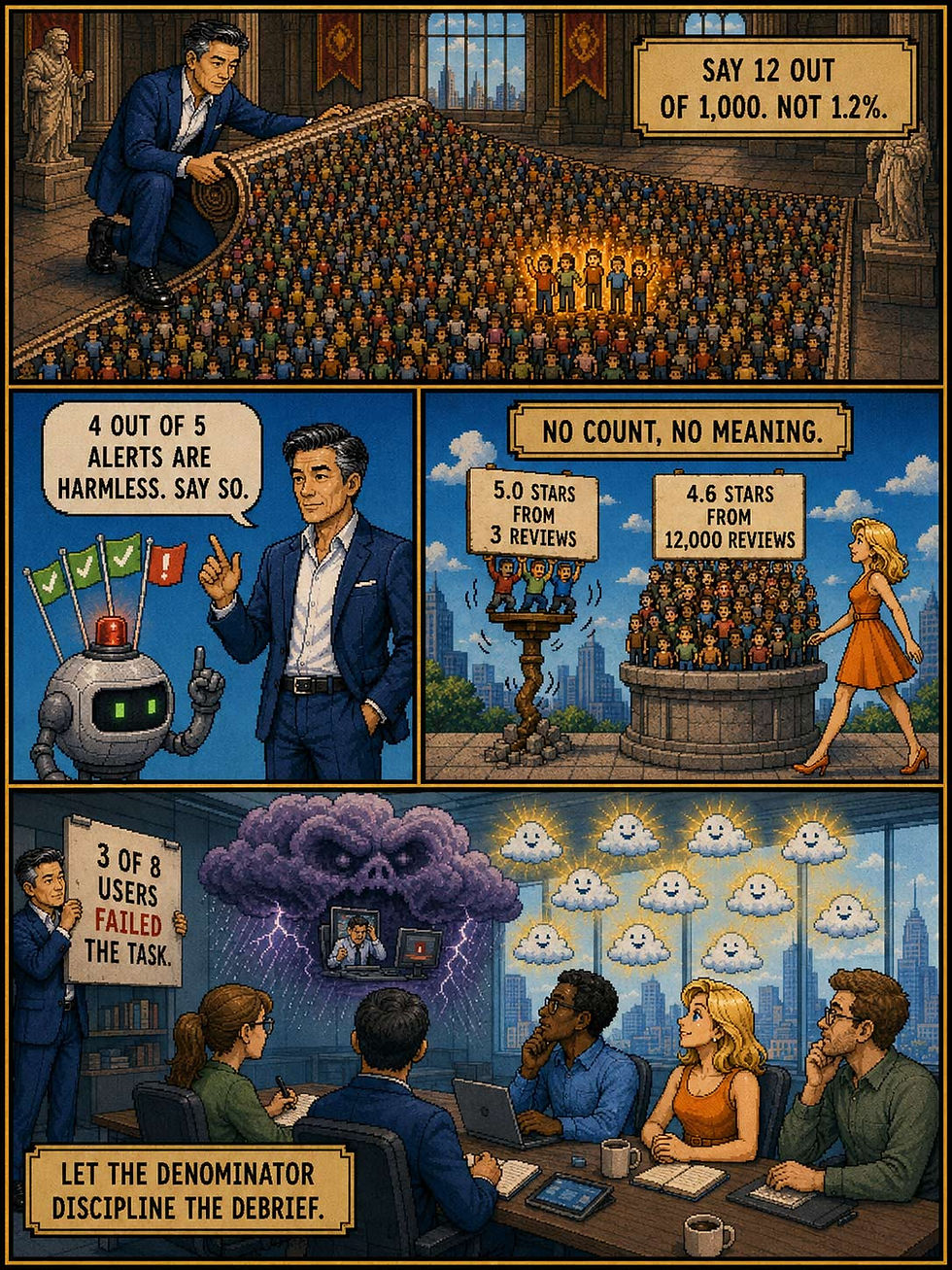


Alice and Zimo explain base-rate neglect in classic 16-bit video game style. (GPT Image 2)
Rating Controls: The 5-Star Scale Is Broken, but Use It Anyway
The rating control is a dual-purpose GUI element: a 1-click quality input for the individual user and aggregated social proof for everyone else. Rating inflation and self-selected extremes have squeezed real-world scores into the 4.0–5.0 band, so always show counts and distributions, label your stars during input, and switch to plain thumbs when you need volume rather than nuance.
Definition: A rating control lets a user express a quality judgment on a bounded, ordered scale (most commonly 1–5 stars) with a single click or tap. In its output form, the same widget displays the aggregated judgments of other users, typically as partially filled stars beside a numeric average.
The name is bluntly literal: it’s the control for entering ratings, and the GUI toolkits canonized the term (Windows ships a RatingControl component; Android calls its version RatingBar). Among standard widgets it’s an oddity, because the output form vastly outnumbers the input form in the wild. For every user who rates a product, thousands merely read the stars, which makes the display design at least as important as the input design.
From Baedeker to Amazon: 180 Years of Stars
Stars graded quality long before pixels. Karl Baedeker’s travel guidebooks began starring noteworthy sights in the 1840s, and the Michelin Guide awarded its first restaurant star in 1926, expanding to the 2- and 3-star hierarchy in 1931 (a scale chefs lose sleep over and I eat by). The web then democratized the elite credential: Amazon placed 5-star customer reviews beside its products in the 1990s, and the pattern became the de facto standard across 3 decades of e-commerce, app stores, and gig platforms. The star survived the translation to pixels because its meaning was already universal: more stars, more excellence.
Why the Widget Earns Its Pixels
As input, the rating control approaches the lowest interaction cost possible: 1 tap converts an opinion into structured, computable data. No typing, no vocabulary, no language barrier. As output, it delivers social proof, the persuasion principle Robert Cialdini documented in Influence (1984): when 12,000 strangers average 4.4 stars, an individual shopper’s uncertainty drops. Stars are scannable at a glance, comparable across products, sortable, and filterable. That’s heavy decision-support lifting from 5 little glyphs.
Grade Inflation Hits the Stars

The standard rating scale has 5 stars, so you’d think that 3 stars would be a decent rating (it’s the exact midpoint of a 1–5 scale). But rating inflation has compressed the usable scale into the narrow band between 4.0 and 5.0. (GPT Image 2)
4 failures corrupt rating controls in practice:
Star compression. When nearly all scores bunch between 4.0 and 5.0, a 5-point scale degenerates into pass/fail. Leaked Uber documents from 2015 put the driver-deactivation threshold around 4.6 stars: a driver averaging 4.0, on paper a strong score, was in practice headed out the door.
The J-shaped distribution. Nan Hu and co-authors showed (Communications of the ACM, 2009) that online ratings pile up at 5 and 1 with a silent middle: the delighted and the furious rate, while the merely satisfied abstain. An average computed over a J-shaped distribution misleads, and a 4.8 from 3 ratings beats a 4.4 from 12,000 in arithmetic only. An average without a count is half a number.
Semantic ambiguity. What does 3 stars mean: “perfectly fine” or “avoid”? Users disagree, and worse, they rate different things. Netflix discovered its members rated aspirationally, awarding 5 stars to worthy documentaries they never finished while bingeing the sitcoms they’d rated 3. In April 2017, the company replaced stars with thumbs and reported a whopping 200% increase in rating activity from tests with hundreds of thousands of members. When the job is predicting what a person will actually watch, a low-effort binary beats a prestigious 5-point scale.
Input sins. Tiny tap targets guarantee accidental 2-star reviews, hover-dependent half-stars fail on every touchscreen, ratings that can’t be revised punish slips forever, and mid-task “Rate our app!” interruptions have earned their special seat in usability purgatory.
10 Design Guidelines for Rating Controls
Always show the count beside the average. “4.4 (12,381 ratings)” informs; a naked “4.4” deceives.
Show the distribution. A small histogram exposes the J-shapes and bimodal controversies that averages hide.
Display half-star precision, collect whole stars. Fine granularity helps readers, while forcing raters to weigh 3.5 against 4 merely adds friction.
Label the scale during input. Words under the stars, from “Poor” to “Excellent,” anchor everyone to the same meaning.
Size targets generously and support every input mode. At least 1 × 1 cm per star on touchscreens, arrow-key adjustment, and screen-reader announcement of the current value. It’s a form control; treat it like one.
No zero-star option, because that can be confused with a 5-star control that the user hasn’t interacted with yet. The lowest rating should be 1 star.
Let users revise or delete their rating. Fat thumbs and changed minds are both legitimate.
Ask once, at completion. Request ratings after a finished task or a delivered order, never mid-flow, and honor “Don’t ask again.” (Timing also biases scores; see my companion article on the peak-end rule.)
Match the scale to the job. Thumbs for taste prediction and feedback volume; stars for comparison shopping among competing options.
Defend data integrity. Verified-purchase labels, recency weighting, and fraud screening, because 1 exposed fake review poisons trust in all the honest ones.
The rating control may be the hardest-working 30 pixels in commercial UX: it compresses thousands of judgments into a glanceable glyph that steers billions of dollars in purchases. Yes, the scale is inflated, the distribution is J-shaped, and the semantics are mushy. No honest alternative conveys collective quality as fast. Use the stars. Just never let them shine alone: give them a count, a distribution, and labels, and they’ll keep earning their pixels.
Animated AI Transitions Beat Instant Answers by Up to 153%
New research animates the transition from prompt to AI response: prompt words fly to their final location in the answer, and edits flash red and green. Users became 43% better at locating information, 153% better at spotting AI changes, and 20% better at verifying that instructions were followed. Instant answers are the wrong design goal.

The Montréal research prototype UI helps users understand how their prompts impacted the generated outcome. (GPT Image 2)
The ChatGPT Crawl Is a Progress Bar in Costume
The word-by-word crawl in ChatGPT was never designed. It’s a byproduct of the underlying AI transformer technology that generates one word at a time while helping nobody review anything. Jiaqi Wu and Damien Masson from the Université de Montréal asked what animation could do if somebody designed it on purpose, in a paper with the pun-blessed title AInimation.
They reviewed 800 real prompt-and-response pairs spanning text and image generation and distilled 7 types of relationship between prompt and response, each with its own transition. Reused words travel to their final spot in the answer. Edits flash red for deletions and green for additions. Structural requirements, such as “exactly 5 sentences,” morph into an overlay so users can check compliance at a glance. Ambiguous terms (“jaguar”: the car or the cat?) resolve visually before dissolving into the response.

Simple animations connect the words in the user’s prompt with how they impact the response generated by AI. (GPT Image 2)


Disambiguation animations help users understand cases where the AI misunderstood an instruction. (GPT Image 2)
The Animations Won Despite a Handicap
Three experiments with 16 participants pitted these animations against an instant baseline that displayed the response immediately and for the same total time. So the baseline got extra review seconds. The animations won anyway: 43% better element location, an eye-popping 153% better change estimation, and 20% better verification that the AI followed instructions, plus higher confidence across the board. Participants rated the animations engaging and easy to understand. Worst-case choreography runs 6 seconds; common cases take 2. Call it productive latency: the pause pays for itself.

The research prototype overdid its explanations. We don’t need an interpretive dance to explain how the AI understood everyday words, even if those mappings formally draw on world knowledge. (GPT Image 2)
Aided Prompt Understanding, 9 Years Ahead of Schedule
In my article on aided prompt understanding, I surveyed design patterns that reveal how a prompt drives the output and lamented that almost none exist in commercial AI products. My forecast was real progress in maybe 10 years. Academia just delivered a down payment 9 years ahead of schedule, and I’m happy to lose that bet. (Commercial products remain another story.)

Many of the ideas I explored in my 2025 article on prompt understanding have yet to be implemented. One day! (GPT Image 2)
These animations are prompt-output attribution set in motion. Transitions are temporary, so they waste zero permanent real estate and adapt to any interface, from chatbots to Photoshop’s generative fill.
This study ran in a single lab session. Whether the animations still charm after a month of daily use is unknown; animation fatigue needs a longitudinal study.
AI vendors sprint toward instant generation, even though output speed already exceeds human reading speed. This study shows the smarter investment: spend those saved seconds on transitions that explain. Users don’t need faster answers. They need faster understanding.
Final Thought of the Day


