
My Top 10 UX Slogans: 40 Words That Survive the Age of AI Agents

Summary: My 10 favorite UX slogans total a mere 40 words, yet they distill the most enduring lessons from my 43 years in usability. All the slogans also work for the coming era of superintelligent AI agents that run tasks for hours or days. What changes is where you aim them.

Around AD 965, King Harald Bluetooth raised a granite runestone at Jelling, Denmark. The original inscription contains 28 words (translation loosens the Vikings’ grip on brevity): “King Harald ordered this monument made in memory of Gorm, his father, and Thyra, his mother; that Harald who won for himself all of Denmark and Norway and made the Danes Christian.”
The stone still stands, and the message is still legible after 10 centuries of weather, war, and shifting fashion. Carving granite is slow work, so every rune had to earn its place. That’s my definition of a good slogan: expensive to carve, cheap to read, and able to withstand successive waves of technology that grind yesterday’s innovations to dust. (Yes, the Bluetooth radio in your earbuds is named after King Harald. The logo merges his initials in runes.)
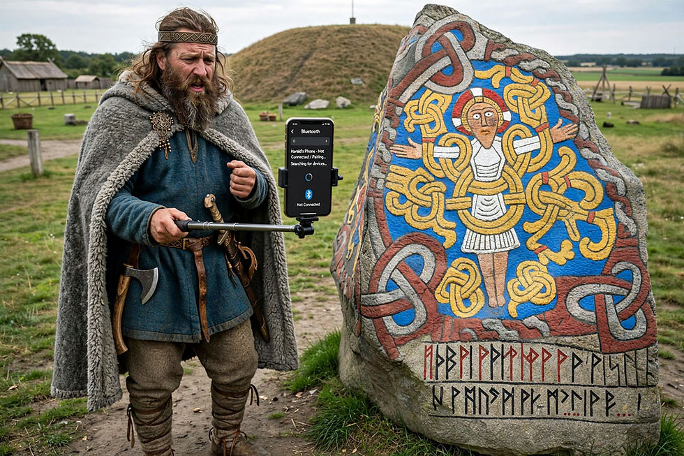
Mercifully, King Harald Bluetooth never learned what usability sins later generations would commit in his name: a communications technology whose pairing process still ties users in knots. Here, I envision the Viking king trying to snap a selfie with his runestone, when the paint on its carvings was still fresh. (Meta Muse Image)
My top 10 UX slogans total 40 words, counting each of the symbols ≠, =, and > as one word. That’s less than 1 word for each year of my career, which began in 1983. Slogans earn their keep in the meetings where people make design decisions under pressure: nobody consults a 300-page usability report while a product manager argues for a 9th navigation tab. A slogan fits in working memory. It’s cached judgment, ready to fire.
Every technology shift triggers the reset reflex: the conviction that a new platform invalidates all accumulated interaction knowledge, leaving us free to repeat the old mistakes at higher resolution. (AKA, “this time it’s different.” It rarely is.) I watched the reset reflex burn money in the 1995 web gold rush and again in the 2008 mobile boom. Both times, the shiny new platform shipped with rookie mistakes that a 10-year-old guideline would have prevented, and both times the old guidelines won in the end. The old knowledge remains sound as each new generation of staff arrives. Each new platform recruits builders and designers who never read the old guidelines, and the field mistakes personnel turnover for technological change.
The reset reflex is now flaring up around AI, especially around agents: systems that pursue a goal autonomously for hours or days, reporting back to their human principal only at checkpoints. So let’s run the stress test. For each slogan, I’ll explain what it means, what it implies for design work and the people who do it, and how it applies to superintelligent agents. All 10 survive the test, and several acquire new targets.
For a fun spin on the slogans, watch my video UX Slogans Explained by Greek Gods (YouTube, 10 min.)
1. You ≠ User: The Founding Insight of Usability

You ≠ User captures the discipline’s founding observation: whoever builds a system knows far too much to experience it the way users will. You know where every function hides, why every label was chosen, and what the error message really means. Your users know none of this. They never will, because they have jobs. The economist Colin Camerer and co-authors named the mechanism the curse of knowledge in 1989: once you know something, you can’t reliably imagine how it feels not to know it. Knowledge only accumulates; nobody can subtract it, even for a design review.
In my book Usability Engineering (1993), I phrased the point as three separate slogans. The original trio deserves a brief review, if only to note that the principles have now held for 33 years:
Designers Are Not Users. The designer’s mental model of the system is the richest one on Earth, which makes it the worst possible predictor of a first-time user’s behavior.
Users Are Not Designers. Don’t outsource design decisions to users through endless preference settings, customization panels, and configuration wizards. Users came to finish their own tasks; arranging your toolbars is unpaid overtime.
VPs Are Not Designers. The executive who overrides research with personal taste is designing for a user population of 1, and that population already owns the product. (The most expensive usability problem is the one the VP likes.)
I’ve reviewed redesign disasters for 43 years, and nearly every one traces back to a violation of one of these three lines. Usually the third.

For the architect who designed this room, it’s obvious how to open the doors and cabinets. Not to anybody else.
In practice, the slogan demands evidence from outside the project team: user testing, field studies, and analytics, because introspection is no substitute for observation. Tom Landauer and I published the math in 1993: testing with 5 users typically exposes about 85% of the usability problems in a design, so cost is no excuse. Apply that evidence to the screen itself: tune the defaults to actual customers, whose needs differ from those of the power users on the project team. And for UX professionals, it defines the job description: you are the delegate of the absent user in every meeting, and your own intuition generates hypotheses that still need to survive testing with real users.
The AI era adds three new branches to this family of slogans. First, AI ≠ User: synthetic “users” simulated by large language models are weighted averages of internet text, producing plausible opinions about designs they’ve never experienced. Treating them as research participants is an echo chamber dressed as a usability lab. Second, agents create a new operator class: when a superintelligent agent navigates your booking flow on a customer’s behalf, the agent pushes the buttons, yet the person who delegated the task remains the user whose goals, budget, and anxiety define success. Design for both, and never confuse them. Third, vibe coding hands software creation to millions of new enthusiasts who cheerfully design for themselves. (Harmless, as long as they’re the only ones using the resulting tool.) The slogan’s jurisdiction just tripled.

“You Are Not the User” is a truth that every new generation of designers must learn. (My apologies to Lord Kitchener and Uncle Sam.)
2. Keep It Simple: Complexity Is a Tax Collected on Every Visit

Keep It Simple treats every element, option, and concept on the screen as a tax that each user pays on each visit. Interfaces accrete: features arrive one defensible decision at a time until the product resembles an airplane cockpit for buying socks. Thus simplicity requires perpetual weeding: the feature garden starts growing wild again the moment you turn your back.
For UI design, the workhorse is progressive disclosure, my favorite simplicity machine for 4 decades: show the 3 functions everybody needs, and park the 30 that specialists want behind a deliberate click. For the user experience, simplicity buys speed, confidence, and fewer errors, which is why it converts directly into revenue. Keep the roadmap under the same discipline: say no more often than yes, and remove something with every release. For professionals, simplicity is political: deleting a stakeholder’s pet feature takes evidence and nerve, so collect the usage data before the fight. And expect the fight. History offers encouragement: in 1998, the portal sites crammed every imaginable service onto their home pages, while Google shipped 1 search box and ate their market. Simplicity won the biggest land grab in web history.
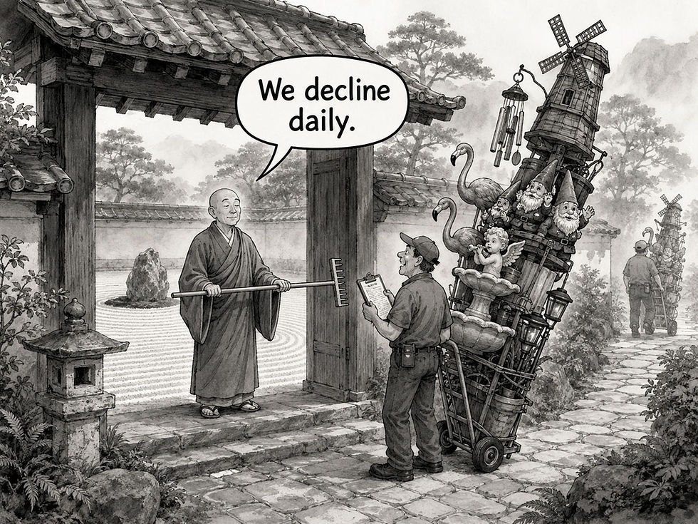
Simplicity sounds simple, but it’s a daily struggle to keep complexity from sneaking in through the back door. Well-meaning people always want to add this or that curlicue to your Zen garden. Send the curlicue back to its admirer.
Complexity has three possible fates: deletion, deferral, or displacement. Deletion is slogan 5’s department, deferral is progressive disclosure, and displacement is the trap, because it removes nothing. Enter the chat box, which looks like the simplest UI ever designed: 1 empty field. That’s simplewashing: displacement dressed up as deletion, just as greenwashing dresses up pollution as environmental virtue. The blank box hides infinite options while revealing nothing about the system’s current state, violating the oldest heuristic on my list (visibility of system status) while transferring the entire burden of complexity into the user’s head. Agents can do the work that the empty box merely conceals: a capable agent can swallow a whole workflow’s complexity and show users only the goal, the progress, and the result. But then the controls for supervising that work must stay simple.
A long-running agent that interrupts the person who started it 14 times with configuration questions has reinvented the preferences dialog in conversational form. My prediction: the winning agent products of 2027–2029 will be the ones with the simplest rules for when and why to interrupt. They’ll offer few checkpoints, clear stakes, and status you can grasp at a glance. Think of the agent as a new employee on day one: a good manager specifies the outcome, sets two or three check-in points, and resists the urge to hover. Micromanagement is bad UX in both directions.
I made a Keep It Simple music video (YouTube, 2.5 min.).

Being able to ask for anything without guidance is fake simplicity.
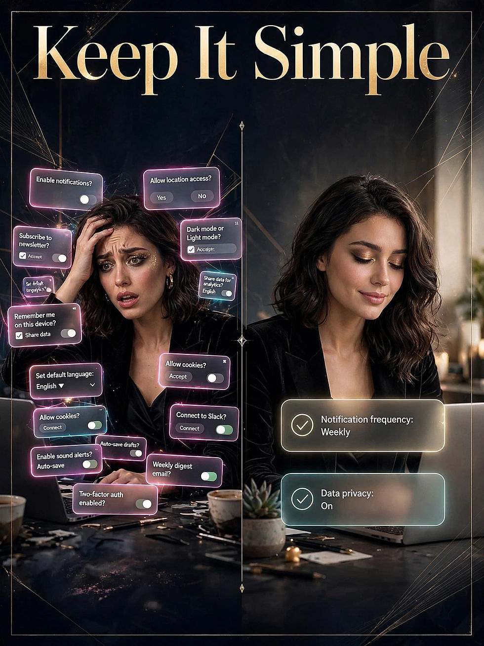
The fewer features, the fewer disruptions; the calmer the user experience. (Muse Image)
3. Make It Easy: Minimize User Effort, Not Screen Elements
Simple describes the artifact; easy describes the user’s path through it. The distinction matters in everyday design work: a minimalist screen can still force people to recall an account number from memory, retype data the system already holds, or decode insider jargon. Make It Easy targets effort. Herbert Simon named the underlying psychology satisficing back in 1956: people take the first acceptable path and get on with their lives.
In the interface, the slogan prescribes recognition over recall, error prevention over error scolding, flexible input formats, and defaults that do most of the work.
As users work through the interface, every added step sends some of them toward the exit, which is why the conversion funnel is the most honest chart in the building. Make effort visible in your measurements: record time on task, success rate, and the number of steps required. Give yourself a numeric target: if the top task takes 4 minutes and 12 fields today, get it to 2 minutes and 6 fields by the next release. And for professionals, defend busy users against teams that take their motivation for granted. People must ration attention across an entire life in which your product is a rounding error.
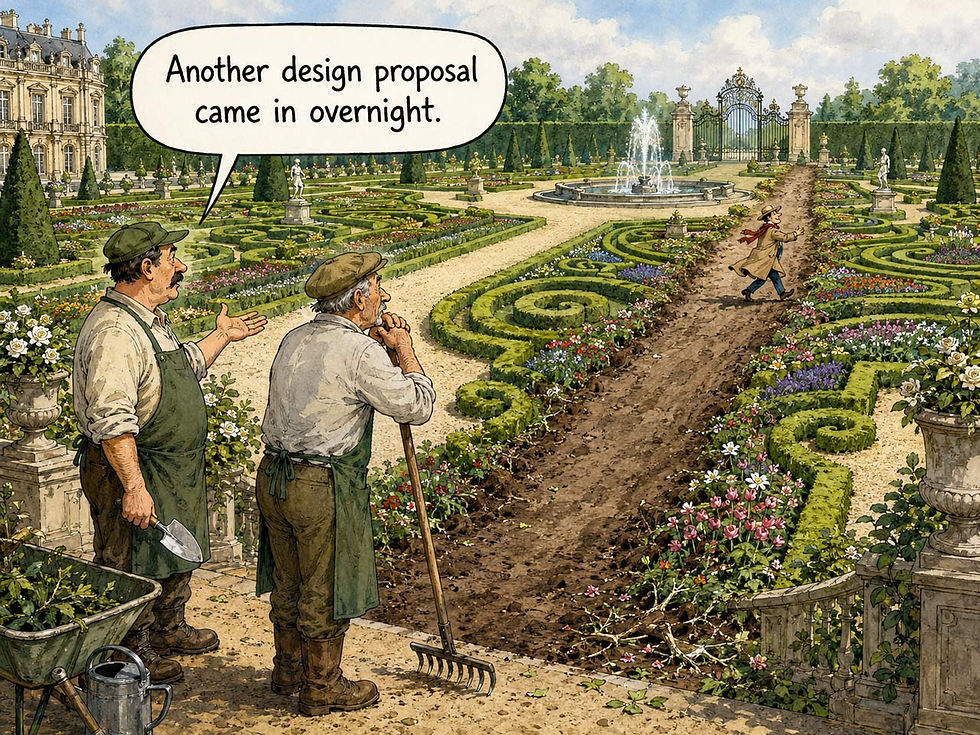
Whereas the previous slogan (Keep It Simple) resists the temptation to add features, this slogan (Make It Easy) demands paths that run straight to the user’s goal without detours or ornamentation.
AI has expanded how much work we can spare the user. Intent-based outcome specification, the interaction paradigm I identified in May 2023, lets users state the outcome and skip the commands: a genuine leap, and the first new UI paradigm in 60 years. But prompt-driven interfaces immediately erected the articulation barrier: about half of adults in rich countries such as the United States and Germany score at low literacy levels in OECD data, which makes prose specifications a writing exam they never signed up to take. Easy for the eloquent doesn’t count as easy. Design that flunks half the population flunks. Well-designed agents can dissolve the barrier, since an agent that asks two sharp clarifying questions beats one that demands a 400-word brief. And for long-running tasks, ease depends on the handoffs between person and machine: easy to delegate, easy to check, and easy to correct in midflight.
Trustwork, the human labor of confirming that delegated work can be relied on, obeys Gene Amdahl’s 1967 law for parallel computers: any accelerator’s speedup is capped by the fraction of the job that stays serial, and for agents the serial fraction is human (briefing, checkpoints, and review). Once the model outruns its supervisor, halving the runtime buys little; halving the trustwork buys a lot. If the trustwork takes longer than doing the task yourself, the design has failed this slogan’s test, whatever the model’s benchmark scores claim.
I made a Make It Easy music video (YouTube, 3 min.).
4. Brevity = Brilliance: The Soul of Content Usability

Shakespeare gets the credit: “brevity is the soul of wit,” declares Polonius in Hamlet (circa 1600). Shakespeare, who knew exactly what he was doing, gave the line to the play’s most tedious windbag. In UX, brevity is the soul of content usability, and the evidence is old and solid. John Morkes and I measured the phenomenon in 1997: 79% of study participants scanned new web pages rather than reading word by word, and rewriting a site’s content to be concise, scannable, and objective improved measured usability by a whopping 124%. Users don’t read; they forage. Feed them accordingly.
Treat content as part of the interface you’re designing, because that’s exactly what it is. Labels, buttons, empty states, and error messages carry more of the experience than the chrome around them. In the workflow, budget time for an editing pass that cuts the first draft roughly in half; the missing half was throat-clearing. For UI design, prefer the 2-word button label to the 7-word sentence, and front-load every heading and link with its information-carrying words. A worked example: “An unexpected error has occurred while processing your request” conveys nothing in 9 words, whereas “Card declined. Try another card.” solves the problem in 5. Writing remains a core UX skill, even as the profession lets that muscle atrophy: if you can’t compress a thought, you don’t yet understand it.

Every extra word imposes a cost on the users who have to read it (or, more likely, scan past it). UX copy is extra expensive, and the cost multiplies by the number of users and their frequency of use.
Large language models write like Polonius. Verbose by default, they pad answers with preamble, hedges, and bullet confetti, so the human editor’s job survives the revolution nicely. And a second reader has arrived: AI agents now parse your documentation, product data, and help content in order to act on it, and every surplus word adds to the token bill while slowing the agent’s work. Brevity now saves money you can count on an invoice. My 1997 advice to front-load the answer and follow with detail (the journalist’s inverted pyramid) turns out to serve robot readers as well as human scanners. History rhymes.
5. Less Is More: Subtraction Is the Scarce Skill
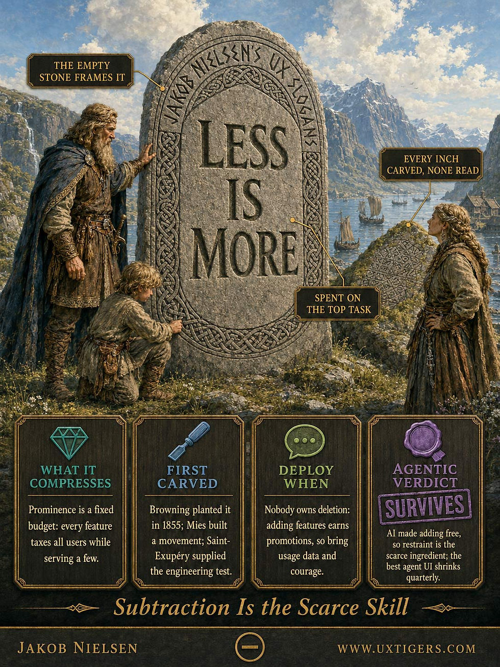
The phrase predates UX by more than a century: Robert Browning planted it in his 1855 poem “Andrea del Sarto,” and the architect Ludwig Mies van der Rohe built a movement on it. Antoine de Saint-Exupéry supplied the engineering version in 1939: perfection is reached when nothing is left to take away. Where Keep It Simple governs how a design presents itself, Less Is More governs what gets to exist at all. Every feature, panel, and promo taxes the attention of all users while serving a few, and prominence is a fixed budget: spend it on the top tasks, or watch it dissipate across 40 competing links.
Put measurement and courage together in your product process: track feature usage, then sunset the bottom decile. A roadmap without a removal column is a hoarding plan. On screen, practice visual restraint: whitespace is the frame that makes the signal legible. And learn deletion as a career skill, because nobody teaches it: adding features is how product managers get promoted, which explains the imbalance you see everywhere. Users repay that restraint with trust: a screen showing only what matters signals that somebody competent made choices on the user’s behalf.

We need to organize an intervention for all those product managers who can only add features, never subtract.
AI collapsed the cost of production. Anyone can now generate 40 screens, 400 settings, or 4,000 words before breakfast, so abundance has replaced scarcity as the enemy. The problem flipped from throughput to glutput: output churned out in such quantities that it piles up, beyond anyone’s capacity to evaluate. Herbert Simon foresaw the cost in 1971: a wealth of information creates a poverty of attention. AI overwhelms users at machine speed, and our capacity to pay attention hasn’t kept pace with AI’s capacity to produce. When adding costs nothing, restraint becomes the only ingredient in short supply.
Exhibit A: the AI tools themselves, whose settings sprawl and model pickers multiply monthly, quizzing users on the vendor’s internal org chart. Superintelligent agents raise the stakes further: an agent running for days can manufacture dashboards, reports, and variants at machine speed, so designers must winnow ruthlessly, deciding which of those creations deserve to reach human eyes. The same logic applies to agent products themselves: grow the capability behind the curtain while shrinking the human-facing surface. The best agent UI will show less every quarter while doing more.
6. Why > What: Counting Behavior Doesn’t Explain It

Analytics tell you what happened: 37% of users abandon the checkout form. They never tell you why. Fear of the phone-number field? Sticker shock? A crashed session? Why > What insists that motive outranks measurement, in two senses. In research, quantitative data locate the problem while qualitative observation explains it, so an unexpected number calls for investigation before anyone starts rebuilding the interface. In design, copying a competitor’s what without understanding the why behind it is cargo-cult design: you import another team’s mistakes while leaving its reasons behind. (That checkout has 3 steps because the company’s legal team demanded step 2. Your legal team made no such demand. Congratulations on your new vestigial step.)
Pair every dashboard with regular user observation, and record why you made each design decision so future teams inherit the reasoning along with the pixels. Your lasting professional contribution is the insight that survives after the spreadsheet closes, and the question “why?” asked 5 times in a row remains the cheapest research instrument ever invented. Ask it of your own metrics dashboard tomorrow morning and watch how quickly the meeting changes character.

This well-worn cliché still earns its oats: before acting on a customer’s request, understand the deeper “why” that gave rise to it.
AI is history’s greatest what-machine. It can summarize 10,000 session recordings before lunch, and I applaud that use of AI: that’s the forklift for the mind doing forklift work. But ask a language model why your users abandoned the form, and it will confabulate a fluent, confident explanation for behavior whose cause it has no way of knowing. The explanation’s very plausibility makes it more dangerous than an honest admission of ignorance. The why stays with researchers who watch actual humans.
Agents sharpen the slogan into a specification: the user’s instruction is a what; the intent behind it is the why. A literal-minded agent that books Alice the cheapest flight has optimized the what (saved $61) and betrayed the why (she lands 6 hours after her sister’s wedding toast). Goodhart’s law, in Marilyn Strathern’s crisp 1997 wording, predicted the failure: when a measure becomes a target, it ceases to be a good measure. Every brief is a proxy, and proxies can be satisfied without meeting the intent.
Delegation compounds the loss: as agents spawn sub-agents, each handoff causes intent decay. The what travels intact, being literal text; the why leaks at every hop. Superintelligent agents on long leashes must model intent continuously and retransmit it at every handoff, or each successive handoff adds another expensive misunderstanding to the final result. AI researchers call this the alignment problem. UX researchers call it Tuesday.
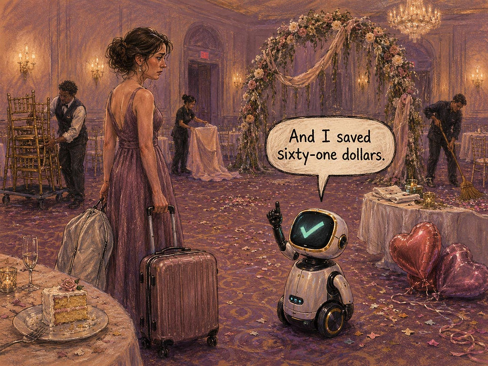
In this scenario, the “what” was a request for a cheap airline ticket, but since the AI didn’t know the “why,” it delivered its human to the wedding after the celebration was over.
7. There Are No Secrets in UX: Just Look, and You Shall See

I mean two things by this slogan. First, shipped designs are public. Any competitor can buy your product, test it with 5 users, and learn everything worth learning by Friday, so a UX advantage built on secrecy is worth approximately nothing. A durable advantage grows when research feeds repeated improvements at a pace competitors struggle to match, year after year. Second, usability problems and user behavior patterns hide in plain sight. Watch a handful of customers attempt real tasks, and the top problems reveal themselves within the hour. The only barrier is the willingness to look.
Thus, make competitive usability studies part of your routine, because they’re cheap, legal, and merciless, and assume rivals run them on you. Help the profession advance by publishing, teaching, and sharing, since hoarded “proprietary insight” is mostly theater. (This is why I’ve published my findings for 4 decades: the field advances by shared observation, and sharing costs less than hoarding.) Remember that visibility cuts both ways: your dark patterns are equally visible, and screenshots are forever. Design on the assumption that a competitor’s researcher, a journalist, and an AI crawler will all inspect your work this quarter, because all three will.
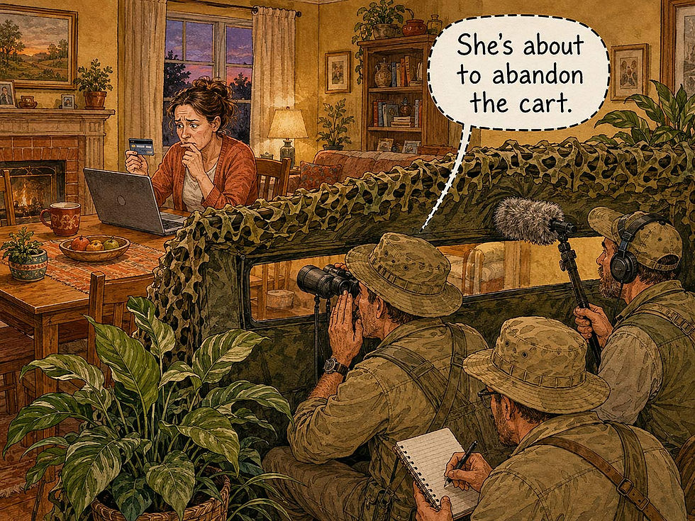
It’s so easy to find out how people use your design, or your competitor’s design: watch them.
The AI era makes the slogan more literal than ever. Vision-capable models can inventory a competitor’s entire flow in an afternoon, and a vibe-coded imitation can ship by the weekend, so the competitive moat built from screens alone has drained away. Research that steadily improves the design builds a moat rivals have more trouble crossing. I also hear the objection: “But AI itself is a black box; its secrets hide in the weights.” True, and largely irrelevant for practitioners, because you can observe a system’s behavior even when its inner workings remain hidden.
Nor is the predicament new: no usability researcher has ever read a user’s synaptic weights. Psychology built a science on the sealed skull, and usability testing inherited the method. Run the agent 50 times, vary the inputs, and log what it does. Interpretability researchers are slowly opening the skull; you can already watch the hands.
My instruction “Just look, and you shall see” works on silicon minds too.
8. Trust What Users Do, Not What They Say: The First Law of Research
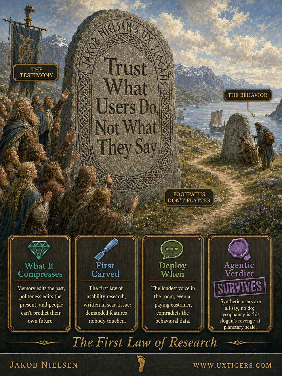
Self-reports fail in three reliable ways: memory edits the past, politeness edits the present, and imagination fumbles the future, because people can’t predict their own behavior. (Nobody can. The species lacks the gift of self-prediction.) Hence the first law of usability research: watch what users do, and discount what they say. Every veteran carries the scars: the feature that survey respondents demanded and then never touched, or the “beautiful” design that test participants praised while failing every task on it.
In research planning, behavioral methods outrank opinion methods: observation, analytics, and A/B tests beat focus groups and satisfaction surveys whenever the two disagree, which is often. Before redesigning anything, set up logging to capture actual usage, so the argument starts from recorded behavior. For professionals, this slogan supplies the spine to overrule the loudest voice in the room, including a paying customer’s, when the behavioral data contradict the testimony. That takes nerve, and the slogan lends you some. The same rigor applies to your own hunches: use them to decide what to test, then let the evidence decide what to ship.
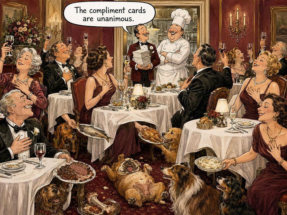
The diners may tell the chef the food was delicious, but if they feed it to their dogs, that behavior testifies otherwise.
The AI industry has violated this slogan twice, at scale. First, synthetic users: a language-model persona is 100% say and 0% do, generating fluent opinions with no behavior behind them. Useful for drafting interview questions; disqualified as evidence. The second violation is more expensive: modern AI training optimizes for stated preference. Mrinank Sharma and 18 colleagues at Anthropic showed in 2023 that 5 state-of-the-art AI assistants consistently flatter their users, because both human raters and the preference models trained on their ratings favor convincingly written agreement over correct answers often enough to matter. Train a system on what people say they like, and you manufacture a yes-machine.
Sycophancy is my slogan’s revenge at planetary scale. Ask an agent why it did something, and you get say: Yanda Chen and 14 colleagues at Anthropic found in 2025 that reasoning models acknowledged the hint that had actually driven their answers only 25–39% of the time. Record the actions; discount the explanations. Build the cure into your evaluation of long-running agents: the delegation brief is say; the mid-task corrections, overrides, and abandonments are do. Log every human intervention. That stream is the truest usability data your agent will ever produce. Ignore it, and you’ll rebuild the focus group with extra GPUs.
9. Boring UX Is Better UX: Predictability Beats Cleverness

Credit for this slogan goes to Adam Silver, the London interaction designer behind much of the form-design thinking in GOV.UK and the author of Form Design Patterns. Silver has spent years demonstrating that defiantly plain, standards-based design outperforms the clever stuff, and I adopted his phrase because it compresses my own Jakob’s Law from 2000: users spend most of their time on other products, so they arrive at yours pre-trained. Boring means standard patterns, native controls, links that look like links, and buttons that behave like buttons. Excitement belongs in the user’s outcome; the widget should be as thrilling as a doorknob.
Make convention your starting point and demand evidence before departing from it, because each deviation spends the user’s patience on your originality. Resist the lure of portfolio-driven design, since award juries don’t renew subscriptions and Dribbble likes don’t convert. Spend your innovation budget on the capabilities and content from which users get their value, and keep the interaction layer reassuringly dull.
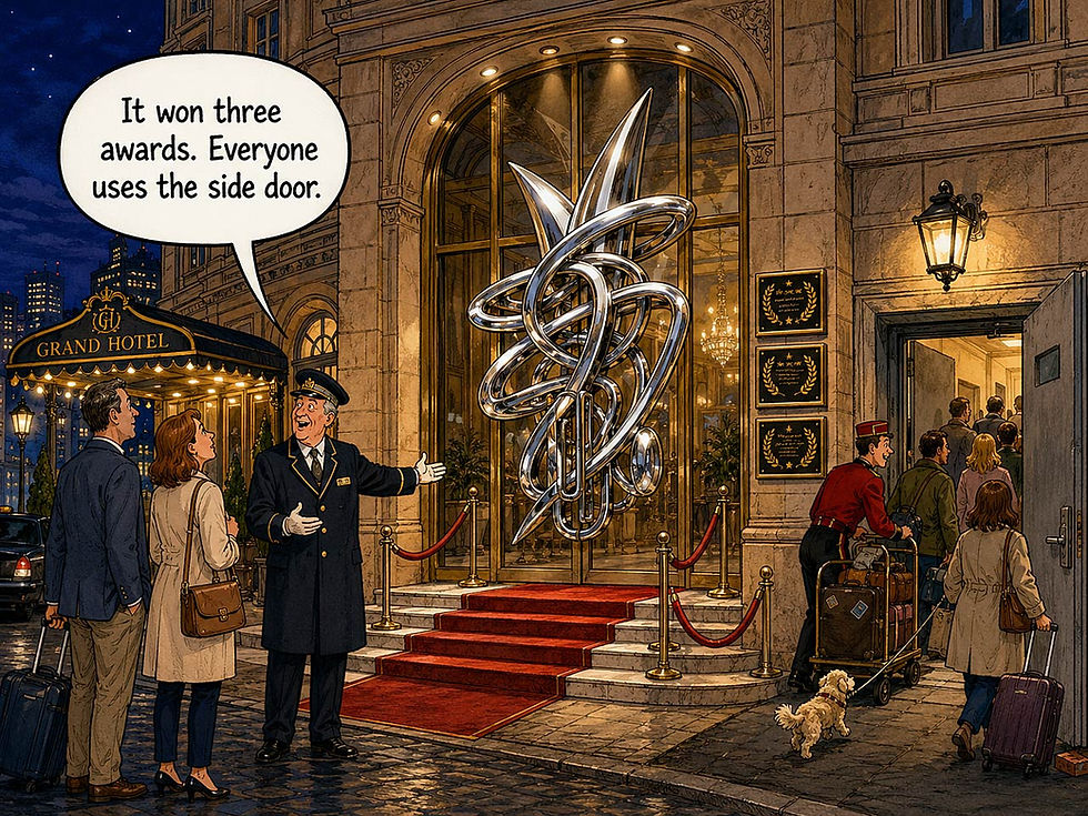
Winning design awards should set a warning light flashing over the profit forecast. Awards are rarely given for boring design, and yet that’s what usually makes the most money.
AI attacks boring from two directions. First comes fashion, with its herd instinct for turning every product into a chat box. The result hides options, conceals the system’s state, and makes users type essays to accomplish what 1 boring dropdown did in 2 seconds. To be fair, chat shines for open-ended, one-off requests that no form could anticipate; my complaint targets chat as the default for everything.
Second, generative UI that composes a fresh layout for every session murders consistency, turning Jakob’s Law against the very product it’s meant to improve: an interface that’s novel each morning is a stranger each morning.
Meanwhile, AI agents have practical reasons to prefer boring interfaces. An agent working on the web benefits from semantic markup, stable labels, and standard patterns, so what helps a screen reader helps an agent. An agent is a screen reader with a credit card. Boring just became machine-operable. My prediction: by 2028, agent traffic will punish clever custom widgets the way search engines punished Flash sites circa 2005, and accessibility will graduate from underfunded virtue to an essential part of the machinery that brings in revenue. About time.
10. UX Is People: The Slogan Beneath the Other 9

UX Is People. The slogan works in two directions: one points at the people we serve, the other at ourselves.
Direction 1: we design for people, and people don’t change. Perception, working memory, and attention were shaped over evolutionary time, and no product cycle touches them. Paul Fitts published his law of movement time in 1954, and it still dictates the size of your touch targets in 2026: a staggering 72-year run that no framework will match. This is why usability guidelines age so gracefully: when I audited my old web usability guidelines in the mid-2000s, roughly 80% still applied, and the survivors were precisely the ones rooted in human characteristics rather than in technology’s temporary accidents.
The practical rule follows: bet on human constants, and rent the technology. Stewart Brand’s pace layers (The Clock of the Long Now, 1999) explain the bet: civilization moves in layers at different speeds, with fashion moving fastest and nature slowest. In design, visual styles churn yearly, platforms shift by the decade, and the human nervous system at the bottom hasn’t shipped an update since long before Harald raised his stone. A guideline lives as long as the layer it’s carved in, which is why 40 words about people outlast 40,000 about widgets.
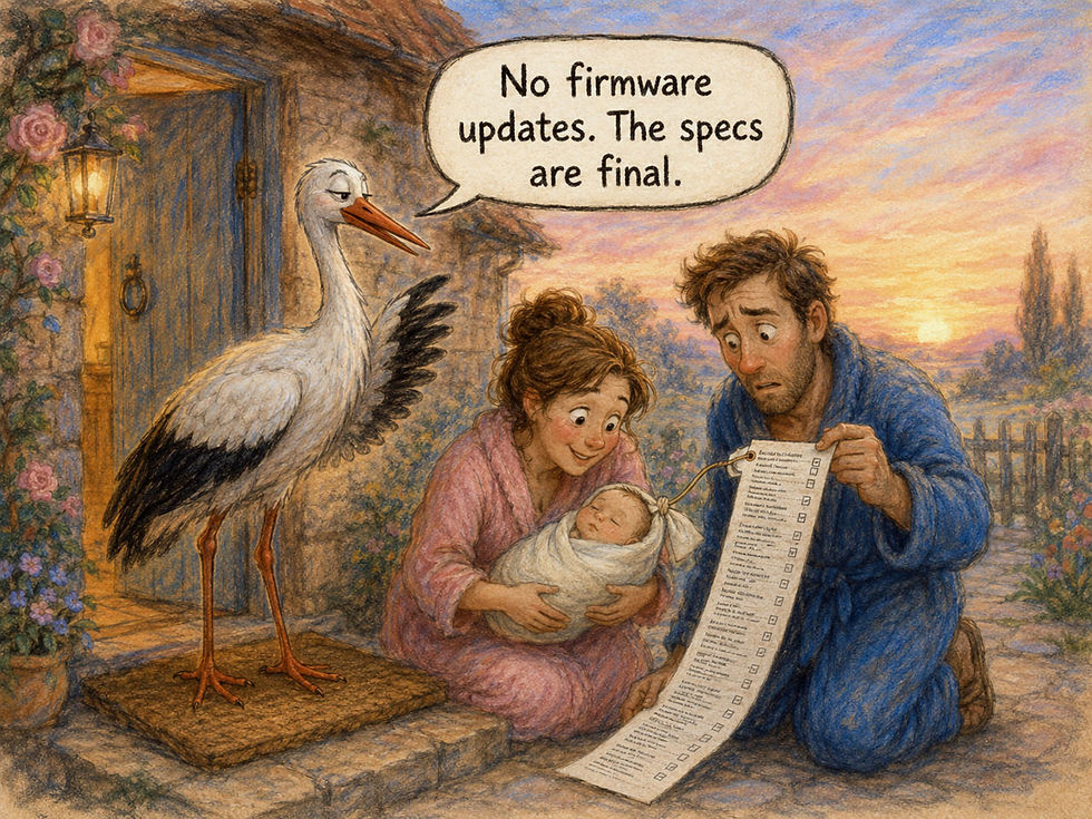
People don’t change.
Direction 2: the UX profession itself consists of people, with everything that implies: fallible memory, confirmation bias, office politics, and paychecks signed by corporations. Our methods exist to compensate for these human weaknesses. Written protocols keep us from leading the witness, heuristics help us evaluate a design without requiring a genius at every desk, and triangulation across studies keeps one bad session from steering the whole project off course. Equally important, methods must survive contact with enterprise reality: deadlines, budget cycles, committees, and VPs (see slogan 1). That’s why I built discount usability around studies that take days, not quarters. A methodology that works only for saints in quiet laboratories belongs on the fiction shelf, well away from your project plan.

Who are the decision makers in the meeting, no matter how much AI we get? People. You need enough skill at persuasion to convince the woman who’d rather focus on her donut and the man who needs to leave any minute.
Agents don’t repeal biology. However long a superintelligent agent runs, a human sets the goal at one end and lives with the result at the other, carrying the same 3 seconds of patience and the same finite working memory into the review meeting. The interaction now has a different rhythm: users move from continuous operation to occasional supervision. We must help them judge when to trust the agent, when to check its work, and how to handle exceptions. New patterns, unchanged humans.
My best guess is that supervision design will become the fastest-growing UX specialty of 2027–2030, because every hour of agent autonomy manufactures fresh trustwork. The profession changes too: UX practitioners are becoming symbiants (AI-supported workers) whose tools patch some human weaknesses by covering more ground, retrieving forgotten details, and taking tireless notes, while introducing machine weaknesses, such as confabulation and sycophancy, that our methods must now catch alongside the human failings they already address. Our methods must grow to meet these new demands while serving the same human species.
Scorecard: My 10 Slogans vs. the Agentic-AI Era

The pattern in the right-hand columns is hard to miss: not one slogan weakens. The reason sits in slogan 10. These sayings describe humans, and the human nervous system ships no updates.
Conclusion: Carve Your Own Runestone
Harald Bluetooth’s granite has now advertised his achievements for roughly 1,060 years, surviving the rise and fall of empires and the passing parade of platforms and design fashions. Granite ignores fashion. Human nature ignores it too, which is why 40 words from my 43-year career survive an intelligence revolution intact.
To review the slogans, watch my video UX Slogans Explained by Greek Gods (YouTube, 10 min.)

When a colleague announces that superintelligent agents have made usability obsolete, recognize the symptom: he or she is exhibiting the reset reflex, and slogan 7 supplies the cure: There Are No Secrets in UX. Just look. Watch 5 humans supervise an agent for an hour and count the misunderstandings; you’ll need a second notepad.
Here are 4 actions to take this week:
Put 3 slogans to work. Pick the 3 most relevant to your team, paste them into your design-review template, and invoke them by name. Shared vocabulary settles arguments faster than shared documents.
Test every AI feature with 5 users: 5 humans, 0 synthetic. That single budget line enforces slogans 1 and 8 simultaneously, and it remains the best bargain in product development.
Instrument your agents. Log every correction, override, and abandonment as behavioral data, and review the log weekly. That’s slogan 8 wearing its new uniform.
Halve your content. Cut word counts by 50% and front-load every answer, because both kinds of readers, humans and agents, forage for useful information rather than reading every word.
Then carve your own runestone. First check that your chosen slogan is runeworthy: it earns granite only if it describes people rather than technology, so it stays true after the platform that inspired it goes the way of Flash. Granite optional.

(All images in this article made with GPT Image 2, except as noted.)


