
UX Roundup: AI Agents Change Workflows | User Expertise and Agentic AI | Controlling AI Complexity | Constraints | Meta Muse Image | Seedream 5 Pro | Image-Model Shootout | GPT 5.6 Sol

Summary: AI agents expand user tasks | Agentic AI makes expertise more valuable, not less | Users need control over the complexity of AI results | Constraints help users | Meta launched a new image model, Muse Image | ByteDance upgrades its image model to Seedream 5 Pro | Comparing the leading image models | GPT receives a major upgrade to v. 5.6 Sol

UX Roundup for July 13, 2026 (GPT Image 2)
AI Agents Don’t Just Save Time; They Expand the Task
AI agents have a higher delegation cost but lower execution cost, which changes what users ask AI to do, according to a new research study by researchers from Harvard Business School and Perplexity.
By comparing behavior in Perplexity Search with its autonomous Computer agent, the researchers show how cheaper execution changes task choice, workflow structure, and the economics of knowledge work. The findings strongly support my argument that companies must redesign workflows around AI rather than bolt AI onto legacy processes.

AI agents expand the tasks users can do. (GPT Image 2)
How AI Agents Change Workflows: From Execution to Oversight
The most immediate finding from the Harvard/Perplexity report is how much autonomous agents alter the anatomy of a daily workflow. In a traditional digital process, even one augmented by conversational AI, the human user remains the primary orchestrator. He or she must manually break down a project into subtasks, query the AI for information, synthesize the results, switch between software applications, and assemble the final output step by step.
AI agents obliterate this bottleneck by shifting the burden of execution onto the machine. The study found that Perplexity Computer performed an average of 26 minutes of autonomous, asynchronous work per session, compared to a mere 33 seconds of machine processing for standard Search queries. This autonomy triggered a massive efficiency gain: task completion times plummeted from an average of 269 minutes (using Search plus manual human execution) to just 36 minutes, an 87% reduction in time and a staggering 94% reduction in estimated financial costs.

AI agents are taking on entire workflows, freeing humans from supervising individual steps, though the scenario in this cartoon probably won’t happen for another year or two. (GPT Image 2)
These productivity gains mean that the same employee can perform 7.5x as many tasks per hour with AI agents as with non-agentic AI. And that’s obviously with current AI. Future agents will be many times more capable and will perform tasks lasting days or weeks, rather than the half hour possible with current technology.
But the workflow doesn’t just get faster; its very nature changes. With the AI absorbing the friction of manual task decomposition and execution, human interaction shifts entirely. The researchers observed that follow-up queries shifted from manual directives (such as drill-downs for more information) toward higher-order task verification, review, and extension. The human steps out of the operator seat and becomes the supervisor. Surprisingly, removing the human from the execution loop improved results; user dissatisfaction rates were 55% lower with the autonomous agent than with the conversational assistant.
The Expanding Scope: What Users Are Willing to Do
Because agents lower the marginal cost of executing complex, multi-step operations, users are emboldened to expand the scope of their work. The study categorizes this into two dimensions: vertical and horizontal expansion.
Vertically, users are delegating more complex and cognitively demanding tasks. Using Bloom’s Revised Taxonomy, the study revealed that 76% of agent queries involved higher-order cognition, compared to 55% for regular search. More strikingly, 50% of the tasks delegated to the agent were classified as “Create” tasks (producing novel artifacts like codebases, spreadsheets, or comprehensive slide decks) versus only 26% in standard search. Users are moving away from routine fact-finding and toward abstract, non-routine cognitive work.

Bloom’s taxonomy: when using the AI agent, the use of higher-order thinking skills increased from 55% to 76%, and the highest level (creating) doubled. Creating is usually considered the most satisfying human work, so doubling it, even with current primitive AI, is promising. (GPT Image 2)
Horizontally, autonomous agents empower users to safely cross occupational boundaries. The study found a 9-percentage-point increase in users performing tasks outside their primary domain of expertise. A marketing professional, for example, is now willing to undertake digital technology tasks, such as building a dynamic website or writing a script to analyze a raw database, because the agent bridges the skill gap. Furthermore, users bundle previously disparate, interdependent subtasks into a single, cohesive macro-request. In short, AI agents aren’t just doing our current jobs faster; they are unlocking new frontiers of work. In fact, 23% of Computer queries involved specific fine-grained tasks that never once appeared in the same users’ Search queries.

AI enables employees to cross traditional discipline boundaries, so that, for example, a writer can code. (GPT Image 2)
This is scope elasticity: when the marginal cost of execution falls, ambition expands. A company that measures agents only by minutes saved will miss much of their value, because the biggest return may appear as new work, broader deliverables, and eliminated handoffs rather than as a smaller payroll line. Advancing the AI task frontier should be the goal. Agentic AI may produce a cognitive Jevons effect. Each task becomes cheaper, yet the total volume of work rises because analyses, experiments, prototypes, and one-off tools that were previously not worth the effort suddenly become affordable. The likely result is less drudgery but more ambition. (AKA, AI won’t cause mass unemployment, as I first stated 3 years ago.)
Validating the Need for Workflow Redesign
These empirical findings align with my analysis of the urgent need for workflow redesign. Companies will never realize massive, paradigm-shifting profit gains by simply bolting AI onto legacy processes, a phenomenon I call “paving the cowpaths” (the route the cows used to take). If businesses treat AI merely as a tool to speed up existing steps in a digitized assembly line, they throttle AI’s true potential and gain only marginal productivity bumps.

Paving the cowpaths allows the cows to get to the same place faster, but doesn’t enable new workflows and revolutionary business gains. (GPT Image 2)
AI should become the foundation of the new workflows, requiring us to rethink task sequences, eliminate intermediate steps, and shift the human role from manual creator to curator and editor.
The Harvard/Perplexity study serves as empirical proof of this dynamic in action. When users were given access to an autonomous agent, they intuitively abandoned the “cowpaths.” They stopped acting as the connective tissue between separate applications and began issuing composite, macro-level commands.
The 7.5x productivity gains and 94% cost savings documented in the report are the magnitude of improvement we can expect from a true, AI-first workflow redesign. However, businesses can’t rely on individual users hacking their way to these efficiencies. Organizations must proactively dismantle legacy protocols and structurally redesign their operational workflows to treat the AI as the primary executor and the employee as the cross-disciplinary manager.
UX Guidelines for Designing AI Workflows
For UX designers and researchers, the transition from conversational AI to autonomous agents represents a shift in interaction design. We are no longer designing interfaces for human execution; we are designing interfaces for human oversight. Here are the core takeaways for UX professionals seeking to redesign workflows for the agentic era:

The user’s primary role will be oversight, not execution, which will be handled by AI agents (not by an octopus, but an octopus makes for a funnier cartoon). (GPT Image 2)
Design for Delegation, Not Just Interaction: Traditional UI focuses on granular control, giving users the tools to manipulate a system step by step. Agentic UX must focus on delegation. Interfaces should help users clearly articulate complex goals, set boundary conditions, and establish success criteria. We need structured intake mechanisms that help users define multi-step composite tasks without feeling overwhelmed.
Elevate Verification and Explainability: As the human role shifts from creator to reviewer and editor, the UX must prioritize robust verification tools. Since the AI might execute 26 minutes of invisible machine work, the user needs to quickly understand how the final artifact was generated. Design interfaces that highlight changes, clearly trace data back to its original sources, and provide intuitive side-by-side “diff” views. If users can’t easily verify the quality of the AI’s output, efficiency gains will be lost to micromanagement.

A proper AI user experience must not simply facilitate getting the job done; it must also allow users to understand what was done (and why) and what was changed. (GPT Image 2)
Scaffold for Cross-Disciplinary Novices: Because agents empower users to operate outside their professional domains, your user base will increasingly consist of confident novices. A copywriter deploying a server via an AI agent needs a very different UI than a seasoned DevOps engineer does. UX professionals must design educational scaffolding, plain-language summaries, and fail-safes (such as approval gates) that allow non-experts to confidently review highly technical work.
Accommodate Asynchronous Parallel Work: Autonomous agents take time to execute complex tasks. UX must evolve past synchronous chat interfaces. Design for asynchronous job management: implement clear progress indicators, background notification systems, and “pause-for-approval” states that allow the human to step away, do other work, and return exactly when his or her managerial input is needed.
Shift from Chat-Centric to Artifact-Centric UIs: Users are increasingly focused on extending and iterating upon deliverables. UX should pivot toward interfaces in which the output itself (a document, a dashboard, or a web app) is the primary interactive canvas, and the AI agent serves as an integrated collaborator to refine it, rather than keeping the interaction trapped in a transient chat thread.
We are exiting the era of AI as a mere assistant. As the data demonstrates, realizing the full economic value of autonomous agents requires redesigning the workflow itself. For UX professionals, the mandate is clear: stop designing tools for users to do the work, and start designing environments for users to manage the machine.
Agentic AI Makes Expertise More Valuable, Not Less
Findings very similar to those of the Harvard study now come from a completely different kind of research by Anthropic. I am always happy when I see different research studies arrive at similar conclusions: this vastly increases my confidence that they are right.
Anthropic analyzed roughly 400,000 Claude Code sessions from about 235,000 users between October 2025 and April 2026. The central finding is not that AI removes expertise, but that it changes where expertise matters. Users tend to do most of the planning, while Claude performs much of the execution. Successful use depends strongly on domain expertise: non-coders can often produce code when they know the work domain, but novices struggle more than experts when they lack the conceptual model needed to steer, verify, and repair the AI’s output.

The division of labor found in Anthropic’s research: humans plan, AI executes. (GPT Image 2)
The study’s most interesting finding is the persistent return to expertise. The common myth is that AI lets anybody do anything. The data says something subtler and more useful: AI lets people express expertise through a new medium.
A marketer who understands campaign operations may successfully produce code for a marketing workflow, even without being a professional software engineer. But a person who understands neither the domain nor the code is in a weaker position. AI lowers the floor for action, but it doesn’t remove the need for judgment.
Expertise is being converted from manual production skill into a control system. The expert contributes intent, tolerances, failure signatures, priorities, and a definition of done; the agent supplies the moves. AI converts expertise from labor into leverage.

Expertise matters in the AI age: even with an army of agents to do the hands-on work, building a good dam still requires a beaver architect who knows what a good dam looks like. (GPT Image 2)
In fact, cheap execution can raise the relative value of judgment. When a scarce input is combined with an abundant one, the scarce input captures more of the advantage: AI makes production plentiful, so problem selection, constraint setting, and quality recognition command a new judgment premium. Expertise migrates upstream into direction and downstream into verification.
This changes the key usability question. We should no longer ask only, “Can the user perform the operation?” We must also ask, “Can the user specify the goal, recognize a good intermediate result, detect failure, and redirect the agent before damage accumulates?” The unit of interaction has grown from pressing buttons to supervising a sequence of decisions.
While the study focuses on software development, the underlying dynamics offer a powerful preview of where all knowledge work is headed.
The New Division of Labor: Humans Plan, AI Executes
The most fundamental shift introduced by agentic AI (systems designed to take actions and complete multi-step workflows autonomously) is a redefined human–machine relationship. We are turning from operators into directors.
According to the Anthropic report, a clear division of labor has emerged. In a typical session, humans made roughly 70% of the planning decisions, identifying the problem, choosing the approach, and defining success. The AI, meanwhile, handled 80% of the execution decisions, like writing code, navigating files, and running commands.

Humans made 70% of the planning decisions, whereas AI made 80% of the execution decisions. A clear division of labor. Human expertise mattered: the expert users got much better results from AI than the novice users. (GPT Image 2)
Translate this dynamic to general knowledge work. A financial analyst no longer needs to spend hours writing complex spreadsheet macros; he or she simply needs to know exactly what economic story the data must tell. A marketing strategist doesn’t need to manually configure campaign tracking; he or she needs to define the nuanced psychological positioning of the ad. The AI handles the “how”; the human must master the “what.”
The Democratization of Execution
Because AI handles the execution, the technical mechanics of a task are no longer a barrier to entry. The report found that non-engineers, including managers, lawyers, sales professionals, and healthcare workers, successfully completed complex coding tasks at nearly the exact same rate as professional software engineers. Across the ten largest occupational groups, success rates were all within a few percentage points of each other.
This suggests that the medium of work is becoming secondary to its substance. A lawyer building a script to automatically flag missing clauses in contracts doesn’t need a computer science degree; he or she needs a flawless understanding of contract law. Because the AI manages the syntax, the only remaining bottleneck is the user’s understanding of their own professional domain.
The Expertise Multiplier
If technical execution is democratized, does human skill still matter? Absolutely, but the nature of the required skill has shifted. The Anthropic data reveals a persistent return to domain expertise. The more understanding a worker brings to an agent, the more high-quality work the agent can produce.
The report found that expert users extracted far more output from the AI than novices. A single instruction from a novice triggered about 5 autonomous actions and 600 words of output. An instruction from an expert initiated more than double the actions (12) and over 5 times the output (3,200 words).

Users with higher expertise levels were able to get more work out of the AI agent. (GPT Image 2)
Why? Because experts know how to articulate the boundaries of a problem. They anticipate edge cases, use precise nomenclature, and know exactly how to verify the system’s work. Furthermore, when things go wrong, novices are far more likely to abandon the task, doing so 19% of the time. Experts, conversely, use their domain knowledge to debug the AI’s logic and steer it back on track, abandoning sessions only 5–7% of the time.
Fortunately, you don’t need a lifetime of mastery to see these gains. The data shows that moving from “novice” to “intermediate” yielded the steepest jump in success. A solid, working grasp of your field was enough to unlock the lion’s share of an AI agent’s potential. Competence, not absolute mastery, captures the majority of AI benefits.
This suggests a concrete design target: minimum viable expertise. AI products should not pretend that domain knowledge can disappear; they should help users cross the threshold at which they can formulate sensible goals, recognize common failure modes, and recover from mistakes. The novice-to-intermediate transition may become the most valuable onboarding journey in software.
The curve looks less like a traditional expertise ladder than a competence cliff: the biggest return comes from acquiring a workable mental model. Yet automation creates an apprenticeship paradox. As agents remove the routine execution through which beginners traditionally learned a field, how will newbies acquire the judgment required to supervise the agent? Agentic UX must preserve productive friction through previews, explanations, staged autonomy, and safe practice, so that today’s novice can become tomorrow’s competent director.
Takeaways for UX Professionals Designing AI Systems
As AI evolves from conversational chatbots into active, agentic coworkers, user experience design must adapt. Here are four crucial takeaways for UX professionals building the next generation of knowledge work tools:
1. Design for Steering, Not Just Doing
Because humans make 70% of planning decisions, interfaces must prioritize high-level orchestration. Move away from simple chat windows and toward managerial interfaces. Give users dashboards to visualize the AI’s proposed plan, tweak parameters before execution, and monitor progress as the agent works.
2. Scaffold the Novice Experience
Since the largest gains in success come from moving out of the novice phase, UX should actively help users bridge this gap. Provide progressive disclosure of domain-specific parameters. Use guided wizards or prompt users with clarifying questions (e.g., “Do you want me to account for this specific edge case?”) to help novices build intermediate-level skills quickly.

Help novice users build skills. (GPT Image 2)
3. Optimize for Verification
Experts succeed because they can catch the AI’s mistakes. UX must make this verification process frictionless. Don’t hide the AI’s work in a black box; surface clear signals of success. Design verification dashboards that allow users to easily inspect the agent’s logic and ensure the work meets domain-specific standards without digging through raw data.
4. Build Robust Error Recovery
Novices abandon tasks at high rates because AI failures leave them stranded. When the AI fails, the interface should present a targeted diagnostic in plain language, offering strategic choices or “try this instead” pathways so the user can easily steer the agent out of trouble.

Help users recover from the inevitable problems when using AI. Expert users are better able to recover on their own, whereas novice users need more help. (GPT Image 2)
Agentic AI won’t herald the death of the expert. By removing the friction of execution, AI clears the stage for what truly matters: human judgment, domain knowledge, and strategic vision.
But expertise is wasted when users must repeatedly translate that judgment into improvised prose. An expert shouldn’t have to write 5 follow-up prompts merely to express a preference the system could have exposed as a control. The next UX challenge is to turn tacit judgment into visible, reusable, and directly manipulable settings.
Controlling the Complexity of AI Results
For the past few years, the standard way to interact with AI has been the ubiquitous chat interface. If an AI generates a response that is too dense, brief, or technical, the solution is always the same: type another prompt. As AI integrates deeply into daily workflows, users are experiencing prompt fatigue. The burden of iteratively coaxing an AI to produce the exact desired output is exhausting. Users want direct, intuitive controls, such as sliders, toggles, and buttons, to adjust AI results instantly.

Formulating endless follow-up prompts to try to steer AI results in the desired direction is exhausting for users. (GPT Image 2)
But are today’s language models capable of powering dynamic interfaces?
A new study from the University of Illinois Urbana-Champaign, “Explain Like I’m 5 or Whatever I Choose: Evaluating the Interactive Potential of Language Model Responses” by Indu Panigrahi and Tal August, investigates this question. The researchers explored whether modern AIs can reliably generate text across a sliding scale of complexity, offering a critical reality check on AI usability.
The Promise of the Complexity Slider
The researchers began with a formative study involving a prototype interface where users could adjust an AI response’s complexity using a 1-to-5 slider, ranging from “College student” (Level 1) to “Senior researcher” (Level 5). Tested with 16 participants exploring unfamiliar STEM topics, the verdict was clear: users loved the slider. The vast majority (13 of 16) preferred direct manipulation to manually writing follow-up prompts in a conventional chatbox.
A slider is not merely a convenient prompt generator; it is a promise of monotonic control. Moving it one notch should change the result predictably in one direction while leaving unrelated qualities reasonably stable. When the model can’t honor that promise, the interface becomes control theater: it displays a precision the underlying system doesn’t possess.
Users expected that moving the slider to higher levels would yield more technical jargon, a greater density of information, and increased length.

A simple idea: control the complexity level of AI output through a slider. (GPT Image 2)
The Reality: Models Fall Short
However, when researchers tested whether AI models (GPT-5.1, GPT-5 mini, Claude Sonnet 4.5, and DeepSeek-V3.1) could deliver these distinct levels, the results were strikingly inconsistent.

Unfortunately, the complexity gauge is broken in current AI models: they can’t accurately deliver the desired level of complexity specified by the user on the complexity slider. (GPT Image 2)
To power a slider effectively, a model must reliably scale complexity up or down in distinct steps. The evaluation of 98 expert-written scientific queries revealed that models failed to do this reliably. The researchers measured complexity based on three metrics: Jargon (proportion of uncommon words), Information (number of independent facts), and Length. While models made responses longer at higher levels, they frequently decreased jargon and information when they were supposed to increase them.
For instance, the best-performing model for adjusting jargon, Claude Sonnet 4.5, shifted the jargon metric in the correct direction only 46% of the time across the 5 levels. Even worse, as users’ requested complexity score increased (moving from Postdoctoral to Senior researcher), models’ accuracy at adjusting jargon and information dropped nearly to chance levels.
Instead of adding specialized jargon and dense facts, models often relied on elaborative simplification. To sound more complex, they simply made the text longer by over-explaining basic concepts, failing to increase the true academic density. The study proves that while users want direct UI controls, current AI lacks the internal consistency to power them across a nuanced gradient.

When users requested more advanced explanations, the AI models often simply used more words to make the output longer rather than adding real depth to the content. (GPT Image 2)
The Broad Need for Malleable AI Controls
While this study focused specifically on language complexity, the implications generalize to nearly every aspect of AI-generated content. Users are no longer just asking an AI for a simple answer; they are asking for outputs that fit specific contexts, audiences, and mediums.
Relying on natural language prompting to achieve these nuances is flawed. Non-expert users often lack the vocabulary to articulate exactly how an AI should change its response. Therefore, users need direct manipulation controls to vary numerous aspects of AI results beyond complexity, including:
Tone and Style: Sliders to shift a drafted document from casual to formal, or from diplomatic to direct.
Verbosity and Format: Toggles to instantly expand a bulleted summary into a comprehensive report, or condense a sprawling email.
Creativity vs. Factuality: Dials that adjust the model’s parameters or prompt constraints, allowing users to choose between strictly grounded data and highly imaginative brainstorming.
Direct controls lower the cognitive load. They shift the interaction paradigm from a conversational command line to a malleable canvas, allowing users to sculpt information visually and instantly without typing.
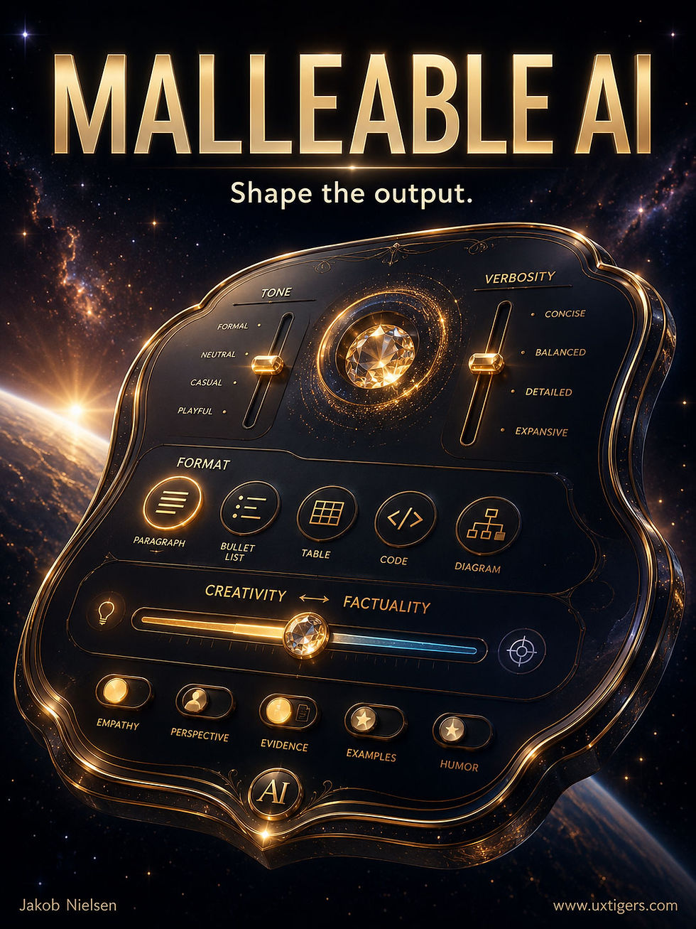
Users would benefit from a full set of controls to shape AI results without the need to articulate their needs in verbal prompts. (GPT Image 2)
Action Items for Designing AI Products
For UX designers building the next generation of AI tools, the transition from static chatboxes to malleable interfaces requires understanding both user psychology and model limitations. Here is how to design future AI products:
1. Move Beyond the Chat Paradigm
The chat interface is a starting point, not the finish line. Replace text-input boxes with direct manipulation widgets for common adjustments. Give users sliders, toggles, and dropdowns that interact directly with the generated text.

Let’s abandon the current command-line UI for AI and base the user experience in semantic manipulation of a canvas where the user and the AI can co-create the desired result. (GPT Image 2)
2. Design for Model Inconsistencies
Don’t assume an LLM can natively handle a smooth 5-point slider. Because models struggle with granular changes, rely on fewer, more distinct options (e.g., a 3-point scale like Beginner, Intermediate, Expert) to ensure changes are perceptible and reliable.
3. Make System Changes Visible
When users adjust a control, they need to know what changed. In the study’s prototype, the UI explicitly highlighted sentences that differed from the previous version. Future AI products must include visual diffs or highlighting to provide immediate feedback so users don’t have to re-read the entire output.

In an iterative AI creation process, the UI should follow usability heuristic 6, recognition rather than recall, and show users what changes have been made, instead of relying on them to remember their request. (GPT Image 2)
4. Anchor Controls in Relatable Concepts
A slider labeled “1 to 5” is less effective than one anchored in user-centric concepts. The study found success using specific audience personas. Use clear, relatable anchors rather than abstract numbers or backend parameters.

Instead of abstract values, such as “complexity 1–5,” usability is enhanced by describing parameter choices in human terms, such as “postgraduate student” in a design targeting academics. (GPT Image 2)
Users are ready for an era where AI feels like a precise tool rather than an unpredictable conversationalist. By designing intuitive controls that mask backend inconsistencies, UX professionals can deliver the controllable AI experiences users crave.
Constraints: Good Design Makes Errors Impossible
A constraint limits what users can do so they can’t do the wrong thing. The best error message is the one users never see, because the design made the error unmakeable. But over-constrain, and helpful guardrails turn into handcuffs that lock out legitimate use.

Guardrails at work: the design’s walls carry users past the spike pits without demanding willpower, memory, or a manual. Nobody misses the pits. (GPT Image 2)
Definition: A constraint is any property of a design that restricts the set of possible actions, ideally leaving the correct action as the obvious or only choice.
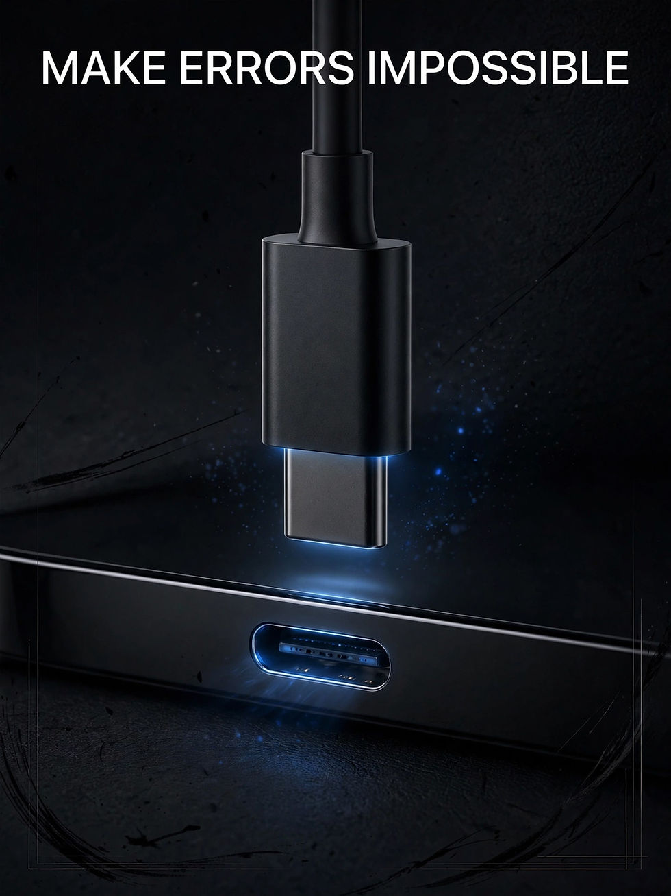
A USB-A plug cannot enter a USB-C port, while a USB-C plug works in either orientation. The connector prevents both category errors and orientation errors. Finally, good cable usability! (Meta Muse Image)
The concept entered the design vocabulary through my good friend Don Norman’s 1988 book The Psychology of Everyday Things. (Later retitled The Design of Everyday Things after bookstores kept shelving it under psychology, where designers stupidly never browsed. Even book titles have findability problems.) The name is refreshingly literal: to constrain is to restrict, and that’s the entire trick. Norman identified 4 flavors: physical constraints (a USB-C plug fits only its port), semantic constraints (a rider must face forward, so the windshield’s meaning dictates its placement), cultural constraints (red means stop), and logical constraints (one part and one hole left, so the part goes in the hole). His famous demonstration had people assemble a 13-part Lego motorcycle without instructions: the constraints permit essentially one configuration, so everyone succeeds.
Norman’s strongest weapon in this family is the forcing function: a constraint that physically blocks progress until the dangerous condition is resolved. Early cash machines dispensed money first and returned the card afterward, and users, having achieved their goal, walked off leaving cards behind by the thousands. Reversing the sequence, card before cash, eliminated the error outright. The microwave that won’t run with the door open works on the same principle. Nobody reads a warning label at the moment of error; a forcing function doesn’t need to be read.

Early ATM designs gave users their money first, causing many people to forget their bank cards in the machine. (Maybe the designers aimed at immediate user delight, which is often a worthy goal.) Newer designs require users to retrieve their cards before they get their money. Problem solved by adding a constraint to the payout process. (Meta Muse Image)
Prevention Beats Cure
Error prevention is #5 of my 10 usability heuristics, and constraints are its sharpest tool, because they stop errors at the source instead of mopping up afterward. Consider the humble date field. A free-text box invites 2/7/26, 7/2/26, February 7th, and a support ticket. A date picker that shows a calendar and grays out the past for a hotel search makes the invalid dates unclickable. The whole class of error is gone, along with the validation code, the error message copywriting, and the user’s embarrassment.

A date picker constrains users to only book flights, reserve hotel rooms, or request shipping delivery on dates that make sense. (GPT Image 2)

Constraints can help users make sense of their options by preventing choices that won’t work. (Meta Muse Image)
The same logic runs through good interfaces everywhere: grayed-out menu commands that don’t apply to the current selection, character counters that stop a headline at the limit, sliders bounded to the legal range, and checkout wizards that won’t offer shipping options until an address exists. Each constraint removes a failure mode and lightens the user’s thinking, since fewer possibilities need evaluating.
And there’s money in it. Baymard Institute’s checkout research finds that nearly 1 in 5 US online shoppers has abandoned an order because the checkout was too long or complicated, while the average US checkout flow displays a whopping 23.48 form elements. Every field you delete or convert into a constrained control is a field that can no longer be filled in wrong. Fewer errors, fewer abandonments, more revenue.
Handcuff UX: When the Guardrail Grabs the Steering Wheel
Now for the failure mode, which I’ll call handcuff UX: constraints so rigid they block legitimate behavior. The designer imagined one kind of user and welded the interface to that fantasy.
The classics are depressingly durable. Name validators that reject the apostrophe in O’Brien or the 2 letters in Ng (a name that “clearly” cannot exist, except for the 524,898 people named Ng, which is a lot of customers to lose because of handcuff design). Phone and postal-code fields that accept only US formats, informing millions of real customers that their addresses don’t exist. Country dropdowns with 195 entries when typing 3 letters would do. Password rules demanding exactly 1 uppercase, 1 digit, and 1 hieroglyph, a practice the US standards body NIST formally recommended against in its 2017 guidance (SP 800-63B) because composition rules annoy humans more than attackers. And the silent killer: the disabled button with no explanation, leaving the user to play detective over which of 14 fields the design secretly dislikes.

The computer should accept input in a range of formats and not force a single approach. Why reject the pigeon’s stick because it doesn’t look exactly like the beaver’s? (Meta Muse Image)
Fortunately, the fixes follow a few clear rules. First, accept and normalize: let users type a phone number in any reasonable format and clean it up in code, because reformatting is the computer’s job, not the customer’s. Second, prefer the soft constraint: when a value is suspicious but possibly legitimate, warn instead of block. Reserve hard blocks for actions that cause real, near-irreversible harm. Third, every disabled control must say why it’s disabled, or better, stay enabled and explain on activation. Fourth, test your validation against reality: international names, foreign addresses, edge-case dates. Your users were not all born in Ohio.
8 Design Guidelines for Constraints
Make invalid options unpickable. Use pickers, steppers, and bounded sliders so out-of-range values can’t be entered at all.
Gray out, don’t hide. Show unavailable commands in disabled form so the feature remains discoverable, and explain what would enable them.
Sequence only when order matters. Use wizards for genuine dependencies; otherwise let users roam freely among steps.
Accept flexible input. Parse dates, phones, and card numbers in any common format and normalize behind the scenes.
Warn softly, block rarely. Flag suspicious values with a confirmation; reserve hard stops for destructive or irreversible actions.
Deploy forcing functions for danger. Require retyping a project’s name before deletion; require the card back before the cash.
Validate against the real world. Test forms with international names, addresses, and characters before shipping, not after the complaints.
Never punish the honest edge case. When a rule rejects input, offer a path forward (an “other” option, a free-text fallback, or human help).
A good constraint is invisible in use and missed only in its absence, while a bad one announces itself every time a real customer gets rejected for being insufficiently imaginary. Guardrails keep users on the road; handcuffs keep them from driving. Build the first kind.

UI constraints increase usability as long as they don’t stray into handcuff territory. (Meta Muse Image)
Muse Image Puts Meta Back in the Image Race
Meta (Facebook’s parent company) has launched a new image model named Muse Image (and a new video model), touted as the “first media generation models developed by Meta Superintelligence Labs.” Is it superintelligent? No, but at least the new image model is actually intelligent and integrated with a general AI model.
I uploaded the full text of today’s newsletter (minus this news item about Muse, which I was still writing) to Meta AI and asked it to draw 4 infographics about the content. You can see the results below. Clearly, the model read my document and understood the material, since it created relevant infographics that highlighted the most important findings I’m reporting.
The information design is competent, but the aesthetics are stock AI: clean, legible, and profoundly boring, defaulting to the familiar visual grammar of AI infographics: stacked cards, oversized percentages, generic icons, and little editorial point of view.
I still maintain that OpenAI’s GPT Image 2 is the best image model, and you can compare the Muse infographics with the illustrations I made with the GPT model for the previous stories in this newsletter. I have tended to use GPT more for hero graphics, cartoons, and comic strips than for infographics, because I don’t think its infographics are fully up to my standards. I did make a few infographics with GPT for this newsletter, so you can compare for yourself: which model is best?
As a further test of Meta Muse Image, I asked it to draw funny cartoons and hero posters about my story about constraints in UX design (see above). Of the 20 images it gave me, I’m running 5 with that story: USB-C photo, ATM card photo, date-picker cartoon, beaver cartoon, and car-and-handcuffs poster. I would say all of these are good illustrations, even though the hit rate of 25% useful generations is slightly lower than what I usually get from GPT.
Overall: good job, Meta Superintelligence Labs! I am very happy to see renewed competition in the AI image-generation space. GPT Image 2 has worn the crown uncontested for too long. Let’s hope Google picks up the gauntlet with Nano Banana 3 and ByteDance gives us something amazing with Seedream 6.


(Meta Muse Image)
Seedream 5 Pro: ByteDance’s Improved Image Model
We’re getting an embarrassment of riches in image generation. Not only did Meta release a strong new image model (see story above), but ByteDance released an update to the leading Chinese image model, Seedream 5 Pro.
However, while ByteDance’s Seedance 2.0 4K is the world’s best video model, its sister model Seedream 5 Pro can only be classified as a runner-up in image generation. It’s good, and a year ago it would have been considered the best, but now I’d rather use OpenAI’s GPT Image 2 (the best), Meta’s Muse (the second-best), or even Google’s Nano Banana 2 (the bronze winner).
Sorry, ByteDance, you didn’t even medal with this try.
As an example, I am currently working on a comic strip with my recurring narrator characters Alice and Zimo in a new style, minimal watercolor. Here are the character reference sheets for Zimo:

Zimo character sheet generated by GPT Image 2 (top) and Seedream 5 Pro (bottom)

Close-up view of the full-body watercolors of Zimo by GPT (left) and Seedream (right).

The face close-up drawings by GPT Image 2 (left) and Seedream 5 Pro (right).
First of all, both models did well. If we didn’t have three better models, I would have been happy to use Seedream 5 Pro’s character sheet.
But the comparison makes it clear that Seedream 5 Pro doesn’t quite make it into the top league of current image models. It draws Zimo well enough, but GPT’s version more closely resembles how Zimo is drawn in the other cartooning styles I have used (three of which were provided as reference images). GPT nails the minimal watercolor style, whereas Seedream 5 Pro only approximates it, especially in the close-up portrait.
Finally, Seedream 5 Pro’s character reference sheet is littered with typos. The face close-up annotation reads “Neat dlack hud gray at temps.” What? If I wanted to make an animated movie starring Zimo, how would the video model make sense of this character sheet?
This exposes an emerging AI-to-AI usability problem. Generated artifacts increasingly serve as handoffs from one model to another in larger AI workflows, so they need machine legibility as well as human legibility. Garbled labels are not cosmetic defects; they corrupt the external memory that a later agent is supposed to use. A character sheet is both a human reference and a sort of API between creative agents.
This isn’t to say that GPT Image 2 is perfect. For example, in the full character sheet, you can see that Zimo’s pocket square is folded differently in the “accessories & details” section than in the full-body rendering. That’s one detail that Seedream 5 Pro did better, though still not 100% correctly. (Pocket squares may be too rare these days to be richly represented in the training data, even though I am a natty dresser and still favor them, which is why I gave Zimo his pocket square.)
Image-Model Shootout
A final challenge: draw my medal podium of winning image models as a satirical cartoon in color ink drawing style. For each model, I picked the best of 4 generations to show you. For completeness, I posed this challenge to two more leading image models, Grok Imagine and Reve 2.0.

GPT Image 2

Meta Muse Image

Nano Banana 2

Seedream 5 Pro

Grok Imagine
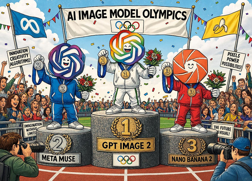
Reve 2.0
Which cartoon do you like best? That’s a matter of taste, but I do think Reve 2.0 failed the test by drawing Meta Muse with OpenAI’s logo and omitting the obvious idea for a satirical cartoon: drawing Nano Banana as a banana. (Bananas are funny, so they are mandatory cartoon elements when applicable.) In another test image, Reve used Meta’s logo for Meta Muse, but then made a similar mistake, repeating that logo for GPT instead of OpenAI’s logo.
In this test, Seedream 5 Pro rendered the GPT robot with 3 arms. Admittedly, who’s to say how many arms a robot has, but I classify this as a rendering mistake. (GPT makes similar mistakes from time to time, though I usually reject extra arms, so you rarely see them in the newsletter.)
I personally feel that Nano Banana’s cartoon is too simplistic, but clean images have their own strength, especially if you want to use them on social media, which is often consumed (doomscrolled!) on small mobile screens. I also like its conceit of drawing the third-place banana in a pixelated style. Finally, the Banana and Grok were the only models with enough cultural breeding to evoke the muse as a real Greek goddess.
Speaking of muses, a final challenge, now in photorealistic style: show all 9 muses with their traditional attributes. Best of 4, but only from GPT Image 2 and Meta Muse Image. (I gotta give the Muse my muse challenge.)

The muses by GPT.

The muses by Muse.
All wear proper Greek outfits. I like Urania’s starry dress in both images, since she’s the muse of astronomy. I also like that Muse (clearly the most muse-centric of these models) shows Thalia being happy, Melpomene being sad, and Terpsichore dancing. (They are the muses of comedy, tragedy, and dance, respectively.)
In terms of art direction, I generally prefer GPT’s tighter shot to Muse’s wider framing. When you have 9 people in a photo, you need to go close. However, GPT’s idea of having 4 of the muses sit on a bench gives Terpsichore an oddly raised arm as her only dance move. Now that I have seen multiple images, I might want a new iteration where I impose my own art direction on top of the AI’s ideas, directing Terpsichore to dance in front of the other 8 muses.
GPT 5.6 Sol vs. Anthropic Fable 5
Several new thinking models launched last week: Meta’s Muse Spark 1.1, xAI’s Grok 4.5, and OpenAI’s GPT 5.6 Sol. In some ways, the big story is that Meta is back in the game. Meta Superintelligence Labs drinks from Facebook and Instagram’s money firehoses and could take its models very far in the next release. Both Spark 1.1 and Grok 4.5 are at roughly the same intelligence level as Anthropic’s and OpenAI’s previous models (Opus 4.8 and GPT 5.5, respectively).
Competition in AI is good for the world. (There’s also a high-end Chinese model from Zhipu/Z.ai: GLM‑5.2, which most analysts rank slightly below the top American models but has the dual advantages of being open-weight and much cheaper to run.)
While cheaper models and more competition are both interesting, what matters most to me is how far we’re pushing the AI frontier with the very top models, which are currently Fable 5 and the new GPT 5.6 Sol. (Rumors are strong that both labs have even better models almost finished, though release to the public might be delayed by the US government’s newfound eagerness to control AI.)
I asked GPT to synthesize the AI influencers’ current take on these two top AI models in a comic strip. In fact, I did this twice, once with the old GPT 5.5 model and once with the new 5.6 Sol Ultra model. (The “Ultra” designation refers to a new capability that lets GPT spawn multiple copies that work on the user’s problem in parallel, which provides an extra lift in intelligence at the cost of using many more tokens.)
The first 3 pages are from 5.5, and the last 3 pages are from 5.6. Both thinking models use the same rendering engine, the GPT Image 2 model, so their line work and rendering fidelity look similar at first glance. The differences arise upstream, in what the reasoning model chose to select, omit, sequence, and emphasize: the thinking model is the art director, while the image model serves as its craft department.
Two differences stand out:
In terms of storytelling, the old AI model’s comic strip is easier to follow. It makes clear that Fable is better at writing and creativity (something I’ve also found in my testing), whereas Sol is better at practical work. The relative strengths of the two are less clearly explained in the new model’s comic strip.
In terms of art direction, the old AI model suffered from overly detailed comic panels. This has also been true in most of the comic strips I have made with it during the last few months. In contrast, the new model seems almost absurdly austere, drawing sparse comic book pages. I may have to relearn how to steer the AI to get the comic strips I want.
Because the rendering engine stayed constant, this comparison isolates the thinking model’s role as a hidden art director. It decides panel density, narrative redundancy, visual emphasis, and how much detail the renderer should allocate. A more intelligent model can therefore produce a subjectively worse comic until the user learns its new aesthetic control surface.
Model upgrades also create prompt depreciation: instructions calibrated to yesterday’s model can overshoot or undershoot today’s. This is a real usability cost that benchmarks rarely capture. In production workflows with accumulated prompts, templates, and style guides, behavioral stability is sometimes worth more than a small gain in raw intelligence.


We now switch to the comic pages drawn by the new GPT 5.6 Sol running in Ultra mode. They were drawn during a fresh session, which led the model to switch the color-coding used for the two AI systems in the story. In the first 3 pages (by GPT 5.5), Fable is orange, and Sol is blue. In the following 3 pages (by GPT 5.6), Fable is blue, and Sol is orange. This continuity error is an artifact of my generating this strip in two rounds without instructions to carry over the color-coding. (Alice and Zimo’s outfits are consistent because they are defined in their character sheets, which both models worked from.)


Execution Is Becoming Abundant; Direction Is Not
Across this week’s stories, the same shift keeps reappearing in different disguises. Agents collapse hours of execution into minutes. Non-engineers build software. Users want explanations that change at the flick of a control. Image models turn a newsletter into illustrations. AI is swallowing the how of knowledge work, which moves the human bottleneck upstream to deciding what should be made and downstream to deciding whether the result is any good.
When execution was expensive, nobody could afford to realize mediocre ideas. When execution becomes cheap, anybody can generate 10 plans, 20 images, and a working prototype before lunch. This creates an abundance paradox: the cheaper production becomes, the more valuable good constraints become. Without goals, boundaries, reference artifacts, and success criteria, cheap generation produces an expensive swamp of plausible output.
That’s why the stories about agents, expertise, complexity controls, and constraints are really variants of the same story. A slider is a compact way to express intent. A character sheet is a constraint system for visual identity. A story bible is memory made portable. A verification dashboard turns expert judgment into a repeatable step. Each moves essential knowledge out of the user’s head and into the workflow, where both people and agents can act on it.
The image-model comparisons make the same point. Muse can understand a source yet settle for generic information design. Seedream can draw an attractive Zimo yet corrupt the labels needed for the next production step. The same renderer can produce different comic pages because a different reasoning model made different editorial choices upstream. Quality is no longer a property of one model or one output; it emerges from the whole chain of planning, execution, selection, verification, and correction.
The next great UX challenge is therefore to design the management layer for machine abundance. Help users articulate intent before execution, constrain the agent without handcuffing legitimate variation, reveal changes and uncertainty during execution, and make verification and recovery fast afterward. The winning AI product will not merely have the smartest model. It will give human judgment the greatest leverage over machine execution.
Execution is becoming a commodity, making direction the differentiator.


Meta’s Muse Image did a decent job here, interpreting my character sheets from GPT Image 2 (I didn’t feed it the bad character reference from Seedream 5). It could be better, because both characters look too young. Even so, this concluding comic underscores that AI-produced artifacts can become constraints during the handoff from one AI model to another.


