
UX Roundup: AI Agents Help Blind Users | Style Exploration | Recognition: Show Options | Synthetic Users Help Designers Reflect | Local Optimization | Fail Early | Before–After Sliders | Error Message

Summary: Current AI agents help blind users at least as well as screen readers in separate studies and may already do better | Decompose styles into elements you can choose and combine | Show users their options to spare them the burden of recall | AI-simulated users can help designers think through how people will use a design | Optimizing individual elements can undermine the whole user experience | Fail while design changes are still cheap | Before–after sliders make visual comparisons easier | Error messages should rescue users and their work | Users who believe they can succeed are more likely to persist | Test AI with your own tasks before buying

UX Roundup for September 25, 2026 (GPT Image 2)
AI Agents Get Half of Blind Users’ Computer Tasks Right: Half Full, Half Empty, and Filling Fast
In a 3-week field study, an AI agent fully completed 53% of the 1,258 real desktop tasks that 8 blind users delegated to it. Graded against perfection, that’s little better than a coin toss. Graded against the realistic alternative (screen-reader users complete roughly 25–55% of tasks in the studies discussed below, after 30 years of accessibility work), the agent is already competitive.
And agents have improved by about 30 percentage points a year on desktop benchmarks, whereas screen-reader accessibility improves by 1–3 points a year, if that.
Half of 1,258 Real Tasks
Satwik Ram Kodandaram and co-authors from Stony Brook University and Old Dominion University built a screen-reader-accessible shell called OLLA around a computer-use agent and had 8 blind screen-reader users run it on their own PCs for 3 weeks. The participants issued 1,258 commands across 12 applications, chiefly Word, Excel, and PowerPoint. Their requests included “insert a table with 4 by 4 cells” and “save this file as a PDF.”
With GPT-5 as its brain, the agent fully succeeded at 53% of the commands, got partway through 34%, and failed outright on 13%. The 4 other models scored 38–49%, so the vendor mattered less than the limitations they shared.
The failures were prosaic: hallucinated controls, options hidden behind a dialog the agent never opened, and an export dialog navigated perfectly until the agent neglected to click Save. Even the partial completions averaged 68% of the required steps. The glass is at least half full.
The study has three limitations. A sample of 8 users is small. Participants chose their own tasks; some avoided banking and passwords, and some stopped delegating task types that kept failing, so the 53% figure describes only the tasks blind users were willing to hand over. And the study has no screen-reader-only control condition, which is the comparison that matters. Earlier studies give us a useful, though imperfect, reference point.
The Realistic Alternative: Screen Readers Score 25–55%
A 50% success rate needs a realistic yardstick. Harold Demsetz named the nirvana fallacy in 1969: judging a real arrangement against an ideal instead of the available alternatives. For a blind user, the practical alternative is a screen reader, and decades of studies put success with screen readers on realistic tasks at roughly a quarter to a half.

(Links: UK Disability Rights, Jonathan Lazar, Wesley Reuschel, Kodandaram and co-authors, Nan Chen. Note that for the 2004 UK study, I’m reporting the success rate for the blind participants. Study participants with other disabilities had higher success rates.)
Across 20 years of studies, measured usability for blind users shows little sign of improvement. Traditional accessibility has failed these users.
The last two table rows offer the closest comparison with the new AI data: the same research groups, applications, and kinds of tasks. The other studies in the table are less directly comparable, but they still give us a rough indication of how well traditional accessibility works. A 2025-vintage AI agent already performs in the field near the top of the screen-reader range, even though screen-reader technology has had 30 years to mature.

The AI agents of August 2025 (when the GPT-5 version used in the study was released) are only about half right when helping blind users. Compare that performance with these users’ realistic alternative: screen readers, with which users completed between 25% and 55% of tasks in the studies discussed here. (GPT Image 2)
Two Slopes: Accessibility Drips, AI Gushes
Today’s scores are roughly tied, but the rates of improvement differ enormously. Slopemarking (judging a technology by the slope of its improvement curve as well as today’s score) should inform both a blind user’s tool choice and a design team’s roadmap.
Screen-reader accessibility has the slope of a dripping faucet. WebAIM’s annual scan of 1 million home pages found detectable WCAG failures on 98% of pages in 2019, 95% in 2025, and 96% in 2026. That’s an improvement of 2 percentage points in 7 years, or roughly 0.3 percentage points per year. Glacial.
In WebAIM’s 2024 survey of 1,539 screen-reader users, only 35% said the web had become more accessible over the past year, and the ranked list of top problems is “largely unchanged over the last 14 years.” The most generous trend I could find is the pair of job-application studies in the table: 28 percentage points in a decade, measured with expert testers. Call it 1–3 points a year.
AI has the slope of an open tap. On OSWorld, the standard benchmark for desktop computer use (revised in mid-2025), the best agent scored 12% in April 2024, 38% in January 2025, 61% in September 2025, 73% in February 2026 (past the 72% human baseline), and 85% by June 2026: a whopping 33 percentage points a year.
The evidence specific to blind users is thinner but points the same way. On VizWiz, a benchmark of visual questions asked by blind people (PDF), accuracy rose from 48% in 2018 to 76% in 2024 (PDF): about 5 points a year in the pre-agent era.
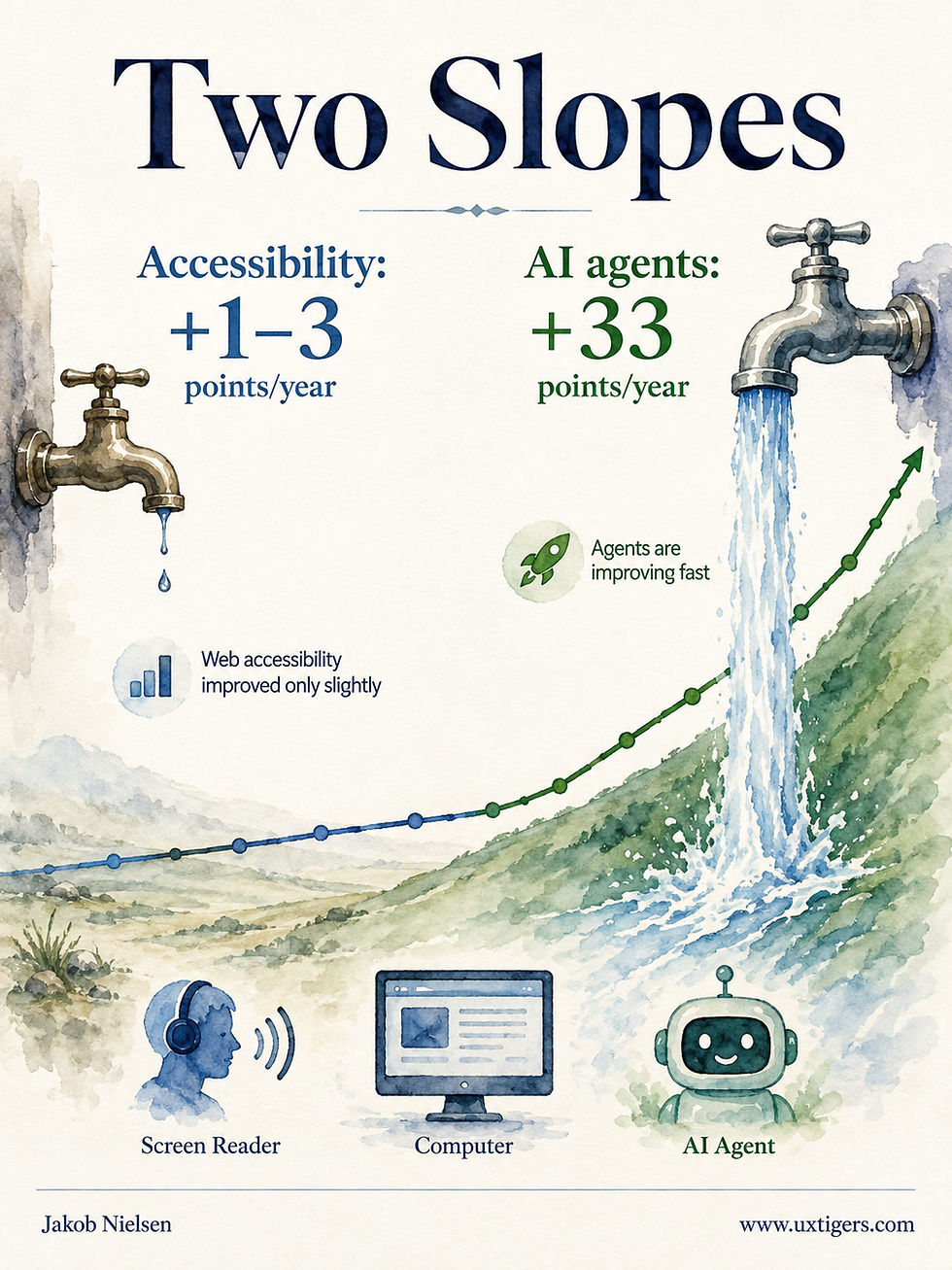
Traditional accessibility improves at less than a tenth of the rate of AI-fueled accessibility in these comparisons. I expect AI to become by far the best solution for disabled users very soon. (GPT Image 2)
And the accessibility gap inside AI is a fixable design problem: Ananya Gubbi Mohanbabu and co-authors (CHI 2026) found that the same agent completed 78% of tasks with free use of the mouse but 42% when restricted to the keyboard-only interaction that screen-reader users rely on. AI vendors should make closing that gap a priority for the next release. The web’s accessibility gap has persisted for decades.
Do the arithmetic. At even 1/3 of the OSWorld pace, or 10 percentage points a year, I project that agents for blind users will surpass the 72% benchmark for sighted users in 2028. A screen reader starting from 27% and gaining 3 points a year might get there in 2039. I predicted in February 2025 that disabled users would predominantly use semi-autonomous agents by 2027. My reading of this study puts that prediction about a year behind schedule and otherwise on track.
Conclusion: The Glass Is Filling
If you’re blind, delegate the tasks agents already handle (formatting, single-step operations, and finding a setting) and keep the screen reader for the jobs the agent leaves half done. I expect the balance to shift toward agents within 2 years.
If you build agents, the participants asked for help they could follow and control: “tell me where I am, what options are available, and what I should do next,” confirmation before anything hard to undo, and a completion signal that actually means done. Nonvisual progress feedback for long-running agents matters especially here, because a blind user can’t glance at the screen to check the agent’s work.
If you manage a product’s accessibility, remember that OLLA read the same Microsoft UI Automation tree that screen readers read. Accessibility metadata is agent metadata. Every labeled control now serves two clients, and the second client is growing fast.
I wrote in 2024 that accessibility has failed after 30 years of trying. The screen reader has sat under that dripping faucet for decades, without filling the glass much. The agent sits under an open tap. Half full beats a quarter full, and the AI glass isn’t done filling.
Artists Want AI to Take Styles Apart for Exploration
Style transfer is the slot machine of creative AI: upload a reference, pull the lever, and wait for whatever the model feels like showing you. A new paper by Wen-Fan Wang and co-authors, mostly from National Taiwan University (UIST 2026, Detroit, November), shows that professional artists want something else: a style taken apart into components they can pick from.
The team first interviewed 10 professional illustrators and concept artists, whose experience ranged from 4 years to more than 15 years. All described developing their style through a similar process: find an admired reference, break it down into composition, linework, color, lighting, rendering, and shape language, work out why each choice works, then fold selected elements into their own practice.
None used generative AI for this process, because AI images hide their rationale and arrive looking finished. One artist said GenAI output creates “a false sense of completeness.” Another said, “If I check AI results while creating, my ideas get locked in too easily.”

Take an existing style apart to understand how its elements work, then choose those that suit your new project. (GPT Image 2)
The wisdom is old. Peter Paul Rubens’s 17th-century treatise on imitation advised painters to study ancient statues closely but never let the marble show in the flesh. Absorb the virtues, leave the stone.

Rubens already warned us against fully literal style transfer. (GPT Image 2)
So the researchers built Analyze–Experiment–Resituate (AER). Analyze uses GPT-5 to decompose a reference into technical tags (composition, palette, lighting, and rendering style) and conceptual tags (emotional expression, intended message, and influences).
Experiment lets the artist drag chosen tags into a prompt and generates 4 variations of his or her own artwork, each with an explanation of what changed and why. Resituate summons 3 simulated critics: a professional artist, a trend-chasing social media audience, and a loyal fan.
Components Beat Copies = Prediction 13, Applied to Style
In a within-subjects test, 16 professional artists used both AER and a baseline modeled on the Midjourney workflow: upload a style reference and your own work, type a prompt, and receive 4 merged images. Both interfaces used the same image model.
With AER, the artists reported higher agency (+0.9 on a 7-point scale, Cohen’s d = 0.85), higher creative self-efficacy (+1.0, d = 0.88), and more reflection (+1.0, d = 0.92). These are all large effect sizes, and the interviews suggest why: with decomposed elements, artists could trace which choice produced which change.
But with the baseline, one participant described typing a prompt and then “waiting for whatever it wants to show me.” That’s the slot machine.

An all-or-nothing AI style transfer is too much like playing the slots: you can win the jackpot, but usually you lose. (GPT Image 2)
Prediction 13 in my 2026 predictions said image generation would stop feeling like a slot machine and start feeling like design software, with images as editable objects: layers, handles, and semantic sliders for mood or lighting hardness. This paper applies prediction 13 one level higher, decomposing style itself into elements artists can inspect. A style becomes a set of components you select and recombine, giving artists control over each ingredient. Direct manipulation beats reroll roulette.
The study’s limitations include self-reported questionnaire data, only one session per condition (advanced tools sometimes take time to learn), and no assessment of the quality of the resulting art.
Synthetic Fans Got 9.4% of the Artists’ Time
The field study is the telling part. A subset of 4 artists used AER for 2 weeks, averaging 9.6 hours each. They spent 65% of their time in Experiment, 26% in Analyze, and 9.4% in Resituate.
Across both studies, the artists’ reasons for neglecting the simulated audience match those I gave in 2024 in User Research with Humans vs. AI: simulated reactions can’t stand in for observations of real people. One artist would trust the feature only if it were grounded in actual audience data. Another dismissed the trend-audience persona’s output as “passerby comments.”

The artists saw little value in the feedback from the AI-simulated audience. (GPT Image 2)

The simulated audience delivered little value for a reason familiar from simulated usability testing: AI rarely produces the surprises that make watching real people so revealing. Those surprises are often the most useful findings. (GPT Image 2)
There were exceptions. Artists valued the professional-artist persona for critique and the fan persona for flagging what was being lost. One artist was reminded that a signature use of particle effects had vanished. AI can play the expert reviewer tolerably well, as in a heuristic evaluation, but it struggles to stand in for an audience whose reactions may surprise you.
Finding the checkout button has a right answer; predicting whether 50,000 fans will love your new rendering style is far less clear-cut, and taste shifts by subculture, platform, and month. I expect dependable simulated usability testing to remain years away, with simulated fandom farther off still.

The simulated fan persona added value by reminding artists to consider a fan’s perspective. Whether its comments matched what a real fan would say remains an open question. (GPT Image 2)
The authors, to their credit, say Resituate is meant for reflection and propose feeding future versions the artist’s real social media data. Good: one real fan beats any number of synthetic ones.
Conclusion: Give Artists Control Over the Ingredients of Style
If you design AI creative tools, apply these three lessons:
Decompose before you generate. Expose the components of a style (or a layout, or a brand) as selectable elements. Agency lives in the choosing.
Explain every variation. A generated option without a rationale is a lottery ticket. Explain the choices behind it, and artists can learn from the result.
Label synthetic feedback clearly as a thinking aid, and use actual audience responses as evidence as soon as you have them.
The artists in this study spent 91% of their time taking styles apart and trying on the pieces, and about 9% listening to synthetic fans. They got the ratio right.
Recognition Rather Than Recall
Human memory retrieves information in two ways, and they aren’t equally good. Recall demands that you dredge an answer out of bare memory. Recognition merely asks you to pick the answer from what’s in front of you, and people are far better at it. That asymmetry helped the GUI beat the command line: the menus of the 1984 Macintosh turned recall (type the correct command from memory) into recognition (spot it in a list).
I made “recognition rather than recall” one of my 10 usability heuristics in 1994, and it remains a moneymaker. Show users their options, make the likely choice visually prominent, and let their eyes do the remembering.

Good interfaces let users choose from visible options, sparing them an essay question when a multiple-choice answer will do. (GPT Image 2)
Sycophantic Synthetic Visitors Still Made Museum Designers Think
Another UIST ’26 paper approaches simulated users from the museum designer’s perspective: can they help while an exhibition still exists only as a floor plan? Huanchen Wang and co-authors from Southern University of Science and Technology in Shenzhen built SiMUSation, which lets a museum designer lay out galleries and about 20 artworks on a 2D grid, then release a crowd of LLM-driven visitor personas into the plan.
The personas draw on John Falk’s visitor-motivation types (explorers, facilitators, hobbyists, experience seekers, and rechargers), with characteristics sampled from real audience surveys. Each persona walks, stops, dwells, tires, and narrates its own confusion. (The stamina variable cites a 1916 paper on museum fatigue, but that’s the kind of human behavior that doesn’t change in a century.)

Humans don’t change. Many usability guidelines have exceedingly long lifespans as a result. (GPT Image 2)
In a 50-minute exhibition-design task, 12 designers (9 of them students) used the tool. On 7-point scales, they rated persona differentiation 5.4, but behavioral plausibility only 4.8, and 2 of them called the aggregate summaries overly positive even for layouts they had made deliberately confusing. AI flattery survives even in an empty museum.
Yet design insight scored 5.6, and 4 expert judges, unaware which layouts were the originals and which were revisions, rated the revised layouts about two-thirds of a point higher than the originals on narrative coherence and spatial organization.

The artificial personas’ behavior wasn’t especially plausible, but their comments still prompted designers to reconsider their choices. Even complaints that no real museum visitor would make can spark a useful insight about the design. (GPT Image 2)
Compare this with my previous news item. Synthetic visitors earned their keep much as the artists’ synthetic fans did: they prompted reflection. Their comments provided no evidence about real visitors. The designers said as much. They wanted a critical reviewer that helped them see the plan as a stranger might, while leaving layout decisions in their own hands.
The study has two limitations. A second draft usually beats a first draft, so the improvement in expert ratings can’t all be credited to the simulation. And nobody walked real visitors through either version to check whether the synthetic crowd predicted the flesh-and-blood one. That’s the study I want. Until it exists, simulated visitors are a cheap way to argue with yourself before the walls go up.

In museum design, as in any other UX project, I recommend observing actual users and asking them to think aloud as they move through the experience. (GPT Image 2)
Nobody Optimized the Whole Page
Every popup on this screen passed somebody’s A/B test. The newsletter modal lifted signups; the notification prompt lifted opt-ins; each team shipped its local winner. So the user now faces 8 simultaneous demands before reading a single word of content. The page has laid siege to its own visitor.
Nobody tested the combination, because nobody owns the whole page. Locally optimal popups are globally user-hostile. Measure the full journey: count the interruptions between arrival and content, and cap that budget at one. Zero is better.

Rate your experience? She just did. Every extra popup gives her another reason to withhold a star. (GPT Image 2)
Let the Design Fail While It’s Still in Rehearsal
Theater companies use dress rehearsals to discover which scenes fall flat before opening night. UI prototypes serve the same purpose: a cardboard version of the interface, performed in front of test users while the stakes are still measured in tape and paper.
Every flaw found at this stage costs a revision. The same flaw found in production costs customers, revenue, and a dent in the brand that no patch release buffs out. And prototypes need no code, so you can rehearse three competing designs before engineering could build half of one. Cheap failures now prevent expensive failures later. Break a leg, then fix it.

Cardboard: the only material that fails politely. (GPT Image 2)
Before–After Sliders Beat Side-by-Side Comparisons
Dragging a divider across two perfectly aligned images or video clips shows exactly what changed, overcoming the change blindness that hampers side-by-side comparisons. The pattern succeeds only with pixel parity between the two versions and a handle users can actually find.
Definition: A before–after slider (AKA image comparison slider) stacks two images or videos of the same subject in exact alignment and lets the user drag a divider across them. Everything to the left of the divider shows the old version, and everything to the right shows the new version, with the change applied.

“Before” on the left, “After” on the right, one handle between them. The interactive version earns trust when both images show the same scene, the same framing, and the same pixels, apart from the change itself. (GPT Image 2)
From Hair-Tonic Ads to Disaster Journalism
The before-and-after pair is one of advertising’s oldest persuasive devices: paired photographs have sold weight-loss regimens and hair tonics for more than a century. The interactive version grew up inside photo-editing software as the preview wipe, then reached the mainstream through journalism.
In 2014, Alex Duner, then an undergraduate fellow at Northwestern University’s Knight Lab, built JuxtaposeJS, a free tool that turns 2 image URLs into an embeddable slider. Newsrooms adopted it for satellite views of disasters, city skylines a decade apart, and website redesigns. The name gives you the specification: a before image, an after image, and a slider between them.
Change Blindness Makes Side-by-Side Comparison Hard
The slider has an advantage over placing the 2 images next to each other because human vision is shockingly bad at comparing separated pictures. Ronald Rensink (then at Nissan’s Cambridge Basic Research), Kevin O’Regan (CNRS, Paris), and James Clark (McGill University) demonstrated the phenomenon, called change blindness, in a landmark 1997 paper in Psychological Science.
Insert a brief blank field between alternating versions of a photograph, and observers fail to spot even large, repeated changes. In one of their examples, observers needed more than 10 seconds and 16 alternations to notice a change that becomes obvious once someone points it out.

People don’t spot changes easily. (GPT Image 2)
A side-by-side pair places a similar burden on visual memory. Every glance from the left image to the right image requires an eye movement, and the visual memory that survives that movement is far coarser than we believe. So the viewer shuttles back and forth, remembering fragments and missing plenty.
The slider removes the need for that back-and-forth glance: both versions occupy the same screen position, while the sweeping divider makes the difference appear to move. Motion grabs visual attention. An aligned overlay turns comparison from a memory task into a perception task, giving users a way to see changes that their memory might otherwise lose.
The interaction style helps, too. My good friend Ben Shneiderman coined the term direct manipulation in 1983 for interfaces offering a continuous representation of the object plus rapid, incremental, reversible actions. Scrubbing a divider back and forth over the exact region you want to inspect, at your own pace, is direct manipulation in its purest form. An animated GIF flipping between 2 states on a timer offers none of that control, which is why I find it far less persuasive.
Pixel Parity or Nothing
The slider’s persuasive power also invites abuse. The comparison is honest only under pixel parity: identical framing, zoom, lighting, resolution, and subject position, so that the single variable separating the 2 images is the change being demonstrated. Break parity, and the slider lies.
Shooting the “after” photo in golden light, at a flattering angle, with better posture is a century-old cosmetic-advertising trick. Users sense misalignment even when they can’t name it; the moment the buildings jump sideways as the divider passes, trust leaves the building.
Unintentional failures are less devious but still common:
The invisible handle. A slider without a visible grip is indistinguishable from a static image, so most users never discover the interaction, and the entire feature evaporates.
Unlabeled sides. Users need to know which side is “before.” Convention puts it on the left in left-to-right locales, but both sides need labels, visible at every divider position.
Gesture fights on mobile. A draggable divider inside a swipeable carousel starts a turf war at the user’s expense, while a divider dragged vertically competes with page scrolling.
Accessibility holes. A mouse-only divider with generic alt text serves sighted mouse users and abandons everyone else.
9 Design Guidelines for Before–After Sliders
Enforce pixel parity. Keep the framing, resolution, lighting, and subject position identical. When you can’t achieve parity, use labeled side-by-side images and stop implying a precision you don’t have.
Show a real handle. Use a grip of at least 44 pixels with left-right arrows, centered on the divider, and change the cursor when users hover over it.
Start the divider near 50% so both states are visible when the page loads; JuxtaposeJS made that its default for good reason. Shift the starting position only to spotlight a specific region of change.
Put the “Before” version on the left. This is the most common layout and also corresponds to the left-to-right reading direction in Western languages. (I honestly don’t know if it would be better to put “Before” on the right in, say, Arabic user interfaces. Anybody who has done that research, please let me know.)
Label both sides persistently. Keep “Before” and “After,” or better yet the dates, readable at every divider position.
Accept taps and clicks as well as drags. Click-to-jump rescues users who never discover that the divider moves.
Support the keyboard. Make the divider focusable and movable with arrow keys in 5–10% increments.
Write alt text about the difference. A blind user needs the specific change (“the retouched version removes the power lines and brightens the sky”). Two disconnected image descriptions leave the comparison unfinished.
Stay honest. Disclose retouching, and remember that in health and beauty advertising, the before-and-after format makes one of the industry’s oldest claims, with regulators watching accordingly.
For a century, the before-and-after pair asked audiences to trust the juxtaposition. The slider gives users control over the comparison: they can move the divider to inspect any region that raises doubts, then return as often as needed. That control makes the pattern persuasive, which obliges the designer to ensure the underlying images deserve such trust. Give users an honest view of what changed, and let them drag the proof wherever their questions lead.
The Best Error Message Is a Way Back
A good error message starts a rescue operation. It tells users what went wrong, protects the work already completed, and offers a practical route forward. The life ring matters because someone is ready to pull.
“Try again” earns its place when another attempt has a reasonable chance of succeeding. If the same missing permission or invalid file will cause the same failure, the button merely schedules another shipwreck.

Error messages should protect completed work and offer a recovery action that addresses the actual failure. (GPT Image 2)
Consider a grant application that fails because one attachment exceeds the upload limit. Preserve the other files and every completed field. Identify the troublesome attachment, state the limit, and offer to compress it. Making applicants rebuild the submission charges them twice for the software’s failure.
In my article on designing user control for long AI tasks, I explain why recovery must preserve completed work and distinguish temporary failures from problems that require a changed approach. A dropped connection and a misunderstood instruction need different remedies.
Measure recovery by how much work users can save and how quickly they can resume. During testing, introduce a realistic failure and watch whether people understand their options without assistance. Also check that retrying won’t duplicate any actions already completed.
Friendly wording helps, but the mechanism must deliver the rescue. Nobody floating among the rocks needs a beautifully phrased account of the sinking.
Self-Efficacy Theory: Users Who Believe They Can, Do
Self-efficacy is a person’s belief in his or her own ability to succeed at a task, and it predicts whether people attempt tasks, how hard they try, and how long they persist after failure. Interfaces build this belief through early, genuine wins, and they demolish it with accusatory error messages and hollow praise.

Nobody hands users a finished staircase. Each successful step paints the next one into existence, and the design supplies the brush. (GPT Image 2)
Definition: Self-efficacy is an individual’s judgment of how capably he or she can execute the actions a specific situation demands. This belief routinely diverges from actual capability, so people’s confidence can misrepresent how much they can do.
That divergence has practical consequences. Imagine two users with identical skills sitting down at your product. The one who believes the task is doable pokes around, recovers from mistakes, and finishes, while the one who believes “I’m bad at computers” quits at the first ambiguous dialog box. Their different beliefs produce different outcomes despite identical software and skills.
Bandura Puts a Name on Confidence That Works
The Stanford psychologist Albert Bandura introduced the theory in his 1977 Psychological Review paper, Self-Efficacy: Toward a Unifying Theory of Behavioral Change (PDF). The name is plain Latin bookkeeping: efficacy is the power to produce an effect, so self-efficacy is your expectation that you, personally, can produce it.
Bandura’s striking evidence came from adults with severe snake phobias: those guided through actual mastery experiences, working step by step toward handling a live snake, improved far more than those who merely watched others or received reassuring talk.
Bandura identified 4 sources of self-efficacy, in descending order of power: mastery experiences (succeeding yourself), vicarious experiences (watching someone like you succeed), verbal persuasion (being told you can), and physiological states (how anxious your body feels). The ranking gives designers practical guidance: doing beats watching, watching beats pep talks, and calm beats panic.
The theory carried over neatly into our field. In 1995, Deborah Compeau and Christopher Higgins surveyed Canadian managers and professionals and found that computer self-efficacy shaped people’s expectations of computing, their anxiety, and their actual use. Belief drove behavior, long before “user onboarding” became a familiar label.
The 4 Sources Map Directly Onto Interface Design
Treat Bandura’s list as a design checklist:
Mastery experiences. Give the user a real, self-produced win quickly. My operational target: the first genuine success within 5 minutes of first use, achieved by the user’s own hands. Templates, sample data, and starter projects should make that first success achievable while leaving the accomplishment in the user’s hands.
Vicarious experiences. Show worked examples and community creations from people who resemble the user, because “someone like me did this” makes success feel attainable. A gallery of expert masterpieces can backfire; it tells novices that the bar is on the moon.
Verbal persuasion. Microcopy that says “You can undo this anytime” reassures more effectively than “Warning: this action has consequences.” And error messages persuade, too: as I’ve argued since publishing my 10 usability heuristics in 1994, an error message should state the problem in plain language and constructively suggest a way forward.
Physiological states. Anxiety corrodes self-efficacy, so lower the stakes: autosave, undo everywhere, sandboxes, and explicit reassurance that “nothing is published yet” help keep the user’s pulse (and self-assessment) steady.
Praise Inflation and Other Ways to Fake It
Design can damage self-efficacy in two ways: undermining justified confidence and inflating confidence beyond the user’s ability.
Confidence destruction is the familiar failure. Error messages that bark “Invalid input” or cough up “Error 0x80070057” assign the failure to the user while withholding the fix. After enough repetitions, he or she internalizes the verdict as “I’m bad at this.” The design failed, but the user takes the blame home. That’s learned helplessness, shipped as a feature.
Manufactured confidence is the newer failure. Confetti for completing a 2-field form, badges for logging in, “Amazing job!” after a trivial tap: this is praise inflation, the devaluation of celebration through oversupply. Smart adults notice they’re being patronized, and the currency stops buying anything just when a genuine milestone needs it.
Worse, inflated confidence can encourage risk: Robinhood showered confetti after stock trades until criticism (and regulatory attention) grew loud enough that the company removed the animation in 2021. Making users feel capable of something the interface has made dangerously easy can bait them into actions their competence doesn’t justify.
The fixes follow from the diagnosis. Celebrate in proportion to actual accomplishment. Guide users through the task, giving them real work to do. A wizard that does everything teaches nothing and leaves self-efficacy exactly where it found it. And write every error message as if the system were at fault, because it usually is.
7 Design Guidelines for Self-Efficacy
Deliver a genuine first win within 5 minutes. Design onboarding backward from one real, user-produced accomplishment, and clear everything else out of its way.
Let the user’s hands do the work. Guide with hints and defaults, but never complete the core task for the user; users gain mastery through their own actions.
Blame the system in every error message. State what went wrong in plain language and offer the next step. Leave out cryptic codes and scolding.
Show attainable examples. Feature work from ordinary users prominently, and clearly identify expert creations when you showcase them.
Make everything reversible. Undo, version history, and drafts lower anxiety, and calm users judge themselves more capable.
Celebrate proportionally. Save the fireworks for milestones a user would tell a colleague about. Ration the confetti.
Provide guidance, then ease it back. Reveal advanced capabilities progressively as competence grows, so yesterday’s ceiling becomes today’s floor.
The little engine’s refrain, “I think I can,” supplies a memorable slogan. Self-efficacy theory gives designers a more practical starting point: successful experience gives people reasons to believe they can succeed again. Every well-designed first task, recoverable mistake, and honestly earned success paints one more step of the staircase, giving the user firm footing for the next climb. The interface must keep supplying those steps.
An Impressive Demo Can Leave Users Thirsty
A demonstration can show that an AI system succeeds under conditions chosen by its maker. Your customers bring their own conditions, including awkward files, ambiguous requests, interruptions, and mistakes. That’s where the oasis must deliver water.

The oasis performed beautifully during the presentation. (GPT Image 2)
The wanderer’s question belongs in every product evaluation. A carefully prepared example provides a useful introduction, but purchasing decisions need evidence from the work people expect to perform. Otherwise, the sales presentation becomes a mirage with a subscription button.
My discussion of Design Theater distinguishes an AI tool’s persuasive explanation from the interface it actually produces. A promise of keyboard access or error handling means little until someone tries the relevant interaction. The same scrutiny belongs in evaluations of agents, research assistants, and other ambitious AI products.
Before committing, choose 5 representative tasks from your own work and define acceptable outcomes. Include a troublesome input and a necessary correction, then complete the tasks yourself. Judge the delivered result under realistic conditions. Record the repair effort alongside successful output, because cleanup consumes the same working day. A convincing palm tree is poor compensation for an empty canteen.
Final Thought of the Day


