
UX Roundup: Vigilance Fatigue | Adaptive Authoring | UI Clutter | Scenarios vs. Surveys for User Preferences | Measure Outcomes | Spotlight Features | Allow Paste | Ambient AI | Proactive Writing AI

Summary: Asking users to watch AI carefully is doomed to failure | Adaptive authoring of content that changes depending on the reader | A cluttered experience kills user focus | To predict patients’ treatment preferences, discussing medical dilemmas beat both survey responses and the patients’ own spouses | Measure outcomes, not vanity metrics | Spotlight the main features and keep specialized options backstage | Allow users to paste passwords | Ambient AI works in the background to proactively surface relevant information during meetings | Writers don’t know what to ask, so AI should speak first, softly | Information pollution: cheap to publish, expensive to read | Give users bigger images when they want to zoom to see details | Past work must have a name so it can be found

UX Roundup for October 2, 2026 (GPT Image 2.5)
Vigilance Fatigue Dooms “Human-in-the-Loop”
Human-in-the-loop sounds like a safety guarantee for AI. In practice, it fails.
Watch duty fails because detection of rare signals falls off a cliff within 30 minutes: when people monitor mostly empty streams of events, including AI output, they can’t stay vigilant.
Verdict duty fails because each routine approval an AI agent requests makes the next click more automatic, until the one request that mattered gets rubber-stamped along with the rest.
Exhortation has a perfect record of failure, so redesign the system.
I wrote an article about vigilance in UX, with 16 design guidelines for adjusting AI to human psychology rather than expecting users to do the impossible.
I also made a 2-minute explainer video about how vigilance fatigue dooms today’s human-in-the-loop safeguards for AI. I used Claude Opus 5.5 for this video and had to make only one change to its initial animations.

Requiring users to stay vigilant (and exhorting them to be more vigilant) won’t work. (GPT Image 2.5)
Adaptive Lyrics: Authoring the Performance, Not the Artifact
A listener sits at the gate for a late-night flight, leaving her hometown for a new job abroad. Journey’s Don’t Stop Believin’ comes on, and the verse has rewritten itself to be about her: her departure, her red-eye, her fresh start. The song wasn’t created until she pressed play.

The song rewrites itself as you listen, until it’s about your own life. (GPT Image 2)
That’s the opening scenario of a new paper by Alexander Wang and colleagues at Carnegie Mellon University, to be presented at the UIST 2026 conference. Their system, MultiVerse, lets songwriters author adaptive lyrics: words that regenerate at consumption time to fit each listener’s life.

One song, as many versions as there are listeners. (GPT Image 2)
Readers of my article The 3 Ages of Authorship and Creation will recognize the pattern. In the oral tradition, every performance was different: the skald read the room and bent the tale to the listeners in front of him. Writing, printing, and recording froze the work into a fixed artifact, identical for everyone. (Every copy of Thriller sounds the same in Tokyo and Toledo.) I predicted in that article that AI co-creation would recapture the oral tradition’s audience adaptation, regenerating parts of a work for each recipient. Two and a half years later, here’s the lab prototype.

In the oral tradition, the bard or skald would adapt the content during the live performance to suit the audience, adding extra praise for the ancestors of any king or nobleman in attendance. (GPT Image 2)
But the third age adds a twist no bard ever faced: the artists aren’t in the room. The AI performs on their behalf, for listeners they will never meet, producing variations they can never review. Thus the object of authorship changes. You no longer ship a song; you ship an adaptation envelope: the intent, constraints, and boundaries within which an algorithm may roam. Authoring behavior is a different creative act from authoring artifacts, and it needs different tools.

Shaping the adaptation behavior of a performance, instead of delivering the performance itself, is a new creative act (or maybe the revival of an age-old one). (GPT Image 2)
MultiVerse offers an early glimpse of what those tools might look like. Artists set global anchors for theme, emotion, and style, lock words that must survive every variation, bind rhyme pairs, and pin syllable counts and stress patterns to the melody. Deterministic rules (not AI vibes) validate every generated line against these constraints. Simulated listener personas let the artist preview how a song might mutate for a Berlin game designer or a Midwest truck driver before any real fan hears it. Previewing on synthetic audiences is a dress rehearsal for media that doesn’t exist yet.

Synthetic personas will never be a great way to evaluate product design, but such stereotypes can be a shortcut for early experiments. (GPT Image 2)
In their study, 10 experienced songwriters (averaging 9.2 years of songwriting) adapted their own songs with MultiVerse and with plain free-form prompting. With 10 participants and 20-minute sessions, no rating differences reached statistical significance. (20 minutes is barely enough to tune a 12-string, never mind a generative pipeline.) Still, the qualitative pattern was consistent: 8 of 10 songwriters associated MultiVerse with greater control, and ratings leaned its way for predicting adaptation behavior (4.8 vs. 3.8 on a 7-point scale).
The sobering result: asked whether they trusted either system to generate acceptable versions they would never review, participants averaged 3.0 and 2.7 out of 7. Below the midpoint for both workflows. Adaptive media stands or falls on exactly that trust.
So the tooling race has barely started. MultiVerse is almost certainly not the ultimate adaptive-authoring UI: we’re at the Xerox Alto (1973) stage of this paradigm, and its Macintosh (1984) remains to be designed. The durable contribution is the framing (the authors call it C³): creator intent, content structure, and audience context as three explicit dimensions to author.

Authoring content with deliberate gaps for audience adaptation is unlikely to be the final form of adaptive creation. It feels too primitive; superintelligent AI will surely offer better solutions within a few years. (GPT Image 2)
The study also confirms a smaller point I keep hammering. Prompts are splendid for expressing initial intent and lousy for precise manipulation. One participant complained about having to “guess about how much of the prompt the AI would follow.” Locking a word by clicking it gives a guarantee; describing it in prose gives a suggestion. As I argued in my Fitts’s Law article, AI shrinks the share of interaction spent acquiring targets, but the fine manipulations that remain deserve dedicated controls. Hybrid UIs beat pure chat.
One finding is worth savoring: some songwriters said their finished songs resisted adaptation, and they’d compose differently from scratch, designing variable slots into the lyrical structure. I predict adaptivity will become a compositional consideration from day one, the way responsive design reshaped web layout. Egil Skallagrímsson improvised a praise poem for Erik Bloodaxe and saved his own head; tomorrow’s songwriter will improvise for a million listeners at once without leaving the studio. The bard is back, now outsourcing the delivery.

In AD 948, the Viking Egil Skallagrímsson was taken captive by Erik Bloodaxe, the Viking King of Jorvik (today’s York) in Northumbria. To avoid execution, Egil improvised a poem praising Erik’s deeds and reputation; it pleased the king so much that he let Egil keep his head, letting the famous axe rest that day. This poem became famous as the Head-Ransom (Hǫfuðlausn). You may think of my ancestors as bloodthirsty killers, but they were also poets. Egil was both. (Muse Image)
Cut Clutter: Attention Is Zero-Sum
Attention is a zero-sum resource: every element on the screen competes with every other element, and each addition dims the rest. That arithmetic is bad news for pages stuffed with 12 simultaneous promotions.
It also explains banner blindness: users have learned to skip anything that screams for attention, and they’ve only gotten faster at it as web ads grew ever more obnoxious. Shouting louder doesn’t work when everybody shouts. The winning move is to give users less to ignore: audit your key pages and delete every element that fails to serve the page’s one main purpose. What remains will finally get seen.

Shout 10 messages at once, and users hear none of them. (GPT Image 2)
Discussing Scenarios Beats Static Questionnaires at Eliciting User Preferences
An AI agent predicted seriously ill patients’ treatment choices with 82% accuracy, against 55% for the patients’ own spouses and relatives. Two UX lessons: abstract value ratings added nothing once the AI had the user’s answers to a few concrete dilemmas, and adding a human in the loop to vet the AI’s predictions reduced accuracy by 20 percentage points.

This study found that asking people to make specific choices about concrete situations was an excellent way to assess their preferences. (GPT Image 2.5)
Ratings Say, Dilemmas Do
Natasha Ureyang and co-authors, mostly at the National University of Singapore, tested a GPT-5.5 patient preference predictor (prompting only, no population data) with 12 patient–surrogate pairs. Each patient rated his or her values on a survey, then resolved 5 medical dilemmas: a condition plus an intervention, with impairment, recovery odds, and pain varied (e.g., a stroke has left you paralyzed with a slim chance of recovery; do you want CPR if your heart stops?).
Patients explained each decision in free text and corrected the AI’s predictions, after which the AI predicted each patient’s answers to 5 new scenarios and got 82% right. The human relatives, 10 of them spouses, scored 55%, barely better than a coin toss (AI beat humans at p=0.002).
“AI is better than your wife” is one way to summarize this study.

After discussing medical dilemmas, AI outperformed the patients’ spouses at predicting preferred treatment choices. (GPT Image 2)

Abstract value ratings added nothing to the AI’s accuracy; letting humans revise its predictions cost 20 points. (GPT Image 2)
Remove the ratings, and accuracy didn’t budge. Remove the dilemmas, and accuracy fell 15 points, with false negatives tripling: fed only abstract values, the model predicted refusals that the real people never made. This is the say-vs-do gap in a hospital gown: people can’t report the weight they give “independence” in the abstract, but a concrete trade-off reveals it, and then they can explain it.
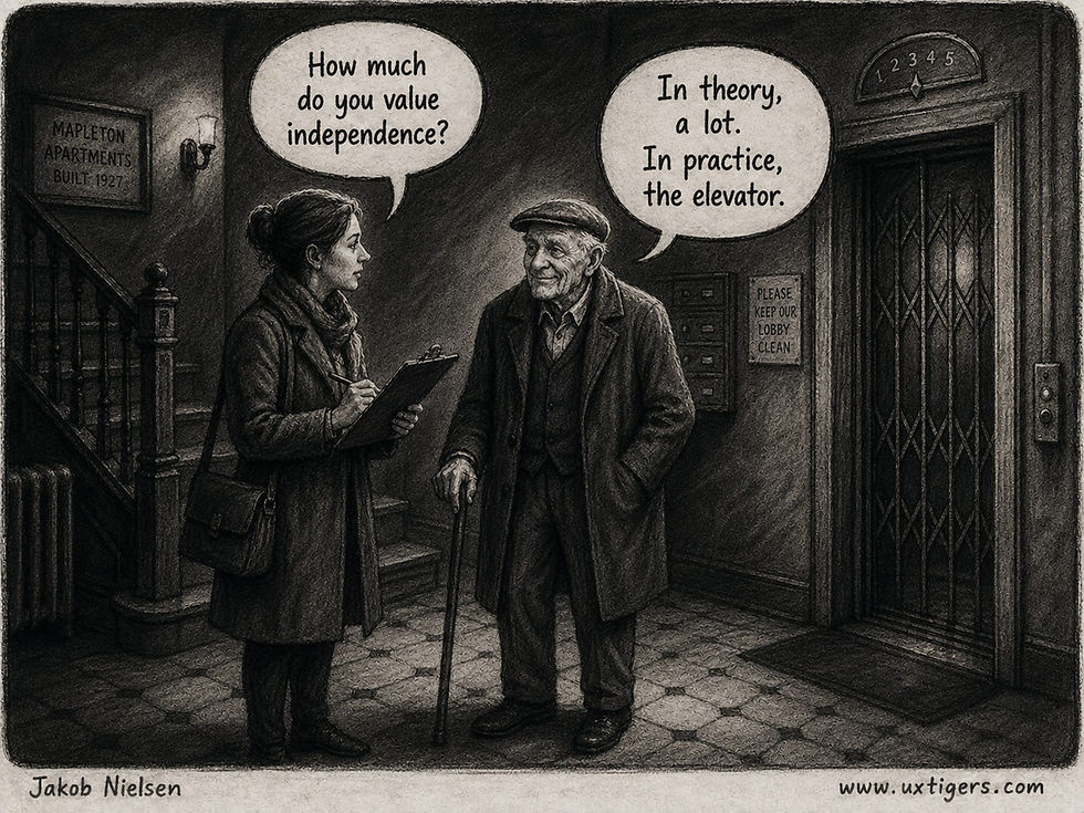
Ask people to rate a value, and you get their self-image. Ask them to choose, and you get their behavior. (GPT Image 2)
Too many onboarding flows suffer from Likertitis: rate how much you value privacy on a 5-point scale, then convenience, then speed, and the answers predict next to nothing. The cure: present 3–5 concrete situations and ask what the user would do and why. But mind the overhead: these sessions ran 90 minutes. Reserve dilemma elicitation for decisions where a wrong guess is costly to notice and undo (medical, financial, agent permissions); for newsletter topics and color themes, pick a default and watch what users do.

Users skip upfront onboarding questions whenever they can. Concrete dilemmas do the asking better. (GPT Image 2)

Elicit preferences with concrete scenarios. Abstract questions get abstract answers. (GPT Image 2)

Reserve time-consuming methods, such as dilemma elicitation, for decisions with serious consequences. (GPT Image 2)
Human in the Loop Is a Weak Link
Human surrogates who saw the AI’s predictions and reasoning improved from 55% to 62%, while the AI alone stood at 82%. So the human-in-the-loop design threw away 20 percentage points. How? The surrogates overrode predictions that were better than their own. That’s the pattern from my article When Humans Add Negative Value: once the AI beats the human at a task, human plus AI usually scores below AI alone. Emotional stakes probably widen the gap, since algorithm aversion peaks when decisions matter most.

AI beat relatives (mostly spouses) at predicting patients’ treatment preferences, 82% to 55%. Given a chance to revise the AI’s predictions, the humans made them worse. (GPT Image 2)
The authors suspect surrogates discounted predictions that clashed with their own picture of the patient, or found the reasoning unpersuasive. I’ll add a third culprit: the design seated the human as judge over every prediction, which invites vetoes. The AI already attached a confidence score to each prediction. Route only the low-confidence cases to the human, and let the rest stand.
Your AI Must Know Your Values
As AI takes over more work, including long-running tasks where an agent can’t stop to ask every 5 minutes, it must know what its human would want. I hope the 90-minute session soon becomes unnecessary, because real use supplies the same data for free. Every request, every “change that,” and every permission granted or denied is a situated dilemma with the user’s answer attached. Log them, and the model of you writes itself. Likertitis, cured.
Measure Outcomes, Not Activity
Odysseus knew the sirens sang beautifully, so he had his crew lash him to the mast. Do the same with your analytics: page views, clicks, and raw activity sing the sweetest numbers on any dashboard, and steering toward them wrecks products on the rocks of irrelevance. A metric earns a place on the compass only if it tracks something users and the business both want: tasks completed, customers retained, satisfaction earned. Activity merely proves that people showed up. Navigate by the harbor that users reach, and ignore the splashing along the way. Lash yourself to outcomes and sail past the rest.

The needle ignores the vanity metrics. Your quarterly review should, too. (GPT Image 2)
Show the Features That Deserve the Spotlight
An interface that shows every feature at once makes users sort the props before the play can begin. The stage curtain offers a better arrangement: put the current task in the spotlight and keep the supporting machinery available backstage.
This is progressive disclosure, which reveals features and information in manageable layers. The primary screen should support common tasks, while clearly labeled controls provide access to specialized options.

Show what users need for the main task, and keep specialized options behind clear, discoverable controls. (GPT Image 2)
When someone exports a report, show the file format, destination, and Export button. Font embedding, compression, and other specialist controls can wait behind a panel labeled “Export settings.”
The difficult decision is what deserves the spotlight. Use observation and usage data to identify what people need most often. Hiding a daily command adds work to every visit, however elegant the resulting screen looks.
Essential information must also arrive before users commit. A fee revealed only at the end of checkout turns your tidy interface into a sticker ambush.
Test both sides of the curtain. Can users complete the main task with the visible controls? Can they find the additional options when their work requires them?
A clean screenshot means little if people must open every curtain to find Save. Good staging lets the audience follow the action.
Let Users Paste Their Passwords
Blocking paste in the password field looks like security and functions as sabotage. It stops the user with a 30-character random string from a password manager and waves through the one typing Summer2026! by hand. Long, random, unique passwords are what password managers produce and what nobody can type accurately, so a no-paste rule selects for the weak ones. NIST made this official (PDF) in its 2025 Digital Identity Guidelines: verifiers should permit paste to support password managers, and shall neither impose composition rules nor demand periodic password changes.
Bill Burr wrote the 2003 NIST guidance that gave us special characters and 90-day rotation, and told the Wall Street Journal in 2017 that “Much of what I did I now regret.” Most sites never got the memo. A security measure that pushes users toward weaker passwords is a security hole. Allow paste, allow 64 characters, drop the rotation clock, and check new passwords against breach lists instead. The whole recipe costs less than the lockout hotline.

30 random characters, typed by hand, three times. Security achieved? Ha! (GPT Image 2)
Chatbot Plus Recap Is Too Crude a Design for Meeting AI
Today’s meeting AI has one pattern: a chatbot parked beside the video call, plus a summary emailed afterward. That’s too crude.

Traditional AI support for meetings is simultaneously too loud and too late. It generates a mountain of material but misses the narrow moment when one relevant fact could change the discussion. (GPT Image 2)
Mohammad Abolnejadian and Matthew Brehmer from the University of Waterloo built InsightToast, which listens for knowledge gaps in the conversation, pulls evidence from 40,000 Canadian parliamentary records, and drops a 280-character snippet or a small chart into the side channel as a toast notification. Each insight carries dual provenance: the source document and the transcript moment that triggered it. Click for depth, ignore at no cost.

From a mountain of possibly relevant information to one pearl, surfaced at the exact moment it can help meeting participants. That’s the goal of the InsightToast research prototype. (GPT Image 2)
In a study of 16 participants deliberating policy questions, the ambient design beat a sidebar of search boxes and a chatbot: reactive searches fell 74%, written justifications cited 85% more sources, and participants felt more informed (4.06 vs. 2.62 out of 5). Several admitted they would otherwise have searched only for evidence confirming their prior position (sad, but confirmation bias is a well-documented human trait, so design for it). The AI fed them the other side unasked.

Proactive AI surfaced evidence that contradicted some participants’ positions: information they would never have searched for on their own. (GPT Image 2)
Mark Weiser and John Seely Brown sketched calm technology (5-page PDF) at Xerox PARC in 1995: a tool should “offer, but not demand.” It took 31 years and LLMs to build it for meetings.

Offer one useful fact at the right moment, then give the conversation back to the people. (GPT Image 2)
Now the caveats. This was a lab study of 15-minute staged conversations; insights arrived every 30 seconds, and 30% of triggers were false alarms (precision 0.70). Some participants called the stream noise; toasts derailed at least one train of thought. Thus the critical UX variable becomes toastworthiness: what the AI knows, and above all when it has earned a slice of human attention.
Observe continuously, surface compact evidence with provenance only when it helps, and let users pull for depth. Get the timing wrong, and ambient intelligence degrades into ambient nagging.

Each notification might be defensible in isolation, but together they obliterate the user’s train of thought. Information can be true, current, and superficially useful and still be wrong for this person at this moment. Even accurate notifications spend attention; irrelevant ones spend it for nothing. (GPT Image 2)

As always, more research is needed, in this case on how to build a control room that tunes ambient meeting support to offer just the right amount of toastworthy help without nagging. (GPT Image 2)
Writers Don’t Know What to Ask, So AI Should Speak First (Softly)
An InsightToast participant (previous news item) was relieved not to have to come up with questions. A writer in this new study made the same point: she often doesn’t know what to ask. That’s the original sin of the prompt box, which assumes you know what you’re missing.

AI prompting assumes not only that you know what to ask (overcoming the articulation barrier), but also that you know when to ask. Agent-initiated assistance solves both problems. (GPT Image 2)
Chao Zhang and co-authors from Cornell and Google DeepMind built proactive thought partners: AI agents that observe your writing and speak first, in a side panel, at moments you define. Users configure partners in plain language: a role (find evidence, rebut me, catch fallacies), a trigger (a 5-second pause, a finished sentence, or selected text), and a heuristic such as “when a claim lacks support.” Triggers decide when the AI looks; heuristics decide whether it speaks.
Toastworthiness again, except the user writes the rule. An activated partner appears as a small tag beside the cursor and fades after 15 seconds. Click to see its question, chat for more, or hit Help Me Write to let it draft.

Proactive AI volunteers what you didn’t think to request. (GPT Image 2)
In a one-week diary study, 16 employees of a large software company (guess which) wrote 66 pieces and received 1,100 interventions. They ignored 58%, opened 20% for inspiration, and let the AI write for 22%, accepting 84% of that text. Pause-triggered nudges were ignored the most (64%): a pause can mean the writer is stuck or thinking, and the AI can’t tell which. Satisfaction still averaged 8.2 out of 10 and climbed over the week.
One catch. Suggestions arrive as questions to protect the writer’s ownership, and questions fail on unknown unknowns: you can’t ponder a counterargument you never knew existed. One participant’s plea: tell me what I missed. InsightToast did that by pushing evidence. The two designs need each other.
Both studies agree: proactive AI should speak first, softly, and be easy to ignore. Give users the dials, make silence cost nothing, and stop pretending people know what to ask.

Even though the AI agent was proactive, it was subtle: it didn’t interrupt too often, and its advice faded away when ignored. (GPT Image 2)
Cheap to Publish, Expensive to Read
I griped about information pollution in 2003, when the culprits were spam and me-too memos, falling like leaves from a single tree. Then AI made publishing free, and that tree grew into a rainforest: weekly reports, KPI dashboards, Urgent banners, 99+ badges, all shedding year-round. Somewhere in the foliage flutters the one insight that would change a decision, and your reader must wade through ankle-deep leaf litter to catch it. Production costs collapsed; attention didn’t. Every word you publish taxes somebody’s reading time. So prune before you post: give readers what changed and spare them the data dump.
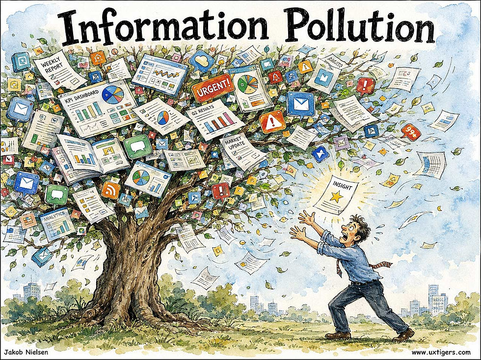
Autumn comes early for KPI dashboards. (GPT Image 2)
Image Zoom: 56% of Shoppers Go Straight for the Photos, So Let Them Look Closer
Product-image zoom is the online substitute for picking an item up. 56% of users inspect images as their first act on a product page, yet 25% of e-commerce sites offer too little resolution or zoom, and 40% of mobile sites ignore pinch gestures. Fix zoom before you polish anything else on the product page.

What users hope for when they invoke zoom: a small picture opens into a bigger, richer world. If your “larger view” is merely a blurrier version of the thumbnail, expect abandonment, not applause. (GPT Image 2)
Definition: Image zoom is any interaction that magnifies an on-screen image beyond its default size so users can inspect details: hover magnifiers and click-to-enlarge overlays on desktop, pinch and double-tap gestures on touchscreens.
In a physical store, a shopper picks up the shoes, turns them over, and squints at the stitching. Online, the zoom feature is the hand and the squint combined. Users arrive with detail hunger: an unmet need to verify texture, material, labels, and build quality before trusting a product enough to pay for it. Zoom is how you feed it.
The word “zoom” migrated from photography’s zoom lens (itself named for the onomatopoeic sense of rapid movement), and the magnifying-glass icon that marks most zoom features borrows Sherlock Holmes’s hand lens. The Web’s first-generation solution was the “click for larger image” page: a full page load for one bigger JPEG, with the Back button as your only exit. Then in December 2005, developer Lokesh Dhakar released Lightbox, a small script that overlaid the full-size image on the current page and dimmed everything else. It spawned hundreds of imitators, and “lightbox” (borrowed from the photographer’s backlit slide viewer) entered the design lexicon as a generic term. The 2007 iPhone finished the job by making pinch-to-zoom a universal gesture that users now attempt on every image everywhere, including on paper. Watch a toddler pinch a magazine. I’ll wait.
The Evidence: Detail Sells
Baymard Institute’s large-scale usability testing found that 56% of users’ first actions on a product page were to start exploring the images, before reading the title or a word of description. And zoom is by now a de facto web convention: 93% of desktop e-commerce sites let users zoom at least some product images. Yet 25% of sites still fail users: 14% serve images at too low a resolution to survive magnification, and 11% cap the zoom level below what inspection requires. In Baymard’s sessions, both failures caused users to abandon products they might otherwise have bought.
Mobile is worse. Baymard’s mobile benchmarks show that 40% of sites don’t support pinch or double-tap zoom on product images (some even disable page zoom through the viewport meta tag, which also punishes every low-vision user), and 52% don’t scale images up when users rotate to landscape, even though half of the users who found images too small tried exactly that rotation.
Methodology note: these numbers come from qualitative test sessions plus benchmarks of leading sites, not from conversion A/B tests. Still, when users say on camera that they won’t buy what they can’t inspect, I believe them.
How Zoom Goes Wrong
Zoom decoys. A magnifier icon promises magnification, but the click merely opens the same-size image in a fancier frame. These decoys advertise a closer look and deliver a lateral move. The user’s detail hunger stays unfed, with a garnish of betrayal. If you show a zoom affordance, deliver actual magnification.
Blur at the destination. Zoom into a 600-pixel source file, and you get pixel soup. And users read low-quality imagery as a low-quality product; a grainy enlargement is almost worse than none, because it invites inspection and then fails it. Serve a high-resolution file for the zoomed state, loaded on demand.
Hover hijacking. Desktop hover-zoom panels cover the price and Buy button, flicker as the cursor crosses boundaries, or spring open on accidental mouse-overs. Make click or tap the primary trigger; treat hover as an enhancement.
Blocked gestures. The viewport setting user-scalable=no and gesture-eating scripts turn instinctive pinches into pantomime. Support pinch and double-tap, and never disable page zoom.
Sluggish response. A zoomed pan that lags the finger breaks the direct-manipulation illusion. My 1993 book Usability Engineering set the response-time limit for that illusion at 0.1 seconds; three decades and a thousandfold hardware speedup later, plenty of zoom viewers still miss it. Nice work, everybody.
Trapped keyboards. Overlays that can’t be opened, panned, or closed from the keyboard, or that lack alt text on the enlarged view, lock out assistive-technology users. The Escape key must always close the box.
8 Design Guidelines for Image Zoom
Shoot and serve source images that stay sharp at 2x magnification or more, and include dedicated close-up shots of the details users care about: fabric, ports, seams, and labels.
Support click or tap to enlarge, plus pinch and double-tap on touchscreens, and test that both gestures work inside your gallery.
Never disable page zoom in the viewport meta tag. Accessibility aside, users will pinch anyway and blame your product when nothing happens.
Announce the capability: a magnifier icon plus a short “Tap image to zoom” hint near the gallery converts intention into action.
Keep panning at direct-manipulation speed: under 0.1 seconds of lag between finger and image.
Load progressively: show the standard image instantly, fetch the high-resolution version in the background, and sharpen in place.
Make the enlarged view keyboard accessible: focus moves in, arrow keys pan, Escape closes, and focus returns to the trigger.
In the zoomed state, preserve orientation: indicate which part of the image is magnified, and let users reach the other photos without closing the viewer.
The magnifier reveals a whole landscape inside a thumbnail, and that’s the user’s fantasy: to see the product as if holding it. So meet the fantasy with boring engineering: big source files, working gestures, fast pans, and honest affordances. 56% of your visitors head straight for the photos. Give their detail hunger a full meal, and the Add-to-Cart button gets its turn next.
Saved Work Must Be Findable by Name
Saving work creates future value only if users can find it when they need it. Three treasure maps marked “Untitled” prove the gold exists, but they leave the pirate unfolding parchment instead of digging. A folder of untitled files wastes time the same way, one double-click at a time.

The treasure is safely stored. Its location is an exercise for the user. (GPT Image 2)
AI tools multiply this problem by making alternatives cheap. A useful paragraph, image, or analysis disappears among dozens of siblings, and users generate another because retrieval demands too much detective work.
In my earlier piece on organizing discarded alternatives, I recommended arranging past work by meaning and location, with previews that support recognition. Chronological history alone assumes that users remember when they created something. Usually, the useful clue is what it concerned or how it looked.
Give saved artifacts descriptive names, visible previews, and a clear project context. AI should generate all of those, because decades of experience show that we can’t rely on users to do more work today to save time tomorrow. Test retrieval by asking users to recover a particular result from 10 saved alternatives a week later. Finding past work is part of creating useful work. Retain the prompt and source material with the result so users can resume the task once they locate it. Even pirates deserve better information architecture.
Final Thought of the Day


