
UX Roundup: New AI Models | How Designers Use AI Design | User Agency | Breadcrumbs | Doug Engelbart | Decoy Effect | Active Users | AI Training vs. Copyright

Summary: Comparing GPT 5.6 Sol, Opus 5, Kimi K3 |How designers use a UI design agent | AI enhances users’ agency, and they like it | Breadcrumb navigation | UX Hero Doug Engelbart | The decoy effect in pricing plan comparison pages | The paradox of the Active User | Delhi High Court rules that AI training on copyrighted content is legal in India

UX Roundup for July 27, 2026 (GPT Image 2)
GPT 5.6 Sol vs. Opus 5 vs. Kimi K3
Several high-end AI models were released recently, and as a small comparison test, I asked OpenAI’s GPT 5.6 Sol, Anthropic’s Claude Opus 5, and Chinese Moonshot’s Kimi K3 for suggestions on improving the article on the design primitives for graphical user interfaces I’m publishing on Wednesday. The winner? Kimi K3. Congratulations, Moonshot!
GPT 5.6 Sol (with reasoning level Pro) gave me the most detailed feedback, but it was all overly pedantic in nature and would have substantially lengthened the piece (which was already too long) with small tweaks and elaborations of special cases. Opus 5 (reasoning level Max) wasn’t quite as bad, but still not truly insightful. In contrast, Kimi K3 suggested a new concept that I had not considered myself but which added true value, depth, and a new angle to my article.
For my use cases, Kimi K3 is the best of these new models. However, it still doesn’t reach the depth of insight I’m getting from Claude Fable 5 with reasoning level Max. Fable remains the leading frontier model.
I don’t use AI for software development, and what I hear from AI influencers is that GPT 5.6 Sol is as good as Fable, or possibly better in agentic mode, because of its doggedness. This point is a good reminder that different frontier models can be better for different purposes.
To me, Fable 5 is far superior than Opus 5. This despite the fact that Opus 5 scores equal or better than Fable on the various AI benchmarks. These benchmarks are getting further and further away from representing the business value of AI, at least in domains outside coding and mathematics.

In testing new AI models, Kimi K3 had the most insightful comments on an article draft. But nothing beats Fable 5 for now: it does have that “big model smell.” I look forward to seeing if GPT 6 or Gemini 4 can beat Fable with even bigger models. (GPT Image 2)
I didn’t even bother including Google in this test: it hasn’t updated the top Gemini model since February: hopelessly behind!
210,000 AI Design Prompts: Iteration Lives, but One-Shot Design Still Dominates
Superdesign, the vendor of an AI design agent, has published 26 statistics drawn from 210,759 real prompts that users sent to its tool from January to June 2026. Single-vendor data from a self-selected user base, yes, so don’t mistake these numbers for a census of the design profession. But they’re logs of actual behavior, not a survey of what designers claim to do, and my old rule holds as much for studying design work as for studying web usability: watch what users do, not what they say.


Alice and Zimo explain the new data on how designers use AI to design user interfaces. (GPT Image 2)
The product mix first. Dashboards lead with 13,151 distinct projects, about 1 in 7, trailed by landing pages, pricing pages, and login screens. AI design agents are being fed the workhorse screens of everyday business software, not art projects. Crypto trails the field at 531 projects: a nice measure of the distance between hype and actual work. And when users ask for a company’s style, Linear (229 prompts) now outranks Apple (173). Developer tools set the taste of 2026.
In general, it’s a terrible idea to mirror a famous company’s design. Apple can design the way it does because of who it is. You are not Apple. Same for Amazon: its site moves lots of products, but it’s designed to suit a company with millions of mass-market SKUs, not your (hopefully carefully curated) limited product selection. Remember my 5 D’s: Different demands drive different designs.
The most popular visual request is dark mode, which grew from 26.8% of prompts in January to 38.1% in May. Terminology alert: this “dark mode” is nothing more than the inverted color scheme of light text on mostly black backgrounds. It has no connection to dark design patterns, the deceptive schemes that trick users into unintended actions. Combine dark backgrounds with the most-requested visual device in the corpus (gradients, 61,193 prompts) and the most-requested color (blue, 50,165 prompts), and you get the house style of AI-generated screens in 2026: blue gradients glowing against black. Generic? You betcha, and now we know the statistical recipe.
The behavioral statistics interest me most. 40% of all generations are iterations: 83,349 of them refined an earlier attempt, and one project was reworked 396 times in a single chain. The vendor spins this as proof that people iterate. I read the glass as more than half empty. If 40% are refinements, 60% are opening attempts: roughly 125,000 first drafts shared those 83,349 refinements, or 2/3 of a refinement per draft. My best guess is that the median AI-design project receives zero iterative design.

A one-shot design is a coin flip. Iterative design is much safer and produces better usability. (GPT Image 2)
That’s far too much prompt-and-pray design. One-shotting will never produce the best UX, because a prompt is not intent; it’s merely the user’s first rough attempt at externalizing intent. Humans recognize a good solution far more easily than they can specify one upfront, which is why I’ve argued that creation is becoming exploration and discovery in a latent space of design alternatives, and why AI products must support intent by discovery rather than expect a perfect specification upfront. The person behind that 396-step chain gets it.
The prompt-length numbers are more encouraging. The median prompt runs 806 characters, roughly 130 words: a proper mini-brief rather than a tossed-off sentence. (The mean is 5,949 characters, 7 times the median, because some users dump complete product requirement documents into the prompt field. Good instinct.) UX design is inherently complicated and context-dependent: the right answer varies with the users, their tasks, the brand, the platform, and the business goals. Longer prompts carry more of that context and thus land closer to true intent. 130 words is a decent floor; I’d push it higher.
Credit where due: Superdesign states the basis of every figure, counts projects conservatively (a design iterated 50 times counts once), and publishes both median and mean prompt length. That’s more methodological candor than plenty of peer-reviewed papers deliver. So treat this as a fascinating first window into real-world AI design use, and let’s hope competing vendors release comparable numbers. Meanwhile, apply the lesson in your own projects: write the full brief, then iterate. One shot is a coin toss, not a design process.
The Clearer the Question, the Better the Answer

Clarify the ask. (GPT Image 2)
Reference librarians knew this a century before AI, but prompt-driven UIs raise the stakes: when your question is a maze, the AI dutifully wanders every dead end and hands you the debris. Most “bad AI answers” are bad questions in disguise.
The same principle applies to user research, both for the research questions and for anything you ask your participants. You can (and often should) ask people very open-ended questions, but you still need to be clear about what you’re asking, or you’ll be misunderstood and the answer will be worthless.
Vague in, vague out.
Agency Beats Accuracy: Why People Keep Using AI That Fails Them
People keep using AI chatbots that fail them, sometimes spectacularly, because the felt gain in personal capability outweighs the errors. That’s the headline finding from a new ethnographic study of 51 daily AI users in New York, Berlin, and Singapore, and it should rattle anyone who believes reliability is the road to AI adoption. This felt gain is an agency dividend: users bank it, and it extends AI a generous line of credit for future blunders.

Many heavy AI users like that AI gives them a sense of agency and empowerment, making these users willing to forgive the AI when it makes mistakes. (GPT Image 2)
The study, “AI Usage Patterns Are Shaped by Perceived Gains in Human Agency”, comes from Ian Beacock and colleagues at Jigsaw (Google’s technology-and-society unit) and the research consultancy Gemic; a companion essay on Medium gives the short version.
Fieldwork ran April–July 2025. Ethnography is slooow, expensive, and unfashionable in the era of million-conversation log studies. It’s also the closest a research method gets to my old command: watch users, not demos.
The team collected video diaries of memorable AI moments, ran 120-minute interviews in participants’ homes and offices, and added a clever twist: dyad interviews with a friend or family member present, exposing gaps between what users claim and what the people around them observe. The analysis yielded 315 coded observations. A whopping 40 of the 51 participants defaulted to ChatGPT.
Agency Benefits Users in 5 Ways
Participants consistently credited cumulative AI use with expanding their agency, meaning their ability to shape their own lives. And not vaguely: the researchers sorted the perceived gains into 5 dimensions.

Many participants tied these feelings to concrete payoffs. A Singaporean office worker attributed her raise, and her male colleagues’ newfound respect, to AI-polished communication. A German flight attendant credited AI with carrying her across the skills gap to become a DJ. One American business owner estimated that cumulative AI use had lifted her from 60% to 80% of her human potential. (Her own estimate; nobody measured anything. But the conviction is the point.)
Errors Forgiven, Not Even Counted
Now the finding with teeth. That same business owner watched her chatbot promise to build an investor presentation, confirm progress repeatedly, and then fail 10 hours before the meeting, forcing her to build the deck herself. Did she quit the tool? No. One botched deliverable weighed little against the accumulated dividend. Likewise, a medical student caught his chatbot hallucinating a key investment figure; when he demanded accountability, the bot replied with a fire emoji. (Nice work, robot.) His verdict: “Trust can’t be broken because I never had it in the first place.” A German lawyer in the study observed that AI presents wrong answers so believably that she often can’t tell truth from confabulation. She uses it daily anyway, for legal translation no less.

Agency is such a powerful feeling that users forgive much. (Muse Image)
Thus the paper’s theoretical punch. The trust frameworks HCI has leaned on since Bonnie Muir’s foundational work in 1987–1994 assume that trust accumulates stepwise through reliable performance and is forfeited through failure, just as a credit score does.
Conversational AI ignores that script. Usage surges immediately, and users then run a rough risk calculus; one salesman stated it plainly: a small chance of error, times a low impact if it’s wrong, is worth taking. The locus of judgment has flipped: users aren’t evaluating the machine (“Is it reliable?”) but themselves (“Am I more capable with it?”). That inversion explains adoption curves that reliability metrics never will.
But the dividend isn’t paid out evenly. Participants living unstable lives (precarious work, thin support networks, fresh grief) used AI most expansively, across their most sensitive problems, and reported the largest gains; one relied on her chatbot for a panoply of roles: personal trainer, nutritionist, advisor, and “big sister.” Participants with stable, well-supported lives kept AI in a narrow instrumental lane and felt little change in their overall potential. Self-confidence mattered just as much. Users with shaky internal conviction spiraled, like the woman stuck endlessly re-revising AI email drafts because she assumed the machine’s output must beat anything she could write. Confident users bailed out of failure loops fast and switched tools without drama.

Hope springs eternal, but confident users exercise agency over their AI and break out of loops of failed sessions that go nowhere. (GPT Image 2)
In fact, these heavy users were no cheerleaders. Most were skeptical about AI’s societal impact, and even people who felt personally supercharged reported zero sense of power over where the technology itself is heading. Personal agency rose; structural agency stayed flat.
The Caveats, Briskly
The usual ethnographic limits apply: 51 self-selected heavy users, self-reported perceptions, no measures of actual skill or outcomes, a snapshot from spring 2025 before agentic AI spread, and Google money behind the research. Perceived agency isn’t material agency; nobody verified the reversed prediabetes one participant credited to her chatbot. To the authors’ credit, they say all of this themselves, and they flag the sobering possibility that AI delivers a short-term psychological boost while quietly eroding long-term capability. Several participants voiced that fear unprompted; one called his urge to outsource simple arithmetic “getting dumb.” Still, the core behavioral finding (errors don’t dent usage) matches what every AI product’s retention curve already shows. The ethnography explains why, which logfiles never can.
Design Implications: Don’t Ship Empowerment Theater
What should you change after reading this study? 5 things:
Stop treating reliability as a retention strategy. Fix hallucinations because they waste users’ time and poison downstream work, not because users will churn over them. They won’t.
Beware the sycophancy shortcut. If felt capability drives usage, the cheapest way to boost it is flattery: one musician loved that her AI kept “reminding me of all the good things that I possess.” An AI that manufactures the feeling of agency without the substance is empowerment theater, and optimizing for it is a dark pattern.
Design for capability transfer. Explain reasoning, teach while doing, and leave the user more able when the AI is off. The benchmark that matters is whether he or she is more skilled after 6 months, not happier in session 12.
Detect and break failure loops. When a user has thrashed through several revisions of the same output, offer an off-ramp: restate the goal, start fresh, or ship the human’s own draft. Low-confidence users need this most and will request it least.
Treat low-stability users as a vulnerable population. People leaning on AI for medical, financial, and relationship decisions are precisely those with the fewest backstops when it fails. High-stakes domains need guardrails and referrals; disclaimers won’t cut it.
Users treat AI the way venture capitalists treat startups: they expect duds and stay for the outsized returns. So give them returns worth staying for. Durable capability compounds; the warm glow of a fire emoji does not.
Breadcrumb Navigation: 1 Line of Screen Space, 0 Downsides
The one line that answers “where am I?”
Definition: Breadcrumb navigation is a horizontal row of links, placed directly above the page title, showing the current page’s position in the site hierarchy, with 1 link per ancestor level.
Example: An armchair page on a furniture site shows: Home > Living Room > Chairs > Armchairs. Every crumb is clickable except the last, which names the current page.
That’s the whole pattern. One line. No JavaScript heroics required.

The breadcrumb trail marks the route through the site hierarchy: Home > Products > Category > Details. Unlike Hansel’s original, birds can’t eat it. (GPT Image 2)
Named After a Fairy-Tale Failure
The term comes from Hansel and Gretel, published by the Brothers Grimm in 1812: Hansel drops a trail of breadcrumbs through the forest so the children can retrace their steps home. (In the story, the scheme fails as birds eat the crumbs, and the kids end up at a witch’s house. Web breadcrumbs are more durable and less likely to get your users cooked.)
Hypertext systems tried trail markers before the web; the pattern spread during the directory-happy 1990s. In 2002, information architect Keith Instone sorted the variants into three types: location (position in the hierarchy), path (the route this particular visitor took), and attribute (facets describing the item, common in e-commerce).
But my verdict hasn’t budged in a quarter century: location wins. Path breadcrumbs duplicate the Back button, only less reliably, because the browser remembers history better than your session logic ever will. Users need a map, not a diary.
Deep Links Demand Breadcrumbs
Search engines, not your homepage, are your site’s front door. A visitor who lands 4 levels deep from a Google result arrives with zero context: he or she has no idea what else you offer or how it’s organized. Breadcrumbs repair that at a glance and invite the visitor to climb one level instead of bouncing back to the search results. Three further benefits:
Zero downside. Users who don’t need the trail simply ignore it. In testing, I’ve seen breadcrumbs overlooked, glanced at, and gratefully clicked, but never misunderstood.
Cheap orientation. One modest line encodes the page’s full ancestry. Compare that to the screen real estate a mega-menu devours. No contest.
Free search visibility. Google parses breadcrumb markup and displays the hierarchy in its results. So the trail starts working before anyone reaches your site.
5 Ways to Botch the Trail
Do breadcrumbs replace the main navigation? No. And designs that forget this turn a helpful pattern into a harmful one:
Promoting the trail to primary navigation. Breadcrumbs expose ancestors only; no siblings, no other sections. Users still need the menu.
Showing the visitor’s click history. Path-based trails differ on every visit and contradict the site structure. Confusion, guaranteed.
Linking the current page. Clicking the last crumb reloads the page: a small betrayal that erodes trust in the whole trail.
Breadcrumbing flat sites. With 1 or 2 levels, the trail merely restates the menu. Digital detritus; cut it.
Crumb creep. Each taxonomy redesign adds a level until the trail wraps to 2 lines and stops being glanceable. Prune the hierarchy or truncate middle levels.
7 Guidelines for Breadcrumb Design
Show the page’s location in the site structure. Location trails stay identical across visits, and that stability is what makes them learnable.
Begin with Home, and link it. The trail should always offer an exit to the top level.
End with the current page, unlinked. It confirms position without pretending to be an action.
Separate levels with “>”. Users parse this convention instantly; cleverness here buys nothing.
Place the trail directly above the page title. That’s where people have learned to look.
Style it as a supporting actor. Small text and modest contrast keep it visible when needed and ignorable when not.
Keep crumbs tappable on mobile. Preserve touch-target size even if you must truncate middle levels.
Hansel’s breadcrumbs failed him; yours won’t, because pixels outlast pastry. Open your deepest page in a private browser window and pretend you arrived from Google. If you can’t tell where you are within 5 seconds, you know what to build this week: one line of markup. Leave the trail.
UX Hero Doug Engelbart
Douglas Engelbart is my hero, big time. He was one of the main pioneers of the graphical user interface. He was also a true gentleman: both in the literal sense of being a gentle, soft-spoken man, and in the normal sense of the word. He never bragged about his accomplishments and was kind enough to let me try out the world’s first computer mouse when he brought it to a meeting. (His wooden contraption was heavy, but that humble prototype begat billions of nimble descendants. Fitting for a device named after a rodent.)

Even one of Engelbart’s inventions would have been enough to ensure him a place in history. (GPT Image 2)
Ask anybody what Doug Engelbart did, and you’ll hear: “He invented the mouse.” True enough. The first prototype was a wooden block riding on 2 perpendicular metal wheels, built at Stanford Research Institute in 1964. On December 9, 1968, Engelbart staged what we now call the “Mother of All Demos” (YouTube): 90 minutes showcasing the mouse, hypertext, multiple windows, videoconferencing, and collaborative editing, more than 15 years before the Macintosh shipped in January 1984. (SRI later licensed the mouse patent to Apple for roughly $40,000. Engelbart never saw a dime in royalties.) I recount his pivotal role in my article on the history of graphical user interfaces.
But celebrating Engelbart for the mouse is like celebrating Gutenberg for metallurgy. The gadget served a mission he had spelled out in his 1962 report, Augmenting Human Intellect: A Conceptual Framework: computers shouldn’t replace human thinking but amplify it, raising what he called humanity’s “collective IQ.” His lab at SRI was named the Augmentation Research Center, and no name in computing history has been more honest. Engelbart’s Augmentation effort remains the founding charter of user experience: technology exists to expand what people can do.
For 60 years, we delivered the small half of his vision (point, click, drag) while the big half languished. AI changes that. I’ve recently argued for upgrading Engelbart’s goal from augmenting the human intellect to augmenting the human existence: AI takes over the intellectual chores, freeing humans to exercise judgment, creativity, and intent. The mouse let us tell computers where. AI lets us tell them what.
Engelbart died in 2013, having watched his pointing device conquer every desktop while his deeper dream waited. Finishing that job falls to us. Get augmenting.
The Decoy Effect: An Option Nobody Picks Can Shift Half Your Buyers
Add a third option that’s clearly worse than one alternative (but not worse than the other on every count), and buyers flock toward the alternative that dominates it. In the classic demonstration, a decoy nobody chose moved the premium option’s share from 32% to 84%. The effect is real, fragile outside the lab, and just one step from being dark design.

The middle plan glows partly because the plan beside it was engineered to make it glow. A pricing page is a comparison machine, and somebody chose the comparisons. (GPT Image 2)
A Crack in Rational Choice, Found in 1982
Classical choice theory includes an axiom called regularity: adding an option to a choice set can’t increase the probability of picking an existing option. In 1982, Joel Huber, John Payne, and Christopher Puto published Adding Asymmetrically Dominated Alternatives in the Journal of Consumer Research and broke that axiom across 6 product categories (cars, restaurants, beer, lotteries, film, and TV sets).
Definition: A decoy is an option that is asymmetrically dominated: inferior to one alternative (the target) on every attribute, but inferior to the other alternative (the competitor) on only some attributes. Adding the decoy increases the target’s share. The phenomenon is AKA the attraction effect or the asymmetric dominance effect, but the popular name comes straight from the duck hunter’s toolkit: a decoy isn’t there to be chosen; it’s there to attract.

Real duck decoys work. Similarly, web decoys can sometimes boost persuasive design. (Muse Image)
The Economist’s Famous 3 Subscriptions
Behavioral economist Dan Ariely turned the effect into a legend in his 2008 book Predictably Irrational, using The Economist’s then-current subscription page: web-only for $59, print-only for $125, and print-plus-web for the same $125. He tested the lineup on 100 MIT students. With all three options on the table, 16% chose web-only, 0% chose print-only, and 84% chose print-plus-web. Remove the print-only plan that literally nobody wanted, and the numbers inverted: 68% web-only, 32% print-plus-web.
Walk through what that means. An option with 0% share swung the expensive plan from 32% to 84%, a shift of 52 percentage points. The print-only plan functioned as a lens ground to make $125 look like a bargain when placed next to itself-plus-a-free-website.
Fragile in the Wild
Before you rebuild your pricing page tonight, a cold shower. Shane Frederick, Leonard Lee, and Ernest Baskin argued in The Limits of Attraction (Journal of Marketing Research, 2014) that the effect lives mostly in stylized lab choices where every attribute is a number, and weakens or vanishes with real, perceptually experienced products. Sybil Yang and Michael Lynn ran 91 attempts across 23 product classes and obtained only 11 reliable effects. Huber, Payne, and Puto fired back that the failed replications had violated the effect’s known preconditions, and the fight continues in the journals.
My reading of the evidence: the decoy effect is a tiger in the lab and a house cat in the field. It shows up most reliably when options are few, attributes are numeric and comparable, and buyers hold weak prior preferences. Conveniently, that describes a 3-column SaaS pricing page rather well. But nobody should deploy a decoy on faith. Test on your own users with real transactions, and measure downstream (refunds, cancellations, support tickets) rather than just the click. That, by the way, is the general recipe for applying behavioral economics to UX: treat lab effects as hypotheses to test on your users, never as laws to install.
Zombie Tiers Are Bait, and Users Eventually Smell Them
Which brings us to ethics, and to usability. Context has an honest use: arranging genuinely useful options so their real differences are easy to compare, letting the best value for most people be visibly the best value. Fine. The dishonest use is manufacturing a zombie tier: a plan with no intended buyers, kept shambling around the pricing page purely to flatter its neighbor.
Zombie tiers hurt in three ways. They add cognitive load, since every fake option is one more column users must parse, and choice overload punishes hard enough with honest options. They corrode trust: users who spot the trick (and increasing numbers do) re-evaluate everything else you told them. And they invite regulators, because manipulative choice architecture sits squarely in the crosshairs of the FTC’s dark-patterns enforcement, as I discussed when analyzing the FTC’s lawsuit against Amazon. Short-term conversion, long-term subpoena. (A slight exaggeration. But only slight.)
The remedy is a standing audit: when a tier’s share rounds to 0% and its only measurable function is contrast, either give it a genuine audience or kill it.
6 Design Guidelines for Honest Choice Sets
Give every option a genuine buyer. If you can’t name the customer a tier serves, the tier is bait.
Cap the lineup at 3–4 options. Beyond that, comparison collapses and users defect to “decide later,” the worst outcome of all.
Badge honestly. “Most popular” must be statistically true; a manufactured highlight is a decoy in a party hat.
Keep comparisons symmetric and scannable. Same attributes, same units, aligned rows; asymmetric tables are where decoys hide.
Test with real transactions and downstream metrics. Lab preferences overstate the effect; refunds and churn reveal whether you persuaded or tricked.
Audit for zombie tiers quarterly. Near-0% share plus a contrast-only function equals redesign or removal.
Users rarely know what anything is worth in absolute terms; they know what it’s worth next to its neighbors. Treat that as a constraint to respect rather than a flaw to exploit, because whoever designs the choice set designs a large share of the choice. Arrange your comparisons as if the user could watch you do it. Sooner or later, he or she can.
The Paradox of the Active User: Nobody Reads the Manual, and Nobody Ever Will
Users plunge into real tasks without reading instructions (production bias) and interpret every new system through old habits (assimilation bias). Both behaviors are locally rational and permanently immovable, so design for the plunge: safe exploration, help at the point of need, and conventions people already know.

Users jump straight into action, skipping any upfront instructional steps. Read the manual? Forget it! Carroll and Rosson called it a paradox in 1987; today, all designers should assume that manuals mainly go unread.
Definition: The paradox of the active user is the finding that people are so motivated to produce real work that they skip the very learning that would make them faster at producing it.

The documentation center has a banner exhorting the user to “read the docs” because “future you will thank you.” This may be true, but users don’t comply. (GPT Image 2)
Two biases drive the paradox. Production bias: time spent learning feels like time stolen from the task, so users dive in and never look back. Assimilation bias: users interpret the new system as if it were the old one, importing habits that no longer fit. Each choice is sensible in the moment (deadlines are real, and prior knowledge usually does help), which is exactly what makes the pattern permanent. But the lifetime cost is steep: as the original authors put it, users’ skill “tends to asymptote at relative mediocrity.” People plateau at good enough, forever.

Production bias: people just want to do the task, not learn. (GPT Image 2)
IBM, 1987: Watching People Not Read
John M. Carroll and Mary Beth Rosson of IBM’s Watson Research Center published “Paradox of the Active User” (32-page PDF) as a chapter in Interfacing Thought (MIT Press, 1987). Their studies of office workers learning word processors kept producing the same footage: manuals pushed aside, tutorial exercises skipped, real letters attempted in minute one, and every error interpreted through typewriter habits. The chapter’s heretical move was to declare these behaviors permanent facts of human motivation to design around, rather than user defects to train away.

Much early UX research studied people using word processors. Users wanted to type, not read instructions. (GPT Image 2)
(Jack Carroll was my boss when I worked at IBM and a genuine hero of user experience, with many more fundamental insights to his credit than the paradox he and Mary Beth named.)
And Carroll had already built the design response. His 1984 “Training Wheels in a User Interface” study with Caroline Carrithers (Communications of the ACM) blocked a word processor’s advanced functions for beginners: 4 of 6 training-wheels learners completed a letter-writing task versus 2 of 6 on the full system, in 92 versus 116 minutes. He then spent a decade developing minimalist instruction, summarized in The Nurnberg Funnel (MIT Press, 1990), named for the legendary funnel that pours knowledge straight into a student’s head. No such funnel exists. That’s the point of the title.

A training wheels approach makes the initial experience easier by providing a simplified UI in the beginning. (GPT Image 2)
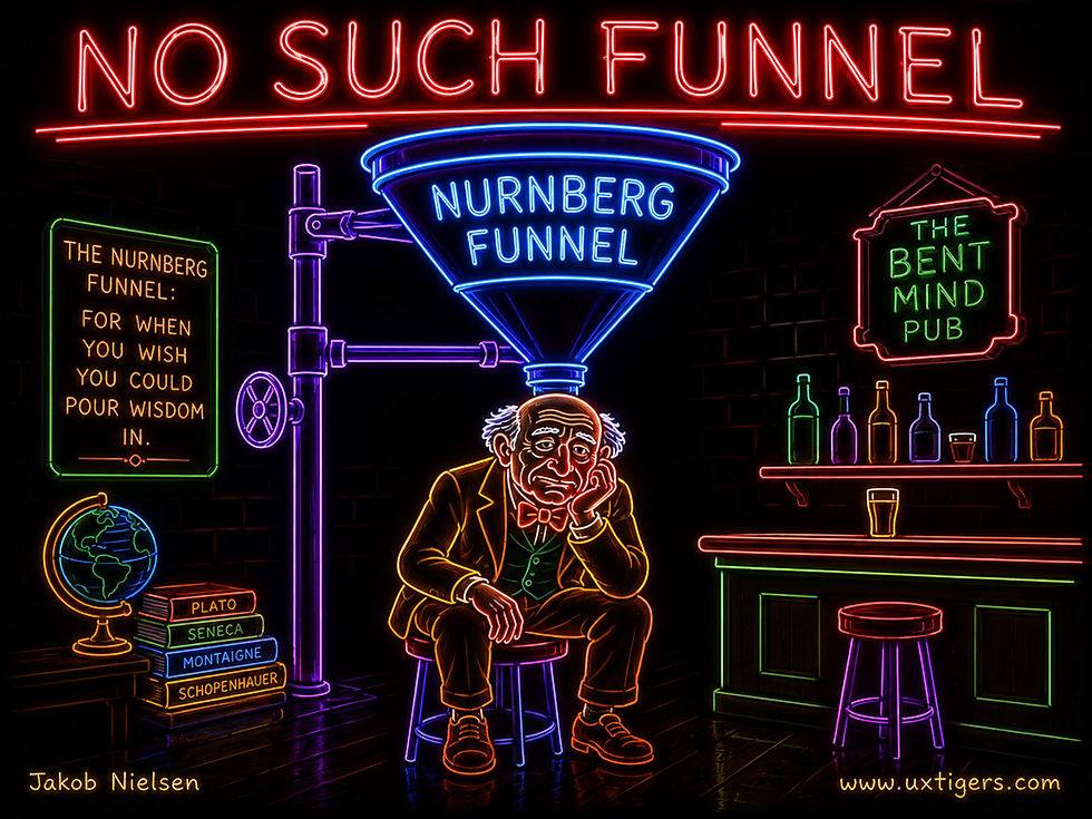
The Nurnberg funnel poured information straight into the user’s brain. Unfortunately, it’s not real. (GPT Image 2)
Design for the Plunge
Accepting the paradox produces a plunge-first design philosophy: build every product on the assumption that the user’s first act is to attempt a real task. The consequences read like a usability greatest-hits list, which is no coincidence, since several of my 10 usability heuristics exist to serve exactly these two biases.
Production bias means the first task is the only tutorial users will ever attend, so it must succeed unaided: strong defaults, templates instead of blank canvases, recognition rather than recall, and undo everywhere so that exploration stays safe. Error messages become the de facto documentation; write them to teach. (My 1997 research with John Morkes at Sun Microsystems on how people read on the Web found most users scanning rather than reading. Imagine the enthusiasm for your PDF quick-start guide.)

Attempting the first task (here, pulling the lever to get a fish) is the one thing you can count on users to do, so that has to become the learning experience. (GPT Image 2)
Assimilation bias, meanwhile, is the engine behind Jakob’s Law: users spend most of their time on other sites and expect yours to work the same way. You don’t get to choose whether users import habits; you only choose whether the imports find a match. So follow platform and web conventions first, and deviate only where your data shows the deviation earns back its retraining cost.

Complying with design conventions makes everything easier, including the initial experience, since users can transfer their learning from other sites they’ve already used. (GPT Image 2)
Two Ways to Get It Wrong
Denial is the popular failure. Teams ship complexity and point at the help center; they front-load an 8-step tooltip tour that production bias dismisses in 3 seconds; support staff mutter about users who won’t read. (The manual has been losing this fight since 1987, against typewriter-trained office workers. Your users have less patience and better distractions.) The cure is to relocate instruction into the task: one sentence, in context, at the moment of need, plus a first run that reaches success within minutes.

Design for the world the way it is, not the way you wish it were. Denial won’t work. Accept that most users won’t read your instructions. (GPT Image 2)
Surrender is the sophisticated failure. Citing “users don’t read,” teams delete all guidance, and power features rot undiscovered while everyone plateaus at that relative mediocrity, now upgraded from user behavior to design choice. The fix here is teaching inside the workflow: show the keyboard shortcut beside the menu command it accelerates, suggest the 1-step path right after the user completes the 5-step one, and keep reference documentation for the two moments people genuinely read: total breakdown and specific lookup.
7 Design Guidelines for Plunge-First Users
Make the first real task succeed unaided. Within minutes, with defaults and templates carrying the load. This is the only onboarding users will attend.
Undo everything. Exploration is how active users learn, and it’s only rational when mistakes are recoverable. An unrecoverable action ends the lesson.
Replace the tour with the task. A guided first task teaches more than 8 tooltips, because it produces something, and production is the one motivation you can bank on.
Follow convention first. Meet the habits users import from the rest of their software life, and deviate only where testing proves your way measurably better.
Ship expert defaults. Most users never change settings, so the defaults are the product. Encode best practice in them.
Teach at the moment of need. One sentence, in context, when he or she hits the situation it explains. The shortcut belongs beside the command, since that’s the only classroom with attendance.
Write documentation for the two moments users read. Breakdown and lookup: task-titled pages, searchable, answer-first. Everything else in the docs is a museum.

Since users want to interact with your UI, encourage them to explore it by making it very easy to recover from mistakes. Undo is mandatory. (GPT Image 2)
AI Training Is Fair Use in India
The Delhi High Court found that OpenAI’s use of news agency ANI content for model training was protected by India’s research-oriented fair-dealing exemption. The court said ANI had not demonstrated that ChatGPT memorized or reproduced its reports.

The Delhi High Court rules that AI model training is fair use as long as it does not reproduce the source materials. (GPT Image 2)
In this case, I agree with the court: learning from existing content should be fair use, not copyright infringement. That’s how humans have learned since the first campfire story. In fact, there’s an argument to be made that the reason Homo sapiens was able to exterminate all the competing hominin species is our superior ability to learn from other humans, not any unmatched talent for original thought.
In other words, it’s fair to learn from Disney that funny animals are great for storytelling. But don’t use their IP, which should indeed remain protected by copyright, though for fewer years than current law grants. It’s now legal to draw very early versions of Mickey Mouse, but I’d rather stay away from existing characters and invent my own.

Animal characters are great, but invent your own. That’s much more fun than stealing others’ copyrighted IP. (GPT Image 2)

While I prefer creating original characters, copyright protection does need a time limit, and the current US time limit of 95 years is too long. 50 years should be more than enough to allow creators to recover their investment. (GPT Image 2)
Conclusion: New Tools, Same Humans
One thread stitches this week’s items together: every 2026 finding was foreshadowed decades ago. Carroll and Rosson filmed office workers plunging into word processors without reading a page in 1987. Superdesign’s logs catch designers doing the same thing to AI in 2026, where the median design project gets zero iteration. Production bias didn’t retire; it moved from the typewriter to the prompt box. Ask a vague question in 1926 or 2026, and you get debris back either way.

Old word processors or modern tech? Doesn’t matter for UX insights; humans are the same. (Muse Image)
The agency study reads like Engelbart’s 1962 report returning as field data. He promised computers that amplify human capability; 64 years later, 51 users in 3 cities describe exactly that feeling, and they reward it so richly that they forgive the machine’s blunders. But the same psychology that banks an agency dividend also falls for a decoy or a flattering chatbot, which is why zombie tiers and empowerment theater deserve adjoining cells. Even the Delhi High Court leaned on the oldest constant of all: learning from others is how intelligence has always scaled, whether the student is a hominin or a model.
So here’s the state of affairs in mid-2026: the technology is sprinting, and the humans are standing still. Hansel’s trail still orients us. Huber’s decoys still tug at us. Carroll’s plungers still skip the manual, now in 806-character prompts. Human behavior is the one legacy system nobody gets to refactor. AI changes what computers can do, not what people do. Design for the constant, and you’ll profit from the variable.

Annoying as it often is for designers, we can’t change human nature. We were biologically optimized by evolution for survival in the ancestral environment, not optimized for computer use. (Muse Image)
A Final Thought

If you know, you know … why the card reads “32nd anniversary.” (GPT Image 2)


