
UX Roundup: UXR Theater | App Overload | Less Is More | Illustrations vs. Photos | Problem vs. Solution | Centralized AI | Recognition vs Recall | Google Growth | Sovereign AI | Agentic Browsers
- Jakob Nielsen

- Jul 28, 2025
- 11 min read
Summary: Usability testing as theater | Too many applications | Less Is More | Illustrations vs. photos | Love the problem, not your solution | A possible centralized AI project for the USA | Recognition Rather Than Recall | Strong growth in Google’s AI production | Sovereign AI | Review of web browsers with built-in AI agents: Dia vs. Comet | Watch this AI movie

UX Roundup for July 28, 2025. I continue to be impressed with the GPT native image generation model 1’s ability to alternate styles, with a very wide range. Here (clockwise from upper left): stained-glass window, concrete, ASCII art, Japanese watercolor. Which one do you like best? Visually, I prefer the Japanese rock garden for “less is more,” whereas I like the stained-glass bar chart best for Google growth. I chose the stained-glass version for my social media post to promote this newsletter, simply because I think its colors are more likely to attract the eye of doom-scrolling users. For social media, eyeballs are more important than aesthetics.
Usability Testing as Theater
New video envisioning the usability testing method as a theatrical production, or even an opera. (YouTube, 2 min.)
Some people like to enact proposed new user interfaces or features as small plays, complete with props. This can be especially useful if the intention is to employ new technology that isn’t yet ready for traditional testing, but you still want user feedback.
(Prompt credit to Ethan Mollick for the prompt to create videos of theatrical productions.)

User testing as theater. New video. (GPT Image-1)
The Sea of Apps

Application overload. (ChatGPT)
The prevailing design ethos favors targeted applications. However, this pursuit of individual application simplicity has created a paradoxical outcome: a profoundly more complex and fragmented total user experience. The usability of a system is not the sum of its parts; it is the integration of those parts.
Application overload is a direct tax on the user’s cognitive resources. Even if each app is intuitive, the user bears the burden of managing the entire ecosystem. They must remember the specific function of every icon, learn the location of dozens of disparate applications, and successfully recall the correct one at the moment of need. This is a significant memory task that exists outside of any single interface.
This fragmentation creates a meta-navigation problem. The home screen has become a disorganized portal, forcing users to scan a sea of icons to find the correct entry point for their task. This is pure navigational overhead, adding a frustrating and unnecessary step before the actual work can even begin.
Furthermore, user tasks are rarely confined to a single application. A workflow may require moving information from a spreadsheet to a presentation, then sharing it via a communication tool. Each app-switch is a context shift, breaking the user’s flow and increasing the likelihood of errors. We have optimized the usability of the rooms but neglected the hallways. The result is a system where the friction of moving between simple tools makes the overall task complex and inefficient. True simplicity must be measured holistically, not at the superficial level of the individual app.
Less Is More

“Less Is More” is one of the most basic mantras for UX design. (ChatGPT)
Think of your user interface as a ship’s wheel. Its purpose is singular: to help the user steer directly toward their goal, guided by a clear star. Every unnecessary feature, every extraneous word, every decorative element is a distraction that complicates this journey. It forces the user to expend mental energy processing information that does not contribute to task completion. This is poor design.

Extraneous features distract users from easily reaching their goal, needlessly complicating the customer journey by risking detours. (ChatGPT)
Users don’t visit websites to admire the design. They come to accomplish tasks. Every unnecessary element competes for their attention and degrades performance.
Each dialogue should contain only relevant and essential information. Does this button, this paragraph, this icon directly support the user's primary goal on this screen? If not, it is noise. Feature creep is the enemy of usability. By presenting users with fewer, more focused options, we support the heuristic of recognition over recall and drastically lower the chance of error. (It’s no coincidence that I made “aesthetic and minimalist design” number eight out of only 10 usability heuristics.)

Overloading users with extra features only gets in their way. (ChatGPT)
Our job in UX is not to see how much we can build, but to determine what we can remove. A clean, minimalist aesthetic is the byproduct, not the goal. The true aim is to provide the most direct path to user success by eliminating everything that stands in the way. In usability, clarity is the ultimate sophistication.
The principle extends to mobile interfaces, where screen real estate is precious. Apps that try to replicate desktop functionality fail. Instagram’s initial success came from doing one thing well: photo sharing. Not photo sharing plus messaging plus stories plus shopping plus video. (Once they captured users, video could be added, while keeping a fairly consistent UI for photos and videos.)
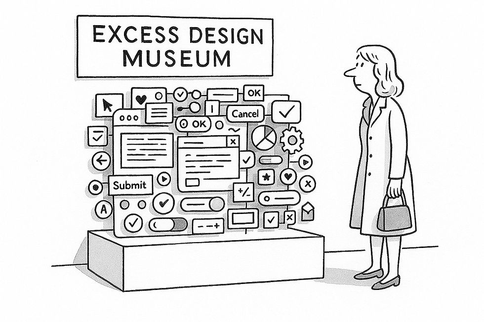
Let’s hope excessive design ends up in a museum soon. (ChatGPT)
Simplicity isn’t laziness. It requires more design effort to determine what to exclude than what to include. But users reward this effort with engagement, completion rates, and loyalty.

Eliminating excess design ideas can leave behind a great UX. (ChatGPT)
Illustrations vs. Photos
The above piece mixed images that I made in various illustration styles with images in a photorealistic style. If you are a long-time reader of my newsletter, you know that I usually prefer various versions of drawings, but I decided to experiment with the photorealistic style for once since ChatGPT’s native image mode has decent prompt adherence even in photos.

Is it better to have AI make images in an illustration style or to have it mimic the real world more closely in a photorealistic style? There is no single answer for all use cases, but I usually prefer illustration styles. (Ideogram)
One reason to prefer illustration styles is that one can more easily art-direct the AI to produce images where the style matches the intended message or use. Photos also include many extraneous details that can distract from the core message.
Love the Problem, Not Your Solution
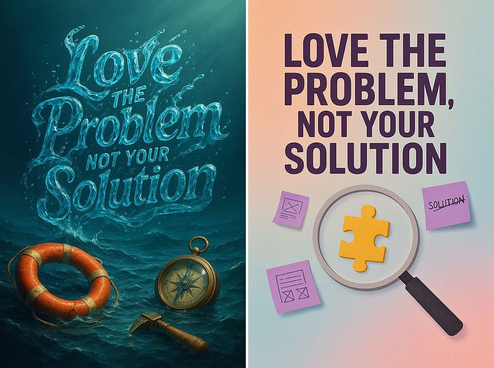
To follow up on the above piece about photos vs. illustrations, here are two posters I made with one of my favorite UX slogans: “Love the problem, not the solution.” (This slogan is most widely attributed to Uri Levine, co-founder of Waze.) Which version do you prefer? Let me know in the comments.
The user’s problem is King, and failing this principle is the most common reason for project failure. Teams become infatuated with their own elegant designs, clever code, or a shiny new technology, and forget to ask if it solves a real user need. They are like a ship’s captain who is proud of his new hammer but fails to notice the ship is sinking in a vast, turbulent sea.
Look at my first poster. The real challenge is the ocean: the vast, deep, and complex problem your users are adrift in. Your job is to understand that ocean. Is the user drowning? Then a life preserver is a good solution. Are they lost? Then a compass is what they need. Offering a compass to a drowning user is useless. This is what happens when you love your solution more than the user's problem.
Nowhere is this mistake more prevalent than with the current fascination with Artificial Intelligence. The mandate comes from on high: “We need an AI strategy.” (Which you do. However, often companies turn to AI tactics without nailing a useful AI strategy first.) Teams rush to bolt on AI features, creating solutions in search of a problem. They add a complex chatbot when a simple FAQ would be faster. They design a “smart” personalization engine that gets user preferences wrong, creating frustration instead of delight.
Don’t “add AI.” Instead, find a documented, severe user pain point. Then, and only then, ask if an AI-driven feature is the most efficient and effective way to solve it. Sometimes the answer is yes, sometimes it’s no. A simpler, traditional interface may be better.
To build usable products, you must:
Obsess over the problem. Conduct rigorous user research to understand the users’ context and goals. Map their workflow. Identify the precise points of friction. Fall in love with this messy, human challenge.
Be solution-agnostic. Evaluate all potential solutions, from the simplest to the most complex. The best solution is the one that removes user obstacles with the least amount of cognitive load and interface clutter.
Use AI as a tool, not a trophy. AI is just another tool, like a compass or a life preserver. Use it when it is demonstrably superior for the specific problem at hand. Deploying AI for its own sake is a hallmark of a product team that has lost its way, loving its own reflection in a shiny new tool instead of focusing on helping the user navigate their sea of troubles.

Focus on the user’s problem, not your beloved solution.
A Possible Centralized AI Project For the USA
Epoch AI is probably the best source for analysis of long-term trends in AI capabilities. They recently published a speculative piece titled, How big could an “AI Manhattan Project” get? (in reference to the Manhattan Project during World War II, which created the atomic bomb).
The Manhattan Project cost 0.4% of US GDP at the time, corresponding to $122B today. The Apollo program, which put a man on the moon, was twice as expensive, costing 0.8% of GDP, equivalent to $244 billion today. What could we get by spending the same on AI, which would be a more useful project in terms of immediate impact?
The authors’ conclusion is that an equivalent of the Apollo project for AI running for the next 3 years would create sufficient compute to support 100-day training runs of 1.2e29 FLOP, which is 10,000x the training for GPT 4. Maybe more interesting, the estimated size of AI training by 2027 will allow us to reach that level of intelligence two years ahead of the currently projected schedule.
Spending $732B to accelerate AI by two years: is that a good or bad deal? I would say “good,” due to the immense benefits that superintelligence offers for the economy, healthcare, and education. These gains will be particularly valuable in developing countries: having two years’ worth of children get a good education will dramatically uplift these countries’ standard of living in twenty years.
However, the $732B expense for the hypothetical project will be borne by US taxpayers, many of whom may be less swayed by improving the standard of living in other countries. Pulling superintelligence forward by two years will likely gain the U.S. economy a few trillion dollars, so even more narrow analysis, the AI project should pay off. (In the long run, superintelligence will likely be worth $30T/year in the U.S. alone, because it’ll double the economy. But in the beginning, gains will be smaller because companies are slow to adapt to new possibilities. I still think two years of early superintelligence will be worth a trillion per year, or $2T combined, corresponding to almost three times the investment.)
Even though a centralized AI project will likely pay off financially, I still don’t like the idea. The reason is a point that’s slightly buried in the article: This huge investment in training compute will consume the entire amount of NVIDIA GPU chips that are likely to be available during this period. In other words, nothing would be left over for OpenAI, Google, xAI, Midjourney, Suno, HeyGen, Perplexity, and all the startups that are yet to come. (Actually, Google might be OK, having its own non-NVIDIA AI chips.)

Just as in the classic Gulliver’s Travels, a giant AI project may be defeated by many small AI projects. But we must allow the many small projects access to the necessary compute. (Seedream)
A single centralized AI project will doubtlessly create something great. But squashing all the independent AI projects by starving them of GPU chips will cause a much greater loss in innovation, including many new forms of AI we can’t even think of yet, but which new ventures will invent if they can only get their hands on enough compute.
Recognition Rather Than Recall

My sixth usability heuristic, Recognition Rather Than Recall, explained by a polar bear (YouTube, 2 min.)

It’s easier to move around the Arctic when you can recognize from the label which ice floes can carry your weight, rather than having to remember whether a floe dropped you in the drink last time. (GPT Image-1)
Google AI Growth
At Google’s recent earnings call, CEO Sundar Pichai announced that Google’s AI models produced 480 Trillion AI tokens in May 2025. In July 2025, they produced 980 Trillion AI tokens. Google doubled AI production in just two months! If this trend continues, Google’s AI will be 72 times larger next year.

Google doubled its AI production in the last two months. (GPT Image-1)
Is it reasonable to expect this exponential growth to continue? In most other cases, I would have said no. However, for AI, we have just scratched the surface so far. Something like the growth of AI video, where Google is the current leader with Veo3, will require the production of a huge number of AI tokens, as video resolution scales to 1080p for consumer and 4K for projects like producing television commercials. (A 4K video has 9x the pixels of the 720p videos currently generated by Veo3 on Google’s most popular website for this model — I don’t know how pixel count translates into AI tokens produced by the model, but 4K will surely require a good deal more.) Even if we are still only considering video generation, the growth of AI-generated video in commercial projects (as opposed to hobby projects like mine) will require extending the length of clips far beyond the current 8 seconds. (For example, HeyGen generates avatar clips of up to 180 seconds, and I still needed to stitch together a sequence of 3 generations for my recent video on top usability annoyances, since it runs to 364 seconds.)
I must say that I have been impressed with Google’s recent AI products, such as Gemini 2.5 Pro and Veo 3. Considering the absolutely horrendous AI models Google launched in the early days of the modern AI era, they have come a long way. Now, they will even render Vikings that look like they could be my ancestors instead of denying my heritage.
Sovereign AI
Should countries emphasize “Sovereign AI”? On July 23, the U.S. government answered “yes,” at least for the United States. The new AI Action Plan is making my song about Sovereign AI newsworthy again. I originally made the song in April based on a discussion between Jensen Huang of Nvidia and Arthur Mensch of Mistral AI.

Sovereign AI means that countries go all-in on owning the future, as the U.S. will be doing now. (GPT Image-1)
Review of Web Browsers with Built-in AI Agents: Dia vs. Comet
Olivia Moore (my favorite VC) posted her review of the two main AI-native web browsers, Dia and Comet, complete with short demos (YouTube, 9 min. video). AI-native browsers differ from browsers with an AI add-on and have capabilities such as constructing a comparison table across a set of browser tabs, making page parking more attractive.
To sum up, she declares Perplexity’s Comet browser the winner of the review, but only with a narrow lead, since Dia (from The Browser Company) excels in workflow automation and cross-tab activity.

AI-native web browsers can reason and act across multiple open tabs as a whole. (GPT Image-1)
Great AI Movie
I recommend watching a short AI movie from a creator named Ring Hyacinth: Out of the Frame (1:45 min.) Nice use of the new ability in Kling to combine multiple elements into a video clip. Here, the video envisions what would happen if the woman in Vermeer's The Art of Painting walked out of the picture frame and visited other famous paintings. (Can you recognize them? — I admit that I missed the most famous painting in the Prado museum, Velázquez’s Las Meninas, despite having seen it many times. My only defense is that the representation in the video is rather subtle.)


