
UX Roundup: Forward Deployed Engineers | AI GUI Controls | Apple Liquid Glass UI | User Testing Explained
- Jakob Nielsen

- Sep 22, 2025
- 12 min read
Updated: Sep 24, 2025
Summary: Forward Deployed Engineers are the new user researchers | Reve has GUI controls for AI image editing | Apple Liquid Glass UI now shipping | User testing explained in 3 minutes

UX Roundup for September 22, 2025. (GPT Image-1)
Forward Deployed Engineers: The New User Research
The hottest buzzword in Silicon Valley right now is “forward-deployed engineer,” or as it’s inevitably abbreviated: FDE. This may not sound like a usability-related job, but it should be.
I have two new music videos about Forward Deployed Engineers for UX Discovery Research:
FDE song made with Suno 4.5+ (YouTube, 3 min.)
FDE song made with Suno 5 (YouTube, 3 min.)
For a great summary of how the FDE came to be and why a vast percentage of startups are creating these positions, watch this interview with Bob McGrew, former Chief Research Officer at OpenAI (YouTube, 51 min.). McGrew claims to have invented the Forward Deployed Engineer while an executive at Palantir, a company that develops software for customers in the intelligence and defense sectors. As he puts it, as a software company, you don’t really know what spies do, and you can’t just ask them. How to achieve product-market fit (PMF)? That’s where the FDE comes in.
McGrew’s short definition is that an FDE is a technical employee, who:
Sits at the customer site: He or she is physically embedded within the client’s operations.
Fills the gap between product and need: The FDE’s primary role is to adapt an existing product to solve a specific, previously unaddressed problem for a customer, delivering an extremely valuable outcome.
Drives product discovery: FDEs act as an internal sensor for the product team, identifying commonalities across customer needs that can be generalized into core product features.

An FDE bridges the gap between what’s brewing in the AI labs back in Silicon Valley or Shanghai and what the customers in the field need to run their companies. (GDP Image-1)
The FDE model employs two key team types. Echo Teams consist of domain experts with deep industry knowledge, often “rebels or heretics,” who recognize the inadequacies of existing solutions. They identify problems, manage relationships, and understand user needs. Delta Teams have skilled engineers who rapidly prototype solutions, prioritizing speed and problem-solving over long-term code maintainability in early stages. McGrew points out that this focus on fast demos and prototypes requires a different kind of technical talent than what’s found in most product development staff.
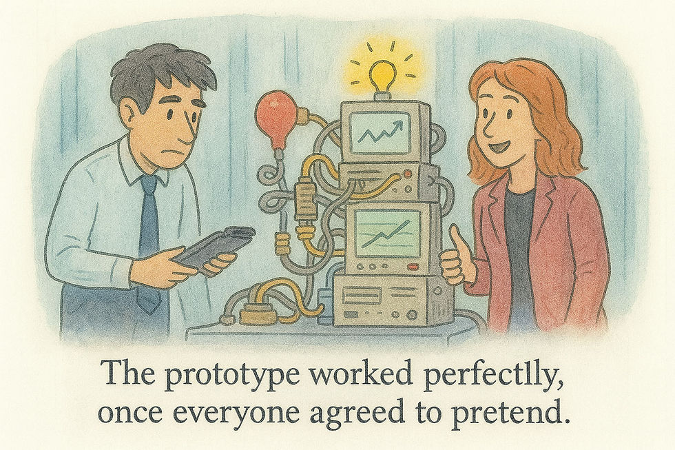
Prototypes are cobbled together quickly without the use of traditional best practices for software engineering. As a result, they may not work perfectly in the traditional sense. However, that’s also not the goal of a prototype. Rather, its goals are to demonstrate initial value quickly and to discover ways to improve the design and the company’s workflows further. (GPT Image-1)
Companies that use FDE to drive PMF employ iterative, demo-driven development, soliciting direct feedback from customers and rapidly iterating the product based on their input. Initially, using FDEs for product discovery transforms customization from a cost (services) into an asset. FDEs build what McGraw calls a “gravel road,” a specific solution tailored to one client, which the product team then generalizes into a “paved superhighway” for broader application.

The FDE initially builds a metaphorical gravel road with quick-and-dirty prototyping to solve an individual client’s immediate problem. Later, the vendor’s product design team generalizes across several such solutions to construct a metaphorical high-end smooth highway that is superior at solving that entire class of problems across multiple clients. (GPT Image-1)
This model focuses on delivering outcomes rather than products, with pricing based on value delivered rather than traditional SaaS metrics. Executive buy-in proves critical, as solving CEO-level priorities provides operational authority and overcomes internal resistance. The demos create customer desire while forcing teams to concentrate on genuine pain points. Sometimes the FDE will identify other key problems in the enterprise that are much more valuable than the ones that they were initially brought in to solve.
The FDE model demands careful balance between customization and generalization. Product teams must abstract insights from specific deployments to identify broader patterns, avoiding over-specialization for individual customers.

The FDE lives by customization, but the eventual product that should come from this discovery work must only require limited customization to be scalable. (GPT Image-1)
FDE are especially popular among AI agent startups because they often have no incumbent solutions to replace. They don’t have existing software to copy and improve, since AI agents are replacing or augmenting humans. This necessitates extensive product discovery that can only occur within the customer companies. Furthermore, rapidly advancing AI capabilities create a significant adoption gap that FDEs help bridge, essentially serving as field teams that determine how to implement cutting-edge AI research in practical business contexts.

Most drastic innovations struggle to overcome entrenched incumbent software within the enterprise, which has many defenders in IT departments whose livelihoods depend on their intimate knowledge of the old, inefficient ways. The beauty of AI agents is that they often don’t need to overthrow incumbent software because they are solving new problems that could never have been done in software before (and may never have been attempted before, even with manual labor). The downside is that the innovator can’t study the incumbents and their solutions. (GPT Image-1)
The economics work because AI deployments translate into substantial contracts immediately, making the high-touch approach financially viable for sustained growth.
Success requires organizational discipline to prevent devolution into pure consulting. Many successful FDE companies have hired Palantir alumni familiar with the model’s nuances. KPIs should focus on increasing outcome value and contract size rather than minimizing customization. The core product must provide leverage to FDEs, making value delivery progressively easier.
For startup founders, the greatest opportunities lie in bridging the AI capability–adoption gap. This requires human ingenuity and willingness to tackle complex integration challenges, focusing on making AI capabilities genuinely useful rather than merely impressive. The FDE model offers a proven framework for navigating this challenge while building scalable, valuable enterprise solutions.
Do watch the full video about McGrew’s FDE experience, since it contains many more useful tips than I have room for here.
Why do I say that FDE is a user research model? Because it is a discovery method driven by field research at the customer location. They don’t call it “research,” and the FDE is obviously called an “engineer” and has a technical background rather than a design background. No matter. The key is that an FDE conducts field research by observing customers to discover their needs, bringing the findings back to the product development team at headquarters.
The product designers then design generalizable and customizable solutions based on FDE findings across multiple customer locations.
In the traditional (pre-AI) UX design lifecycle, discovery research is conducted at the very beginning of the product development lifecycle, preferably before any design work has started. Its primary goal is to uncover and understand user needs, behaviors, and motivations within a specific problem space. Instead of validating an existing idea, discovery research aims to identify the right problem to solve, ensuring the team builds something people actually want and need.
This type of research seeks to answer broad questions like, “What are the biggest challenges our users face in their daily workflow?” or “What are their unmet needs related to a particular activity?” The insights gathered are qualitative and help define the product’s strategic direction, identify opportunities for innovation, and build a shared understanding of the user across the entire team. It prevents teams from creating solutions based on incorrect assumptions.
Doesn’t this sound exactly like the FDE’s goals? The main exception is that the FDE has an early version of the product to bring to the customer, so that he or she can build working prototypes for them. This violates the point of doing discovery research before any design or implementation, but is critical for the FDE process to work. Also, now that AI has given us vibe coding and vibe design, its less work to build that rough early software and economical to expect most of that up-front work to be discarded once the FDE team has discovered what the customers really need.
Many of our old assumptions about how to build software and user interfaces must change in the AI age, including the old fear we had of being stuck with premature implementations that would be too expensive to change.
The methods used in traditional UX discovery research are typically qualitative, focusing on rich, in-depth insights rather than statistical significance. Key methods include:
Contextual Inquiry: Observing users in their natural environment to understand their context, tasks, and pain points as they happen organically.
In-depth User Interviews: Conducting one-on-one, open-ended conversations to explore a user's attitudes, past experiences, and frustrations in detail.
Diary Studies: Asking participants to log their activities, thoughts, and feelings about a specific topic over an extended period. This captures in-the-moment data that is difficult to recall in an interview.
Surveys: While often quantitative, open-ended survey questions can gather qualitative insights about user problems and preferences from a larger audience.
Competitive Analysis: Evaluating how competitors are solving similar problems to identify gaps, best practices, and opportunities for differentiation.
Okay, now that I've listed the old methods that UX people used to employ for discovery research, it doesn’t sound as much like FDE work. Fast prototypes and demos were not prevalent in the past for those purposes, although I did take a prototype of the web-based multimedia newspaper of the future on a tour of customer visits to legacy news media clients when I was a Sun Microsystems Distinguished Engineer.
My recommendation is to merge the advantages of the new FDE model with the benefits of the old methods honed in old-school UX discovery research. These methods are easy enough to learn, and anybody going on an FDE assignment would be advised to spend a week or so studying these UX discovery methods.
Competitive analysis may be less useful for many new AI agent companies, as they are breaking new ground in industries where there is currently little to no AI-based competition. As mentioned, the competition for the new software is the legacy human employees, who are currently doing the job inefficiently due to human limitations. However, the best solutions will be built upon understanding existing workflows, and traditional discovery methods are well-suited for this purpose.
“Contextual inquiry” is a terrible and intimidating name for a research method, but at its core, it simply means observing customers in their own environment. That’s what an FDE does, but probably with weak study methodology. In particular, rule number one for almost all usability research (except user interviews) is to shut up and let the users do the talking without providing any help or suggestions on what they should do.

Discovery research requires you to shut up and watch what the user does without interfering. (GPT Image-1)
Keeping quiet does not come naturally to most people, even the most introverted engineers. When you watch a customer awkwardly doing something you know can be done better, it’s natural to jump in with suggestions. But then you have ruined the rest of the session by biasing the user to pay more attention to some things than what he or she would have done on their own.
Of course, the FDE should suggest workflow improvements: the only way for AI to create 10x productivity improvements is through complete workflow redesigns, not just doing the old things 20% faster. However, the FDE should refrain from interfering until after an initial round of quiet watching.

Existing workflows have sometimes been around since time immemorial, but they are unlikely to be optimal for the cognitive revolution, where AI frees us from many old limitations and enables new ways of doing things. (GPT Image-1)
To conclude, two recommendations:
If you currently don’t have FDEs, get them, especially if you’re building revolutionary new AI products.
Your FDEs should study proper user research methodology and learn about the key methods for UX discovery research, since that’s what they are doing.

Engineers can absolutely do field studies, but they should learn the proper methodology tricks from old-time UX research. (GPT Image-1)
For a fun take on this story, I made two new music videos about Forward Deployed Engineers for UX Discovery Research:
FDE song made with Suno 4.5+ (YouTube, 3 min.)
FDE song made with Suno 5 (YouTube, 3 min.)
Reve Has GUI Controls for AI Image Editing
The AI image service Reve has launched an update with improved features for image editing. Hot on the heels of Google’s Nano Banana and ByteDance’s Seedream 4, Reeve joins the club of models that support AI-driven image modification. You can do full-image restyles, like “make this photo look like a Studio Ghibli-style anime,” as was already introduced with GPT’s native image model in March 2025.
I award Seedance 4 the crown for highest-quality image restyles and prompt-based editing. For example, I’m working on a music video with a K-pop theme, and I made a great avatar for the lead singer with Grok. For the dance breaks, I thought it would be nice to have backup dancers, as are used in virtually all K-pop stage videos with human idols. (Very rare to see a lone singer on stage in K-pop.) I uploaded the singing avatar’s photo as a reference image to several image models and prompted them to create the same stage set with 4 dancers in the same outfit as the one in the reference photo, but in different colors.
Seedance produced the highest-quality stage photo that I can easily use as the start frame with Kling to animate dance breaks. (I probably ought to use Seedance’s video model for these clips, but I already have a paid Kling subscription, causing some inertia in my model use.)
For my dance break exercise, Reve’s revised photo was of much lower quality than Seedance’s. However, Reve offers an interesting new user interface for more detailed AI editing. Here’s an example: I generated a thumbnail with Seedream for my article Email Newsletters Build Loyal Audiences. While nice enough, the image included a bit too many details for a thumbnail. Here’s how I edited it in Reve:

Reve’s image-editing UI. Note how it automatically recognizes and names the elements in the uploaded image, even though it was generated with another image model. Reve even produces an object hierarchy: here, it recognizes that the heart is a part of the envelope. If I operate on the envelope as a whole, the heart will be included (as shown by the current selection), but I can also select the heart and modify it separately from the rest of the envelope.
Reve auto-recognized the component of the image, creating a list and selection handles that allowed me to edit each component individually without naming it. For example, I could move the “Green shield” to another part of the thumbnail by dragging its selection handle, or I could delete it or modify it (for example, make it red) by issuing a prompt on that item in the list view.
I’ve long called for a hybrid UI to AI that combines prompting with traditional GUI controls, and Reve now offers a good example of this approach. Reve’s hybrid UI has three major benefits:
Direct manipulation is a superior UI for specifying where you want a design element to be moved or added to an image. Try to say in words precisely where you want the green shield to go. Yikes.
This GUI reduces the articulation barrier to AI use by freeing users from having to name the image elements they want to modify. I don’t have to think up the proper vocabulary to refer to “the green shield” when I can select it directly within the image or recognize that name in the object list. (Recognition beats recall.)
Efficiency is increased by offering one-click access to common operations, which is much faster than typing the equivalent prose command. Currently, this only works for “delete,” where hovering over an object in the list reveals a trash can icon, but it's easy to imagine features similar to those in Microsoft Word, which offers a (too extensive, actually) set of edit features in a small pop-up when you select something.
Apple Liquid Glass UI: The Saga Continues
With the release of iOS 26, Apple’s “Liquid Glass” user interface is finally hitting the street. Worse, it’s hitting your phone if you own an Apple. The Wall Street Journal’s coverage of the release focused on how to turn off Liquid Glass, which is telling.
WSJ reviewer Joanna Stern writes that her reaction was somewhere between “This is bad” and “This is really bad,” though she also says that “Apple softened some of the worst of it” in the release version, relative to the beta version. (Damning with faint praise.)

My bloodthirsty Viking ancestors would not have wanted to brave the Atlantic in a glass longship, and yet Apple’s saga of imposing Liquid Glass on users continues. (Seedream 4)
Consumer advice, cribbed directly from the WSJ, so you don’t have to go hunting in obscure corners of iOS’s mess of preference settings:
To be less bothered by Liquid Glass, go to Settings > Accessibility > Display & Text Size > Reduce Transparency

The main benefit of Liquid Glass is that it offers a way to reduce its annoyance level, if you can locate it within Apple’s rather confusing information architecture. (GPT Image-1)
(You would think that a menu labeled “Accessibility” would be for disabled users. Now, it's for everyone. Apple is raising public awareness of accessibility, but not in the way we would have wanted.)
I stand by my analysis of Liquid Glass from the beta release, even though it’s probably true that it’s not completely as terrible now:

Liquid Glass usability analysis, summarized from my detailed article in June. (GPT Image-1)
In contrast to the WSJ, which focuses on the consumer impact of Liquid Glass, Fast Company magazine has an interesting article about the UX implications of Apple’s new design direction. Several designers quoted in the article are hopeful that Liquid Glass will get better in a few years. (Though such hopes for the future don’t say much for Apple’s former brand reputation from the Steve Jobs years, for not releasing half-baked products but waiting until designs were perfected before inflicting them on the customers.)
It is possible that more fluid (if not liquid) user interfaces can offer better progressive disclosure and less confusing user interfaces in the future. Sonja Radovancevic, creative director at Metalab, is quoted in the article for pointing out that it is quite likely that an AI-driven user experience will rely less on in-your-face UI, as I discussed in my article “No More User Interface?” and my song “No More UI.”
Finally, credit where it’s due: Apple did show a lot of its old attention to detail in the animations, which are indeed well-implemented, even if they are spurious and we’re better off without them.

Present (left): the main benefit of Liquid Glass is that you can disable it, if you can dig your way through Apple’s confusing accessibility preference settings. Future (right): AI will likely reduce the amount of user interface chrome and a future evolution of Liquid Glass may be helpful then. (GPT Image-1)
User Testing Explained in 3 Minutes
New explainer video: User Testing Explained in 3 Minutes (YouTube).
This is a highly condensed version of my recent article about the 12 steps to sound usability studies. As an experiment, I’m using an unusual science-fiction style cartoon avatar.


