
UX Roundup: Make It Easy | AI Traffic = Best Customers | AI Visibility | Hidden Team Disagreement | AI Attitude Questions | Sunk Costs | Tools Palette

Summary: Make It Easy song | Users referred from AI answers convert 60% better than other traffic | The visibility of sources in AI responses can shift 46x overnight without users noticing | Use AI to uncover the hidden disagreements behind a team’s apparent consensus | A 17-item questionnaire is the best-validated way to survey attitudes toward AI | The sunk cost fallacy: design can honor users’ invested effort or hold it hostage | The tools palette keeps frequently swapped modes visible

UX Roundup for September 4, 2026 (GPT Image 2)
Make It Easy: New Music Video
I produced a new music video about my UX slogan number 3, “Make It Easy” (YouTube, 3 min.). Since I like experimenting with new styles, I tried a cute children’s song this time, with accompanying childlike animations. Let me know what you think.

Make It Easy is the complement to my other slogan, Keep It Simple, for which I made a song a few weeks ago in a grown-up style. (GPT Image 2)
I used MiniMax H3 for this project instead of the best current video model, Seedance 2.5, because MiniMax performs better with the simple animations I used this time. (I’m doing my next project with Seedance because it excels at complex photorealistic cinematography with a large cast of characters.) MiniMax is also much cheaper than Seedance: it cost only about $30 to generate the 6 minutes of footage I cut down to the 3 minutes you see.
Kudos to YouTube’s subtitle team: this is the first time I haven’t had to make a single edit to the subtitles after uploading my song lyrics. One request: once a creator uploads subtitles for a video, YouTube should retire its auto-generated ones, which are never quite as good. (For example, they spell Jakob with a C, which is understandable but wrong in my case.)
AI-Referred Visitors Are Your Best Customers
Adobe Digital Insights analyzed over 1 trillion visits (59-page PDF) to U.S. retail sites, plus telemetry from travel and financial-services sites, from October 2024 through July 2026, and surveyed 5,000+ U.S. consumers in July 2026. Traffic arriving from generative-AI interfaces grew 62% year over year for retail sites, 119% for travel, and 31% for financial services.
The commercially decisive finding: AI-referred retail visitors convert at rates 60% higher than non-AI traffic and generate 53% more revenue per visit. On the attitude side, 59% of consumers had used AI in the week before the survey, and 95% of consumers who use AI say its answers are at least as trustworthy as traditional search. The usual vendor caveat applies: Adobe sells both analytics and AI tooling, so treat the exact magnitudes as directional. The trend line, however, matches what independent publishers are reporting from the opposite side of the fence.
AI referral traffic is still a trickle, but it’s the highest-intent traffic your site receives. These visitors arrive pre-qualified: the comparison shopping happened inside the chatbot, which elicited their constraints, winnowed the candidates, and sent them off holding a recommendation. The behavioral fingerprint is unmistakable: AI-referred retail visitors bounce 34% less, stay 59% longer, and add to cart at a 28% higher rate.
That pre-work inverts the classic landing-page job from persuading to closing. For 30 years, conversion optimization assumed a skeptical arrival: the visitor came from an ad or a search snippet, undecided, so the page had to make the sale with hero shots, benefit statements, social proof, and objection handling. AI referrals break that assumption because the deciding already happened, in a conversation you never saw: 66% of consumers say they visit a brand’s site to verify an AI recommendation. And 89% click the links the assistant hands them. At this stage, people aren’t browsing but confirming. The AI is the salesperson now. Your website has been demoted to cash register. Three design consequences follow:
Confirm before you convince. The visitor lands carrying one claim: the price, spec, or capability the chatbot cited. Put it above the fold. A mismatch between the pitch and the page reads as bait-and-switch, and the user boomerangs back to an AI that will happily recommend a competitor on its next turn. Information scent now spans two systems, and you control only the second.
Remove closing friction. Newsletter popups, forced registration, and interstitials are persuasion-era rituals that now tax visitors at the moment they’re trying to hand you money. And once AI agents complete purchases on users’ behalf, an opaque checkout (the lowest-scoring page type in Adobe’s AI-readability analysis, in every industry) will silently drop you from the running.
Persuasion moves upstream, to a machine audience. Buying guides, comparison content, and FAQs still do the selling, but their most important reader is now the model deciding whether to recommend you. Adobe scores the weakest retail product pages at 48% readability: the AI sees less than half the page and can only recommend what it can parse. Write the pitch for the machine; keep the receipt simple for the human.
Finally, rebalance your funnel metrics. As comparison shopping migrates into chatbots, category and internal-search pages will bleed traffic while conversion rates rise mechanically: the denominator shrinks to pre-sold visitors. Don’t misread that as a design win; segment AI-referred traffic before crediting any redesign.
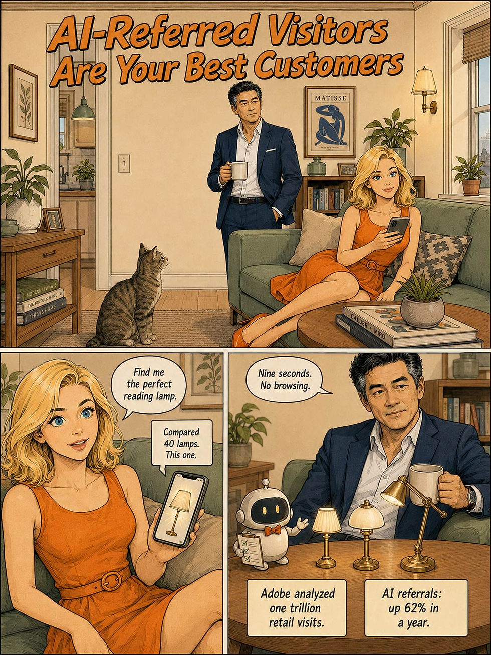


Alice and Zimo act out a textbook example of agentic shopping, drawn in Sunday Domestic Comedy style. (GPT Image 2)

The bottom line. (GPT Image 2)
AI Visibility Can Shift 46x Overnight, Without Users Noticing a Thing
We just saw how valuable AI-referred traffic is. Now consider how fragile it is: Klaas Foppen (Promptwatch, an AI-search monitoring firm) documented a structural change in how ChatGPT Search prioritizes sources after the GPT-5.6 rollout: on August 8, 2026, the share of ChatGPT’s behind-the-scenes search queries that targeted a single named domain (site: searches) jumped roughly 46x (from 0.4% to 17% of queries), and within a week Reddit’s share of ChatGPT Search citations collapsed 86%, from 3.8% to 0.52%. (Good riddance to Reddit, whose quality has fallen off a cliff in recent years. I’ll cry dry tears to see it cited less.)

After an update, ChatGPT abruptly reshuffled the sources it cites in its answers: fewer forum discussions, likely due to their declining quality (especially on Reddit), and more established websites. (GPT Image 2)
The analysis draws on Promptwatch’s real-interface monitoring across major AI platforms and cross-checks against Google AI Overviews and independent citation trackers. Foppen’s conclusion: this change in ChatGPT’s source prioritization shifted AI search visibility from forums and community content toward official and brand domains.
Content strategy built on AI-search visibility (AKA GEO = generative engine optimization) rests on quicksand: mechanisms that can shift 46x overnight, with no announcement. Two lessons. First, if part of your discovery strategy is community presence (Reddit threads, forum answers), its AI-search payoff just cratered, while authoritative owned domains gained. Second, and more broadly for UX researchers: users see none of this. The answers keep flowing while the evidence base underneath them silently reorganizes, which is a transparency problem worth studying in its own right.

Users consume AI-generated answers without knowing which prioritization mechanisms were used to compose them. Of course, that’s the way it has always been for search engine rankings, as far as most users are concerned, because only geeks like me knew about PageRank. (GPT Image 2)
Consensus Theater: The Average Meeting Hides 3 Unspoken Disagreements
Your design crit ends with nods all around. “Simplify the dashboard,” everyone agrees. Two weeks later, the PM has cut features, the designer has decluttered the layout, and the engineer has collapsed three API calls into one endpoint. Three people, three products, one word. Nobody lied, and nobody was careless: each participant filled the ambiguous term with his or her own private assumptions, and the meeting never surfaced them.

What does it really mean to “simplify the dashboard”? People’s interpretations differ. (GPT Image 2)
New research from Kaiming Liu and colleagues at Tsinghua University names this failure the illusion of alignment: a collaborative dialogue ends in surface agreement while the participants still differ on goals, assumptions, or execution plans. Their motivating example is a lead telling an engineer to “learn Torch before debugging”: the lead means the client’s legacy Lua-Torch codebase, the engineer preps modern PyTorch, and a week of work evaporates.
The nasty part is that this failure is undetectable by normal means. If people knew they disagreed, they’d say so. Since they don’t know, you can’t ask them. And the transcript is spotless: no hedging, no contradiction, no repair. An AI reading the transcript concludes that everybody agrees. So did everybody in the room. Both are wrong.

Pretend to agree, or sincerely believe you agreed. Either way, the disagreements stay buried. (GPT Image 2)
The Tsinghua fix is elegant. Instead of asking a model to judge whether people disagree, their system reads the transcript and generates a few concrete multiple-choice questions about what was decided (“What should the engineer prepare? A. Lua-Torch. B. PyTorch. C. Either is fine.”). Each participant answers privately. When two people pick different options, that split is the disagreement, established by the participants’ own behavior. The model proposes; the answers decide. No AI verdict, no hallucinated mind-reading. And the multiple-choice format is an old friend from my usability heuristics doing new work: recognition beats recall. You can’t articulate an assumption you don’t know you hold, but you can recognize your position in a lineup of alternatives.
Does it matter outside the lab? The team ran its trained detector, a small specialized model called IoA-Prober (8 billion parameters), on 18 real working meetings with 43 participants. It surfaced 2.89 validated hidden disagreements per meeting, beating the frontier giants, and the participants themselves confirmed 95% of the flagged splits as genuine gaps they had never voiced. Almost 3 landmines per meeting, buried under what everyone believed was consensus. (Humbling aside: on the team’s benchmark of dialogues with planted disagreements, none of 9 frontier models cracked 50% detection. The signal hides in private context that a meeting transcript doesn’t contain, so this is a hard AI problem.)

Participants left believing they were aligned, yet the 18 real meetings analyzed averaged almost 3 hidden disagreements each. (GPT Image 2)
UX work is a hothouse for the illusion: abstract vocabulary (“clean,” “accessible,” “MVP”), cross-functional teammates who load the same words with different operational meanings, and social pressure to keep the meeting moving. Design crits are prime territory, alongside kickoffs, research readouts, and design-to-dev handoffs. Every “agreed” that papers over a definitional split costs you a sprint of rework when the divergence finally surfaces in the artifacts.
Collaboration tools should build this in now: Zoom, Teams, Figma, Miro, take note. Add a private alignment check before decisions become commitments. When a meeting closes on a decision, the AI drafts 3–5 neutral, concrete multiple-choice questions about what was agreed; every participant answers privately in a minute; only the splits return to the group for 5 minutes of targeted discussion. Three design rules are non-negotiable: the AI only proposes the questions, so participant answers rather than model judgment determine whether disagreement exists; results stay symmetric, visible to every participant and never a boss-only surveillance feed; and answers stay anonymous, so nobody learns who picked what.
Consensus theater plays nightly in every conference room. Cancel the show.
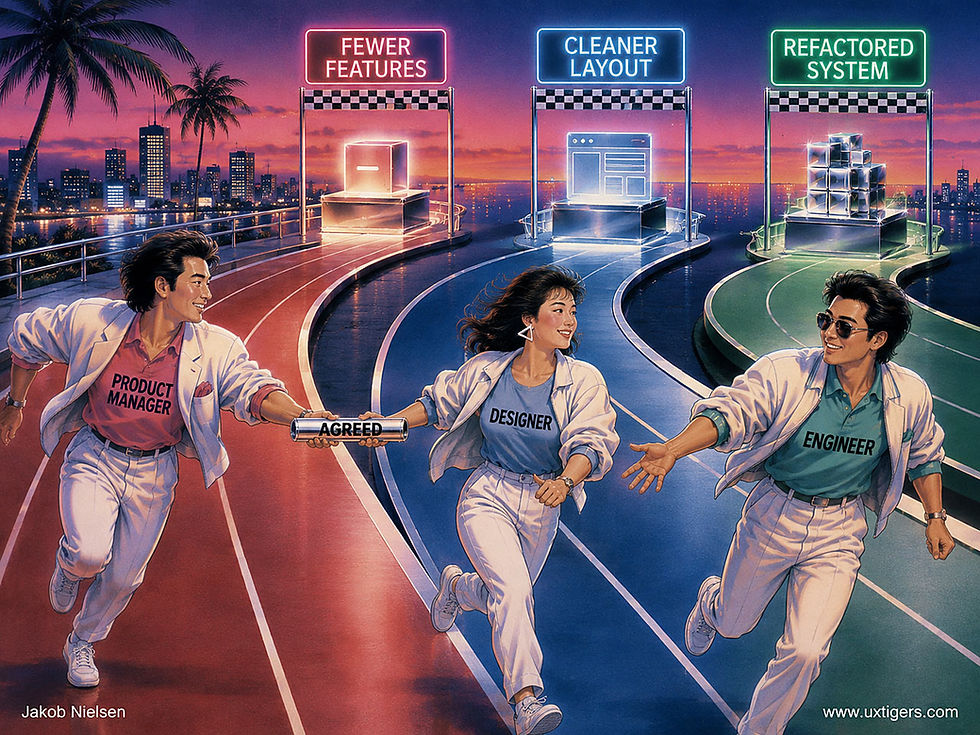
UX projects pass through handoffs at every step, between disciplines that easily misunderstand each other. An AI-run alignment check would be a valuable addition to your process. (GPT Image 2)
The Only AI Attitude Survey I’d Recommend Asks 17 Questions
Watch what users do, not what they say. I’ve preached this since the 1980s, and AI hasn’t repealed it. To learn whether a chatbot helps people, give 5 users real tasks, watch them, and measure the outcomes: time, success, and the quality of what they produce. A rating scale records how somebody feels about last Tuesday’s session. That’s an opinion, not a usability finding. (Opinions do predict renewals, so executives love them. Fine. Just don’t confuse the two.)

The 3 A’s of user opinions: To assess attitudes, ask. (GPT Image 2)
But if your boss insists on surveying attitudes toward AI, one instrument now earns my recommendation: the 17-item questionnaire from my good friends Jim Lewis and Jeff Sauro at MeasuringU. (I’m not recommending their survey because these guys are old friends, but because they always use rock-solid methodology, if sometimes a bit more elaborate than my discount-usability tastes call for.)
They started with 34 candidate items covering 6 constructs (productivity, trust, dependency, anxiety, personification, and early adoption), collected ratings from 420 U.S. panel participants about ChatGPT, Claude, Gemini, and Grok, and then did the psychometric work that homemade surveys skip. Factor analysis measured how well each item tracked its construct, letting the researchers keep the best 2–3 questions per construct and discard the rest.

Factor analysis reduced the number of questions by half while maintaining high reliability in assessing 6 factors of user attitudes toward AI. (GPT Image 2)
The trimmed scales all reached reliability above 0.80. Reliability above 0.70 is considered acceptable in psychometrics; the 10-item SUS, that old warhorse, scores about 0.91, and the 2-item UMUX-Lite (also from MeasuringU) lands at 0.82–0.83. Reliability grows with item count, so 0.81–0.87 from only 2–3 items per construct puts these scales on par with the best short scales in UX.

I much prefer short surveys to torturing users with a barrage of questions that dance around the same few topics. Cartoon jokes aside, my go-to survey also comes from MeasuringU: the Single Ease Question (SEQ). One question, and you’re done with surveys and free to focus on observing users. (GPT Image 2)
And the scales tell the 4 chatbots apart (product-by-scale interaction, p < .0001), making it likely that they’ll also differentiate liked from disliked AI in your products.
The result is 17 questions. That’s a lot. Around question 12, the middle-column reflex sets in: respondents click the neutral option to get it over with. But 2–3 items per construct is the floor (go leaner, and the psychometrics fall apart), and Lewis has validated usability questionnaires since his IBM days in the early 1990s. I trust these 17 thoroughly tested items more than anything your team invents in an afternoon.

Long surveys breed fatigue, so I’d use them only when a detailed understanding of attitudes truly matters to your project. (GPT Image 2)
This type of rating scale is great for benchmarking, but too thin to tell you why trust is low and how to improve it. For that, you still need qualitative research.
So if you must survey, use all 17 questions unchanged, compare against their benchmarks, and spend the rest of your budget watching users. The survey tells you what people say about your AI. Observation tells you whether it works. Only the second pays the bills.

Watch actual behavior. That remains the surest route to insights you can act on. (GPT Image 2)
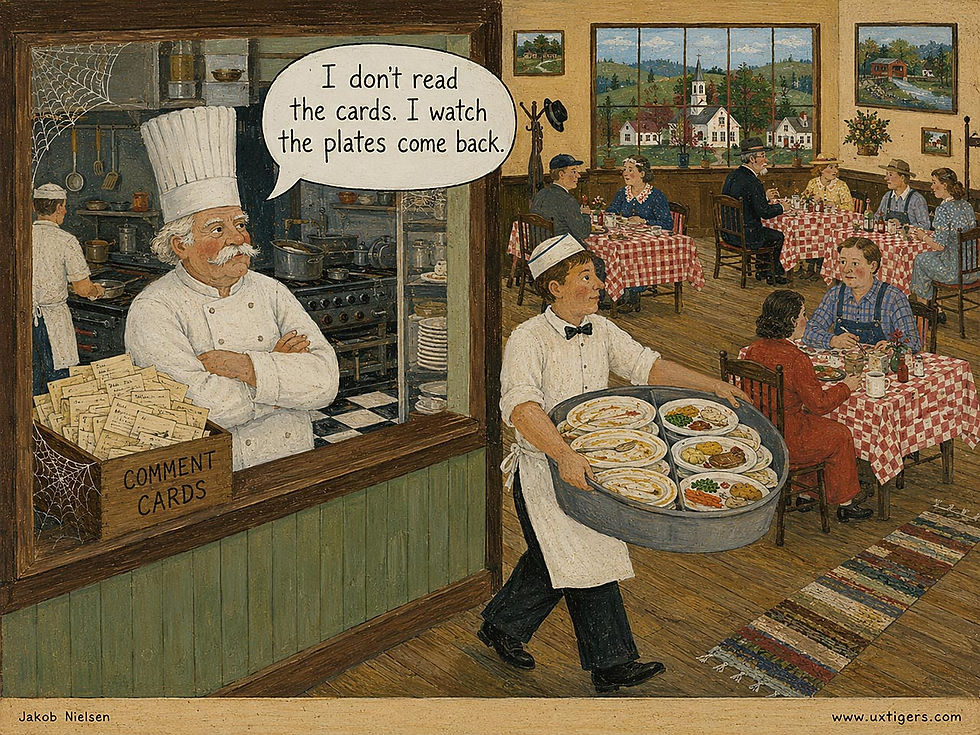
Even better than lab studies: what happens in real customer contexts. If diners leave a lot of food on the plate, that dish didn’t taste good enough. No questionnaire needed; the validity of food left on the plate beats any comment-card feedback. (GPT Image 2)
Stop Chasing Vanity Metrics
Page views measure how many people walked past your shop window. Task success measures how many left with what they came for. Guess which number the board deck features. Vanity metrics flatter because they’re easy to inflate: split an article across 3 pages, and page views triple while readers fume. But outcome metrics resist that game. Did users complete their tasks, will they come back, and would they recommend you? Harder to move, and that’s precisely why they’re worth tracking. Measure what users achieve, not what they click on the way there. Let the confetti blow off the hillside.

Retention has mass. Clicks blow away in a light breeze. (GPT Image 2)
The Sunk Cost Fallacy: Why 54% Chose the Ski Trip They’d Enjoy Less
Money, time, and effort already spent should carry zero weight in a forward-looking decision, yet 54% of people in the classic experiment picked the vacation they’d enjoy less because it cost twice as much. Design can honor users’ invested effort or hold it hostage, and design teams sink themselves by shipping doomed designs because 9 months went into them.
Definition: The sunk cost fallacy is the tendency to continue a course of action because of the resources already invested in it, even when a better future lies down another path. Rational decision theory is blunt: costs you can’t recover are “sunk,” shipwreck-style, and belong on the seabed, not in your next decision.
Economist Richard Thaler flagged the effect in 1980; psychologists Hal Arkes and Catherine Blumer nailed it in 1985 in “The Psychology of Sunk Cost”. In their first experiment, 61 students imagined a $100 ski trip to Michigan and a $50 trip to Wisconsin, booked by accident for the same weekend, both nonrefundable, with Wisconsin promising more fun. 54% chose Michigan. The worse weekend won because it cost more. In the second, the researchers randomized the first 60 buyers at the Ohio University Theater’s 1982–83 box office to pay full price ($15), $2 off, or $7 off for season tickets. Full-price patrons attended an average of 4.11 plays in the first half-season versus 3.32 and 3.29 for the discount groups. Same plays, same seats; only the sunk amounts differed. (Mercifully, the effect faded by the second half-season. Even sunk costs depreciate.)
The fallacy’s alias is the Concorde fallacy, coined by biologists Richard Dawkins and Tamsin Carlisle in a 1976 Nature paper on animals overinvesting in doomed broods, published the very year the plane entered service. Concorde was budgeted at £70 million in 1962 and had devoured a staggering £1.3 billion by launch, 3 years late (UK National Archives). Britain pondered escape as early as 1964 but kept paying: partly to dodge treaty penalties, partly for 16,000 jobs, mostly because so much was already spent. No airline other than the sponsors’ flag carriers ever bought one; the last flight was in 2003. (A magnificent machine, to be clear: Mach 2 with champagne service. The engineering soared; only the arithmetic crashed.)

The receipts are paid, the hours are spent, and none of it will move this man an inch down the road ahead. That’s the sunk cost fallacy: the door charges no admission, but the clock charges everything. (GPT Image 2)
Sunk Effort Is a Design Material
Users invest in your product constantly: learning conventions, filling forms, feeding it data, building streaks. That effort is why they stay, and design can put it to honest work.
Start with the sacred rule: never destroy user work. A session timeout that empties a cart, a validation error that wipes 20 fields, a crash that eats a draft: each converts sunk cost into sunk fury. A user who has completed 20 fields won’t lightly abandon at field 21, because he or she has too much on deposit. Delete the deposit, and you teach a lesson no one forgets. Autosave everything, always.
Then give honest head starts. In Joseph Nunes and Xavier Drèze’s car wash study, 300 customers received loyalty cards: half needed 8 stamps for a free wash, half needed 10 but got 2 stamps free. The remaining effort was identical, yet 34% completed the endowed card versus 19% for the plain one. Pre-crediting steps users have already taken (“profile 40% complete”) does the same for onboarding and is legitimate whenever finishing truly serves the user.
And respect their largest investment of all: conventions learned everywhere else transfer to your design free of charge, if you follow standards.
When Investment Becomes a Hostage
But the same psychology curdles into dark patterns when designers weaponize what users have sunk. Cancellation flows that warn “you’ll lose everything you’ve built” hold years of photos and playlists for ransom on the way to retention purgatory. Streaks slide from motivation into obligation. (Duolingo knows its streaks can bite; to its credit, streak freezes let users miss a day without forfeiting a year.) And wizards that demand account creation at step 5 of 6 are betting you won’t quit after investing 4 steps. You probably won’t. You’ll just resent it. The remedies: full data export, pause instead of cancel, and costs disclosed at step 1, so commitment grows from value, not entrapment.
The deadliest sunk costs, though, sit inside the design team. “We’ve spent 9 months on this redesign” has shipped more bad UIs than any dark pattern, with usability findings ignored because the design is “done.” This is one reason I’ve pushed discount usability methods since 1989: a paper prototype nobody sweated over is a prototype nobody defends to the death; every added sprint welds the team to the design. So test with 5 users while changing course is still cheap, and write your kill criteria before the project starts, while nobody’s pride is on the line. Then apply my drop-the-rope test: if this feature, project, or subscription weren’t already strapped to your shoulders, would you pick it up today? If not, drop the rope.
6 Design Guidelines for Sunk Costs
Never destroy user work. Autosave drafts, preserve form entries through errors and timeouts, and restore sessions after crashes. Wiping invested effort is the fastest way to teach users to leave.
Give honest head starts. Pre-credit steps users have already completed; endowed progress nearly doubled completion (34% vs. 19%). Reserve the trick for journeys that benefit the user, not just your activation metric.
Let learning transfer. Users’ biggest sunk cost is the conventions they’ve mastered elsewhere. Follow standards, and that investment works for you instead of against you.
Take no hostages. Offer full data export, account pausing, and streak freezes. Retention that depends on exit penalties is churn on a delay timer.
Don’t end-load the pain. Springing fees or registration demands late in a flow exploits invested users; disclose at step 1 and earn the remaining steps.
Decide forward, always. Set kill criteria before projects begin, test prototypes with 5 users while abandoning is cheap, and rerun the drop-the-rope test at every milestone: would you start this today?
Look once more at the poor fellow in the illustration. Nothing fastens those ropes to his shoulders except his own grip, and the door stands open, lit, and free of charge. Shakespeare diagnosed the condition in 1606, in Macbeth’s line about being “in blood stepped in so far” that turning back would be as tedious as wading on. He kept wading. It didn’t end well. Your 9-month redesign, your users’ 365-day streak, and a £1.3 billion airplane are all the same clock: sunk costs are heavy luggage and terrible advisers. Drop the rope and take the road.
The Tools Palette: 42 Years of Making Modes Visible
A tools palette shows an application’s tools as an ever-present grid of icons; selecting one changes what the pointer does. Palettes succeed by making modes visible and spatially stable, and they fail when icons turn cryptic and half the toolset hides in flyout burrows.

15 tools, 0 labels: a palette lives or dies by whether its pictograms explain themselves, and by the tooltips that rescue the ones that don’t. (GPT Image 2)
Definition: A tools palette is a persistent panel of mutually exclusive tools (select, crop, brush, eraser, text, zoom, and friends). Choosing a tool sets the pointer’s mode: it determines what the next click or drag will do, until the user picks another tool.
The name borrows from the painter’s palette, with its pigments held within arm’s reach, and the software genealogy is short and glorious. Richard Shoup’s SuperPaint at Xerox PARC (1972–73) pioneered computer painting, but the canonical form arrived with Bill Atkinson’s MacPaint in 1984: a slim 2-column strip of pictographic tools (lasso, pencil, brush, spray can, eraser) parked beside the canvas. Photoshop (1990) inherited the layout, and 42 years after MacPaint, every creative application still ships a recognizable descendant. Few UI inventions age that well.
A Truce in the War on Modes
A tool is a mode, and modes have a criminal record: the user acts believing the system is in mode A while it sits in mode B, and mayhem follows. Larry Tesler fought modes at Xerox PARC in the 1970s with a zeal usually reserved for religion, building the modeless Gypsy editor (1975) and driving around with a license plate reading “NOMODES.” He was right about text editing. But drawing programs can’t escape modes, because a click on the canvas must mean something, and “select,” “paint,” and “erase” are different somethings.

Larry Tesler, who did pioneering UI work at Xerox PARC and Apple (and later was Amazon’s VP of shopping experience), had a custom “NOMODES” license plate. I had a nice dinner with him in Paris some years ago, but he hadn’t brought the car. (GPT Image 2)
The tools palette is the negotiated truce. Modes may exist, provided they’re visible (the active tool stays highlighted), stable (tools keep fixed positions, so spatial memory and muscle memory take over), and announced at the point of action (the cursor changes shape to preview what a click will do). That last provision applies my first usability heuristic, visibility of system status (1994), to the most dangerous thing in any interface: the mode. A good palette works like a carpenter’s bench: every tool in sight, every tool in its spot, the hand reaching without the eyes checking.
Three further strengths:
Recognition over recall. The toolset sits on permanent display instead of living in the user’s memory as command names.
Frequency economics. Creative work switches tools hundreds of times per session, so a 1-click switch (or 1-keystroke: V, B, E) beats any menu by a wide margin.
Chunking by neighborhood. Selection tools cluster, paint tools cluster, navigation tools cluster, so users search a region rather than a list.
How Palettes Rot: Mystery Meat and Flyout Burrows
Mystery-meat icons. 15 unlabeled pictograms invite guessing. Quick: what separates the dashed circle from the dashed square? (My illustration reproduces this quiz faithfully.) Icons are a memory aid for tools you know and a riddle for tools you don’t; tooltips with the name and shortcut are the cheap cure.
Flyout burrows. Modern Photoshop hides roughly 2/3 of its tools in long-press flyouts beneath sibling icons. Users can’t find what they can’t see, so the palette’s core virtue, visibility, gets traded for tidiness. (In fairness, Adobe’s keyboard shortcuts and spring-loaded tools are excellent, and 70-odd tools were never going to fit in MacPaint’s strip. The sin isn’t grouping; it’s hiding tools with no visible hint that anything is buried.)
Mode amnesia. The user forgets which tool is active, then drags what should have been a selection and paints a fat stroke across the artwork instead. Every second of undoing is a tax levied by weak mode feedback: a timid highlight, an unchanged cursor.
Palette sprawl. Floating palettes drift over the canvas until users pay a window-management toll before every stroke. Docked, collapsible panels ended most of this misery; resist reintroducing it.
Convention violations. The magnifier means zoom in every application your user has ever opened. Jakob’s Law (mine, 2000) says users spend most of their time in other products, so a reinvented icon taxes every newcomer for zero benefit.

The past shapes the future, according to Jakob’s Law. (Grok Imagine 2)
8 Design Guidelines for Tools Palettes
Give every tool a tooltip with its name and keyboard shortcut, appearing within about 0.5 seconds of hover. On touch, a long-press should reveal the label.
Make the selected state unmistakable: a filled background plus an outline, not a 1-pixel border that requires forensic examination.
Change the cursor per tool so the current mode is announced exactly where the user is looking: at the point of action.
Follow iconographic convention for the classic tools (arrow, crop, eyedropper, magnifier, hand). Save your creativity for tools that have no established icon.
Keep tool positions fixed. Spatial memory is the palette’s superpower, and rearranging tools between versions burns it down. Customization should be strictly user-initiated.
Limit hiding to 1 flyout level and badge it: a small corner triangle, plus a “show all tools” view, tells users that more lurks below the surface.
Offer spring-loaded temporary tools: hold the spacebar for the hand tool, release to snap back. Jef Raskin called these quasimodes (The Humane Interface, 2000), and they abolish mode amnesia for transient switches because the muscle tension itself remembers the mode.
Size targets at 1 × 1 cm on touch and at least 24 × 24 pixels with a pointer, the floor codified in WCAG 2.2 (2023). Tools are hit hundreds of times per session; misses compound.
MacPaint’s little strip of pictograms has survived 42 years because it solved a genuine problem: it made modes visible, stable, and cheap to switch. The palette will survive the next 40 too, because drawing on a canvas will always need modes, and no committee has invented a better truce. Your job is to keep the truce honest: label the tools, announce the mode, and never hide what users need to see. Tesler’s license plate was half right. We couldn’t kill modes, but we can keep them in plain sight.
Final Thought of the Day


