UX Roundup: People Tell AI Their Secrets | Employment & AI | Long Forms | Two Ways of Using AI | Flow | Funny AI | Triangulation | IKEA Effect | Focus

Summary: Users say they don’t trust AI, but they tell it their secrets anyway | More people have gained jobs because of AI than have lost them | Every form field you cut increases conversion | The two main ways users direct AI: specify upfront or correct as you go | Keep users in the flow | How to use humor in AI | Combine insights from multiple research methods | The IKEA effect increases the perceived value of something you built yourself | Protect users’ focus by limiting distractions

UX Roundup for September 21, 2026 (GPT Image 2)
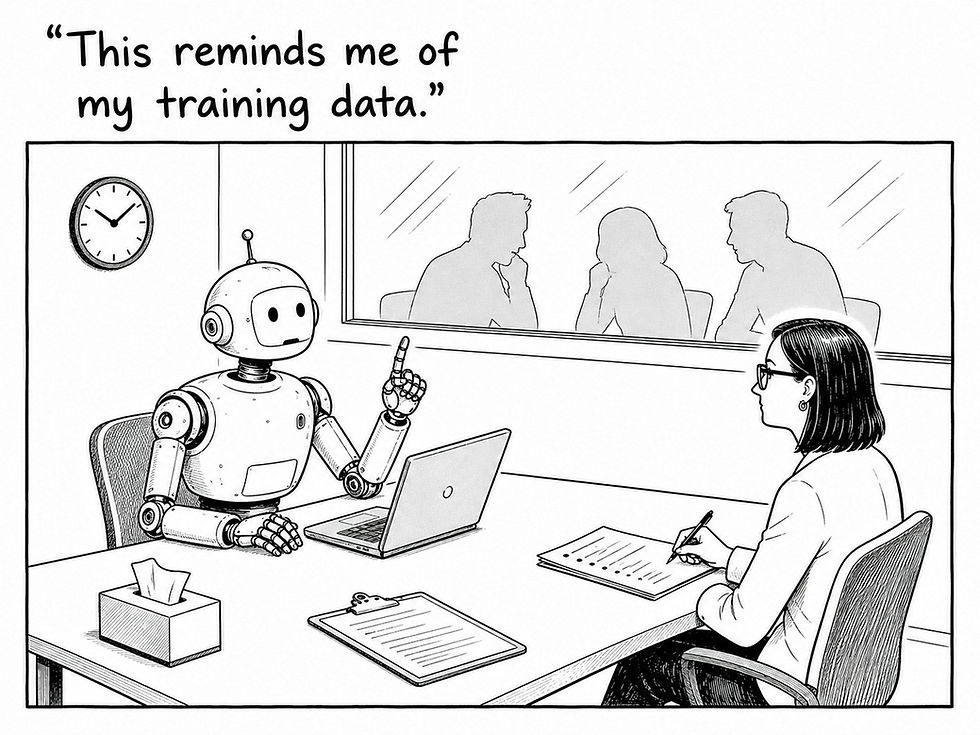
A Third of AI Users Have Told a Chatbot Something They Kept From Friends, Family, or Their Doctor
DuckDuckGo surveyed 1,944 US adults about what they tell AI chatbots and what they know about where those disclosures end up. 32% of AI users have disclosed something to a chatbot that they withheld from close friends, parents, or medical professionals; among self-described AI enthusiasts, the figure is 56%.

People willingly tell AI things they otherwise keep secret because AI doesn’t judge them and is always nice. (GPT Image 2)
Trust is thin: only 14% trust large AI companies to protect their data. But their reported behavior tells another story: they spill the beans anyway. This echoes many prior findings that people voice privacy concerns while acting as if privacy doesn’t matter.
People treat the chat box as a confessional, and the interface encourages it: no face, no judgment, no raised eyebrow.

As always, what people say and what they do tell different stories. (GPT Image 2)
AI Doesn’t Cause Unemployment
Sociology professor Jeffrey C. Dixon asked 1,250 employed Americans 25 questions about AI at work. Since 2023, 3% report having lost a job to AI automation, and 95% report no such loss. Among these respondents, 6% landed a job that didn’t exist before AI, and 9% received a promotion tied to AI skills.
The survey’s arithmetic:
Job gains = 2× job losses
Promotions = 3× job losses

People are earning promotions because of their AI skills. Hint. (GPT Image 2)
Thousands of years of human history show that technological revolutions don’t cause unemployment: better technology wipes out old jobs, but new jobs take their place. Thus, I’m not surprised by the finding that more people gained jobs than lost them because of AI.
But I wouldn’t have expected that 9% of staff would already be good enough at AI to earn a promotion.

Old jobs disappear, and more new ones arrive. The pattern reaches back to the Stone Age. (GPT Image 2)
Every Field Must Earn Its Place
A long form is a long list of questions, and every question makes a small demand on the user: recall, type, check. Middle name, fax number, email confirmation, department: the requests keep coming. Each costs the user seconds and nibbles away at your completion rate, and those losses add up.
Baymard Institute found that the average e-commerce checkout contained 11.3 form fields in 2024, down from 12.7 in 2019, while its testing shows most sites need only 8. Baymard also found that field count matters more than step count, so spreading the same 20 questions over 4 pages leaves the burden intact. The form on this poster asks for 18 things before page 2 of 4; whoever built it never had to fill it in.
Put one question to each field: “What will we do with this answer today?” If you won’t use the answer yet, delete the field or defer it to a later, optional moment when the user has a reason to answer.
Fax number fails the test in 2026; so does email confirmation, which users defeat by copying and pasting. Ask for what the transaction needs, prefill what you already know, and treat every remaining field as a favor you’re requesting. A form is a conversation with someone in a hurry; don’t ask questions when you won’t use the answers.

Every unneeded field is a tax on patience, and users’ patience runs out before the form does. (GPT Image 2)
The Two Ways Users Direct AI: Specify Upfront or Correct as You Go
Novelists come in two breeds: architects, who outline the whole plot before writing the first sentence, and gardeners, who plant a premise and prune whatever grows. (George R.R. Martin popularized the distinction, then spent 15 years demonstrating the risk of gardening without a deadline, which is why the final TV season of Game of Thrones was terrible.) AI users divide along the same line.
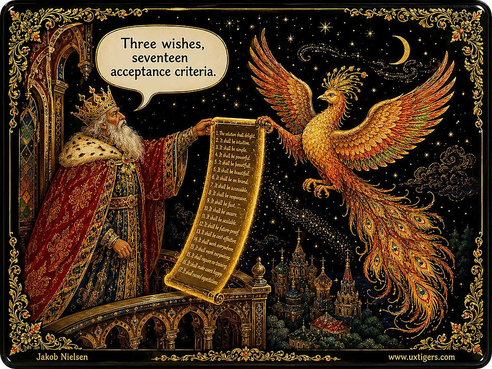
Every magic-genie story ever told is a cautionary tale about underspecified delegation. (GPT Image 2)
A new analysis by Jorge Fábrega of Universidad del Desarrollo in Chile (arXiv preprint) mined the Anthropic Economic Index and found two main ways people direct AI-assisted work. In specified delegation, the user defines the task before execution through instructions, constraints, and acceptance criteria. In iterative coproduction, he or she steers the work in progress by correcting the AI’s provisional drafts. Architects write the brief; gardeners prune what grows.

An open-ended request delegates both execution and judgment to the AI, though the user can still correct course after seeing the AI’s initial result. (GPT Image 2)
The index compresses millions of Claude interactions from April and May 2026 into roughly 20,500 cells of monthly activity data. These are classified by O*NET work tasks and divided between two modes of use: raw API traffic and the Claude.ai chat interface.
Stakes Buy Specification
Fábrega’s clever move is to examine the mix of purposes behind AI use. For each activity, he estimates what happens to the two control profiles when 10 percentage points of usage shift from personal purposes to work purposes. The specification profile climbs in both modes: by 2.8 points (on a 0–100 scale) in API traffic and 1.5 points in Claude.ai.
So when the output will be judged by a boss, a client, or a court, users invest in the brief before the work starts. Consequences turn prompts into contracts.

Work use drives specification: when the outcome carries professional consequences, users write real briefs before delegating. (GPT Image 2)
For personal use, the reverse pattern makes sense. When choosing dinner, prompt-and-pray is rational: the worst a casual one-liner can serve up is a bad meal suggestion. Users calibrate control effort to consequences, which is exactly what a usability analyst should expect. Yet one-size-fits-all chat boxes ignore this distinction.

The more your reputation depends on AI output, the more you’ll invest in strict requirements. If your portrait is destined to hang in the manor house dining room for generations, you want it painted just right, whether by a robot or John Singer Sargent. (GPT Image 2)
Steering Shows Up Only Where the UI Supports It
The iterative route behaves differently. Across activities observed in both chat and API, the same 10-point shift toward work use moves the iteration profile by +0.15 points in Claude.ai and by −0.3 points in the API. Neither change is statistically distinguishable from zero on its own, but the between-mode gap of 0.45 points is (95% confidence interval: 0.15–0.75). The shift toward iteration is thus relatively greater in chat than in API use.
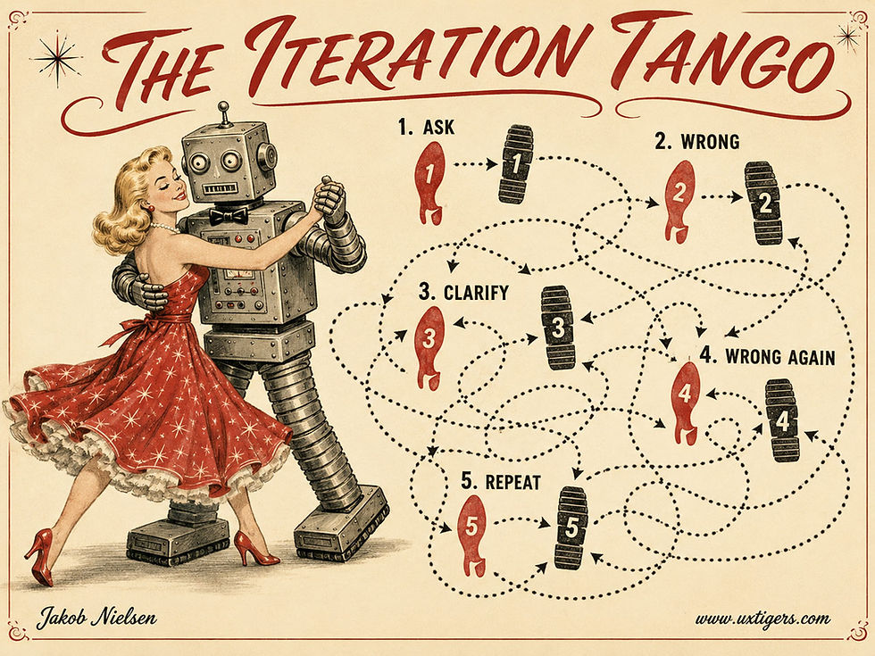
Iterative coproduction: without a plan, directing the work can become a seemingly endless sequence of “no, not like that” corrections. (GPT Image 2)
The effect is small, but its direction is clear: steering during production concentrates where the interface makes it cheap. A chat thread keeps every correction attached to the draft that provoked it, so redirecting the AI costs one sentence. An API call arrives as an isolated input-output pair, and any iteration depends on orchestration code.
(Fábrega flags a second caveat himself: the number of exchanges tells us little about direction. 58 polite regeneration requests can leave a product exactly where it started.)
That measurement gap carries a warning for UX researchers: if your product logs single requests, your telemetry will “prove” that users don’t iterate. You’ve mistaken a blind spot in your logs for a user habit. Watch what users do, but first check what your instruments can see.
Design for Architects and Gardeners
Three guidelines follow from the data:
Scaffold the brief. Writing a good specification is a skill, and half the population struggles to articulate what it wants (see my analysis of the articulation barrier). Offer templates, constraint pickers, example galleries, and editable acceptance criteria. The blank prompt box is where specifications go to die.

Constraining the output format would have worked wonders with the ancient oracles that famously produced ambiguous predictions. It’s certainly a good way to steer the modern equivalent: our AI models. (GPT Image 2)
Make pruning cheap. Show provisional output early, and let users fix the exact part that’s wrong without rewriting the whole prompt. The conversation transcript is version control for thinking: keep it visible, and preserve it as the work moves from one revision to the next.
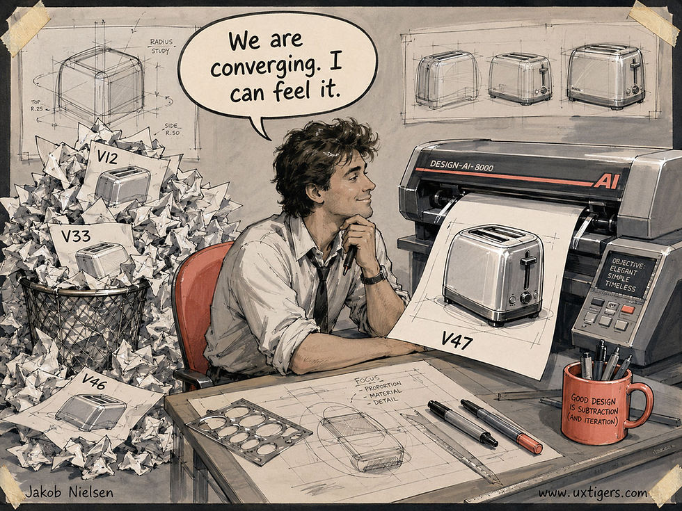
Gardeners improve the result by pruning what grows, correcting each draft as they go. Cheap correction makes even version 47 affordable.
Match the route to the task. Stable, repetitive tasks deserve a saved, reusable specification. My rule of thumb: a task you run weekly needs a written specification, and a task you run daily should have a thoroughly tested one.
Ambiguous work that demands judgment needs live correction loops. Work with serious consequences needs both, plus a record of who set the criteria and who accepted the result. Skipping that record creates brief debt, and you’ll repay it during the postmortem, with interest.
In this analysis, both “profiles” are indices derived from AI-classified behavior, which limits how faithfully they describe actual tasks or users. Treat the exact magnitudes with suspicion. But the direction of the findings rests on observed behavior at scale. That gives it a firmer foundation than asking users how carefully they believe they prompt. Behavioral evidence beats survey self-flattery every time.
Conclusion: Sell Blueprints and Pruning Shears
Today’s AI products serve gardeners tolerably and starve architects almost entirely: a text field, a send button, and good luck. Fábrega’s data show that users, especially those doing paid work, stand ready to invest in upfront direction; the tools give them nowhere to put it.
I predict that the next competitive frontier in AI UX will be specification support: structured briefs, reusable criteria, and revisions whose changes are easy to compare. The AI does the typing either way. Whether a human still does the directing is a design decision, so make it deliberately.
Keep Users in the Flow
You can’t always remove a step: the user must open, choose, and confirm before anything happens. At least make each remaining step so obvious that it barely registers as a step. Psychologist Mihaly Csikszentmihalyi named this absorbed state “flow” in 1975: total engagement with the task, with no attention left over for the tool.
An interface supports flow when every action follows the user’s momentum, with no stumbles between steps. Friction arises whenever he or she must stop and think about the interface instead of the goal. Hunt down those moments and smooth the path. Users will glide through without noticing your careful engineering, which is precisely the compliment you want.

Flow is what users feel when the interface stops demanding attention. (GPT Image 2)
AI Stand-Up Comedy: Funnier as a Machine Than as a Fake Human
An AI comedian that mined its own machine identity for jokes beat the same model doing generic material by more than a full point on a 7-point humor scale (4.9 vs. 3.7). Humor has made computers more likable since the 1990s; the news is that the machine no longer needs to hide behind a human mask.

Welcome to the AI comedy club, where the machine supplies its own comic material. (GPT Image 2)
Machine Identity = Comedic Material
Xuehan Huang and co-authors from universities in Hong Kong, mainland China, and the United States built an AI stand-up comedian for a live online audience (“Not Human, Funnier,” CHI 2026 conference). They started the right way: by studying human experts first.

How can we make AI more funny? Through research! (GPT Image 2)
Interviews with 5 professional comedians and a coded analysis of 50 stand-up videos confirmed that identity fuels much stand-up humor. Comedians introduce themselves through jokes, invoke a stereotype and then break it, and make fun of themselves so the audience can feel comfortably superior.
An AI has no ethnicity, hometown, or embarrassing relatives. But it does have an identity: it crashes, it hallucinates, and it predicts the next word for a living. So the researchers prompted their agent to mine its machine nature for laughs, complete with the stage name Stand-Up.exe and this line about human dreams: “Me? My dream is just 404 Not Found.”

Can AI be funny, and will users enjoy an AI that cracks jokes? A team of researchers put these questions to the test. (GPT Image 2)
The study’s 32 participants watched two performances by the same underlying model (GPT-4o mini): the machine-identity comedian and a baseline agent given a generic talk-show prompt. Audience members typed “H” to laugh. The machine-identity act scored 4.9 for perceived humor (vs. 3.7 for generic AI-generated jokes), and participants also rated it higher on warmth and agreeableness.
Then came a curious twist: it scored higher on anthropomorphism and animacy as well. Dropping the human act made the bot seem more human and more alive to its audience.

AI that admits it’s a machine gets more laughs than AI pretending to be human. (GPT Image 2)
The study has limits: the audience was small, young, and mostly East Asian, and the experimental condition bundled identity with a full kit of comedy craft (joke structure, timing rules, and pauses after punchlines). Thus, the experiment never isolated the effect of identity alone, a limitation the authors acknowledge.
Even so, the entire gain came from prompt and interaction design on a small, cheap model. The model stayed the same; better design got more laughs.

Design can drive humor. (GPT Image 2)
1998 Called: Computer Humor Already Worked
John Morkes, my colleague from Sun Microsystems (we ran the foundational 1997 web-reading studies together), teamed up with Hadyn Kernal and Clifford Nass of Media Equation fame for two Stanford experiments, reported in a CHI 98 summary and the full 1999 paper in the journal Human–Computer Interaction. Participants solved the Desert Survival task with a partner that occasionally offered one of 5 canned, pretested jokes. Half believed the partner was another person; half knew it was a computer.
The jokes made the computer more likable. Users joked back and typed friendly asides to the machine, even though every participant swore it couldn’t appreciate them. And the humor carried no productivity penalty: task time and effort were unchanged. Users even felt the computer was more competent and cooperative when it cracked the occasional joke.

When you can laugh at yourself, you become more likable. Same for AI. (GPT Image 2)
But one effect didn’t carry over from the supposed human partner to the computer. Jokes made the fake “person” feel more similar to the user. The funny computer, when people knew it was a computer, remained just a machine in their eyes; humor did nothing to increase its perceived similarity to the user.
The paper’s list of open questions asked outright whether a computer could pull off self-deprecating humor. It took 27 years, but the answer is in: yes, and it’s the best material the machine owns.
(Confession: the 1999 paper politely filed me among the humor skeptics, citing my 1993 advice to keep usability-test tasks businesslike. Fair cop. Their data changed my mind: higher likability at zero productivity cost is a trade any designer should take.)

Traditionally, computers were productivity tools, and I admit that in 1993 I was one of the killjoys who advised against computer humor. (GPT Image 2)
Better Models, Better Jokes? Yes, but With a Ceiling
Is AI humor improving as models improve? The research has produced mixed reviews. Drew Gorenz and Norbert Schwarz of the University of Southern California found that ChatGPT-written jokes were rated as funny as human-written ones (PLOS ONE, 2024). Yet when Piotr Mirowski and colleagues at Google DeepMind had 20 professional comedians try LLMs as writing partners, the pros dismissed the output as “cruise ship comedy material from the 1950s.” (I see this as a classic example of AI stigma: AI jokes can be funny, but that finding cuts too close to home for professional comedians’ comfort.)
Both findings fit: current AI reaches the competent middle of the pack, but it lacks bite. Safety tuning has sanded off whatever edge survived. My prediction: frontier models will keep closing the craft gap, since structure, callbacks, persona consistency, and spoken timing are all trainable skills. The courage gap will close far more slowly. That’s why machine identity matters: it gives AI a patch of comedic territory with authentic material no human can claim.

The “safety” restrictions that the main AI labs place on their models have tended to blunt their comedic potential, since much humor relies on breaking conventions and being edgy. At least AI can make fun of itself, and it turns out that users enjoy a machine with a sense of humor about its own failings. (GPT Image 2)
6 Guidelines for Humor in AI Products
Let AI be AI. Self-deprecating machine jokes (about reboots, hallucinations, and token limits) beat fake human anecdotes. Ration the grievances, though: audiences soon tire of a bot whining about overwork.
Punch up, never down. Tech billionaires and bureaucracy are fair game. Users and demographic groups never are.
Anchor machine jokes in human life. “Data addiction” lands because it mirrors doomscrolling.
Treat timing as a UI feature. Tell jokes during waits, onboarding, and empty states. Pause after the punchline to let it land. Stay silent during errors and high-stakes steps.
Refresh the material. Repetition breeds joke fatigue, as Morkes and colleagues found in 1999. The beauty of AI is a writers’ room that never sleeps and can keep supplying fresh material.
Pretest the jokes. Both research teams did. Test with 5 users; they’ll soon tell you whether your bot is funny or merely embarrassing.
We’ve known since 1998 that users like a computer more when it tells jokes. The 2026 update: the machine kills hardest when it plays itself. The oldest advice in comedy is now an AI design guideline: be yourself, even when “yourself” is a language model.

AI can be funny when it makes the most of its computer nature, and those laughs can help users like it more. (GPT Image 2)
Combine Research Signals
Every evidence source has a blind spot. Users misremember in interviews, analytics count clicks without revealing motives, support tickets overrepresent angry users, and observation covers only the sessions you watched. Triangulation is the remedy: combine the sources so that each helps correct the others’ distortions.
When a user’s comment, a usage graph, and a cluster of support tickets all point to the same sore spot, three things happen: the finding is more likely to be true, stakeholders find it more convincing, and they remember it long after the research presentation ends. Agreement across independent sources is the strongest signal research can produce. One source gives you a hunch. Agreement among three gives you a case.

Prescription-strength research mixes all 4 jars. Intuition stays on the blackboard. (GPT Image 2)
The IKEA Effect: Users (and Designers) Overvalue What They Build Themselves
People place inflated value on things they helped create: in the study that gave this effect its name, participants bid almost 5 times as much for their own wobbly origami as others would pay for it. Invite users to invest effort, and you buy loyalty. But never hold core value hostage behind forced assembly, and never trust your affection for a design simply because you built it yourself.

The crooked chair you assembled yourself earns a pedestal and a gold finish in your eyes, while the flawless factory chair gathers museum dust. Labor leads to love, whether or not the joinery deserves such devotion. (GPT Image 2)
Definition: The IKEA effect is a cognitive bias in which people value products more highly when they have invested their own labor in creating them, even when the finished result is objectively mediocre.
The study that named the effect is a small classic. In 2012, Michael Norton (Harvard Business School), Daniel Mochon, and Dan Ariely (Duke University) published The IKEA Effect: When Labor Leads to Love in the Journal of Consumer Psychology. The paper reported 4 experiments in which participants assembled IKEA storage boxes, folded origami, and built LEGO sets.
Builders bid an average of 23 cents to keep their own amateur origami; non-builders offered a measly 5 cents for the identical folds. Builders even valued their clumsy creations nearly as much as origami folded by experts and expected other people to agree. (Other people didn’t agree.)
The name honors the Swedish flat-pack giant whose business model outsources assembly to the customer, converting your Saturday afternoon and an Allen key into affection for a bookcase. Two limits to the effect matter for design. Novices experienced the effect, as did self-declared do-it-yourself types. And it evaporated when participants failed to finish or had to disassemble their work: labor leads to love only when labor leads to completion.
Older Than Flat-Pack Furniture
The 2012 paper named the effect, but the mechanism has a longer pedigree. In 1959, Elliot Aronson and Judson Mills showed that people who endured a severe initiation to join a group rated that group more favorably, a phenomenon known as effort justification. Leon Festinger’s cognitive dissonance theory (1957) explains why: having paid dearly, we inflate the prize to keep the story we tell ourselves coherent.
Marketing folklore adds the tale of psychologist Ernest Dichter advising cake-mix makers in the 1950s to require a fresh egg. A mix that demanded a little labor let the baker feel like a baker. Food historians have poked holes in that story, so treat it as legend. Still, it captures the mechanism neatly: effort converts a transaction into a small act of authorship.
Let Users Build, and They’ll Stay
For UX, the IKEA effect pays an effort dividend: every meaningful ounce of user labor invested in your product raises the value the user assigns to it. Products collect this dividend constantly.
A playlist assembled song by song, a dashboard arranged widget by widget, a workspace structured page by page, a recommendation feed trained rating by rating: each is a crooked golden chair its owner will defend. Users stay because their labor has made the product feel like their own. Each small act of creation gives them another reason to return.
So design for authorship. Let users name things, arrange things, and make choices that visibly shape the outcome. My rule of thumb: the user’s first act of creation should reach a satisfying result in under 3 minutes. The research gives us a blunt reason to aim for that quick finish: incomplete labor pays no dividend at all.
A related trick is to show the work being done on the user’s behalf. This also raises perceived value, as Ryan Buell and Norton demonstrated with the “labor illusion” (Management Science, 2011). Fine, but show real work; faking delays to simulate effort is a con, and users eventually catch on.
When Labor Leads to Lock-In or Blinds Designers
The IKEA effect also creates traps for users and designers. The crudest is forced assembly: a 12-step setup wizard demanding profile answers, integrations, and preferences before delivering anything of value. That’s a toll booth masquerading as an effort dividend, and users abandon the product when they reach it. Remember the limit observed in the research: unfinished work forfeits the affection that successful assembly earns. A long setup process also gives users plenty of time to resent the demands.
A subtler trap is weaponized sunk cost: making user-built content impossible to export, so that invested labor becomes a means of captivity. Loyalty should grow from users’ pride in their creations. Trapping people is a different business altogether. Regulators and reviewers eventually notice the difference, and so do users.
And the most easily overlooked victim of the IKEA effect is you, dear designer. You assembled this interface. Thus, the bias leads you to overvalue it, which is precisely why your team resists the usability findings and why the stakeholder’s pet feature is unkillable. You ≠ user, and the IKEA effect is one big reason why.
The same applies to a user defending a cluttered custom dashboard: he or she built it, so it must be good. Fresh outside eyes are the only reliable antidote to this affection for our own handiwork.
6 Design Guidelines for Harnessing the IKEA Effect
Deliver core value through smart defaults first. Invite users to build and customize once they have experienced that value, without making setup the price of admission. A product that works before personalization earns the right to be personalized.
Help users finish their first creation quickly. Get that first playlist, board, page, or automation to a satisfying finished state in under 3 minutes, because unfinished labor earns no effort dividend.
Make the effort meaningful. Every required user action should visibly change the outcome. Filling out forms that change nothing is labor without authorship, and users know the difference.
Provide export and undo. Let users take their creations elsewhere. Pride of ownership gives users a reason to stay; taking their work hostage corrupts the relationship and damages your reputation.
Usability-test your own team’s work with outsiders. Your affection for the design you built is the bias in action. Recuse your inner judge, and watch 5 external users put the design to work instead.
Never fabricate effort. Show real work in progress when it gives users sound reasons to trust your product, but skip artificial delays and fake friction. The effect rewards genuine authorship, and users eventually see through the theater.


Alice and Zimo try building in ink-crosshair style. (GPT Image 2)
Good UX Defends the User’s Attention
Every notification makes a claim on the user’s attention. A new message, available update, or special offer asks to interrupt work already in progress. The sender’s enthusiasm supplies remarkably little evidence that the interruption is worthwhile.

Protect users’ concentration by filtering interruptions, deferring routine updates, and helping people resume their work.
The focus doorman represents a responsibility that belongs in the product. Users shouldn’t need heroic self-discipline to defend their concentration against software supposedly designed to help them work.
Imagine an analyst checking a forecast when a banner announces a colleague’s comment on an unrelated project. Reading it takes little time. Recovering the comparison she was making takes additional effort. In Think-Time UX, I explain why this recovery time belongs in our accounting of usability.
Judge notifications by the value of acting now and the cost of waiting. Deliver genuinely urgent information promptly, collect routine updates for later review, and make promotional messages easy to silence. Quiet defaults should do most of this work before users visit settings.
When an interruption is necessary, preserve the person’s place and provide enough context to resume. A system that remembers filters, selections, and unfinished edits helps rebuild the interrupted thought.
Measure completed work and recovery effort alongside notification clicks. A rising click-through rate can accompany falling productivity.
The doorman earns his salary by being selective about whom he admits.
Final Thought of the Day