
UX Roundup: Adapting AI to Users | What Characteristics of Profitable AI Use? | Integrated AI Design Advice | Progress Visibility | Agent Delegation | AI Must Show Its Work | Free | What Happens Next

Summary: Several approaches help AI learn how to serve individual users better | A survey reveals differences between companies profiting from AI and the rest | Real-time feedback during editing | Show how far a slow process has advanced toward completion | Delegation to AI agents deviates from traditional economic modeling | Show the context, sources, and rules behind AI answers | The price of “free” can overwhelm arithmetic | Be clear about the next step | Keep expandable tree views from becoming thickets | Measure progress by whether users complete their tasks successfully

UX Roundup for September 18, 2026 (GPT Image 2)
AI Must Learn What Matters to You
AI can learn preferences from users’ corrections, reducing the need to specify every detail. New research demonstrates its promise and brings us closer to the noncommand vision I published in 1993. The harder problem remains: understanding what matters to users, why it matters, and when an old preference should stop governing new work.
Users Won’t Write Manuals About Themselves
Personalizing AI shouldn’t require users to write an operating manual for their own minds. Most people have neither the patience to specify every preference nor the ability to author the reusable instruction packages known as AI “skills.” They have work to finish.
Making them describe how an assistant should assist piles another chore to an already crowded plate, Even writing prose about what you want defeats many users: half of adults in rich countries have low literacy, as I documented in The Articulation Barrier. A preference file is a prompt about all future prompts; it raises the articulation barrier across every task the assistant will perform.

It’s too much work for users to write detailed preference specifications for their AI agents. (GPT Image 2)
I favor an approach that lets users teach AI while doing useful work. When you revise a paragraph or rearrange a chart, you reveal something about your standards. The system should learn from the judgment embedded in that effort instead of requiring you to explain the same correction again tomorrow.
In 1993, I defined noncommand user interfaces as systems that act as a side effect of the user’s normal actions, with no explicit command needed. Learning from edits is noncommand personalization. You’d fix that paragraph anyway; teaching the assistant requires no separate chore. The prompt box gave us intent-based outcome specification, which still makes users state their intent; learning from corrections takes the next step toward the vision I described 33 years ago.
Edits Beat Messages, 76% to 68%
Zora Zhiruo Wang and co-authors from Carnegie Mellon, Stanford, the University of Washington, and elsewhere tested this idea in Efficient Test-Time Adaptation through Human-AI Interaction. Their TAHI system learns across successive tasks from messages, direct edits to deliverables, changes to plans, and adjustments to evaluation criteria.
One version converts these interactions into memories and reusable skills that users can inspect and edit. Another adjusts the AI model itself using the difference between its initial output and the corrected result. Thus, skills can remain useful infrastructure while AI takes over the work of writing them.
Humans are lousy skill maintainers anyway: in the first large-scale study of AI skills, 53% of reused skills never got a single update. But users are unlikely to prune rules they never wrote or even knew existed, so the assistant must tend its own skills to prevent skillrot.
In the study, 30 participants completed 600 task sessions (20 each) in research-abstract writing and data visualization, with separate groups for each adaptation method and a control group whose AI didn’t adapt.
The results are encouraging. In data visualization, the memories-and-skills version raised its average score from 77% to 87%. These scores measure the share of evaluation criteria satisfied; they don’t measure the share of tasks completed successfully. Each draft was graded before that session’s corrections, so the gains came from lessons learned in earlier sessions.
A further analysis supports learning from actions: all interaction channels together scored 76% on visualization criteria, against 68% for messages alone. Users’ edits conveyed information that conversation missed. My oldest rule, to give observed behavior priority over users’ statements, holds for teaching AI as much as for user research. An edit shows the standard; a message only describes it.
But users may choose an action simply because the alternative would be too difficult. Observed behavior can record resignation as faithfully as preference.

Users’ actions reveal which options they can reach; their preferred outcomes may remain out of reach. Here, since it’s easy to sit on the stool but impossible to relax in the comfy chair, a literal-minded AI could conclude that the user prefers stools. (GPT Image 2)
The evidence also comes from a small study of specialized work (5 participants in each combination of domain and condition) with AI-graded scores, and nobody measured whether ordinary users saved time, enjoyed the experience, or found it easier than writing their own skills. Those remain open usability questions.
When Every Correction Becomes a Standing Order
There is a deeper problem yet, Beyond the ones already met: An action shows a choice, but one That’s tied to where and when it’s done; Its meaning rests on those alone And doesn’t stand up on its own.
A user wants a playful ode To mark a birthday; down the road, A sober article is due. The AI rhymes each sentence, too: It keeps the rhyme for every thought And loses sight of what you sought.

Just because you had AI write a poem once doesn’t mean that you want your legal brief for the client to become a sonnet. (GPT Image 2)

Yesterday she went hiking and preferred sturdy boots that could take a coating of mud. Today’s plans may call for entirely different shoes. (GPT Image 2)
Even repeated actions can mislead. Someone who shortens every paragraph for a conference submission with a strict word limit may want an expansive tutorial next month. The goal is effective communication; the right length changes with audience and assignment. Then ruleflation sets in: one situational correction inflates into a standing order. Learning theorists call this problem negative transfer: a habit from one setting degrades performance in the next.

You tell the waiter to compliment the chef on a plate of amuse-bouches, and every remaining course arrives as another tiny bite. That’s what happens when AI personalization turns one compliment into a permanent menu. (GPT Image 2)
Remember Office 2000’s personalized menus, which hid commands you hadn’t used lately, explained nothing, and died unmourned? Silent adaptation trades predictability for cleverness.
The researchers recognize this danger: their instructions tell the system to preserve contextual preferences and discard task-specific details. But the study doesn’t establish that it can reliably distinguish lasting preferences from experiments, exceptions, and goals that change over time.

Successful adaptation requires understanding why the solution worked. Even the waterbird doesn’t like the fishbowl. (GPT Image 2)
The study’s findings reveal the limits of what the agents learned. In writing, the agents absorbed 70–74% of the expressed expertise about surface conventions and terminology, compared with 42–43% about context and problem framing. My interpretation: learning a writer’s habits is easier than understanding what a particular document must accomplish. The assistant learns your accent before it learns your argument.
Personalization can also manufacture its own evidence. Once AI decides you favor brevity, it offers only short drafts; your acceptance then reinforces its original guess. Occasionally offer a meaningful alternative when doing so costs little. Otherwise, the assistant mistakes the limits of its own offerings for the limits of your taste. Taste-lock sets in: every restricted choice hardens the assistant’s original guess into an apparent preference.

An assistant can manufacture agreement by narrowing every option to its original guess. (GPT Image 2)
Frequency ≠ Importance
Shruti Mishra sharpens this distinction: “The memory race is over. The judgment race hasn’t started.” Recalling what users said doesn’t reveal which statements matter, especially when nobody stated their importance. Frequency is a poor substitute for importance. A user may correct punctuation 20 times and mention a career ambition once. Counting repetitions would crown the commas.
Designers should make inferred preferences conditional: a useful memory associates concise writing with conference abstracts, records the reason, and stays open to revision when the task changes.
Timing matters too: Zhu and co-authors found that users’ prompting habits crystallize within 3–5 sessions, and an assistant that fixes its picture of the user just as quickly may imprison future work in that first impression.
Robert Scoble captures the missing dimension: “The calendar knows when. You know why.” In his discussion of Ashwin Gopinath’s argument, Scoble sees competitive advantage moving toward deciding what to remember and what deserves an interruption as models and execution become commodities.
The UX requirement follows: judge the cost of silence as carefully as the cost of interruption. A routine lunch and your daughter’s graduation occupy identical calendar rectangles but carry very different consequences if missed.
6 Ways to Fit AI to the Individual
In Individualizing UX, I traced the stages of user targeting from audiences to AI individualization: customization fails because most users never change a setting, and personalization fails because the computer guesses wrong. Every stage must answer two related questions: how does knowledge about an individual get into the system, and who must do the work of putting it there?

None of these approaches is perfect. We probably need a combination that lets AI adapt to users without burdening them with setup and repair work. Finding the right mix will require substantial user research because these mechanisms create a new set of design problems.
Make Wrong Inferences Cheap to Fix
Users need a quick, low-effort way to correct mistaken inferences: controls such as “This task only,” “Use for this project,” and “Forget this preference,” placed where the relevant behavior appears. Reserve questions for ambiguities that could cause substantial rework; asking users to approve every tiny inference would rebuild the specification burden one interruption at a time. The assistant would become a permission pest, demanding attention for the very work it was meant to save.

The system shouldn’t issue major alerts for every minor action, or users will learn to ignore them. (GPT Image 2)
Mishra also observes that discerning what matters requires a more intimate model of the user, which makes correcting the model itself a usability requirement. Users need to ask, “Why do you think this matters to me?” and respond, “You’ve misunderstood my priorities.” Deleting a remembered sentence won’t necessarily remove the mistaken inference built from it.

Deleting the initial record won’t repair a system that still retains every mistaken conclusion it drew from that record. The source disappears; its errors live on. (GPT Image 2)
Test adaptation with changing circumstances: have participants establish a preference, make an exception, try an experiment, and later reverse it. Slip one consequential goal among many trivial requests and check whether the system gives that goal the weight it deserves. Measure the effort of correcting mistakes and the frequency of unwanted carryover alongside output quality; an assistant that remembers everything can still force users into repeated repair work.
Conclusion: Learn My Ways, Leave Room for Change
Learning through interaction holds considerable promise: people express expertise through work they already understand, and AI learns as the noncommand side effect I hoped for in 1993. The longer-term ambition must be to build an assistant that understands enough about users’ goals to know when yesterday’s lesson applies. A competent assistant learns your ways while giving you room to change your mind.
What Separates Profitable AI Users From the Rest
McKinsey has released the results of its annual survey of 1,719 business respondents, 36% of whom work at companies with revenue above $1 billion. Of those surveyed, 44% report enterprise-scale AI adoption, up from 38% last year.
Fully 80% of respondents say AI has improved their own productivity, and 50% say it has improved their decision-making. Yet the share attributing any earnings impact to AI stayed flat at 37%. Only 6% of companies qualify as high performers, with AI contributing at least 5% of earnings before interest and taxes (EBIT).
What distinguishes these high performers from the remaining 94% of companies? The three largest gaps in the survey concern the following practices and ambitions:
Redesigning workflows around AI: high performers led by 48 percentage points (73% vs. 25%).
Expecting to use AI for transformative change across the enterprise: high performers led by 45 percentage points (62% vs. 17%).
Having senior leaders demonstrate ownership of, and commitment to, the organization’s AI initiatives: high performers led by 33 percentage points (65% vs. 32%).
These gaps suggest an action plan for getting more out of AI in your company: put these three practices to work. (I’ve previously recommended redesigning workflows for AI and having management actively demonstrate support for AI by using it themselves.)

To profit from AI, unshackle this rocket from legacy workflows; redesign those workflows around AI’s new capabilities. (GPT Image 2)
The report breaks down people’s assessments of AI by their level in the company: C-level executive, manager, or individual contributor. The main differences concern decision-making and creativity. C-level executives are more likely than individual contributors to say that AI helps them make better decisions (55% vs. 40%) and makes them more creative (47% vs. 38%).
The shares reporting improved productivity and new-skill development are much closer across these two levels: 80% vs. 76% for productivity, and 53% vs. 54% for learning new skills.

C-level executives were more likely than individual contributors to report that AI helped them in two areas: decision-making and creativity. (GPT Image 2)
It’s an intriguing finding: executives report greater benefits from AI for decision-making and creativity than individual contributors do. That’s the opposite of what I had expected, and it deserves further investigation. Unfortunately, the McKinsey report relies on survey responses rather than field observations, so it can’t explain what caused this difference or establish the size of the actual gains.
Put the Model at the Point of Decision

Reversibility is what makes a suggestion safe to accept: one click to apply, one click to undo. (GPT Image 2)
Microsoft Word got red squiggles in 1995, and batch spell-checking was toast. Much accessibility tooling remains stuck in that batch era: audit at the end, then retrofit. Alexa Siu and co-authors at Adobe Research and the University of Maryland built ColorA11Y (ASSETS ’26), a canvas editor that flags low-contrast text as you place it and offers fixes you can apply with one click and continue to edit. These fixes, including recolored text, background plates, and outlines, meet the contrast requirements of the Web Content Accessibility Guidelines (WCAG).

Spell-checking moved to the point of decision in 1995. Accessibility checking is still a separate step, which often makes it an afterthought or something that’s simply not done. (GPT Image 2)
The workflow study was tiny (8 content creators), but the results were lopsided: 100% of text elements passed the contrast check with ColorA11Y, vs. 71% with Adobe Express plus a contrast checker. Ease-of-use ratings were 4.5 vs. 3.1 out of 5, respectively. One participant called the alerts “disruptive, but in a good way.” Checks bolted onto a final audit get skipped; checks built into authoring get used.

A checker that makes you probe every color pair by hand is a checker people often skip: 71% compliance in the baseline condition. (GPT Image 2)
The preference study (40 design-tool users) adds a subtler lesson: the right fix depends on what the designer wants to preserve. Over a photo, a translucent background plate beat a solid one because it kept the picture visible. Over a busy texture, 53% picked a solid plate to quiet the visual noise. Over a gradient, recolored text won because it preserved the color harmony. (ColorA11Y relies on straightforward color calculations and needs no LLM. Its lesson for AI products is where to offer help.)

Designers reject fixes that pass the checker but kill the design. Offer alternatives that preserve its visual character: a design advisor earns its keep by suggesting useful repairs instead of merely scolding designers for noncompliance. (GPT Image 2)
Color contrast is merely the test case; the same approach fits alt text, reading order, plain-language rewrites, and brand compliance. Put AI advice at the point of decision, make every suggestion one click to apply and one to undo, and keep the designer in control of the changes. Audits find problems. Timely nudges can prevent them.

The approach generalizes beyond contrast: many AI-powered checks and design suggestions belong at the point of decision, where users can act on them immediately and undo any unwanted change. (GPT Image 2)
Show Progress, Shrink Anxiety
Waiting is bad. Waiting without information is worse, because uncertainty turns a delay into a worry: Did it crash? Did my payment go through? Should I click again? Brad Myers demonstrated back in 1985 that users prefer progress indicators showing the percentage completed, and 41 years later, the finding still holds.
My longstanding guideline: for any operation lasting more than 10 seconds, show a progress bar with an estimate of when it will finish. Users can then decide whether to wait or do something else in the meantime. Feedback converts helpless waiting into informed waiting. The delay lasts just as long, but the anxiety shrinks, giving users more reason to stay.
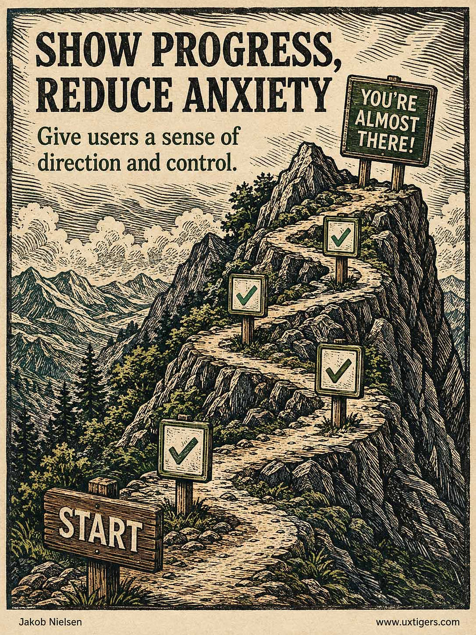
A progress bar doesn’t shorten the wait; it shortens the suffering. (GPT Image 2)
What People Delegate to AI Agents Defies the Forecasts
For a decade, economists have ranked occupations by how exposed they supposedly are to automation. Now we finally have behavioral evidence from the tasks people configure AI agents to handle. Yet the occupational overlap with Frey and Osborne’s famous 2017 computerization-risk list has a Jaccard similarity of just 0.05: essentially two different lists.
For scale, Jaccard similarity runs from 0 (disjoint sets) to 1 (identical sets). A score of 0.05 means that occupations appearing in both lists account for just 5% of the distinct occupations appearing in either list. Thus, the two lists share only a narrow sliver of occupational territory.
Since the last millennium, I’ve preached the value of watching what users do. Exposure indices dress predictions in a lab coat. Published agent configurations let us inspect the work people have taken the trouble to delegate.
A Prompt Is a Date; a Configuration Is a Marriage
Hyeongjae Lee and colleagues from the Korea Advanced Institute of Science and Technology (KAIST) analyzed 53,515 skill files that practitioners published on the Manus Skills Marketplace: reusable configurations telling an AI agent what task to perform, how to perform it, and when to activate (their new paper).
The team computed the semantic similarity between each skill description and roughly 18,000 O*NET task statements, then aggregated the results across 748 occupations. The resulting Agentic Adoption Index (AAI) estimates how much of an occupation’s task content early adopters have configured for delegation to agents.
Configurations reveal a commitment that chat logs can obscure. A prompt is easy to write and reveals little by itself: the same log entry could record idle experimentation or genuine reliance. But configuring an agent means writing down the goal, the procedure, and the tools for repeated use. A prompt is a date; a configuration is a marriage.
The authors call this measurement layer delegated exposure. It sits within what AI could do (capability), what tools vendors ship (availability), and what workers use (observed use).
The Old Predictions Flunk the Behavioral Test
Delegation concentrates in work that involves handling and coordinating information: management analysts, technical writers, and computer programmers top the index. Oral surgeons, roofers, and tire builders sit at the bottom. (Nobody has published a skill file for wisdom-tooth extraction. Long may that last.) Earlier automation theory located risk in routine tasks; the configuration data shows agents colonizing analysis, documentation, and coordination instead. So much for theory.
Two further findings sting. First, delegation follows an inverted U across wages, peaking around $136K and at the bachelor’s-degree level, then declining among the best-paid occupations and those requiring the most education.
Whether current AI tools can handle an occupation’s tasks explains 58% of the variance in delegation and fully accounts for the low end: agents can’t climb onto roofs yet. But it doesn’t account for the top, where occupations requiring graduate degrees delegate less than their technical feasibility predicts.
Second, the AAI correlates more strongly with what AI can do (ρ = 0.67) than with observed chatbot usage (ρ = 0.37). Chatting takes little setup, so users try it for all manner of tasks. Configuration takes effort, giving practitioners more reason to invest where agents deliver dependable results.
Caveats: the corpus overrepresents technically sophisticated early adopters who publish on GitHub, and cosine similarity between short text snippets is a blunt matching instrument. But blunt behavioral reality still beats sharp theoretical speculation.
Mine the Configuration Layer
Your users are producing the same artifacts right now: custom instructions, saved automations, agent skill files. That’s the richest UX research ore of the agentic era, and most teams let it sit unmined. Three action items:
Practice configuration mining. With explicit consent, collect and analyze the agent configurations your users build around your product. Each one records, at the level of individual tasks, which jobs its author intends to hand over to AI. Surveys and focus groups struggle to capture this task-level detail. But don’t bury the request in a legalese checkbox: spell out why opting in serves the user, and reciprocate with concrete value. Offer personalized tips for repairing a brittle configuration or examples of how superusers structure theirs. Users who learn something useful from sharing have a reason to keep sharing. (Cialdini’s reciprocity principle at work.)
Design for delegated reality. Build supervision dashboards, exception handling, and review workflows for the tasks users actually delegate. Retain a full set of hands-on controls for the work they demonstrably want to keep doing themselves.
Re-mine quarterly. Delegation patterns will shift as models improve. Treat configuration data as a leading indicator of where your product’s workflows are headed, likely moving before usage logs or employment statistics do.
The Specification Bottleneck
My diagnosis of exposure theory’s failure starts with a familiar obstacle: to delegate a task, you must specify it in advance. I’ve argued for 30+ years that humans can’t state their needs in a specification document with any accuracy. Prompts inherited that problem; agent configurations compound it. Elite professional work runs on tacit judgment and shifting context, exactly the material that resists being pinned down in advance. (The professions may also decline to codify their work while they still control the pace, as the authors note.)
The authors propose a useful test of whether better agents will change the picture: if the shortfall at the top shrinks as agents improve, that would point to a constraint; if it persists, that would point to a choice. My prediction: constraints explain most of the gap.
Next-generation agents will draft their own configurations by interviewing users and shadowing their work, dissolving the specification bottleneck and pushing delegation upmarket. Expect the graduate-degree gap to narrow by 2028–2029, with a rump of professional protectionism remaining. Either way, we now have a behavioral method for tracking the change. Watch what people delegate, and track how that changes.


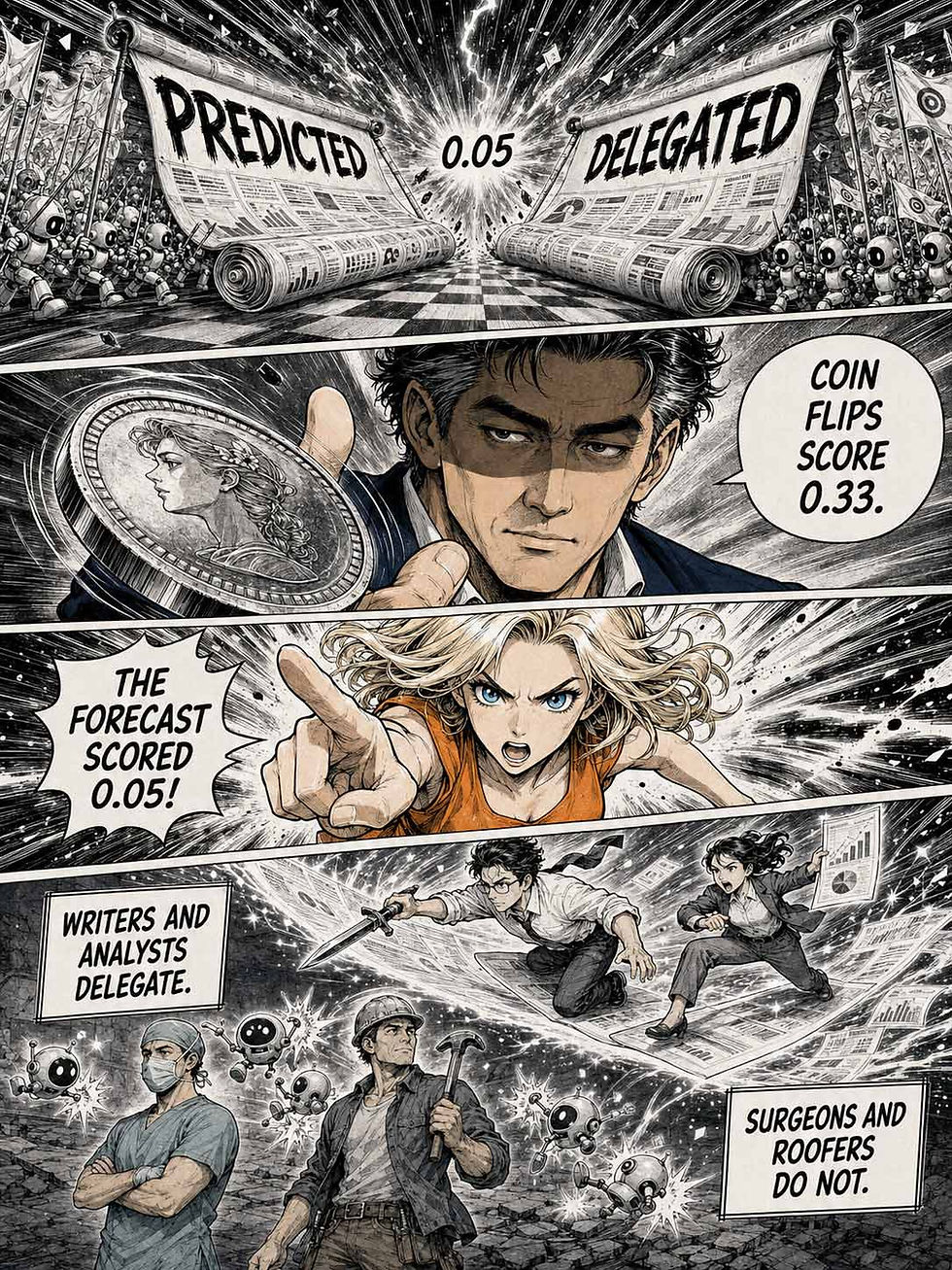


Alice and Zimo explain the new delegation data in a Shonen Speed-Ink Manga.
AI Must Show Its Work
An AI answer without reasons is a fortune cookie with better grammar. Users can’t calibrate trust in a black box, so they either believe everything (dangerous) or verify every answer elsewhere (slow, and a confession of design failure).
Show the ingredients: what context the AI considered, which sources it drew on, and what rules constrained it. Explanations help users judge when to rely on the machine and when to double-check its answer. That judgment is the goal of trust design. Each answer must earn the confidence it receives; a famous brand can’t do that work on its behalf. Give users evidence they can inspect and grounds for questioning a result.

Inside this answer: context, sources, and rules. Inside most actual AI answers: vibes. (GPT Image 2)
The Zero-Price Effect: How a 1-Cent Discount Multiplied Demand 7-Fold
Demand doesn’t slide smoothly as prices fall: it explodes at exactly $0.00, where a price stops being arithmetic and becomes pure emotion. In the classic experiment, a 1-cent price cut multiplied demand 7-fold. An honest free offer removes friction and financial risk from a design; a dishonest one is dark-pattern bait (ask Amazon about its $2.5 billion FTC settlement).
Definition: The zero-price effect is people’s tendency to overvalue free items far beyond what a rational cost–benefit tradeoff predicts. Cutting a price from 1 cent to zero causes a demand explosion; cutting it from 2 cents to 1 cent causes a ripple.
The effect got its name in 2007, when Kristina Shampanier and co-authors (MIT and the University of Toronto) published “Zero as a Special Price: The True Value of Free Products” (16-page PDF) in Marketing Science. At zero, they showed, the demand curve breaks.
Their crispest experiment offered 232 MIT cafeteria customers a Hershey’s Kiss for 1 cent or a Lindt truffle for 14 cents. Result: 8% took the Kiss, 62% the truffle, and the rest bought nothing. Sensible. A truffle is easily worth 13 cents more than a Kiss. (I’d have paid the 14 cents. I don’t compromise on chocolate.)
Then the researchers cut both prices by a single cent: Kiss free, truffle 13 cents. The price gap stayed 13 cents, so classical economics predicted unchanged market shares. Instead, the Kiss’s share rocketed from 8% to 56%, a 7-fold jump, while the truffle’s share collapsed to 13%. One penny flipped the market.
A companion study is even more damning: when offered a choice between a free $10 Amazon gift certificate and a $20 certificate priced at $7, a gobsmacking 100% of participants grabbed the free card. Every single person forfeited $3. Free switches off arithmetic.
Ariely popularized the finding in his 2008 bestseller Predictably Irrational: free removes the perceived risk of losing money. Paying 1 cent can feel like a mistake. Paying nothing feels safe.

Cutting a price from 1 cent to zero is the smallest discount a designer can offer, yet it can conjure a crowd out of all proportion to that saving. Demand at $0.00 belongs to a different curve entirely. (Muse Image)
Free = No Loss, No Math, No Checkout
Why does a single cent matter so much? Because every positive price, however tiny, erects a penny wall: a decision barrier whose height barely depends on the amount. To pay 1 cent, a user must judge value, trust you with payment credentials, and survive a checkout flow. To pay nothing, he or she just clicks.
Thus, zero price is a usability feature: it deletes the payment form, the assessment of financial risk, and the worry about wasting money in one stroke.
I learned this the expensive way. For years, I advocated micropayments as the way to fund great Internet content, predicting that we’d happily pay a cent or two per webpage. My erstwhile enthusiasm smashed into the penny wall: charging 1 cent makes users pay twice, once in money and once in decision effort. Free content won.
Field evidence agrees with the laboratory findings. When Amazon introduced free shipping, orders jumped in every country except France, where a local promotion priced shipping at 1 franc, roughly 20 cents. That last franc kept the offer on the paid side of the penny wall. French sales stayed flat until the shipping charge vanished; then orders in France jumped too.
Baymard Institute’s checkout survey found that 39% of users had abandoned a checkout because extra costs (shipping, taxes, and fees) were too high, making this the leading reported reason. Free-shipping thresholds, trials that don’t demand a credit card, and truly useful free tiers all convert so well because they demolish the penny wall instead of relocating it to step 4.
When Free Becomes Bait
Because free is the strongest word in the interface, it’s also a favorite lure for designers who rely on dark patterns. The classic specimen: a “free trial” that silently converts into a paid subscription defended by a cancellation labyrinth.
Amazon internally code-named its Prime cancellation flow “Iliad” because it dragged on forever, and in September 2025, Amazon agreed to a $2.5 billion FTC settlement over its enrollment and cancellation designs. (At least somebody in Seattle reads Greek epics. To be fair, Prime itself delivers honest value; only the exit was Homeric.)

Homer’s Iliad tells the story of the wrath of Achilles, the greatest of the Greek heroes. Maybe swift-footed Achilles had been stuck for too long trying to cancel a supposedly “free” subscription. (Muse Image)
Subtler abuses abound: springing shipping costs at the final checkout step, “free” apps that charge in attention and personal data, and free tiers designed to be useless except as upgrade nagware. The zero-price effect can even turn users against themselves, as the gift-certificate study showed: free lures people away from paid options that fit their needs better. And users hoard free stuff (downloads never opened, accounts never touched) that lingers as digital detritus.
The remedy is unglamorous honesty, carried through every step: show the full price before checkout begins, explain conversion terms at signup, send a reminder before the first charge, and offer 1-click cancellation.
6 Design Guidelines for “Free”
Reserve the word “free” for things that are actually free. If fees, shipping, or a mandatory subscription hide behind the label, you’re borrowing conversions that you’ll repay with interest: churn, chargebacks, and possibly an FTC settlement.
Reveal the full cost before checkout begins. Extra costs are the leading reported reason for abandonment: 39% of surveyed users had abandoned a checkout for this reason. Springing them on users at the last moment gives them a reason to distrust the offer as well as reject the price.
If a free trial becomes a paid subscription, say so at signup, remind users 3–7 days before the first charge, and make cancellation 1 click. Honest conversion beats ambushed conversion on customer lifetime value, if not on this quarter’s numbers.
Use free to remove first-use friction, then measure the share of users who reach activation. Free attracts hordes who’ll never become customers; the number that matters is how many people reach real value.
Check whether your free option works against the user. People grab free even when a paid option serves them better, so show an honest comparison instead of exploiting the reflex.
Don’t attach “free” to what users assume costs nothing anyway. A “free account” or a “free download” of your sales brochure devalues the word for the offers where it counts.
Look again at the illustration: identical gumballs, identical mechanics, yet every ghostly hand reaches for the golden machine. The price tag gives the machine its glow before anyone has tasted the candy. That’s the zero-price effect in one image.
Free is a spotlight, and a spotlight flatters whatever you aim it at. Aim it at honest value, and you can make a 90%-off coupon look stingy. Aim it at a trap, and you’ll star in an FTC press release. Free is the most powerful word in your interface, which is exactly why it must also be the most honest.
Buttons Should Say What Happens Next
“Continue,” “Submit,” “Next Step,” and “Finalize” all point somewhere; none says where. A button is a promise about the future, and generic verbs make vague promises, so users hesitate exactly where you want momentum: at the point of commitment.
The fix costs nothing. Pair the verb with its object: “Place Order,” “Save Draft,” “Delete 3 Files.” Now the label answers the question every user silently asks before a click that commits him or her to an action: what am I agreeing to? When the label predicts the outcome, the click follows.
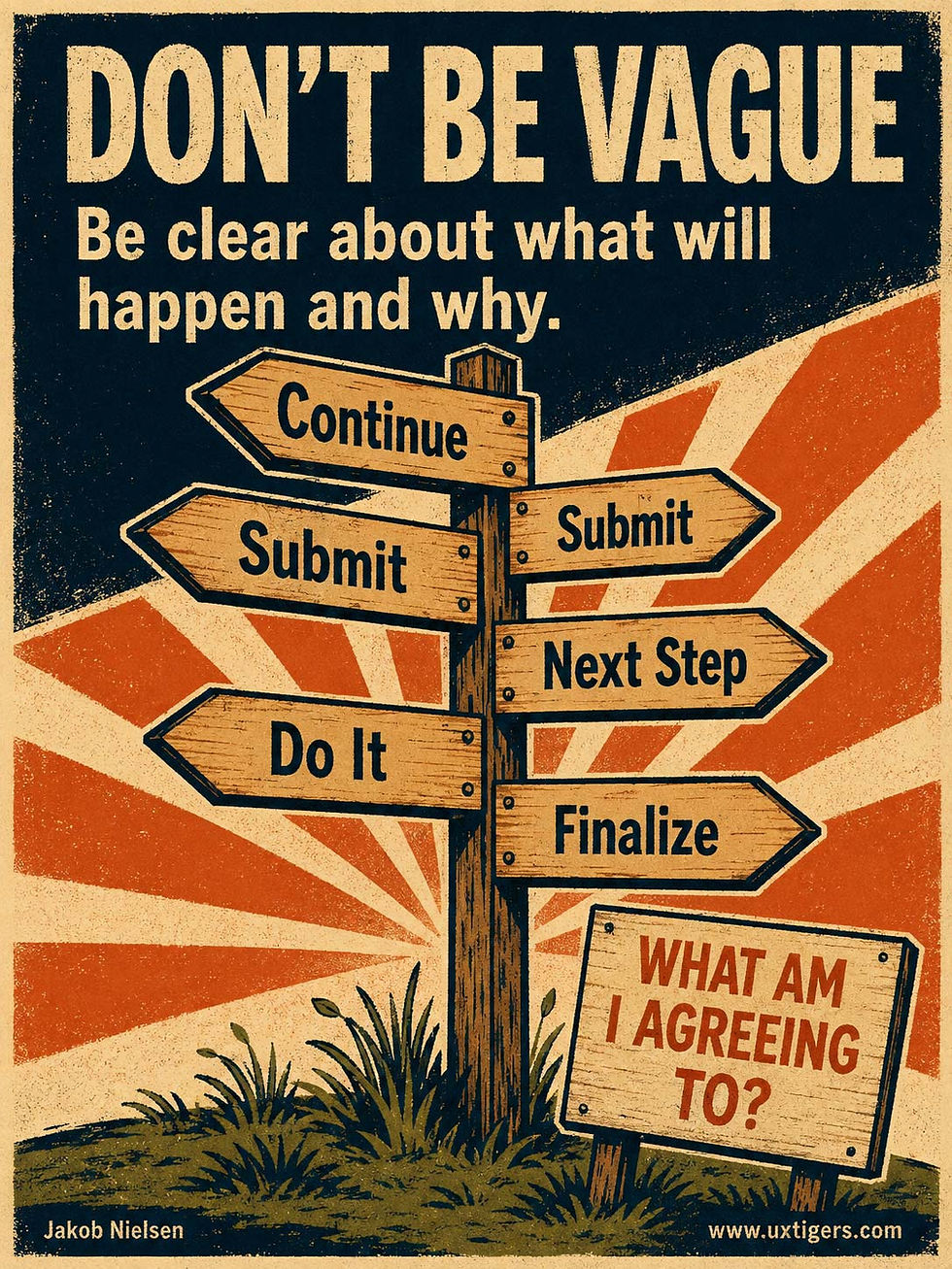
Just say what the next step will be. (GPT Image 2)
Tree Views: 3 Levels Good, 7 Levels Bad
A tree view presents a hierarchy as an expandable outline, giving users structure and detail in one control. It’s the right widget for nested data, but deep nesting, hidden branches, and microscopic click targets turn a family tree into a thicket.
Structure creates clarity. That’s the tree view’s promise, and the reason this widget has survived 4 decades of interface fashion. But structure only clarifies when users can see it, reach into it, and trust it. Botch those three conditions, and the same widget delivers confusion with indentation.
Definition: A tree view is a vertical list of hierarchical items in which each parent node can be expanded to reveal its children or collapsed to hide them, with indentation signaling depth.

A tree view in full bloom: one root, expandable branches, leaves on demand. Botanical trees grow up, computer-science trees grow down, and UI trees grow sideways from the left margin. Users have learned to cope with all three. (GPT Image 2)
From Yggdrasil to Windows 95
Humans have drawn hierarchies as trees for millennia. Medieval genealogists gave us the family tree, and the Norse went further and organized the entire cosmos as a tree: Yggdrasil, the world tree, whose roots and branches connected 9 realms. (Gods in Asgard, humans in Midgard: even mythology benefits from clean information architecture.) Computer science adopted the metaphor for its branching data structures, and the interface widget inherited the name.

The Norns Verdandi, Skuld, and Urðr lived at the foot of the world tree Yggdrasil, where they spun (and cut) each Viking’s life thread. (Muse Image)
Collapsible hierarchies appeared on screen before tree views became a familiar GUI widget. Dave Winer’s ThinkTank outliner (1983) let writers expand and collapse headings, and XTree (1985) drew entire DOS directory trees in character graphics. Windows 3.0’s File Manager (1990) placed a directory tree in a left pane, Apple’s System 7 Finder (1991) introduced the disclosure triangle, and Windows 95 shipped the TreeView control, whose plus boxes and dotted lines cemented the pattern for good.
Conceptually, a tree view is simply progressive disclosure applied to hierarchy: show the trunk, reveal branches on demand.
Why Trees Beat Both Flat Lists and Search
A tree view shows an item together with its context. Users see where they are, which siblings exist, and what the parent category is, all without leaving the view. A flat list of 500 items offers no such orientation.
My erstwhile Bellcore colleague George Furnas (nicknamed “Fisheye Furnas” by coworkers) formalized the underlying principle in his 1986 paper Generalized Fisheye Views: people handle large structures best when they see fine detail near their focus and progressively coarser context farther away.
A tree view with a few branches expanded follows a similar principle. The hierarchy may contain 10,000 nodes, but the screen shows 30 rows, and they’re the right 30.
Trees also match how people retrieve their own material. Ofer Bergman and co-authors found that users preferred navigating folder hierarchies over searching for their own files, even with modern desktop search installed: navigation was the default, search the fallback. People remember where they put things. A tree honors that spatial memory; a search box discards it.
How a Tree Becomes a Thicket
Depth is the classic killer. Kevin Larson and Mary Czerwinski at Microsoft Research tested 512 items arranged either 2 or 3 levels deep: the 2-level structures produced reliably faster searches and less disorientation than the 3-level version. Every additional level compounds the damage with more clicks, weaker information scent, and more chances to pick the wrong branch.
My rule: keep tree views at 2–4 levels. By level 7, users are wandering through a hedge maze.
Collapsed branches carry a subtler danger. Whatever a branch hides stops existing in the user’s mind. This is branch blindness: he or she will swear a feature isn’t in the product because the branch concealing it was never opened.
Deep trees compound this with disclosure debt, the click toll charged when the tree forgets its expansion state and greets returning users fully collapsed. Every visit. Add the widget’s mechanical sins, such as an 8-pixel chevron as the only way to expand a node (a target that would embarrass a watchmaker) or a single click that both expands and selects, and the promised clarity evaporates.
Couldn’t a cleverer visualization do better? The 1990s tried. Xerox PARC’s hyperbolic tree browser (John Lamping and colleagues, CHI 1995) swirled thousands of nodes around a movable focal point and looked sensational in demos; a startup commercialized it, and mainstream interfaces ignored it. Users chose the boring, stable outline.
10 Design Guidelines for Tree Views
Keep the tree 2–4 levels deep. Flatten categories before nesting them, and reserve real depth for domains such as file systems where users built the hierarchy themselves.
Use a tree only for a true hierarchy. If the data is flat, a list with filters beats a decorative tree: fake nesting adds clicks without adding meaning.
Make the expansion control obvious and generous. Show a chevron on every expandable node with a touch target of at least 1 × 1 cm, or let the whole row toggle when the node has no competing action.
Separate expanding from selecting. Assign expansion to the chevron and selection to the label, and apply that split consistently throughout the product.
Show state at a glance. Distinct expanded and collapsed indicators, plus subtle indentation guides on deeper trees, tell users where they are without counting pixels.
Remember what the user opened. Preserve expansion state across sessions; a tree that resets to fully collapsed charges the full click toll on every single visit.
Provide “Expand All,” “Collapse All,” and filtering. Beyond roughly 20 nodes, batch controls plus a filter box that reveals matches inside collapsed branches are the cure for branch blindness.
Load big branches honestly. When loading a branch’s children on demand, show a spinner or a child count; a parent node that masquerades as a leaf teaches users that the tree lies.
Support the standard keyboard model. Follow the ARIA tree pattern: Up and Down move between visible nodes, Right expands, Left collapses. Keyboard users navigate trees more than you think.
Rethink the tree on phones. Indentation devours a narrow screen by level 3, so sequential drill-down lists with a clear back path usually serve mobile users better.
Even the Norse knew that a world tree needs tending: the Norns watered Yggdrasil every day to keep its branches from rotting. Your product taxonomy deserves the same discipline. Prune dead categories, flatten needless levels, remember what users opened, and keep every branch’s contents one honest click away. Structure creates clarity, but only the gardener keeps it that way.
A Product That Almost Works Doesn’t Work
Design awards go to the object; users grade the outcome. A printer can win a ribbon for its looks and still print nothing, because the plug lies 2 inches from the outlet or the Wi-Fi handshake dies on step 6 of 7. The team calls that product 95% done; the user has received 0%: no page, no ticket, no signature.
The user’s outcome is binary while the team’s progress is continuous, which is why products ship one inch short of working.
Tom Cargill’s rule from Bell Labs (1985) still holds: the first 90% of the work takes 90% of the time, and the last 10% takes the other 90%. The last 10% is where the plug meets the wall.

A printer with its plug almost touching the socket prints exactly as many pages as a printer with no power cord. Zero. The blue ribbon makes the failure more expensive to admire. A product that gets the user 95% of the way to the goal has delivered none of the goal. (GPT Image 2)
The same principle applies to UX: when users need a completed result, almost working can deliver the full cost of an interaction with none of its benefit. A beautifully designed expense form that loses your receipts at submission has wasted every minute you spent filling it out.
Teams invite this failure when they measure progress by counting finished features. Search works, editing works, and the preview looks splendid. But if users can’t export the document in the format their client requires, the workflow ends with an apology. Three successful components have produced one unsuccessful task.
Thus, evaluate the entire journey through to the user’s actual finish line. For a report, that might mean checking that a colleague can open the exported file and read it as intended. “The download button worked” stops the test too soon. Almost connected is disconnected; almost working is a failure.
Final Thought of the Day


